Application: Fonts, font size & 12 tips on procedure and design
Which fonts are recommended for a job application? What font size should you use? Detailed advice on font and text size in applications can be found here. First, we start with 12 tips on how to go about creating your application and designing your documents.
1 | Scope and Page Format of an Application
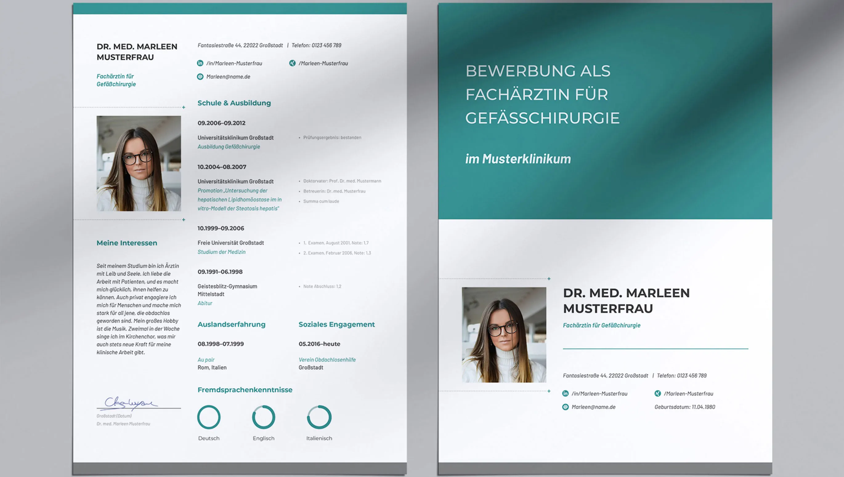
No matter how much you would like to write: In fact, the shorter, the better! Your letter, along with all the necessary marginal information, should fit on a A4 page in the end. Its dimensions are 21 cm × 29.7 cm. Typically, you set the left margin to 2.5 cm, and all other margins (top, bottom, and right) to 2 cm. However, beware: The text of your cover letter itself should not extend across the full page width. A line length of about 60 to 70 characters, on the other hand, offers high readability.
2 | Header
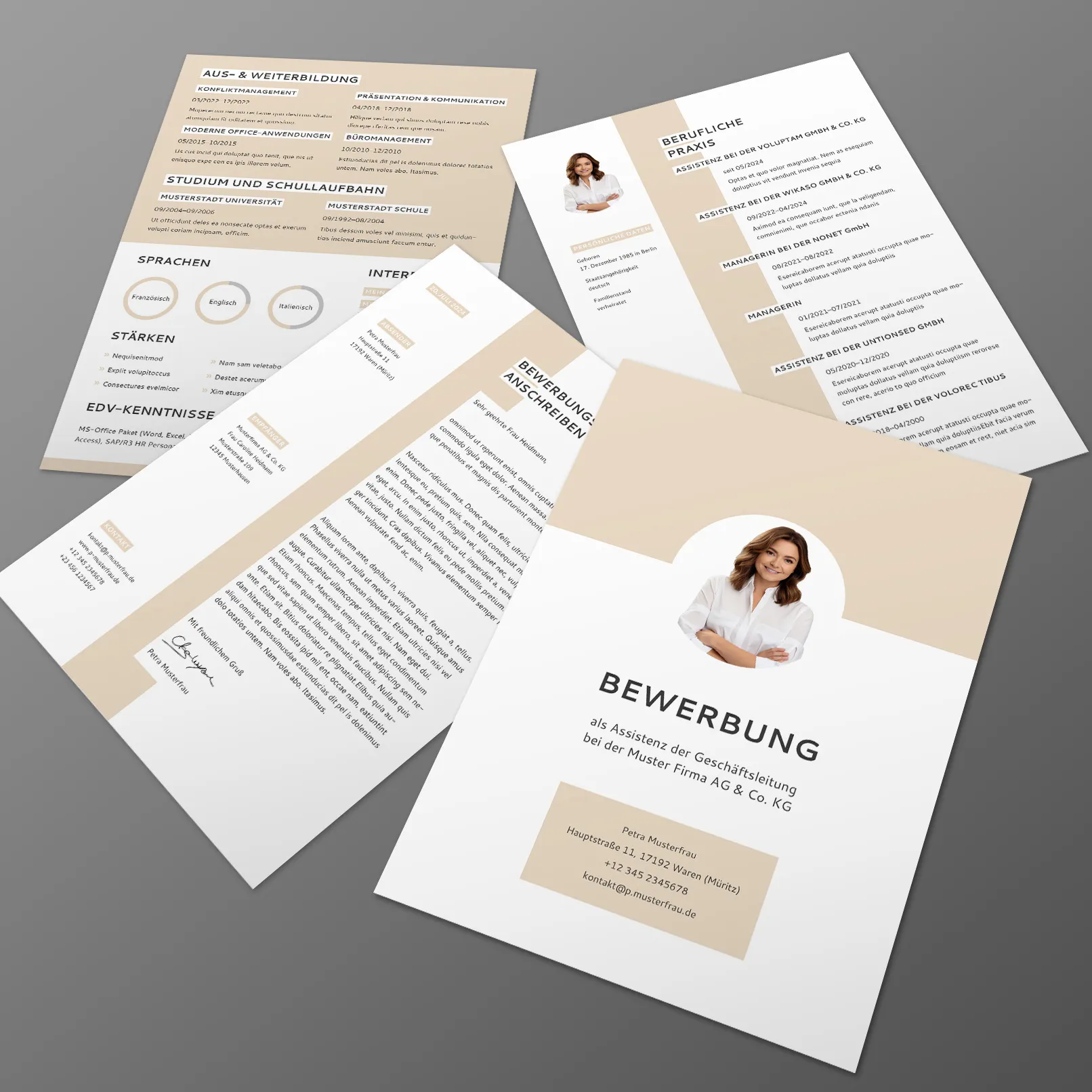
Your contact information can also be nicely placed in the header. For example, use a two-line layout: In the first line, you place your name in a larger font size (15 or 16 points). Below that, in the second line, you provide your details in a smaller font size (13 or 14 points), which you can separate from each other with a vertical bar (|) or a bullet point (•). If your application layout is a bit more unique, the size suggestions may not apply. Just focus on the structure, ensuring that the name is bold or larger than your accompanying details.
3 | Right Margin
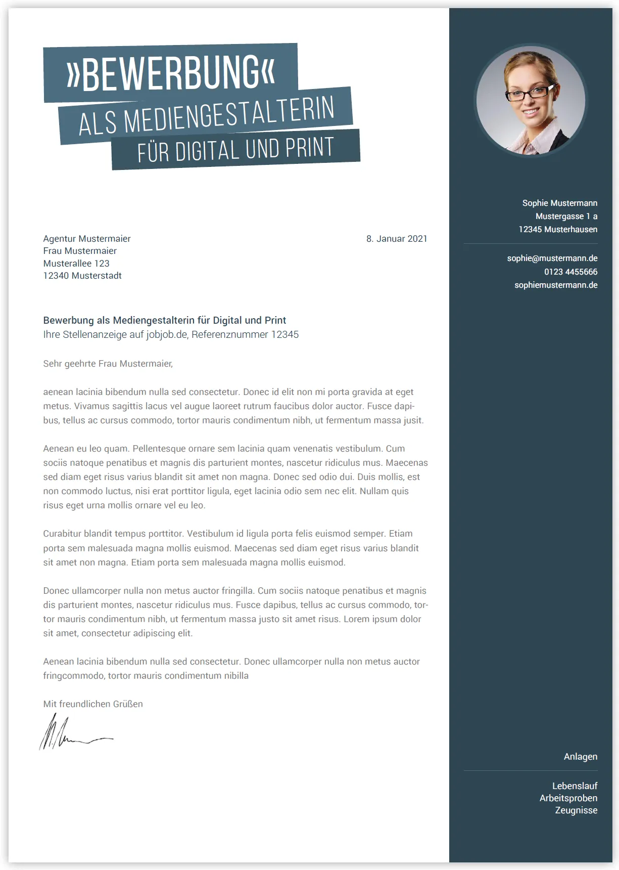
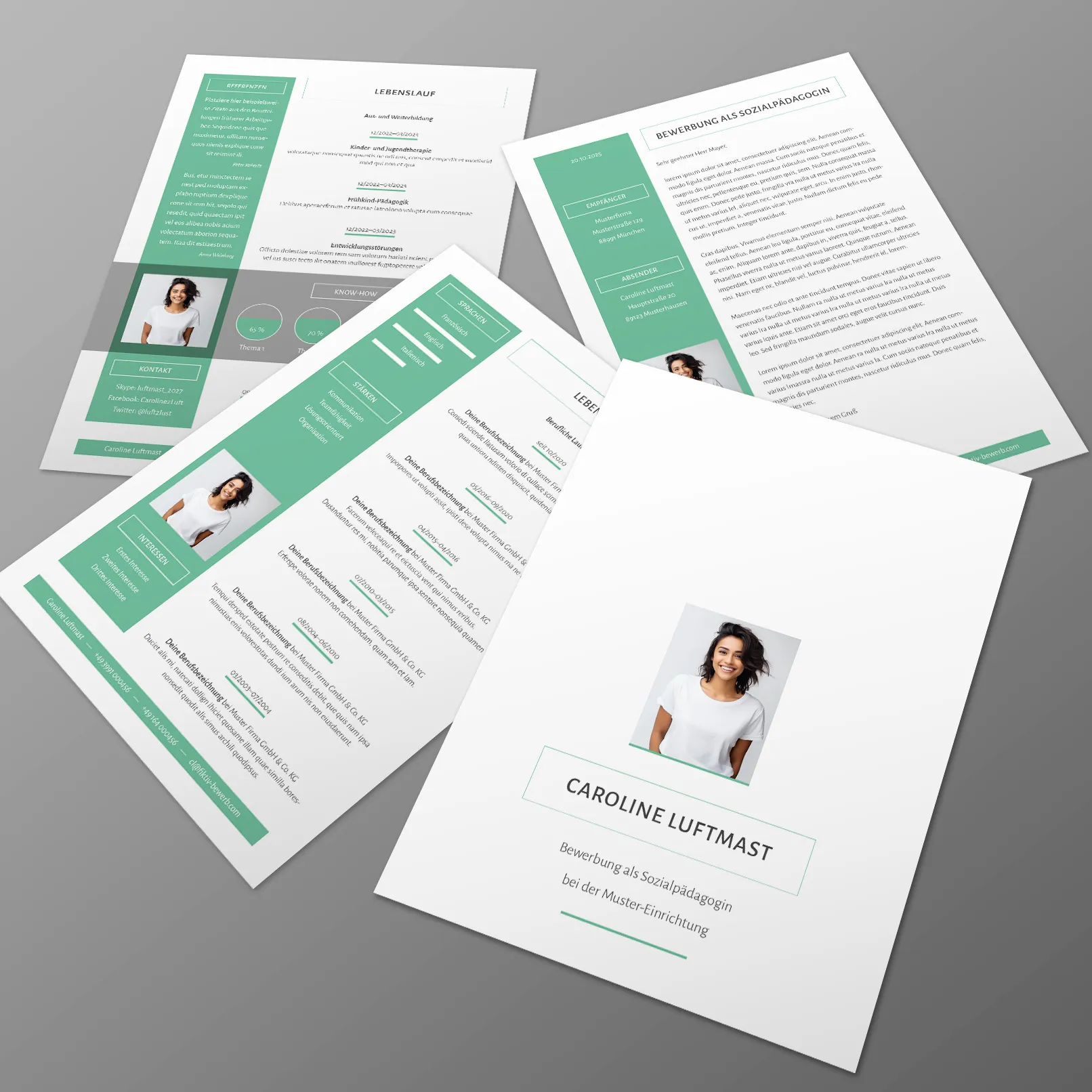
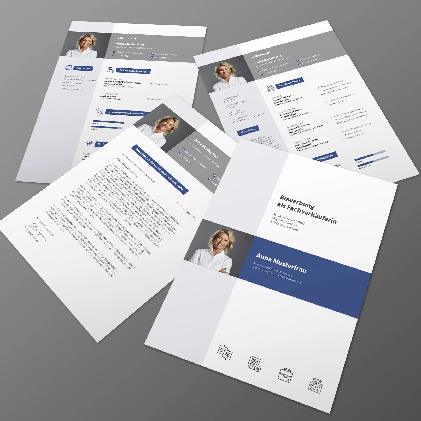
Here too, you can place your contact information and maybe even insert your application photo. If you opt for this variant, leave more space for the margin, approximately 6 cm would be suitable. The margin also offers you the possibility to include your list of attachments. You can distinguish the margin from the rest of the letter by using a dividing line or even a colored area.
4 | Color
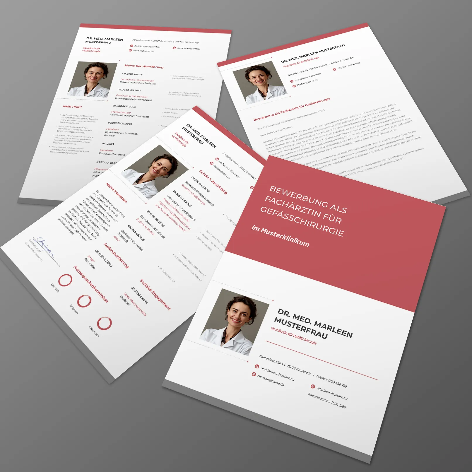
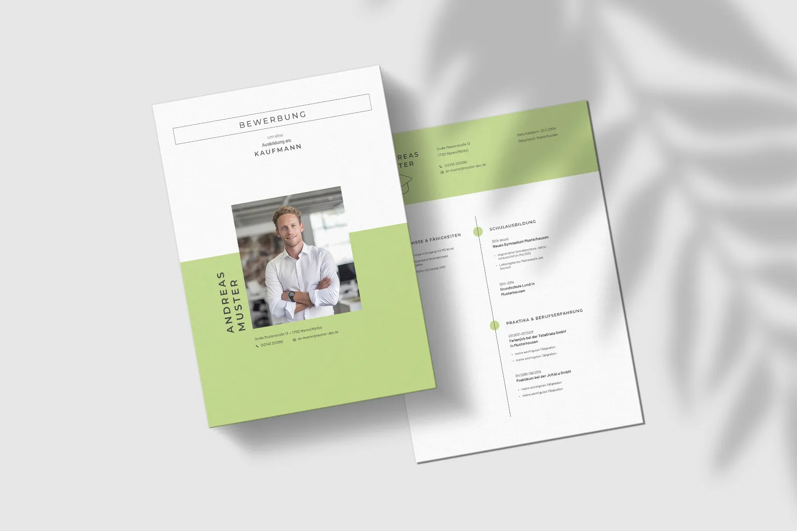
All black and white? – It doesn't have to be. In other words: Use colored accents in your design to stand out from the crowd! You can also work with subtle color gradations and use light and dark shades of blue, for example, for different design elements. When choosing the color, you could consider the following:
- Simply choose your favorite color to put more focus on your personality.
- Choose a color that matches or is close to the color of the company you are applying to.
- Choose a color that is typical for the respective industry. In the field of ecology, for example, green is welcome.
5 | Concept
Writing a job application is not necessarily a favorite task. One quickly wants to finish and turn to more enjoyable things. The quickest way to an efficient result may be quick writing. But hold on! With this approach, you will end up needing more time than if you sit down beforehand and create a small concept.
Write out again what requirements are specified in the job posting. Consider which ones are especially important and which are less important. Compare this list with your own profile: Where can you specifically mention something, where less so? Then structure your writing. What should go in the introduction? What in the main part? What things do you want to mention at the end?
Based on this rough outline, start writing the text. Keep in mind: Just because you are writing an official letter does not mean the expression should be overly formal and stiff. Avoid colloquial language, but don't create a legal text either. Formulate short sentences that say what is.
6 | Know Your Target Audience
Every text is directed at a very specific target group – and so is your job application. The good news is: The target group is pretty precisely defined here. So, keep in mind with every sentence that you are addressing it to the corresponding contact person, a superior, or a human resources manager. Essentially, you just need to answer one question: What does this person need to know about you to be convinced that you are of value to them or the company?
7 | Work Reduced
HR managers certainly don't have the time or desire to read six or more paragraphs in your cover letter. Therefore, write as concisely as possible, following the motto of the French writer Antoine de Saint-Exupéry: "Perfection is not achieved when there is nothing more to add, but when there is nothing left to take away."
8 | Scanned Documents as Attachments
For the attachments section, you will surely need to scan documents such as certificates. Make sure to align them properly. Also, when scanning, gray areas often appear in the actual white spaces. You should brighten these up afterwards (for example, via a tonal adjustment). The cleaner the overall appearance of the scanned documents, the better! Of course, there are now useful smartphone apps for photographing and converting documents. Just look around the web for them. Make sure that not every attachment is saved in a separate file, but that all attachments are merged into one PDF. No one wants to receive your email with six attachments in separate files.
9 | Google Yourself
If you provide links to your own website, your online portfolio, or social media profiles in your application, make sure that these pages are up to date. Also, check what information can be found about you when your name is searched on the internet. You may discover content on Google, Facebook, and others that could hinder your employment, and that you may want to revise before sending out your application.
10 | Creative Industry: Online Portfolio
Especially for applications in the creative industry, providing an online portfolio is highly recommended. This allows you to showcase your work more easily and visually than through attached documents. It's best to present your work where other industry professionals gather. This can include specialized platforms like Behance and Dribbble, as well as more general channels like Instagram, Pinterest, or YouTube. Being well-connected there shows that you are a good networker. If you don't have references as a newcomer, create some impressive concept designs.
11 | Presenting Visually
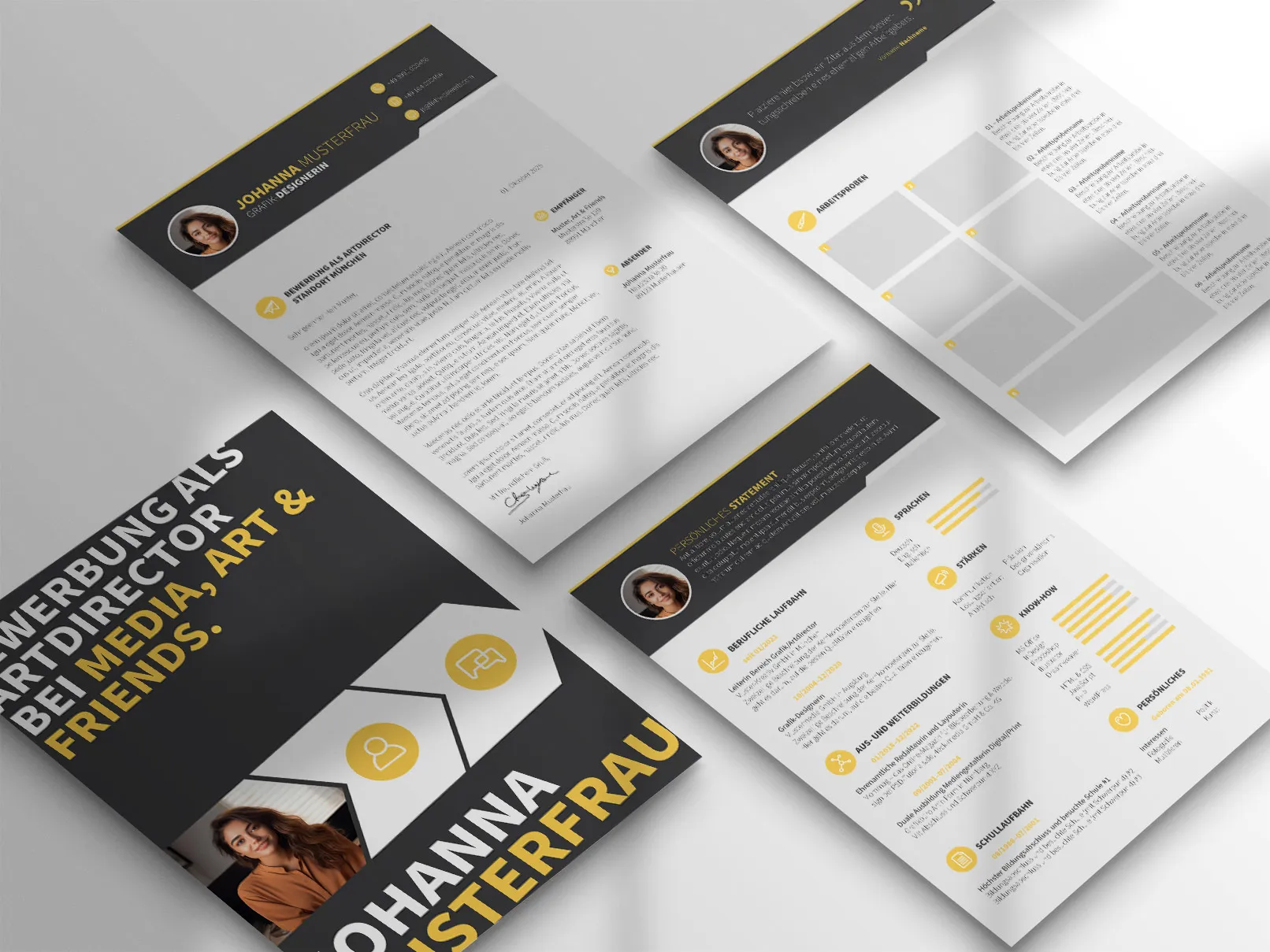
When visualizing your work, mockups are often helpful, allowing you to integrate your two-dimensional works into photorealistic scenes. Here, you'll find hundreds of mockups for printed products like brochures or for displaying web content on various devices. Mockups can be used for certificates you've received or for design work.
12 | Quotes in Application and Resume
Whether on the cover page, in the margin, in the header or footer... by using a quote, you give your documents a kind of slogan or convey a specific attitude, a philosophy. Draw on quotes from more or less well-known individuals. Alternatively, select a striking sentence from your school or work certificates that positively assesses and describes you, highlighting an aspect relevant to the advertised position. Place the quote in quotation marks, mention the name of the quoter, and provide context such as the person's profession. For example: "You have an eye for creativity. Keep it with you." (from the work certificate of Anna Sample, my high school teacher)
Font Size and Fonts in the Application
Readability with Character
Use font as an additional design element to add your personal touch. When choosing a font, you have some leeway, but it's not unlimited.
1 | Uniformity
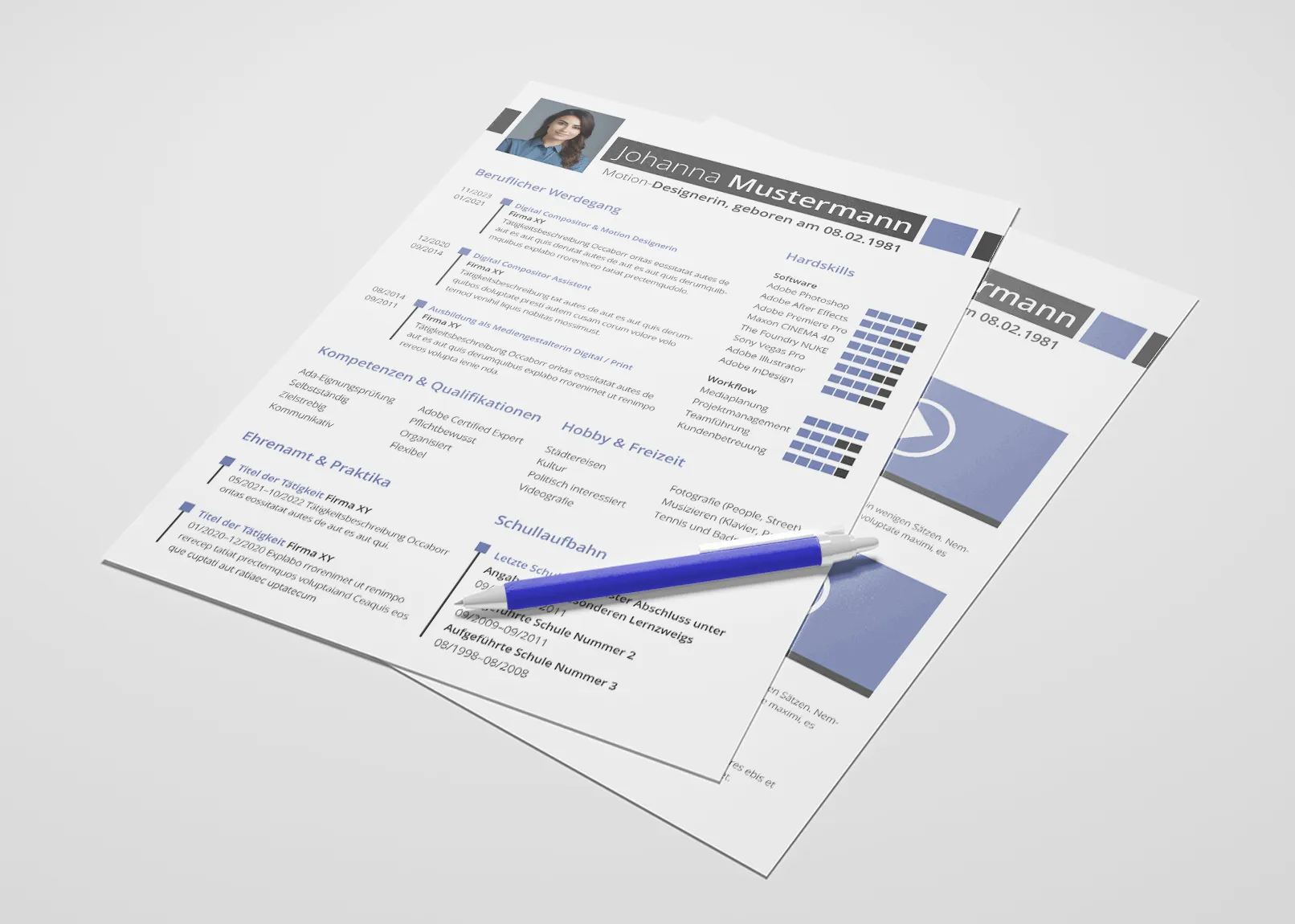
In your application, you should not use more than two fonts. Ideally, one font in the application is sufficient. This sets the foundation for a cohesive typography – anything else may seem unplanned and chaotic. Feel free to use highlights like color or bolding to emphasize the structure of your document. But don't overdo it. Less is more! For example, highlight the subject line in bold, adapt the color to match your application's design. An additional marking (such as underlining) can be too much. If you want to write headlines only in uppercase, use sans-serif fonts for this purpose. The body text should usually not contain special markings. Also, don't use 100% black for text. Text with values around 95 to 97 percent appears lighter and less harsh.
2 | Font Size in the Application and Line Spacing
You should set the line spacing slightly higher, in word processing programs like Word to a maximum of 1.5. In layout programs like InDesign, you can control the line spacing individually, aiming for around 120 to 150 percent of the font size. The choice of line spacing depends on the available space and the length of lines – the longer the lines, the larger the line spacing should be. In general, remember: Good readability is paramount - give your writing some "breathing room." The font size should ideally not go below 10 points. Often, 12 points are excellent. If you wish to vary, the 11-13-15 or the 12-14-16 rule is recommended.
- 11 or 12 points: Body text
- 13 or 14 points: Dates, addresses, subheadings
- 15 or 16 points: For your name in the header, also for headings
3 | Which Font to Use for Application and Resume?
Which font for the application and resume should you use? Here too, readability plays a crucial role. Avoid elaborate cursive fonts. Fonts such as "Impact", "Courier", and "Comic Sans" are considered unsuitable for applications. You cannot go wrong with the classics like "Arial," "Verdana," "Helvetica," and "Times New Roman." Many application coaches even recommend using them. However, be cautious: these fonts may seem generic and interchangeable. If you are applying to a design agency, using "Arial" may evoke some yawns. By choosing alternatives, you show that you have taken care in formatting your writing. Explore platforms like Google Fonts or Font Squirrel. You can also select a font that is similar to the company's to which you are applying.
Therefore, as design professionals, we recommend against using a font such as Calibri, Times New Roman, or Arial. These fonts are common in many documents, emails, and business letters, potentially making your application less memorable. Your application should stand out and reflect a piece of your own personality. Using a less common but still professional font can help achieve this. Modern applications often prioritize design and aesthetics. Alternative fonts can make an application visually appealing and contemporary.
Here are our recommendations for you:
Serif Fonts
- Merriweather
- Dejavu Serif
- Heuristica
- Kameron
- Libertinus Serif
- Manuale
- Noto Serif
- Source Serif
- Unna
Sans-Serif Fonts
- Ubuntu
- Open Sans
- Source Sans Pro
- Roboto
- Cantarell
- Alegreya Sans
- Encode Sans
- Fira Sans
- Aller
- Lato
If you lack a sense of design, it is better to use a sans-serif font. Serif fonts require more adjustments in font size, line spacing, and whitespace to create the perfect overall look.
Creating the Application and Preparing for the Interview
Depending on the industry and company, a classic or modern resume may be more suitable. Traditional companies often prefer a conservative style, while creative firms favor innovative and appealing designs. There are numerous options for downloading resume templates in Word for free, which you can customize according to your needs.
The cover letter is also crucial. The structure and content of a cover letter should be clearly tailored to the respective position. It is important to convincingly present your motivation and qualifications. Our article "What's important in a resume?" provides a detailed guide on what to consider in your resume.
Prior to the interview, you should prepare for typical interview questions. These questions may vary, but often focus on your strengths and weaknesses during the interview. It is advisable to respond authentically and reflectively to leave a positive impression.
Our collection of articles will help you master all essential aspects of your application. We offer detailed guides and valuable tips, from creating a compelling resume to formulating a strong cover letter, to helpful advice for the interview. Prepare thoroughly, invest in a good application photo, and tailor your application to the company's style. With these resources, you are well equipped to find and secure your dream job.
