10 typical mistakes in job applications: a real example
The day before yesterday, we received an application for a training position at our agency 4eck Media. This application is as classic as it is indicative of many applications that will hardly have a chance with good companies. Therefore, based on this real example, I would like to highlight the ten typical mistakes of an application from the perspective of employers and personnel decision-makers in this blog post.
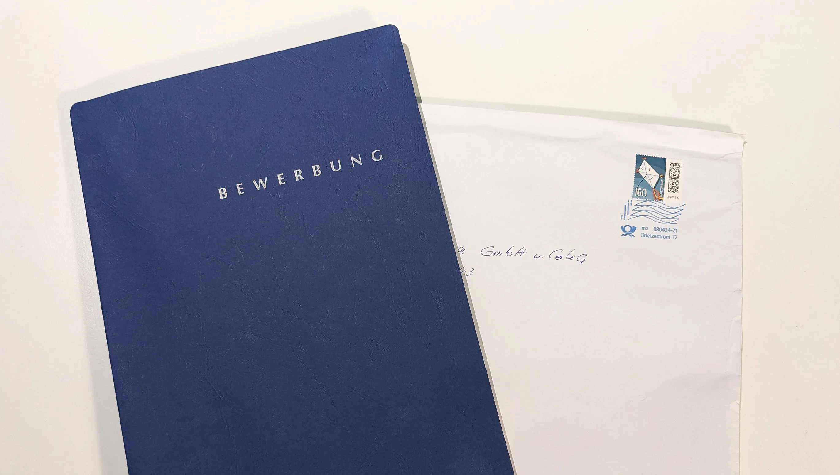
The applicant's name is redacted, and the photo is also blurred. I want to assure you that this is indeed a real application we received the day before yesterday. For data protection reasons, the information that could identify the applicant has been anonymized. We do not want to compromise anyone here, but we believe that learning from this example can help you improve your own application.
Table of Contents
- Application Mistake No. 1: Sending the application by post
- Application Mistake No. 2: The structure of the application documents
- Application Error No. 3: The visual impression of the photo
- Application Error No. 4: A font that expresses arbitrariness
- Application Error No. 5: Spelling and Grammar
- Application Mistake No. 6: Layout, Styles, and Formats in the Application Design
- Application Mistake No. 7: The Text of the Cover Letter
- Application Mistake #8: Currency of the Certificate
- Application Mistake #9: No References, No Concept Designs, No Certificates, No Social or Business Profiles
- Application Error No. 10: Print offers potential for positive tactility and aha effects
- So how can you improve now? Here is a personal example of an application.
Application Mistake No. 1: Sending the application by post
Some companies still require applications to be sent by mail. That's okay in itself. Like many other companies, we prefer the digital version via email. Large companies with numerous applications also prefer a digital format or even data entry through an applicant management system. The background is that the company wants to make handling applications, invitations, and rejections as easy as possible.
When I pulled the application out of the mailbox and felt the typical shape of the application folder, my first thought was: If there is a rejection, we will have to send the documents back in a cumbersome manner. Yes, that was my first impression. It was regrettable why the applicant didn't just send a PDF. Unfortunately, most applicants with us receive rejections without an invitation to an interview. The reasons are similar to those of this applicant. So read carefully why companies may not have invited you to an interview so far.
I checked the sender's address and then realized that the applicant lives just 350 m away from us. According to Google Maps, that's just a five-minute walk.
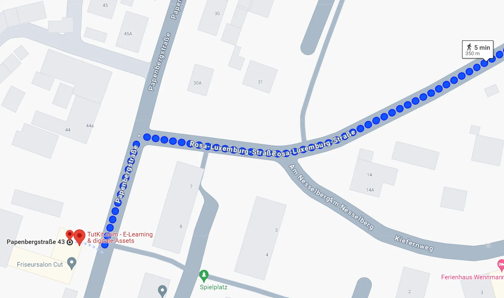
My next thought was: Strange that he had the envelope franked and brought it to the post office instead of simply delivering the application directly to us or putting it in our mailbox.
The applicant missed the chance to ensure that the envelope arrived here in perfect condition. In the further photos, a slight bulge can be seen, which probably occurred when the mailman pressed the envelope into our mailbox.
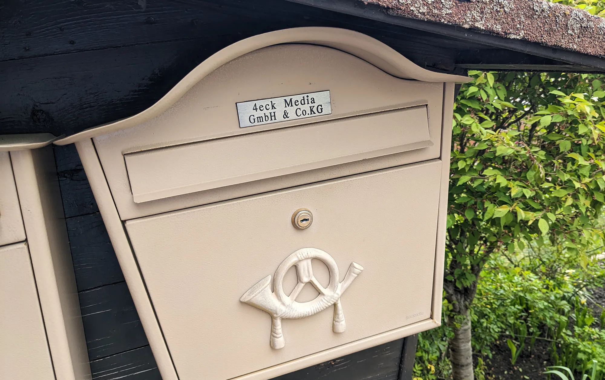
Furthermore, I also think that if someone lives only 350 m away from us, why didn't they just ring our doorbell beforehand and inquire if we are hiring apprentices, who the contact person is, and in what form we prefer applications. It is really questionable to me why this important step was skipped. Someone wants to commit to our company for three years as part of an apprenticeship without ever having spoken to us? Perhaps we are not even looking for apprentices, and he could have saved himself the effort through a quick phone inquiry or by coming directly here. Or maybe we simply do not fit his expectations as a company, something he could have found out in an informal initial conversation before applying. He omitted this step.
In my experience, female applicants - even for student internships - are braver. They come here determined and ask what they want to know. I remember my own behavior as a very young person. I too was very shy and sometimes scared and preferred to avoid such situations.
Application Mistake No. 2: The structure of the application documents
When I open the application folder, I expect to see the cover sheet, the cover letter, the resume, and important attachments in terms of structure. This is still the standard in Germany, although in some cases the cover letter can be omitted if the resume is comprehensive enough.
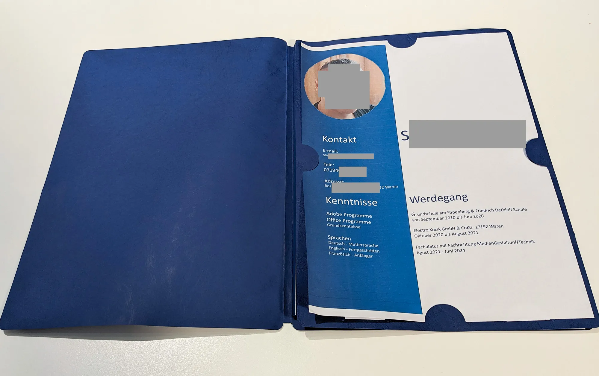
In this application folder, I search in vain for a resume. The applicant has included his three points on career development and his skills on the cover sheet. That was somewhat unusual for me. Well, one might argue that as a young person, there isn't much to tell. That could be true. But later in this article, I'll show you an example of how a fifteen-year-old boy structured his application, including the resume, in a beautiful layout with all the information placed nicely. You can also click here for tips on structuring an application.
Also, our application templates including cover letter and resume are optimally prepared. If you need something quick, feel free to check out our application category.
Application Error No. 3: The visual impression of the photo
The applicant is wearing a t-shirt. The light is coming from the right, which causes his face to be unilaterally illuminated. He is probably sitting by the window. The background is in the same color tone as his skin color, which also has a disadvantageous effect on the overall impression. I think the picture was taken by himself, not by a photographer.

It is not mandatory for an application photo to be taken by a photographer. It can actually be done with a smartphone as well. The picture at the very bottom in the positive example was also taken with a smartphone and professionally edited. There is another article on this topic in the blog: Application photos by a photographer vs. application photo with a smartphone.
What could the applicant have done better: Application photos should align in pose and expression with how the company positions itself. It can be seen on our About Us page that we are all relatively casually dressed, but we do wear a shirt. So, on an application photo, I would present myself to us in the same manner. The applicant did not do that. Furthermore, on the cover page, it is stated that the applicant has skills in Adobe Photoshop. Why didn't he digitally edit his image? It would have been simple in Photoshop to correct the exposure and desaturate the background color.
The poor print quality adds to the overall impression.
Application Error No. 4: A font that expresses arbitrariness
The applicant appears to have used the font Calibri. Calibri is a classic font that modestly fulfills its purpose. It was designed by the Dutch designer Lucas de Groot for screen purposes. However, it also does well in print materials. There are no surprises, no missteps, nothing special. Calibri does not provide any accents. It is a good font. That's why it was introduced as the standard font by Windows in 2006, until 2021. Therefore, everyone knows the appearance of Calibri.
For other applicants, I would not say it is a mistake to choose Calibri for the application. It just makes you arbitrary. That's all.
However, those applying to a design agency should not rely on standard fonts like Calibri, Arial, or Times New Roman. Today, there are better free alternatives like Roboto, Lato, Montserrat, Raleway, etc. All fonts that can be downloaded from Google Fonts.
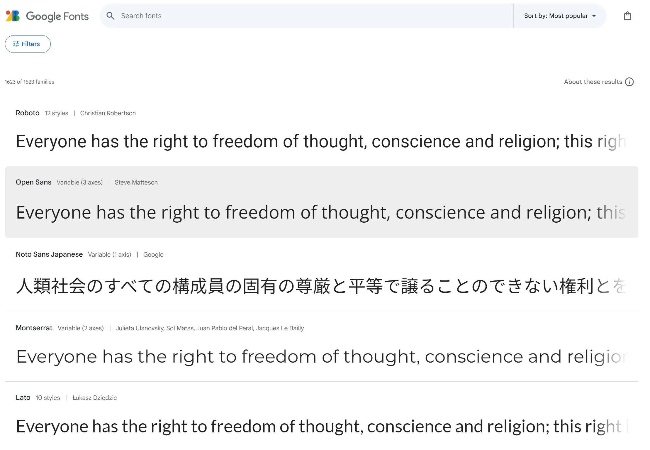
And even the designer of Calibri, according to Wired magazine, does not regret that the world is moving forward and Calibri has been replaced as the standard font by Windows.
I believe I will further explain the topic of fonts and font combinations in applications in a separate blog article. It seems to be an interesting topic to me.
In conclusion: Use a font that is easy to read and professional, but has a bit more expressiveness and individuality. It would have been a special touch if the applicant had chosen Ubuntu as the font: Ubuntu is our font that we use at 4eck Media. Or the Noto font, which we use here at TutKit.com. That would have shown that someone pays attention to details, and I would have noticed it positively right away. So, you see, you can position yourself with the choice of font.
We have already predefined suitable and modern fonts for our application templates, all of which can be downloaded for free. Feel free to browse through our application samples to see if there's anything that suits you:
Application Error No. 5: Spelling and Grammar
It is the duty of every applicant to check all information for completeness and correctness of spelling and grammar before submitting the application.
How many mistakes can I, as a recruiter, forgive? One, five, ten? I would prefer to receive a flawless document. Honestly.
Lets take a look at just the cover page, how many mistakes could the applicant have made? I have marked in red where errors are present.
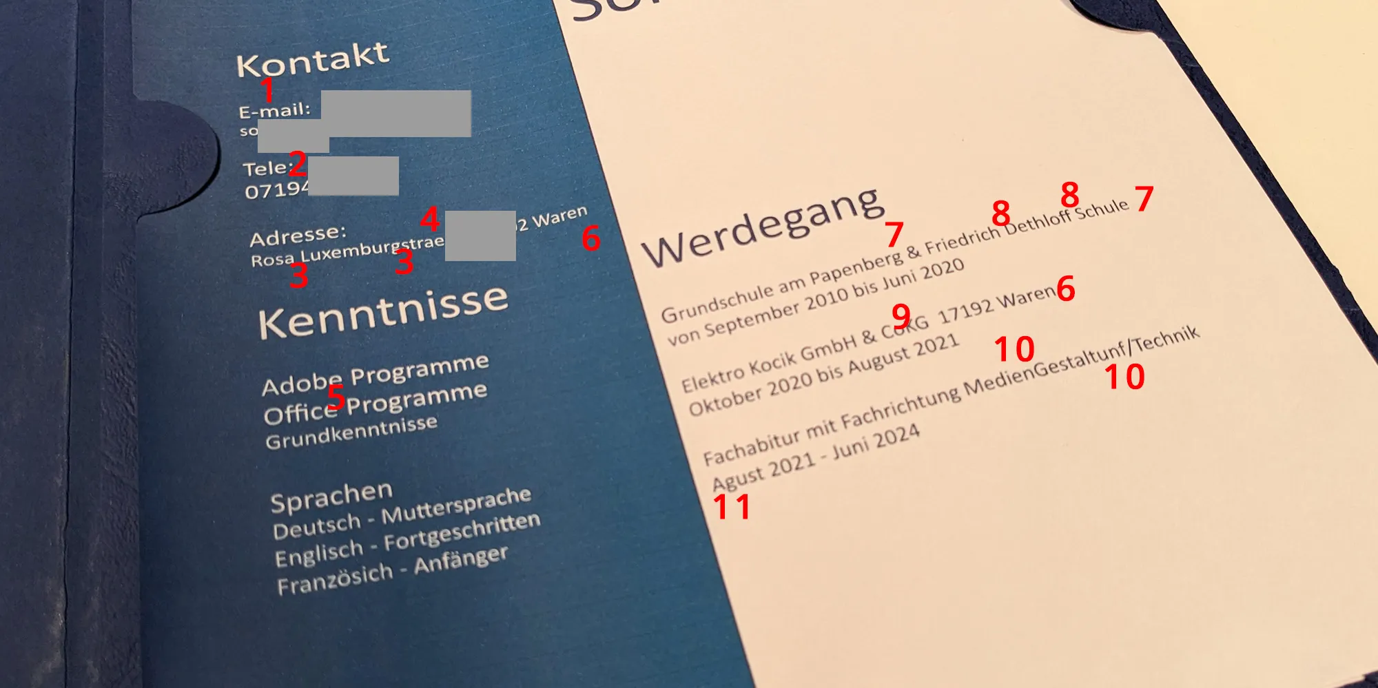
What mistakes could I identify? This also depends on the rules of the German language. If I take it very precisely, these are the following mistakes:
- 1. "E-mail" ... according to Duden, only E-Mail is correct
- 2. "Tele" ... as an abbreviation, the correct variant without the e is Tel.
- 3. missing hyphens in the street name
- 4. missing ß-character in the street name
- 5. missing hyphens in "Adobe programs, Office programs"
- 6. incomplete location name: the suffix (Müritz) is missing
- 7. missing location names for the schools
- 8. missing hyphens in "Friedrich-Dethloff-Schule"
- 9. Company name spelled incorrectly: period and space are missing
- 10. "MedienGestaltunf/Technik" => "Mediengestaltung/Technik"
- 11. "Agust" => "August"
Eleven errors solely on the cover sheet with the limited information about the career path give me the impression that the applicant does not work precisely.
Furthermore, there is a mix-up in his telephone number. The beginning should be 0179 instead of 0719. The telephone number is correctly spelled in the cover letter.
Application Mistake No. 6: Layout, Styles, and Formats in the Application Design
One thing I pay attention to in applications is the coherence in layout. Everything should appear consistent to me. And right there, applicants also make mistakes in the layout, where styles and formats are not uniform.
Our applicant has multiple inconsistencies in style and format in his application.
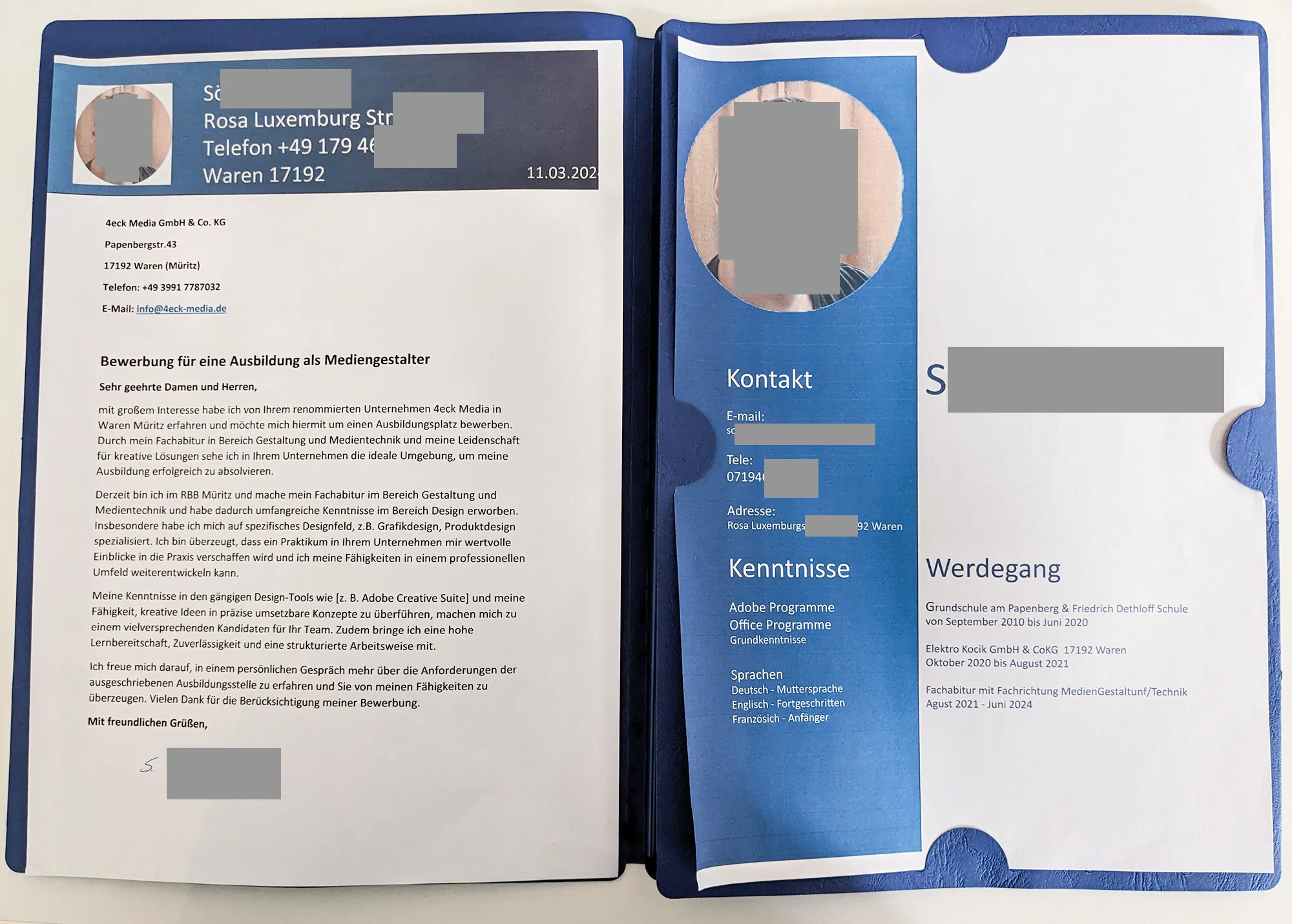
It starts with the different formatting of the telephone number. Apart from the mix-up, the telephone number on the cover sheet is placed without separation or space. In the cover letter, it is correctly formatted according to DIN 5008 for German applications: +49 123 456789.
The applicant has written the telephone number once with and once without the country code. I do not appreciate inconsistencies in formats. Such an inaccuracy I also find in the telephone number. Following the format of the cover sheet in the left column, the telephone number should have been placed in a smaller font size. It has the same font size as the heading next to it.
Another mistake is made during document printing. The print settings were not correctly set to the paper size, resulting in the date being cut off on the right side. Additionally, the date is outdated. It is over a month old.
The empty lines for the addressee are unnecessary.
Equally unnecessary is the blue, underlined email address of ours in the address field of the cover letter. I cannot click on it. It is not a digital application. Moreover, I question why our email address is there. It would have been better if the applicant had included their email address in their contact details on the cover letter. Perhaps there was no space left, because their contact details are set in a too large text size. Additionally, the city and postal code are swapped. In Germany, the postal code always precedes the city and not vice versa.
I find it important that lines are placed on a sort of imaginary baseline. Looking at the words skills in the left column and career path in the right, I notice that the right word is slightly higher placed.
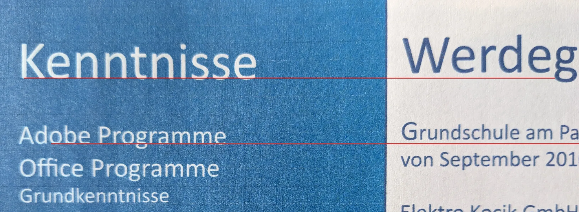
Not every company pays attention to such small details. However, the applicant has addressed an agency focused on design. We pay attention to such details. To me, these small mistakes indicate that the applicant does not work accurately enough or has not yet learned to pay attention to such attention to detail.
One last point that immediately catches my eye, which I consider a layout error, is the embedding of the photo. It is displayed prominently on the cover sheet. The edges appear frayed. This is probably due to the poor print quality. On the cover letter, the circular image has a white rectangle background. The applicant comes from a design school. Therefore, they should have the professional competence to embed an image without a white background. Also, as a person with a focus on design, they should recognize that the image in this form could have a negative impact.
Application Mistake No. 7: The Text of the Cover Letter
The cover letter starts at the top with the outdated and cut-off date. The fact that the applicant has written the salutation and the closing formula in bold at the end, is not something I would do. In my opinion, it's not disadvantageous, but the comma in the closing formula is grammatically incorrect according to German grammar. The punctuation in the closing formula should be without a comma.
Another criticism regarding the salutation is the lack of a personal address. We are a small agency with fewer than 20 people in the team. In such cases, the manager usually makes all personnel decisions directly. Therefore, always address the manager, if no other responsible person is recognizable in small teams. The optimal way, of course, is to simply call beforehand and inquire. It can be that simple. Then you also have a substantive trigger for your introduction in the cover letter.
Then the applicant also uses two typical phrases that are repeatedly found in applications in this or a similar form:
- with great interest
- I hereby apply
This can now be done better and more creatively. Furthermore, and I repeat myself, the recipient of the application is an agency, not an authority.
In the cover letter, the applicant writes that he is convinced that an internship at our company provides valuable insights into practice. I agree with that. I'm just not sure if the applicant is now offering an internship prior to a decision about training. It seems to me more like the applicant has used an outdated cover letter text that he used in advance for the vocational internships at his school. Either way, this paragraph raises questions for me. Either the applicant specifies his offer for an internship or voluntary trial work, or he replaces the word internship with the word training to make it fit cohesively.
Furthermore, the intern writes about his skills in design tools, specifically Adobe Creative Suite. The current version of the Creative Suite is technically Adobe CS6 from May 2012. It was replaced twelve years ago by the Adobe Creative Cloud. This is just a small content oversight, as the applicant probably also means the Adobe CC. However, it is another point that does not make a positive impression.
In the final paragraph, the applicant looks forward to learning more about the advertised training position. It is positive that the applicant does not use the subjunctive with: I would be pleased ... This is indeed a common mistake made by applicants using the subjunctive in applications. However, I wonder which advertised training position the applicant is referring to, as we have not advertised any training positions. It is just a small oversight ... like all the others.
Formulating cover letters in applications
How can this be improved? Honestly, as a student, you probably don't have much to report. What could you possibly write about? But in a cover letter, it's not just about the applicant, but about the company and the benefit it could derive from the applicant as an employee. We seriously thought about this. You can find assistance here on how we would formulate cover letters in applications. These tips were developed before AI tools further facilitated our work.
If you use text AIs like ChatGPT for formulating cover letters? Yes, definitely. Because this way, you already get a well-structured draft. Then, you enrich this draft with important details about the company and assess how convincingly you can present your value to the company as an applicant. Below, you can see the student application. This cover letter text was also created with the help of ChatGPT. But only about 80 percent. ChatGPT also uses phrases that are already worn out. Why? Because ChatGPT has learned this way through processing countless application texts it has crawled on the internet. So, you can use ChatGPT and further refine this text as a cover letter. And it is important to always verify the information for accuracy.
And if you don't use ChatGPT, that's fine too. Still, copy your text and ask colleagues, acquaintances, or family members if there are any spelling or grammar errors or if certain formulations can be improved. The use of AI tools is not cheating but demonstrates digital skills! It is almost negligent or arrogant to refrain from using AI tools in working with texts.
Application Mistake #8: Currency of the Certificate
The applicant is currently attending the technical high school with a focus on design. He submitted his last graduation certificate, which is from the previous school. The attached certificate was issued almost four years ago.
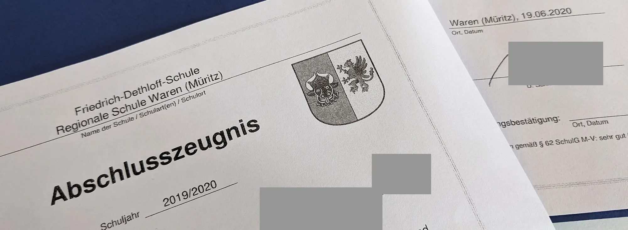
What about the current certificate from the current school? That interests us.
In contrast to ongoing certificates, no absences are recorded on a graduation certificate - at least here in our federal state in Germany.
Can I speculate that the grades on the last certificate are too low or that it contains too many absences? The simple logic behind this is that someone who has been absent too often during school, excused or even unexcused, will likely also be absent too frequently in the professional setting.
Of course, I can request the applicant's current certificate. But just by missing the current certificate, the applicant gives me clues for a negative assessment.
Application Mistake #9: No References, No Concept Designs, No Certificates, No Social or Business Profiles
Students applying for an apprenticeship with us often include their internship assessments in their applications. It can be done, but it is not necessary, as internships in a kindergarten or at the police are often not very significant for a position with us. Additionally, every year I issue several internship assessments for students who do their internships with us. And these assessments are almost always very good. Why? I don't want to provoke resentment or anger. If I evaluate an intern negatively, which may seem unfair to him, I might later receive a negative review on Google. A positive assessment brings good spirits and doesn't hurt anyone. Yes, it may be hypocritical, but it's the truth. And what do I find: all internship assessments in the applications we receive are also very good.
The applicant in this example did not include an evaluation. This is totally okay. Since he is applying in the design field, providing evidence of talent and skills is desirable. He could have enclosed some graphic works of himself as copies (never originals!) or could have referred to them via a link. If someone has not yet completed commissioned work for clients, which is often the case with students, there are no presentable references. In this case, Concept Designs can help. As an applicant, I would look at how the agency earns its money and create Concept Designs for that type of projects. These are fictitious projects that demonstrate how a result could look like within the scope of a commission. With Concept Designs, applicants without real references can still prove their skills and better communicate the benefits for the company.
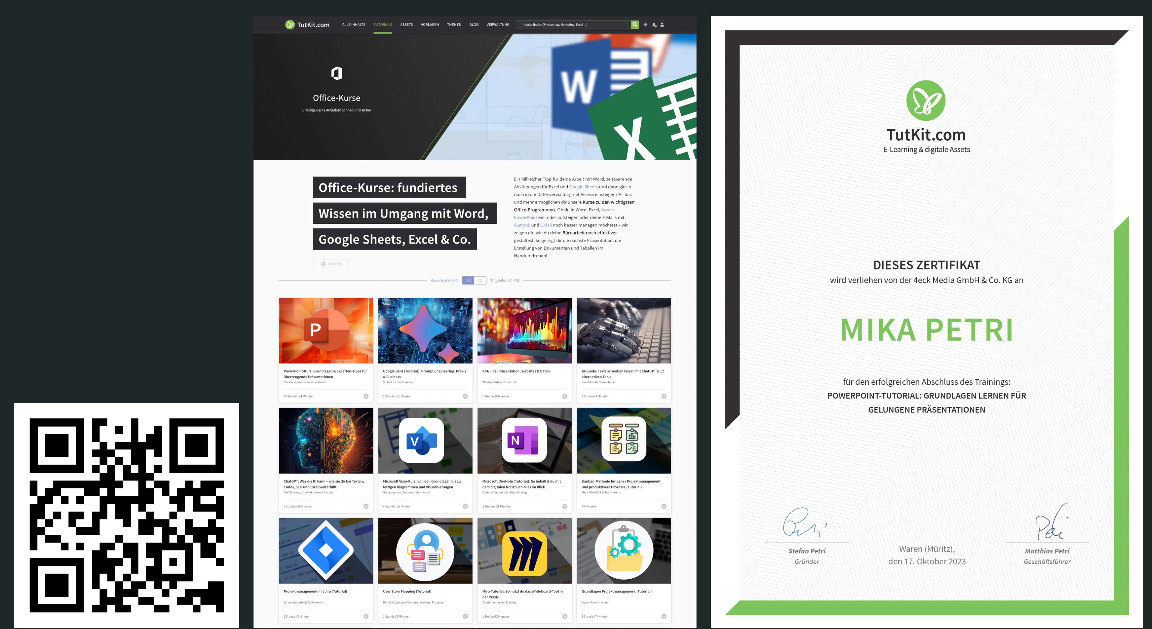
Certificates of competencies that are crucial for the company are also helpful. The applicant did not include these either. Such certificates could, for example, be our certificates after completion of our online courses or other participation certificates.
This is how our certificates look when you purchase an online course and successfully pass the learning assessment in the form of a quiz. On the left, there is a category with our online training sessions, and on the right, the certificate.
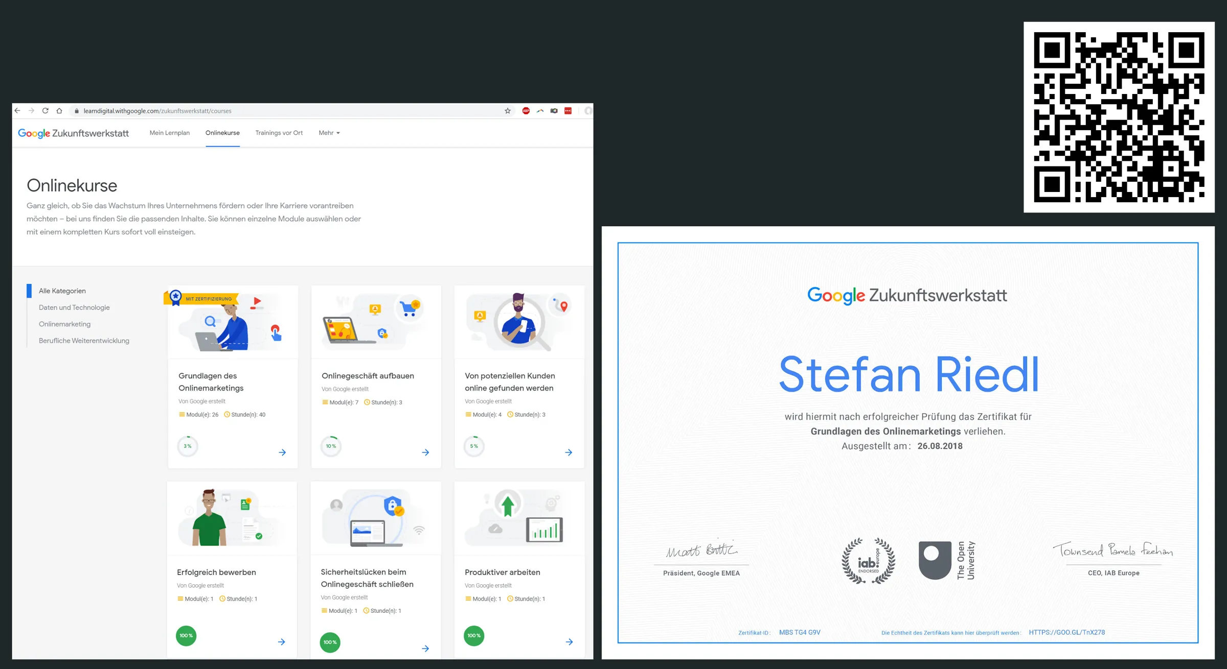
You don't always have to spend money on a course with a certificate. For example, Google offers a course on the Fundamentals of Online Marketing. After completion, the participant can take a test and receive a certificate. Here is one from a member of our team:
I will celebrate the first applicant who enriches their application with such certificates. Because for me, that proves the willingness and discipline for further education.
As an applicant, you must always assume that your name may be searched by the recruiter on Google. Our applicant only has an empty LinkedIn profile with no picture or content. That's not negative at first. It becomes negative when questionable content is found.
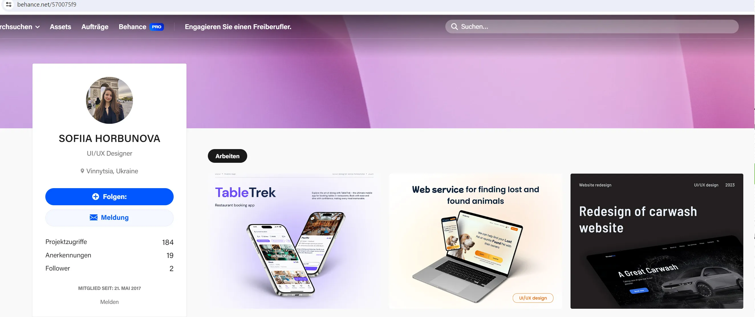
A positive decision can be influenced through social media or business profiles, if a recruiter likes what they find after entering the applicant's name in Google search. In the design field, this could be a profile on Behance showcasing Concept Designs. Here's an example of a design student presenting her three Concept Designs on Behance. The link to her Behance profile is also placed in her CV. It's strategically placed!
Application Error No. 10: Print offers potential for positive tactility and aha effects
By opting for print in your application, you can create some positive elements that are not possible with a digital application. You just have to leverage the strengths of a printed application. How can you turn a print application into a positive experience and position yourself as a candidate that a company would want to meet in person? Here are some tips for a print application:
- use high-quality paper instead of normal copy paper
- ensure high print quality so that texts and images (e.g., the photo) look premium on the paper
- sign with a fountain pen
- use an envelope that matches the paper of the application, both in quality and color
Sometimes, just using slightly thicker paper than the normal copy paper with a weight of 80g/m2 can suffice. Those wishing to choose paper accordingly for the occasion may opt for finer, lightly textured papers. The trick is to choose paper that does not look outdated or overly formal, but rather fresh and modern, yet still high-quality.
If I may make a recommendation, I particularly like the Rives Design Paper 170 g. The application placed below was also printed using this paper. Rives Design is a fine paper with a very delicate diamond pattern. It has a delicate, discreet surface structure with a special radiance. It's original and exceptional. Rives Design feels like a natural paper on one hand but also feels pleasantly smooth due to the surface structure. And its white color fits perfectly in a business context.
With this paper, we have not only printed the application placed below, but also the menu cards for two of our agency clients' restaurants. Here is an image of how the paper looks when printed with a regular printer. The example shows the menu of a fish restaurant. Another restaurant is showcased here, where the menu was specially laid out so that the customer can print it themselves. This one also uses the Rives Design Paper.
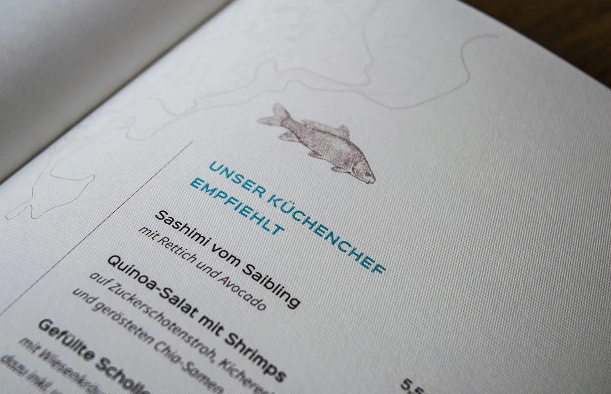
When the HR manager holds your application in their hands with a modern fine paper that they have never felt in this way before, what do you think their thought will be? Simply wow! And if the rest of the application avoids typical mistakes and includes further aha effects, the invitation to the interview is almost certain.
Another way to provide a little surprise with a printed version is to include something in the application that brings a smile. For example, in our agency, we once received a folding card from a photographer for an introduction. It was not an application, but the start of networking. The folding card was handwritten, and two tea bags were included. That provided a pleasant change. Such a creative addition is certainly possible in certain industries, especially if you then refer to it in the cover letter. The photographer wrote that she is looking forward to having a cup of tea with us.
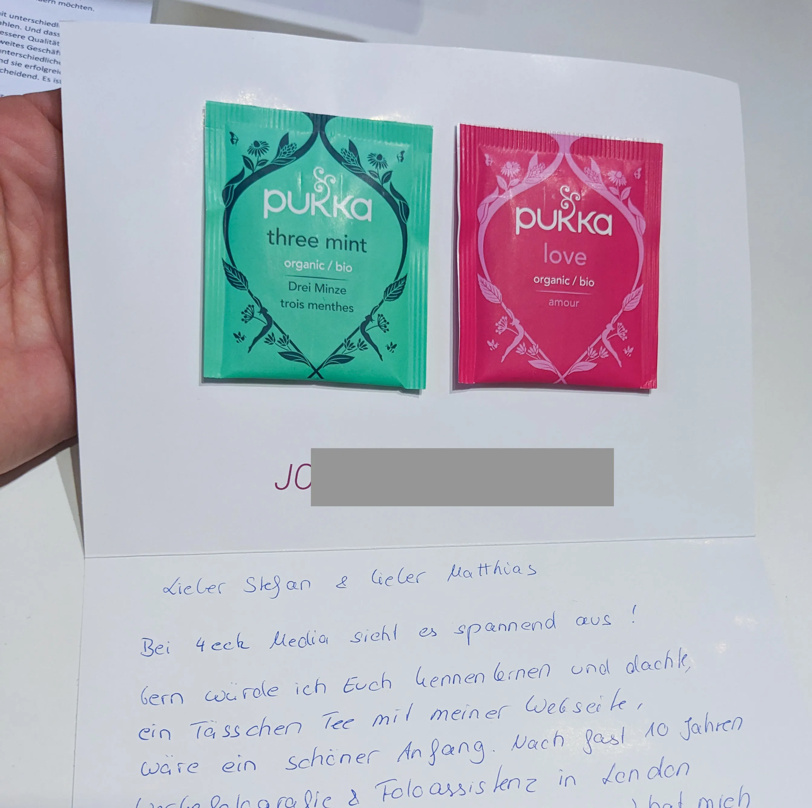
If you notice that a company has had a job opening for a while, consider adding an aspirin and writing in the cover letter: If the unfilled position gives you a headache ...
You know what I mean. So if you are already sending a printed application by post, you can also consider how to create special attention through haptics and with the help of a small aha effect. Because in an application, it often comes down to standing out positively from the mass of applications.
Thank you for reading until the end. I am aware that some may think I am a bit fussy. I am aware that many companies should be grateful if anyone still applies proactively. That is absolutely true. However, there are also companies that are not waiting for you. There are companies that receive dozens, hundreds, or even thousands of applications for a vacancy. Now imagine competing with your application against 50 others. Then be the one who did not make the ten mistakes mentioned above. Because that increases your chances of being invited to the interview.
So how can you improve now? Here is a personal example of an application.
Here at the end, I want to show you how my son Mika, who is also a student, built his application with my help. Since there are more applicants than places available every year for the business department of the vocational high school, we put our heads together and invested time to develop a well-thought-out application. We used our application template for students and trainees as a basis and customized all the details accordingly to the recipient.
Of course, this application of a student for a vocational school will not meet with approval from everyone, and certainly everyone will find some points that they consider improvement-worthy. From my perspective as an agency owner, it worked in this form. He did get the acceptance.
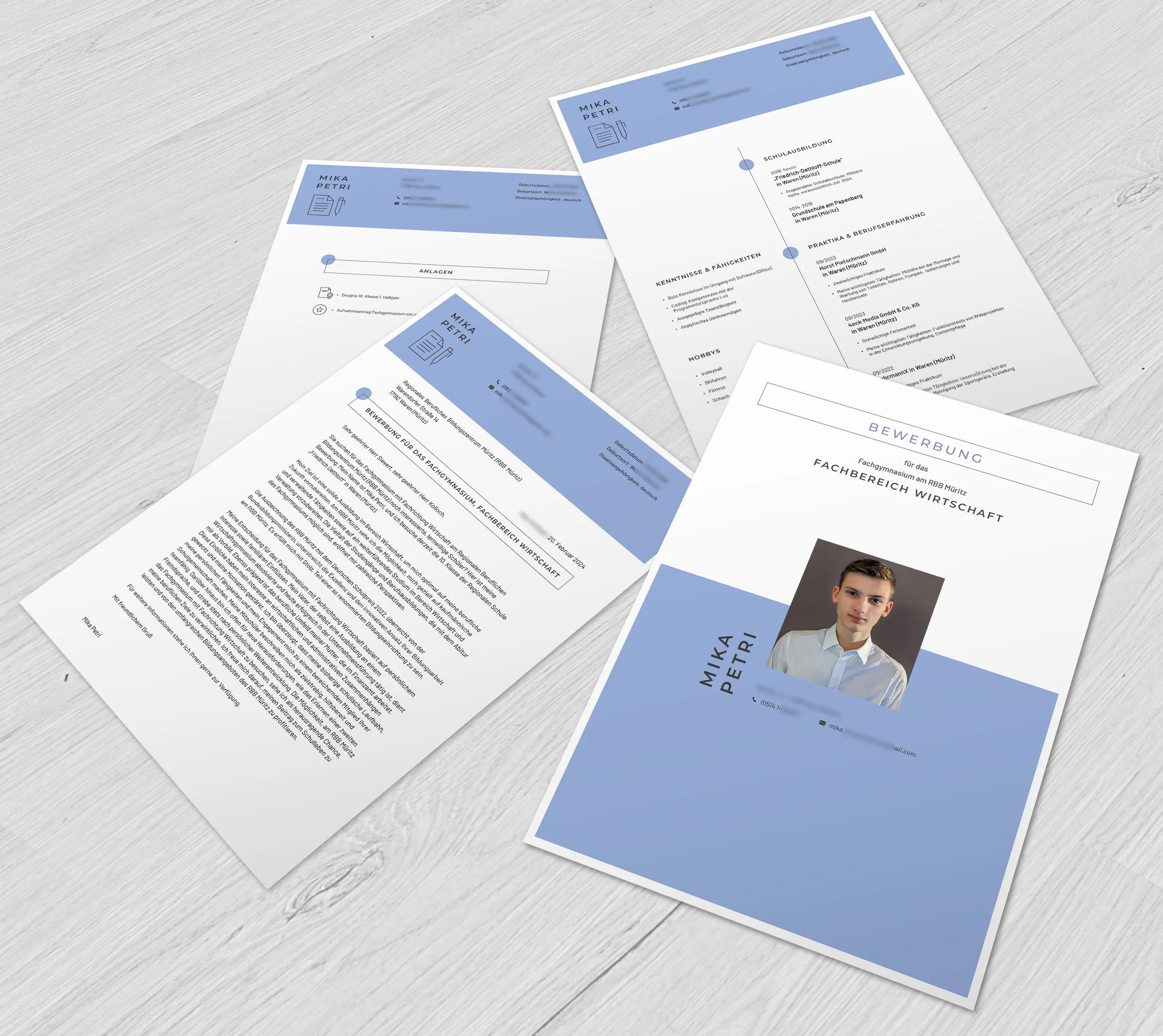
If you are looking for modern application templates that already take some of the work off your hands and ensure that some of the typical mistakes do not happen in the first place, then take a look at our category with our application samples and resume templates. Here is a small preselection:
From Matthias Petri
