From striking and eye-catching to rather inconspicuous and yet useful - we have made numerous changes to TutKit.com in recent weeks and months. These included performance improvements and technical updates as well as adjustments to the design and user guidance. All in all, everything has a positive effect on your user experience. What has changed under the hood and on top - a comprehensive overview.
Now it's getting dark
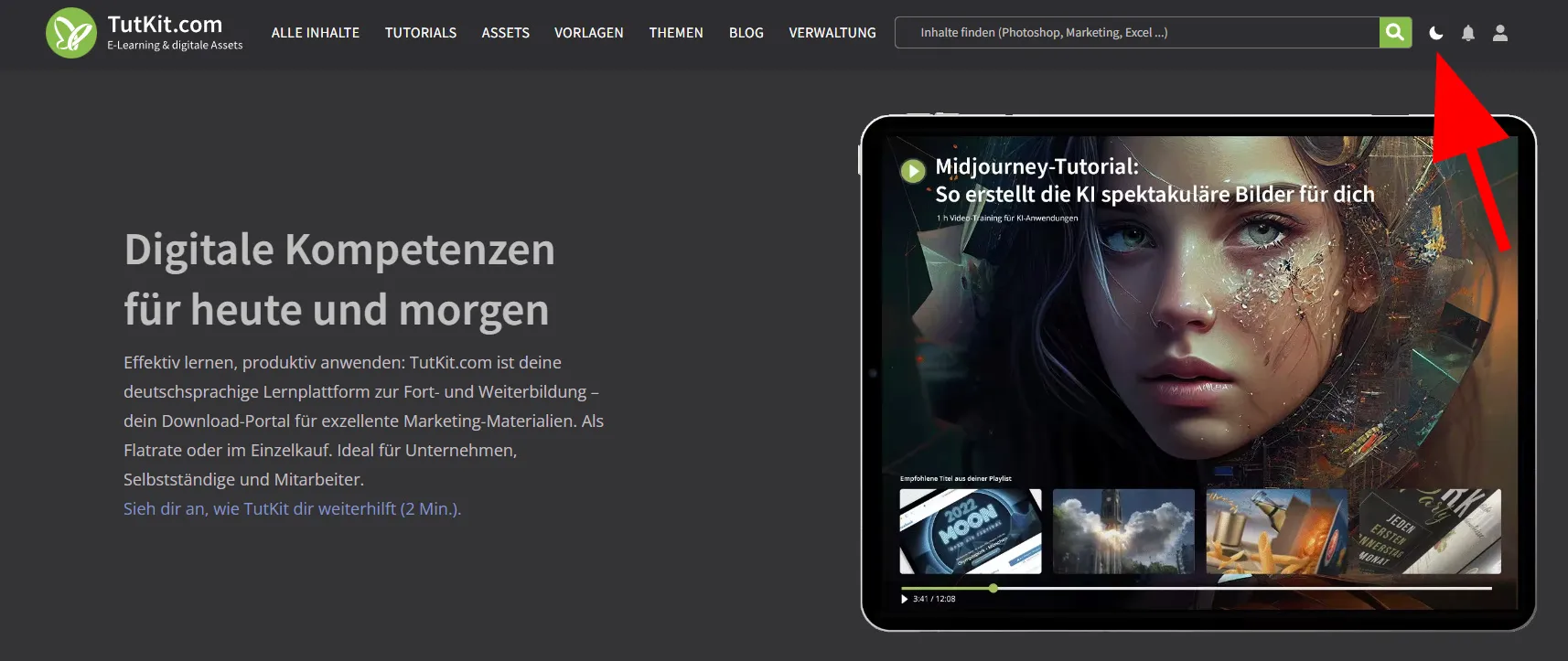
From now on, you can change the design to dark or light at any time with just one click. We have preset it as it is stored in the operating system.

At the same time, we have also converted all images to AVIF format so that your browser doesn't have to download as much data (this has reduced the file size of the images by around 70%).
Assets, templates & e-books: more at a glance, without a detour click
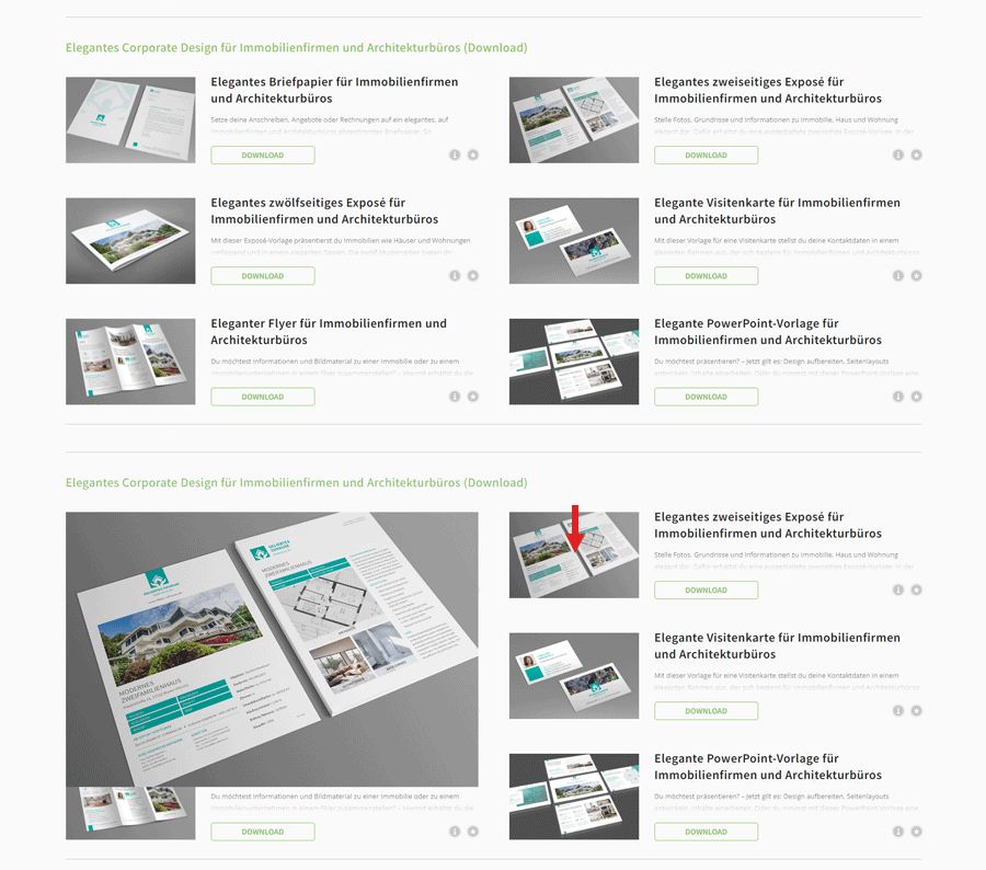
We have always shown you small preview images for all individual content on the pages of our assets, templates and e-books. This allows you to see directly what you can expect when downloading.
There was also a small menu behind each preview image. You can use it to enlarge the preview image, mark the content as a favorite and call up the compatibility information. Nice ... But it also meant that to enlarge each image you had to open the menu, click on an icon, view the image and close it before moving on to the next one. An unnecessary detour. We have therefore removed the menu. Now all you have to do is move the mouse over a small thumbnail and the large version is displayed.
Other useful adjustments were also quickly made during the revision: The compatibility notes can now be called up via the directly visible icon with the Info-i. The content can be favorited via the star icon, which is also directly visible and is now only displayed for logged-in users.

Video tutorials: Now you are also in the picture here!
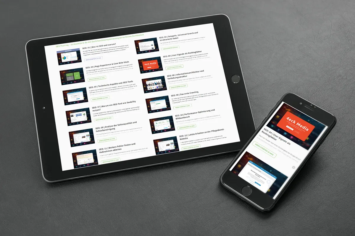
If you had a look at one of our video tutorial pages a while ago, you wouldn't have seen much more than a mostly gray desert of text and play buttons. The view has been completely redesigned to match the layout of the assets, templates and e-books.
In other words, our video tutorials now also feature small thumbnails, which is simply more aesthetically pleasing. As with assets, you can see whether the video is free or a fresh update in the form of colored badges on the images.

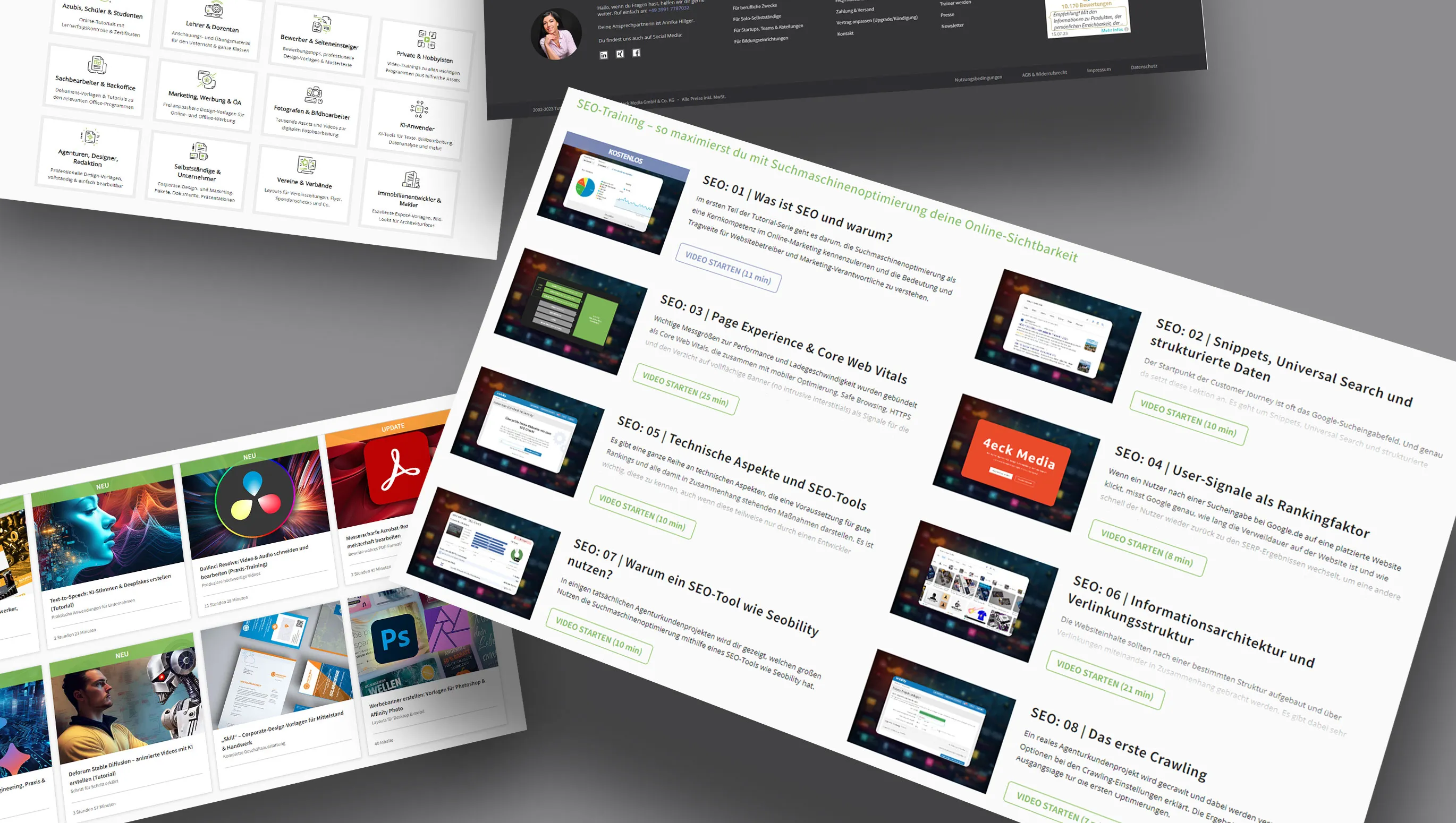
This means that our pages now have a uniform look throughout. Whether it's an asset, template, e-book or video tutorial: there's a preview image that you can enlarge by hovering; there's a button for downloading or playing the video; there are icons for further information and favorites; if additional materials such as project files, instructions or text tutorials are available for the content, you'll find the links at the bottom of the description texts.
In addition, superfluous items such as triangle icons for expanding and collapsing the texts have been removed, so that the view is tidier in line with the motto "less is more". Finally, we have also prepared all the optimizations for mobile devices.
The big tidy-up on the pages of the complete packages
What can be removed? What can be displayed differently? What can be placed in a better position? These were the kinds of questions we asked of our complete package pages in order to streamline them while still keeping the information content high. In addition to the above-mentioned changes to the view of individual content, we made the following adjustments:
Gallery: In the galleries, we show how you can use our assets and templates, for example. Previously there was a rotation effect here. Nice, but also distracting. We have therefore reduced the view of the new gallery to just three things: you see the selected image, a subtitle and the navigation to the left and right - without a lot of effects fireworks around it.
Expand and collapse and a little more color: Previously, almost every section on a complete package page could be expanded and collapsed, for which corresponding buttons in the form of triangles were available. This function has been removed. Makes the pages even cleaner - and let's be honest: is there anyone who has ever used this function? We also gave the subheadings more color throughout. From top to bottom, a soft TutKit green now separates the individual sections from one another instead of a clunky black.
Info area: At the top right of the complete package pages, we have bundled all additional information, for example regarding compatibility, the number of contents and the categories. A lot of data comes together here.
We have tidied up the info area once again and enhanced it with illustrations. For example, the learning progress for tutorials is now only displayed for logged-in users (logged-out visitors don't need it anyway). The rating of our packages has been moved down to the comments section. A link to the usage rights has been added to the info section. Finally, probably the most noticeable change concerns the presentation of the people who created the package. Instead of their names, we show you their portraits. Hopefully this will also have a more friendly effect on them ...
Many small improvements to details:
- no more slider navigation for software/categories
- generally continuous scrolling in search, category pages etc.
- Cards: fewer shadows, icons gone, square corners
- Cards: Animation gone, green overlay instead
- Optimized hover effect for split button
- Larger faces, for example in the blog and video tour
- Face in contact form
- Footer completely new (no more opening, show face etc.)
- Author page: "To the author's website" removed, continuous scrolling, green overlays
- Homepage: New content no longer as a slider
- 4 columns for authors
- Page hopping for pop-ups
- New module for target groups
With fewer questions about questions to improve performance
Fast pages that load quickly - Google likes it, we like it and you certainly like it too. As far as the performance of our portal is concerned, we will continue to make improvements in the future. However, we have implemented image optimization, for example. We have switched from the lean JPG format to the much leaner WEBP and AVIF formats.
We have also worked on the databases and the queries that take place when our pages are called up. It's all pretty technical, but just to give you an example: If you come to one of our complete package pages with tutorials, the system needs to know, among other things, to what extent you can watch the videos. So do you have a membership? Have you bought the package? Are individual videos possibly free? We have to ask a lot of questions like this when you call up the page, which of course takes time. This is where we start to improve performance (attention, now it's getting really technical):
- Unnecessary database queries that asked for more information than was actually needed were removed.
- The speed of the most frequently executed database queries has been improved.
- The code in php methods has been optimized and repeated database queries in certain loops have been eliminated.
- All parts of our system were checked for unnecessary database queries used on all pages, especially those linked to our menu items. These were optimized for better performance.
- Some database queries were found to be unnecessarily repeated multiple times, especially those linking users to packages. These repetitions were fixed using a short-term storage system (cache), saving both time and resources.
- The system's error log was monitored and all reported issues were resolved.
- Automated system tasks (cronjobs) were checked for those that ran too long or aborted. These tasks were made more efficient by filtering information directly from the database instead of doing so indirectly via php code.
Everything up-to-date with the technology? Everything up-to-date!
Of course, we have also optimized a lot under the hood and updated software packages such as
- Update to the latest php version.
- Laravel (our framework) was updated from version 9 to 10.
- Almost 35 packages of the framework have been updated as well as the SDK of our payment provider Braintree.
- We now rely on http2 (we would prefer to use version 3, but the Apache server does not (yet) support it.
- Ubuntu has been updated from 20.04 to 22.04 (this was important for AVIF image support).
What else is coming?
We are currently working hard to ensure that our portal will also be available in multiple languages from January. This is quite an effort, but it fills us with pride when we have achieved this.
It will also be possible to purchase individual content at a discount as early as next week, provided a promotion is currently running. As a result, our separate store (store.psd-tutorials.de) will no longer be updated with new products and will also go offline by the end of Q1 2024 at the latest and all our content will only be available on TutKit.com.
We also want to send out a newsletter at least once a month in 2024 so that all members & newsletter subscribers can see what's new. Because one thing we have always managed to do so far: at least one new piece of content has gone online every week!
Of course, we will continue to provide interesting new content. For example, I myself would like to include a new training course on Adobe Photoshop Elements, as something has finally changed in the interface and it is now worth providing a completely new training course on this. The topic of AI will continue to occupy us and we will keep existing products up to date or provide completely new products.
Is something still missing? Then please send me an e-mail to info@tutkit.com. I would also be delighted if the blog had a comment function. What do you think? Does it make sense or does hardly anyone comment anyway due to a lack of time?

