Table of contents
Creating a poster with Adobe Photoshop
Today you'll learn how to create a cool poster with Adobe Photoshop. I'll show you how to use the program's tools effectively to create a high-quality poster. There are many different types of posters, and each type has its own peculiarities, especially when it comes to text placement and size choices.
Let's try creating an advertising poster using ready-made templates - it's a good way to practice.
Posters are often used to draw attention to products, services or brands. They are usually designed in bright colors that immediately catch the eye. In the center of the poster there is usually a picture of the product or a description of the event, so that the potential customer can quickly grasp the essentials without having to read the text.
Many small things have become big things through good advertising.
Mark Twain
Preparation for creating an advertising poster
Before you start designing a poster in Photoshop, check out the latest trends and designs to make sure your project is current and attractive. If you find good ideas, you can use them as inspiration.
The first thing you should do is choose your basic colors and fonts. Make sure that your poster design matches your corporate identity and contains all the important design elements.
You need high-quality images or graphics. You can create them yourself or find them on Stocker platforms, where there are both paid and free options. You can also use image AI such as Midjourney to generate your own images.
Don't forget to accentuate your poster well. It should contain so much information that it can be grasped at a glance. A poster is not a brochure, every word counts.
Then decide on the size of the poster and make a sketch. The best size to start with is A2 (420x594mm), which is the standard size for posters.
We think we know what we want. But in reality, our desires no longer belong to us. Advertising encourages us to do things we didn't really want to do. That's how we end up starting to live someone else's life.
Frédéric Begbeder
Creating a poster design
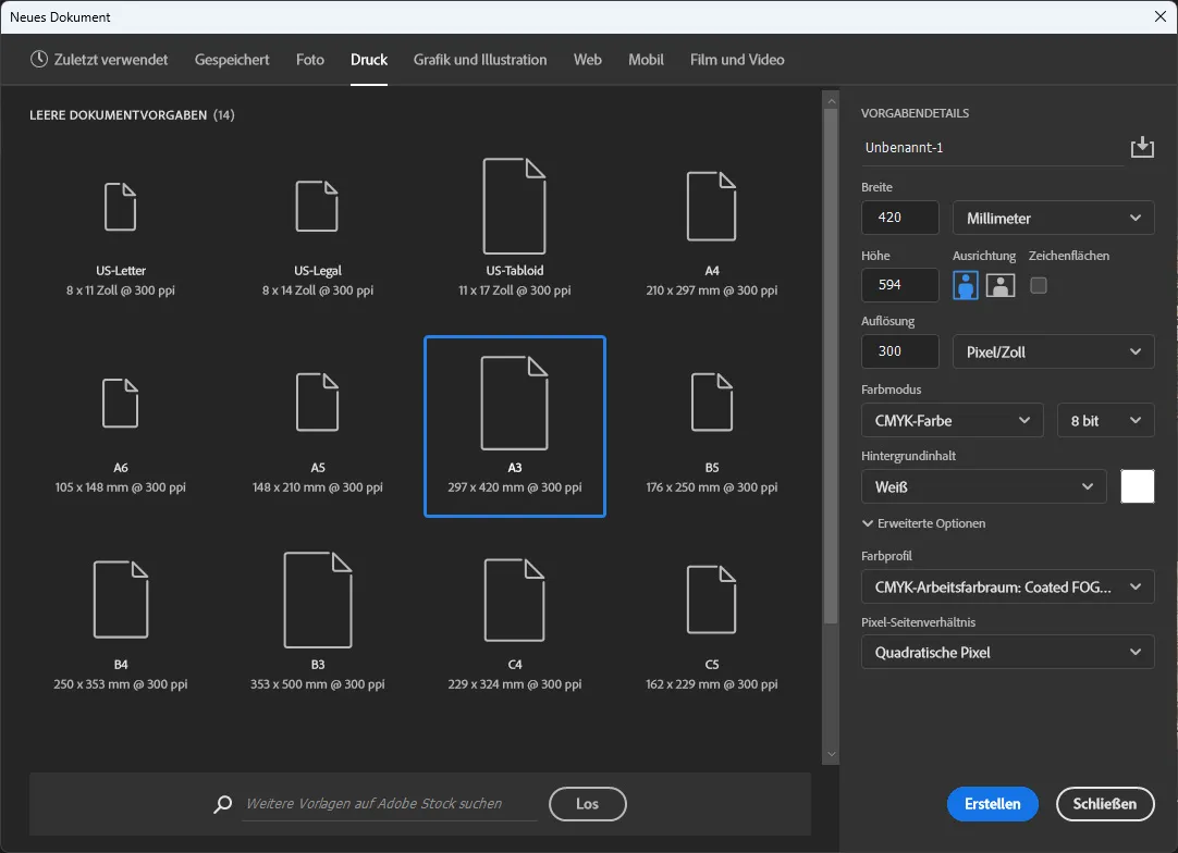
When we start the Adobe Photoshop program, we see a window. In the top left-hand corner is the "New file" button. If you click on it, a small window appears with the possible sizes of the workspace. It is now worth selecting the print format and dimensions: For a poster, we recommend the A2 format (420x594 mm). Make sure that the resolution is set to 300 dpi so that the image is sharp and can be printed later. Then click on "Create".
When you click on Create, you will see a white workspace. Before you start, I'll tell you the key combination I use to save time (Ctrl+T), which you can use to change the size of graphic elements. Ctrl+T stands for transform.
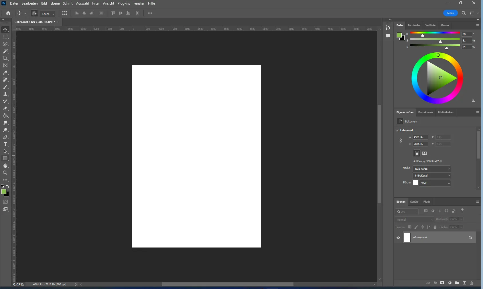
To start creating a poster, select the rectangle tool located in the left toolbar above the hand icon. Create a rectangle that takes up the entire page.
To change the color of the rectangle, go to the "Appearance" section in the right pane "Properties".
When you click on the color, a window will open with a palette where you can select the desired color or enter its name.
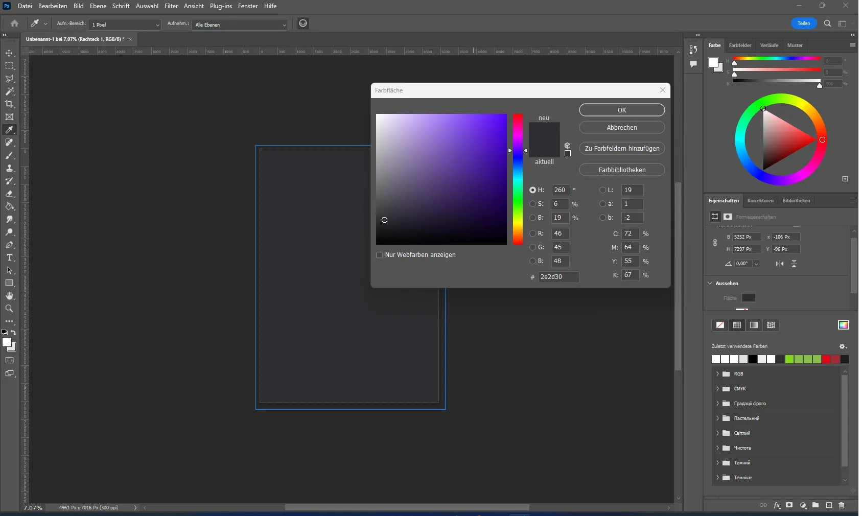
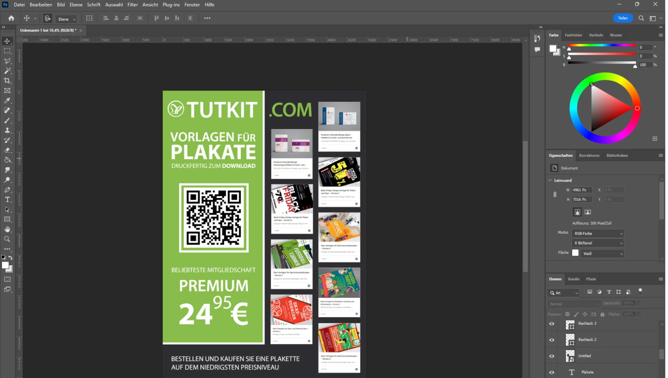
For example, I am designing a poster for TutKit.com and we already have the colors of the corporate design. So I made the back of the poster a dark color and designed a green rectangle on the left side. This was to convey the main colors of the company and associate them with the brand.
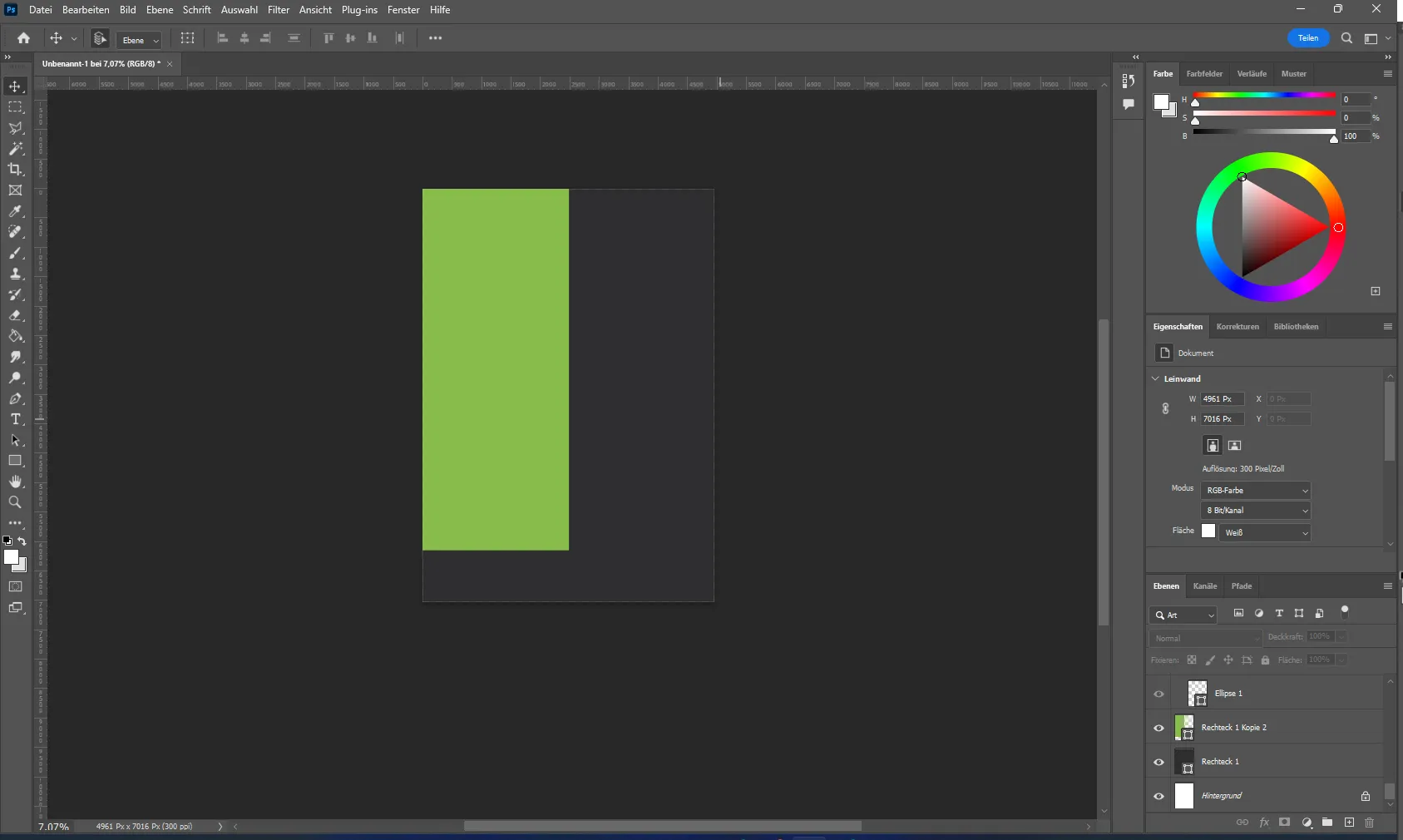
I also added two white rectangles to emphasize order and add interest to the background. This adds efficiency and style to the poster design.
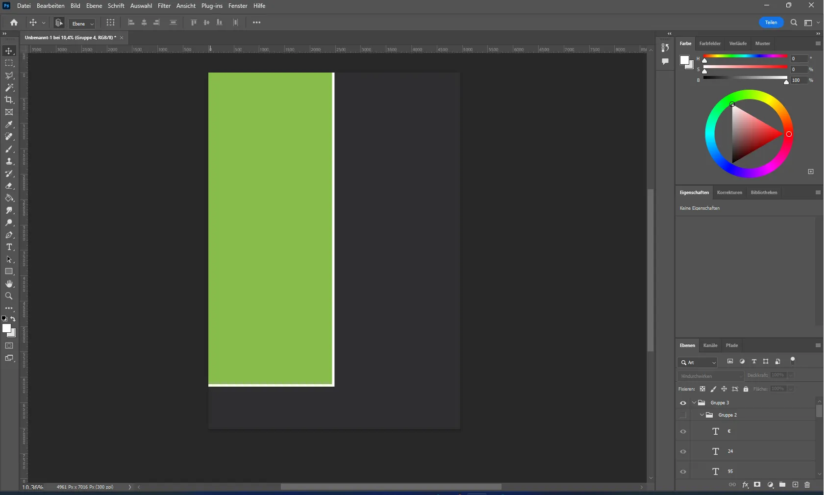
After creating the background, I add images and graphic elements. To insert an image, you have to use the keyboard shortcut Ctrl+C and then Ctrl+V or simply drag the image into the program.
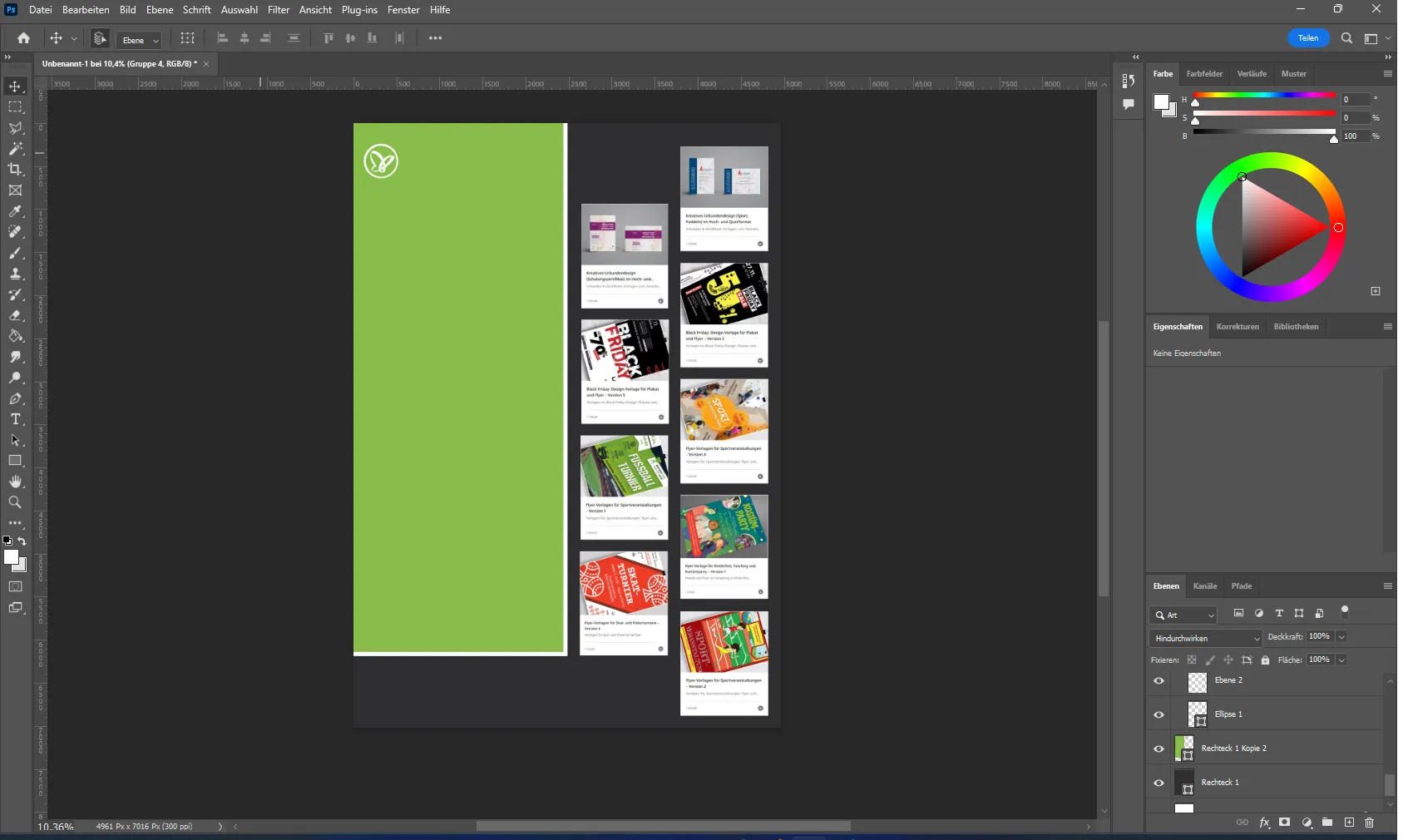
I start by adding the company logo and template images by simply dragging and dropping them into Adobe Photoshop and then using the keyboard shortcut Ctrl+T to move and zoom them for optimal placement on the poster.
Now we want to create a company name with the corporate design fonts.
Select the text tool in the left toolbar of Photoshop (capital T), click on the sheet so that a line of text appears and replace it with the name "TutKit.com".
As with the images, you can change the size and position of the text. Since it is common in Europe to read from right to left, you usually start reading at the top left, so we put the name there so that it is more visible.
A little play with the color of the text gives the poster a harmonious look and is a good design solution. Changing the text color is as easy as changing the color of rectangles: just select the text tool, click on the text and choose a new color from the palette.
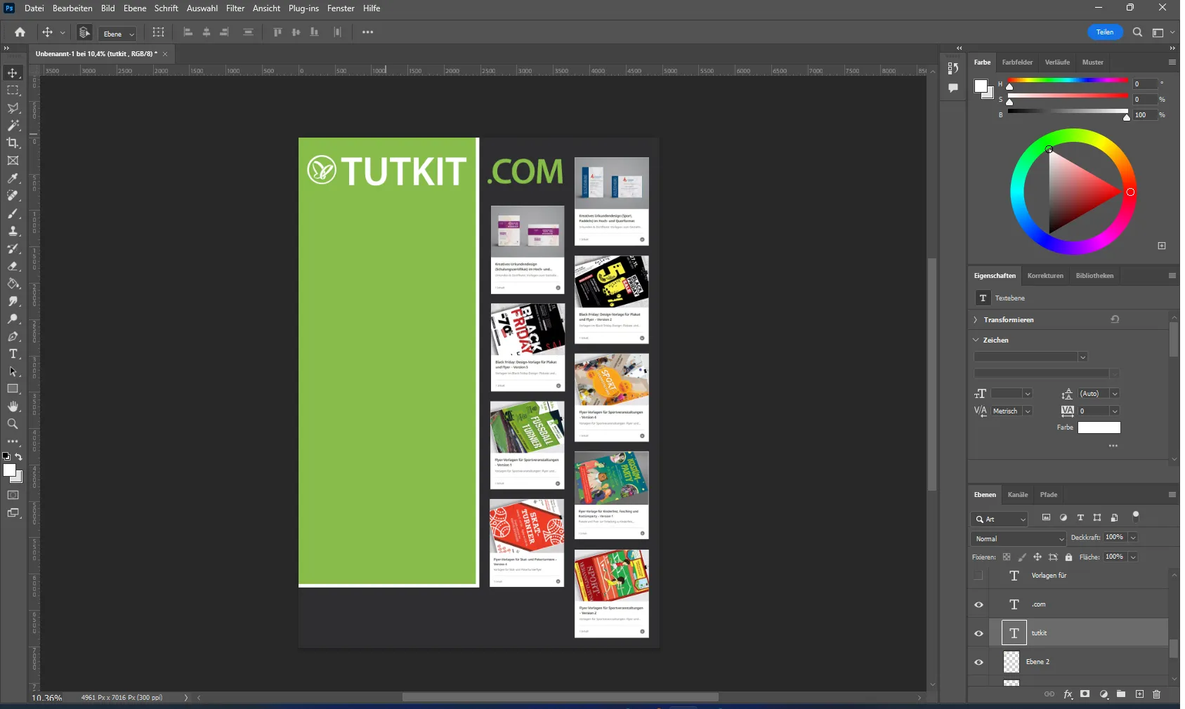
Next, we insert the ready-made information that we have previously written. The main purpose of an advertising poster is to convey information to a potential customer. The text on advertising posters must be short, memorable and informative to attract the attention and interest of the target audience.

The poster is almost finished, but I have left space for a pre-made QR code. Technology is evolving, and with a QR code on your phone, you keep your potential customer engaged: after all, they haven't just read the poster, they've decided to find out more on the website. There they can see what the company has to offer and select what interests them or save it in their favorites for a later visit. The interested customer can quickly contact the company using a QR code.
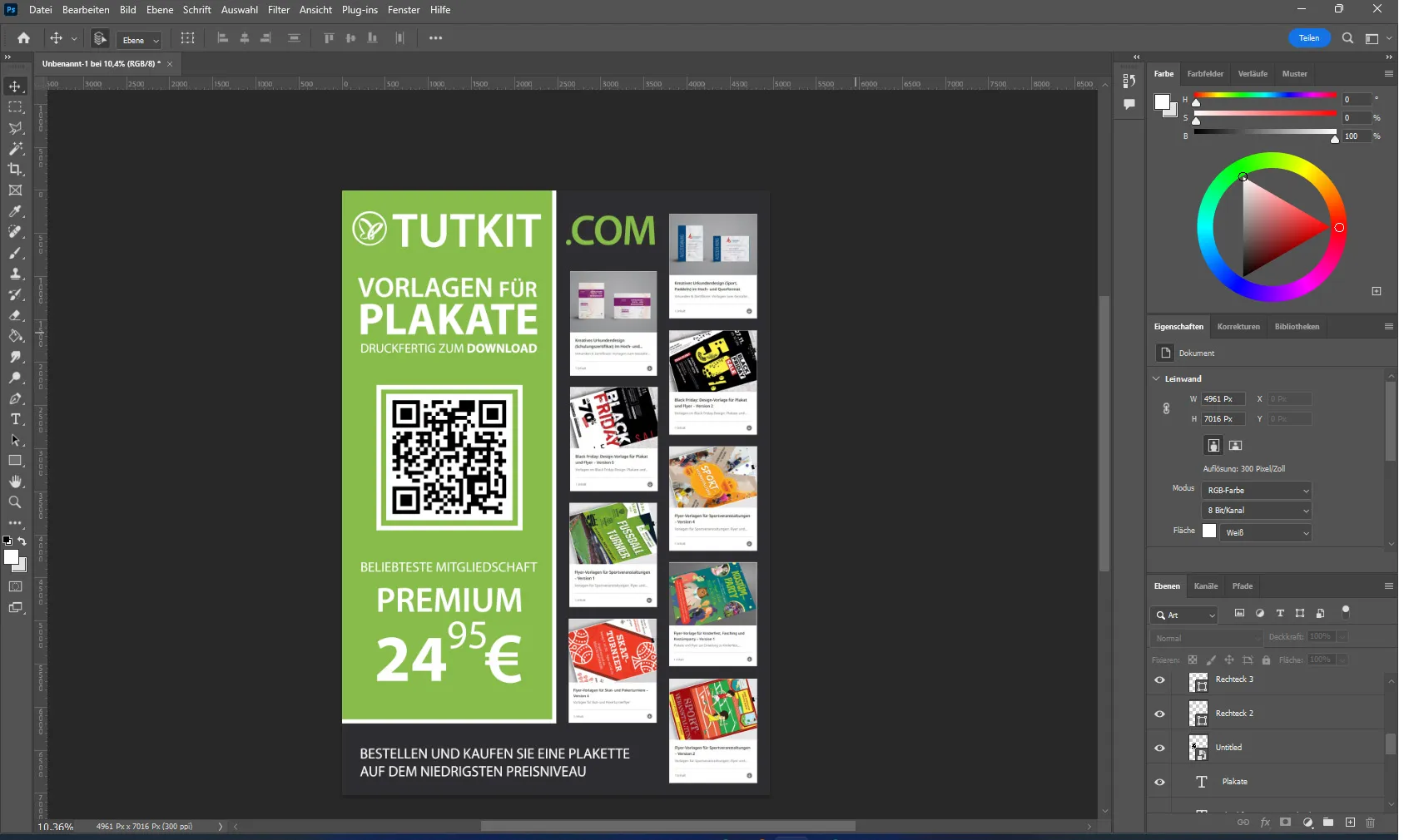
Once the poster is ready, it is important to save it correctly. To do this, call up the "File" menu at the top of the program.
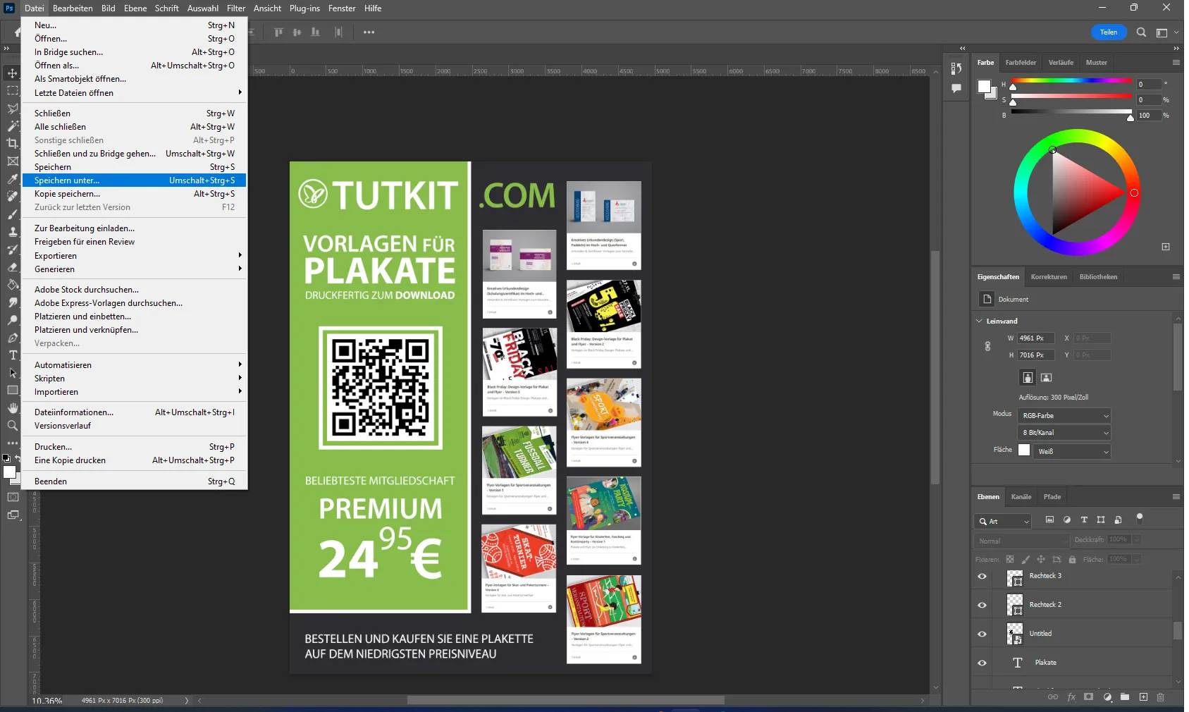
Then select the "Save as" option. In the window that opens, enter a file name, select the format in which you want to save the file for printing, e.g. PDF, and click on "Save". Your file is now saved and can be sent for printing.
Creating a poster completely from scratch in Photoshop is not a difficult task if you have experience, but it does require some time and effort. Although it is relatively easy to master the program, its price should be considered. It's important to remember that brainstorming and careful preparation play a key role in creating a successful poster design, and a careful approach at every stage will help avoid mistakes in the layout and design.
Ready-made poster templates at Tutkit.com
The use of ready-made poster templates is common among many designers. Printed materials are needed for many purposes, from business cards to banners to magazines. Posters are also one of them. Let's say you need to create two advertising posters every month. There are three options:
- Hiring a design agency, which is usually expensive
- Your own designs, which take a lot of time
- Using ready-made design templates, which can be used to create the desired number of posters quickly and without any loss of quality.
Pre-made templates offer a variety of design options that are suitable for different purposes and can be adapted to the customer's requirements. This is an efficient and cost-effective way to regularly create high-quality advertising products without having to spend large sums of money on the design and layout of each individual poster.
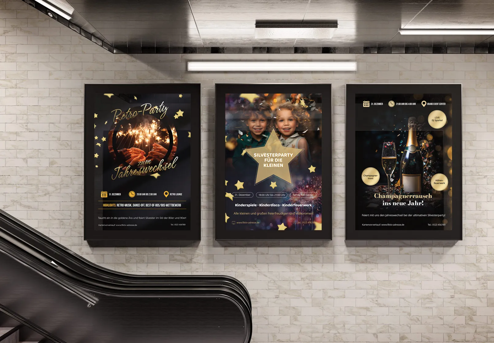
Tutkit.com's ready-made templates offer a number of advantages.
- You don't need to spend time mastering programs - you just need to insert the text of your information into the ready-made layout. But you still need the software to edit it.
- The templates are created by experienced designers, which guarantees high quality and a professional appearance.
- Developing a poster in a design agency is more expensive and time-consuming than using a ready-made template.
- The template created can be used several times and the text can be adapted as required, which saves a lot of time and resources.
