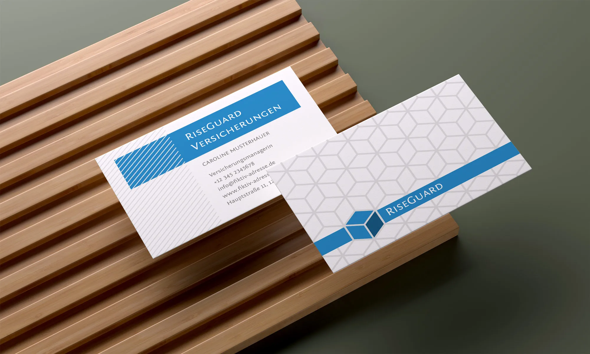
When it comes to creating business cards , we all look for the shortest and cheapest way. To avoid wasting time and resources, it's best to use a template. Think back to the last business cards you received. Have they stuck in your memory? Although business card templates are a dime a dozen on the internet, you should look for professional business card templates for Word. Every detail, color and font choice is important to make sure your business card looks professional. It's worth remembering that any carelessness can cost you opportunities and undermine the trust of a client or partner. Next, I'll tell you how you can prevent this from happening.

Table of contents
What you should know when choosing a suitable business card template
Choosing the right template for your business card is your starting point for customizing the content and later printing your business card. There are a few criteria to consider when selecting the different layouts: Style, functionality, customizability and marketing potential.
Classic business card templates reflect a traditional aesthetic, which can be important for conservative business sectors. They often contain simple but elegant design solutions that convey confidence and professionalism. Above all, they also need to be customizable for your corporate design.
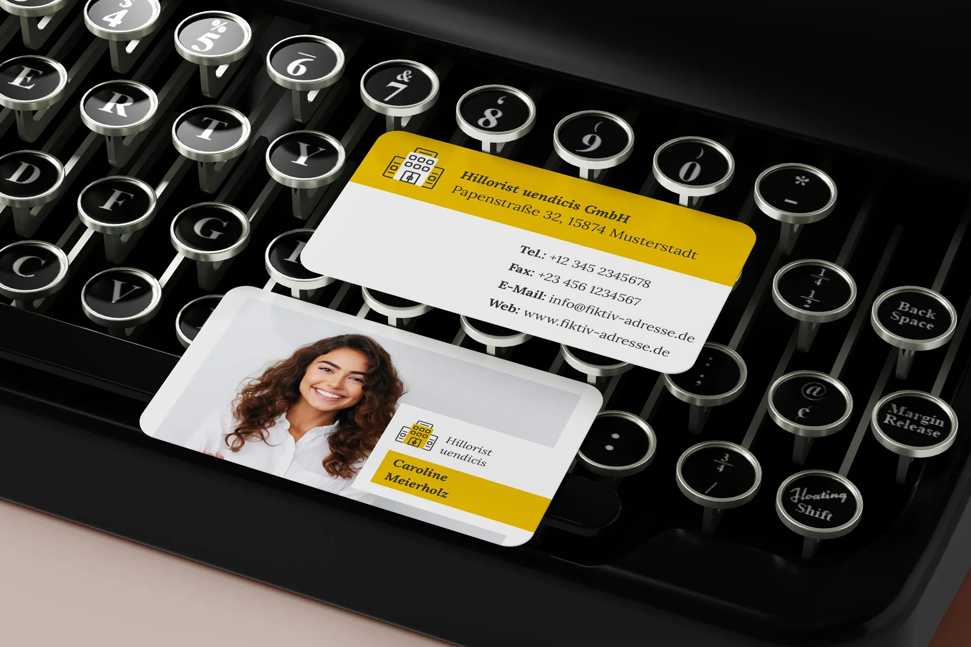
Modern business card templates, on the other hand, incorporate current design trends and have a contemporary look. They can include bright colors, unconventional shapes and eye-catching elements, making them ideal for companies that want to stand out from the competition, even in the small format of a business card.
Creative business card templates offer many opportunities to experiment and express uniqueness. They can incorporate unexpected shapes, textures and visual elements, making them ideal for creative industries or brands looking to impress and make an impression. Creative business cards also often have tactile features that simply make the card feel better or different.
When choosing, it's important to consider the marketing potential of each option. For example, if your target audience is young and tech-savvy, a modern or creative template will communicate better with them than a more classic one. However, for a more conservative audience, a classic template may be more effective because it matches their expectations and habits.
The best business card template is the one that suits you, reflects your brand well and communicates effectively with your target audience. For best results, balance aesthetics, functionality and marketing opportunities.
Main elements of a business card
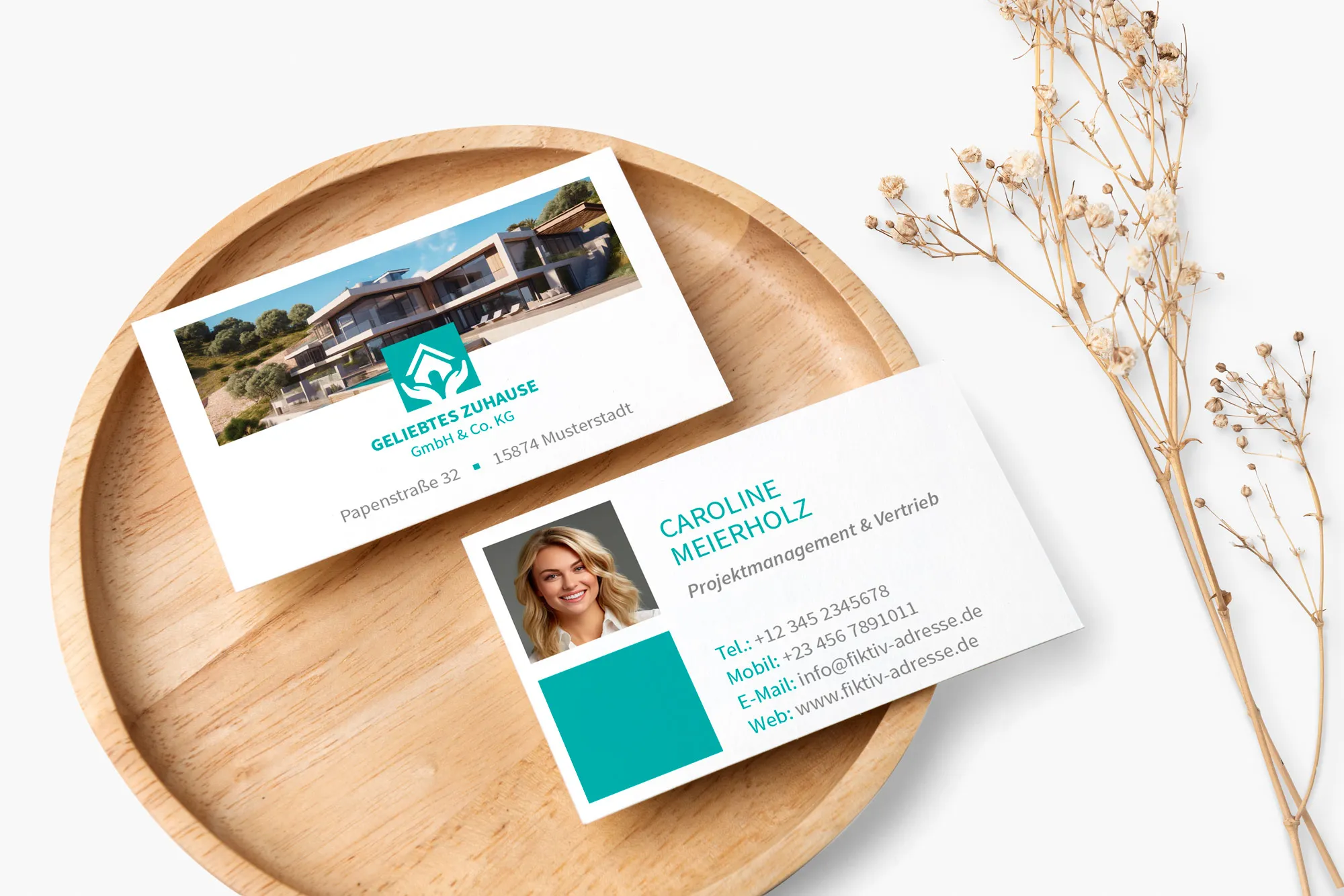
The main elements of a business card template include a logo, a graphic design and an information block with contact details.
The logo is an important element of brand identification. It should be clear, expressive and easily recognizable. Using the right color, shape and font will help make the logo memorable and distinguish it from others. You already have the logo and simply replace the placeholder on the template with it.
The graphic design of the business card itself is also important to make a strong impression. It can include interesting textures, colors, shapes and visual effects that draw attention and differentiate the business card from others. Create the design to reflect your brand's style while being attractive to the target audience.
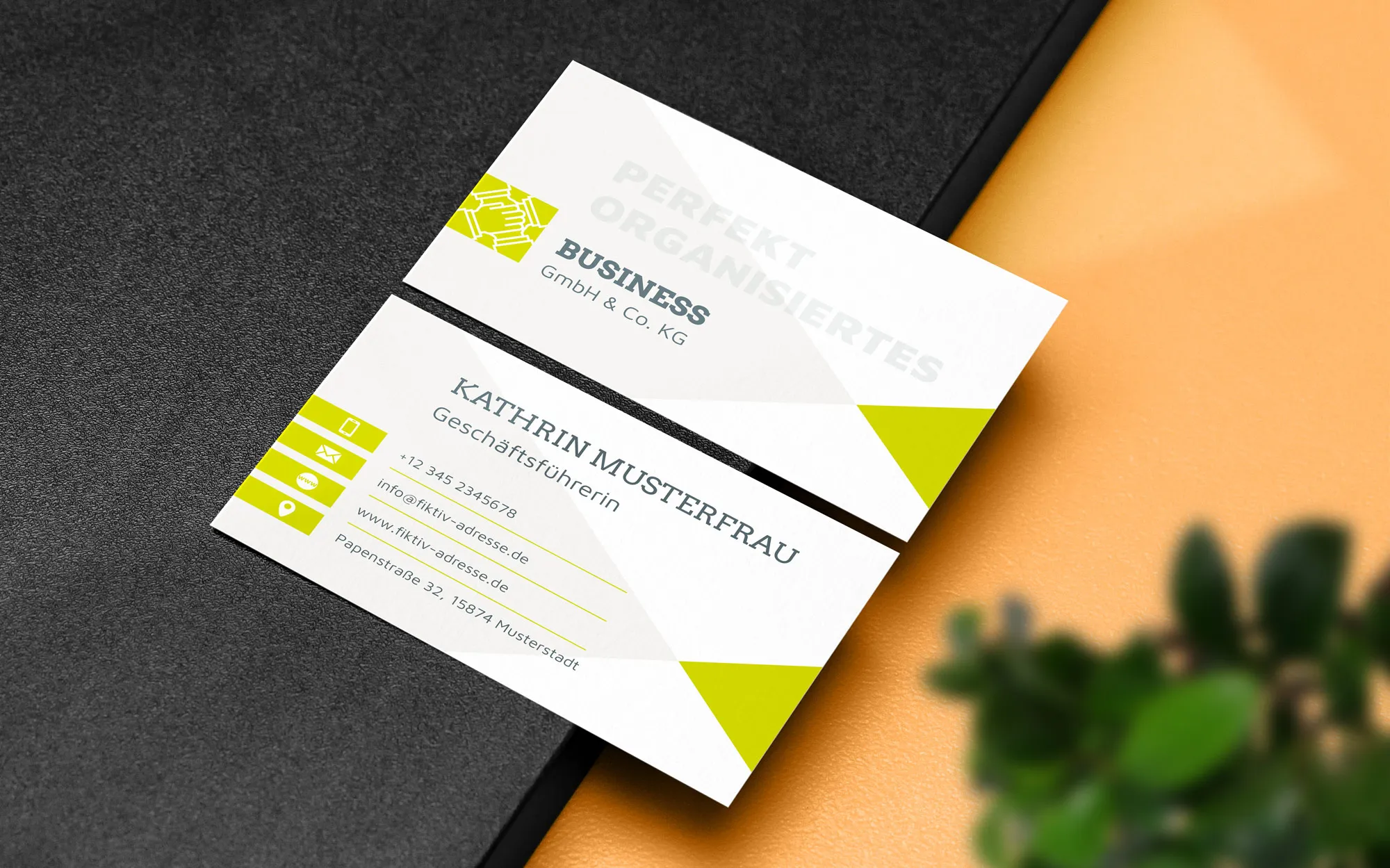
As for the information block, the correct placement and formatting of contact information plays a crucial role in the convenience and accessibility of this information for the recipient. Contact information such as name, title, address, phone number and email should be clear and easy to understand. The arrangement of this information should be logical and convenient for the reader, and the formatting should be clear and structured. The font size should not be too small or too narrow, as this will make it difficult to read once printed. But don't make the font too large for contact information either, as this will look clumsy and awkward.
Remember that the right business card design ensures that all key elements are expressive, memorable and accessible, helping to increase the effectiveness of this marketing tool.
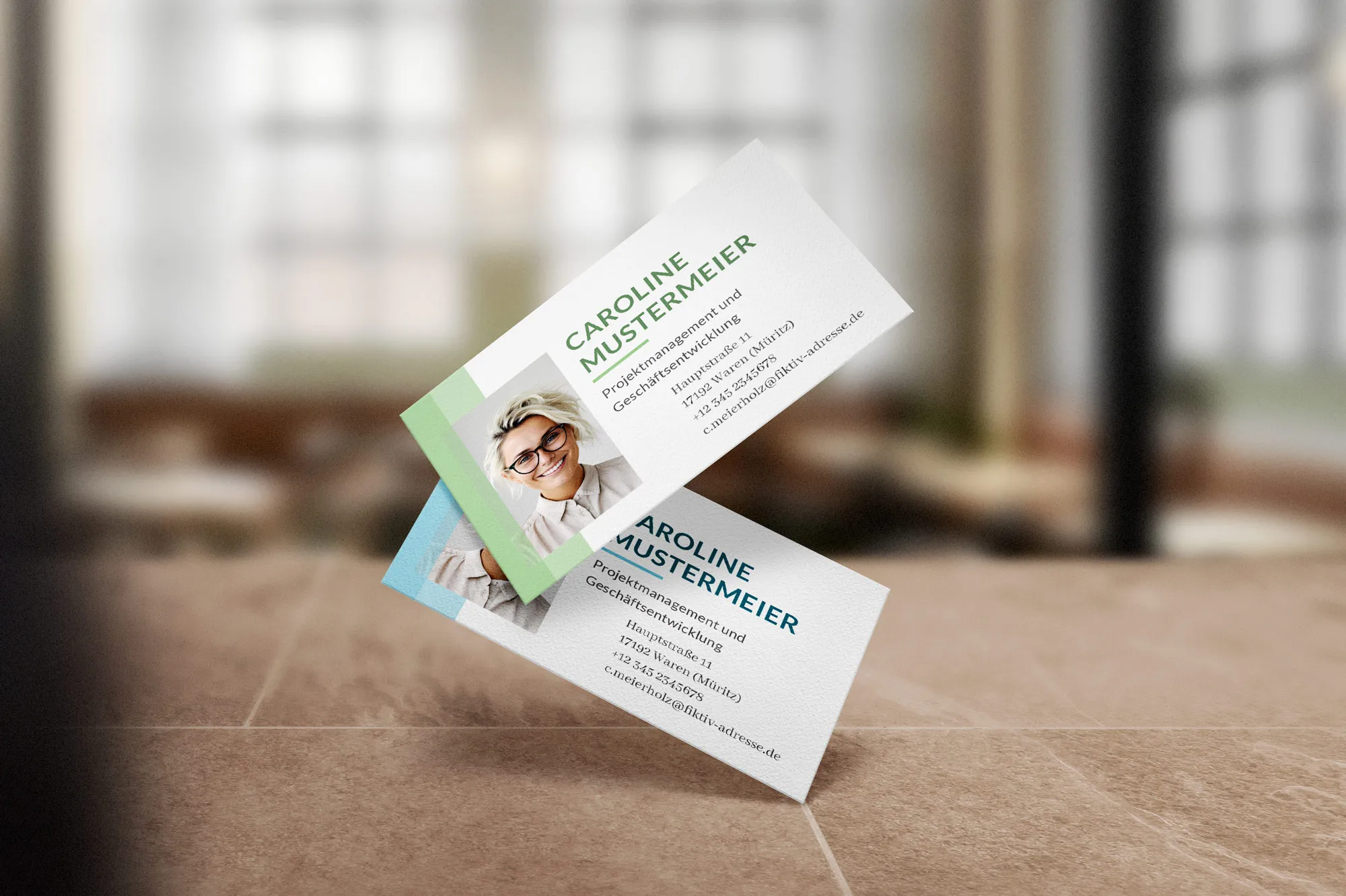
Business card style and colors
The color and design of a business card should match the style of the company. This ensures uniformity and recognizability. The colors should reflect the values, character and style of the company.
When selecting the colors, you should give preference to the colors that are already used in the brand's corporate design. This will allow you to maintain consistency and conformity with the overall identity. You should also consider the effect of colors on the audience's perception. For example, red can evoke energy and activity, blue can evoke calm and confidence and green can be associated with nature and stability. But as I said, your company's corporate design determines the colors.
Similar colors are arranged next to each other to create a harmonious palette. Complementary colors stand opposite each other and form a striking contrast. Triads are three colors that are equidistant from each other and create a bright, vibrant palette.

Practical tips to improve the effectiveness of your business card
A business card is just as important as a sign or an advertising banner. It's the first word you say when you meet a new job or a new client. But how can you design your business card so that it makes an impact? Here are a few tips.
- Choose the clearest and most legible font for the text on your business card template , taking into account its size and style.
- Make sure there is enough white space to avoid clutter and ensure the information is easy to read.
- Show only the most important information to avoid clutter and keep your business card clean and uncluttered.
- Use bright colors or unusual shapes to make your business card stand out from the crowd.
- Place the brand logo so that it is clearly visible, but not over the entire surface.
- Choose high-quality material for production that ensures durability and a professional look and feel.
- Make sure that the contact information is easily accessible and understandable for the recipients.
- Include a QR code or other technical solutions that make it possible to quickly obtain additional information or contact you. Check the QR code to make sure it works!
- Check and update your business card at regular intervals to ensure that it meets the current requirements and standards of your company.
- Invite the recipients of your business card via special links to communicate with you via social media or other channels.
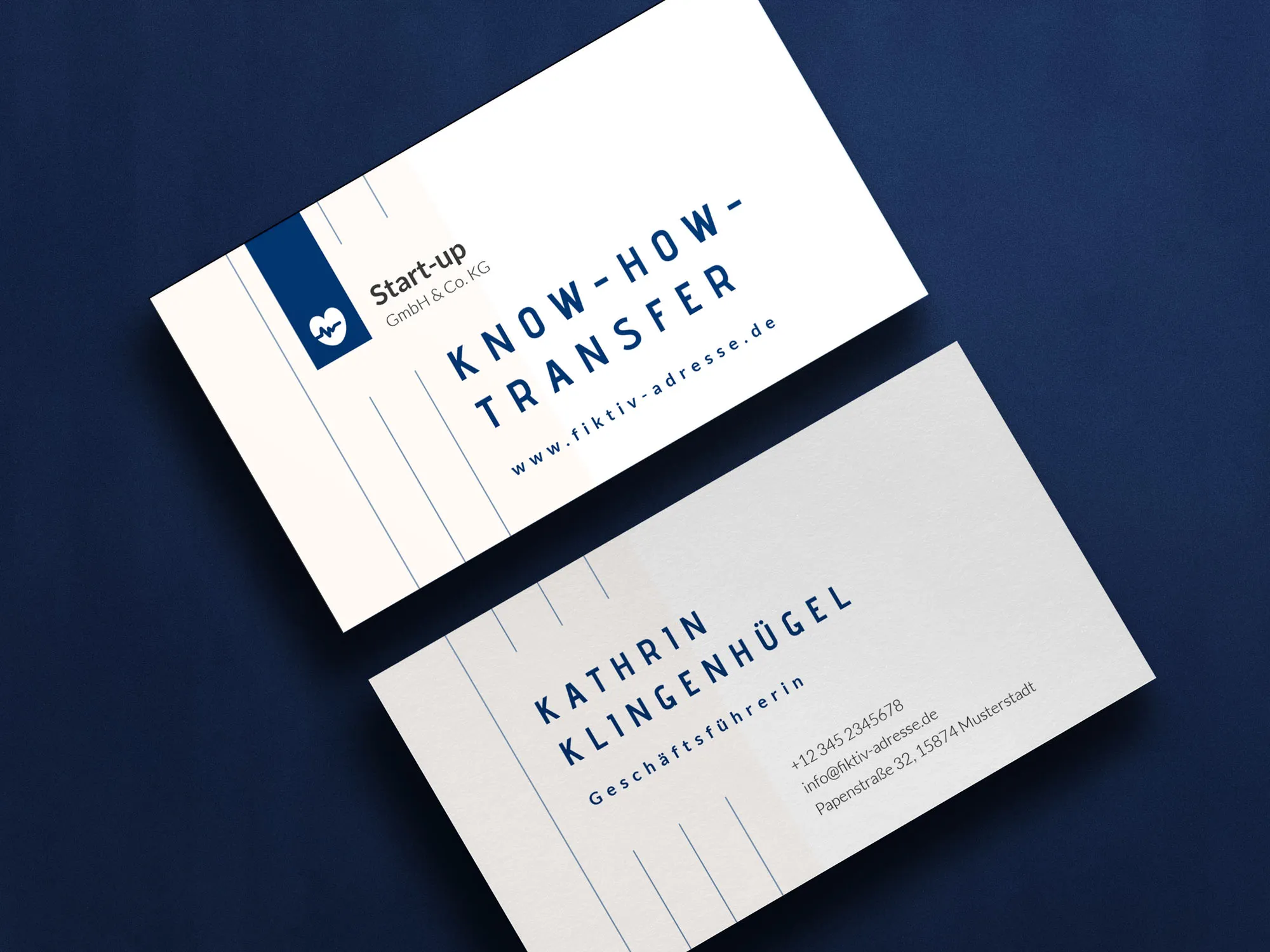
Save time and effort: use ready-made business card templates from TutKit.com
Using ready-made business card templates from TutKit.com not only saves time and effort, but is a smart move to ensure quality in your print products. Not only do we offer convenience and efficiency, but also a high level of professionalism and aesthetics that can make a big difference in first impressions. You no longer have to spend hours on design and layout, but can simply rely on ready-made, proven solutions that meet modern trends and standards. All layouts were created by the well-known design agency 4eck Media and have proven themselves in practice many times over. They can be easily edited and adapted to your own needs using programs such as InDesign and Word. And most importantly, the process is as intuitive as possible and requires no additional design knowledge or skills.
