Are posters still relevant today? Despite the pervasive digitalization and the massive shift of advertising to the Internet, posters are still one of the most powerful means of communication. They are simple but effective and can attract attention and convey a message as quickly as many other mass media. And above all, they reach people who are not digitally active. From advertising products to highlighting important events and political campaigns, posters continue to play an important role in shaping our perception of the world. They are catalysts for ideas and motivate us to act. If you know their characteristics and use poster templates, you can communicate with your audience in an effective way.
No time for design? No problem! TutKit.com offers a wide range of ready-made poster templates for many occasions and themes. Choose one you like, add your own text and images and you're done!
In this article, I'll introduce you to the most important aspects of poster templates that help to have a lasting impact on viewer perception and behavior.
Dimensions of the poster templates
The standard sizes for posters can vary from country to country - these are the DIN formats commonly used in Europe:
- A0: 841 x 1189 mm
- A1: 594 x 841 mm
- A2: 420 x 594 mm
- A3: 297 x 420 mm
- A4: 210 x 297 mm
The following sizes are inch-based:
- ANSI E 34 × 44
- ANSI D 22 × 34
- ANSI C 17 × 22
- ANSI B 17 × 11
- ANSI A 8+1⁄2 × 11
- The posters can also be customized to your needs and goals.

Regional standards for poster templates
Standard poster sizes can vary by country and industry. The most common sizes for posters in the USA are: 445.72x60.96 cm / 60.96x91.44 cm / 68.58x101.6 cm.
In Europe, the following sizes are popular: A3 (29.7x41.9 cm) / A2 (41.9x59.4 cm) / A1 (59.4x84.1 cm) / A0 (84.1x118.9 cm).
The effect of size on perceptual effectiveness
The effectiveness of a poster's content is directly related to its size and context. Larger posters, such as A0 or A1, are effective on the street or in large shopping centers, where they easily attract attention. Smaller posters, such as A3 or A4, are more practical for places with limited space, such as shop windows, exhibitions or notice boards. You should bear in mind that the size of the poster affects the legibility and presentation of the content. A poster that is too large is difficult to see at first glance, while a poster that is too small is less effective due to limited visibility. Choosing the right size depends on the communication objectives, the context of use and the potential audience. It also always depends on the distance, how far away your target audience is from the poster. If a poster is hanging on a street light for motorists, it must not be too small to be overlooked.
The difference between posters and billboards
The difference between posters and billboards lies in their purpose and design features.
Posters
Posters are graphic materials intended for public communication or advertising. They are used for advertising campaigns, political campaigns, educational initiatives and to promote cultural events. The design of posters is usually simple and versatile, with an emphasis on bright colors and large fonts to attract attention.

Posters
A poster is often more for decorative purposes. You have an artistic poster hanging in your study. Children have their idols hanging on the wall from their favorite club or music band. Posters can be used to advertise products, services, events and as interior decoration. Their design can be creative and aesthetically pleasing, using photos, drawings and illustrations to convey a message.
Posters are used to announce events, exhibitions, concerts, movies, etc. They are used to attract the attention of viewers and get them excited about a particular event or activity. When designing posters, the focus is often on the image of the main object or event, with a short informational text about the date, time and location of the event.
Correct placement of the poster elements
The placement of elements on a poster is determined by the composition, which includes the arrangement of text, graphic elements and other objects. The most important thing in the design is that the message is as legible and effective as possible.
The basic principles of proper poster design include:
- Graphic center: place the most important elements, such as the key image, in the center of the poster for maximum attention.
- Readability of the text: Use a large enough font so that it is easy to read from a distance. Position the text horizontally and vertically so that it is easy to read from different angles.
- Balance of elements: Ensure a balanced number and placement of graphic elements to create a harmonious appearance. Avoid overloading with unnecessary details to avoid visual clutter.
- Color scheme: Use colors that catch the eye and fit the theme. Ensure contrast between text and background to improve readability.
Successful design techniques include large photos or illustrations that catch the eye, bright colors that draw the eye, and a simple, clear layout to get the message across quickly. For example, posters promoting products often have photos of the products in the center and little text to convey information.

Features of the poster templates by application area
Posters as a means of visual communication are very different depending on the area of application. They have unique characteristics depending on their intended use and have different objectives and strategies.
In the political field , they aim not only to inform, but also to mobilize and influence public opinion. They often use strong emotional images and direct language to call for action. Such posters are used strategically to influence public opinion and gain support for a particular political and ideological position.
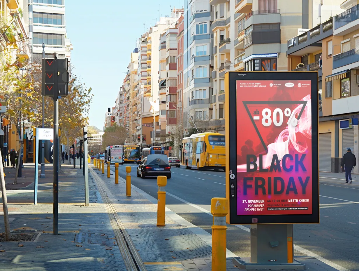
In the advertising sector , posters aim to attract attention and promote sales. They use bright colors, catchy slogans and eye-catching images to generate interest in a product or service and encourage purchases.
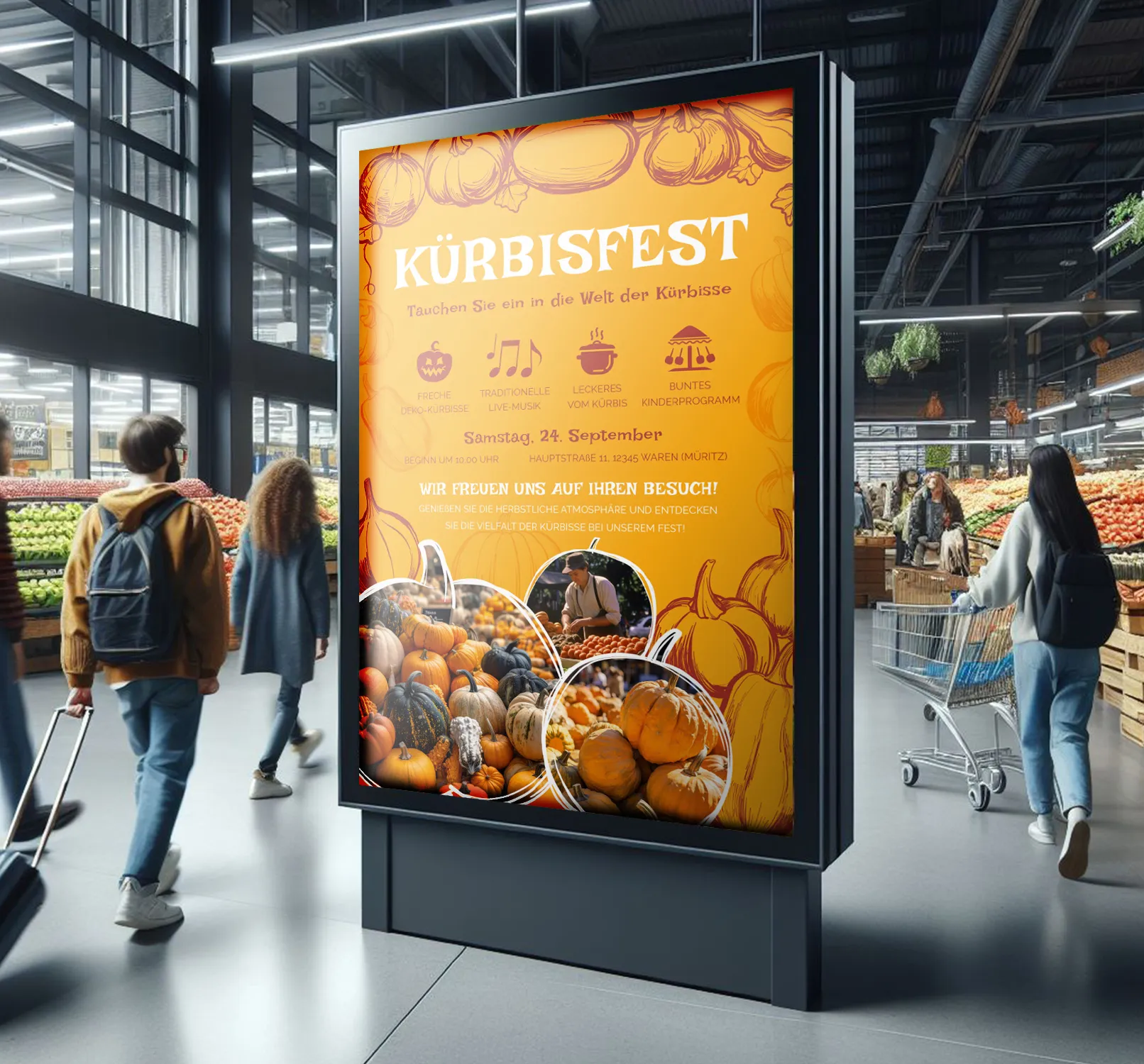
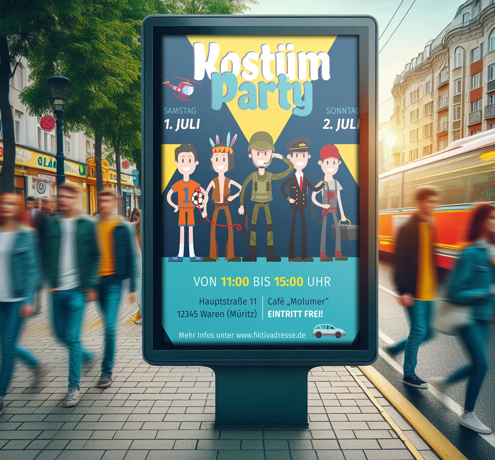
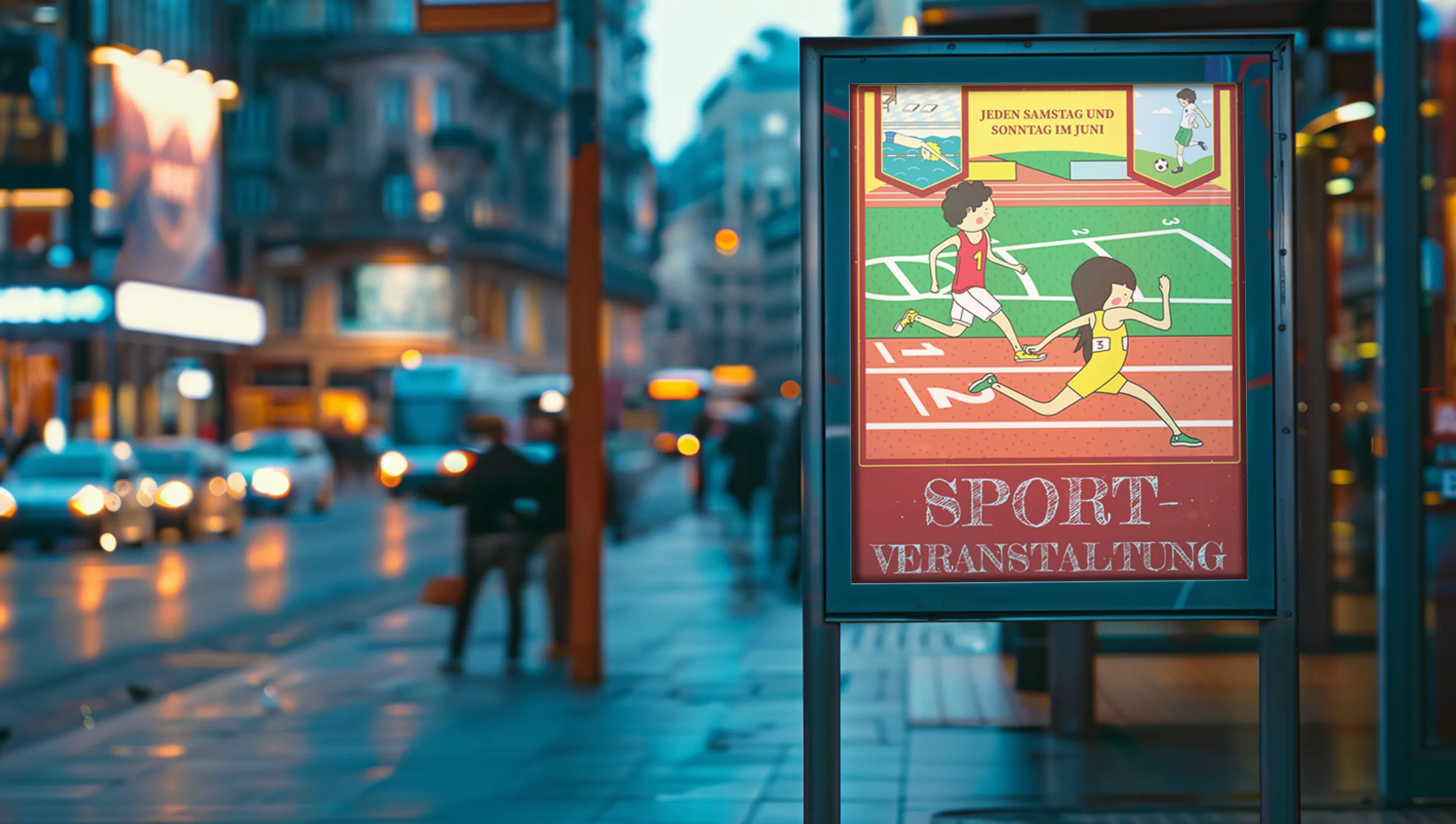
Posters for events and promotions inform and motivate people to take part. They often include information about the date, time and location of the event and evoke an emotional connection and motivation to participate in the promotion or event. Their design usually focuses on providing clear information and creating a sense of community and engagement. This is especially true for posters for sporting events.
Poster templates: Why you should use ready-made templates
Constantly developing posters from scratch is time-consuming and costly. You often need to have the necessary design knowledge and skills or hire expensive and qualified designers. With ready-made poster templates, the above requirements can be solved efficiently and, in the case of TutKit.com's poster templates, a number of advantages can also be utilized:
- The ability to choose from a wide range of over 200 unique poster designs.
- Professional layout according to industry standards and requirements.
- Full compatibility with InDesign, Photoshop, Word and many other programs.
- Intuitive and quick customization of poster templates to suit your needs without additional knowledge or skills.
- The poster templates are ready for printing and take into account the formats of both office printers and professional printers.
It is worth emphasizing that all poster templates on TutKit.com are unique and created by professional designers from the well-known agency 4eck Media, which is another indication of their quality. Tired of boring posters and expensive agency bills? Create your own creative design in minutes using the ready-made templates on TutKit.com! Surprise your friends, colleagues and customers by creating your own modern posters.

