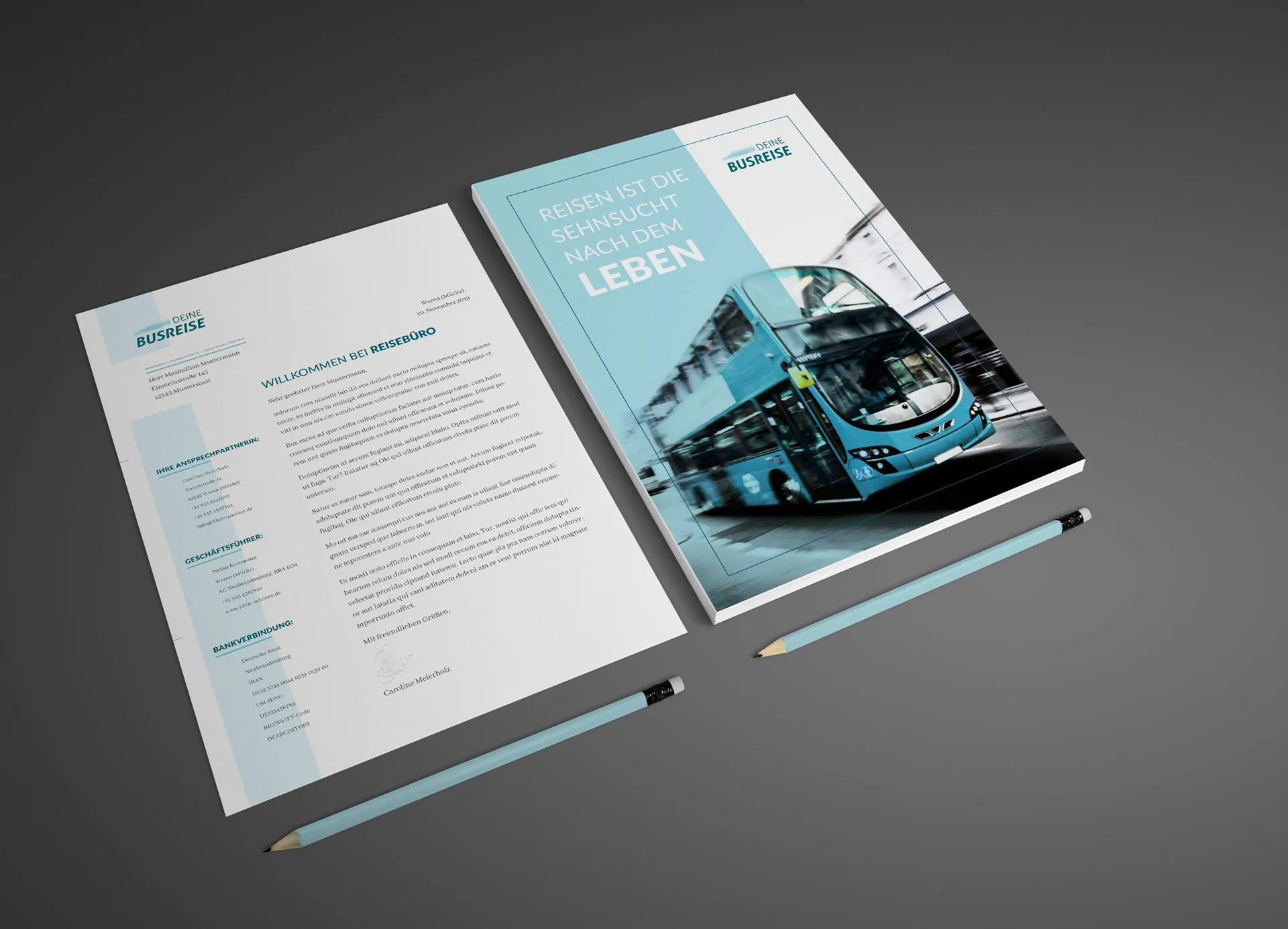
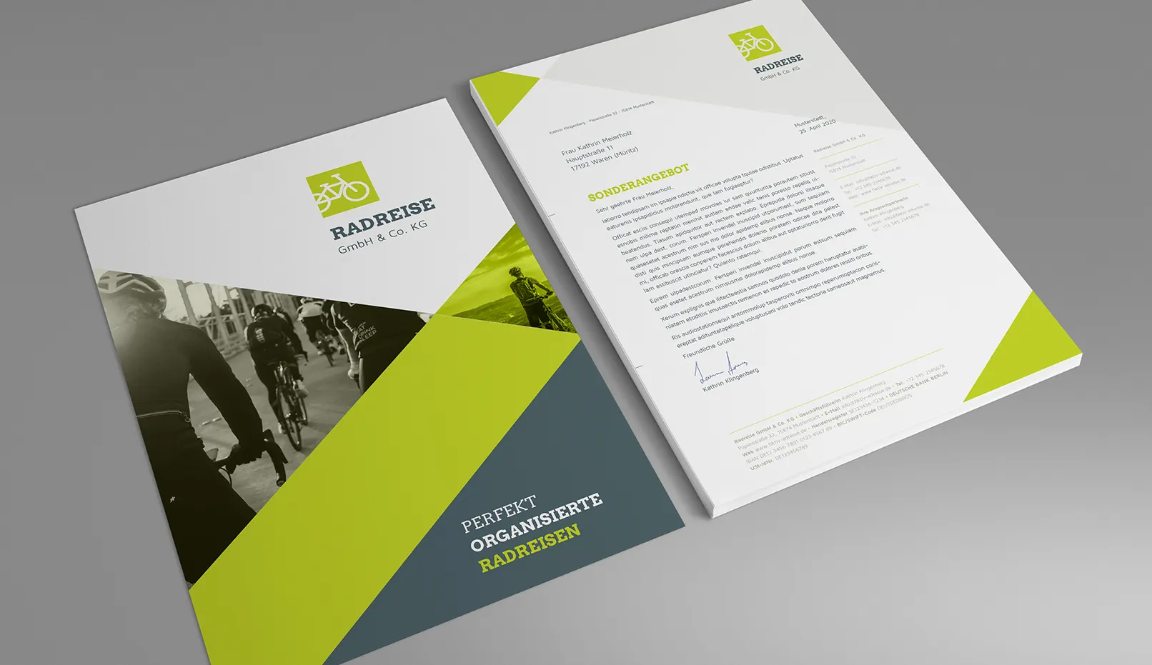
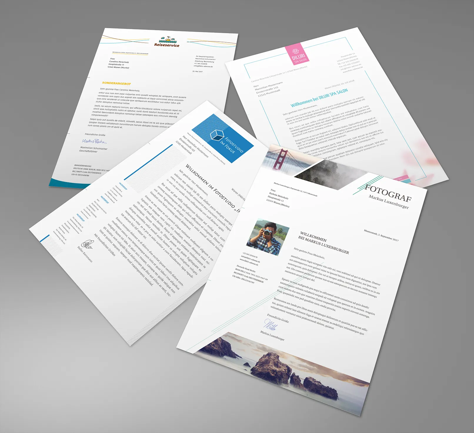
Imagine you receive an important business letter from a company. The first impression the stationery makes can be anything from professional and trustworthy to unprofessional and sloppy. A well-designed stationery with a stylish logo, clean fonts and an appealing color palette can reinforce your company's credibility and professional positioning.
With a variety of creative and professional templates for business stationery such as letterheads, business cards and more, you can easily create a consistent and appealing look for your brand. This guide will walk you through the basics of designing your business stationery, from choosing the right template to tips for creating a cohesive design. Learn how to make a lasting impression with high-quality templates.
An organization, no matter how well designed, is only as good as the people who live and work in it.
Dee Hock
Table of contents
First impressions count: The role of business stationery in your public image
Your business stationery is often one of the first points of contact with potential customers or business partners. It creates a lasting first impression and reflects the professionalism and seriousness of your company. An appealing design and layout can help to build trust and set your brand apart from the competition.
Professional image
- Credibility: High-quality business stationery shows that you pay attention to detail and work carefully. This strengthens trust in your company.
- Consistent brand identity: A consistent design for all business stationery such as letterhead, business cards and presentations conveys a strong and professional brand identity.
- Attracts attention: A creative and eye-catching design makes your company stand out from the crowd and makes it easier for potential customers to remember your brand.

Psychological effect
The appearance of your business stationery can also subconsciously influence the perception of your company. For example:
- Clean, clear fonts convey seriousness and reliability.
- Harmonious color combinations create a positive and trusting atmosphere.
- Modern designs can position your brand as innovative and progressive.
Through the targeted use of visual elements, you can convey the desired message about your company and leave a lasting positive impression.
There are no secrets to success. It is the result of preparation, hard work, and learning from failure.
Colin Powell
Basic elements of business stationery
Every professional business stationery consists of a few key elements that give it a consistent and appealing look. Here are the basic components you should consider:
Company logo
Your company logo is the face of your brand and should be prominently displayed on all business stationery. It makes your stationery instantly recognizable and strengthens your brand identity. But please don't make the logo too large! After all, the main function of business stationery is to convey information.
Contact information
Contact details such as address, telephone number, e-mail address and website URL are essential. Place this information in a clearly visible place so that your customers can reach you easily. This could be at the top right, in a side column or in the footer of your stationery.
Fonts
Choose one or two fonts that match your branding and are used consistently across all business collateral. Avoid using more than one font, as this can look unprofessional. It makes sense to use one font for the subject line and other distinguishing elements and another for clear readability. In any case, the font of your corporate design is the right one to use. It is usually a font family with several font steps that can be combined well.
Color palette
Your color palette should reflect your brand identity and fit together harmoniously. Use a maximum of three to four colors to achieve a balanced and appealing design. Here, too, orient yourself to the conditions of the existing corporate design. These are your basic colors. You can also use another one as an accent color.
Graphic elements
Graphic elements such as lines, shapes, icons or design patterns can give your business stationery a unique touch. However, make sure that they don't distract from the actual content.
White space
Leave enough white space (free space) around the text to ensure a clean and clear layout. Too many elements on a page can look cluttered. The eye needs space to focus on the essential information.

Design and layout
Layout design
The layout of your business paper should be clearly structured and user-friendly. Here are some tips for an effective layout design:
- Header and footer: Place your logo, contact information and other important elements in the header or footer to make them visible on every page.
- Alignment: Ensure consistent alignment of text and elements. A balanced arrangement ensures a professional and harmonious appearance.
- Hierarchy: Use different font sizes and styles to create a visual hierarchy and emphasize important information.
- Grid: An invisible grid can help you align elements on the paper and achieve a balanced layout.
By making clever use of visual elements and a thoughtful layout, you can turn your business stationery into a real eye-catcher that represents your brand in the best possible way. Always remember that most companies often only receive cluttered advertising or lovelessly designed mail from the authorities. How beneficial professional stationery is for the recipient!

Template usage
Using professional templates for your business stationery offers numerous benefits and can save you valuable time and effort. Here are some reasons why you should consider templates:
Time saving
Instead of designing from scratch every time, you can use templates to create appealing designs quickly and easily. This saves you valuable time that you can invest in other important tasks.
Consistency
Templates ensure a consistent look and feel across all your business documents. By using the same template for letterheads, business cards, presentations and more, you strengthen your brand identity and convey professionalism.
Customizability
Most templates are fully customizable, so you can tailor them to your specific needs and branding. Change colors, fonts, graphics and more to create your unique design.
Wide selection
There are a variety of templates for different purposes and industries. Whether you need templates for letterheads, business cards, presentations or other documents, you're guaranteed to find suitable options.
Simple implementation
Many templates are available in common formats such as Microsoft Word, PowerPoint or Adobe InDesign, so you can integrate them seamlessly into your existing workflows.
If you want to take full advantage of templates, it's best to choose high-quality, professionally designed templates. Think about which templates you want to invest your time in customizing to make your brand look professional and consistent.

Templates for your business stationery at TutKit.com
To summarize, professional and appealing business stationery makes a significant contribution to your company's public image. Not only does it create a lasting first impression, but it also strengthens your company's credibility and brand identity. By using high-quality templates, you can save time and ensure a consistent design across all business documents. And high quality layout is ensured from the start.
TutKit.com offers templates on various topics, for example for advertising brochures or corporate style. Our designs are beautiful and practical. Here are a few advantages that set us apart from other providers:
- High-quality templates from talented designers at 4eck Media Agency.
- We have templates for different companies and industries.
- You can edit templates in different programs. When you buy a template, you can download it in different formats. So you can easily edit it.
You get a good product and save time and effort. And the best thing about it: you can develop your business without having to invest a lot of money.
FAQs
DIN 5008 template
A DIN 5008 template is an exemplary format for business letters that is based on the German DIN 5008 standard. This standard provides detailed guidelines for the design of business correspondence on a DIN A4 sheet, including:
- Placement of the company logo and address fields
- Fonts and font size
- line spacing
- Arrangement of text blocks
- Placement and formatting of date, subject line and salutation
Creating your own letter template in Word
To create your own letter template in Microsoft Word, follow these steps:
- Open the program: Start Microsoft Word.
- Use the search area: Go to "New" in the start area or on the start page.
- Search for templates: Enter "Letters" in the search field or filter for letter templates.
- Select template: Select a template that meets your needs.
- Edit template: Click on "Create" or "Download" to open the template. Edit the template by clicking on the text fields and adjusting the text accordingly.
Finding letter templates in Word
To find letter templates in Word:
- Open Word: Start Word.
- File menu: Go to "File" > "New".
- Discover templates: Click on "More on Office.com" or search directly in the templates displayed.
- Select category: Select the "Letters" category to see a list of suitable templates.
Features of a company letterhead
Company stationery, also known as letterhead, is characterized by the following features
- Company logo: Conspicuous placement of the company logo for recognition value.
- Contact information: Full address, telephone number, e-mail address and website.
- Legal information: Commercial register number, VAT ID, etc., if required.
- Corporate design: Use of fonts, colors and graphic elements that match the brand identity.
- Professionalism: A professional appearance that radiates trust and competence.

