Knock, knock: We're launching the tutorial series "Creating Christmas composings in Affinity Photo" on our blog. 14 instructive lessons for the pre-Christmas period - and who knows, maybe you'll use what you've learned to prepare a few photo gifts?
Welcome to a series of tutorials for Affinity Photo in which you create a Christmas composing. The motif "The Christmas Angel" and its preparation will be presented to you by Marco Kolditz in his video training. Here on the blog, we show you how he proceeds step by step. Take your own pictures and use the procedures to create your own personal picture composition - a wonderful gift idea! Of course, you can also pick out the methods and techniques individually and integrate them into your general Affinity Photo workflow.
The goal: A metal-look Christmas angel in the middle of a snow globe
The final composition shows a snow globe in which a winged Christmas angel with a metallic look stands on a rock, surrounded by falling snowflakes. During the training session, you will use various methods to free the woman, the wings and the rock. You generate the snow globe and paint the snowflakes into the picture using certain brush settings. You also round off the overall look by using the background in a special way. Have fun learning!

This is what you will learn in the course of the entire Affinity Photo tutorial
- Create a Christmas and winter composition in Affinity Photo.
- Create a metallic effect in two different ways.
- Crop: Paint brush and quick mask, pencil and paths, selection brush
- Create a glass ball
- Painting snowflakes into a picture with self-created brushes
- Applying various adjustment layers such as black and white, tone correction and color balance
- Applying various live filters such as waves, motion blur and polar in Cartesian
- What you should pay attention to when compositing, including light and shadow, color look
- Numerous keyboard shortcuts as well as tips and tricks for an efficient workflow
The 14 parts of the Affinity Photo tutorial at a glance
The 14-part tutorial series is published in a total of 7 posts on our blog. Click directly to the desired parts:
Part 1: Customizing the user interface: Docking the toolbar, monochrome icons
Let's get straight to it! But before you start creating your Christmas angel, we'll give you some general and helpful information about working with Affinity Photo .
In this first part of the "Creating Christmas composings in Affinity Photo" training course, we'll look at some aspects of the user interface . Among other things, you will learn how to dock the toolbar, set the order of the tools and adjust the color of the icons. With the layer palette and the adjustment area, you always have an overview and access to all the important functions you need in the training.
This much is certain: with a customized user interface , working is twice as nice and certainly more efficient.
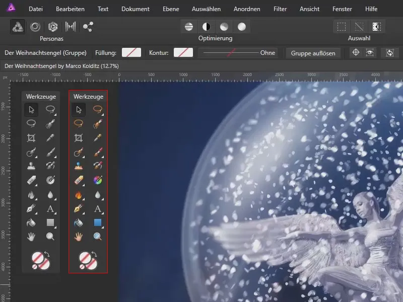
You'll learn how to do this in part 1 of the Affinity Photo tutorial:
- Docking or floating the toolbar in Affinity Photo
- Customize the toolbar (add other tools, change the order)
- Setting the color of the tool icons
Overview of the user interface
At the beginning of the tutorial, I'll give you a few tips on how I personally set up the Affinity Photo user interface.
On the right-hand side, for example, I have placed the Customization panel and below it the Brushes panel, where I can select the various brushes. You will also find the currently closed Layers paletteand the expanded Channels palette.
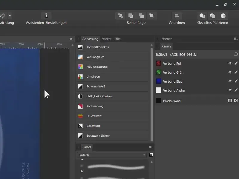
Docking the toolbar in Affinity Photo
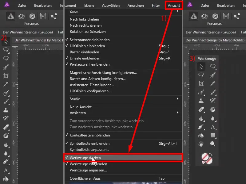
Under View and Dock tool (1) you can activate the docking of the tool bar. This means that all the tools are on the left-hand side (2). The display is single-column, two columns are not possible here. For my part, I prefer a free-floating toolbar, which is why I deactivate the function again (3).
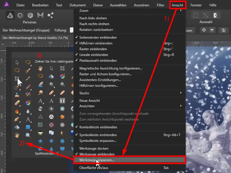
Customize the sorting of tools
Via View>Customize tools... (1) you also have the option of selecting which tool is located where in the toolbar (2). You can sort the tools by clicking and dragging . On the right-hand side (3) you will see many more tools. You can simply drag them into the toolbar and customize the bar as you need it.
Monochrome or colored toolbar icons
You have also seen above that the tools are very colorful. Personally, I don't like this so much, so I display these tools in monochrome . This is very easy to do via Edit>Preferences... (1) Click on Surface (2).
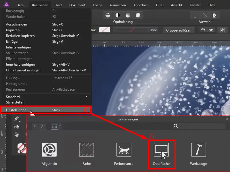
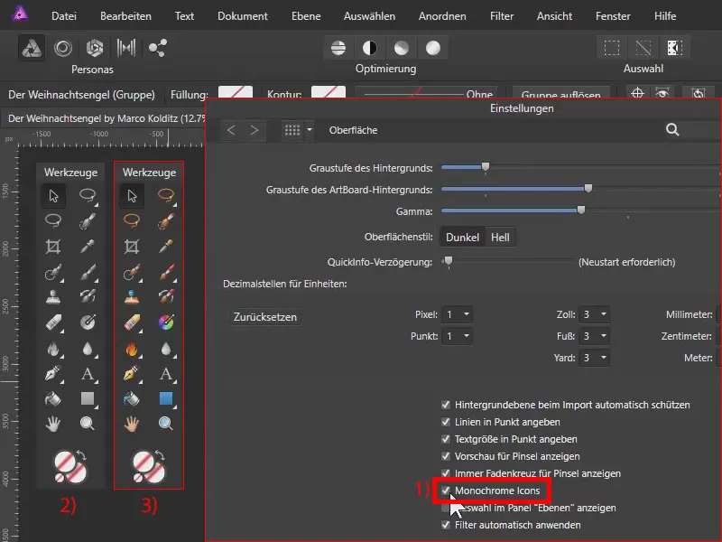
In the settings you will find the item Monochrome icons (1). As soon as this is activated, the icons are displayed in black and white (2), deactivated the colorful icons are displayed (3).
In the selection shown, I have also activated the two functions Show preview for brushes and Always show crosshairs for brushes (above 1).
I also use a graphics tablet to work with Affinity Photo, which is particularly recommended because it is much more comfortable to work with a pressure-sensitive pen than with a mouse.
Tips on the user interface in Affinity Photo - summary
- View>Dock tool: Fixes the toolbar to the left edge or lets it float freely
- View>Customize tools: You can individually assign tools to your toolbar and determine their order.
- Edit>Preferences>Interface: If you don't like it too colorful, you can display the tool icons in monochrome here.
Important links for you
A complete video of this Affinity Photo tutorial by trainer Marco Kolditz is available on TutKit.com. You can also find numerous assets such as brushes and illustrations as well as further tutorials on Affinity Photo in our software category for Affinity Photo.
Your membership gives you access to the content mentioned above. Don't have a membership yet? Then try us now for free and without obligation.
> Continue to parts 2 and 3 of the Affinity Photo tutorial
The content of this article is based on a tutorial by our trainer Marco Kolditz:
