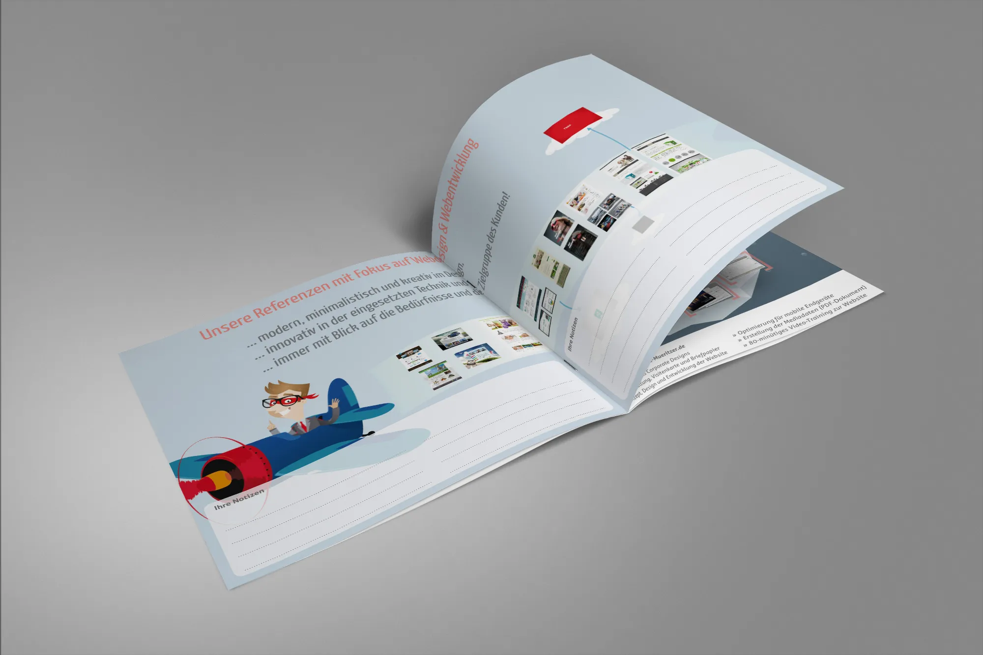
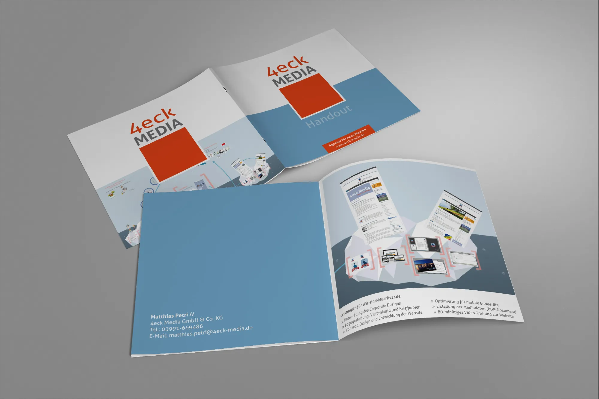
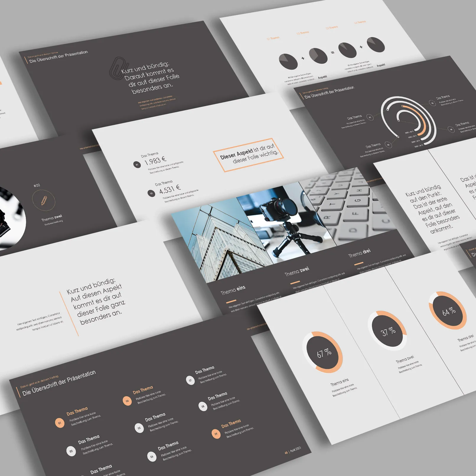
A handout is an indispensable tool to support presentations and lectures. It not only serves to complement the spoken word but also allows listeners to read the key points again and add their own notes. A well-designed handout helps to present complex content clearly and increases the comprehensibility and traceability of the presentation.
Whether in school, at university, or in a professional context - a handout offers numerous advantages. It structures information and ensures that listeners do not lose the thread. By fixing the key statements in writing, the presentation remains firmly anchored in the memory of the audience.
A handout should always be tailored to the needs and expectations of the target audience. While students often require a more detailed elaboration, a concise summary may be sufficient in a professional environment. In any case, the handout should be clear, easy to read, and well-structured.
Below you will receive a comprehensive guide to creating a handout, starting from the definition and basic structure to practical tips and examples. With this information, you are well-equipped to create a professional and effective handout.
Table of Contents
Definition: What is a Handout?
The term "handout" comes from English and literally means "to hand out." In the German language, a handout is often referred to as a handout, table handout, handout, or thesis paper. But what exactly is meant by a handout, and how does it differ from other similar documents?
Origin and Meaning of the Term
A handout helps listeners to get an overview of the upcoming topics of a lecture, presentation, or report. It is a compact document that captures the essential content and core theses of the oral presentation in writing. Handouts are particularly useful for facilitating the understanding and follow-up of the discussed content for the listeners.
Differences between Handout and Thesis Paper
Although the terms handout and thesis paper are often used synonymously, there are some differences between the two:
- Thesis Paper: A thesis paper, also known as a thesis sheet, summarizes the main theses of a lecture. These theses are usually presented in bullet point form and serve to highlight the central statements of the lecture.
- Handout: A handout is generally more detailed than a thesis paper. In addition to the theses, it contains additional explanations, examples, and further information. A handout thus provides a more comprehensive summary of the entire lecture and can serve as a supplementary reference work.
Uses
Handouts are used in various contexts:
- School and University: Students use handouts frequently to accompany reports and presentations. They provide written support and enable classmates or fellow students to better follow the presentation and take their own notes.
- Professional Context: In meetings, workshops, and conferences, handouts are a useful tool to convey the most important information in a compact and clear manner. They help participants to understand the discussed content and serve as a valuable memory aid.
A well-designed handout meets three essential criteria: it succinctly summarizes all key content, the bullet points are understandable and traceable, and the document is concise, short, and to the point. With these characteristics, the handout becomes an effective companion for any speech or presentation.
Structure of a Handout

A well-structured handout consists of several clearly defined sections. Each of these sections plays an important role in providing listeners with a clear and easily understandable summary of the presentation. The following describes the key elements of a handout:
Header Section
The header section of the handout contains basic information about the presentation and the speaker. These details are important to clearly identify the document and provide context.
- Event Details: Where and when is the presentation taking place? What event or seminar is the framework for the presentation?
- Lecturer and Speaker: Who is the lecturer or supervisor of the seminar? Who is giving the presentation? The name of the speaker and possibly their contact information should be provided here.
Title and Topic of the Presentation
The title of the presentation should be clearly visible in the upper area of the handout. It provides a first indication of the content of the presentation.
- Title: Should be concise and meaningful to immediately convey the main theme of the presentation.
- Topic: Can be further specified in addition to the title to clarify the exact focus of the presentation.
Structure and Content
The main part of the handout consists of the structure and content. Here, the key points of the presentation are presented in a structured manner.
- Subheadings and Structuring: The structure should be organized by clear subheadings. These subheadings help to divide the content into manageable sections and provide the audience with guidance.
- Content: Each section of the structure should be elaborated on briefly and concisely. It is recommended to work with bullet points or short phrases rather than using fully formulated sentences. This facilitates the quick comprehension of information for the audience and allows space for their own notes.
Footer Section
The footer section of the handout contains important information about the sources used and references to further literature.
- Source and Literature References: All sources used in the handout should be listed here. This includes books, articles, internet sources, and other references. The information should be as complete and precise as possible to allow the audience to trace the sources themselves.
Exemplary Structure of a Handout:
- Header Section
- Event Details
- Lecturer and Speaker
- Title and Topic of the Presentation
- Structure and Content
- Introduction
- Main Part
- First Point
- Second Point
- Third Point
- Conclusion
- Footer Section
- Source and Literature References
A clear and structured layout of the handout helps the audience to better understand and follow the presentation. It is important to present information in a way that is easy to read and comprehend. With these elements, your handout will become a valuable tool for any presentation.
Content Design
The content design of a handout is crucial for its effectiveness. It is about presenting the most important information in a compact and understandable way. Here are some basic principles and tips for the content design of a handout:
Introduction and Definitions
Introduction: Start your handout with a brief introduction that introduces the topic of the presentation and explains the context. The introduction should be brief and precise, providing the audience with an overview of the following contents.
Definitions: If your topic includes specific technical terms or concepts, it is helpful to define them at the beginning. This ensures that all audience members have the same foundational knowledge and can better understand the presentation.
Development of Topic Points
Structuring: Divide the main part of the handout into several clearly delineated sections. Each section should address a specific aspect of the topic. Use subheadings to mark the sections and make it easier for readers to navigate.
Bullet Points and Phrases: Avoid long, fully formulated sentences. Instead, work with bullet points and short phrases. This makes it easier for the audience to quickly grasp the information and provides room for their own notes.
Example:
- Introduction
- Brief Introduction to the Topic
- Relevance and Objective of the Presentation
- Main Part
- First Point: History of the Topic
- Short Historical Overview
- Key Events and Developments
- Second Point: Current Status
- Present Relevance and Applications
- Current Challenges and Debates
- Third Point: Future Perspectives
- Possible Developments and Trends
- Forecasts and Scenarios
- First Point: History of the Topic
- Conclusion
- Summary of Key Points
- Outlook and Concluding Thoughts
Use of Bullet Points and Phrases
Bullet points not only help to present information in a compact way but also support the speaker's free speech. They enable the quick comprehension of the key statements and at the same time allow flexibility in responding to questions or discussions.
Examples of effective bullet points:
- Clear and concise: Each bullet point should contain a clear and concise statement.
- Consider the order: Arrange the bullet points logically to ensure a coherent flow.
- Visual aids: Use bullet points or numbering to visually separate the points and enhance readability.
Exemplary bullet points:
- Origin of the term:
- Originated in the 19th century
- Refers to political and cultural movements
- Key figures:
- Alexander Dubček
- Tomáš Masaryk
Visualizations and Examples
If relevant, you can also include visualizations such as graphics, charts, or tables. However, these should be used sparingly to avoid overloading the handout. Visualizations can clarify complex information and facilitate understanding.
Important Tips for Content Design
- Focus on the essentials: Limit yourself to the most important points and avoid unnecessary details.
- Maintain consistency: Ensure that the design and style of the handout are consistently uniform.
- Reader-friendly: Make sure the handout is easy to read. Use an appropriate font size and provide enough spacing between sections.
With these tips for content design, your handout will become a valuable support for your audience, clearly and understandably presenting the key information.
Style and Design

The style and design of a handout play a vital role in how well the information is absorbed and understood by the audience. An organized and visually appealing handout enhances readability and ensures that the key points are remembered. Here are some important aspects to consider when designing your handout:
Font Sizes and Formatting
Font sizes:
- Header: The font size in the header should be smaller (e.g. 10 point) to save space for the actual content.
- Title: The title of the presentation should be highlighted and displayed in a larger size (e.g. 14 point) to immediately catch the eye.
- Subheadings: These should be larger than the body text (e.g. 12 point) to make the structure clear.
- Body text: A pleasant and easily readable font size (e.g. 11-12 point) for the main body of the handout.
Formatting:
- Bold and Underline: Use bold and underline sparingly to highlight important points and headings. Too many highlights can make the handout cluttered.
- Italic: It can be used to emphasize terms or definitions, but should also be used sparingly.
Space for Notes and Avoidance of Overloading
Space for Notes:
- Margins: Ensure that the margins are wide enough for the audience to take their own notes. A margin of at least 2 cm is recommended.
- Empty lines: Leave enough empty lines between sections and points to prevent the handout from appearing too crowded and to provide space for notes.
Avoidance of Overloading:
- Focus on the essentials: Limit yourself to the most important information and avoid unnecessary details. An overloaded handout can overwhelm the audience.
- Visualizations: Use graphics, tables, and charts sparingly. They should only be used if they truly contribute to illustrating the content and do not overload the text.
Use of Graphics, Maps, and Tables
Graphics and Charts:
- Visualization: Use graphics and charts to visually represent complex information. This can significantly facilitate understanding.
- Simplicity: Ensure that the graphics are simple and understandable. Too complex representations can be more confusing than helpful.
- Labels: Each graphic and chart should be clearly labeled so that the audience can immediately recognize what is being presented.
Maps and Tables:
- Clarity: Tables can be used to clearly present data and facts. Ensure that the tables are easy to read and do not contain too much information.
- Relevance: Use maps to illustrate geographical information. Again, only include relevant and necessary information.
Color Design
Colors:
- Clarity: Use colors sparingly and strategically to highlight key points. Too many colors can distract and make the handout appear restless.
- Contrasts: Pay attention to sufficient contrasts to keep the text easily readable. Black text on a white background is generally the most readable.
Exemplary Color Design:
- Headings: Dark blue or dark gray to differentiate them from the black running text.
- Emphasis: Use a color (e.g. red or green) for important bullet points or terms.
Consistency and Uniformity
Design and Layout:
- Consistency: Ensure that the design and layout of the handout are consistent. Use the same fonts, sizes, and formatting consistently.
- Structure: Stick to the structure and layout you established at the beginning. A consistent design helps the audience navigate and understand the content.
Exemplary Layout:
- Title and Header section on top: Clear separation by a line or distance from the main body.
- Outline and Content: Clear subheadings and sufficient space between sections.
- Footer section at the bottom: With clear references to sources and literature.
With these tips on style and design, you create a handout that not only convinces content-wise but also visually appealing and easy to understand. A well-designed handout supports your presentation and remains memorable to the audience in the long run.
By the way, we have a wonderful tutorial in text form that fits perfectly: Designing a Brochure as a Handout in InDesign or as a video training in the package Sharp InDesign Recipes (at the very bottom).
Handout Distribution

The timing and manner in which you distribute your handout can significantly influence the impact of your presentation. There are various strategies, each with different advantages and disadvantages. Here are the key options for when and how you can distribute your handout:
Distribute handout before the presentation
Advantages:
- Preparation: The audience has the opportunity to familiarize themselves with the topic in advance and prepare specific questions.
- Structure: The audience can follow the presentation better as they already know the structure and key points.
Disadvantages:
- Distraction: There is a risk that the audience will read more in the handout during the presentation and pay less attention to the actual speech.
- Anticipating the content: The element of surprise and suspense can be lost if the audience already knows the content.
Distribute handout shortly before the start
Advantages:
- Time for preparation: The audience has the opportunity to get an initial overview just before the presentation without losing the suspense.
- Note-taking: The audience can make notes directly in the handout during the presentation.
Disadvantages:
- Rush: Distributing right before the start of the presentation can seem rushed and rob valuable preparation time.
- Distraction: Just like distributing before the presentation, there is also a risk that the audience will be less attentive.
Distribute handout during the presentation
Advantages:
- Active use: The audience can use the handout directly during the presentation to take notes and better understand the content.
- Control: The presenter can distribute specific parts of the handout at certain times to focus attention.
Disadvantages:
- Interruption: Distributing during the presentation can interrupt the flow of speech and create restlessness.
- Coordination: It requires good coordination and planning to choose the right timing for distribution.
Distribute handouts after the presentation
Advantages:
- Undivided attention: The audience focuses on the speaker throughout the presentation without being distracted by the handout.
- Follow-up: The handout serves as a valuable memory aid, allowing the audience to review the presentation calmly afterwards.
Disadvantages:
- Lack of note-taking: The audience cannot take notes directly on the handout during the presentation.
- Memory lapses: Without the handout, important information may be lost or forgotten during the presentation.
Recommendations for distribution
Before the presentation:
- Complex topics: If the topic is complex and prior understanding would be helpful, distributing the handouts before the presentation can be beneficial.
- School and academic contexts: In schools and universities where detailed understanding and discussion are important, early distribution can be advantageous.
During the presentation:
- Interactive presentations: For interactive lectures or workshops where the handout is used as a working material, distributing it during the presentation is ideal.
After the presentation:
- Conferences and meetings: In professional contexts where it is important for the audience to follow the presentation, distributing the handouts after the presentation may be the best option.
Handout versions:
- Digital and printed: It is always a good idea to have both digital and printed versions of the handout available. This allows the audience to choose the format that suits them best.
Practical tips:
- Organization: Plan the distribution in advance and make sure there are enough handouts for all audience members.
- Communication: Inform the audience about the timing of the handout distribution so they know what to expect.
With these strategies for distributing your handouts, you can ensure that they provide the greatest benefit to your audience and support your presentation optimally.

