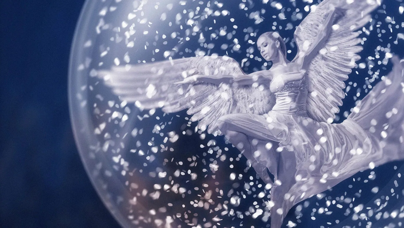
All good things come in threes. In part 11 of our Christmas Affinity Photo series, you'll learn about a third way to crop subjects. Immediately afterwards, you'll conjure up a glass ball seemingly out of nowhere. A well-rounded affair!
Part 11: Clipping rocks with the selection brush and inserting them into the background
It's impressive how the angel presents itself with its wings in a shiny metal look. But the statuesque apparition is still floating in a vacuum. That's why we've now given it a rocky background with a new background . And because the rock formation does not simply grow into the picture by itself, it too must first be cut out of another picture. The tool for the cropping process this time: the selection brush. How your trainer Marco Kolditz proceeds until the rock is firmly in place:
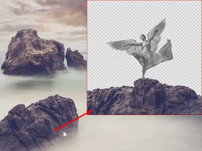
This is what you will learn in part 11 of the Affinity Photo tutorial
- Creating a selection using the selection brush
- How to use the rasterize function
- What you should pay attention to when placing a new background
Clipping rocks with the selection brush
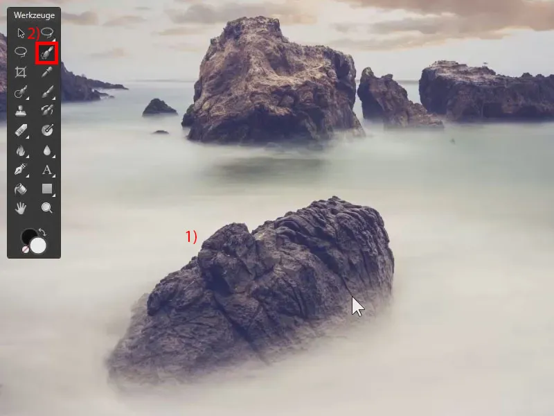
Now let's take care of the rock on which the Christmas angel will later stand. To do this, I have opened the rock image. We want to crop the rock at the bottom (1). I have already shown you how to crop objects using the QuickMask or the Pen tool.
Here we will use a different method that works very well with strong contrasts . You can clearly see the dark rock against a white background in the picture. The selection brush tool(2), which can be activated with the W shortcut, is therefore suitable for this motif.
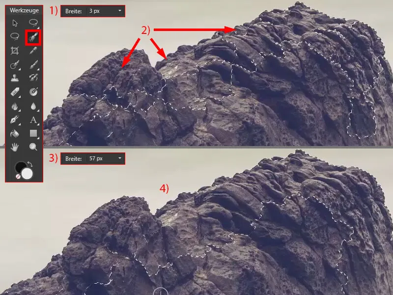
I zoom in and switch to the selection brush. I can use it to paint over the image. I have initially selected a width of 3 px (1), which doesn't work very well with this image. You can see individual areas that are not yet selected (2). So if you want to select larger objects using the selection brush, I recommend increasing the width (3) .
Now I'll paint over the rock and you can see that areas are automatically selected (4) . The selection brush is based on strong contrast and contours. In other words, it recognizes to a certain extent: There it is light, here it is dark, so this should be the edge of the object to be selected.
Check and correct the selection of the selection brush
At this point (1) it didn't work so well, an area was not selected. But it doesn't matter - I simply click in again and the area is also selected (2).
If I zoom into the image, however, I can see again that these areas have also been selected (3). You could now reduce the width again (4>6), hold down the Alt keyand click on the areas (5) to deselect them again (7 ).
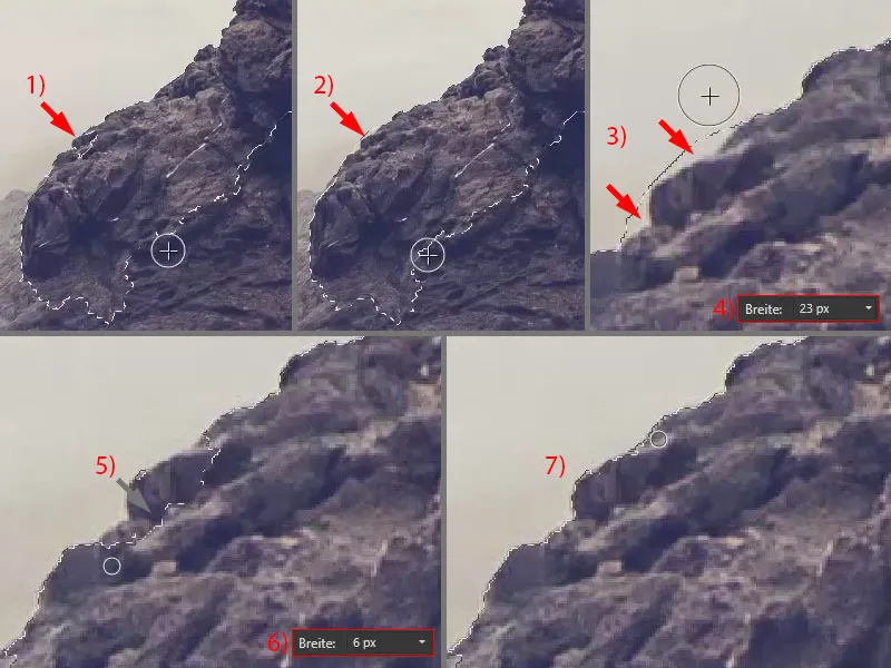
Hold down the space bar and move through the image to edit such problem areas. This works very nicely and quickly.
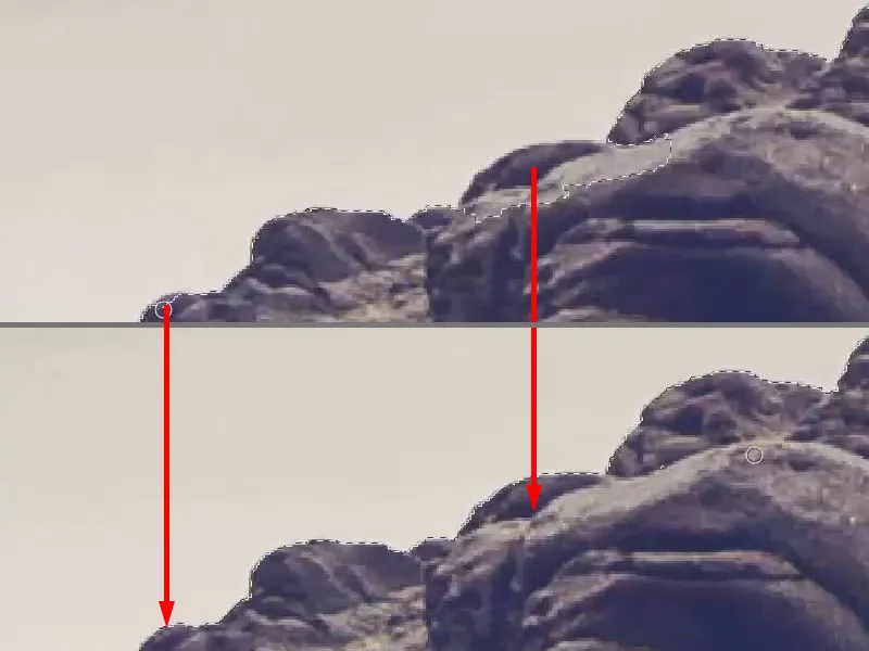
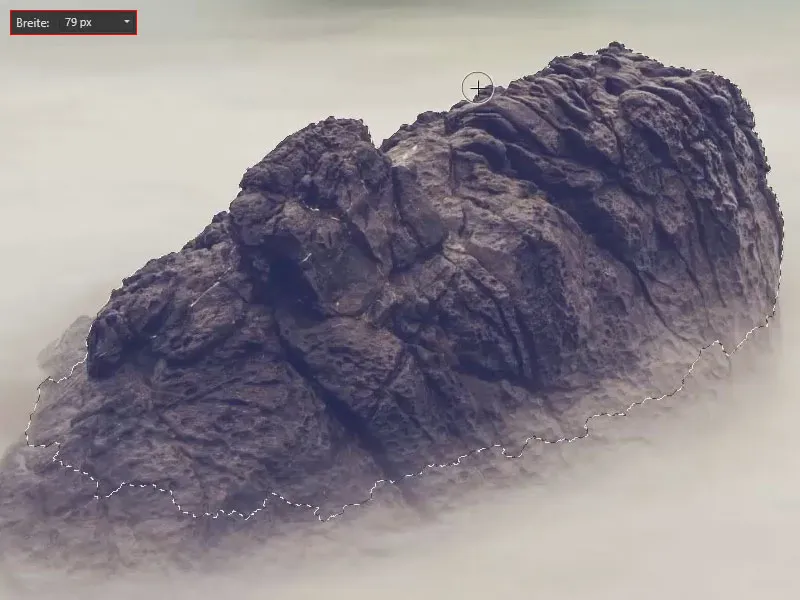
I select the other areas with a larger selection brush. You can later use a mask to retouch out too much of the selected area.
Creating a mask
I can create a mask based on the selection. To do this, I click on the background layer (1) and select the mask icon (2). To cancel the selection, press Ctrl+D. The rock has now been masked.
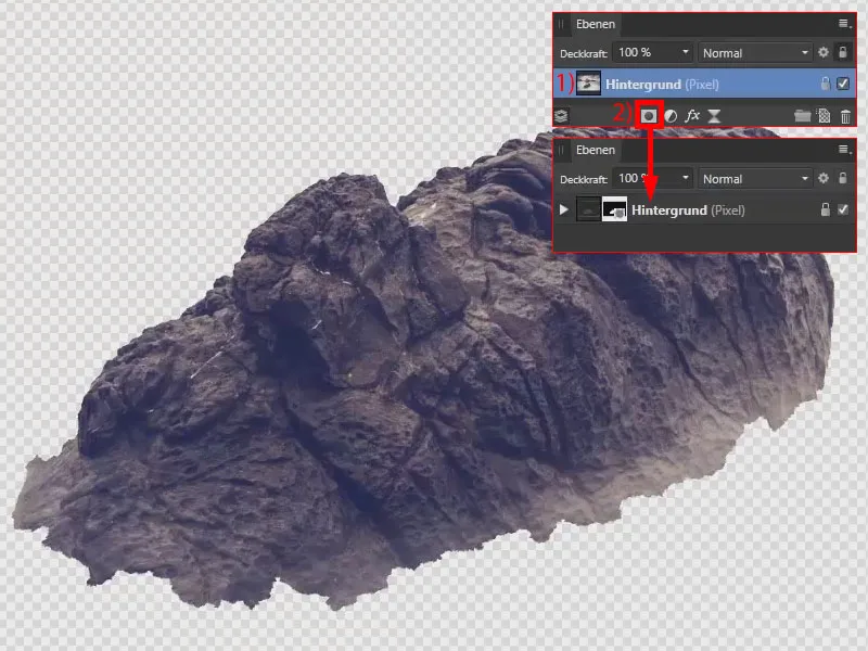
Check and touch up the edges of the selection with a color layer
Using Layer>New fill layer (1), I create a color layer in blue (2). I drag the layer all the way down (3). This makes it easier to see whether the edges have been selected correctly (4).
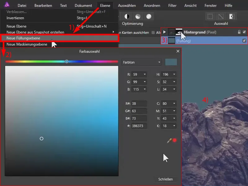
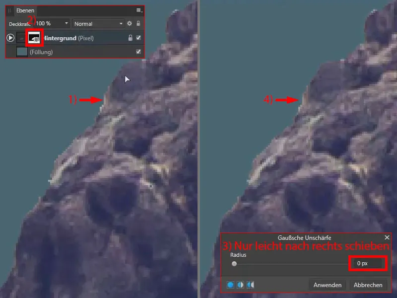
At the moment, they appear very hard. This means that we have no anti-aliasing here, but unsightly staircase effects (1) . We can correct this by selecting the mask (2) and going to Blur and Gaussian Blur under Filter. This softens the mask a little - not the image, which remains unaffected.
Without blurring, the edge is hard. If I increase the radius just a little (3), the value even remains at 0 px, but the edge is slightly softened (4) . I confirm this with Apply.
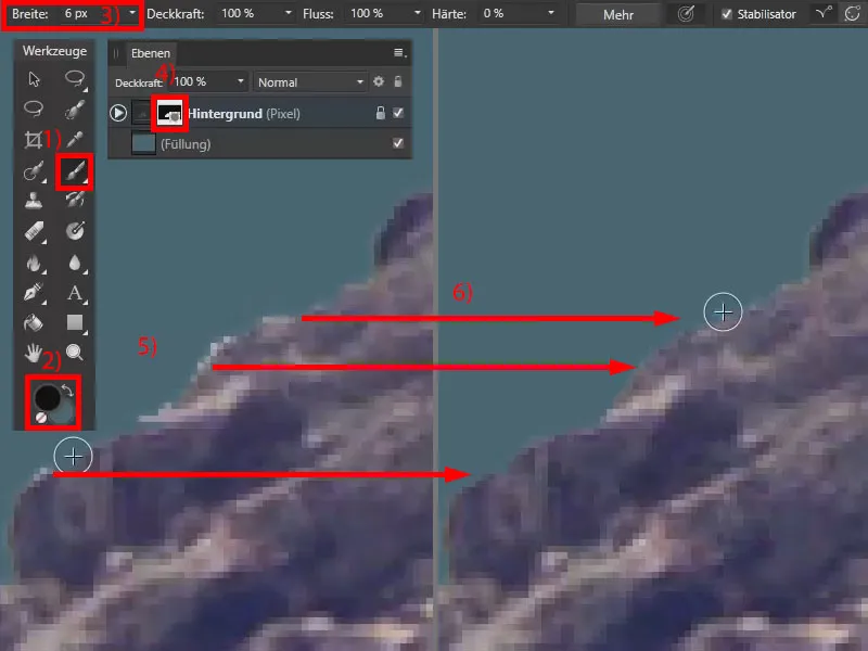
You can use the paint brush tool(1), black foreground color (2) and a smaller width (3) to optimize the edges . I am on the mask (4) and paint with black. Where there are bright flashes at the edges (5), I paint them away (6).
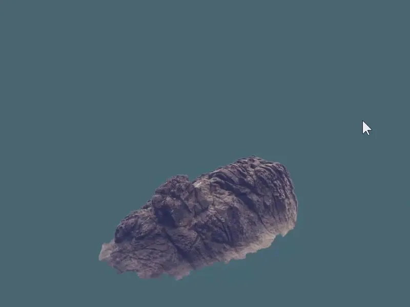
You can achieve good results with the selection brush. You can still optimize this manually with the painting brush. The more time you invest, the more detailed you work, the better the results.
Rasterize to save memory space
In a previous tutorial, I showed you how to crop an object using a mask and then place only the object itself, without the mask, in another document. This is a destructive step, but if you know that you don't want to edit the object further using the mask, it saves storage space and possibly also computing power, depending on how many layers you end up using.
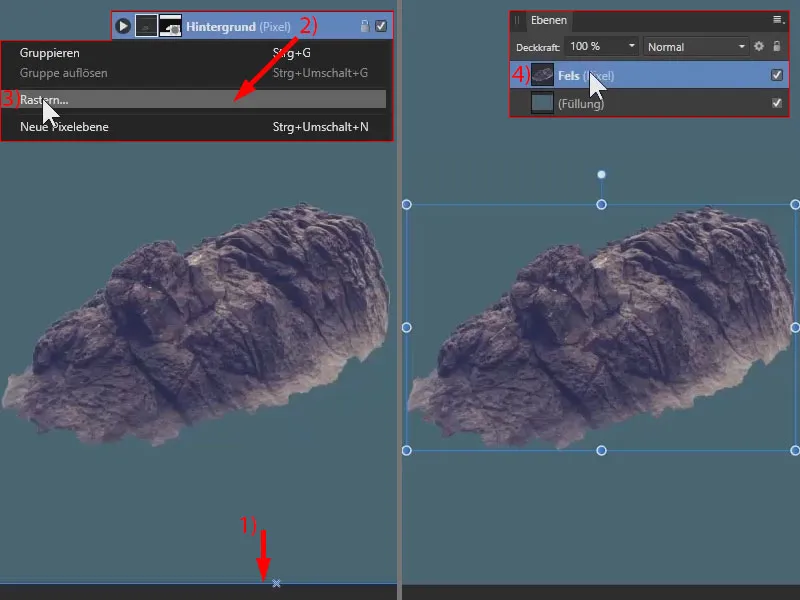
Using this selection frame (1), we can see that we are still working with the entire image - not just the rock. The rest of the image is still there, but is currently hidden. However, we only want to work with the rock.
There is a function called Rasterize. With the right mouse button, I click on the layer of the rock (2) and select Rasterize... (3). The mask has been applied in this way, the rest of the image has completely disappeared and we now only have the selected rock on the layer.
I rename the layer to "Rock" (4). Now I copy the rock with Ctrl+C.
Inserting the rock as a new background element
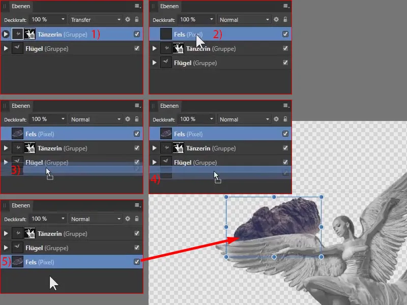
I switch to the other image and paste the rock using Ctrl+V. But be careful: once again, neither the layer nor the group is selected in the layer palette. It is important that you click on the topmost group or layer (1), for example, and then press Ctrl+V so that the rock is placed above it (2).
Of course, we want to move the rock to the very bottom, but there is also something to note: If you take this layer and drag it downwards, you will see the blue bars - at this point (3) I would place the rock in the "Wings" group, for example.
Therefore: Drag down a little more so that the blue bar takes up the entire width (4) and let go. The layer is now at the bottom (5).
Pay attention to the incidence of light on the image components
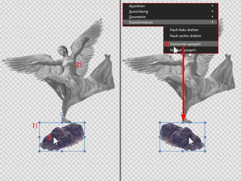
I zoom out of the picture and drag the rock downwards (1). I still have to mirror it, because here (2) we have the shadow on the right-hand side, here it is on the left-hand side (3). With the layer active, I click on the rock, select Transform and Mirror horizontally (4).
Align the rock
I can now enlarge the rock, scale it non-proportionally and rotate it until the angel is positioned on the rock as desired. I also pay attention to the edges of the image so that no transparent areas appear. And I want the rock to be reasonably straight.
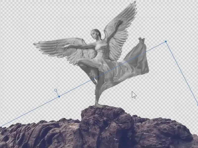
Now our angel has finally reached a rock-solid position!
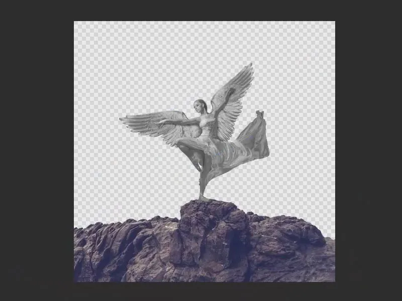
Cropping subjects with the selection brush - summary part 11
- If there is a high contrast between the subject and the background, you can use the selection brush to crop the image.
- Your shortcut for the selection brush: the W key .
- Once you have selected an area, you can undo it by holding down the Alt key.
- Tip: Place a colored area in the background to check the edges of your selection.
- Use the Gaussian blur to soften the edges if necessary.
- If necessary, use the paintbrush to optimize the selection.
- Use the rasterize function to apply a mask to an image. Although this is destructive, it saves storage space, especially with larger composings.
- When placing new image elements in a composing, always pay attention to the incidence of light in all elements.
Part 12: Creating a glass sphere with Affinity Photo filters
Simply magical - but by no means magic! Marco Kolditz now grabs a spot of light and transforms it into a sphere with a few skillful clicks. How does it finally become a glass sphere? It's actually quite simple - as is so often the case, you just have to know.
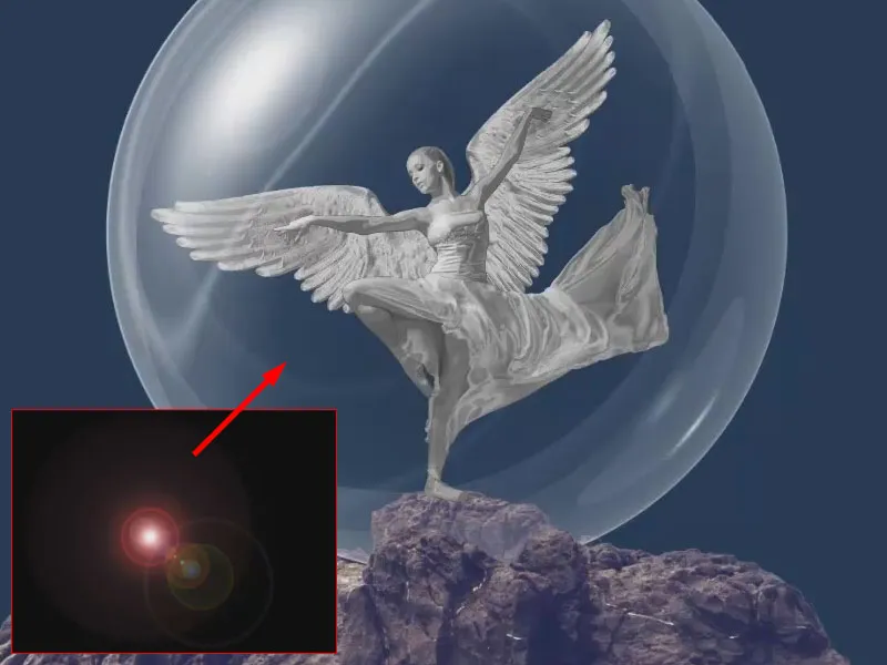
This is what you'll learn in part 12 of the Affinity Photo tutorial
- How to create a glass sphere from an aperture spot
- How to incorporate the glass sphere into the compositing
- Using special filters like Polar in Cartesian
An aperture spot as a starting point for the glass sphere
Now let's create the snow globe. To do this, I created an image with aperture spots. Unfortunately, Affinity Photo (version 1.6) does not offer a function to generate such aperture spots by default. I created this with Photoshop, where there is a simple render filter to generate such flare spots.
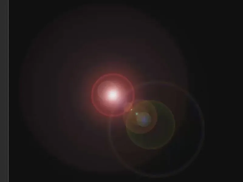
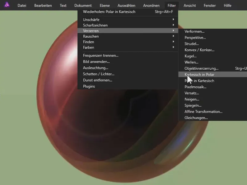
The image lies on a plane. We use a filter under Distort>Polar in Cartesian. We already have this interesting result:
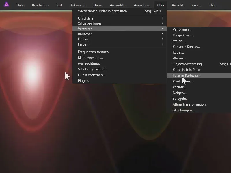
We mirror this: With the layer activated, click on the image and select Transform>Flip Vertical.
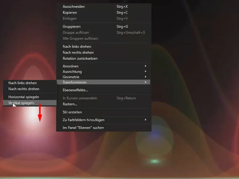
Now select the Cartesian point in Polar under Filters and Distort. We now have this effect:
From the colorful to the black and white sphere
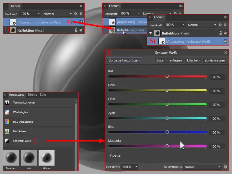
This really does look like a glass sphere, although it is still colored at the moment. I rename the layer to "Reflection" (1). I also display the sphere in black and white by selecting the black and white adjustment(2). I leave the parameters as they are (3).
I drag the layer with the black and white adjustment into the "Reflection" layer (4) so that the black and white adjustment only affects this layer (5).
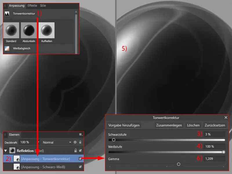
Now I adjust the contrast : To do this, I select a tonal value correction. This is also located directly in the "Reflection" layer (2), as I had previously selected the black and white layer within the "Reflection" layer. I darken the dark areas slightly (3). I leave the light areas as they are (4), otherwise the white would be washed out, as you can see (5). I increase the gamma value(6).
We have now prepared the sphere.
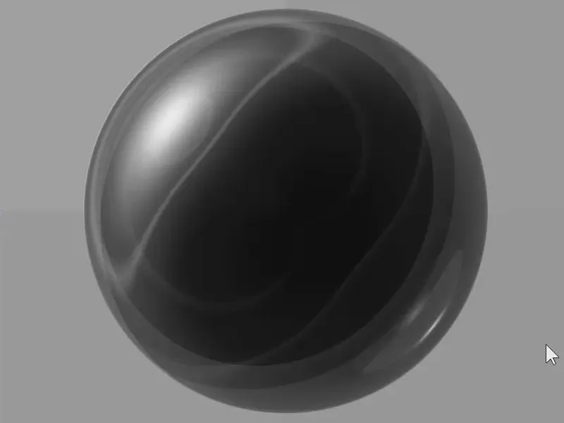
Creating a mask for the sphere
Remove the background. To do this, we create a selection. I would normally use the selection frame - ellipse tool. This allows you to simply draw a circle while holding down the Shift key. I would like to be able to move this selection while drawing it. In Photoshop, this would be possible by holding down the space bar. Unfortunately, this is not possible with Affinity Photo (version 1.6).
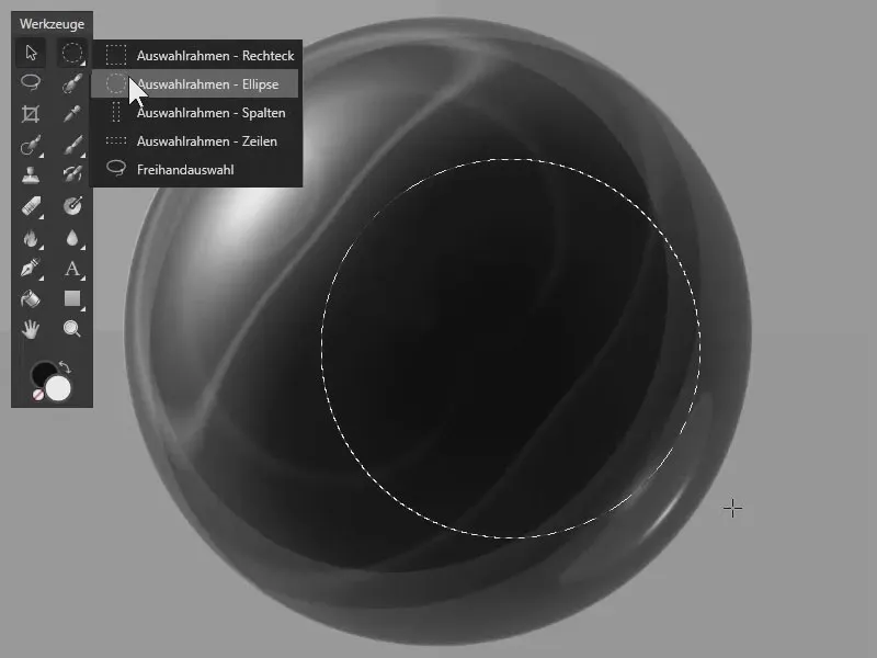
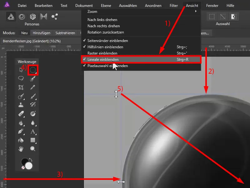
That's why I display the rulers via View>Show Rulers (1). By clicking on a ruler, I can drag out an auxiliary line, which I place at the top edge of the sphere (2). I do the same on the left edge of the sphere (3).
Now I draw a circle with the Selection - Ellipse tool(4), starting at the intersection of the two guidelines (5). I also go slightly beyond the edge of the sphere so that we can see an edge later.
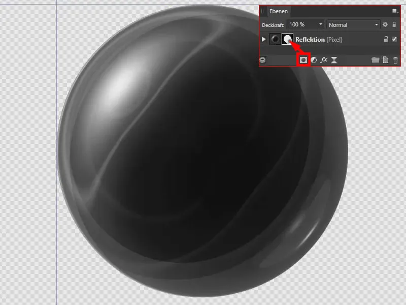
I create a mask by clicking on the mask symbol . I cancel the selection with Ctrl+D. We have already created the sphere.
Placing the sphere in the image
I have abbreviated the following steps as they are editing steps that we have already carried out. Our rock is at the bottom. Behind the ball is our Christmas angel. I have placed the ball and the mask at the top.
Now I want to create a piece of the rock at the bottom in front of the sphere.
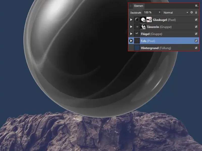
I have two masks here : on the one hand, the mask in the shape of a circle (1). On the other hand, a mask where I have masked the area of the rock at the bottom that I ultimately want to see (2).
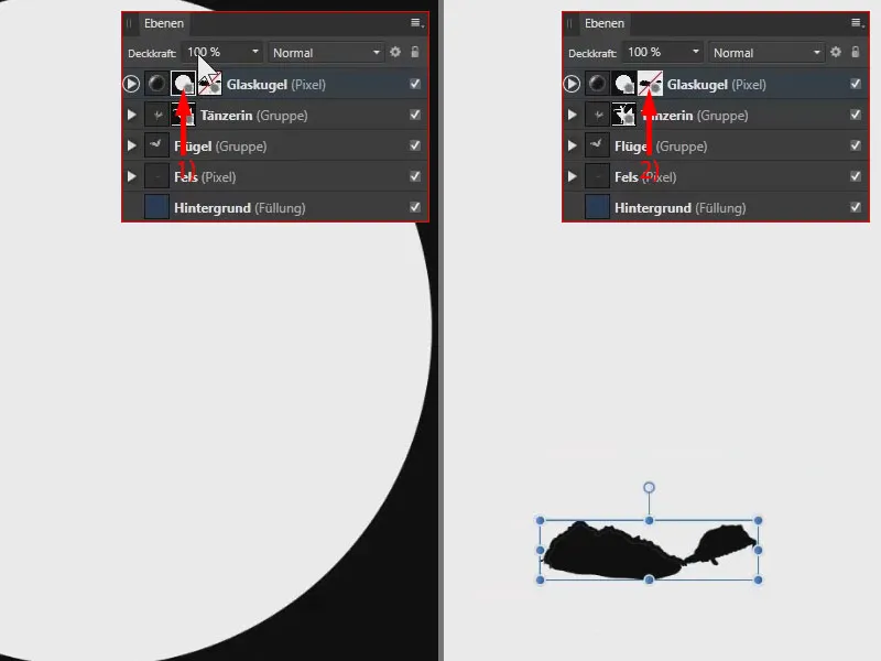
The mask is not active (1). I hold down the Shift keyand click on the mask to make it active (2).
A second mask like this is very easy to create: I delete it briefly. If I now select this layer (3) and click on the mask symbol again (4), I have another mask on which we can mask the rock again, for example.
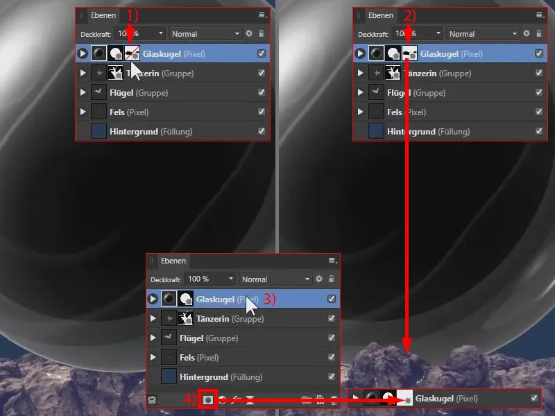
Give us the glass sphere!
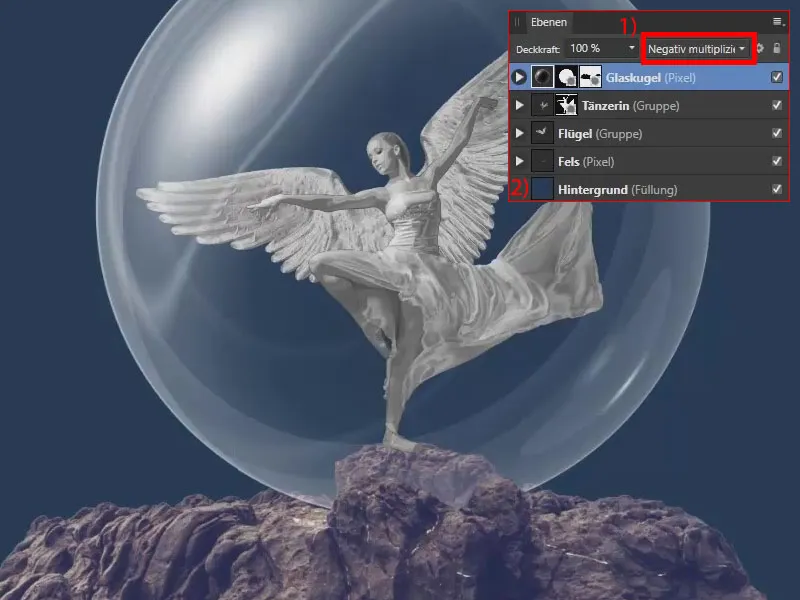
I'll now change the layer blending mode for the glass sphere layer. I select Multiply negative (1). This creates this beautiful glass effect . So that we can see the effect better, I have also created a fill layer with the blue color at the bottom of the layer palette via Layer (2).
Creating a glass sphere in Affinity Photo - Summary Part 12
- Use the image of a generated aperture spot and the Polar in Cartesian filter , a vertical reflection and the Cartesian in Polar filter to create a spherical shape with reflection.
- Use a black and white adjustment and tone correction to adjust the sphere in terms of color and contrast.
- Use the Multiply negative blend mode to transform the sphere into a glass ball.
- When placing new image elements in a composing, always pay attention to which other image components are in front of and behind the new image elements.
> To the previous parts 9 and 10 of the tutorial
The contents of parts 11-12/14 are based on a video tutorial by our trainer Marco Kolditz:
