Becoming aware of the customer journey
What is the customer journey? Where does it begin?
An experience that happens in this or a similar form thousands of times around the world every day: You are looking for a tiler to decorate your bathroom. Friends recommend a tiler by name and you search for him online without finding a website or the actual contact details. The trust you've built up through word of mouth can quickly be used up if your need for information isn't met ... so you're already pretty much at the beginning of the customer journey.
The customer journey describes the path or journey of your target customer before - i.e. from the first interaction - they decide to show the desired behavior (purchase/booking/contact, ...) ... or cancel it. And the customer journey also includes the steps after the desired behavior in terms of usage and loyalty.
Definition: What is a customer journey?
The customer journey describes the entire process that a customer goes through, from the first contact with a product, brand or service through to the purchase and possibly beyond to repeat purchases or brand loyalty. It is a conceptual representation of the different stages a customer goes through during their interaction with a company, including awareness, research, evaluation, purchase decision, purchase and post-sales support. The customer journey is often analyzed and optimized to improve the customer experience and increase customer satisfaction.
Touchpoints on the customer journey
According to the magazine t3n in December 2019, a customer goes through 11 pieces of content before making a purchase decision ... whether vertically with a company in a customer journey or horizontally via competitors' offers remains open. In 2005, Edgar K. Geffroy wrote in his book "The only thing that bothers you is the customer: clienting replaces marketing" that seven contacts are sufficient. This means that more and more touchpoints between customers and the brand are needed before a purchase decision is made. Today, more than 11 touchpoints may already be necessary.
The UX design of a website should address the needs of the target customer and present solutions to satisfy those needs. The customer journey helps to identify the weak points of your own website (e.g. misleading call to action, misleading navigation, missing content, ...) and improve the user experience. The customer journey does not have to end when your user shows the desired behavior, but can go beyond the purchase, for example, by highlighting the thank you page, highlighting opportunities to subscribe to the newsletter and to rate or placing cross-selling offers.
So you need to know for an optimal user experience on the customer journey:
- who your target customer is (buying persona, value and emotion system)
- what problem they have
- what your solution looks like
- what touchpoints they have (all of them!) on their journey to finding a solution
- where does the target customer enter your website, where does he leave again
- what do they feel when they come into contact with your brand and your solution
- what different (information) needs they feel at each touchpoint in the customer journey
For example, a target customer looking for an online search engine optimization tool can do research on Google, ask their friends on Facebook and watch a few product experience reports on YouTube. They are presented with several offers that they like and then take advantage of the free trial of three selected tools. Both on your own website and on social channels, the points of contact must be considered in brand perception and communication. At the beginning, the target customer is primarily concerned with solving their problem. At the end of the customer journey - shortly before completing the order - they are concerned with the security and trustworthiness of the provider. At this point, it is also important to know whether the user is also the decision-maker on the purchase. The content must be prepared accordingly so that the user can very easily lead the decision-maker in their company to complete the purchase. For example, we make it easy for users who are not decision-makers themselves and provide them with a pre-formulated text for the decision-maker (see below on this page: our Convince-your-boss template).
Visual creation of a customer journey
A customer journey can be created manually or digitally. Based on the insights into the business model and the user group that have been gathered, the individual steps that the end user uses (and can also walk/choose) are recorded as a travel timetable.
Information about the origin of visitors can be obtained using analytics tools such as Google Analytics. The customer journey map can be an important tool for UX designers to identify and discuss problems.
Typically, a customer journey map comprises several steps or phases that can occur during the course of the customer's interaction with your company. These steps can vary depending on the company, industry and specific context, but some common elements include
- Awareness: in this phase, the customer becomes aware of the company, product or service. This can happen through various channels such as advertising, social media, word of mouth or search engines.
- Consideration: The customer begins to examine and evaluate the company's offer in more detail. They may research, read reviews, compare different options and evaluate their benefits and value.
- Decision: In this phase, the customer makes a purchase decision. They select the product or service that best meets their needs. This can be influenced by various factors such as price, quality, brand image and customer service.
- Acquisition or purchase: The customer completes the purchase and acquires the product or service.
- Service or post-purchase experience: After the purchase, the customer journey continues. The customer uses the product or service and evaluates their experience with it. This includes aspects such as user-friendliness, quality, customer service and fulfillment of expectations.
- Loyalty or endorsement: If the customer is satisfied with their experience, they can become an endorser of the brand by recommending it to others, giving positive reviews or sharing them on social media platforms.
It becomes interesting later on when Google Analytics uses the conversion paths function to show other paths taken by users who actually trigger a conversion. These touchpoints should then be examined and certain shortcuts or detour incorporated if this helps to increase the conversion rate.
For example, it is a good idea to precisely map the possible and desired behaviors of the target group in all steps on the website. This provides clarity about the vertical touchpoints and makes it possible to design the content and UX design more precisely based on the needs of the target customer ... and to eliminate the current weak points. It must also be clear from the outset that the target behavior, i.e. the call-to-action, is clearly defined for each website and for each touchpoint.
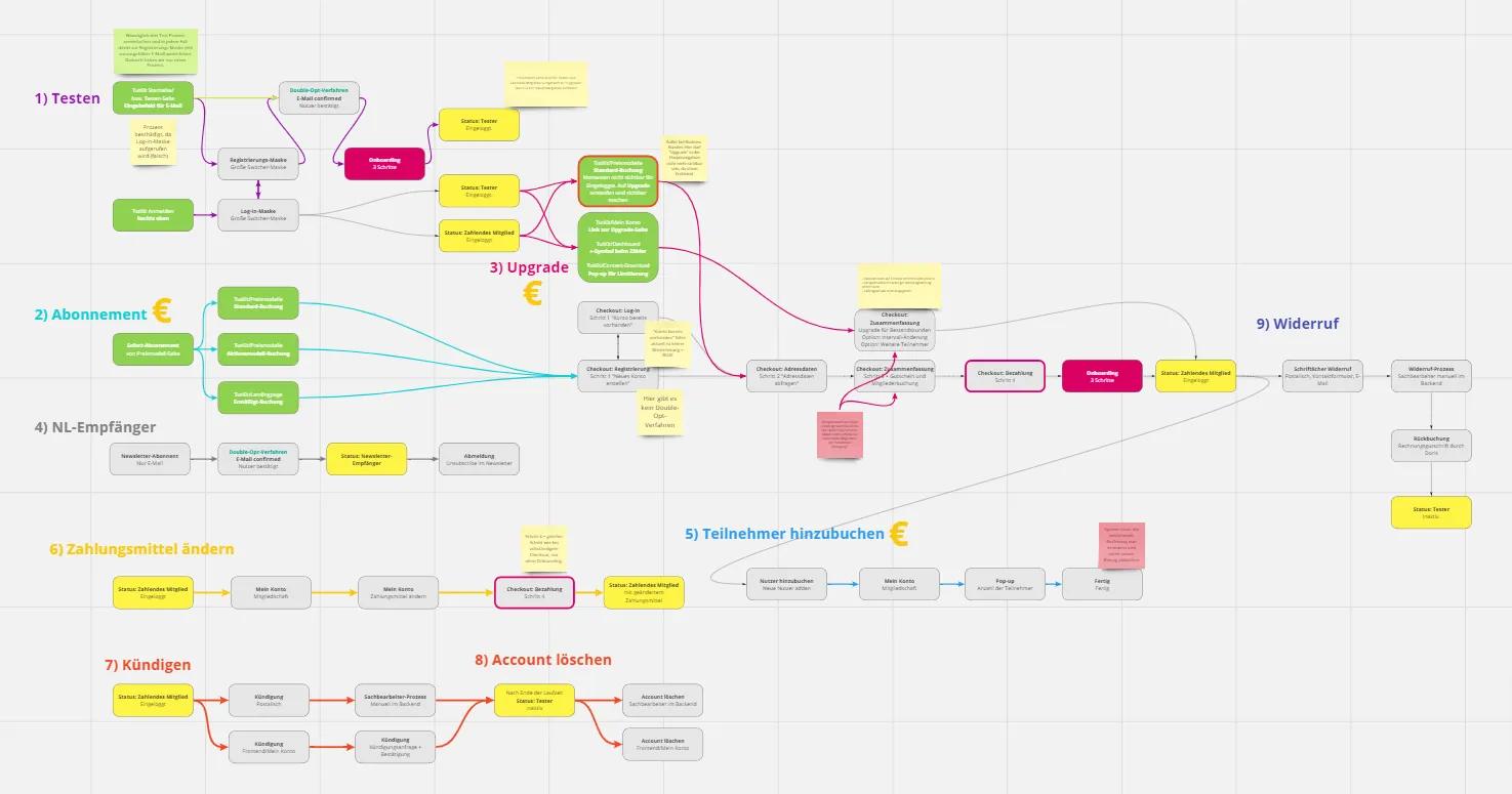
Here is an example of an internal, vertical customer journey as a mapping of how a target customer interacts on our website on the way to the desired behavior.

Nine processes are visible that a target customer, test customer and/or existing customer can go through with our TutKit.com service. We show the exact paths of movement. The test process on TutKit.com, which represents our important call-to-action to our subscription target groups who are not yet customers, was rolled out in detail as an example with all touchpoints and how we continue to "support the test customer in terms of content" on the way to the final conversion.
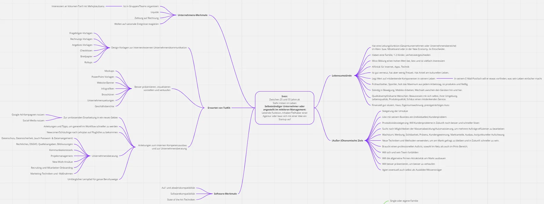
The content of the document is even closely linked to the buying persona - i.e. the fictitious representative of our target groups. In the same document, we have defined our buying persona and visualized the customer journey:

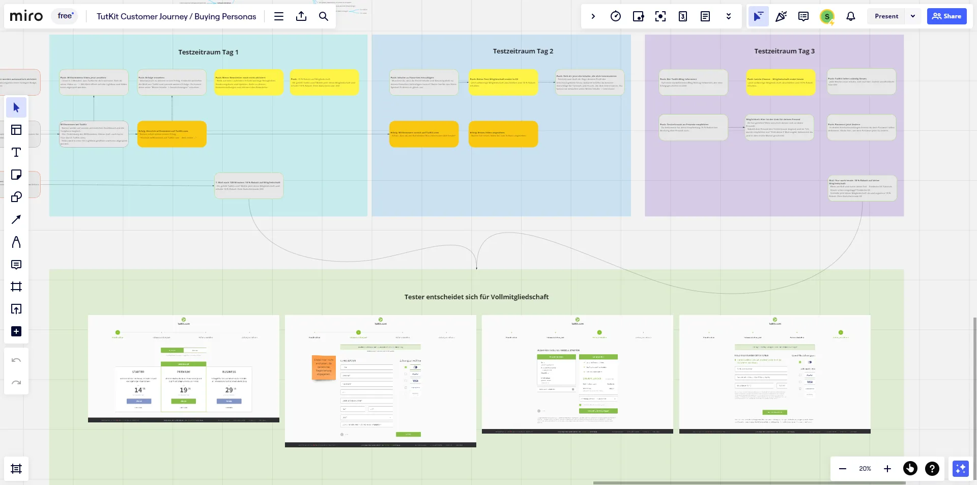
Here you can see a further example of ours from the sensitive order completion process , which experience has shown to have a relatively high abandonment rate in the e-commerce and subscription commerce sector. We have discussed each step of the customer journey in detail from a user experience perspective and defined what we consider to be an optimal approach as an XD design, in which the user is guided to the conversion without distractions and in a targeted manner.

Especially at the beginning of the work on a customer journey, it is worth learning to understand your own users even better. User research methods offer potential. These can include surveys, interviews, on-site observations, focus groups, click tracking and heat maps, etc. The findings are helpful in all optimization steps because they help to understand how users actually act, think and feel.
The customer journey starts where the target group is currently located.
Matthias Petri
In live mode, it is advisable to further improve the user experience, for example by using A-B tests to make small changes (e.g. contact details with a photo of the contact person and once without) when completing the order in order to further reduce the abandonment rate and thus increase the conversion rate. The customer journey is not static. It changes with the behavior of our target group, changing situations due to the emergence of new competitors, etc. The customer journey should therefore be regularly reviewed using analysis tools and conversion paths. It may be that the target group "moves on", at least at touchpoints outside your own website. While they used to exchange information in forums, they may use Facebook groups today and completely different platforms tomorrow. So the customer journey starts where the target group is - be aware of this. And if it is then picked up there via specialist articles, podcasts, videos, advertisements, search hits, etc., it goes through the conversion path on your own site, which is continuously optimized with the help of A-B tests.
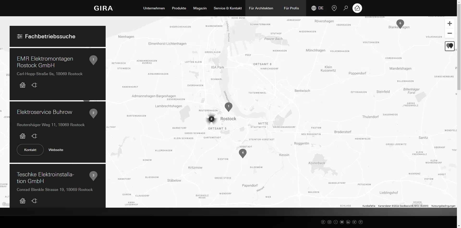
Another example where the customer journey reveals problems very early on: if I'm looking for a specialist partner for a particular provider and they don't offer me the right information to give me the overview I want, it can be a competitive disadvantage ... or a competitive advantage if you've done your homework. Here's an example from Gira. Gira is a German electrical engineering and smart home equipment company. It works with many electricians and offers a map with a filter function on its website to find a regional specialist company that is familiar with Gira technology. If I search for a specialist company in the northern German city of Rostock, the first entry has no contact details and no website. As a user, I then click through to the next entries, where the websites of the specialist companies are listed.
The company in the first entry naturally has a website. It is just not listed here on the manufacturer's website, which is careless and leads customers directly to the competition at the start of the customer journey.

The sooner errors are corrected, the less effort is required
Finally, I would like to give you a hint as to why it makes so much sense to take a planned approach to website design, especially when creating a customer journey: With every milestone in the project development , your effort and costs for changes in the processes increase. While troubleshooting only takes a few minutes during the planning phase, it can take as little as an hour in the conception phase, up to a day in the implementation phase and several days after the launch in a live project.
If you work as a UX designer, the following products from us may also help you in your processes:
From Matthias Petri
