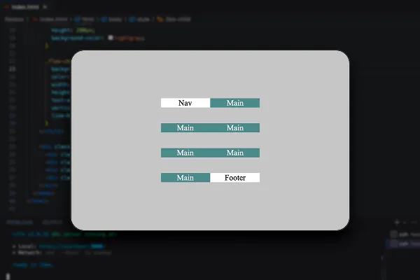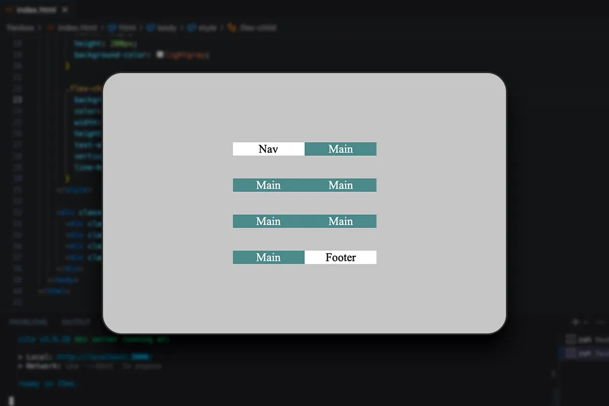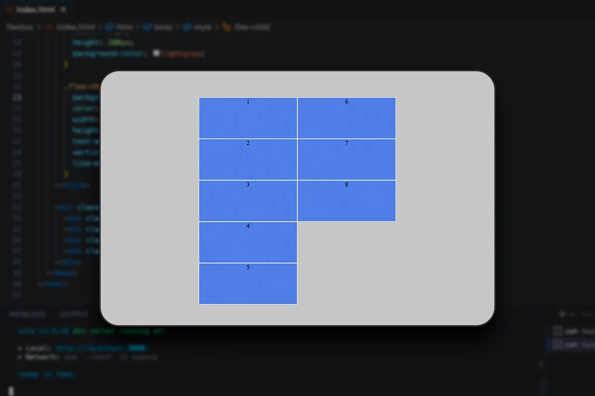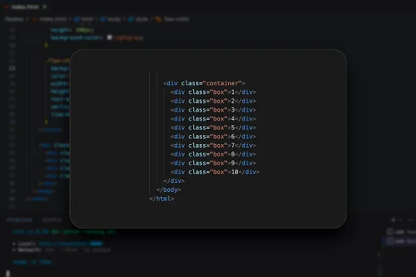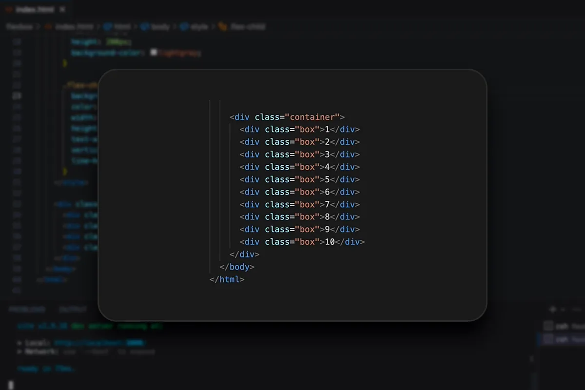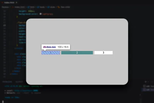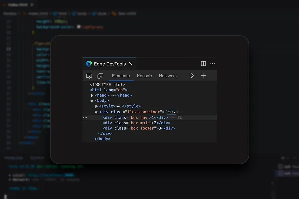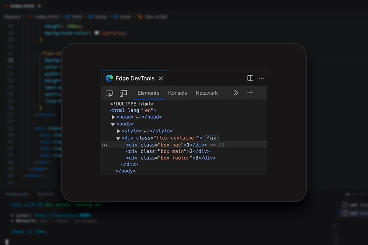
Flexbox in CSS & HTML (Tutorial) - develop responsive layouts
Do responsive layouts always cause you problems when developing websites and apps? Change that with Flexbox layouts! Stephan Haewß uses theory, practical exercises and concrete examples to explain how to use Flexbox in CSS and HTML correctly and for different layouts. The modern solution for flexible desktop and mobile views of your pages!
- How to develop responsive layouts with Flexbox in CSS and HTML
- Explained step by step: basics, arrangement, alignment, spacing and sequences
- Specific examples of typical layouts such as centering and nested layouts
- Learn & understand: with practical exercises including exercise materials
- Ideal for web developers, web designers and front-end developers
- A 3-hour intensive course on Flexbox by developer and trainer Stephan Haewß
Start the tutorial and expand your HTML and CSS knowledge with everything you need to know about Flexbox.
- content:
3 h Video training
- Licence: private and commercial Rights of use
- Bonus: including working material
Intro to the tutorial
Introduction
Flexbox Layout – Basics
Examples of layouts with Flexbox
Conclusion
Details of the content
Flexbox in CSS and HTML - and your pages and apps adapt accordingly
Whether desktop, tablet or smartphone ... websites and apps need to adapt to different display sizes . In CSS and HTML, you can do this relatively easily with the help of Flexbox, even with more difficult layouts.
If you haven't heard of Flexbox yet or would like to finally get to know Flexbox in detail, then start this three-hour tutorial by developer Stephan Haewß right away. Your trainer will start with the basics and combine theory and practical exercises with concrete examples throughout the course. By the end of the course, you will be able to develop modern and responsive websites and apps using Flexbox in CSS and HTML .
Flexbox explained - from the basics to exercises and specific examples
To kick off the tutorial, you will first learn what Flexbox is, how it works and what you can use it for. After setting up the initial project, you will learn step by step how to use Flexbox for different layouts.
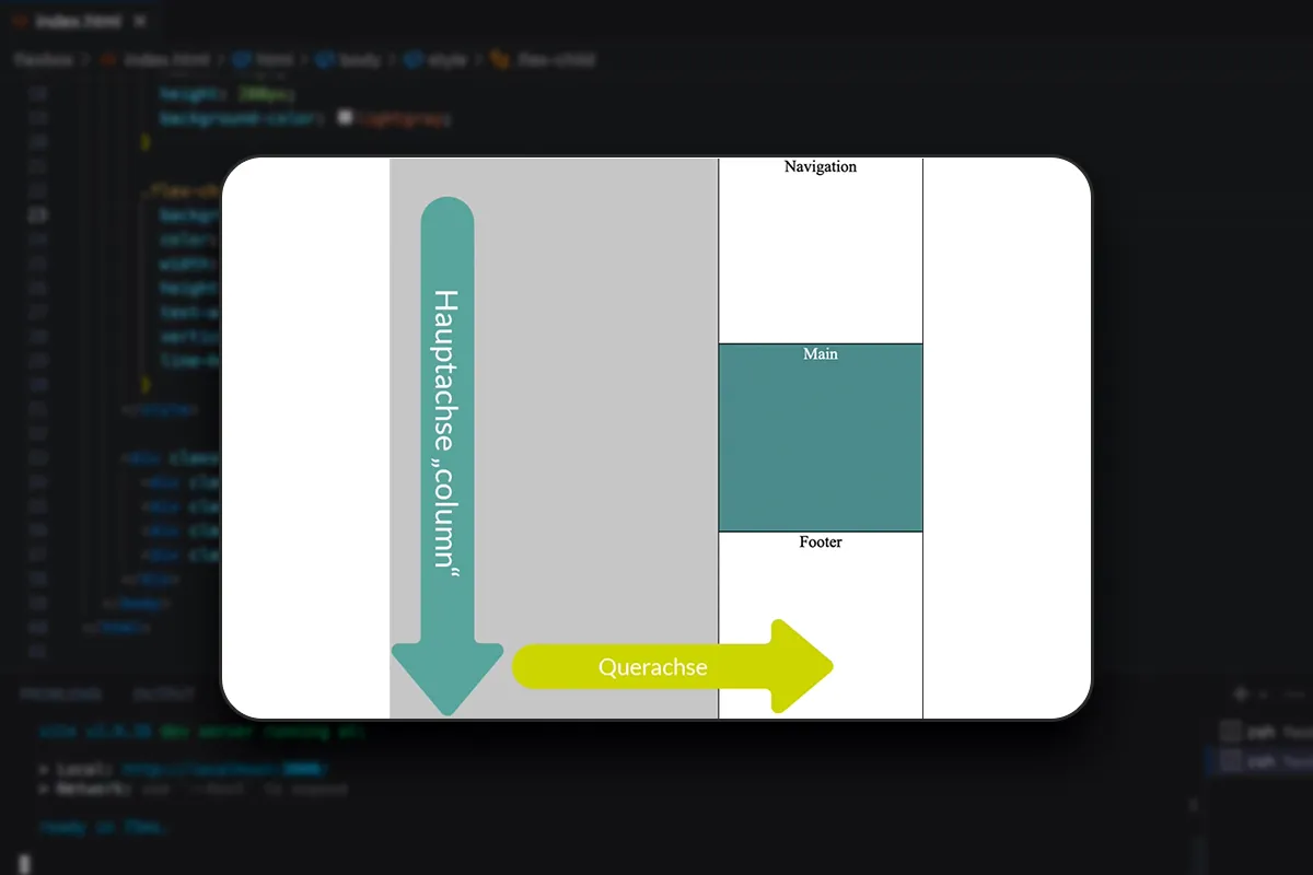
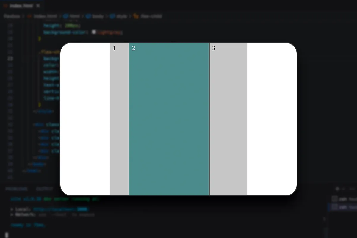
What do you need to consider when aligning? How do you control size increase and reduction? How do you ensure correct breaks and the correct sorting of your elements? Your trainer will teach you all this and more in a comprehensive basics section.
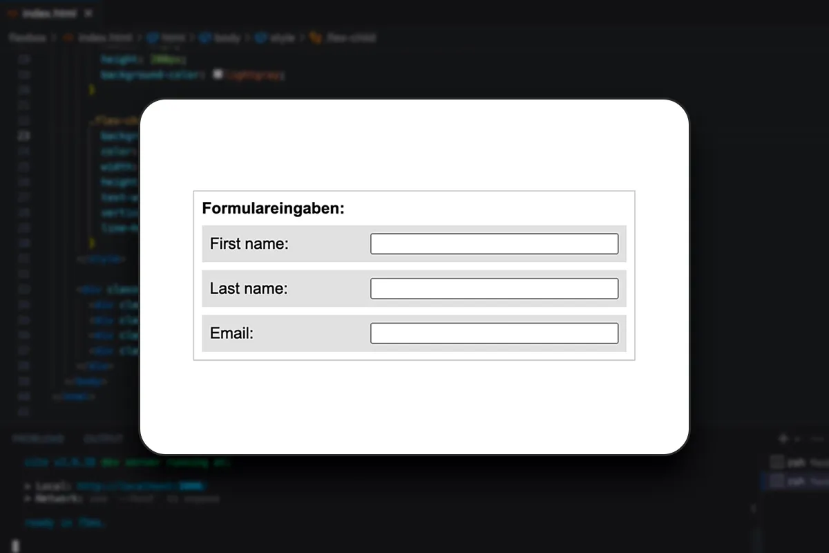
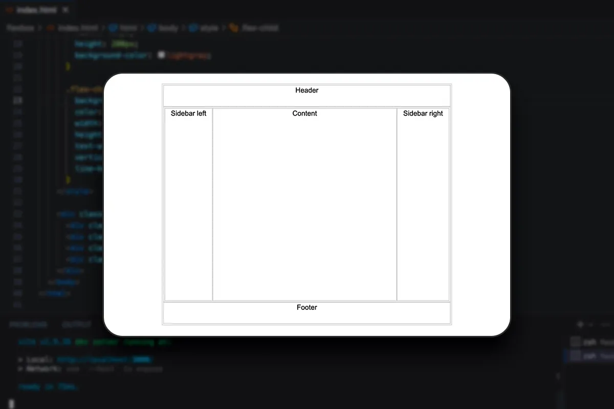
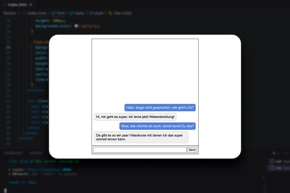
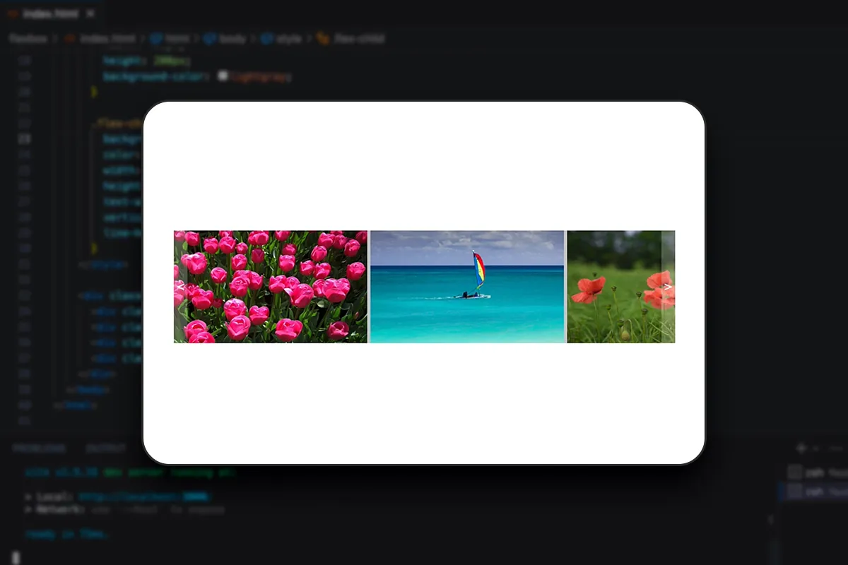
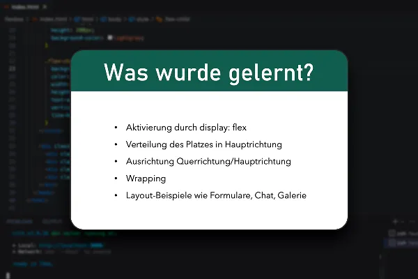
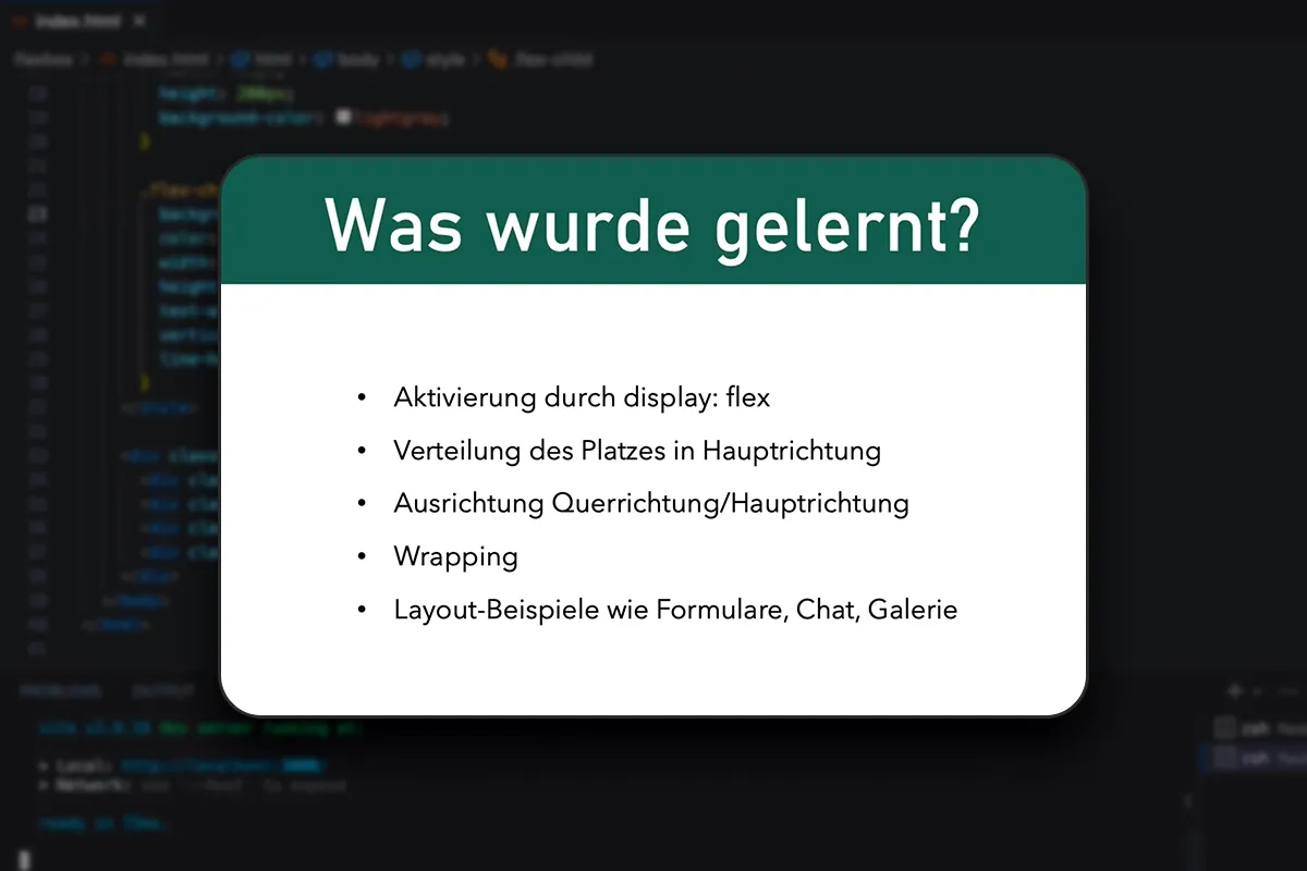
He then uses examples such as centering, form input, chats and a gallery layout to show you how you can use Flexbox for your purposes in typical use cases . In between, you can practice and deepen what you have learned using exercises - exercise materials are included.
What is Flexbox?
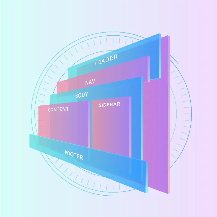
Flexbox is a layout model in CSS that makes it easier to create complex layouts and organize elements within a container element. Flexbox allows you to flexibly control the size, order and alignment of elements, regardless of their original order in the HTML document. A powerful technique for developing modern, flexible and dynamic user interfaces!
Who is the tutorial suitable for?
To follow the tutorial, you should already have some knowledge of CSS and HTML. You will expand or deepen your programming skills in relation to the creation of responsive websites and apps . The course is therefore particularly aimed at web and frontend developers and web designers. Take a look at the tutorial if you have not yet been able to achieve satisfactory responsiveness with CSS and HTML. Flexbox makes it a lot easier!
Other users are also interested
For error-free, fast websites with optimized layouts

Step by step to your own functional forms

Develop websites and apps yourself
Write your own lines!

How your websites & apps speak like ChatGPT
All important modules explained!

VPN basics & setting up your own VPN
All relevant features explained in detail

