Excel tutorial: Pivot, charts and table design for clear data presentation
Turn Excel tables into clear visualizations. The result: Your analyses are easier to handle because you can read relevant information more easily. Third parties will also find their way around more quickly thanks to your skillful presentation using clear chart and table designs. René Fürst shows you how to use conditional formatting or pivot tables, for example, in this three-hour tutorial on Excel.
- Over 3-hour Excel tutorial for the clear and informative preparation of data
- Pivot table in Excel: How to keep an overview at all times, even with large amounts of data
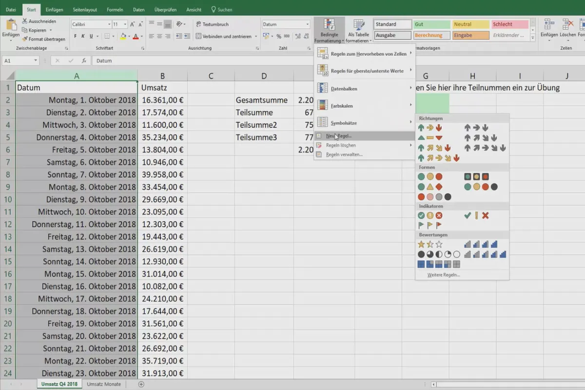
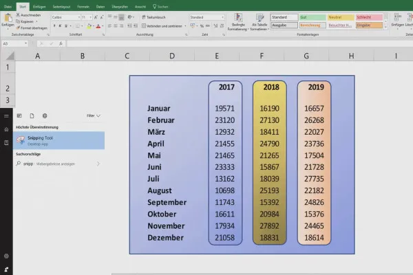
- Table design: Use functions such as conditional formatting for a better overview
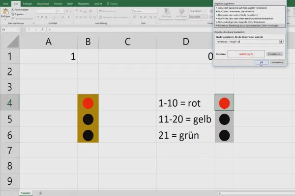
- Excel presentation: Create, for example, a traffic light that switches at different values
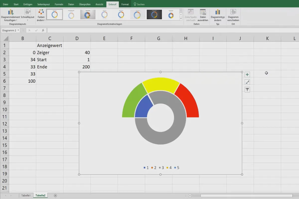
- Excel charts: How to set up an informative speedometer chart, among other things
- Many more tips and tricks for working efficiently with Microsoft Excel
All your data can be so beautifully presented and therefore even more informative! Give your tables a design boost with this Excel tutorial - for a better overview and clarity.
- Usable with:
- content:
3 h Video training
- Licence: private and commercial Rights of use
- Bonus: including working material
Intro
Evaluations and data overview
Presentation and print
Pivot 1x1
Tips & Tricks for faster working
Details of the content
Table design, data presentation & clear Excel charts
Have you ever tried in vain to read an Excel table you hastily created last year? Do others not want to make sense of your charts at all or only after a detailed explanation? Or are you wondering how you can prepare vast amounts of data in such an elegant way that the essentials catch the eye? In all these cases, the solution is Reduction and design. In this Excel tutorial , your trainer René Fürst has put together some effective methods for doing just that.
The contents of the Excel tutorial: pivot, charts, visualization and presentation
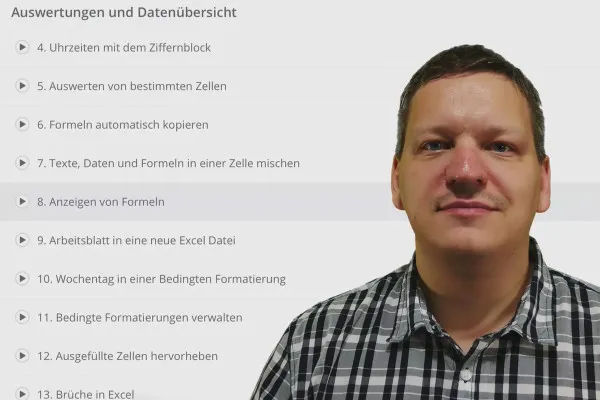
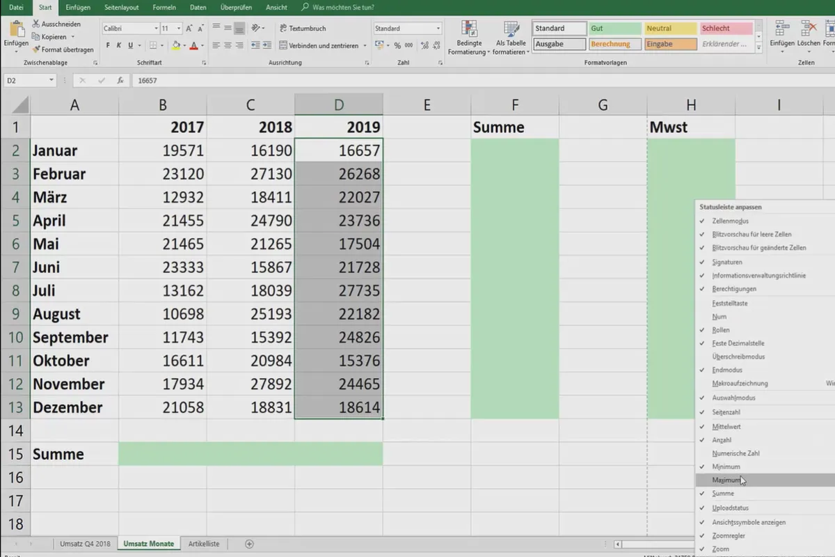
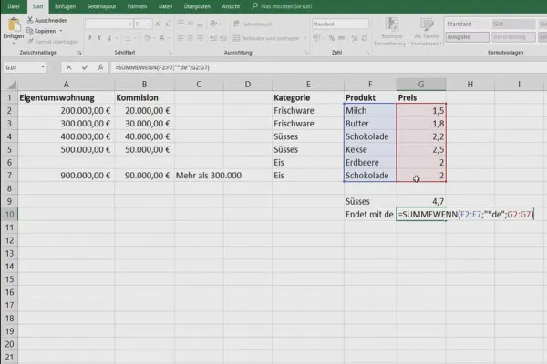
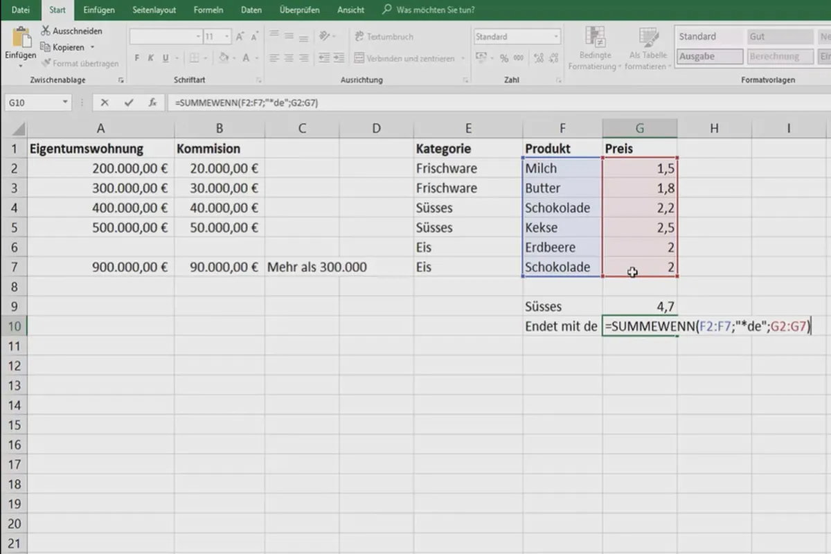
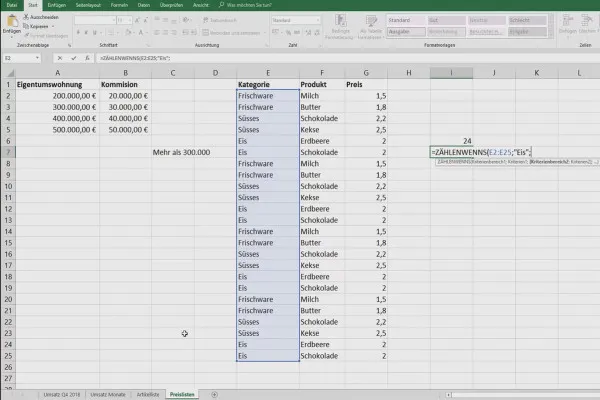
The Excel tutorial, which lasts over three hours , is divided into 44 lessons. Go step by step through the chapters "Evaluations and data overview", "Presentation and printing", "Pivot 1×1" and "Tips and tricks to work faster" to get to know Microsoft Excel even better. The following topics will be covered, among others:
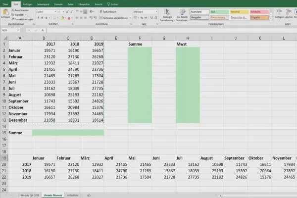
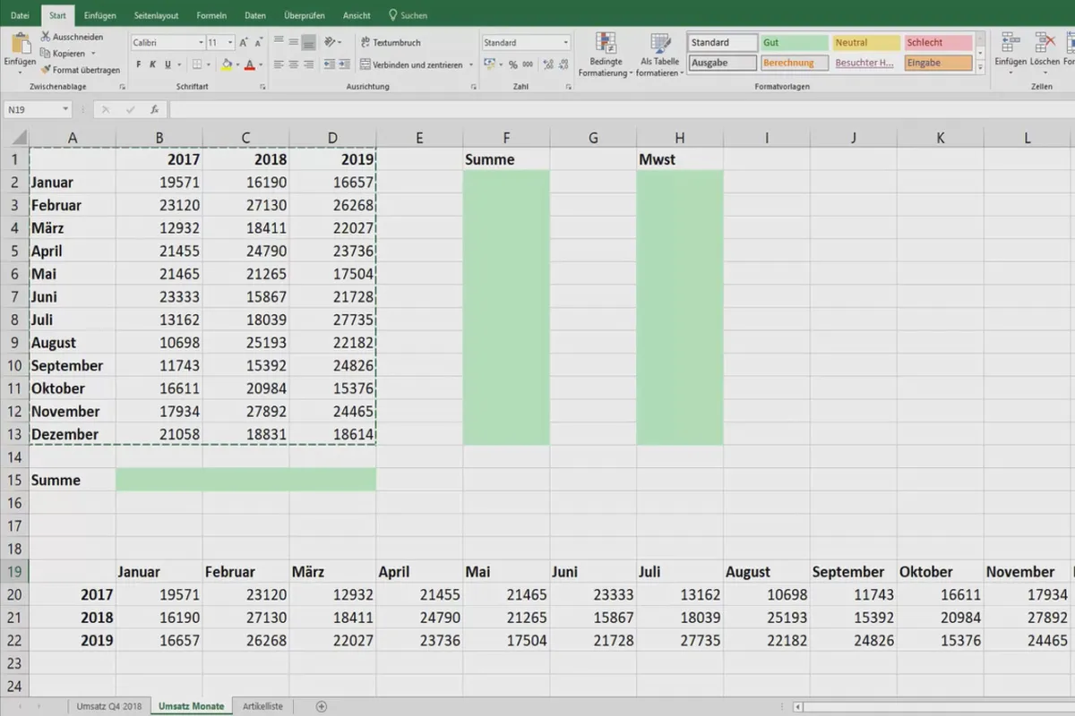
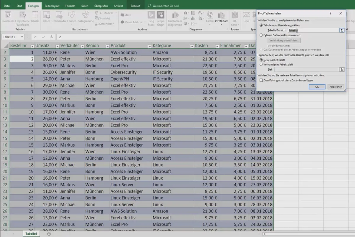
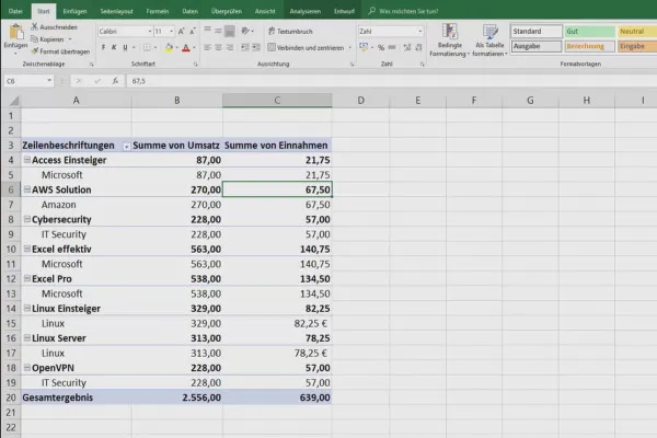
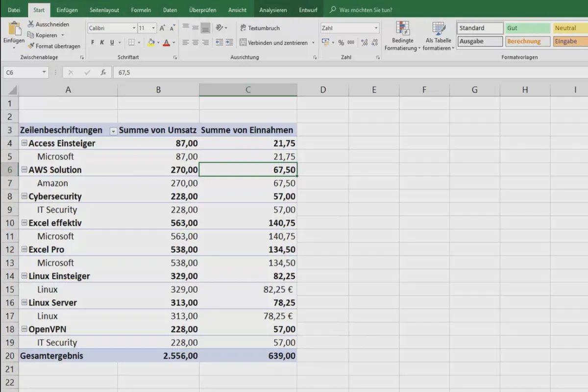
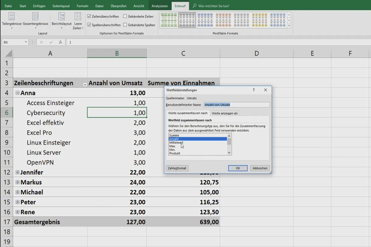
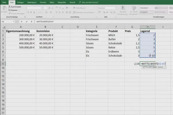
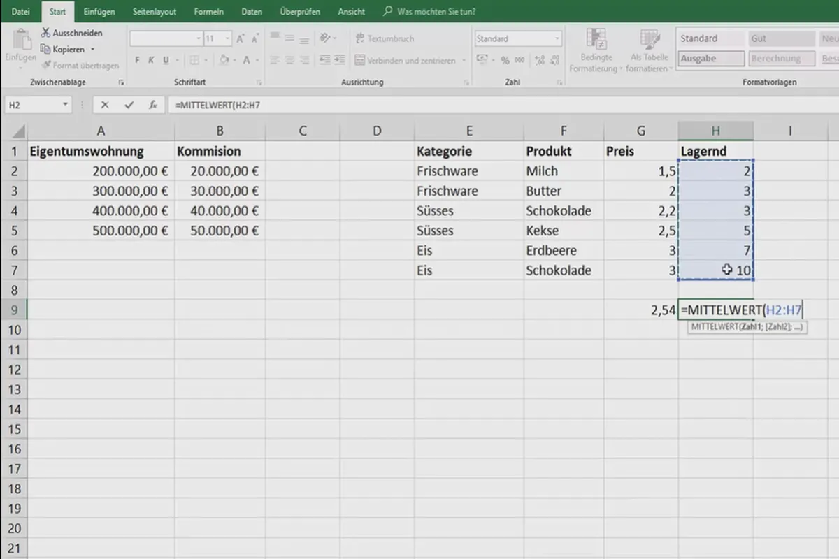
- Pivot table basics: How to analyze large amounts of data
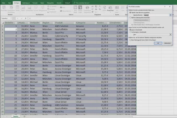
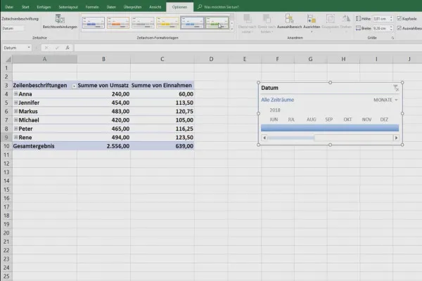
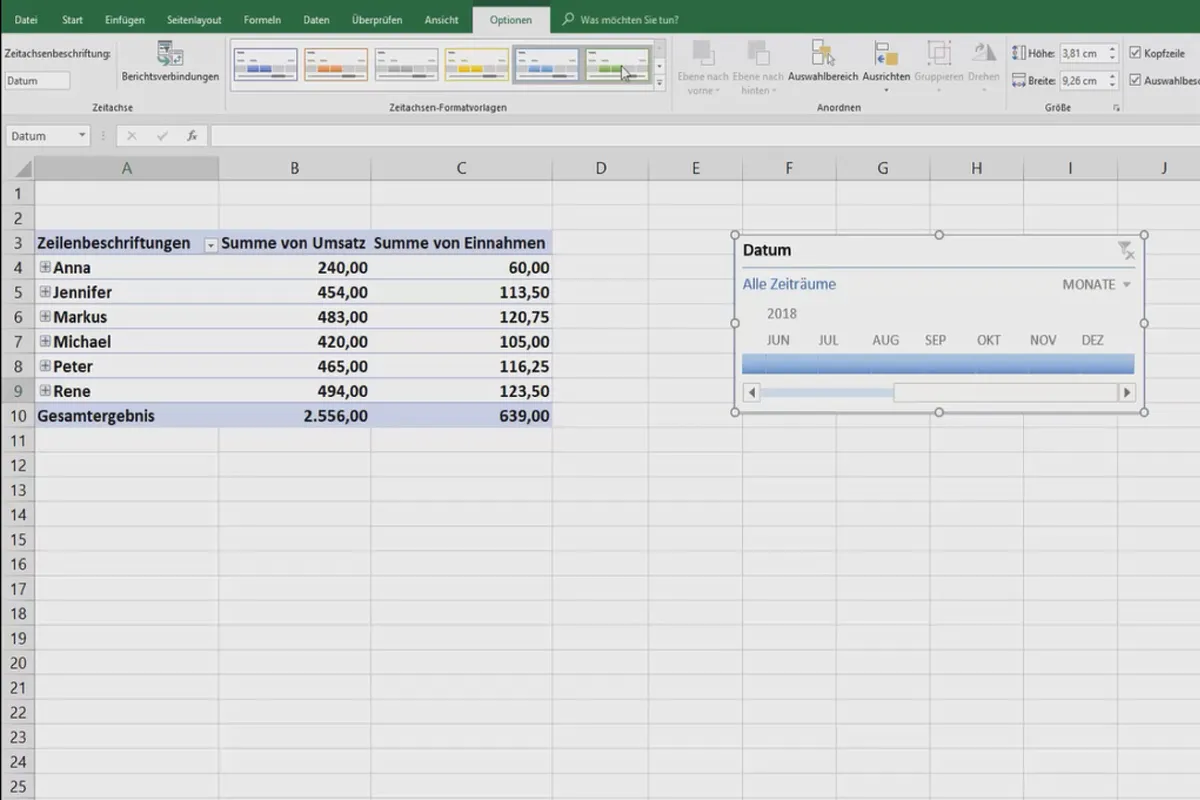
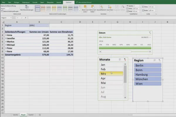
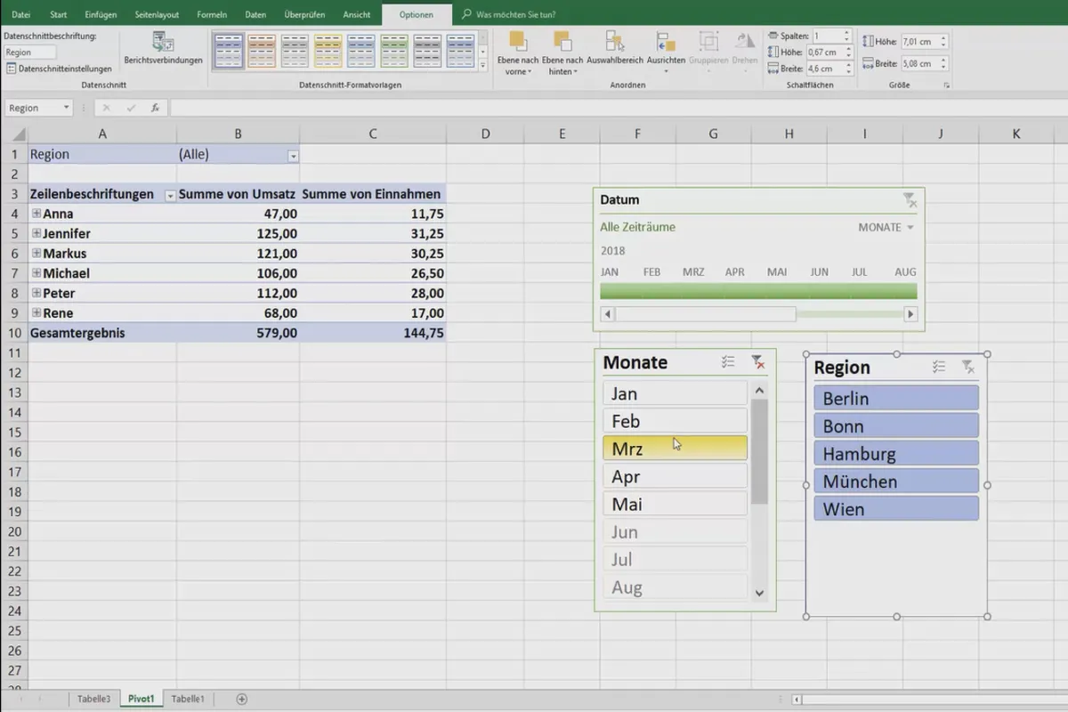
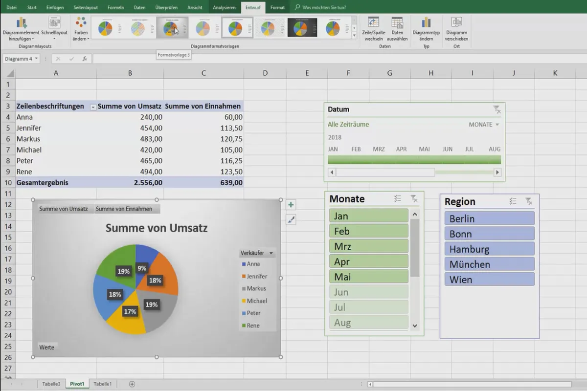
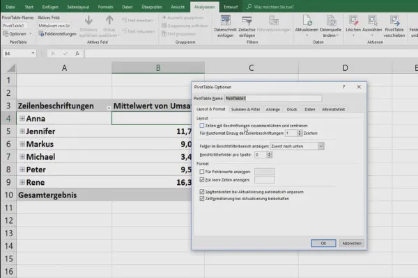
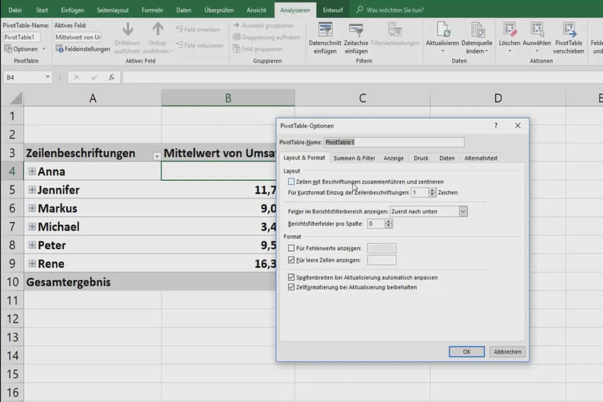
- Pivot tables in practice: creating timelines, using filters, charts and options
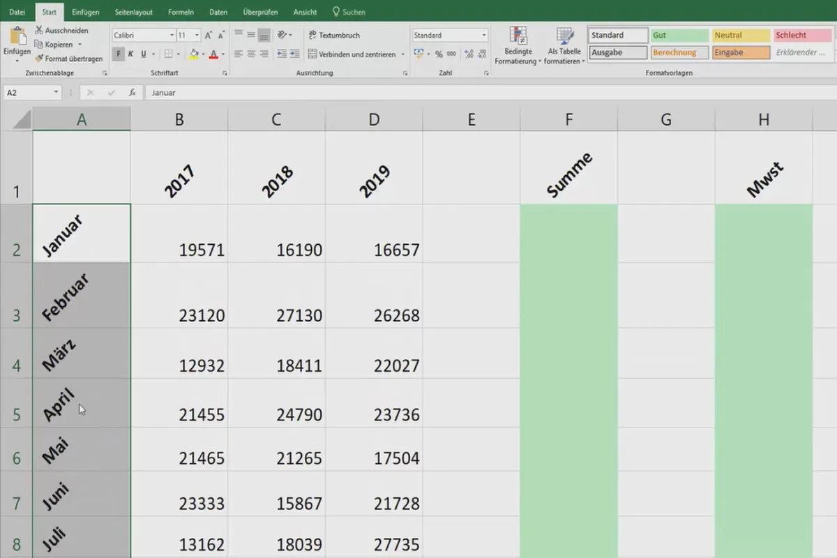
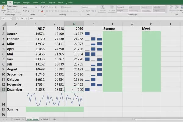
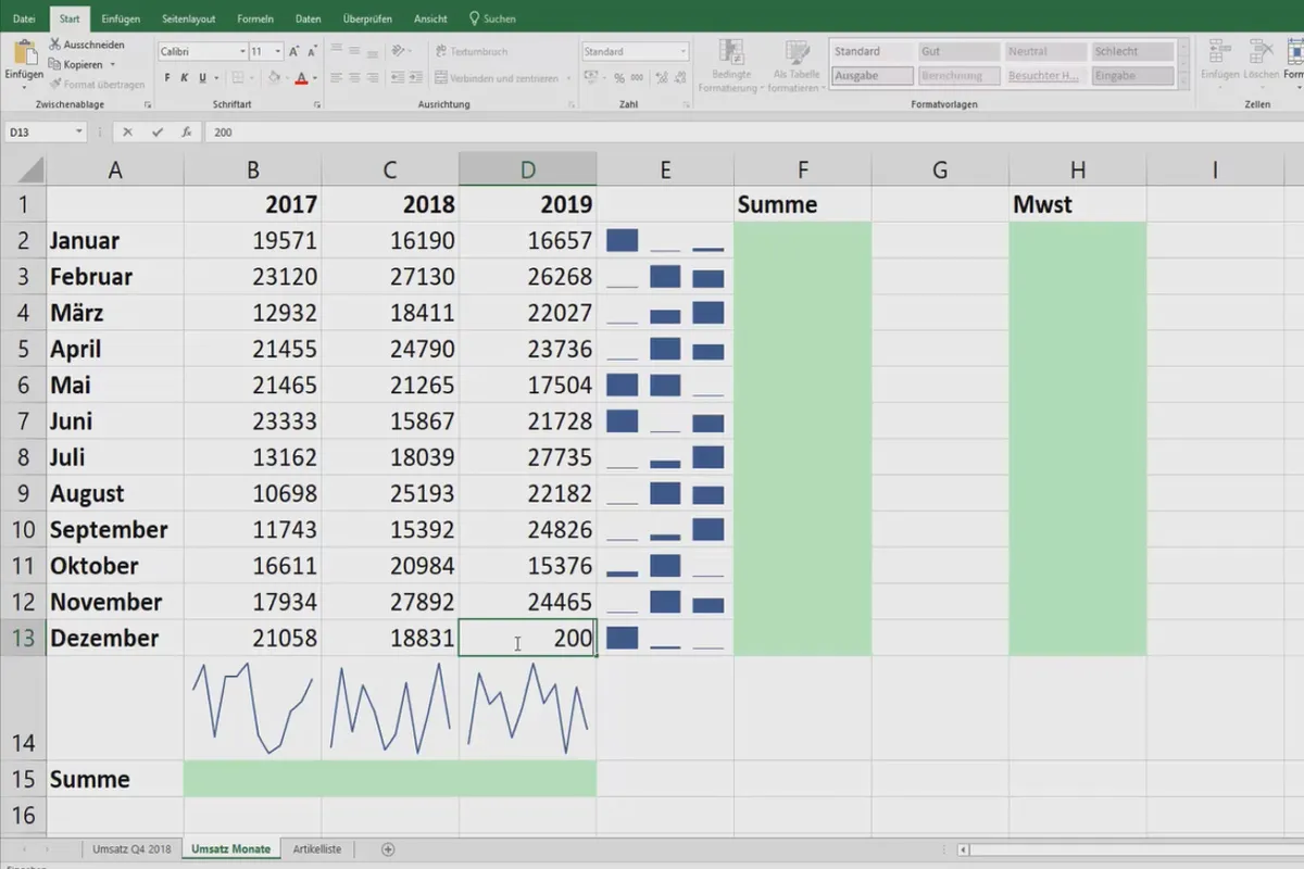
- Using sparklines - small, fine charts in an Excel cell
- Creating a speedometer chart - your data causes the speedometer needle to deflect
- Create traffic light function - the traffic light changes from red to orange or green depending on the value
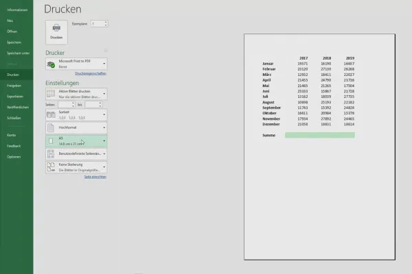
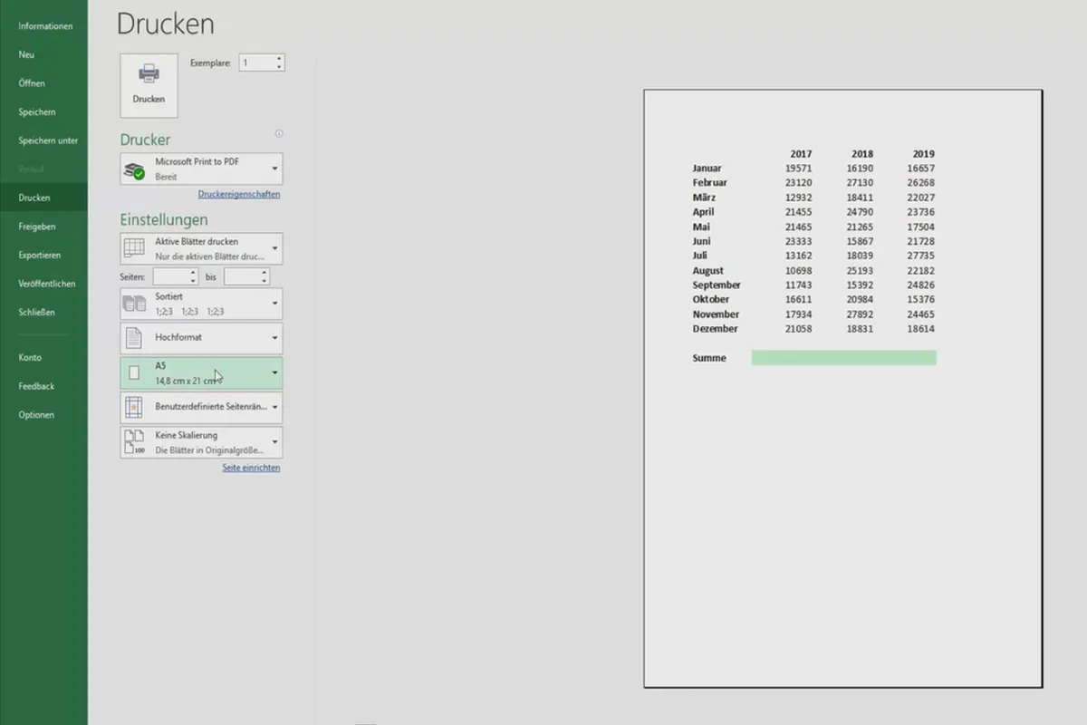
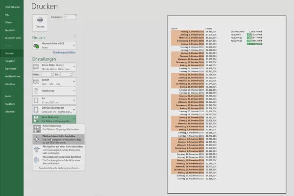
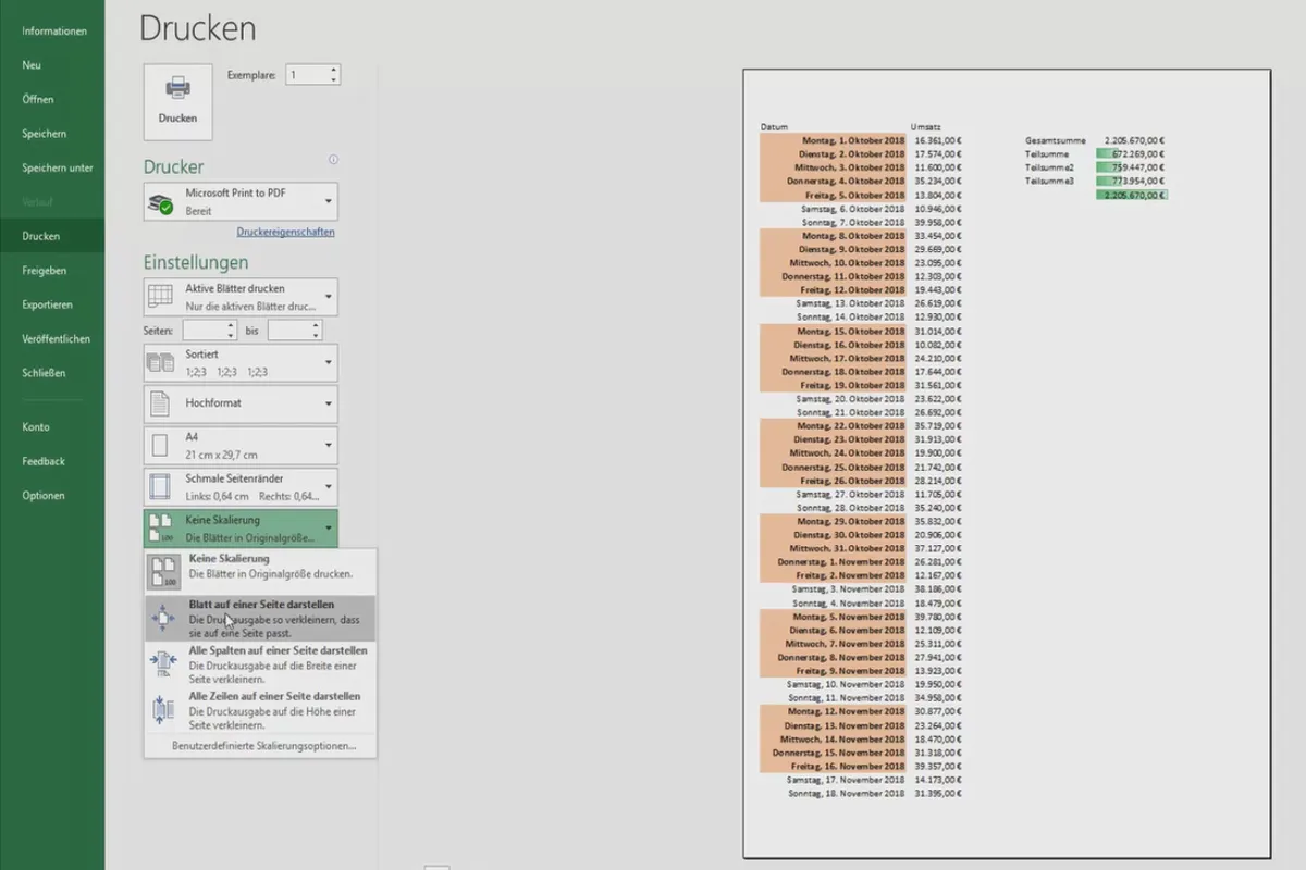
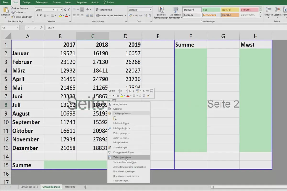
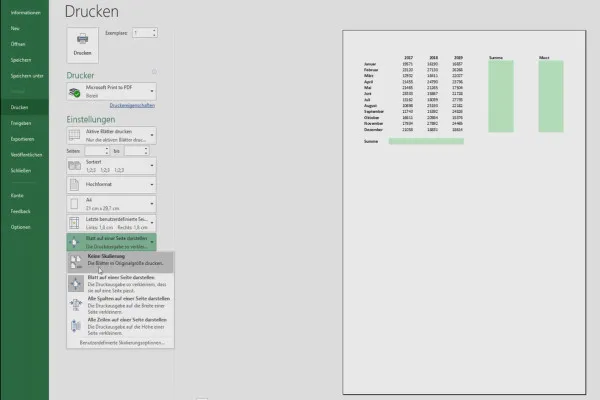
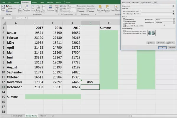
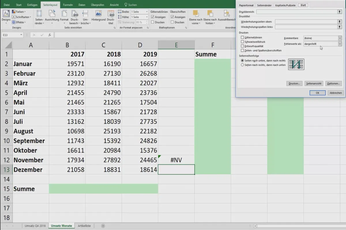
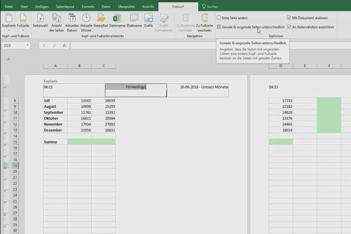
- Printing Excel tables: manual pagination, tables on one page and more
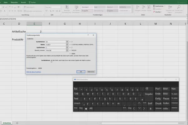
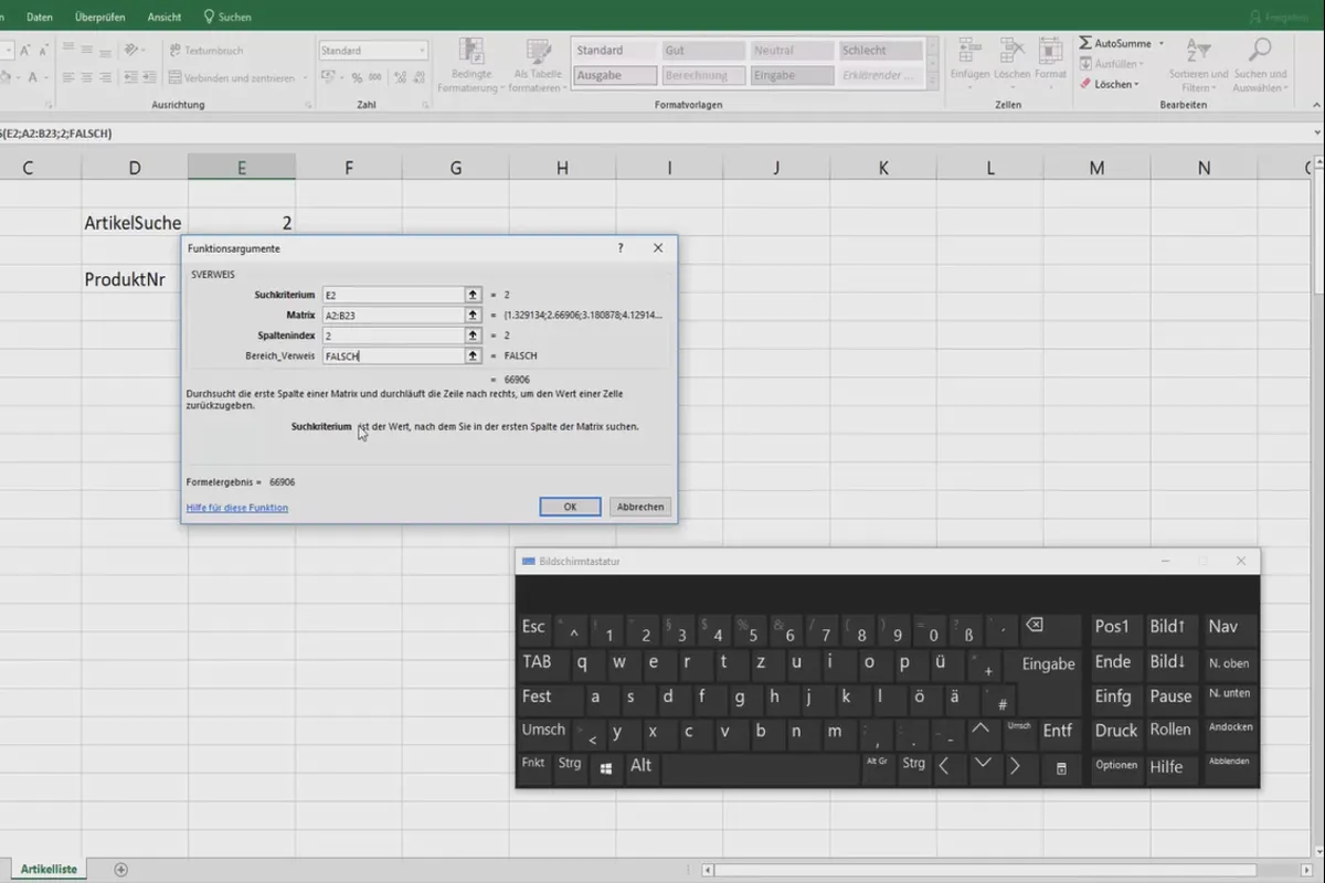
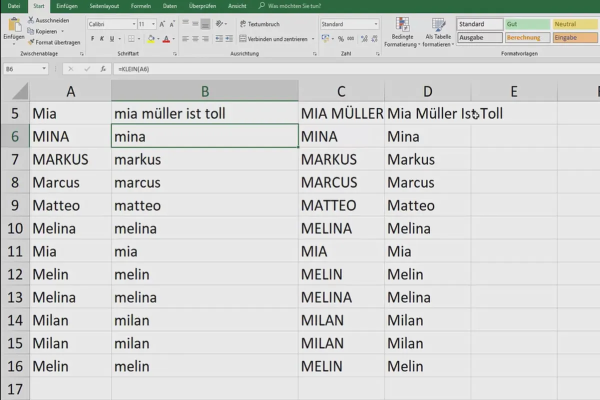
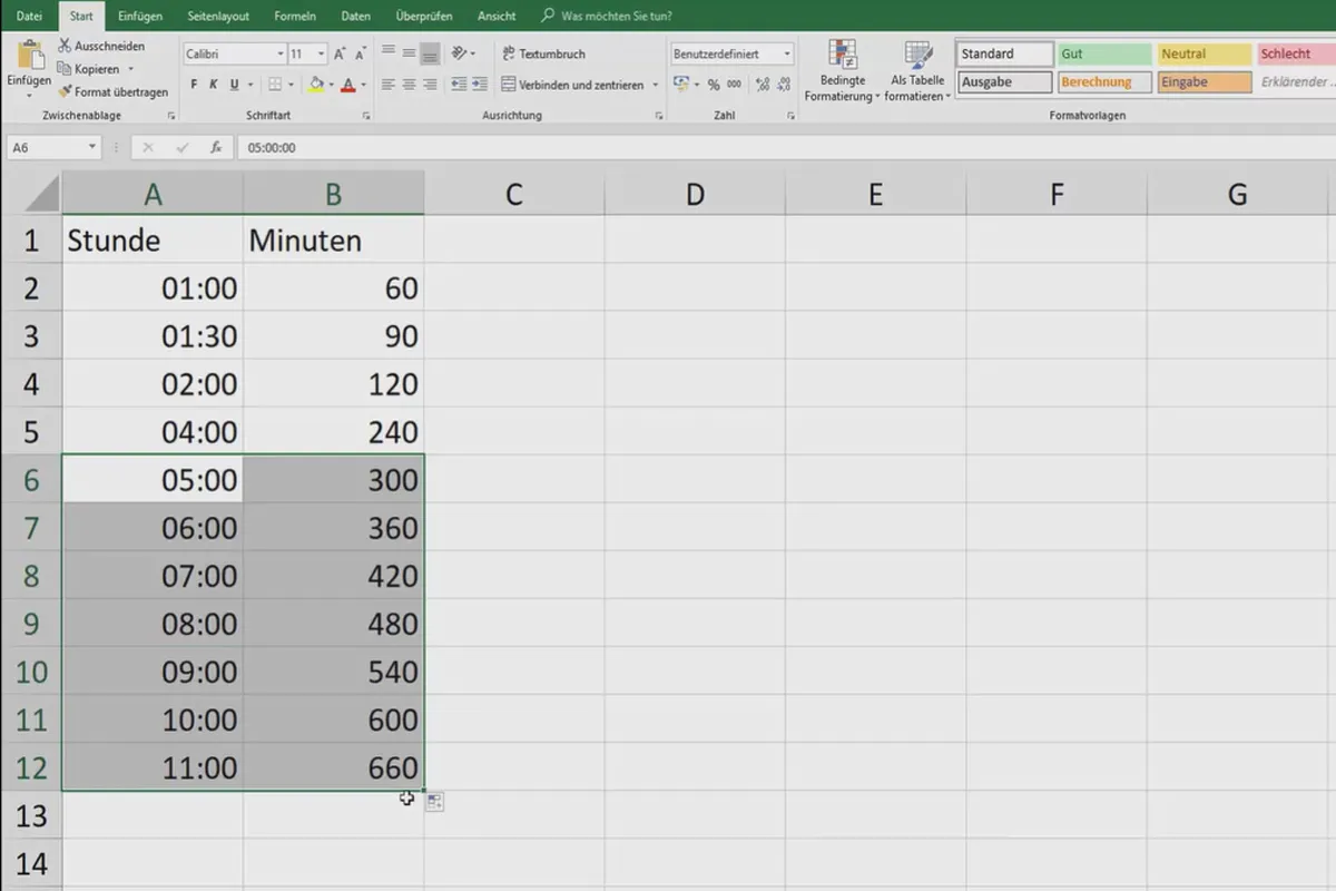
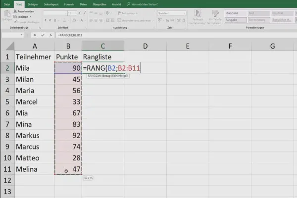
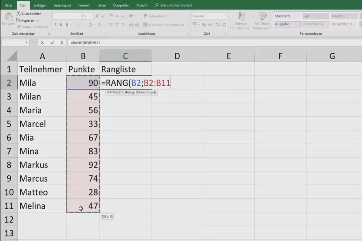
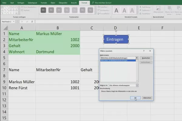
- Tips and tricks: converting hours to minutes, using macros, generating ranked lists ...
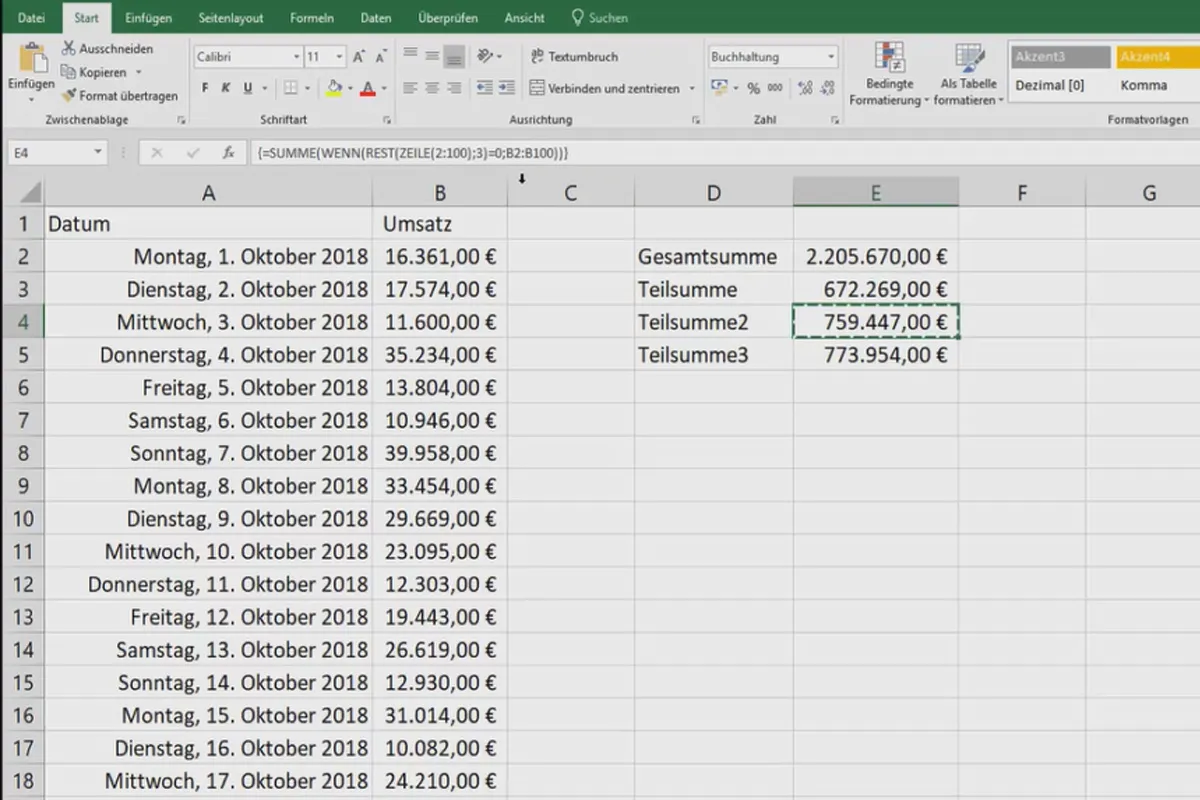
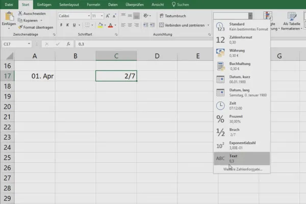
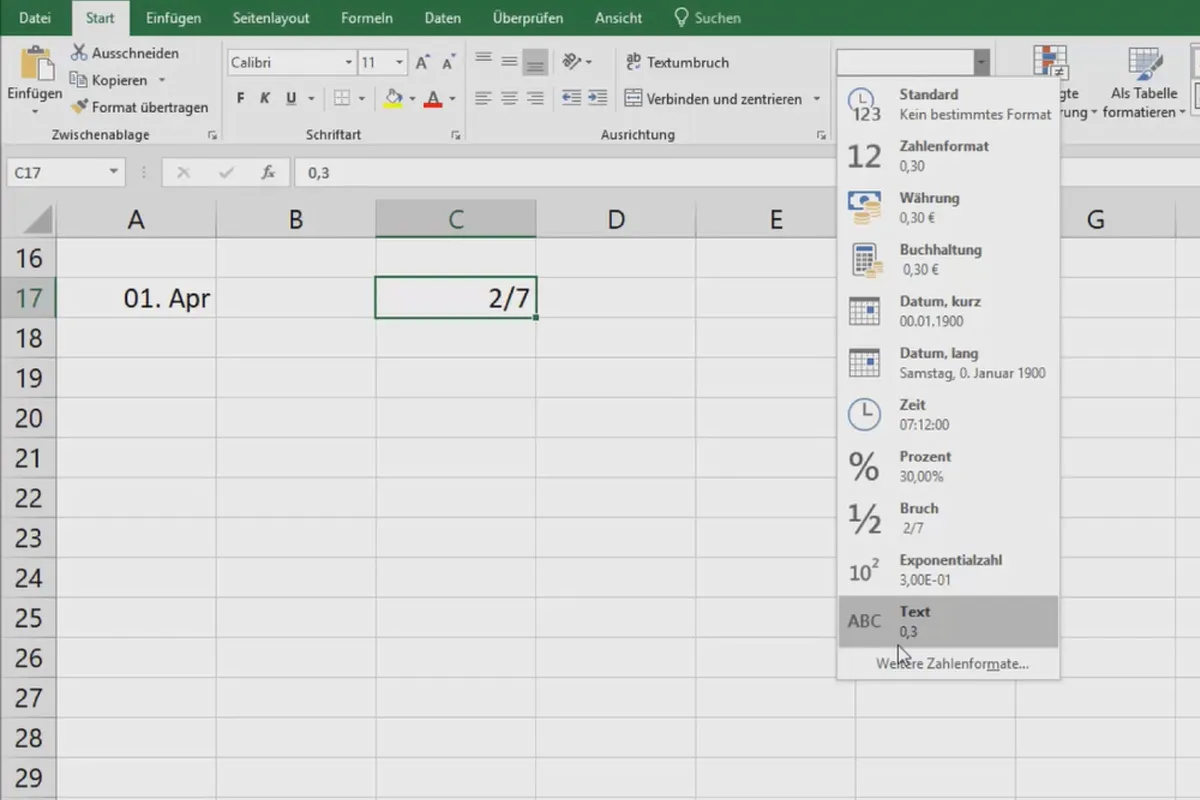
- Exchanging columns and rows, displaying formulas, handling fractions in Excel
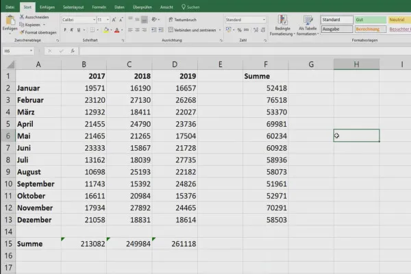
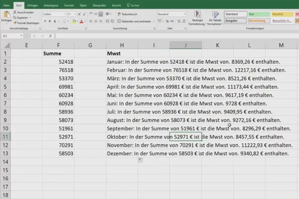
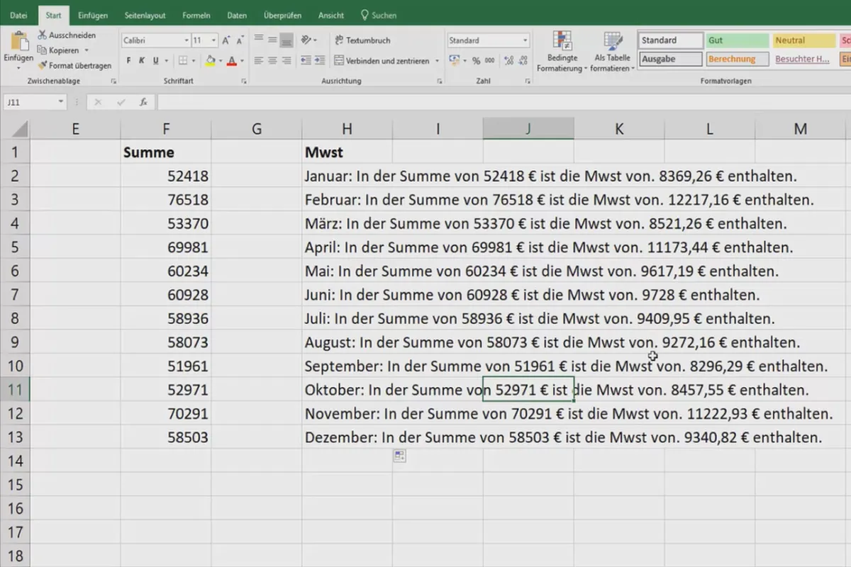
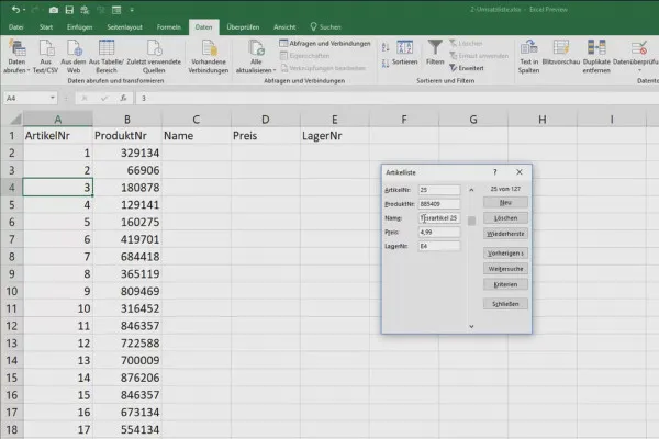
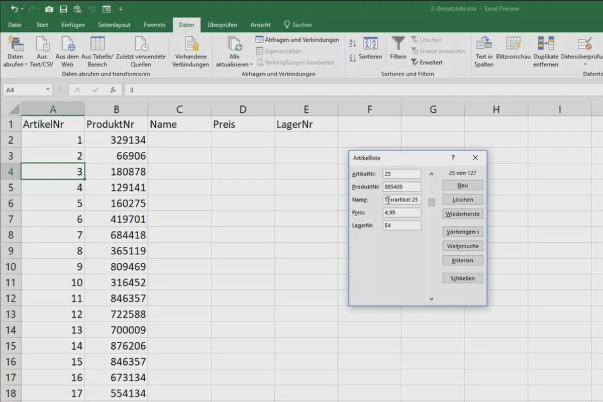
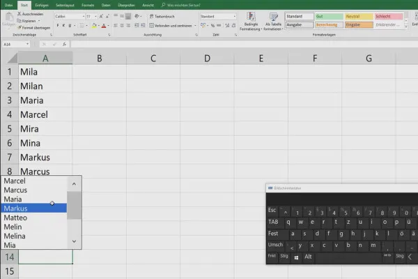
- Mixing texts, data and formulas in a cell, database mask in Excel
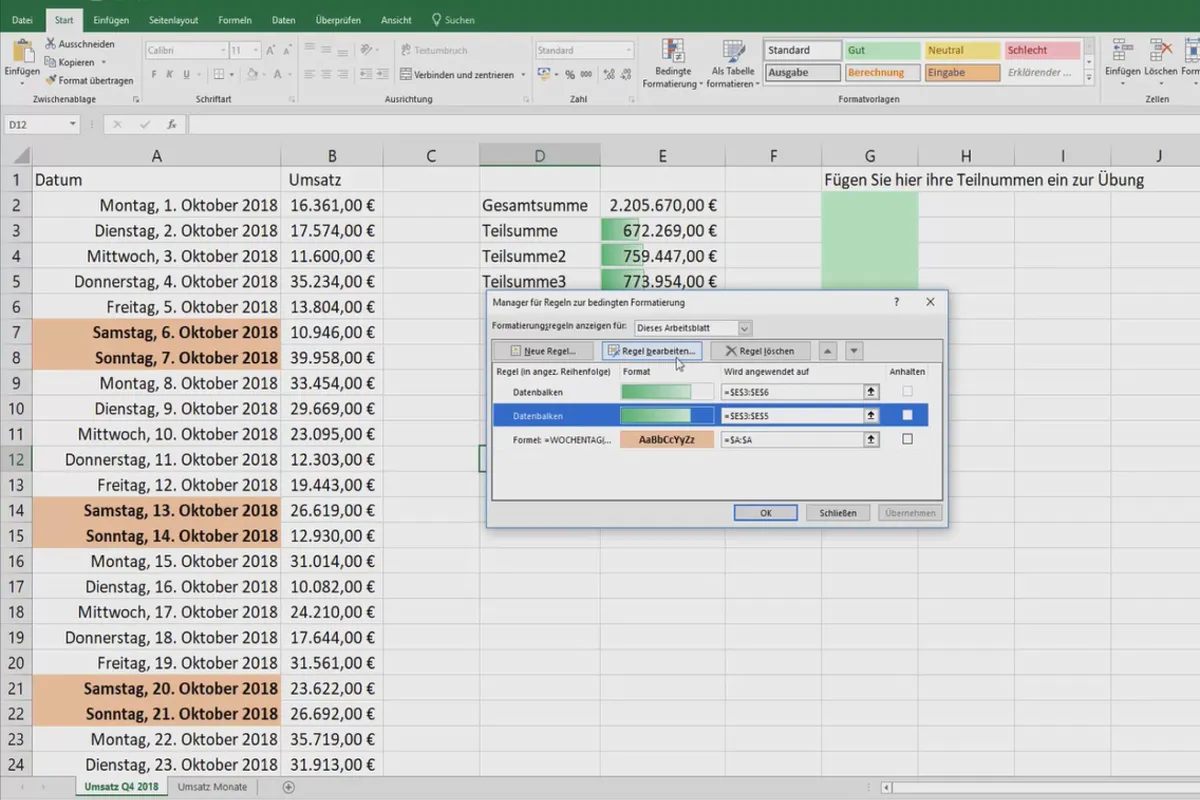
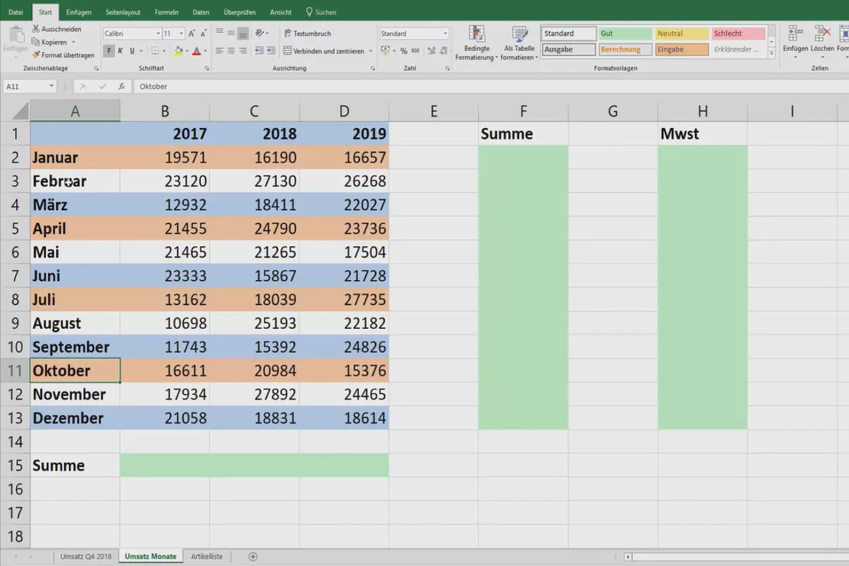
- Manage conditional formatting, use for weekdays
Understand data faster and better with the right table design
With the Excel tutorial, you will leave the traditional gray in gray far behind. You will learn methods and techniques that will help you analyze your data faster and present it more clearly. To understand the contents of the tutorial, you should already know the basics of Excel. The explanations are particularly suitable if you regularly work with Excel in your job, for example as a controller or in sales, manage large amounts of data and want to present it clearly for others, but also for yourself.
Other users are also interested

Fully equipped from flyer to roll-up

Effectively create modern slides
How to build trust with customers
Create, set up & optimize online advertising
This saves you time and effort!

With flyer, business card & Co.
For complete business equipment
Faster results in your tables


