
Affinity Publisher: the basic tutorial

- Easy to get started with Affinity Publisher: quickly find your way around and create your first layouts.
- Typography and typesetting: How to skillfully set the scene for your texts with paragraph style, initials, etc.
- Multi-page design: How to tackle more extensive design projects.
- Export: Prepare your layouts correctly for display on the web and for printing.
- How to learn practically: Join in and create an invitation card and a brochure.
- Over four-hour basic tutorial by layout master Stefan Riedl
Have you already tried Affinity Publisher? Are you still unsure whether to say goodbye to other programs? Would you like to get a basic introduction to design? - This is your tutorial!
34 Videos, 257 minutes
Intro
Affinity Publisher Basics Tutorial: 01 | Intro
Welcome to the big Affinity Publisher basics training. In this intro, I introduce myself and the contents of this training course in a compact overview.
Entry, basic functions and creation of double-sided invitation card
Affinity Publisher Basics Tutorial: 02 | Organizing the program interface and workspace
In this video training we start with getting started with Affinity Publisher. We get to know the user interface in broad strokes and set up a workstation.
Affinity Publisher Basics Tutorial: 03 | Create new documents
The dialog for creating new documents has a few settings that we will go through very briefly. We then create a two-sided invitation card in DIN long portrait format.
Affinity Publisher Basics Tutorial: 04 | Placing images in the workspace
There are several ways to import images into Affinity Publisher. I present some of them in this video. We will go into useful tips that make handling images easier.
Affinity Publisher Basics Tutorial: 05 | Placing objects, contours and frame options
In the following minutes I will explain how objects are used, which contour options and settings result from this and how text is integrated into the object boxes.
Affinity Publisher Basics Tutorial: 06 | Graphic text, frame text and fill text
In this video we learn the basics of working with text and the difference between graphic text and frame text.
Affinity Publisher Basics Tutorial: 07 | Tips for precise selections and fast navigation
In this box of tricks, I'm going to put some shortcuts on the table: the two main points are: creating more precise selections and faster navigation.
Affinity Publisher Basics Tutorial: 08 | Colors, color palettes and gradients
The handling of colors, color palettes and gradients is explained in this video so that an efficient workflow can be achieved in the design process using the tips.
Affinity Publisher Basics Tutorial: 09 | Visual effects - the drop shadow
Affinity Publisher offers a number of visual effects via the FX engine. In this video, we take a closer look at the outward shadow, also known as the drop shadow, which increases the legibility of our text elements.
Affinity Publisher Basics Tutorial: 10 | Finishing the invitation card
Now that we have learned the basic techniques, we can use them to design the back and finish the card.
Affinity Publisher Basics Tutorial: 11 | Using Glyphs
Well-developed fonts often offer equally rich libraries of glyphs to obtain special characters. In this video, I explain where to find the glyph browser and how to insert alternative characters into texts.
Affinity Publisher Basics Tutorial: 02 | Organizing the program interface and workspace
12 min OpenAffinity Publisher Basics Tutorial: 05 | Placing objects, contours and frame options
10 min OpenAffinity Publisher Basics Tutorial: 06 | Graphic text, frame text and fill text
12 min OpenAffinity Publisher Basics Tutorial: 07 | Tips for precise selections and fast navigation
7 min OpenTypography, typesetting, automation, and text styles
Affinity Publisher Basics Tutorial: 12 | Guides for clean layouts
Guide lines are absolutely essential if designs and layouts are to be aligned correctly. In this video, I explain a few tricks for correct handling.
Affinity Publisher Basics Tutorial: 13 | Baseline Grids, Grids and Columns
Let's now set up a grid for our document, creating 12 columns that will make layouting much easier later on. We also create a baseline grid so that all text modules start at the same height.
Affinity Publisher Basics Tutorial: 14 | Image placeholders, layout structure and frame linking
In these minutes, we will divide the document into rough areas and define structural cornerstones. In addition, color fields are imported, text linking is addressed and headings are set.
Affinity Publisher Basics Tutorial: 15 | Define paragraph styles
Paragraph styles allow us to format texts quickly, which means that typesetting in your layout can be done in no time at all. However, these styles must first be defined - this is the first paragraph style.
Affinity Publisher Basics Tutorial: 16 | Building initials and paragraph styles on top of each other
Paragraph styles that build on each other are a powerful tool for setting large amounts of text even faster. In this training course, you will find out how styles can be played in sequence and how initials can be inserted at the start of text.
Affinity Publisher Basics Tutorial: 17| Character Styles
Whenever individual characters and words are assigned a style, the character styles are activated. Affinity Publisher has a number of setting options for automatically highlighting passages.
Affinity Publisher Basics Tutorial: 18 | Generate bulleted lists by combining paragraph and character styles
In this learning unit, I explain how enumerations can be set automatically, how the associated styles are defined and how this function helps us to set text quickly.
Affinity Publisher Basics Tutorial: 19 | Text wrap and text wrapping
In Affinity Publisher, texts can also flow around objects, which can result in a nicer overall layout. In this video, I'll explain how you can easily guide text passages around overlapping images, image frames, text frames or tables.
Affinity Publisher Basics Tutorial: 20 | Set text to path
The graphic text tool can also be used to set various text units on lines, curves or the outline of a shape.
Affinity Publisher Basics Tutorial: 21 | Search and Replace
Projects and publications can be searched for text and formatting and then replaced with other words, characters and even text styles - all in one go.
Affinity Publisher Basics Tutorial: 14 | Image placeholders, layout structure and frame linking
7 min OpenAffinity Publisher Basics Tutorial: 16 | Building initials and paragraph styles on top of each other
9 min OpenAffinity Publisher Basics Tutorial: 18 | Generate bulleted lists by combining paragraph and character styles
6 min OpenMulti-page layouts and advanced techniques
Affinity Publisher Basics Tutorial: 22 | Creating multi-page layouts with double pages
Multi-page layouts and designs with facing pages are not uncommon. In this video, we learn how to correctly lay out multiple pages with a center fold and also how the page arrangement can be influenced.
Affinity Publisher Basics Tutorial: 23 | Sample pages and page numbering
Working with master pages is a great advantage for large documents. Learn here how to do this and how to add consecutive page numbering.
Affinity Publisher Basics Tutorial: 24 | Section Wizard
Sections can be used to divide large documents into chapters in order to output the chapter name as a column title on the master page on all document pages.
Affinity Publisher Basics Tutorial: 25 | Adding and subtracting objects
Objects can be merged or subtracted to form new creative shapes as a vector path.
Affinity Publisher Basics Tutorial: 26 | Quick image corrections in Affinity Publisher
Affinity Publisher offers numerous on-board tools for editing photos using tonal value correction, exposure control or gradation curves.
Affinity Publisher Basics Tutorial: 27 | Resource management and image effects
You can find an overview of all the media contained in the resource management. In this lesson, you will find out what you can do with it and how this list supports us in different cases.
Affinity Publisher Basics Tutorial: 28 | Transparency Tool
The tool can be used to draw transparency gradients on any object and text field by dragging. Linear, radial, elliptical and conical gradient types are supported.
Affinity Publisher Basics Tutorial: 29 | Adding Artificial Noise
In Affinity Publisher, artificial noise can be used as a stylistic device or to generate textured patterns. You can find out how this works here.
Affinity Publisher Basics Tutorial: 30 | Saving assets in libraries
Asset libraries provide quick access to recurring objects such as logos, author boxes, etc. - but these must be created beforehand. Find out how to do this in Affinity Publisher.
Affinity Publisher Basics Tutorial: 22 | Creating multi-page layouts with double pages
6 min OpenAffinity Publisher Basics Tutorial: 26 | Quick image corrections in Affinity Publisher
4 min OpenPDF export and import
Affinity Publisher Basics Tutorial: 31 | Export PDF for digital playback
In this video you will learn how you can influence the balancing act between file size and file quality in order to make your PDF available on the World Wide Web with a slim volume.
Affinity Publisher Basics Tutorial: 32 | Exporting PDF for printing and using ICC profiles
This Affinity Publisher tutorial is about the correct data export as PDF to create a reproducible file for printing. I will also show you where to obtain the required ICC profiles for the corresponding color space.
Affinity Publisher Basics Tutorial: 33 | PDF export with spot color for partial finishing
Spot colors can be used to highlight certain areas on the printed product. In this video, I explain to you how the data is created and what pitfalls there are during preparation.
Affinity Publisher Basics Tutorial: 34 | Importing PDFs and editing options
In this video, we take a look at Affinity Publisher's options for editing PDF files that have already been created. What changes are possible and what is completely ignored during import?
Affinity Publisher Basics Tutorial: 32 | Exporting PDF for printing and using ICC profiles
8 min OpenAffinity Publisher Basics Tutorial: 33 | PDF export with spot color for partial finishing
14 min OpenExamples of use
-
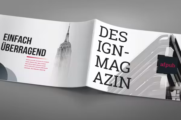 Example: After the tutorial, you will be able to design your own layouts with Affinity Publisher.
 -
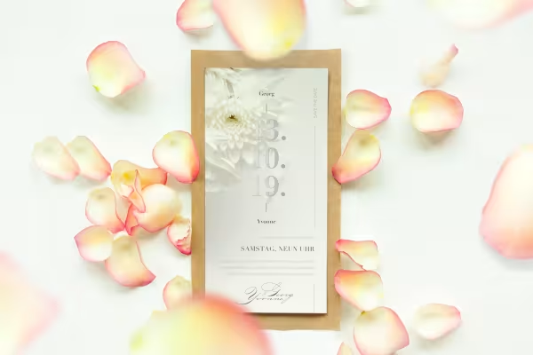 Example: Learn the basic functions of Affinity Publisher using this design for an invitation card.
 -
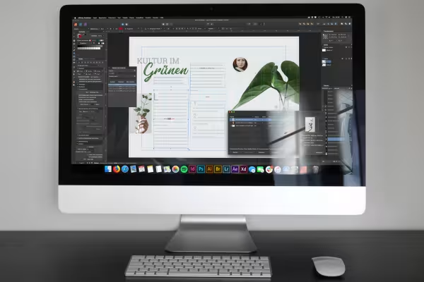 Example: You will receive numerous tips and tricks on how to create a clean design.
 -
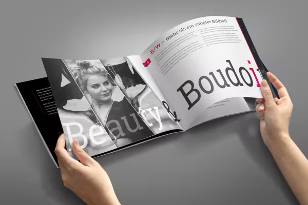 Example: Follow the instructions from the creation of the document to the print-ready PDF.
 -
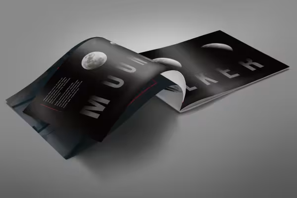 Example: Discover great features that you might not expect to find in a DTP program.
You might also like

More style, more power, more templates!

Live your layout now!

Full power, more inspirations, maximum WOW effect!

Save time with artificial intelligence
Comment now „Affinity Publisher: the basic tutorial“