Create Excel charts and visualize data - the complete course
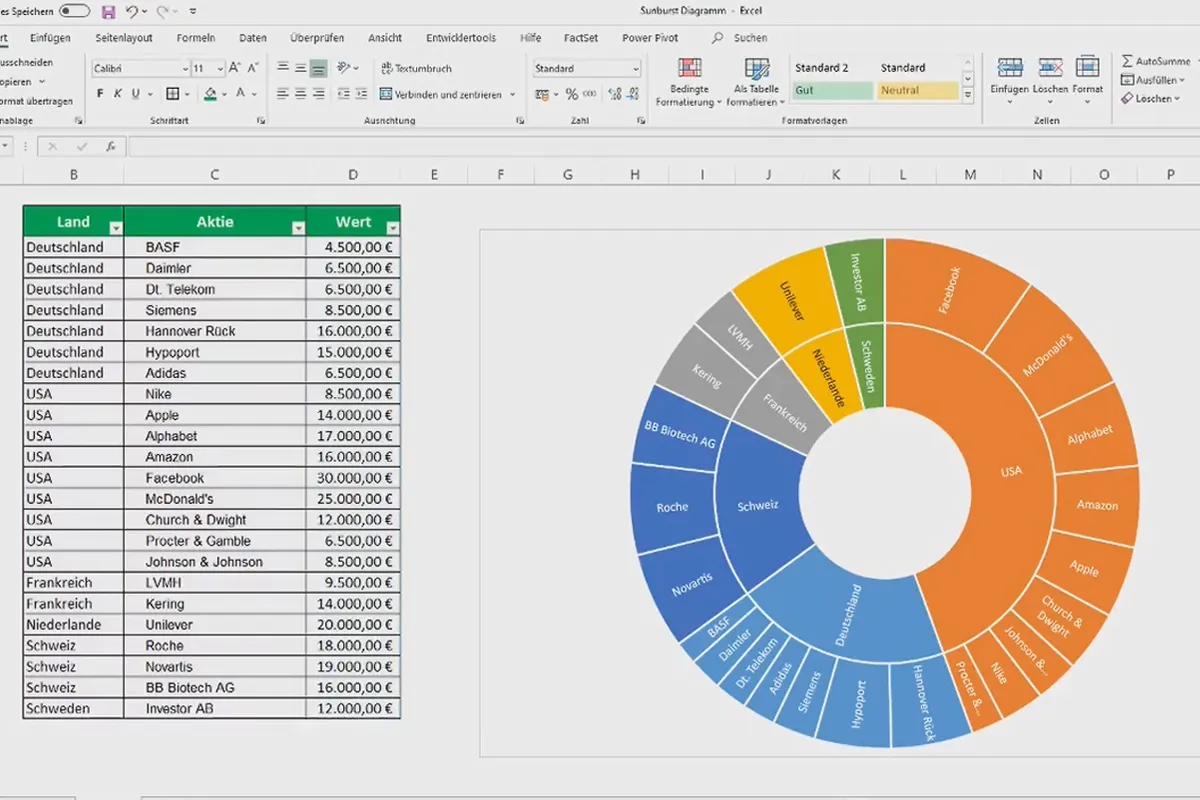
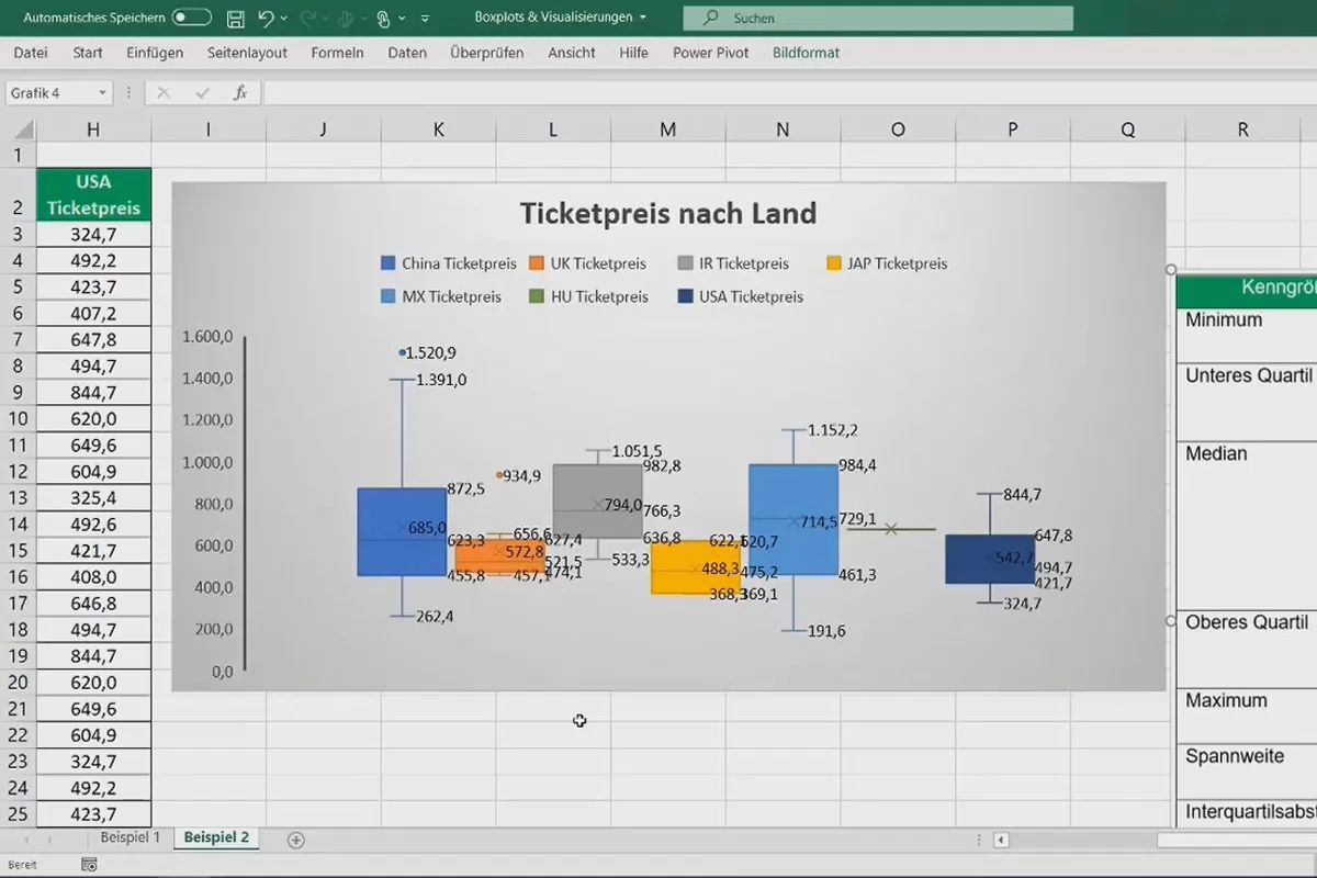
What was that again about creating pivot charts? How do box plots actually work? Which charts are also recommended to visualize your data more clearly? Excel expert Fabio Basler will introduce you to all the important charts in this complete 5-hour course. So if you want to present a funnel or sunburst chart, you will now know how to create them in just a few minutes.
- Excel complete course: Create charts and visualize data
- All important diagrams and visualizations explained step by step
- From the basics to simple bar charts and advanced Gantt charts
- Over 5 hours of training with practical tips and tricks from Excel expert Fabio Basler
Create charts in Excel - get an overview of the possibilities or use the training as a reference work. This is how you present your data clearly!
- Usable with:
- content:
5 h Video training
- Licence: private and commercial Rights of use
- Bonus: including working material
Introduction
Basics Data Visualization
Simple diagrams in Excel
Advanced visualizations in Excel
Special diagrams
Secret professional visualizations
Details of the content
Create charts in Excel: Which ones there are, how you use them
The same applies to data: you eat with your eyes. What's more, specific forms of visualization are suitable for every data set, analysis and presentation. So create a better overview, more clarity and greater understanding by preparing your data with the right chart. Find out which Excel charts are available and how to use them in 40 lessons lasting over 5 hours from Excel trainer Fabio Basler.
The complete diagram course for beginners AND Excel users
Whether you are new to Excel or you work with the program regularly, this complete course is suitable for beginners as well as for getting to know other chart representations:
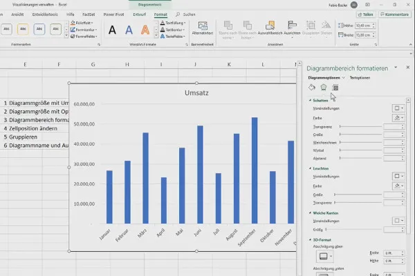
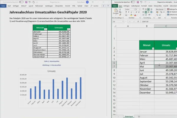
As a beginner, you can expect basic explanations first. Learn how to create and manage charts in Excel and how to link them to Word, for example . You will also learn how to create simple and frequently used charts such as bar and column charts.
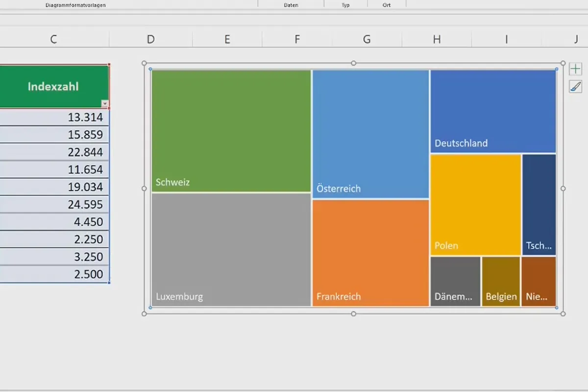
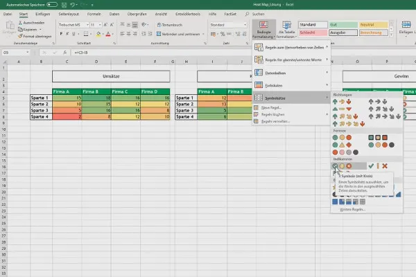
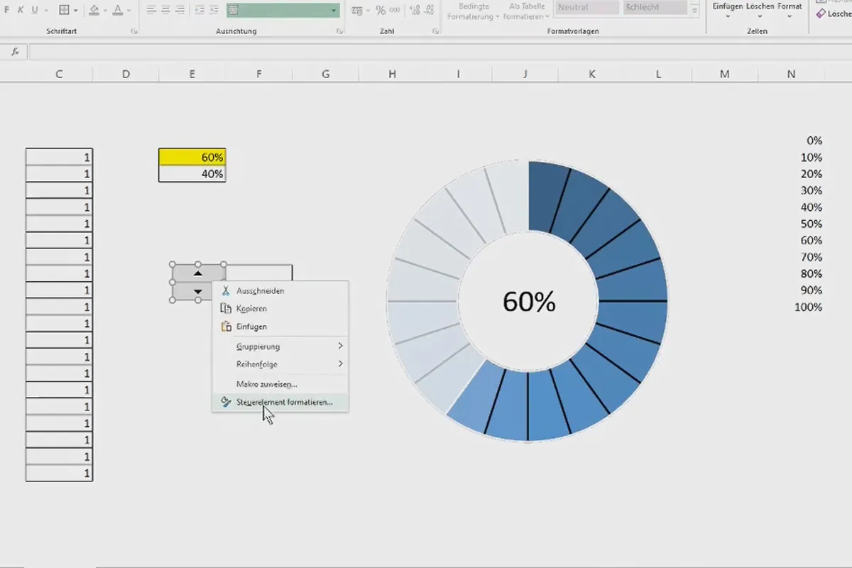
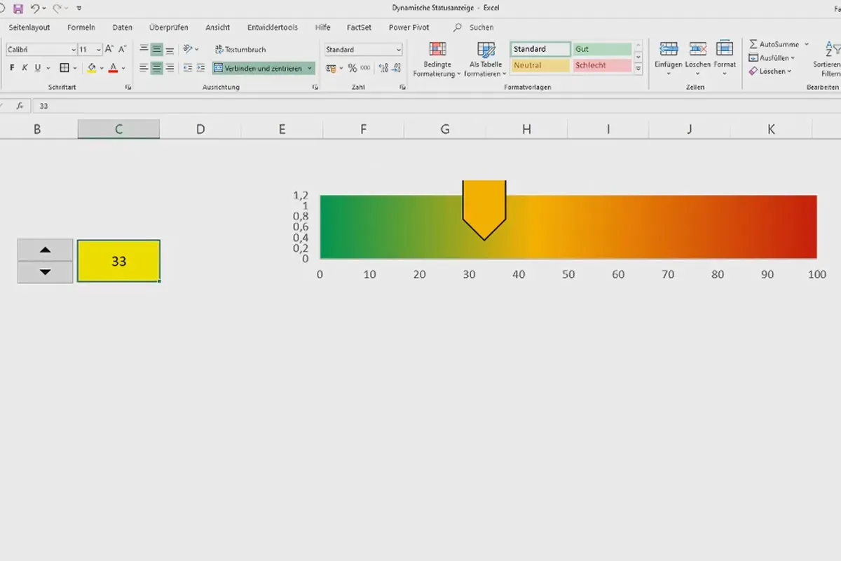
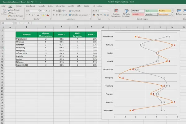
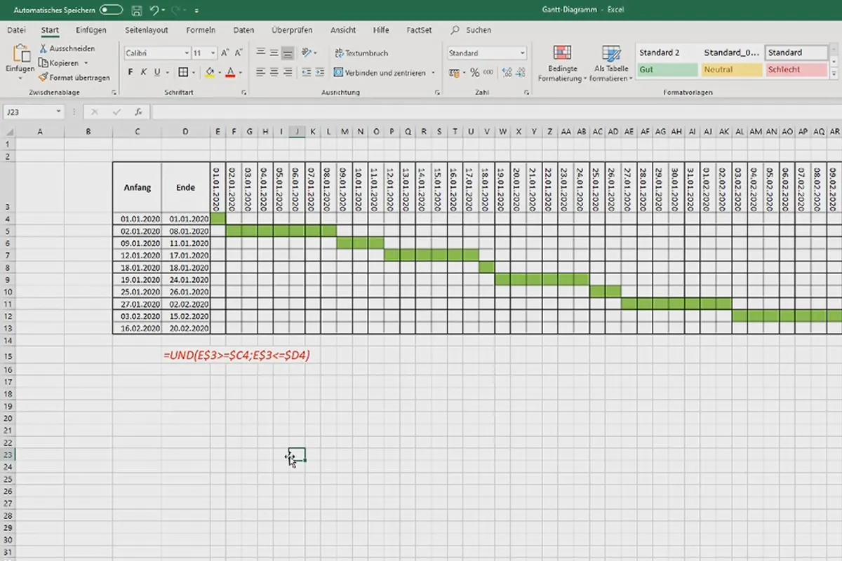
Advanced users will enjoy a compact and targeted explanation of all the important Excel charts . Whether heat maps, box plots, bubble charts or treemaps - with your trainer's tips, you will be able to use Excel even more effectively for data visualization and, with the help of Gantt charts and dynamic progress indicators, perhaps even for your project management.
All important visualizations: Explained step by step and in a practical way
Separate video lessons are available for all important Excel charts. On the one hand, you can watch the training as a whole to get an overview of the available visualization options . This way, you will know which chart variant is recommended for visualizing your next data series.
And on the other hand, if you want to use a specific chart type later and want to quickly check how to proceed beforehand, simply jump to the relevant lesson.
The following diagrams and visualizations are discussed in the course:
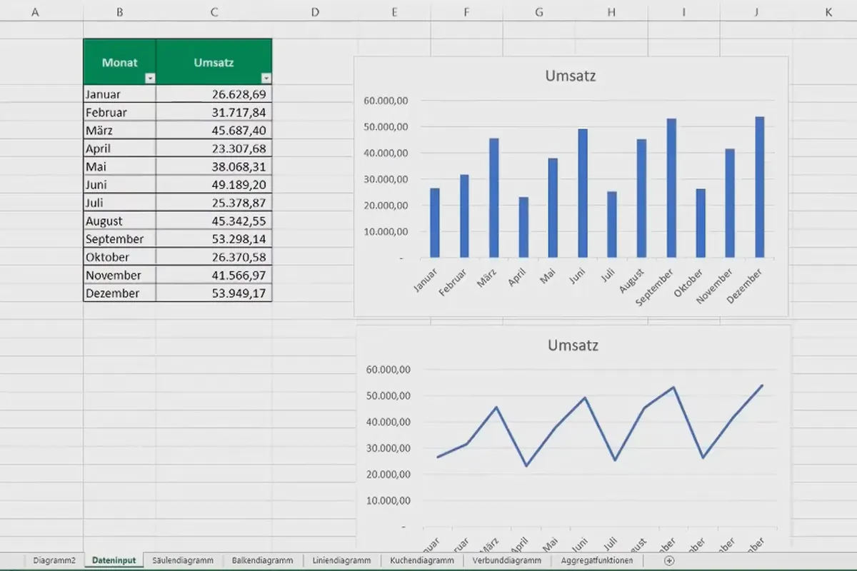
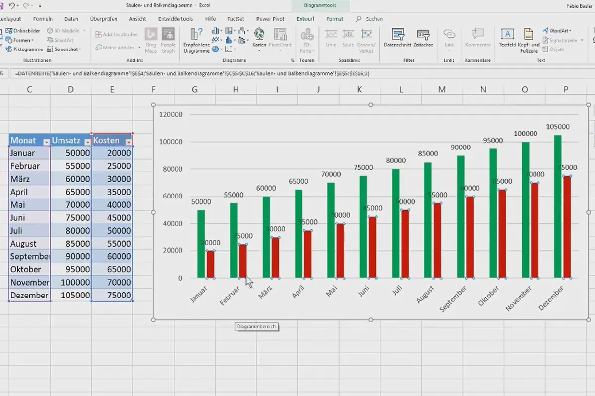
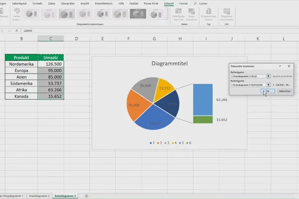
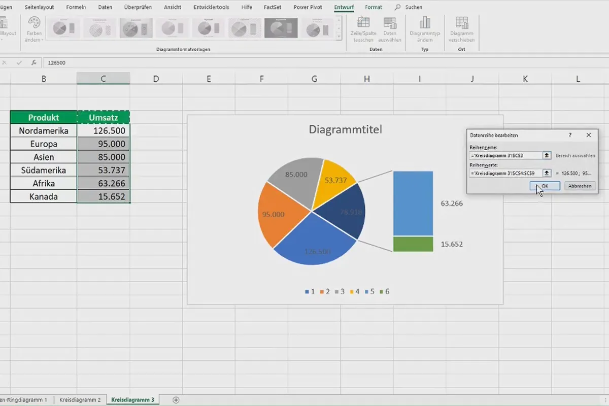
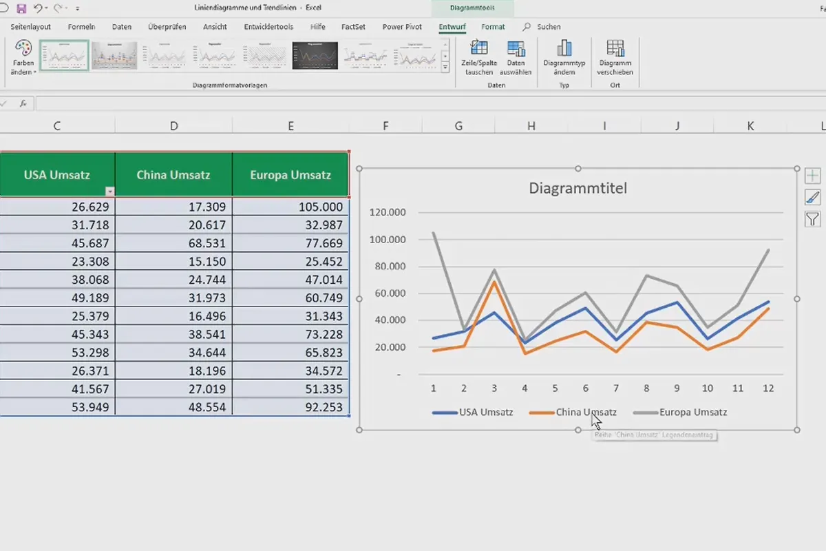
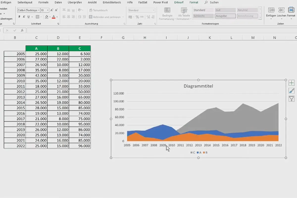
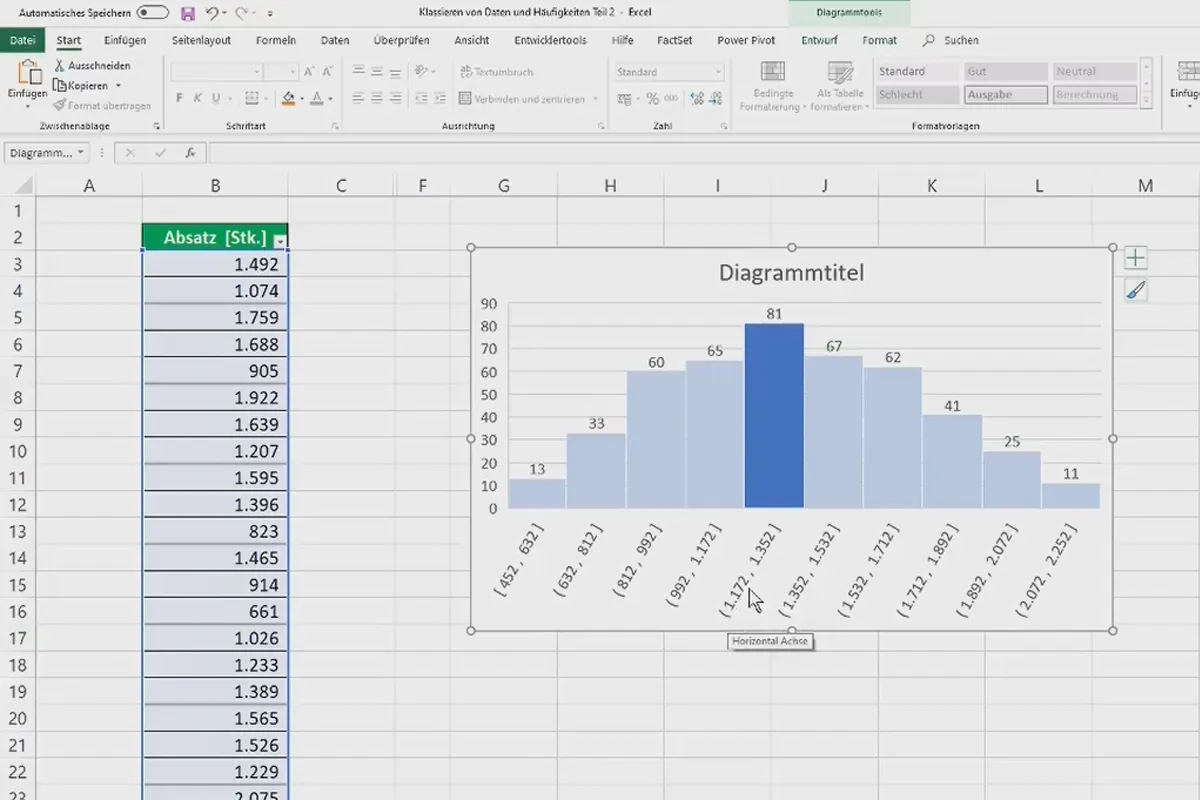
- Simple diagrams: Column, bar, pie, ring and line charts, area charts, trend lines, histogram, Pareto charts
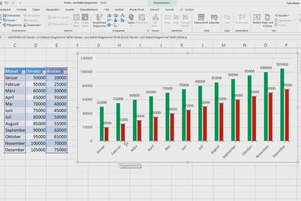
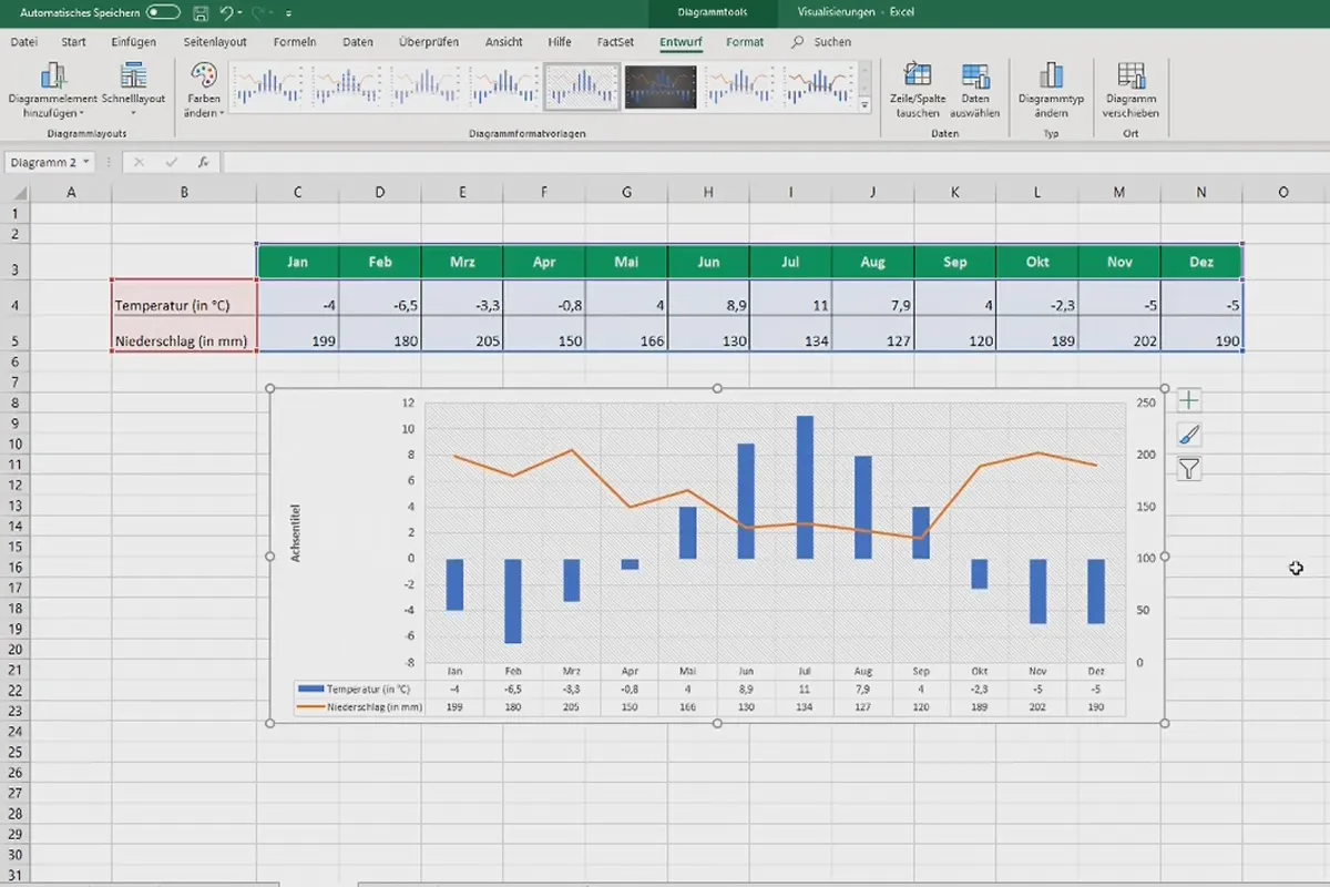
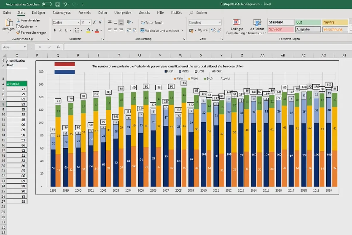
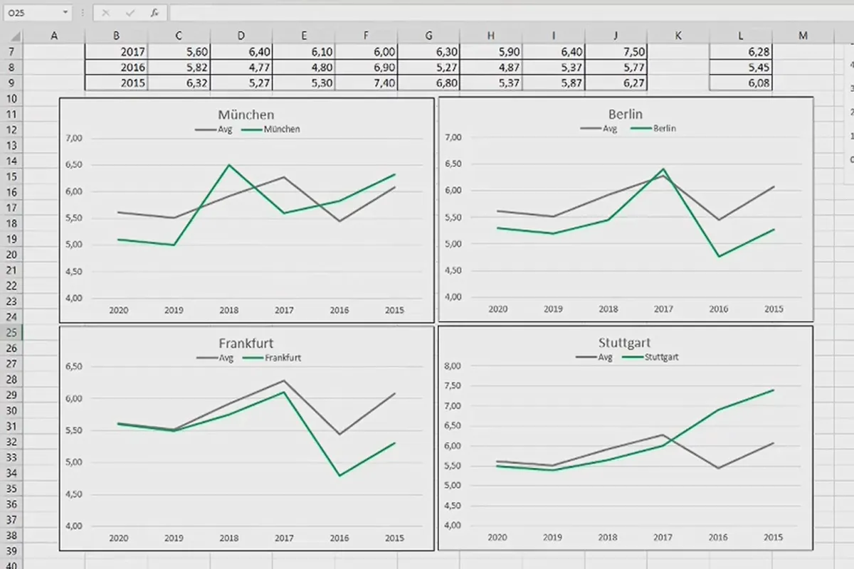
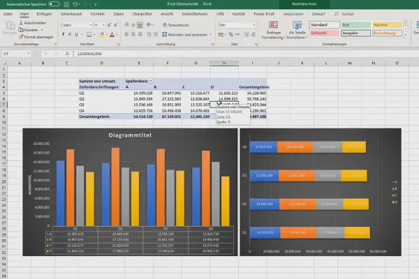
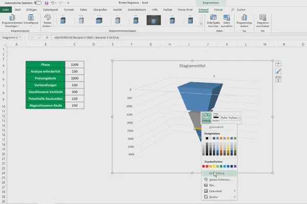
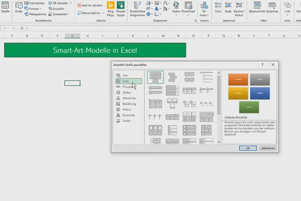
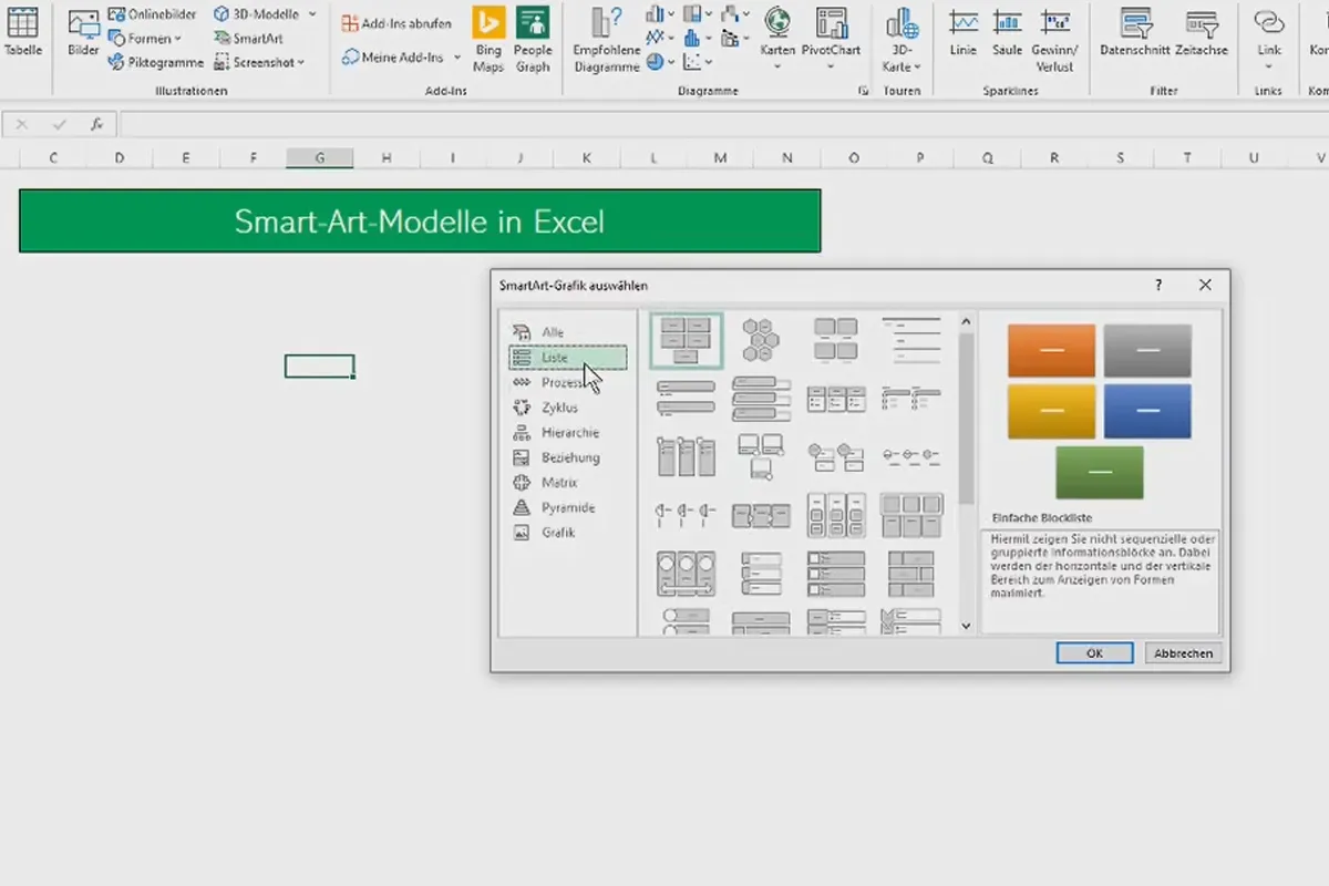
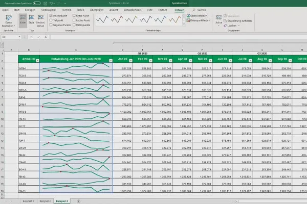
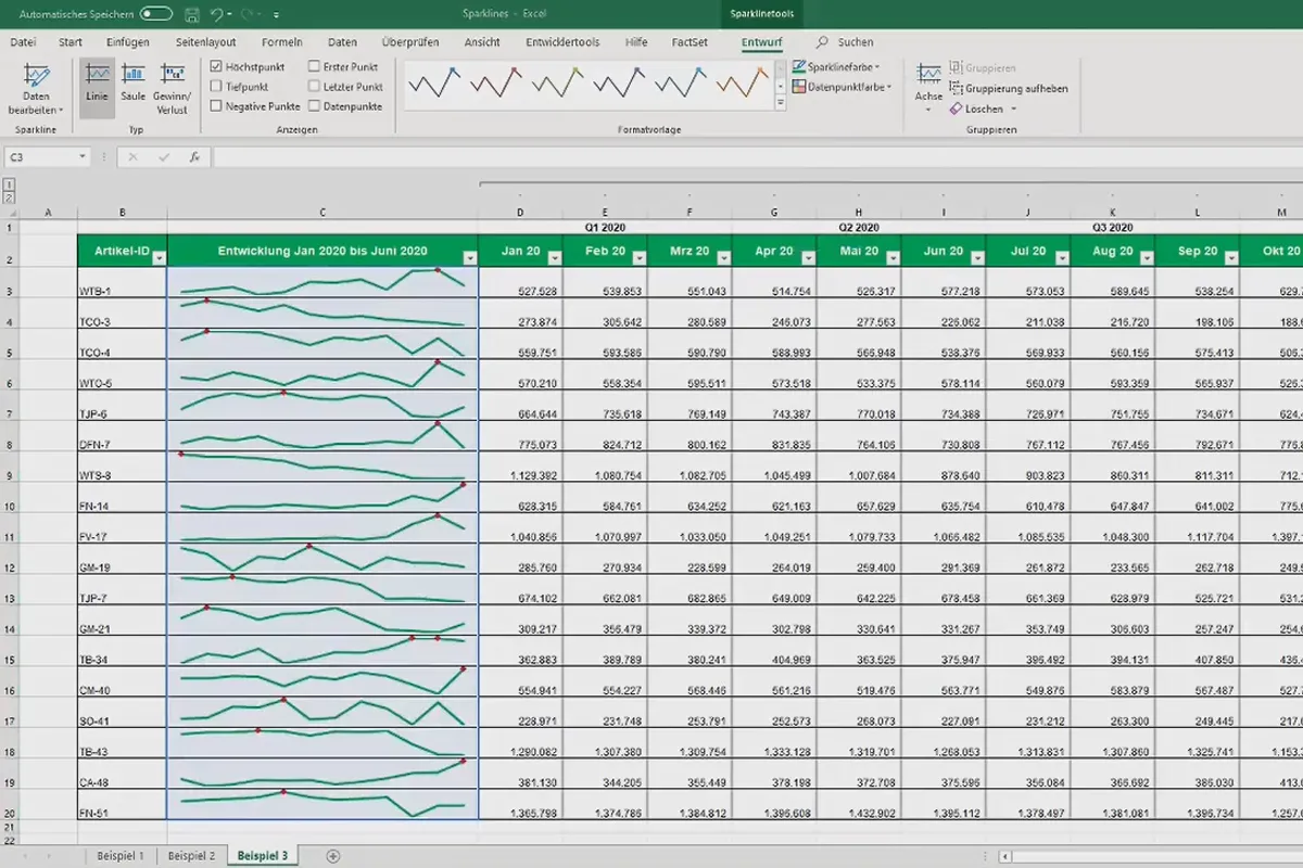
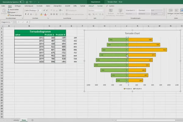
- Advanced diagrams: Composite charts, stacked column charts, panel and pivot charts, treemap, funnel, sunburst, dot XY and network charts, SmartArt, sparklines, tornado chart, HeatMap, dynamic progress and status display, boxplots
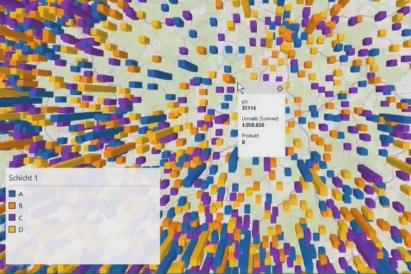
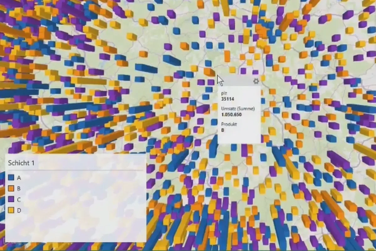
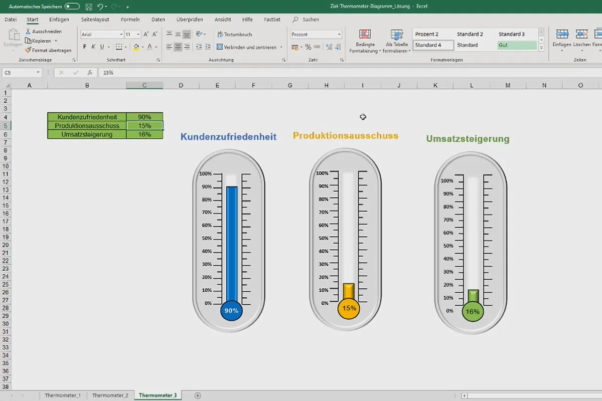
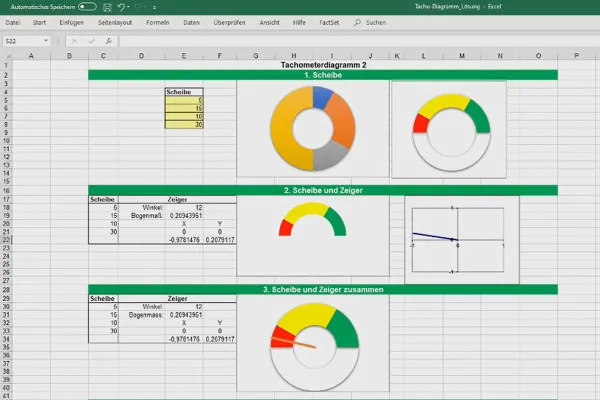
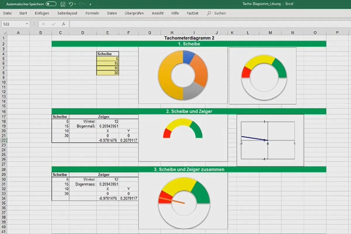
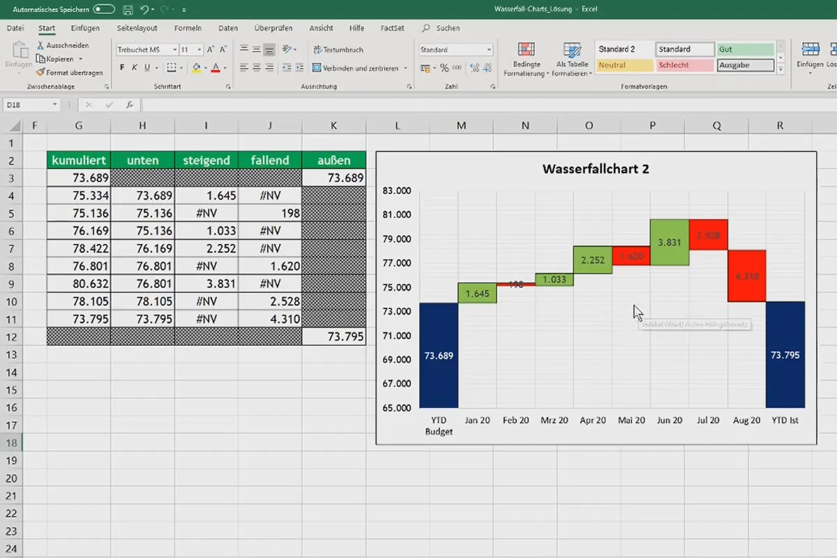
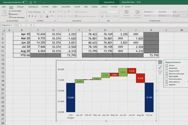
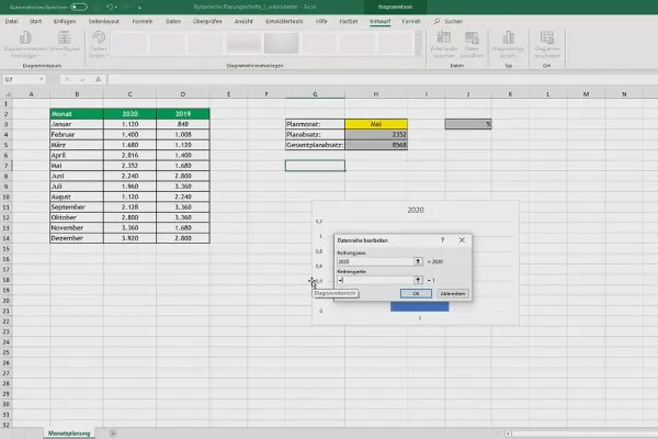
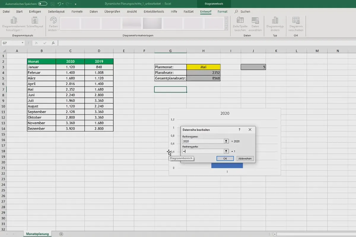
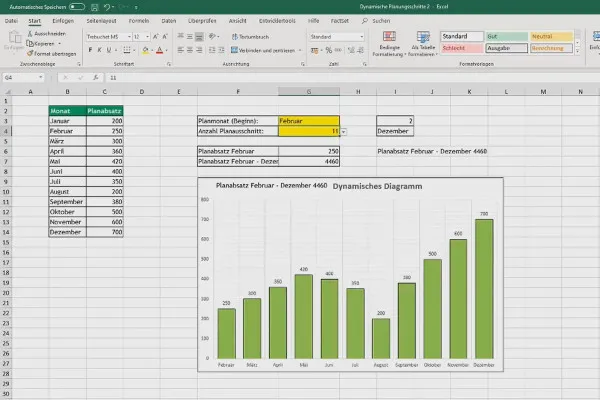
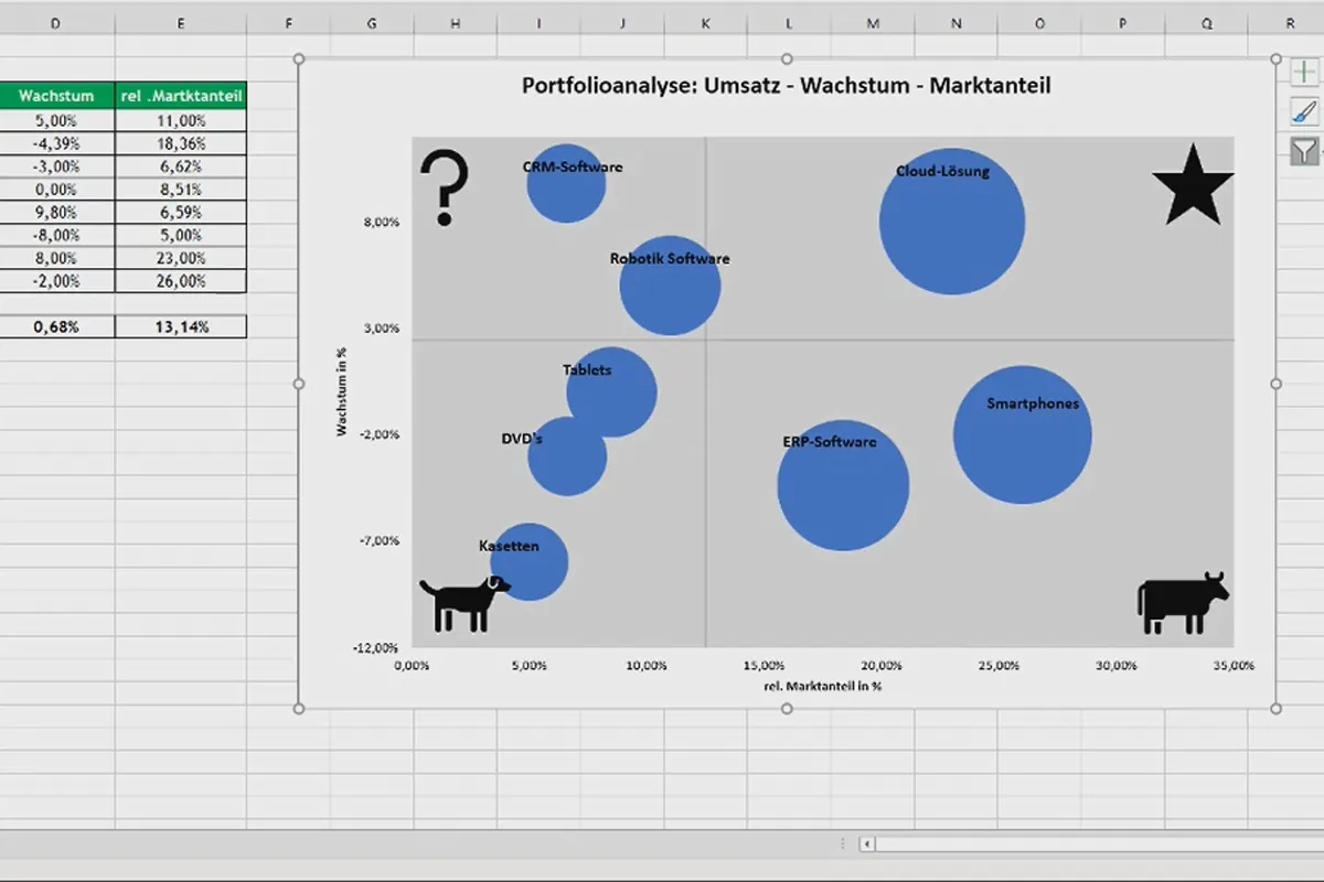
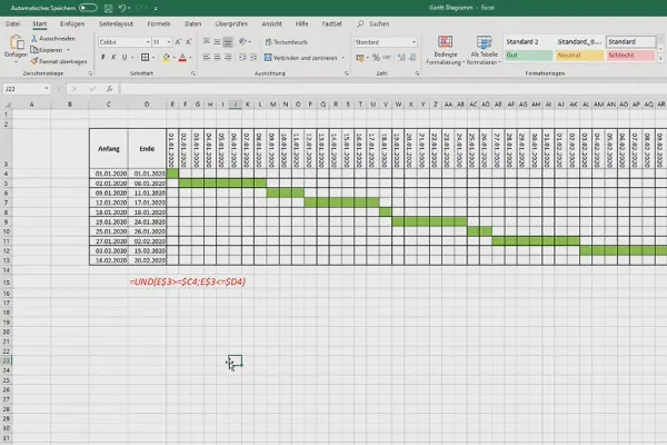
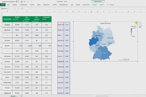
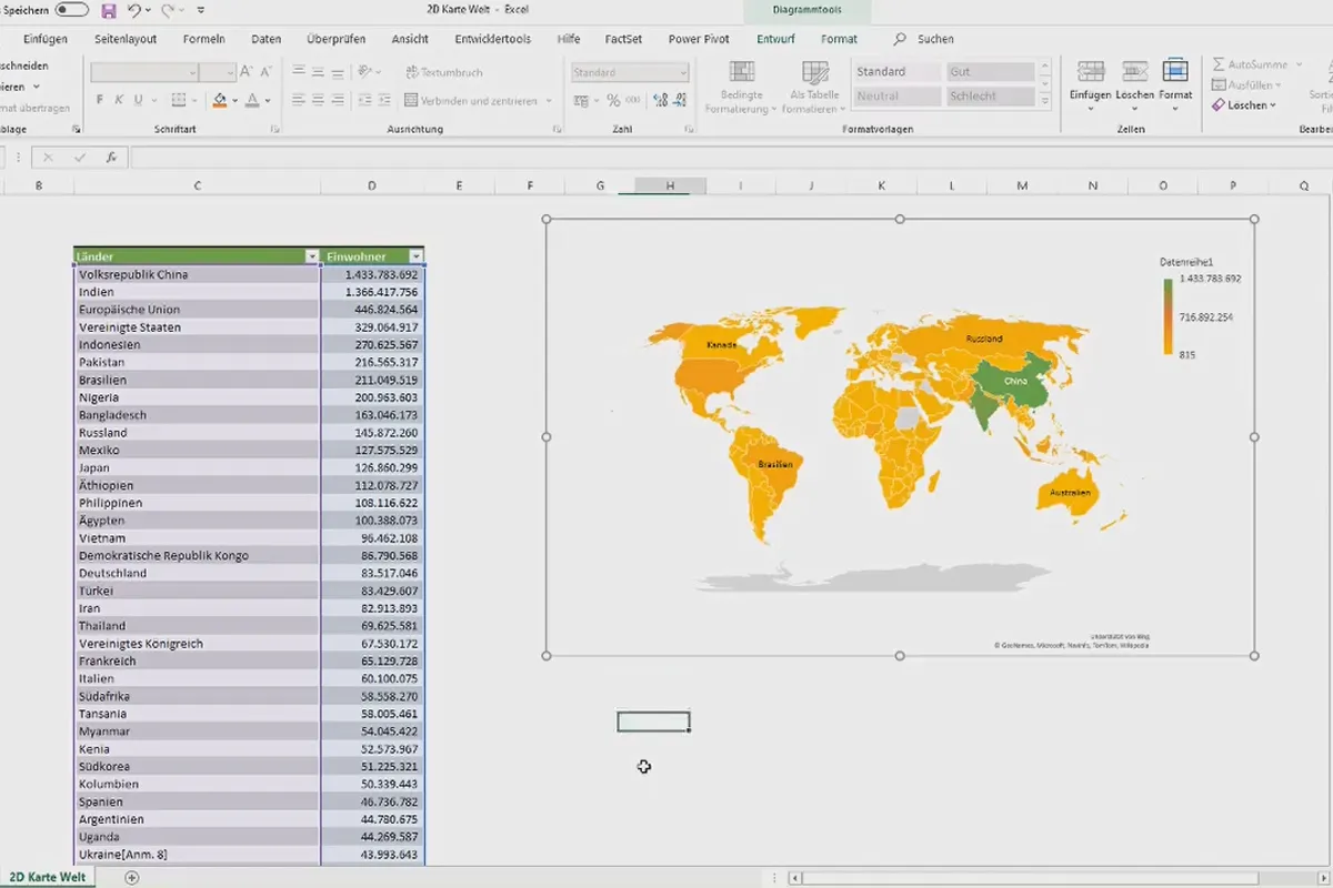
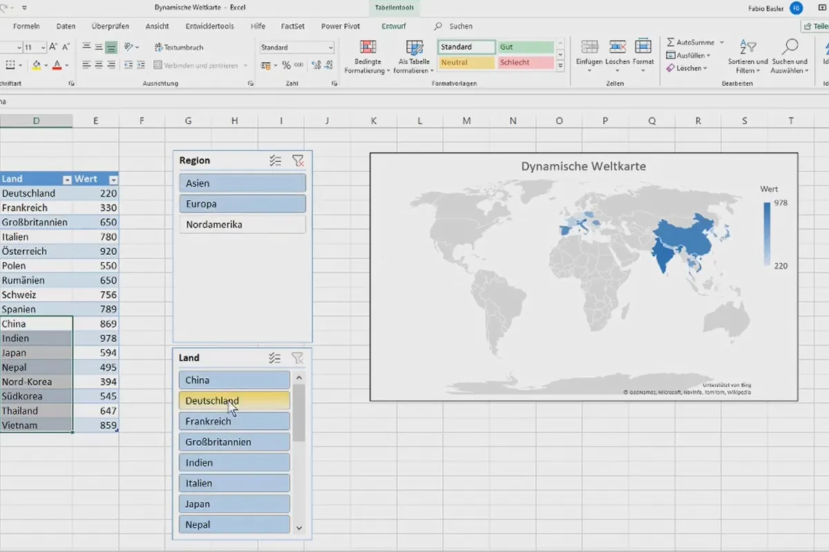
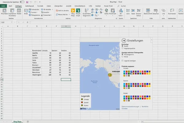
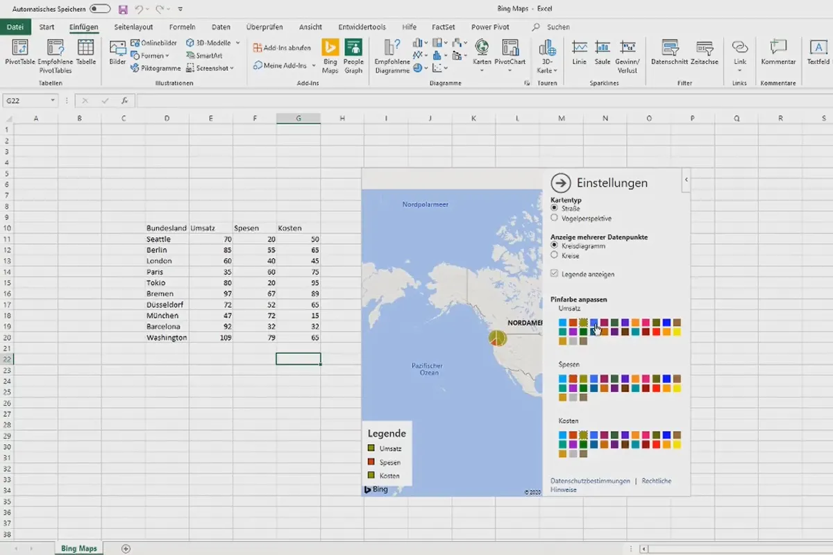
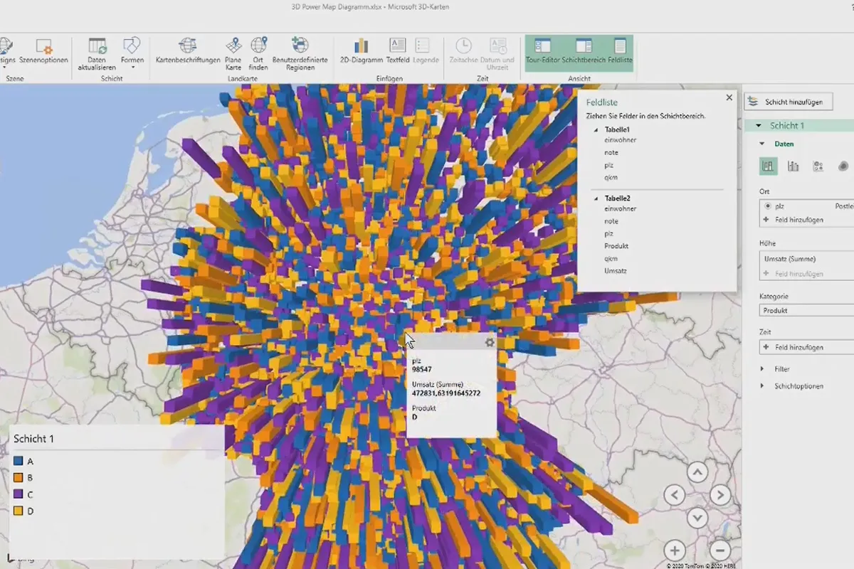
- Special visualizations: Thermometer, speedometer chart, waterfall chart, dynamic planning steps, bubble chart as portfolio matrix, Gantt chart (bar chart), maps
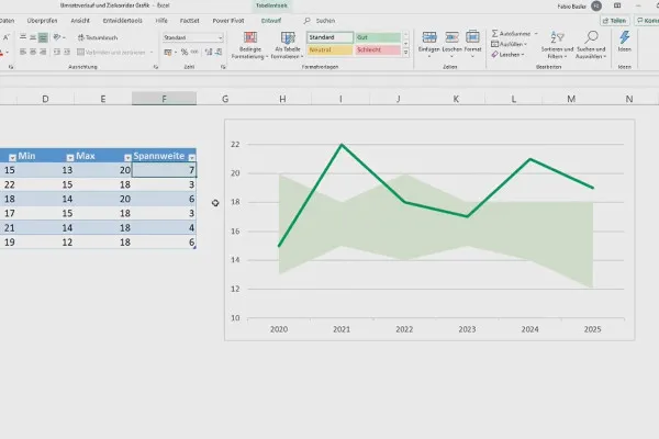
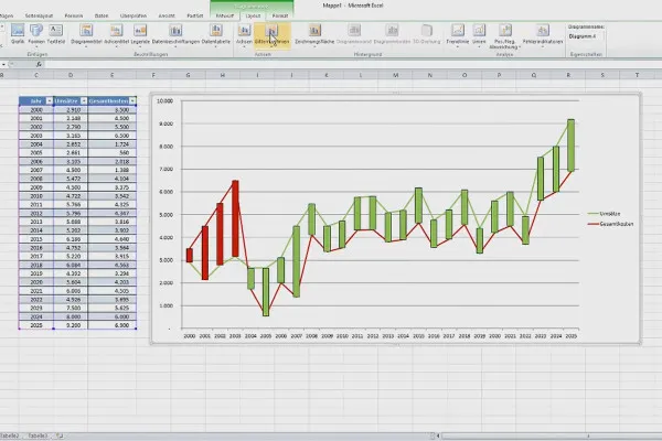
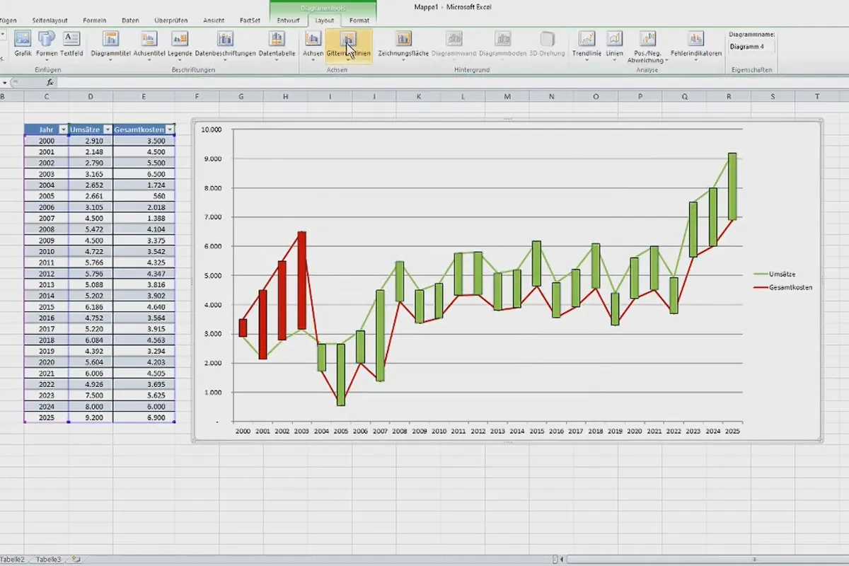
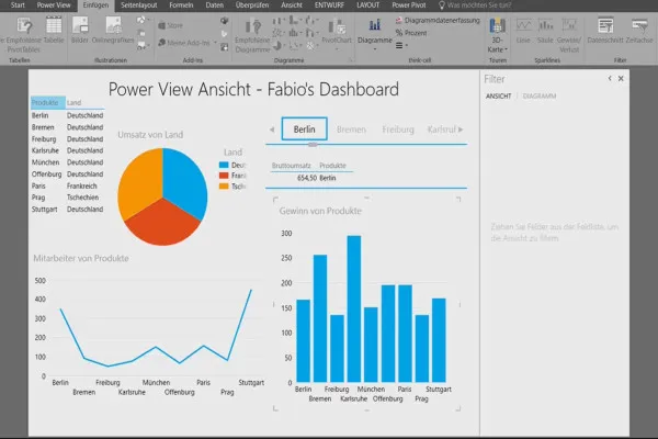
- Professional visualizations: Sales progression and target corridor chart, analyze deviation of number series, PowerView dashboard
Other users are also interested

Fully equipped from flyer to roll-up

Effectively create modern slides
How to build trust with customers
This saves you time and effort!
Faster results in your tables

For complete business equipment
Create, set up & optimize online advertising

With flyer, business card & Co.


