User Experience (UX) & Customer Journey - the practical tutorial
Whether they should buy, book or simply read on: Are you already taking your website visitors by the hand in such a way that they exhibit the desired behavior based on their positive user experience? With the help of this 3+ hour video training, you can put the user experience of your websites to the test along the entire customer journey. Together with Managing Director Matthias Petri, you will see practical examples of how you can guide your users from A to B and then to their desired destination using easy-to-implement means.
- Avoid frustration and reduce abandonment rates: How to improve the user experience for your visitors
- Everything at a glance: Which factors are decisive along the entire customer journey
- Specific examples: How you should design your buttons, navigation and landing pages, among other things
- Easy to use: You don't need any developer or special software knowledge
- Directly implementable: Check and optimize your own pages with your new UX knowledge
- From the field: Agency head Matthias Petri reports on the lessons learned from dozens of website projects
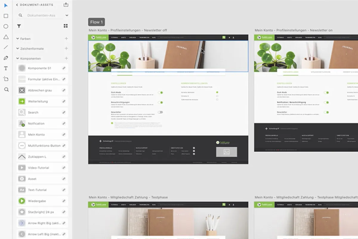
- Over 3 hours, including a downloadable customer journey map and introductory training on Adobe XD
More sales, better ratings - a good user experience makes all the difference! Sensitize yourself to the topic of UX with this training and increase the success of your own websites.
- content:
4 h Video training
- Licence: private and commercial Rights of use
- Bonus: including working material
Examples of use
-
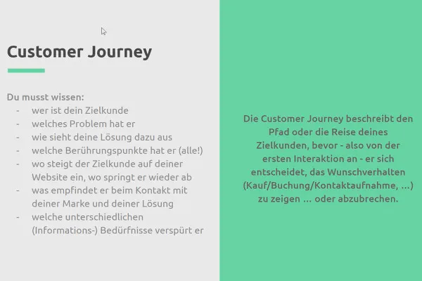
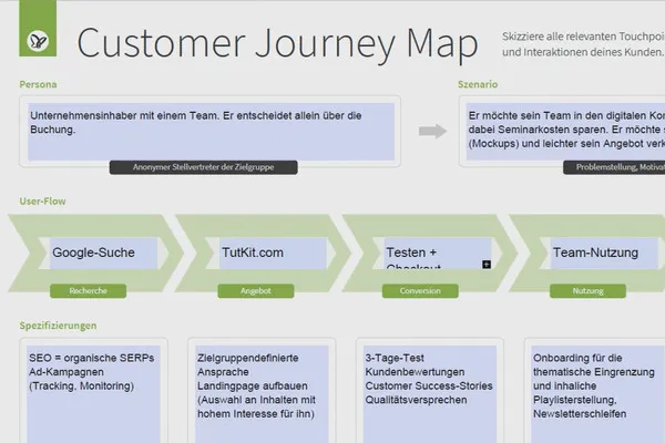
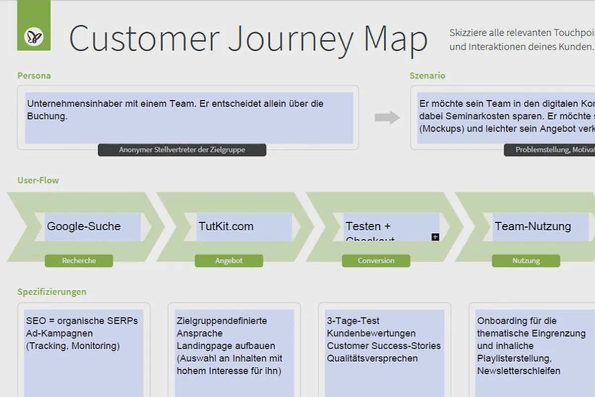
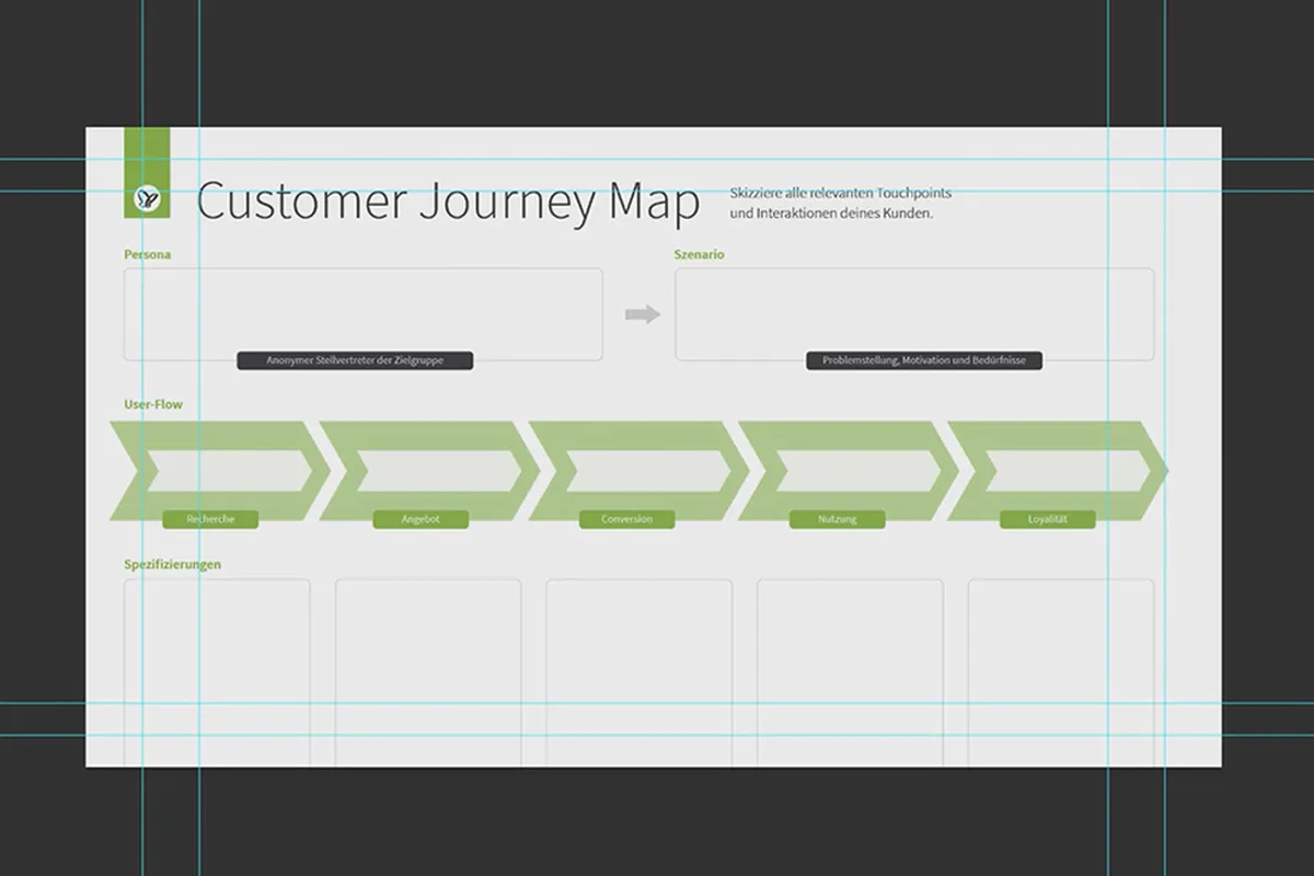
 Open galleryUse the enclosed customer journey map to improve the user experience of your pages.
 -
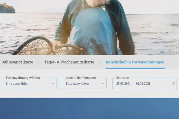
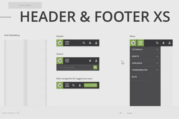
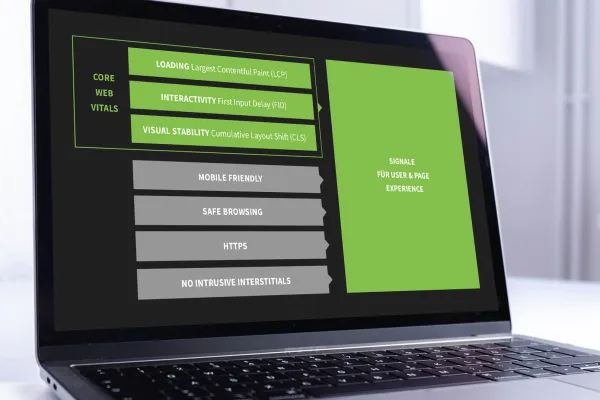 Open galleryThe training provides you with insights into UX theory, always underpinned with concrete practical relevance.
 -
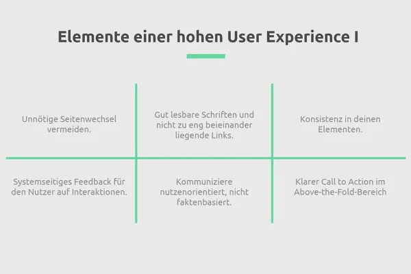
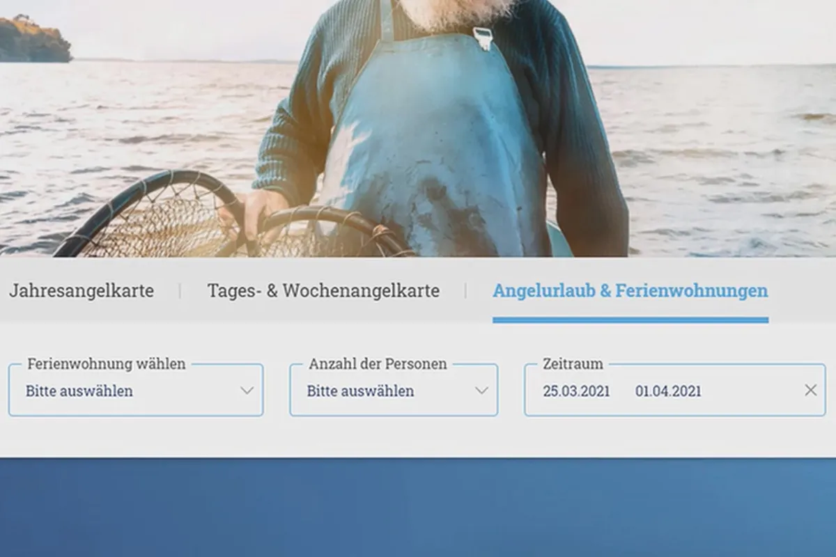
 Open galleryTelephone number, navigation, orientation triggers: get to know simple ways to improve the user experience.
 -
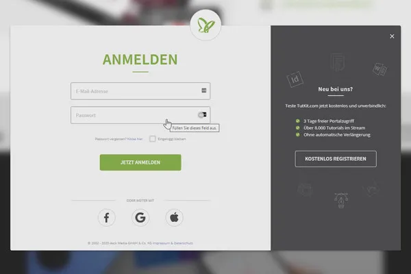
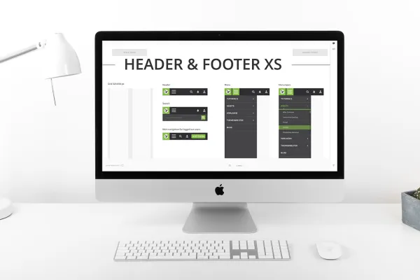 Open galleryAlways in focus with every topic: best practice examples for inspiration!
Intro to the video training
User Experience and Customer Journey
Details of the content
Improve the user experience along the entire customer journey
To make your users feel completely at ease, you should pick them up at every single touchpoint. Your trainer Matthias Petri shows you what to look out for in this practical tutorial.
Pick up or drop out: what type of company is yours?
There are companies that frustrate their target customers at many points of the customer journey - without even realizing it. And there are other companies that meet customer needs right from the first points of contact with their own brand and lead them on to their own website or online store, where users then exhibit the desired behavior thanks to further positive experiences.
The difference between these two types of companies is directly measurable in the sales realized, in the applications received, in the recommendations and reviews from customers. The key to this is a high level of user experience (UX for short), which is effective throughout the entire customer journey. It is a clear competitive advantage in the battle for customers (and potential employees).
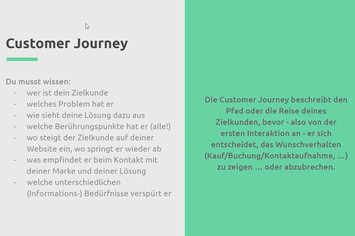
This tutorial provides you with a guide to raise your awareness for a high user experience on your own website or online store. Because your target customers' journey starts before that, you will learn how to pick them up at the first touchpoints on the customer journey , such as Google search or social media, and lead them to your offer.
The importance of user experience for your websites
A high user experience for websites is so important because ...
- a product (the website, store, app) should meet or exceed customer expectations.
- it puts the customer and their needs at the center.
- it makes it easier to trigger positive emotions in the customer.
- it makes it easier to accept the product and increases loyalty.
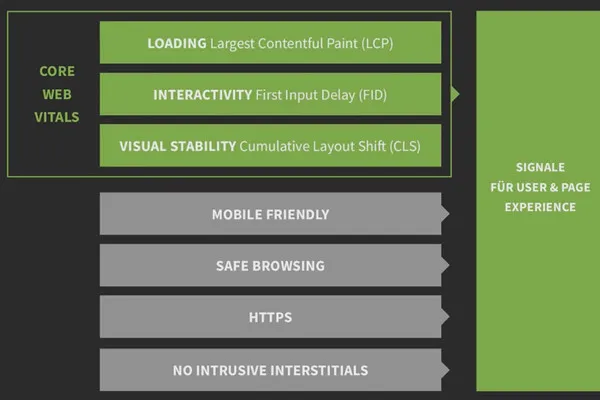
- it will become one of the most important ranking factors for Google from mid-June 2021 (!).
Avoid customer frustration, lower your visitor abandonment rates and increase the number of those who show the desired behavior on your offer page - thanks to an exceptionally high user experience on your pages.
Who is this training for?
This tutorial is for anyone who wants to reach their target customers digitally and positively convince them of themselves and their offers - without frustrating them unnecessarily and unnoticed. Ideal for:
- Designers who design websites to know what is the measure of all things today from a UX perspective
- Developers to gain a better understanding of conceptual considerations in the content and structure of websites and online stores
- Marketing managers who communicate with customers, work on the design of website content and/or act as an interface with agencies
- Entrepreneurs who gain an enormous competitive advantage thanks to a high user experience for their own offer and want to be sensitized to this from now on
Your learning journey towards an optimized customer journey
You will be shown by means of many practical examples
- the importance of UX for how Google ranks your website,
- which (free) measurement tools are available to you for determining a high (technical) UX and
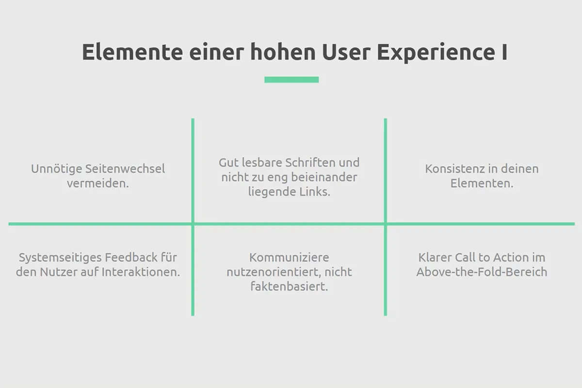
- which factors and elements on your website promote a high user experience.
The training is not a technical or software-related training, but one that examines websites from a conceptual and content-related perspective with the aim of ensuring a high user experience and sensitizing users to the factors and elements that frustrate them (often unnoticed). So you don't need any developer knowledge or software-specific skills. Here is a small selection of some of the aspects that you will look at in more detail using examples during the course:
- Homepage, landing pages and categories: the in-house touchpoints for your users
- Slide, light and accordion boxes: how to avoid unnecessary page changes
- Buttons and call-to-actions: How to formulate them clearly and understandably
- Location icon and phone number: where you should place them
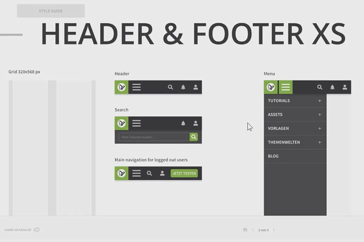
- Navigation, search and hamburger menu: How your users can find their way around
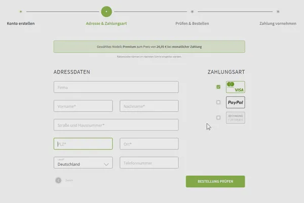
- Checkout and form fields: Avoid abandonment and exploit cross-selling potential
Your trainer Matthias Petri's promise to you: You'll think a lot of the content in this training sounds pretty simple and logical, and then when you look at your own website, you'll be shocked to realize how little of it you've actually considered yourself. Guaranteed!
Other users are also interested
How to build trust with customers
Save time with artificial intelligence

More style, more power, more templates!
With flyer, business card & Co.

Live your layout now!
Create, set up & optimize online advertising

Full power, more inspirations, maximum WOW effect!
For complete business equipment


