With this picture I want to give you a few rules and thoughts on the subject of image design and composition.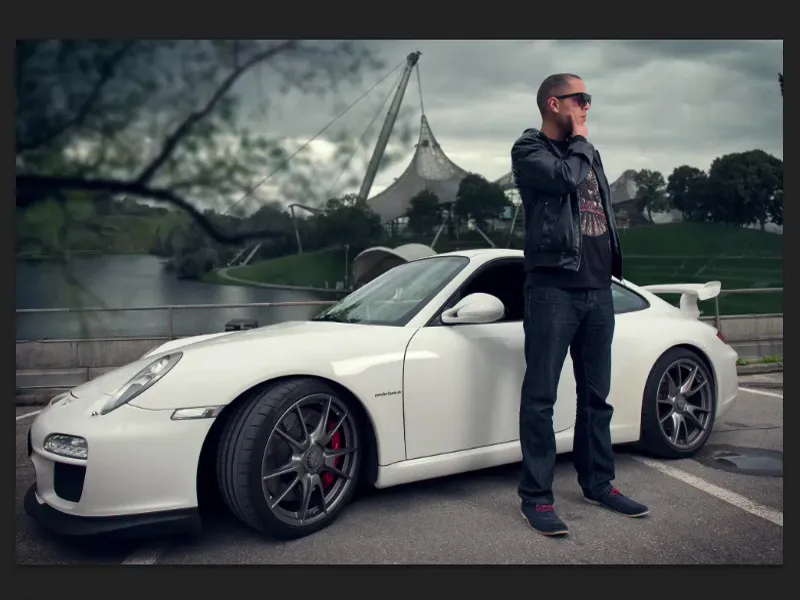
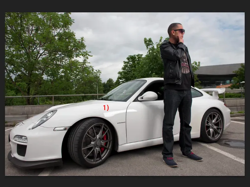
Let me show you what the original picture looked like. The aim or task here was to set the whole thing in the Olympic Park in Munich. The picture was taken normally with available light or perhaps with a small flash, I guess, because here (1) you can perhaps see a softbox, which could also have been a flash.
But it's a relatively unspectacular shot, so I don't have any highlights in here and I have drawing everywhere. I can see the brakes well, the rims and so on, the face, the jacket, everything has a nice outline. This is a good base image for retouching.
I'll go through the layer stack with you briefly so that you know what's happening in the compositing. This is probably a bit too quick to follow, but you have all the source files and can build it up as you go.
Crop and control layer
When I crop something like this, the first thing I think about is: Which cropping tool do I want to start with? I can make it quite easy for myself in this case, because if I zoom in a little closer here: I have these relatively straight edges due to this parking lot boundary in the background (1). The polygon lasso is my tool of choice for something like this, because I can easily crop the whole thing step by step. And I don't have any major problems with the model either, especially not with the hairstyle, because I can go around it nicely. So I'll get a very nice result with the polygon lasso.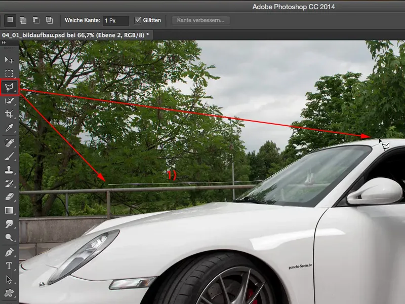
Before I start cropping, I always place a color in the picture, simply a color area with a fill (1) that doesn't appear in the picture and is quite bright. I do this because when I activate my clipping layer (2), I can control how my clipping is very well with this layer.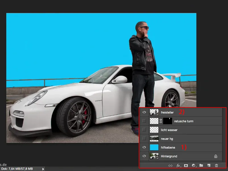
If I zoom in here to 100% (1), I can immediately check the edges and I can see: Have I somehow forgotten something? The clipping is really perfect because it's so simple.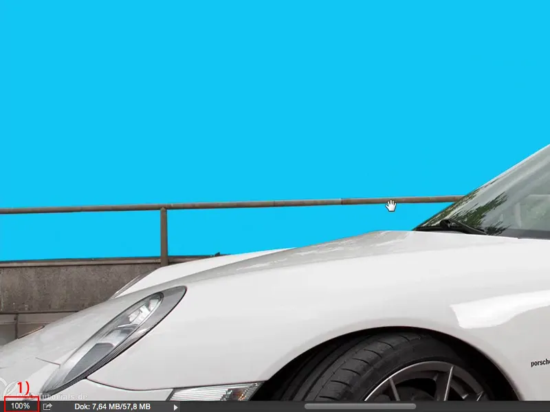
And no matter how close I zoom in here ... Yes, I could remove two more pixels here closer to the wing (1) of the Porsche, but I don't have to, you won't see that later in the picture anyway. So I definitely recommend this control layer (2) if you're cropping something.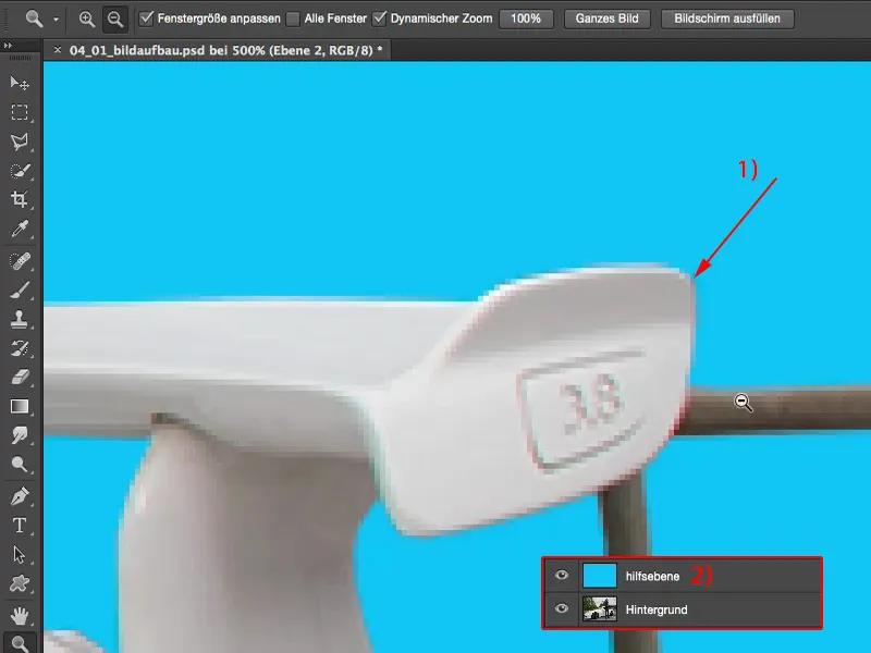
Image composition and retouching
The new background (1) is then easily placed under the clipping area. This is the Olympic Center in Munich. As you can see, the whole thing was taken under a cloudy sky, so I haven't included any highlights here either. This fits in relatively harmoniously. If I don't edit both pictures, then I don't have any big differences in contrast. That actually fits quite well. Now there's a tower growing out of the head, which I'll definitely have to retouch out.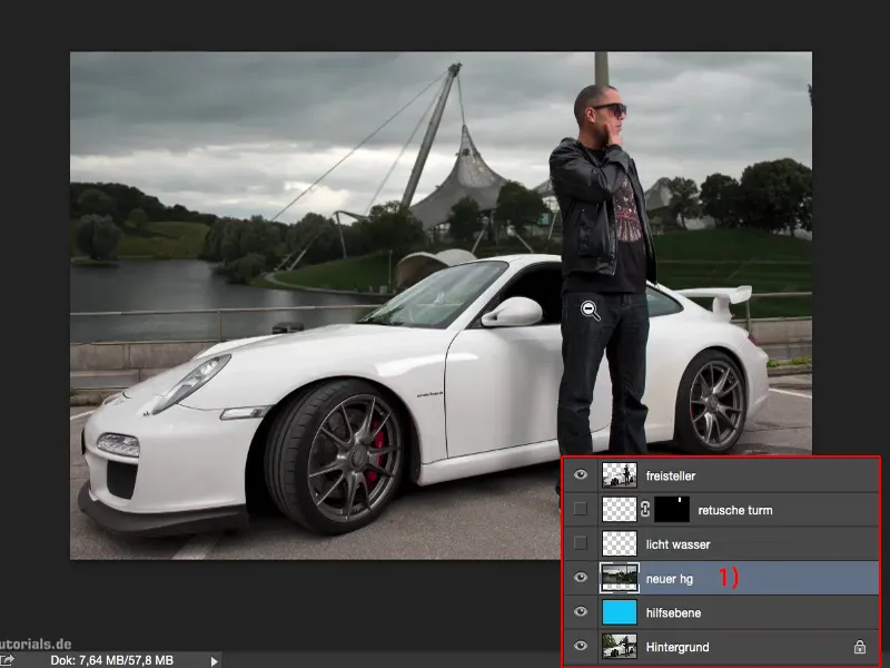
I'll do that on an empty layer (1).
I've brightened up the light and water a bit here, simply with a white, soft brush tip using the Soft Light mode (2). I removed small imperfections from the car and the model on an empty layer (3).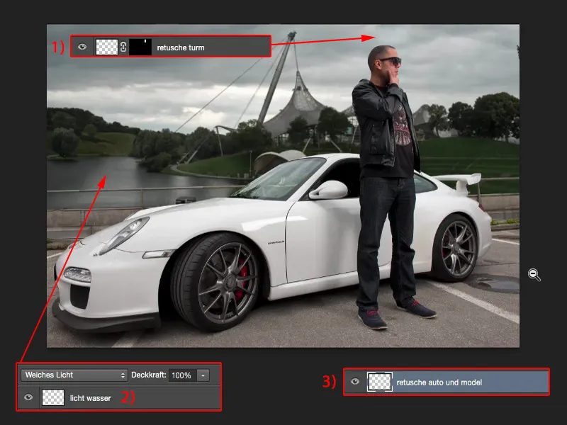
Then I added a cropped tree (1) to the front, gave the whole thing a vignette (2) and a certain color look (3). And that was basically it. Now the whole thing is harmonious.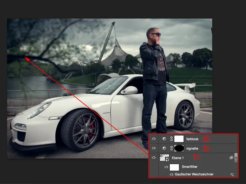
Image composition
Now I'll come to the subject of image composition and why the whole thing is harmonious. So this isn't a training course for tinkering, but it should explain the rules of image composition to you a little. I have created an empty layer for this purpose. I'd like to draw a few things on this layer.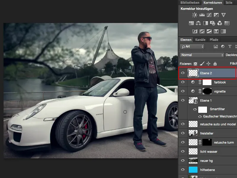
Rule of thirds
In terms of the picture layout, the whole thing is based on the rule of thirds. You may be familiar with the golden ratio rule. I haven't used the golden ratio here, but I've modified it a little for my purposes, because I've noticed that when I position picture elements in the picture using the rule of thirds, it's visually interesting.
In the original, the picture had a bit more air. The first thing I thought about when I cropped the picture was that the model should be in the right third. The Porsche and the border - it's all more or less in the lower third. That makes the picture quite exciting for the viewer.
I could also mirror the whole thing now, then I would have it upside down. That's a bit of a matter of taste. In this case, I quite liked it this way. So that's the first thing: pay attention to the rules of thirds when composing the picture.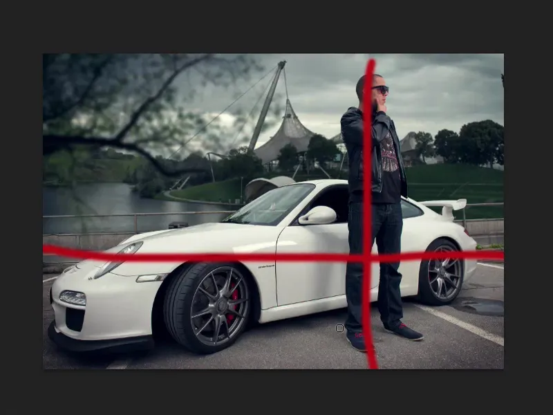
Horizon line
The second: If I have to replace a background image here, I take everything out and bring back the original image (1), then I have to think about where the horizon line is in my image.
It's relatively easy with this picture. I can simply draw guide lines through the parking lanes and see where they meet. And at this point, you can also see it quite clearly in the background, there is my horizon line (2).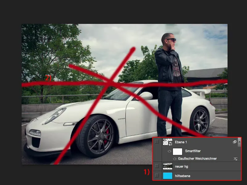
This means that if I now insert a new background (1), I also have to make sure that this background also has its horizon on the horizon line.
Let me show you what it would look like if I had set the background incorrectly. To do this, I'll use the Move tool and simply move the background upwards. Now the whole picture suddenly looks as if the car and the person are almost sliding into the Olympic lake. The car is sliding - and you almost wonder why the person is still standing upright. Actually, he should be tipping backwards because gravity should be pulling him down, or he should be leaning a little more forwards. But the perspective doesn't fit because the horizon line is much too high.
Of course, the same is also the case if I set the horizon line too far down. So I can see a lot of sky here, but it doesn't fit because the photo is taken at hip height, about stomach height, and that pulls everything backwards. So it doesn't fit either.
So: make sure that the horizon line is more or less where it is in your original photo.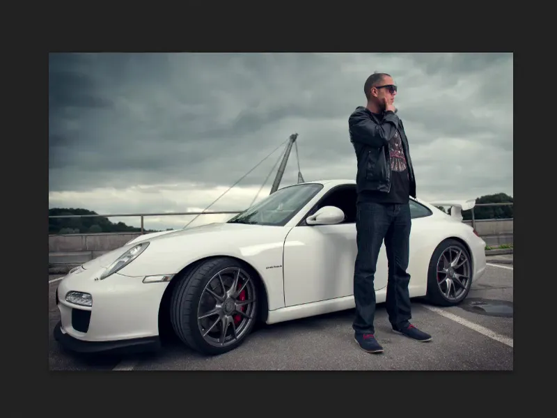
Elements in the foreground
Then I added one more element here and that's this tree. I have cropped it. You can now also render trees via Filter>Renderfilter, which makes it a bit easier if you want to insert a tree here. And I converted it into a smart filter and ran the Gaussian blur on it.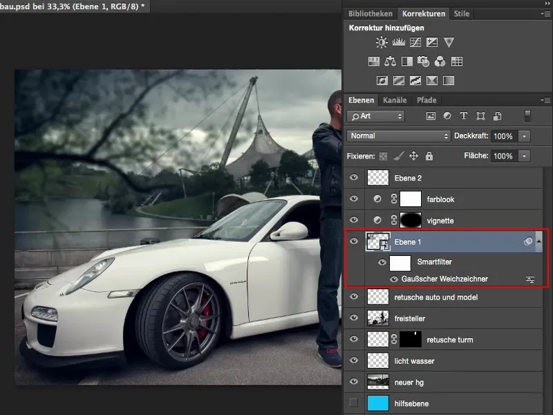
I'll now show you why. The tree is now in focus. You can see every leaf, every little branch. By the way, you have the clipping of the tree in a separate file, so you can also see how it's done.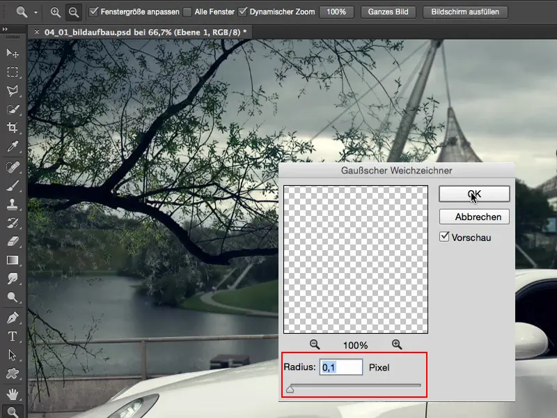
In my opinion, composing always consists of three elements. I have a middle ground, where the action takes place - this is where I have placed my model or the car. That's where the focus should be. I have the background, which in this case is also the newly mounted background. And if I want to make the whole thing a little more exciting for the viewer, then I also create a foreground. So I create blurred elements that are visually in front of the model.
I've just cropped this tree and let it grow in from the left. This also fits in a bit with the reflection in the window, because I can hardly conceal it in the original, and putting the lake behind it would never look really real.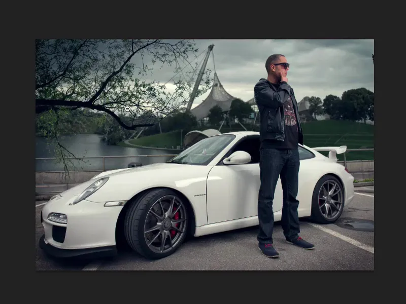
So I simply needed an element in the foreground. If I put it in here one-to-one - the tree is perfectly cropped - but the sharpness, it's much, much sharper than my model and the whole picture, it just doesn't fit. But if I apply a smart filter here and I put a Gaussian blur over it, for example with 6 to 7 pixels, then I suggest to the viewer: Aha, that's out of focus, it must be in front of the whole scene. And then it all blends in much, much better.
Even the photomontage is no longer so recognizable. I think I've managed it quite well, but maybe the horizon line isn't one hundred percent perfect and someone measures it or says: "Well, the way the light is ... and he's casting shadows here", and so on - then you can expose the whole thing. But if you integrate blurred elements in the foreground in front of your model, then you manage to make the whole thing melt together. It merges more and more. You're no longer so concerned about paying attention to the Olympic Center, to the background, because there's this tree here.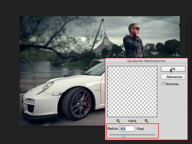
Summary
And I'm sure that when you show something like this to people and ask: "So, what do you think I've done here?" They say: "Yeah, I don't know. Dodge and burn on the car, on the person, color look and so on." But as a rule, if the horizon line fits and you've inserted a blurred foreground well, then the montage as such is no longer so quickly recognizable. Of course, people who work with Photoshop on a daily basis will say: "Well, the tree has probably been inserted, maybe not, let's see." And then they look at the layer stack.
But if you show it to people who don't know anything about Photoshop, they'll take the image for granted, because they might look at the Olympic Center in the back, they'll look at the car - they won't look at the tree. And that's the purpose of such an image composition.
So always remember to adjust the horizon line, adjust the perspective, adjust the brightness and contrast of montage elements, and the saturation is also very, very important. It wouldn't make any sense at all if the green at the back of the hill really pops out now. Then you would immediately see that these two elements have to be mounted, they don't match. And then always remember to insert out-of-focus elements in the foreground, to direct the focus onto your model using a thirds adjustment and to adjust the perspective of the background. Then you will have a photomontage that appears logical and relatively real in terms of the image composition.


