In this tutorial, I will show you how to professionally format text in PowerPoint. A visually appealing formatting is crucial to give your presentations more clarity and aesthetics. You will learn how to strategically use headings, bullet points, and spacing. This knowledge will help you better structure and present your content. Let's get started!
Key Insights
- Strategic formatting makes the text more appealing and easier to read.
- Key formatting tools in PowerPoint include numbering, bullet points, and the use of images or icons.
- A clean layout enhances the clarity and professionalism of the presentation.
Step-by-Step Guide
First, download the presentation template and open it in PowerPoint. You can either practice with me or follow the steps on your own.
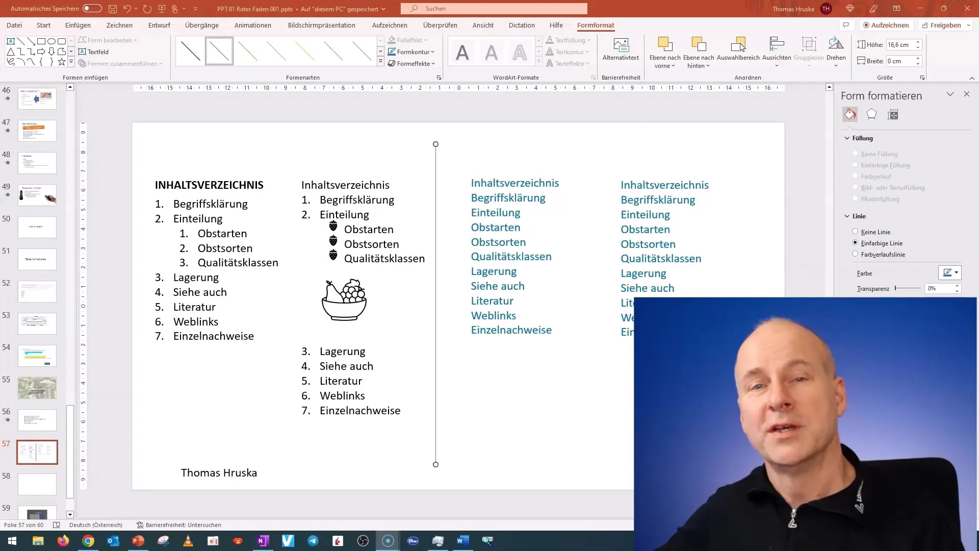
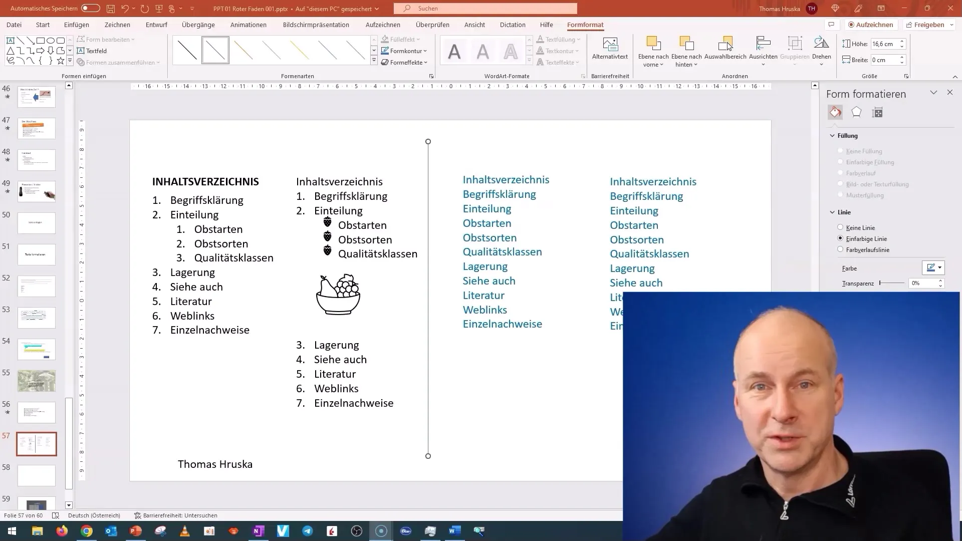
Now, let's start with the most important foundation of formatting: headings and bullet points. Go into the slide text editing and begin with a brief overview of the topic "Fruits".
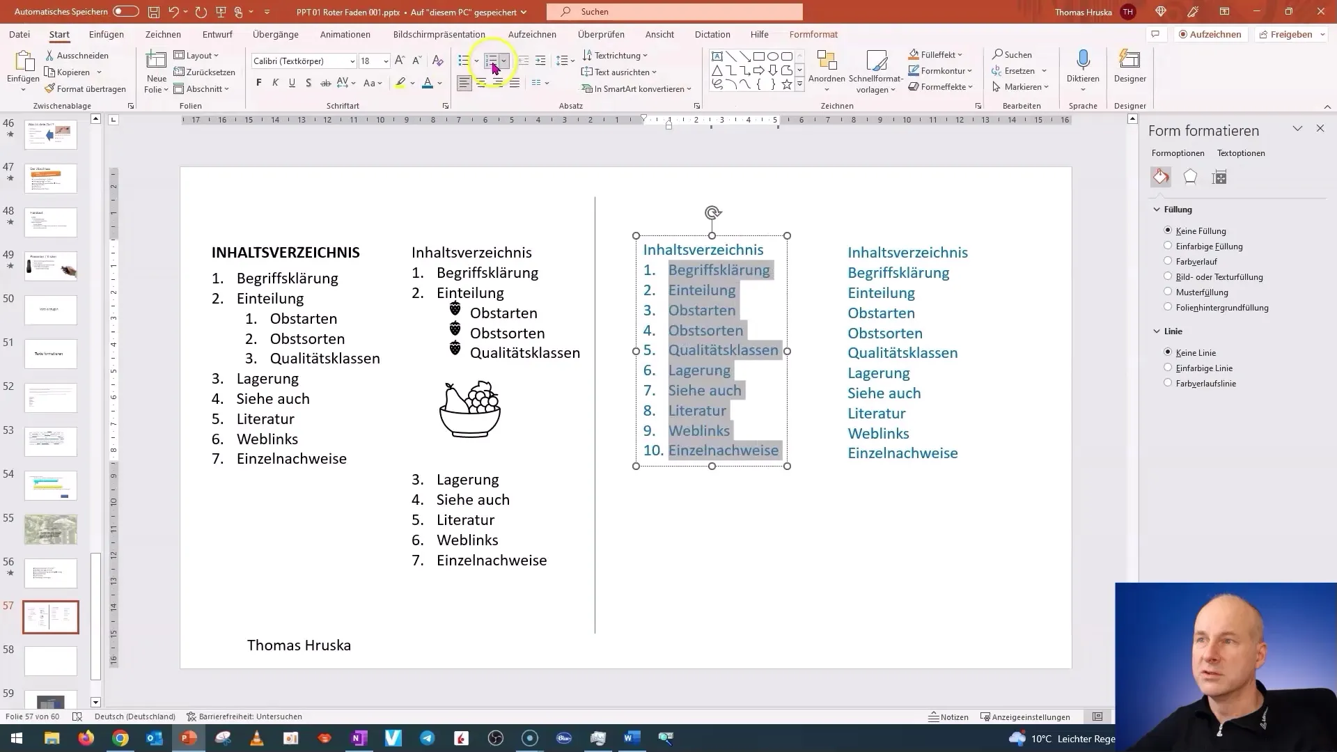
First, number the list items. To do this, go to the "Numbering" option in the menu bar and select the first option. This gives your list a clear structure.
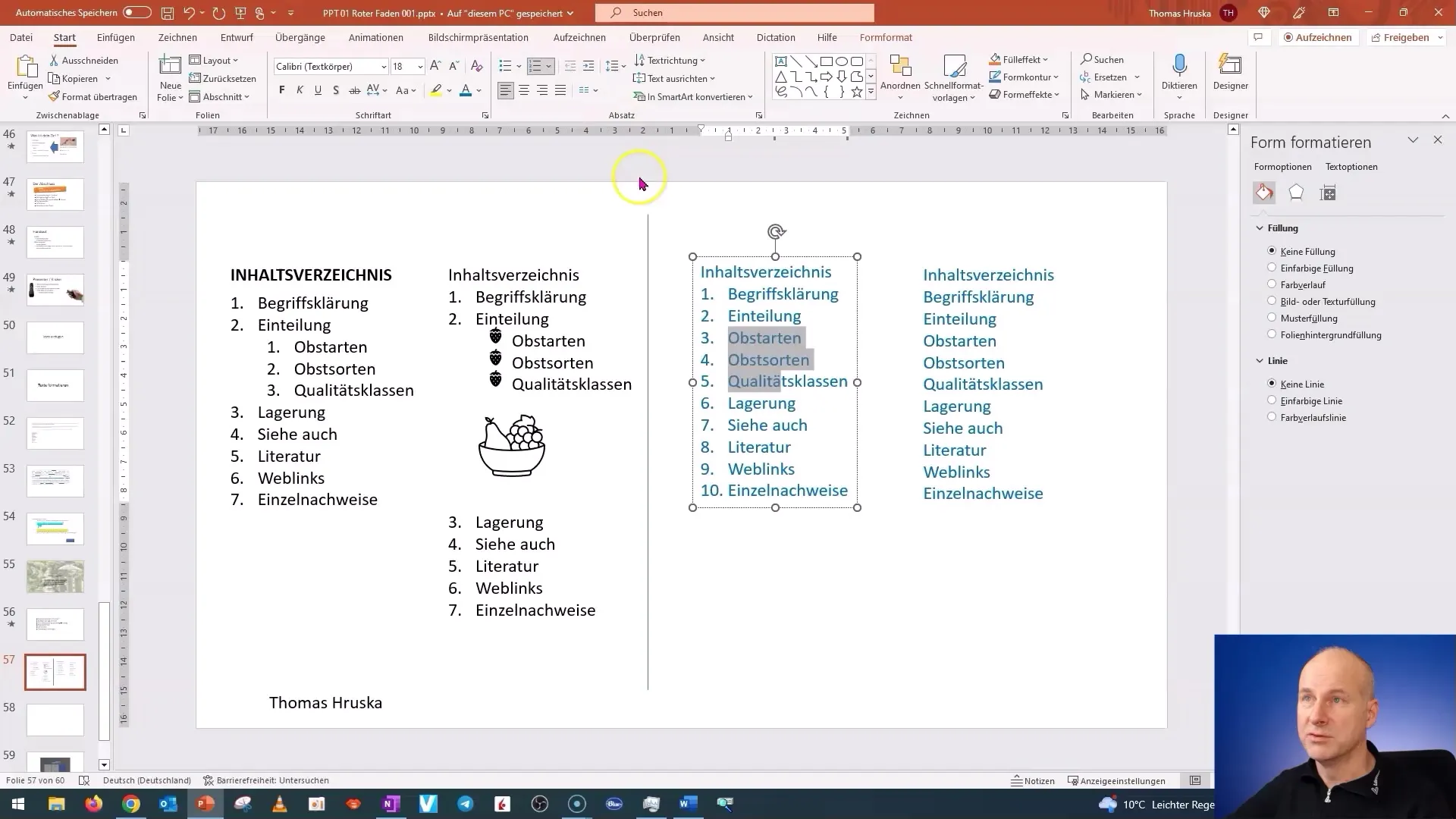
A very helpful trick I want to show you is indenting text. Highlight the first three lines of your list and press the Tab key. This will move these points to the next level, creating a sublist.
To create more space between paragraphs, go to the paragraph options and adjust the spacing. Make sure to set the spacing to your liking to achieve a clean layout.

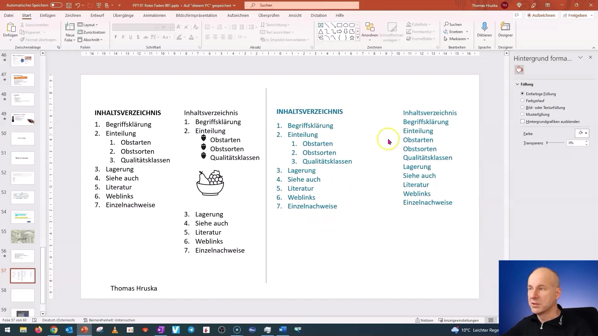
Next, let's format the table of contents. Highlight the heading and choose the "Bold" option to emphasize the title. Headings should always stand out to catch the eye.
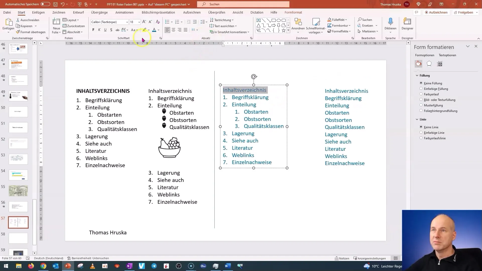
Then, continue by expanding your layout, adding more spacing between paragraphs and bullet points. Make sure everything looks good.
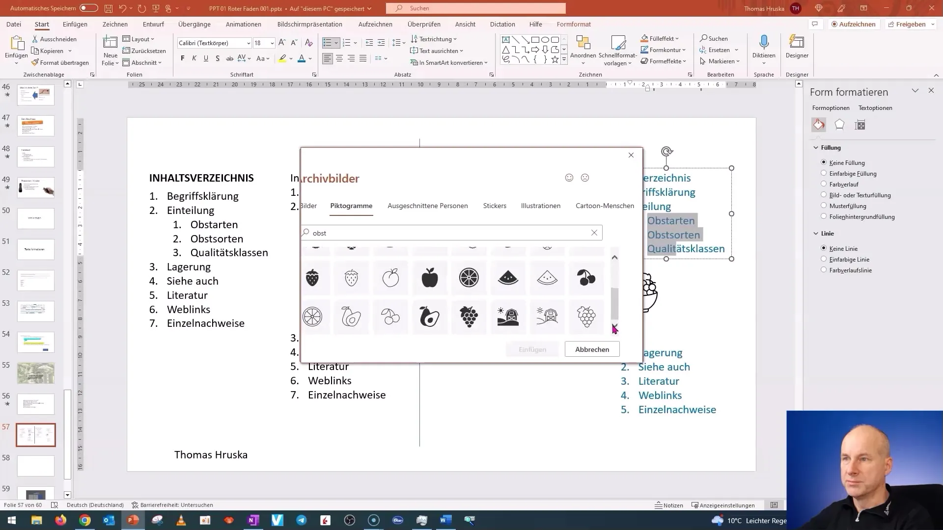
In the next step, let's insert an image into the presentation. Go to "Insert," search for the image using "Icons," or directly through the file path, and select an appealing image.
To further optimize the layout, you can constrain the image to fit well on the slide. I recommend adjusting the size of the image. Select the image and adjust the size to around 170%.
To structure the headings and points, go back to the formatting settings. Choose the "Align" and "Align Left" options here to make the list even more organized.
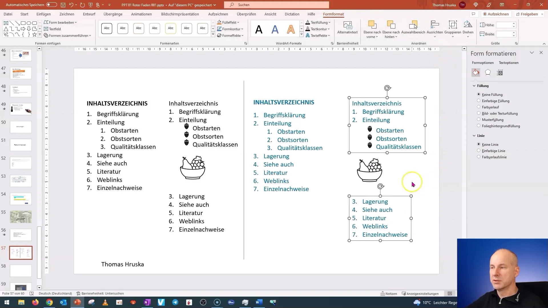
Finally, you can adjust the entire list as needed by moving it up or down. Hold down the Shift key to keep the spacing even.
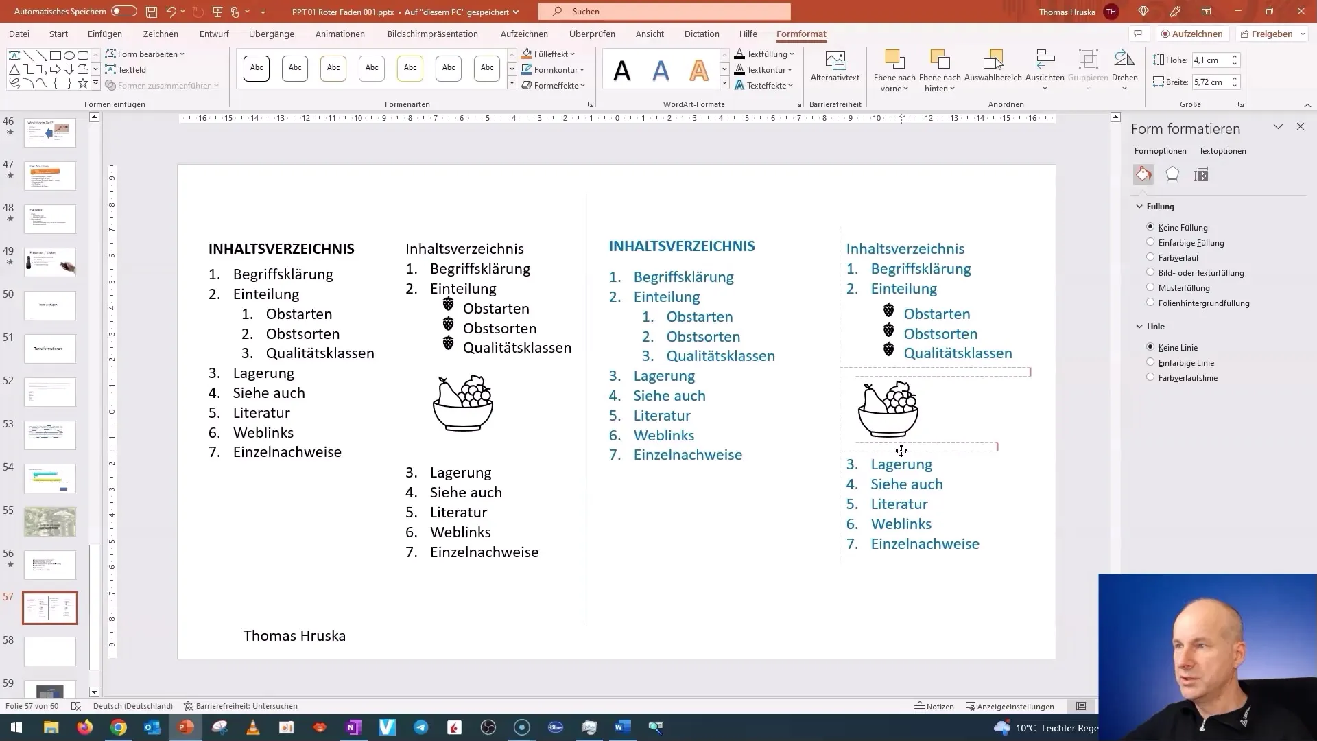
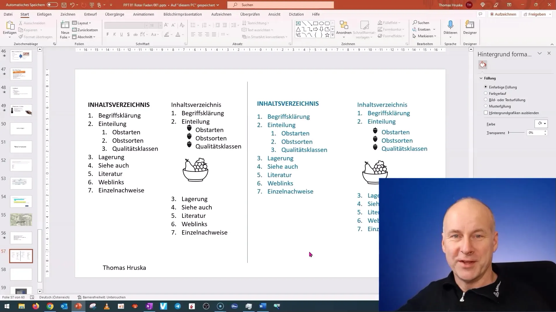
Check out the entire slide. You will see how much easier and more appealing the text looks now. Take the time to practice these steps - it's worth it!
I look forward to seeing you in the next session, where we will continue working with text boxes.
Summary
In this tutorial, you have learned how to format text in PowerPoint to create a professional presentation. You have learned the basics of numbering, indentation, paragraph styling, and image editing. These skills will help you create more engaging presentations in the future.
Frequently Asked Questions
How can I indent text in PowerPoint?You highlight the desired text and press the Tab key.
How can I format text in bold?Highlight the text and click on the "Bold" icon in the menu bar.
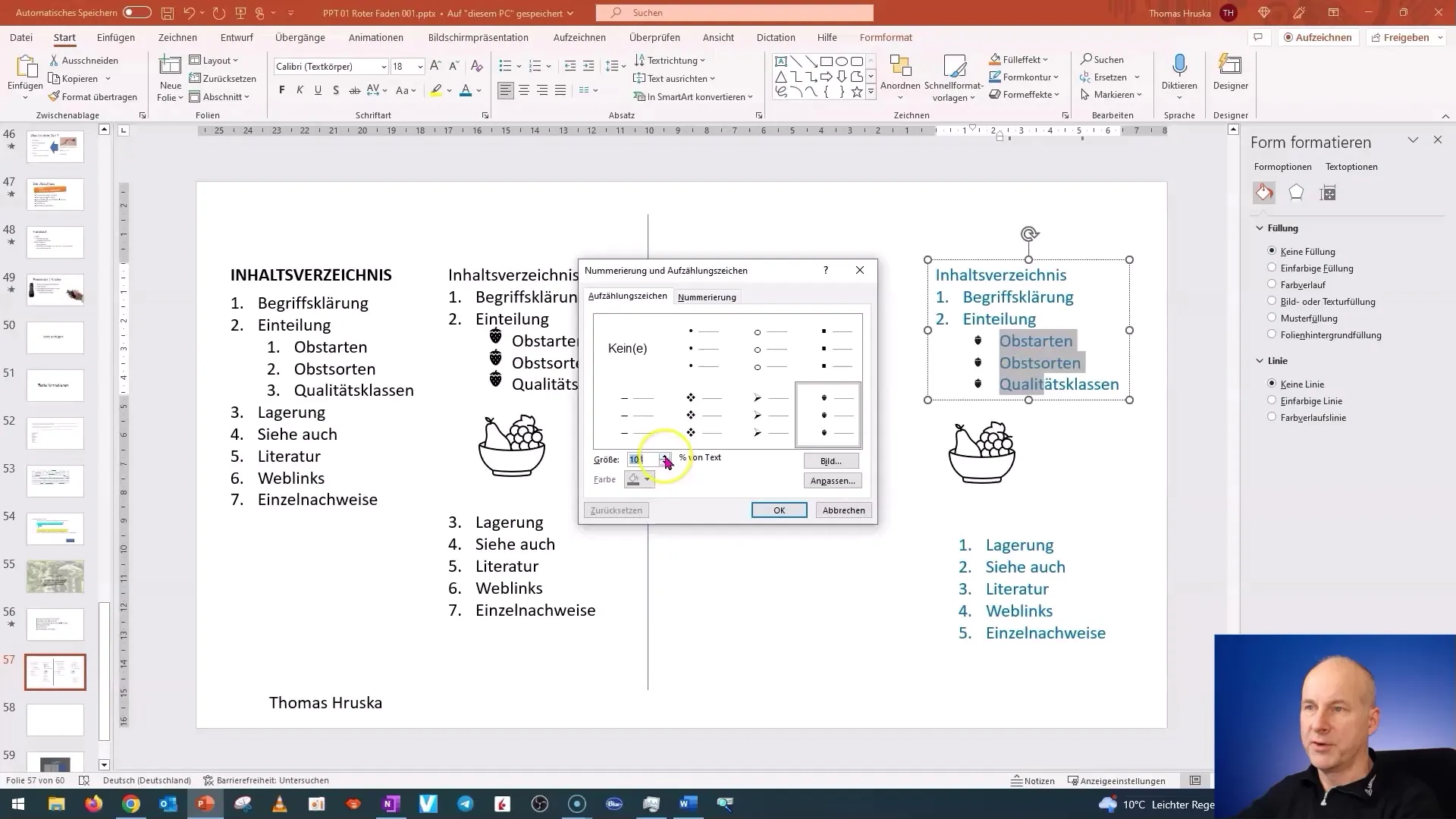
Can I customize my bullet points?Yes, you can choose different bullet points and adjust their size.
How do I insert images into my presentation?Go to "Insert" and choose the "Pictures" or "Icons" option.
How can I resize my images?Click on the image and drag the corners to adjust the size.


