Welcome to this guide that focuses on inserting charts into PowerPoint, especially using Excel data. You will learn how to effectively insert graphs, understand the advantages and disadvantages of the various insertion options, and how to select effective color schemes to avoid the "color trap". The project file I discuss in this tutorial includes the slides for the video.
Key Takeaways
- Charts should ideally be inserted from Excel into PowerPoint to ensure precise data visualizations.
- There are several insertion options: use destination theme, maintain original formatting, and insert the entire image.
- Be cautious with color schemes to ensure that the colors in the presentation match those in Excel.
Step-by-Step Guide
To start inserting charts into PowerPoint, first open your Excel document with the necessary data.

Once you have prepared your data and created the desired chart, simply copy it. To do this, go to the chart view in Excel, select the chart, and right-click to display the copy options.

You now have various insertion options: most often, you will right-click to insert the chart. Make sure to choose the correct insertion option so that the formatting and data link are inserted as desired.

One of the options is to "use destination theme," which gives the PowerPoint presentation consistent styles. Ensure that your selection fits well with your overall design.

This option can be helpful in achieving a professional appearance. Another practical aspect is that PowerPoint shows you directly how the chart will be inserted based on the chosen options.

A common mistake is to maintain the original formatting without first aligning the color scheme, which can lead to undesired color changes. It is important to pay attention to the color schemes set in Excel and PowerPoint.

Switch to design options in PowerPoint and check the colors to ensure that the color palette you used in Excel is also set in your presentation.

If the colors do not match, it can lead to confusion. If you are using specific color schemes, ensure they match in both programs.
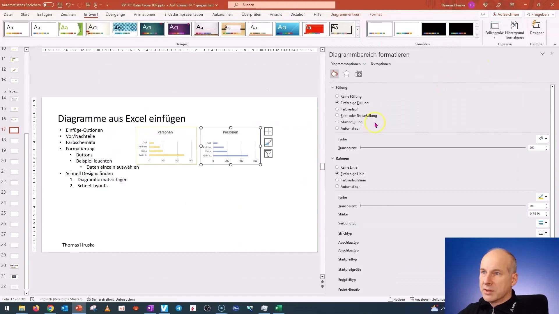
Copying a chart and aligning the colors with a different file can result in the unfrozen colors of your chart being randomly changed in the presentation. To avoid this, manually select the desired colors and then adjust the chart in both programs.
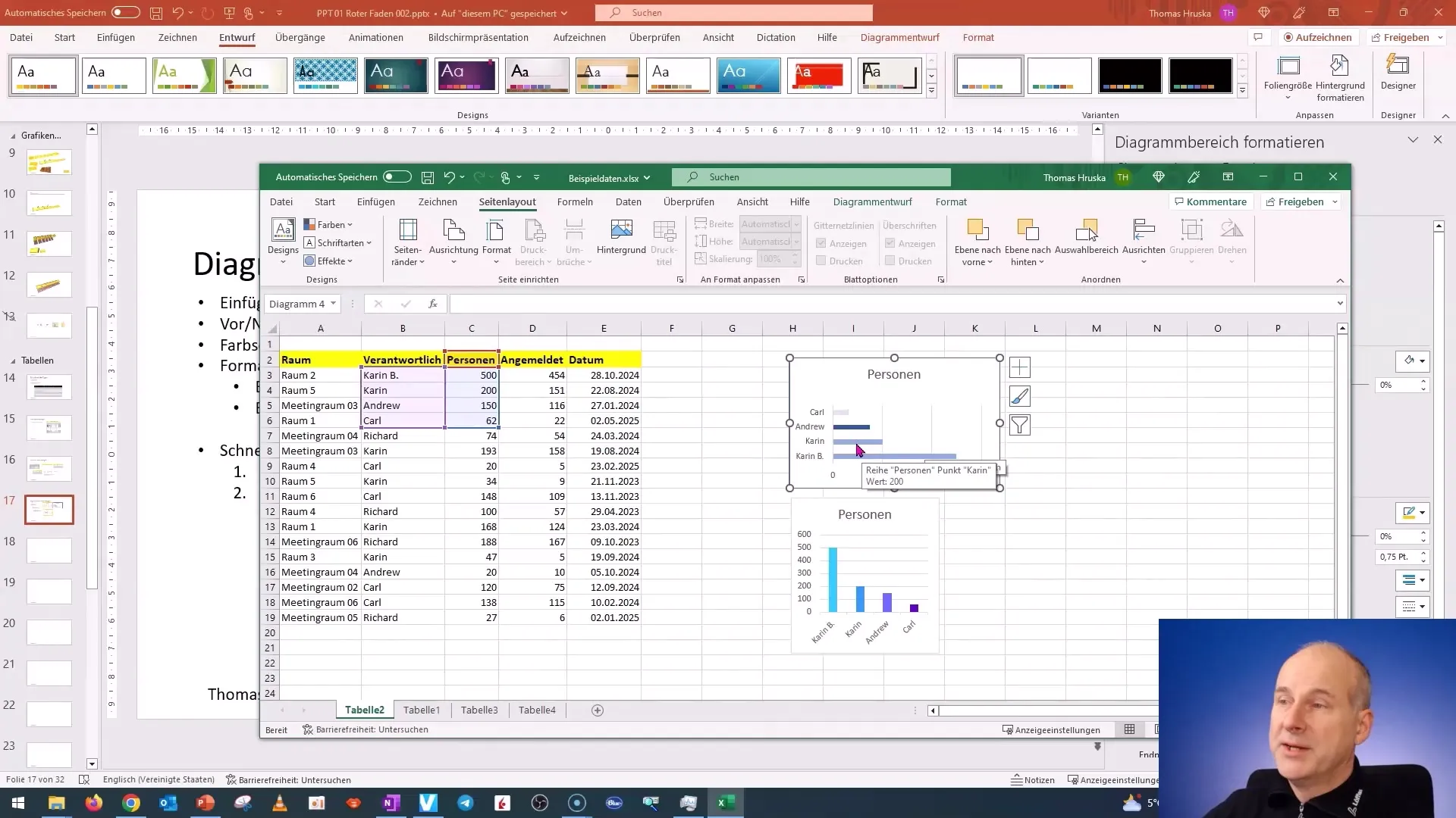
Before inserting the chart, prepare it in Excel to meet your requirements. The more precise you are in Excel preparation, the easier the presentation will look in PowerPoint.

Once you have inserted the chart in PowerPoint and if you want to change the data in Excel, you can select the "Link Data" option to automatically update the graphic in the presentation when the info in Excel is updated.
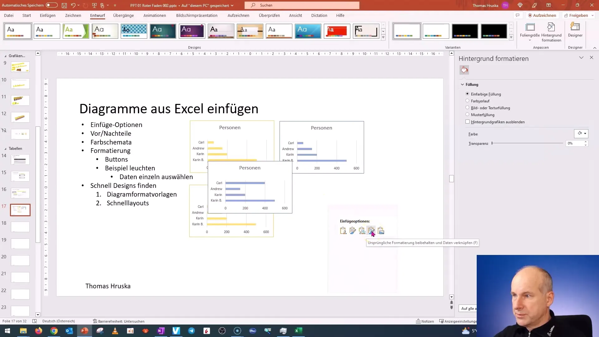
To change the representation in the presentation, check the insertion options and choose between the options to achieve the best results.
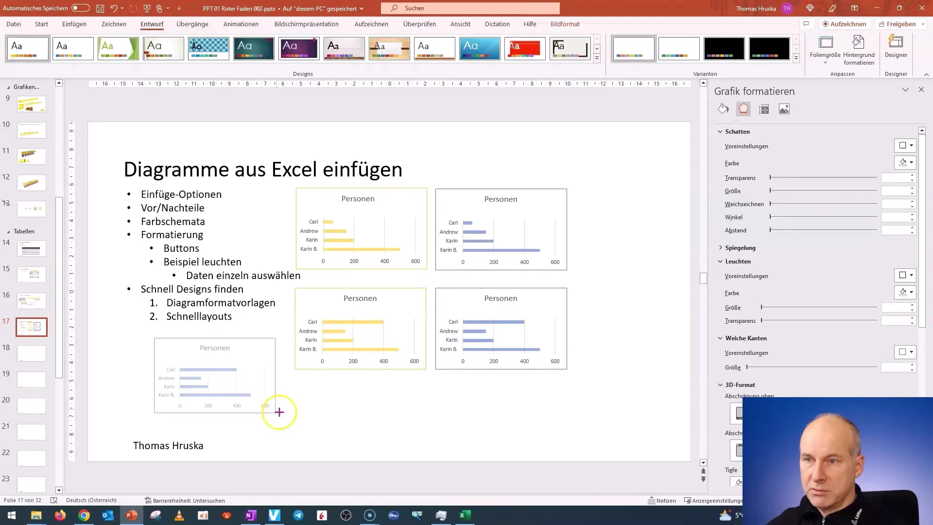
In addition, you can choose whether you want to insert the entire graphic or only parts of it. If you need a static representation, you can insert the graphic as an image.
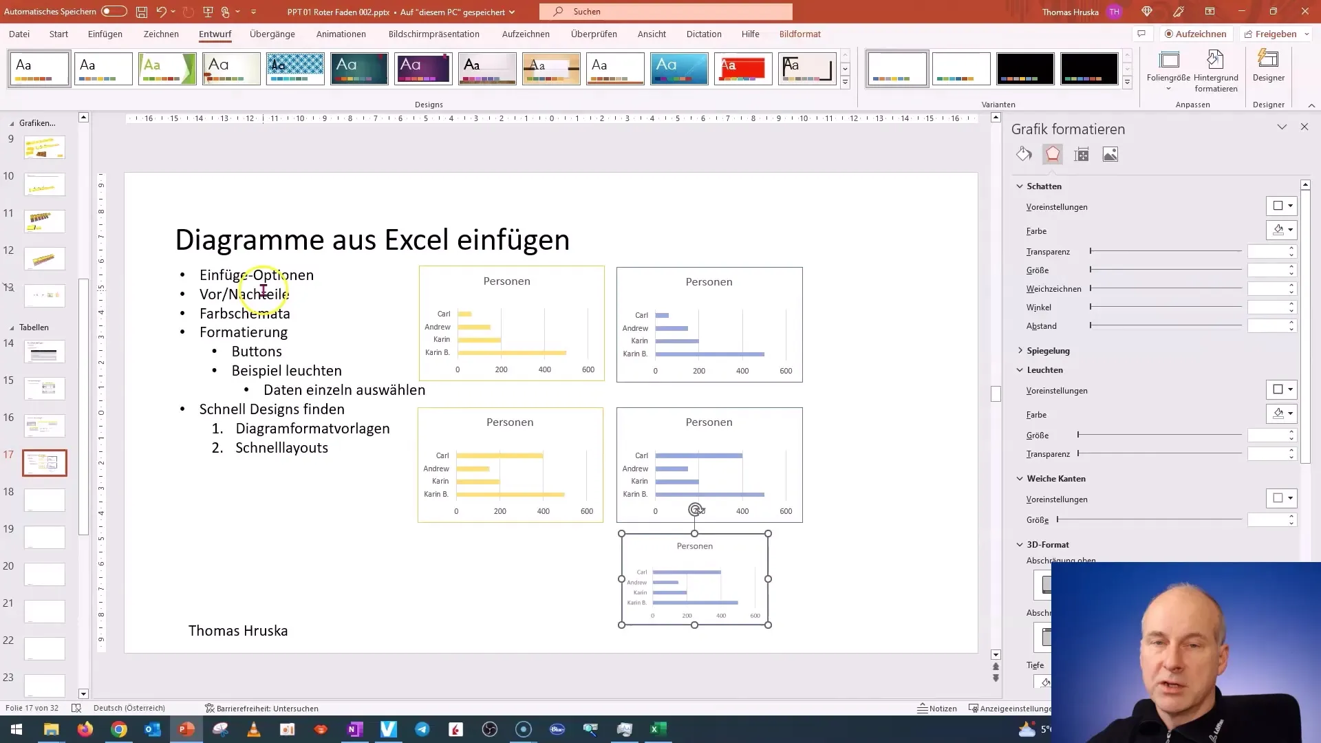
After testing the various insertion options, you will have a clearer idea of how the graphics should appear in your presentation. Make sure to differentiate between the different formats and their representations to achieve a clean, professional look.
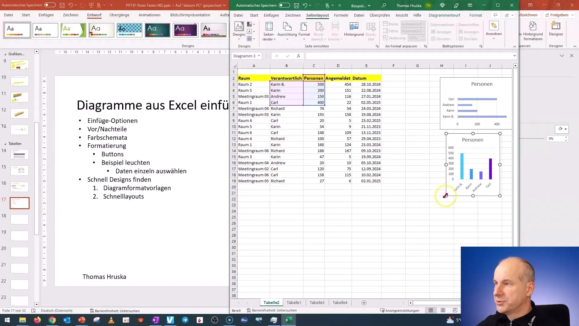
To establish uniformity in the presentation and avoid errors in colors, handle the color schemes carefully and test how they appear on the screen before finishing and saving your presentation.

Summary
In this guide, you have learned the steps to insert diagrams from Excel into PowerPoint, from the various insertion options to the color schemes and their significance. Always make sure to prepare your diagram accordingly to ensure consistency and an appealing design.
Frequently Asked Questions
How do I insert a chart from Excel into PowerPoint?Copy the chart in Excel and use the insertion options in PowerPoint to insert the chart.
What insertion options are available?The most common ones are "Use Destination Design", "Maintain Original Formatting", and "Insert Whole Picture".
How can I prevent color changes when copying?Make sure that the color schemes in Excel and PowerPoint match before copying the chart.
What does the "Link Data" option do?This option automatically updates your chart in PowerPoint when you change the data in Excel.
Can I use custom colors?Yes, you can choose custom colors to use specific color tones in your chart.


