In this tutorial, we will delve deep into the formatting of charts in PowerPoint. It is important that your charts are not only informative but also visually appealing. You will learn how to effectively utilize various formattings, designs, and features to convincingly present your data. Let's get started!
Key Takeaways
- Charts in PowerPoint can be formatted in various ways.
- There are different buttons for selecting and customizing chart designs.
- You can insert data labels and hide specific data series.
- Color schemes can be adjusted to match your presentation's existing color scheme.
- It is easy to use the formattings in Excel as well.
Step-by-Step Guide
Let's start with the first step of formatting your chart. It is helpful if you have already inserted a chart in your presentation before proceeding with the next steps.
Once you have selected your chart, you will notice three buttons on the formatting toolbar. These buttons are your tools for adjusting the chart.
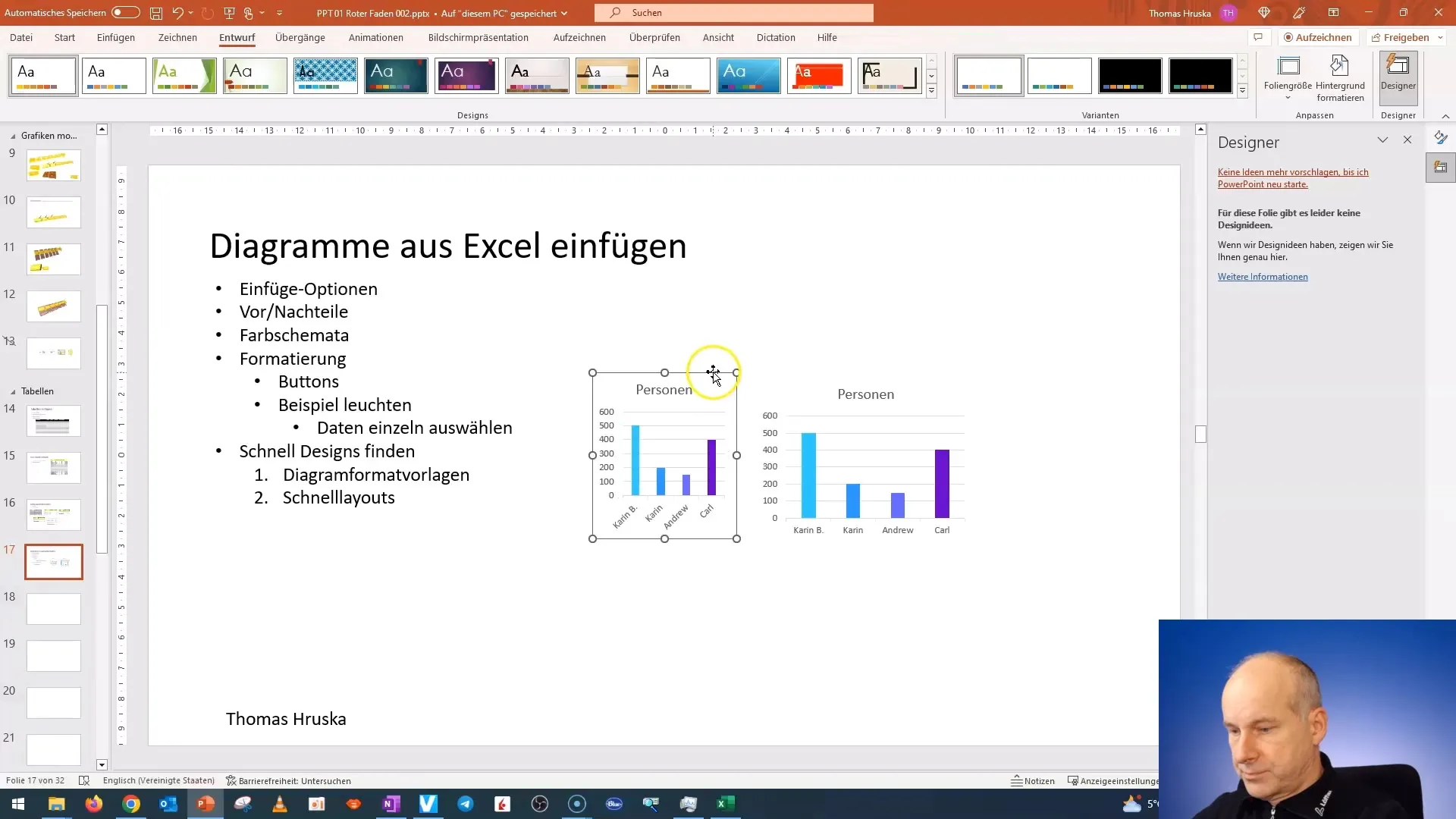
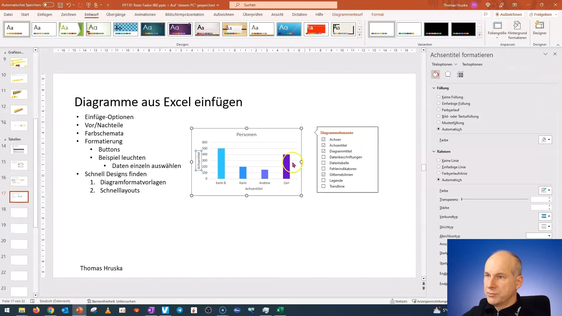
You have the option to select various elements of your chart. This means that you can address not only the entire chart but also specific data series, axes, and legends, giving you flexibility in design.
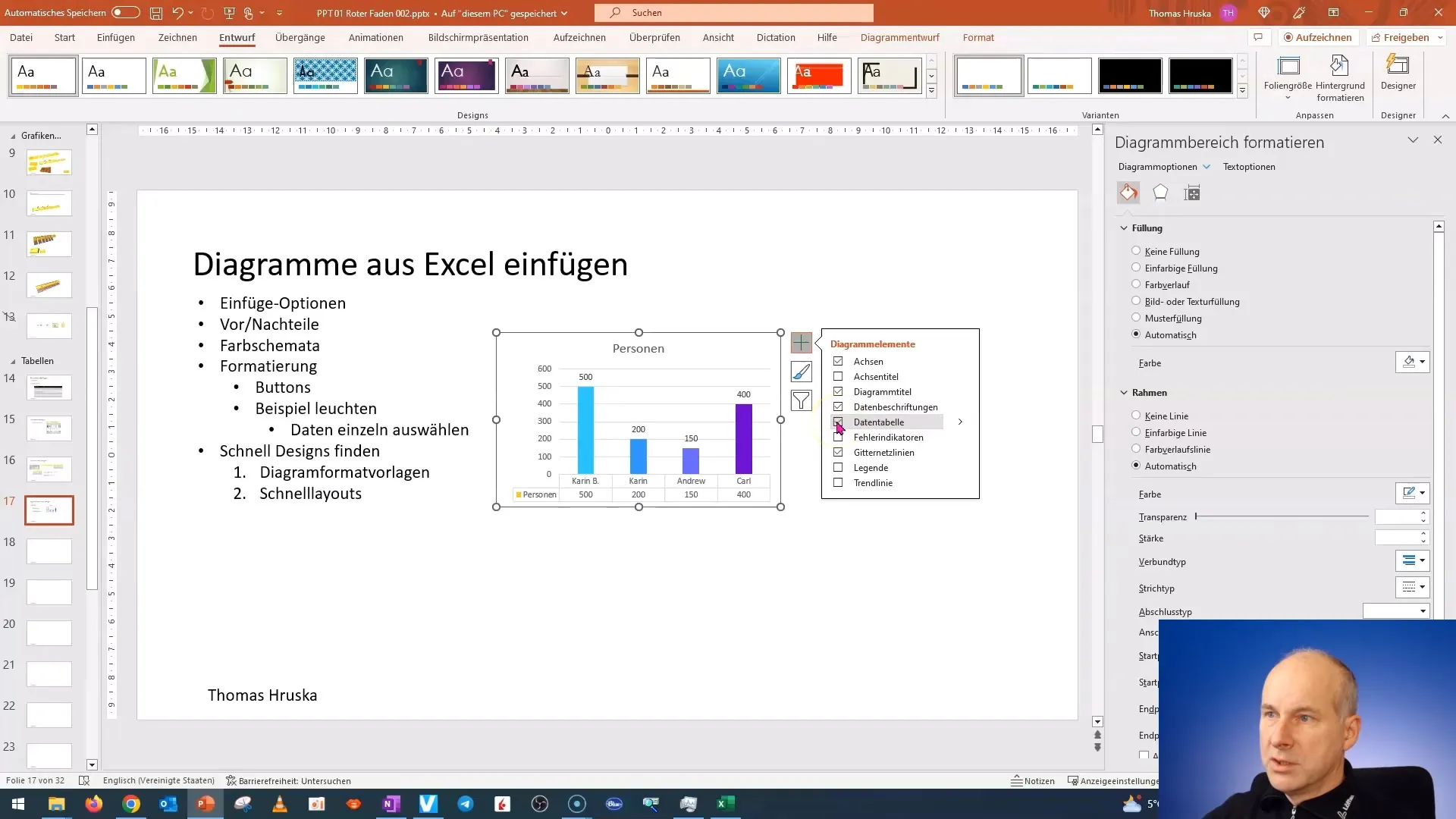
An useful function is adding data labels. These can help make the data directly visible in your chart, increasing readability. You can also insert a small table below the chart to present the data even clearer.
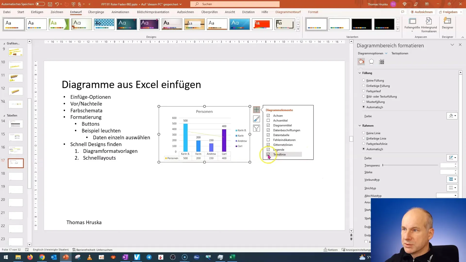
Don't forget to use the legend of your chart. It helps viewers quickly identify the different data series. You can display the legend and also add a trendline, further enhancing the clarity of your data.

There are many sub-options you can use to perfect your charts. For example, you can add a custom trendline if you want to highlight specific data. However, this feature should be used sensibly as it is not always necessary.
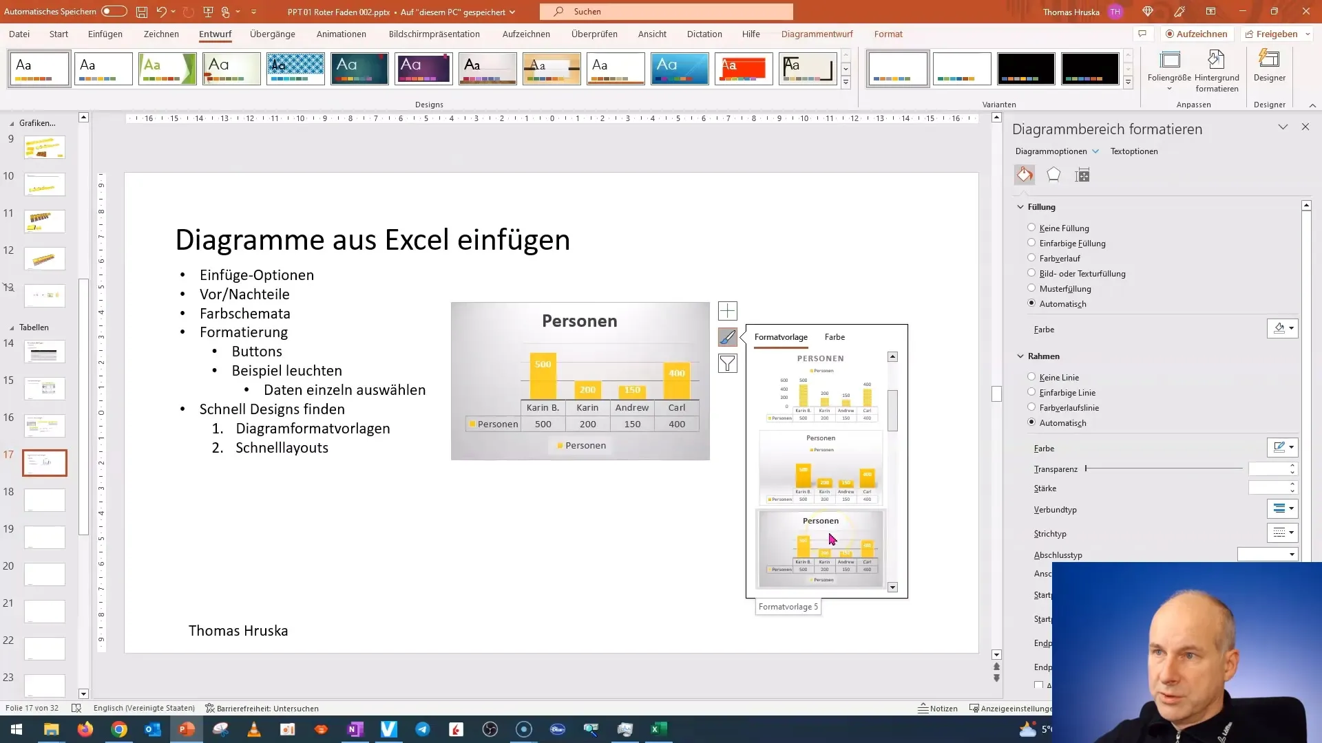
Now, moving on to the second button, which provides an easy way to choose different designs for your chart. These designs are very appealing and can vary depending on the context of the presentation.
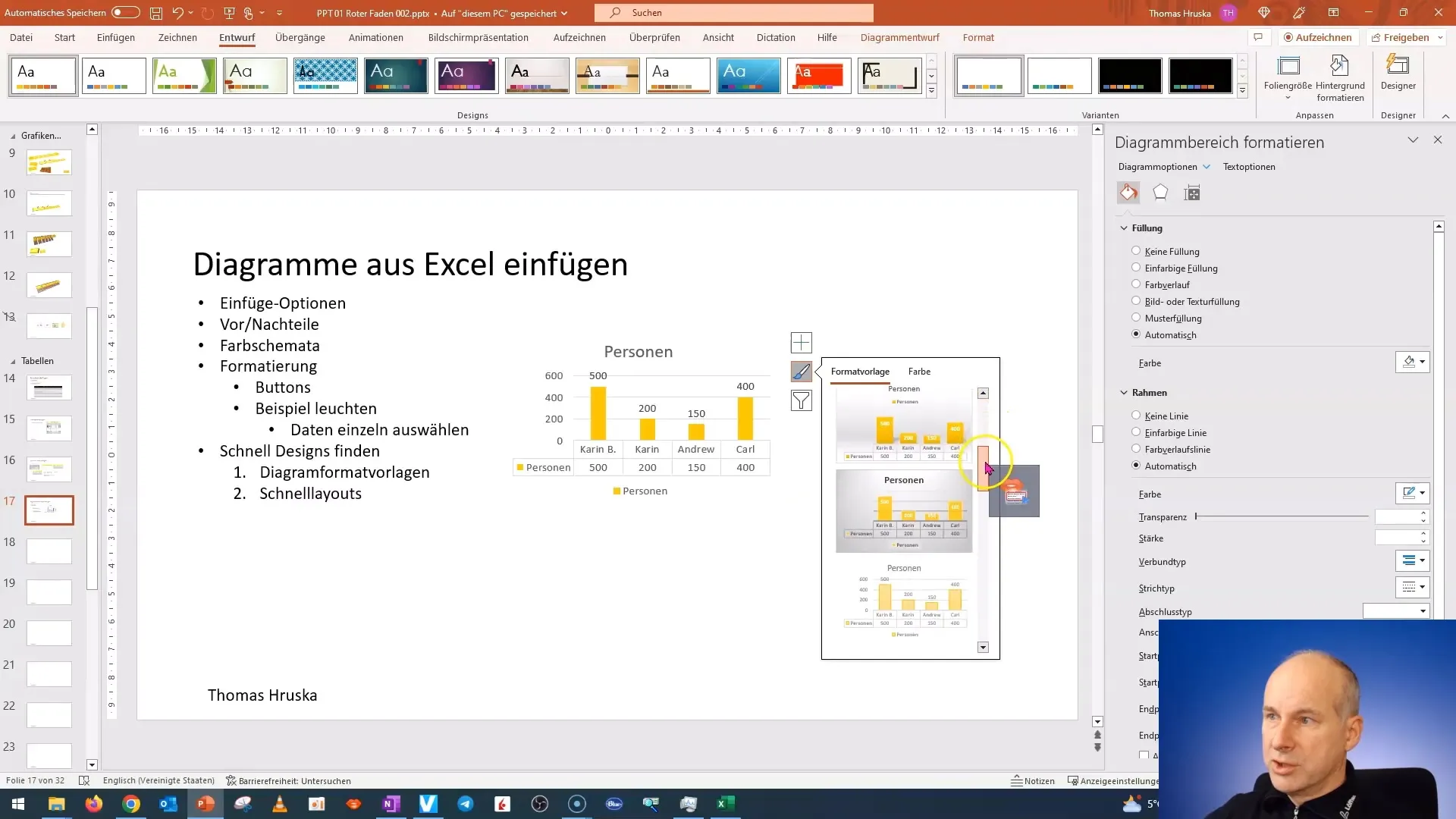
Make sure the colors you choose match optimally with your color scheme in PowerPoint. PowerPoint already uses the colors defined in the presentation design to ensure a consistent look.
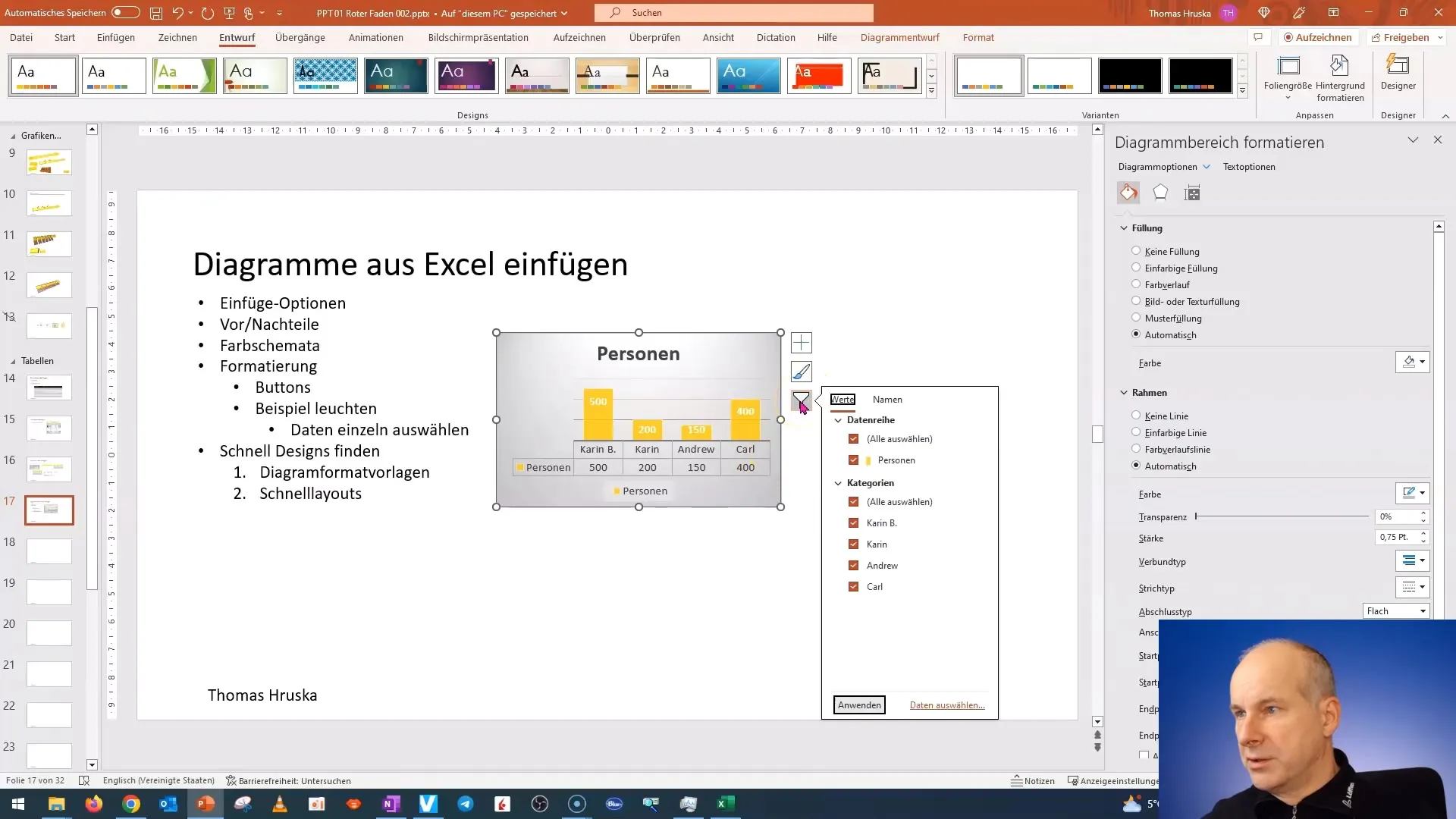
In addition to the designs, you can also use filters to hide specific data series. This can be advantageous when presenting complex data and you want to focus on the essentials.
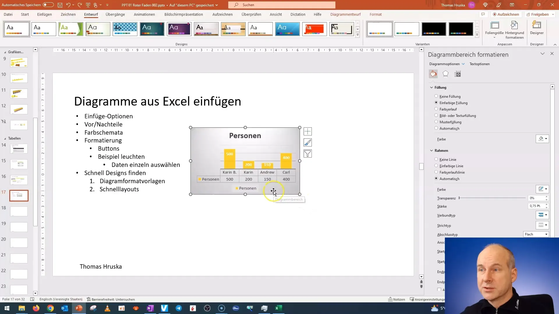
If you ever need to undo a selection, you can usually do so easily. It is important to stay connected with what you are presenting to keep your data clear and comprehensible.
To conclude this tutorial, I will go straight to the next video. There, I will show you how to quickly preselect a formatting that is optimal for your charts. Stay tuned for the upcoming tips!

Summary
In this tutorial, you have learned how to fully format charts in PowerPoint. You can now link data labels and customize the design to match your presentation. Use the various functions to optimize the display of your data.
Frequently Asked Questions
How do I add data labels to my chart?You can insert data labels by selecting the chart and using the corresponding function in the formatting menu.
Can I customize the colors of my chart?Yes, the colors can be customized to match the color scheme of your presentation.
How can I hide specific data series in the chart?Use the filter function to hide individual data series and simplify the representation.


