In this tutorial, you will learn how to create various diagrams in PowerPoint, insert data into them, and customize them to your needs. Diagrams are an excellent tool for visually representing information and presenting complex data to your audience in an understandable way. You will be guided step by step through the process, from creating a diagram to adjusting font sizes and colors, so you can easily enhance your presentation.
Key Takeaways
- You can create various types of charts in PowerPoint, including bar, line, and pie charts.
- Data from Excel can be easily copied into your chart.
- The font size and colors in the chart can be customized.
Step-by-Step Guide
Inserting a Chart
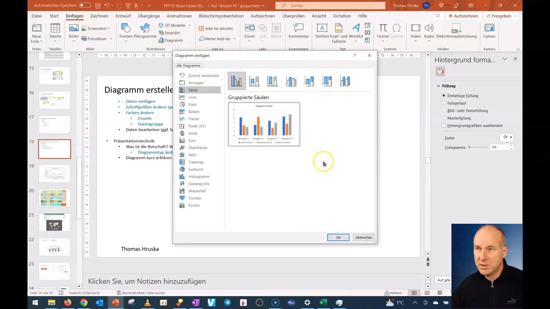
First, open PowerPoint and navigate to the slide where you want to create the chart. Go to the "Insert" tab and choose the "Chart" option. You have a choice of different types of charts, including bar, line, and pie charts. The selection depends on the data you want to visualize. To start, click on "Column" and then "OK".
Inserting Data
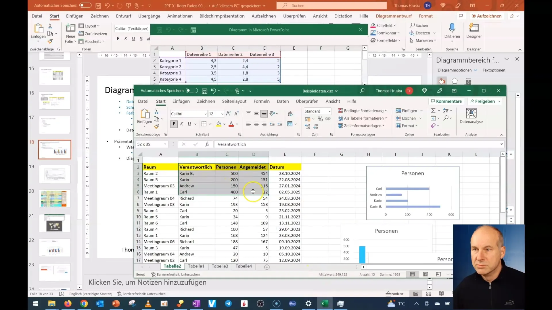
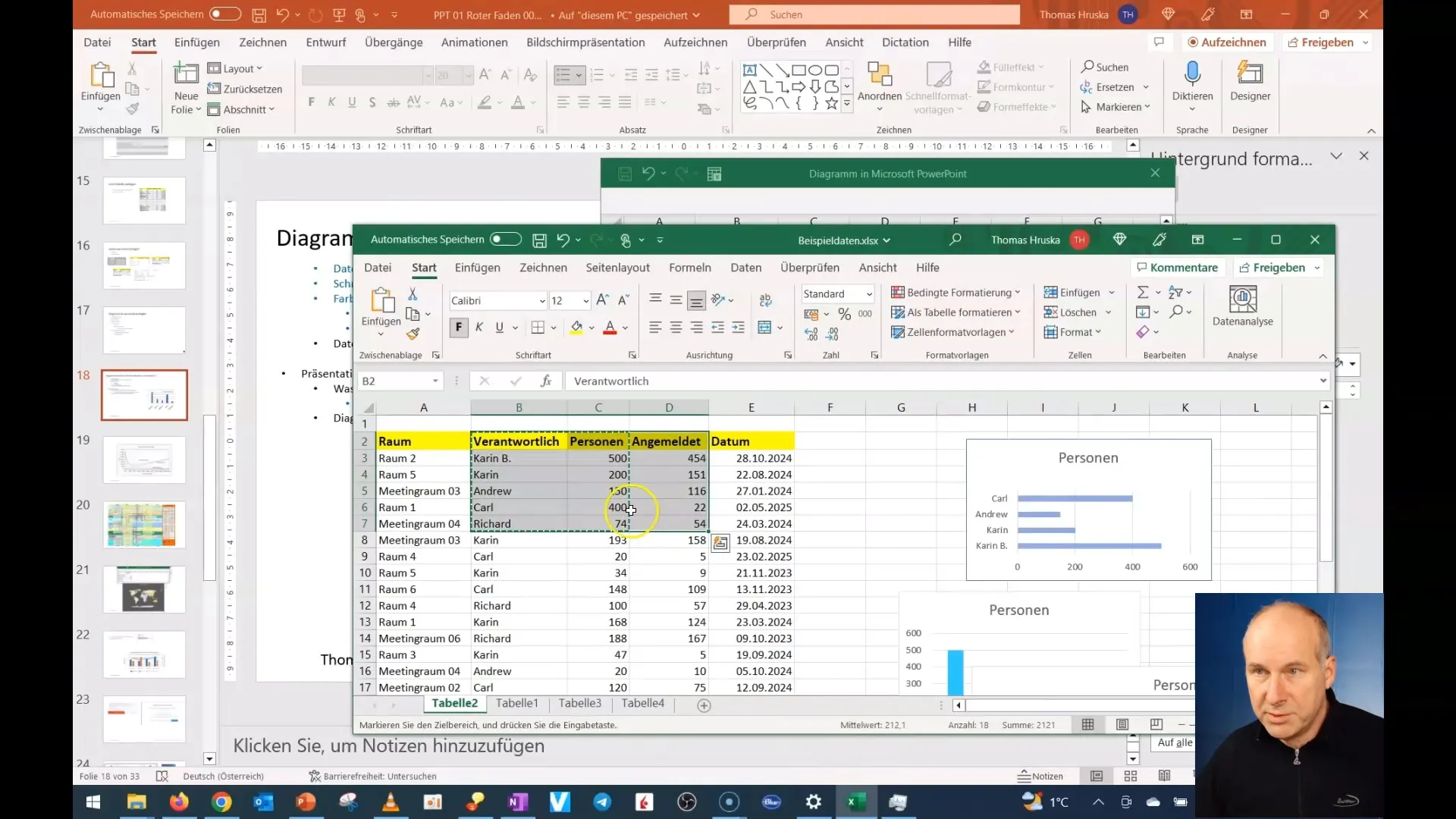
Once the chart is created, an example chart with placeholder data will appear. To insert your own data, go to Excel and copy the relevant data. Then return to PowerPoint and paste the data into the chart. Click on the cell, start with the first data position, and insert your data. Make sure to remove empty cells so the chart is displayed correctly.
Customizing the Chart
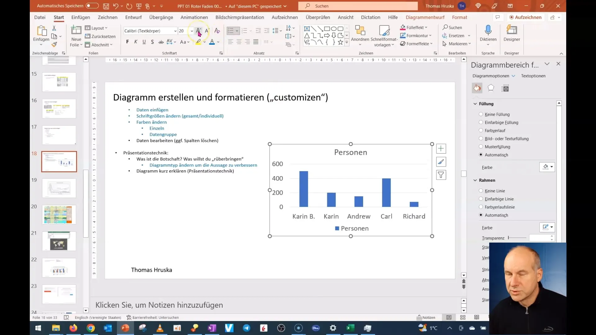
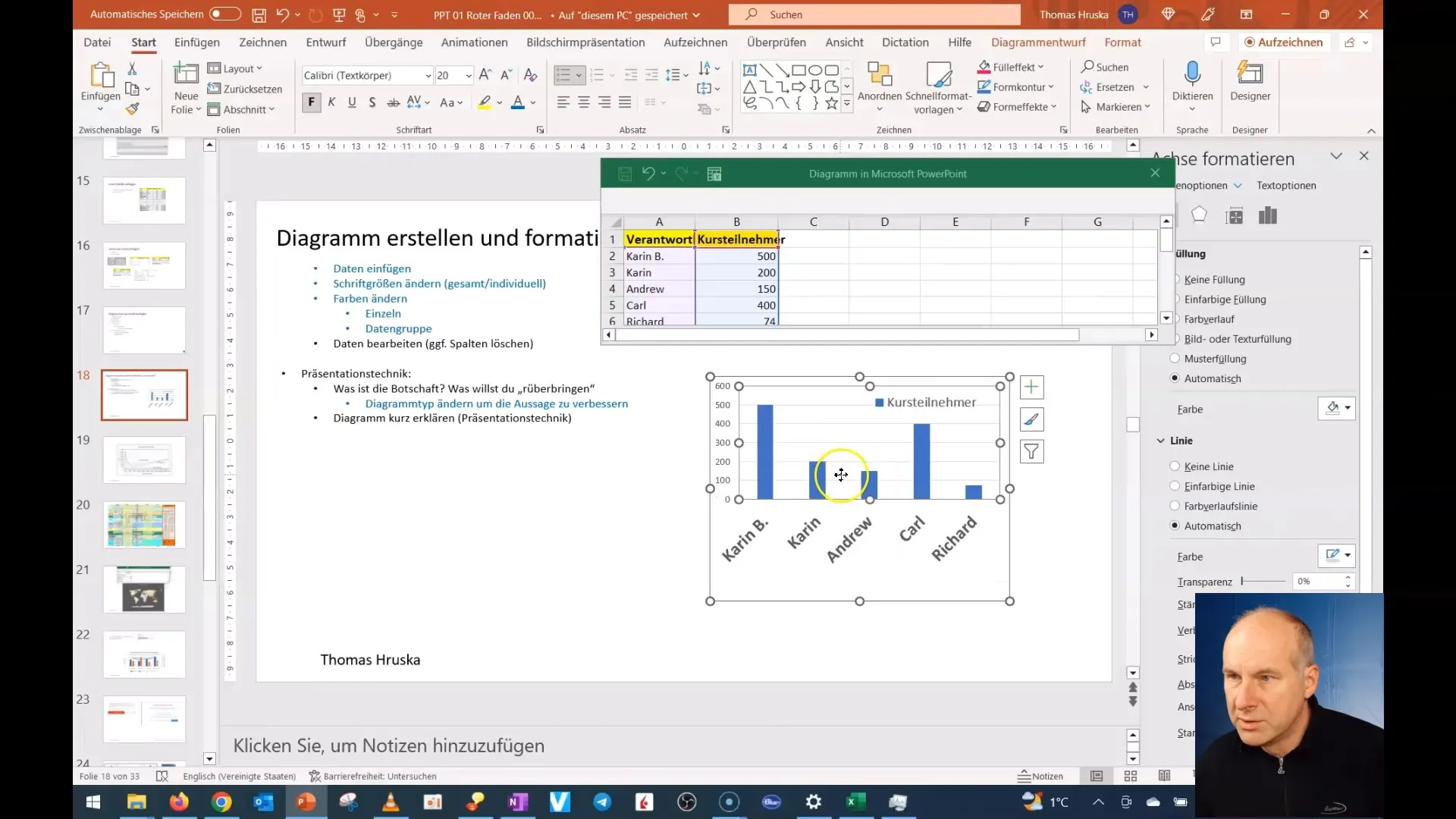
Now that you have inserted your data, it is time to format the chart. To do this, select the entire chart by simply clicking on it. You can customize the font size for the chart titles, axis labels, and the legend. For example, click on the title heading to edit the font style and size individually. This ensures that your audience can read everything clearly.
Changing Font Sizes
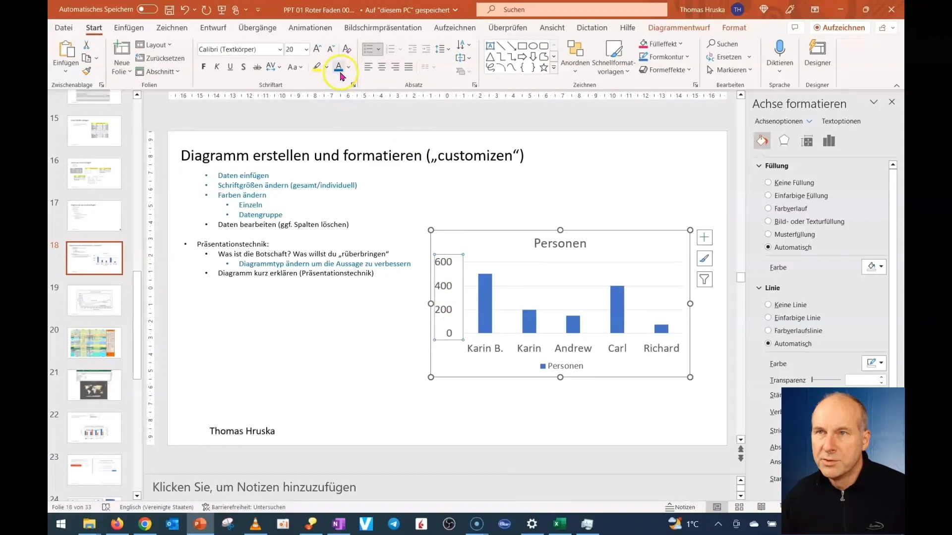
If you want to adjust the font size for various elements of the chart, you can easily select each text individually and change the font size. You can make the legend smaller and adjust the data labels to improve readability. These changes make a significant difference in the clarity of your presentation.
Editing the Data Source
To make changes to the data source, click on the chart, then go to the "Chart Tools" tab, and finally select "Edit Data". This way, you will access the original data source where you can add additional information or modify existing entries.
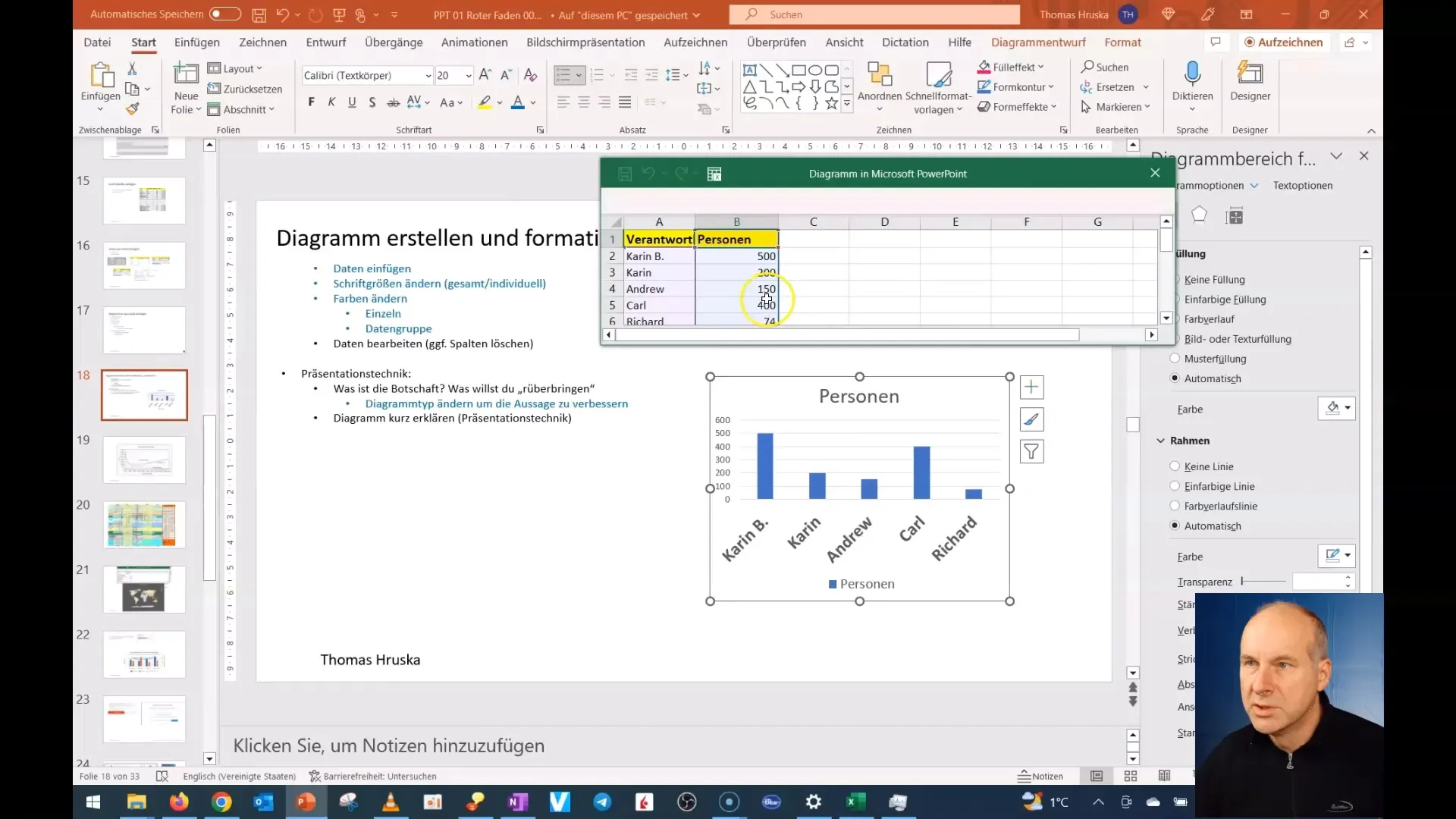
Chart Layouting
The next step is to tidy up the layout of the chart. Remove unnecessary elements, such as the chart title if you do not need it. Position the legend in a place that takes up less space but is still clearly visible. This helps your audience focus on the essential data.
Changing Colors
Another essential element of chart design is color customization. To change the colors of your columns or lines, click on the respective elements in the chart. There, you can choose from the color palette or select custom colors that better suit your presentation.
Checking the Chart Preview
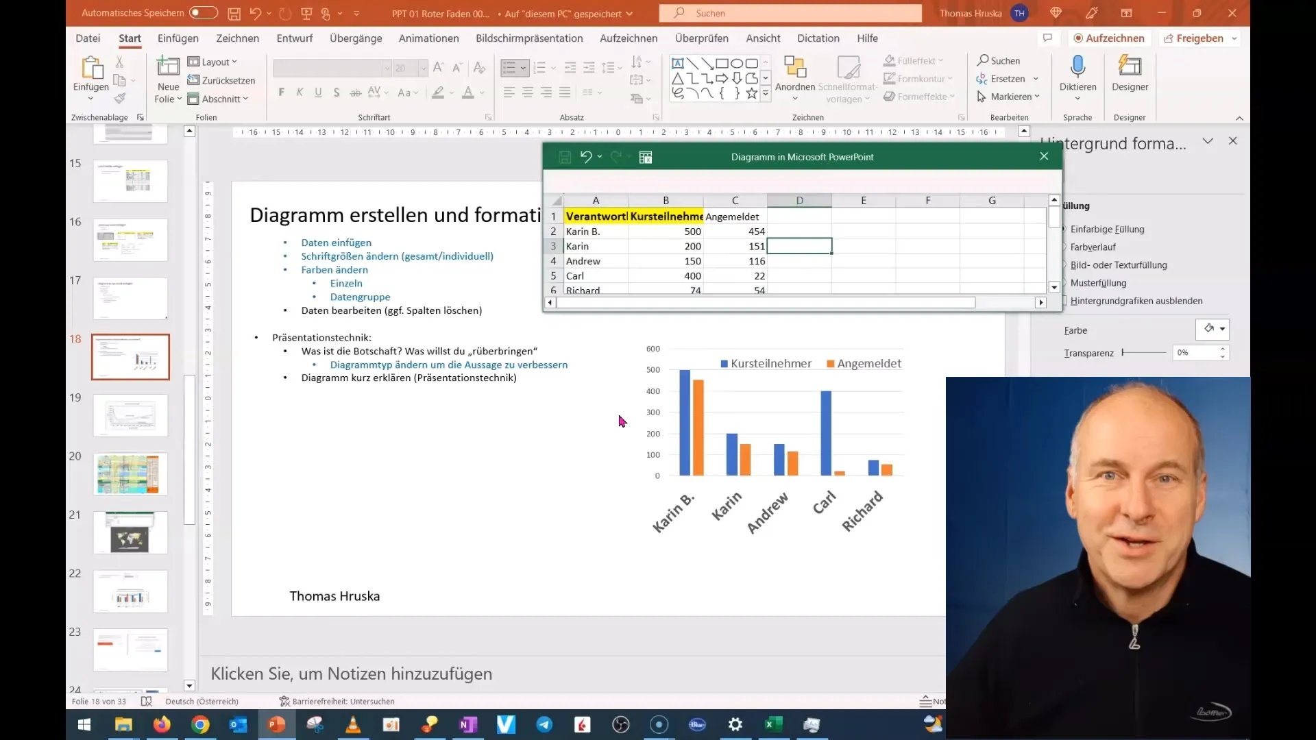
Now it is important to take a look at your chart and make sure that all changes look good. Make sure the font size is readable and the colors are pleasant. Also, check the overall layout and make sure all information is clear and understandable.
Summary
You have now learned how to create charts in PowerPoint, add data, and customize the appearance and readability of your charts. These skills will help you improve your presentations and present your data effectively.
Frequently Asked Questions
How do I insert a chart in PowerPoint?Go to "Insert", choose "Chart" and then select the desired type.
How can I insert data from Excel into my chart?Copy the data from Excel and paste it into the chart in PowerPoint.
Can I change the font size in the chart?Yes, you can customize the font size for titles, axes, and legends individually.
How do I change the colors in my chart?Click on the chart element you want to change and then select the color palette.
How can I edit the data source of my chart?Select the chart and go to "Chart Tools", then "Edit Data".


