Welcome to this comprehensive tutorial on color design in PowerPoint. Colors are not just aesthetic elements, but also crucial for communicating your content. If you've already worked with charts in PowerPoint, you know that selecting and adjusting colors is essential for visual clarity and brand identity. In this guide, I'll show you how to perfectly control the colors of your charts in PowerPoint so they are both appealing and in line with your corporate identity.
Main Takeaways
- Choosing the right colors can significantly improve the clarity of your data visualization.
- You can integrate corporate colors using color codes or selecting from a color scheme.
- It is possible to differentiate across different shades within a chart to highlight important information.
- Freezing a color scheme allows you to maintain the desired color design even when template changes occur.
Step-by-Step Guide
1. Getting Started with Color Management
Launch PowerPoint and open your presentation or create a new one. To effectively use color management, you should have already inserted a chart to apply your colors to.

2. Understanding and Selecting Color Schemes
When you insert a chart, the default Office color schemes are typically displayed. It's important to be aware of your specific color scheme, whether it's from your company or one you wish to set yourself.

3. Adjusting Data Series Colors
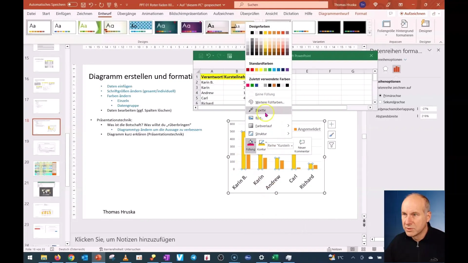
To change the specific colors of your chart, right-click on the desired data series in the chart. A context menu will open, offering you the option to modify the color of the selected series.

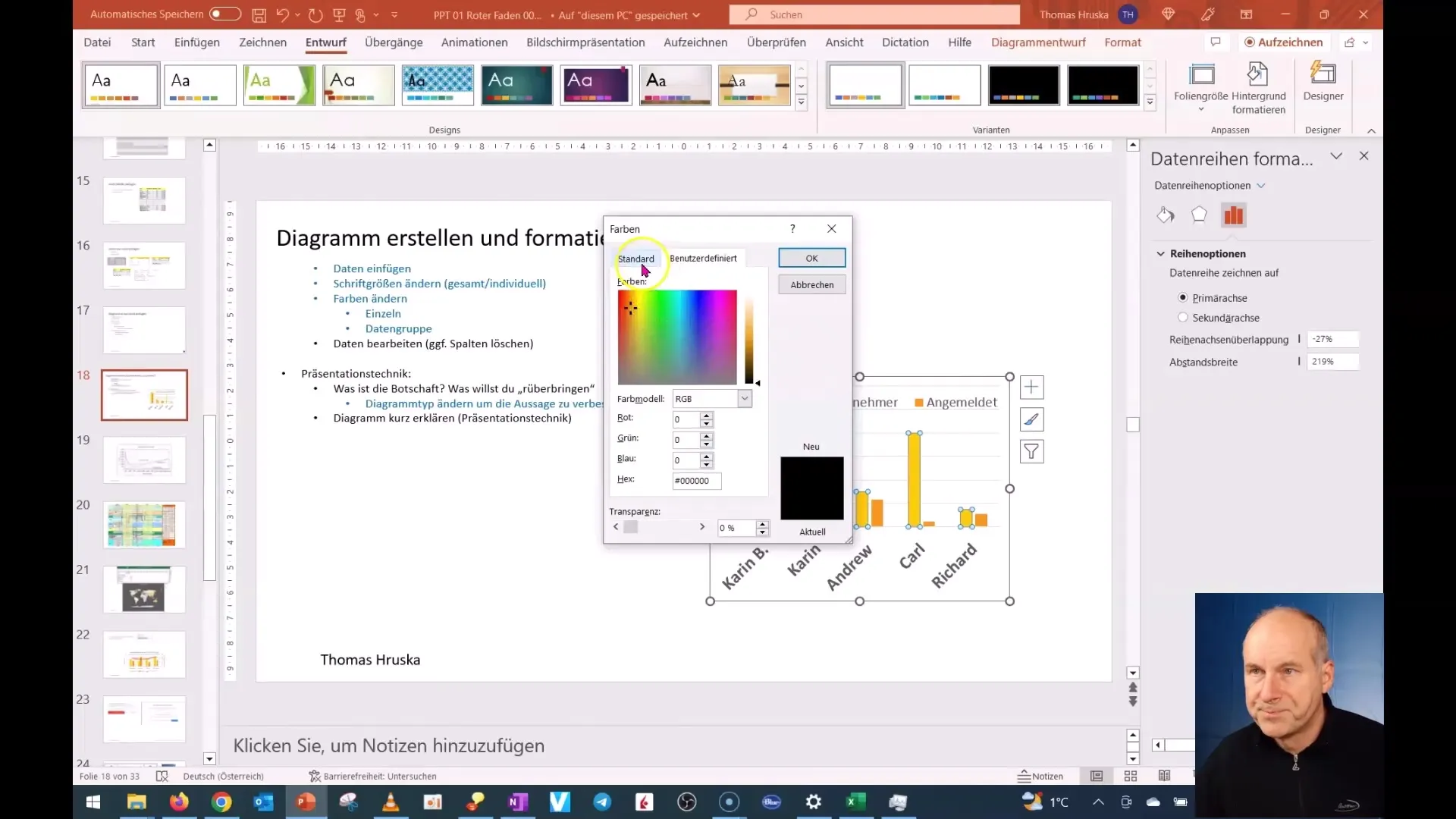
4. Using a Color Code
If you have a specific color code you want to use, enter it in the appropriate field. This is particularly useful if your company has a set color palette that needs to be followed.

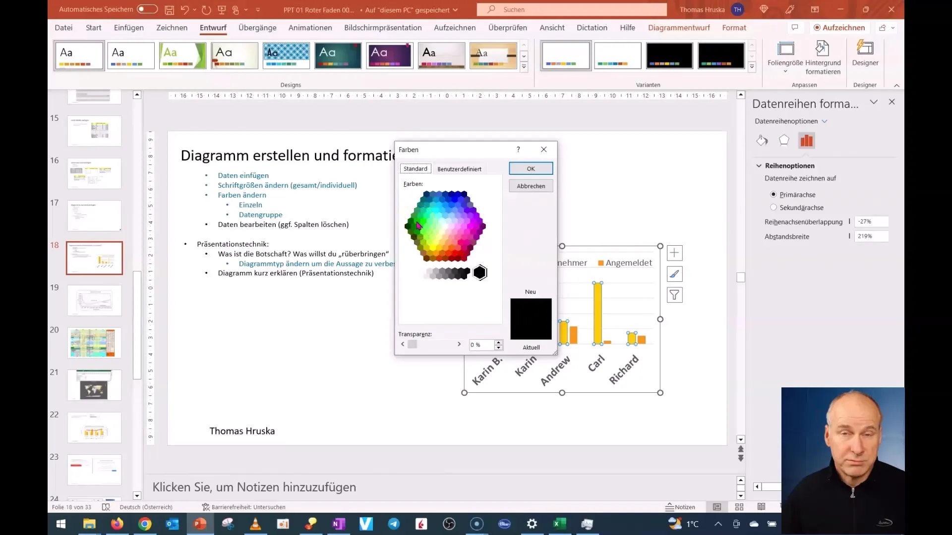
5. Choosing a Color from the Chart
In most cases, it is also helpful to simply select a manually choosable color. For example, you can choose a green tone if you are working with a company that wants to address ecological themes.

6. Color Highlighting
To emphasize a specific point or highlight a data series, you can adjust individual columns or bars in your chart. Consider how important this differentiation is for the overall understanding of your presentation.

7. Consistent Color Design
Ensure that your color design remains consistent across all charts and slides in your presentation. This not only creates a unified image but also highlights your professionalism. If you choose a pale color, it may be visually appealing and not distract the audience.

8. Freezing Colors
An especially important function is freezing your selected color scheme. When you update the chart later or change the slide, your colors will remain as long as you have chosen the right color scheme.

9. Color Changes with Template Switch
If you want to change the color scheme, test how your existing chart reacts. You will see that the frozen colors remain, allowing you to work flexibly with different templates.

Summary
In this tutorial, you have learned how to select, customize, and set colors in PowerPoint strategically to make your charts more attractive and informative. Having control over colors not only aids in data presentation but also strengthens the visual identity of your content.
Frequently Asked Questions
How can I change the colors in my chart?Right-click on the data series you want to change and select the corresponding color from the context menu.
Can I use specific color codes for my courses?Yes, you can enter specific color codes to choose the desired colors for your chart.
How do I maintain consistent color design across multiple slides?Ensure to use the same color selection in all slides and charts to establish a professional consistency.
What happens if I change the color scheme of my presentation?If you change your color scheme, the frozen colors of your charts will remain, giving you the flexibility to design the presentation.


