In this tutorial, we will learn how you can edit data in PowerPoint to convey your message clearly and concisely. Often, a complex set of data can dilute the main message if it is not presented optimally. Using an example, I will show you how to distill crucial insights from your data and present them in an engaging format. By the end of the video, you will be ready to present your data in a way that conveys the most important information to your audience at a glance.
Key Insights
- Consider the message you want to convey before starting the presentation.
- Condense complex data to the essential to facilitate understanding.
- Use diagrams strategically to visually represent data in an engaging way.
Step-by-Step Guide
To effectively manage your data, follow these steps:
1. Find your core message
First, it is important to define the message you want to convey. Consider what is relevant to your audience and what information will provide value to them. Focus only on highlighting the central points.

2. Collect data
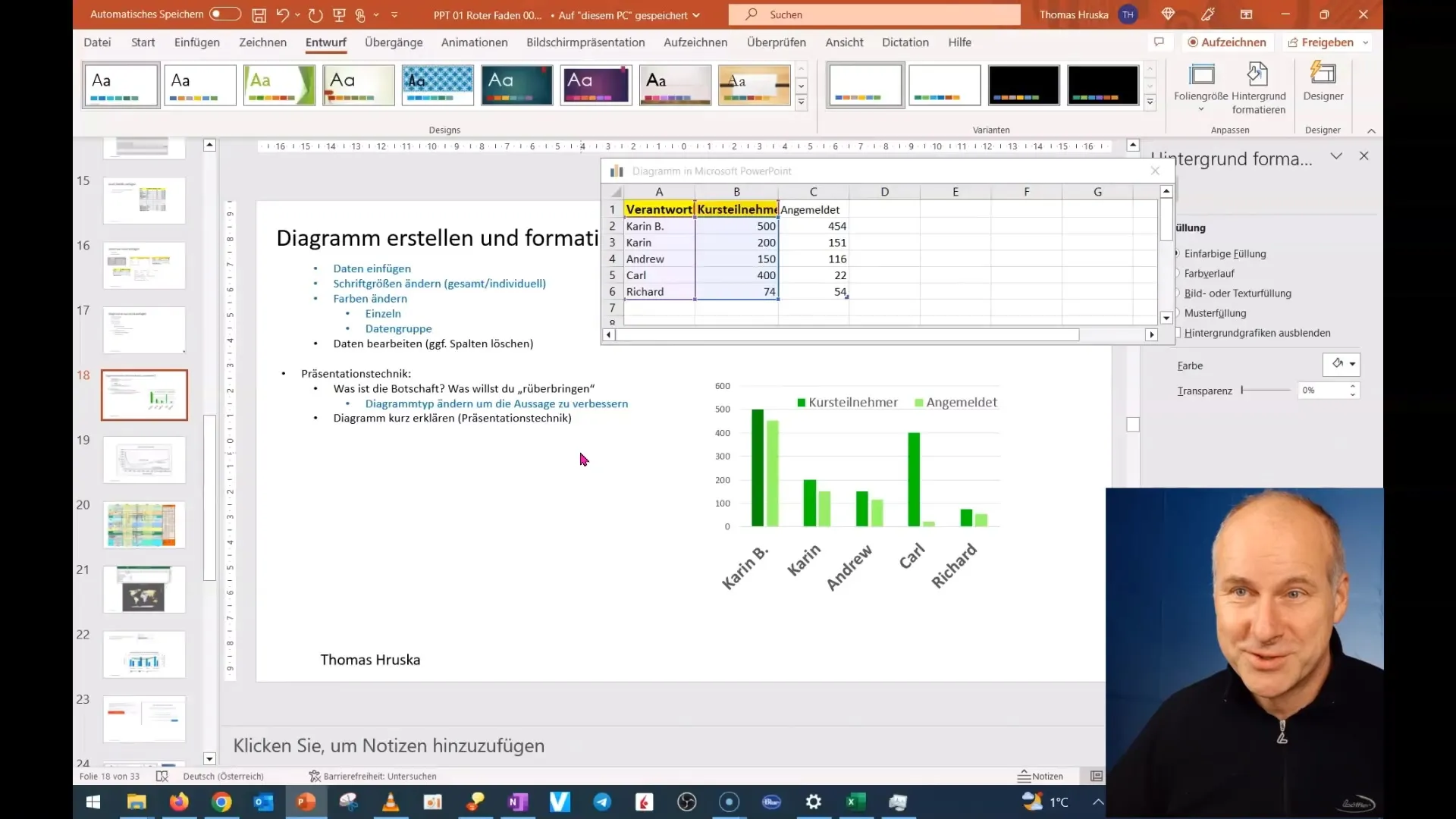
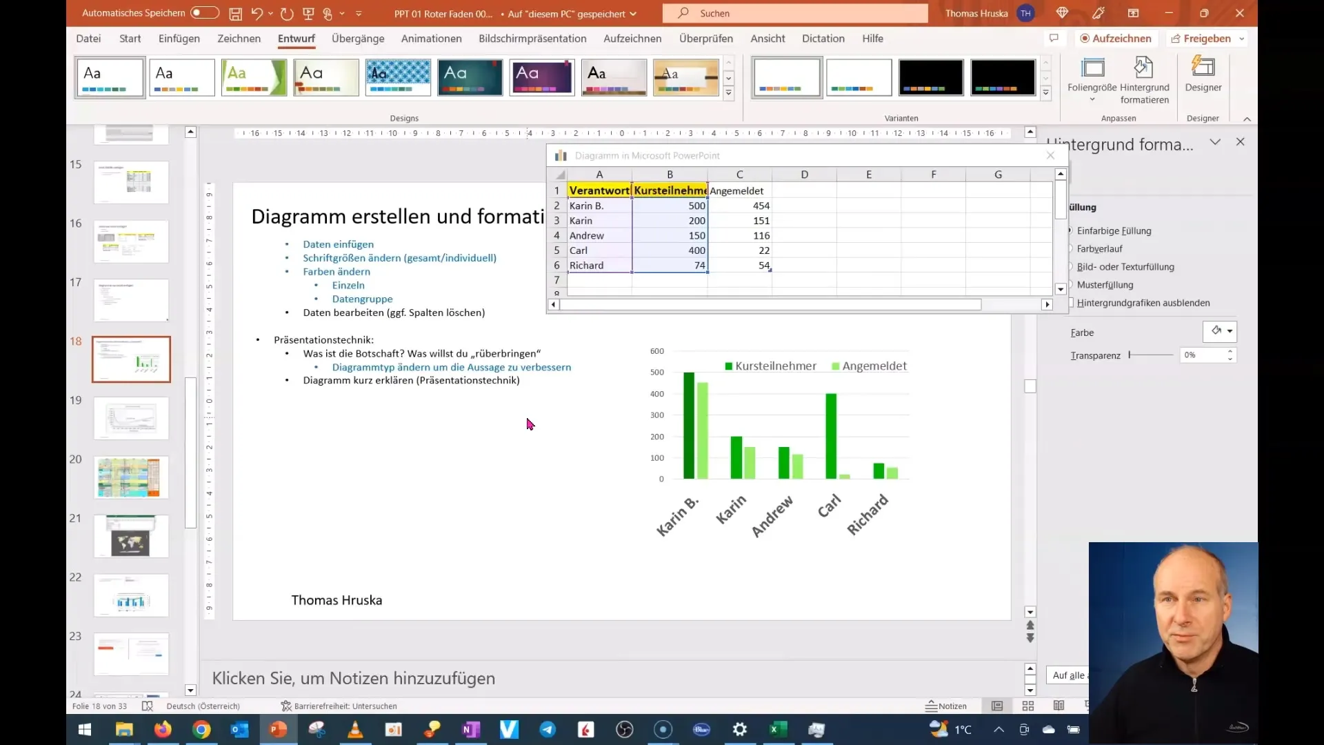
Gather all necessary data required for your presentation. For example, if you are analyzing course participants, ensure you have current and complete numbers available. This will not only help you get a true picture but also support your argumentation.

3. Choose the right metrics
Determine which metrics are truly crucial. In our example, we could compare enrollments for different courses. It is important to select the most relevant information instead of displaying all available data. Focus on trends and deviations that capture your audience's attention.

4. Reduce and distill data
Once you have gathered all the information, it is time to reduce the data. Remove anything that does not contribute to the core message. For example, you may find that certain details about enrollments are irrelevant, and only the essential points should be shown in the diagram.

5. Create a diagram
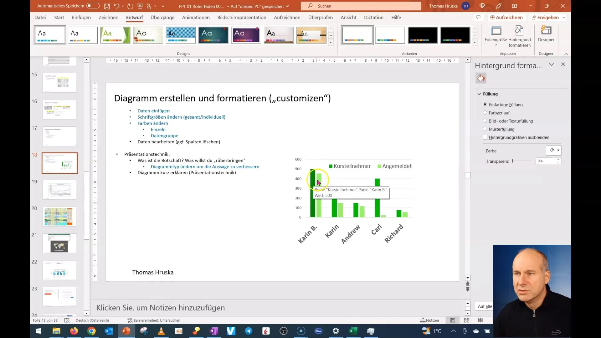
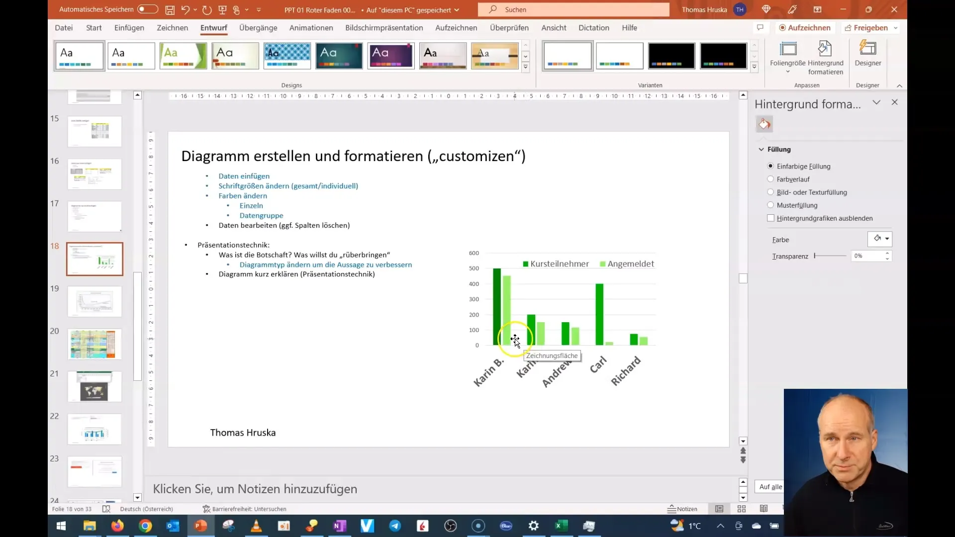
Now, create a diagram in PowerPoint that clearly and distinctly represents the selected data. Ensure that the diagram is designed to be easy to read and understand. Use appealing colors and clear labels to highlight the key points.

6. Adjust and optimize
Once the diagram is created, review if the representation is optimal. You may need to make further adjustments to ensure that the message is clearly communicated. This could involve choosing a different type of chart or adjusting the color palette.

7. Prepare for the presentation
Before delivering your presentation, practice explaining your diagram. Make sure you can communicate the key points clearly and concisely. Remember that your audience may not be familiar with the data, so explain everything in an understandable manner.

Summary
In this tutorial, we have learned how important it is to clearly convey the message of your data. You have discovered how to condense your data to the essential and create a compelling diagram. With these steps, you are well-equipped to optimize your presentation.
Frequently Asked Questions
Why is it important to clearly define the message during data presentation?A clear message helps to engage the audience and ensure that the most important information is understood.
How can I ensure that my data is understandable?By focusing on relevant metrics and simplifying complex data, you will promote understanding.
Should I always use a chart to present my data?Charts are helpful, but not always necessary. Choose the communication tool that best suits your message.


