In this tutorial, I will show you how to optimize the clarity of your charts in PowerPoint by making content changes and adjustments. You will learn how different types of charts can enhance the clarity of your presentation and how to represent the data in a way that is easily understandable at a glance. We will guide you through the process step by step, from creating a chart to customization and formatting, so that your message comes across clearly and precisely. Let's get started!
Main Learnings
- Choosing the right type of chart can significantly influence data perception.
- Clarity and structure are crucial for presenting information understandably.
- Data labels and color changes help to highlight important information.
Step-by-Step Guide
First, let's look at a chart that we want to customize. You have already created a chart and removed some data. It is important that your data series are structured in a way that allows you to clearly communicate the key points.
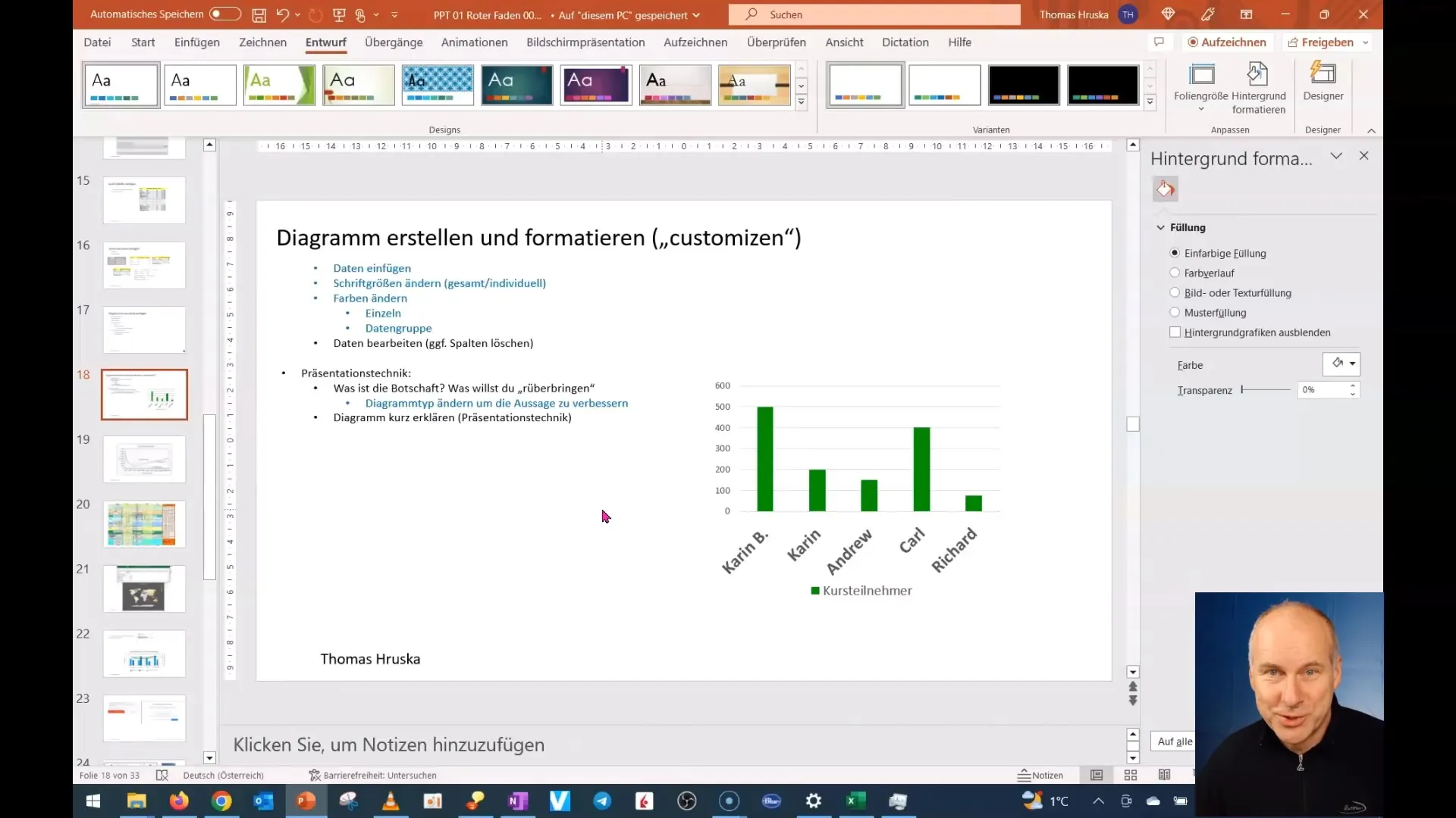
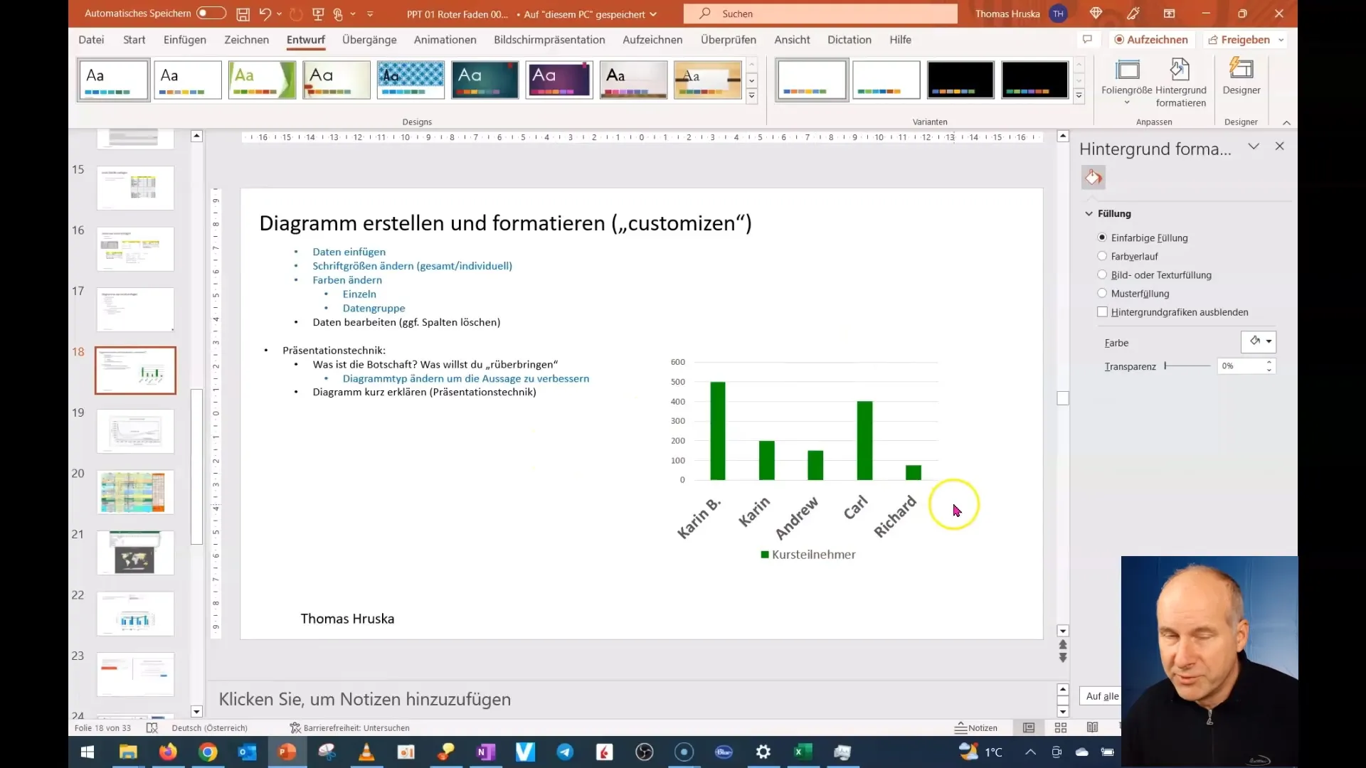
In the next step, you will determine the message you want to convey with your chart. In our example, it is about representing the number of course participants per responsible person. It is important that this message clearly highlights who has the most course participants.
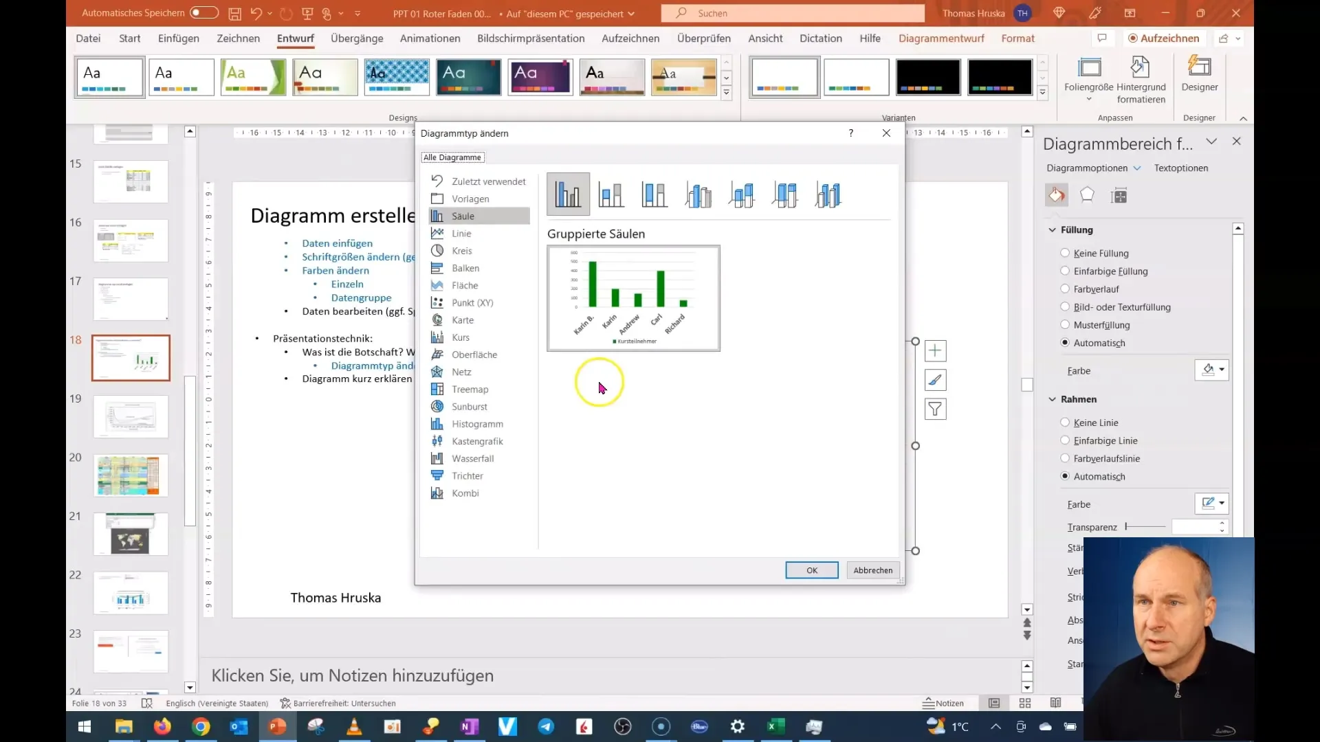
Now, you will change the type of chart to sharpen the message. A pie chart could be much more impactful in this case. Go to "Change Chart Type" and select an appropriate chart.
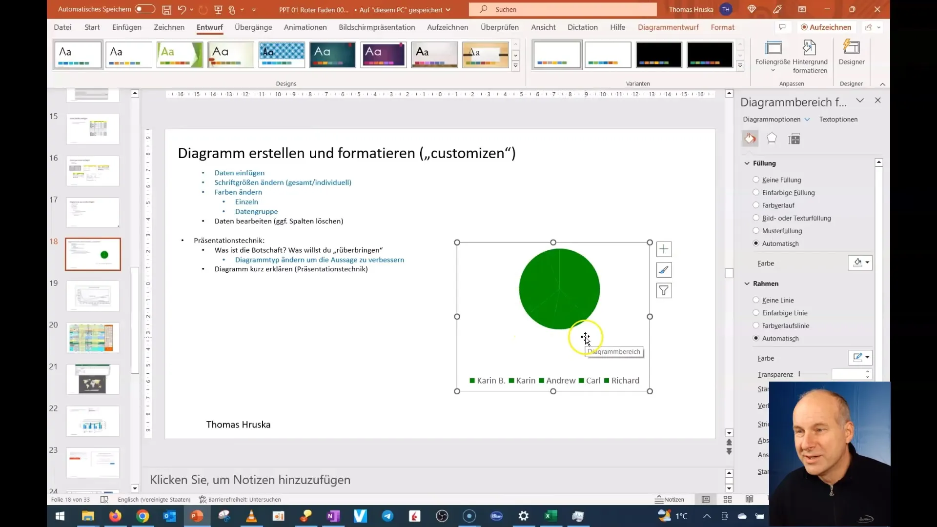
Before entering the data, make sure that the colors are clearly distinguishable. If you use a chart with preset colors, it may be difficult to see the differences. Therefore, it's worth adjusting the colors to ensure better clarity.
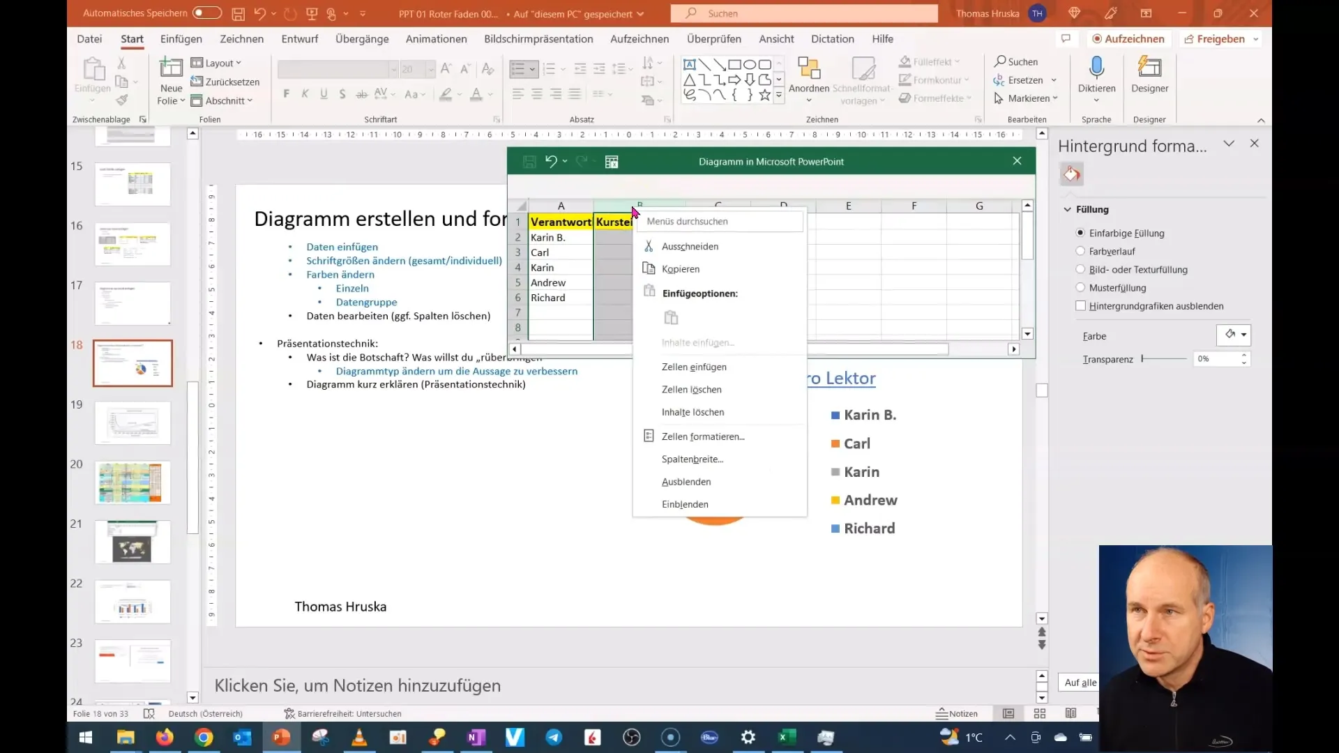
Now insert your new data from Excel into the chart. You can simply copy the data and paste it directly into the chart. Make sure all relevant information is included.
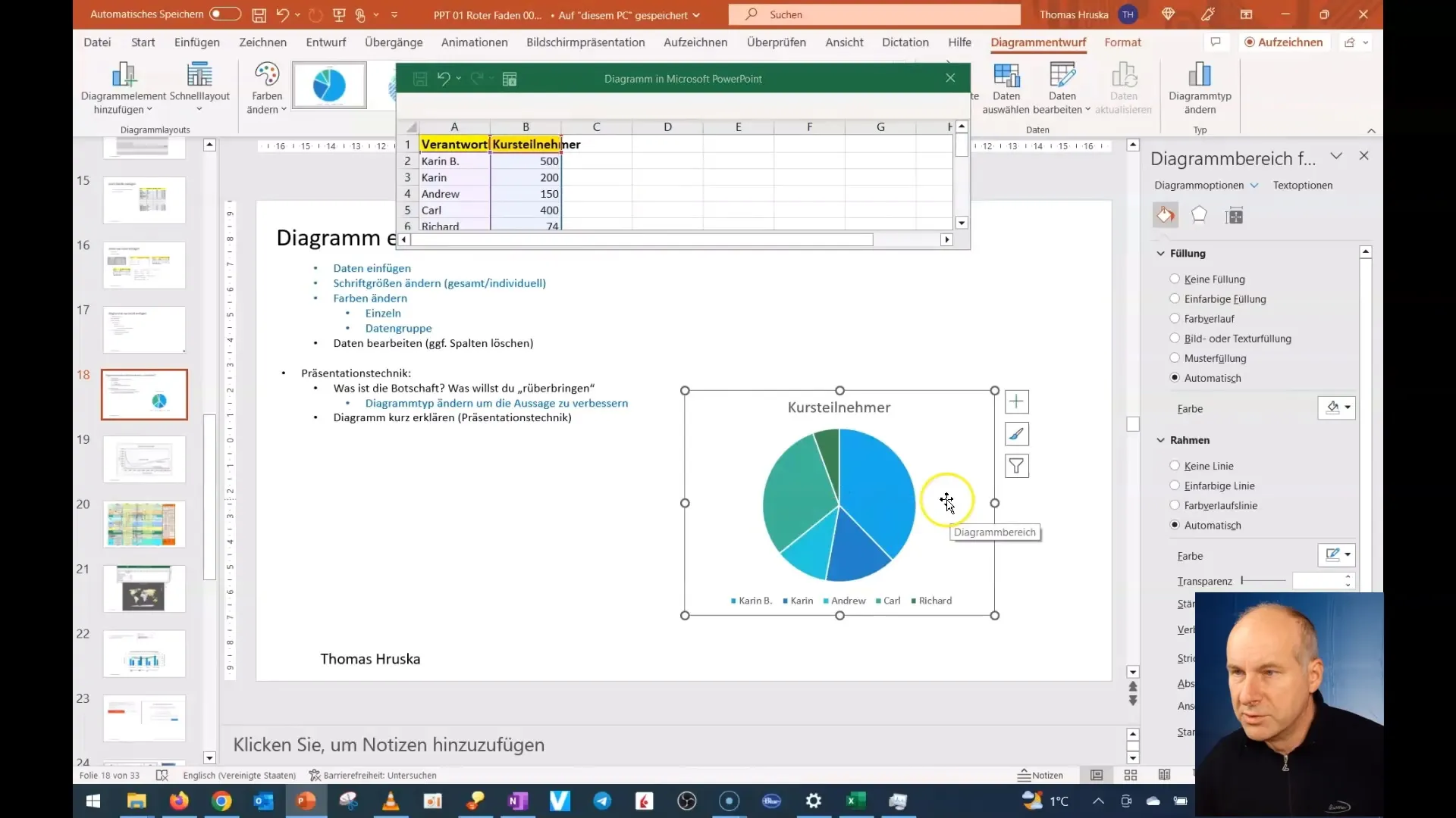
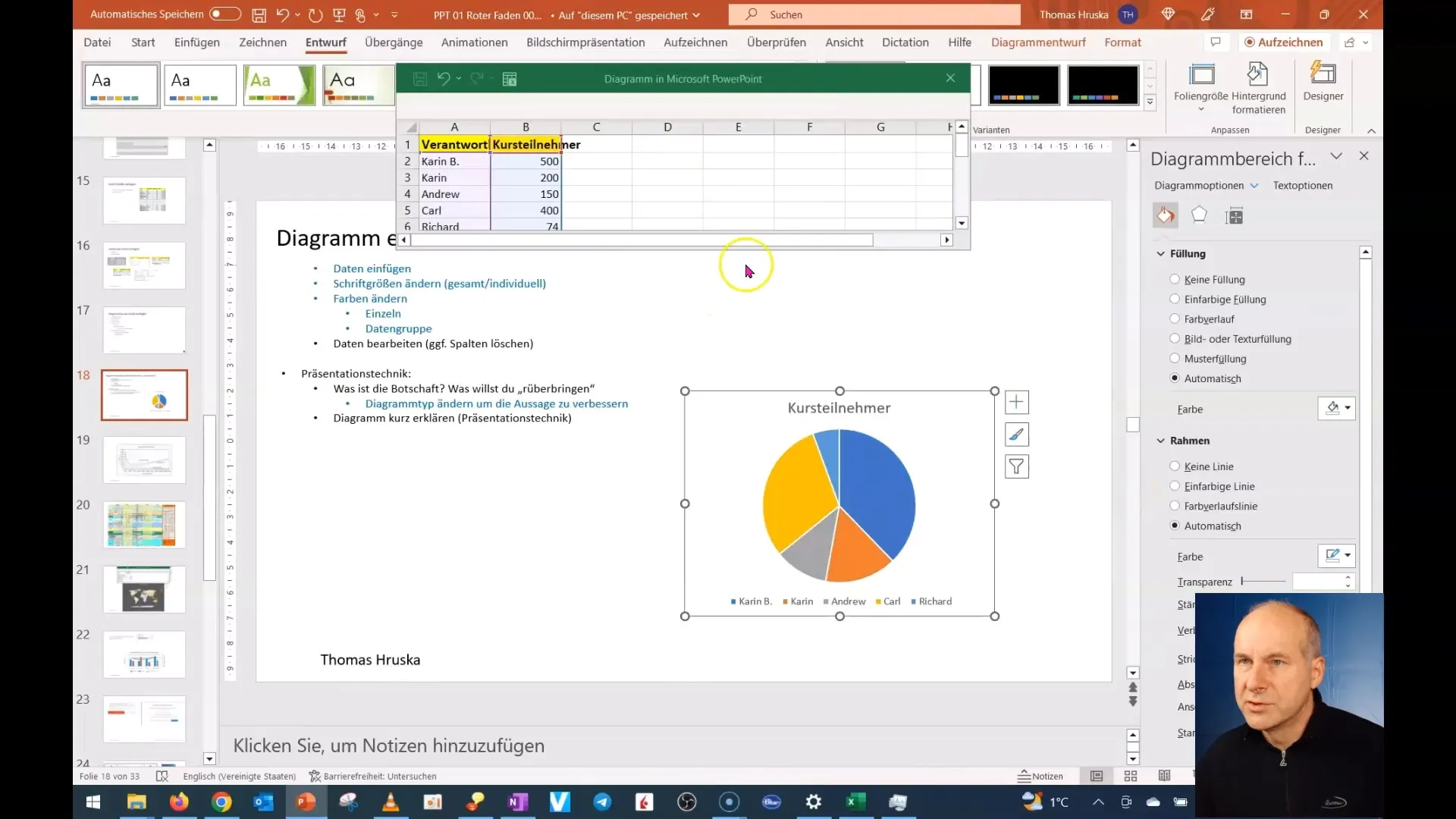
To select an appealing color scheme for your chart, go to the design options in PowerPoint and choose a color scheme that highlights your data well and is easy to understand.
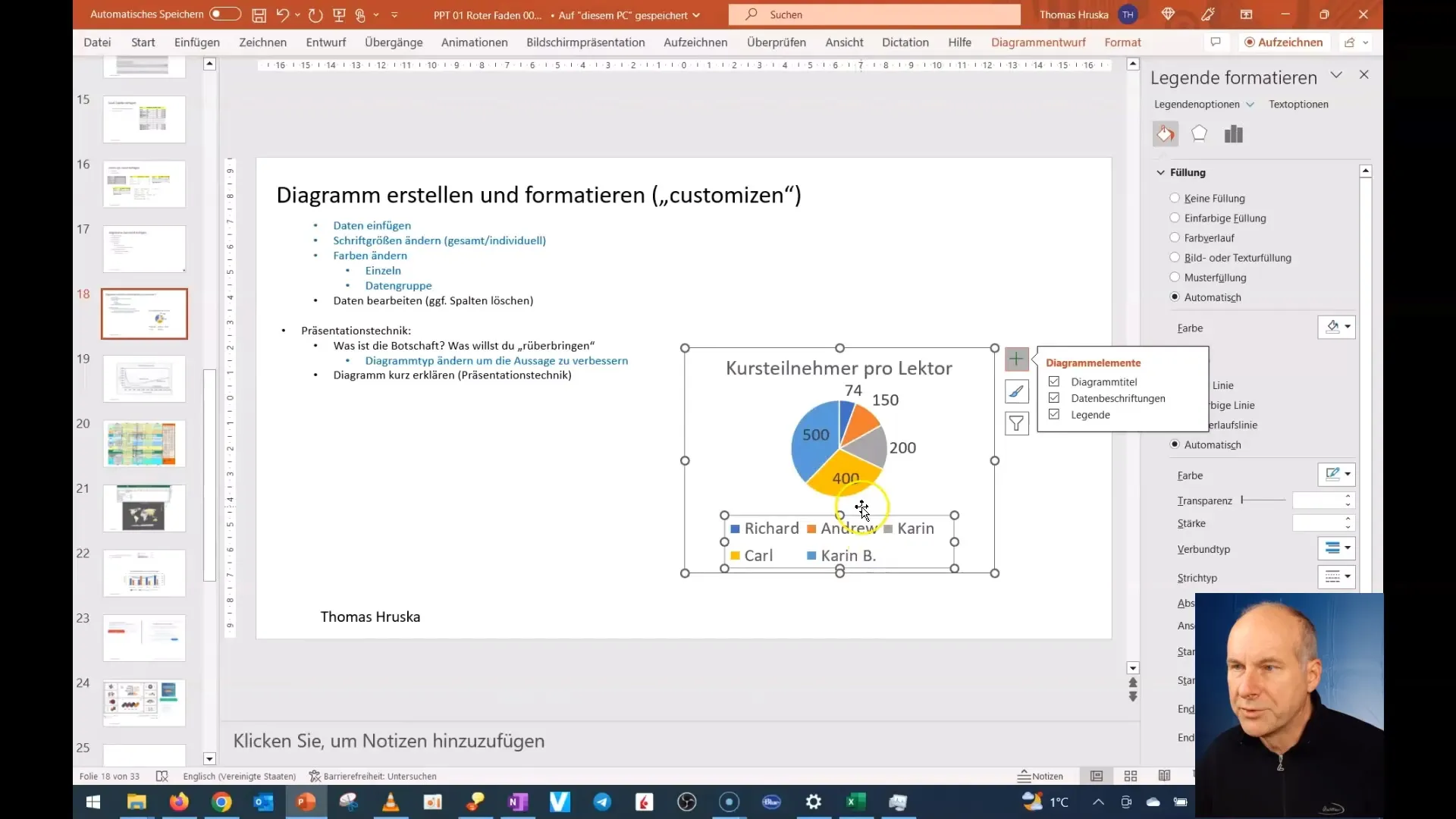
Once the basic structure of the chart is in place, you can customize the labels. Make sure the labels are clear and easily readable. You may want to change the font style or increase the font size to enhance readability.
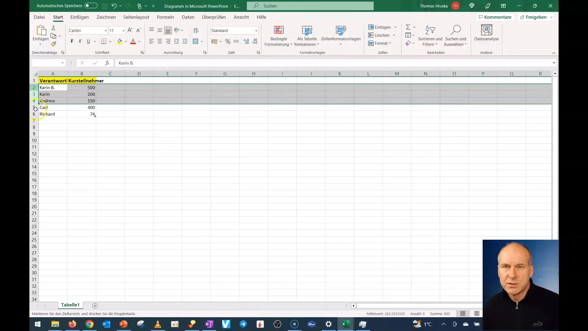
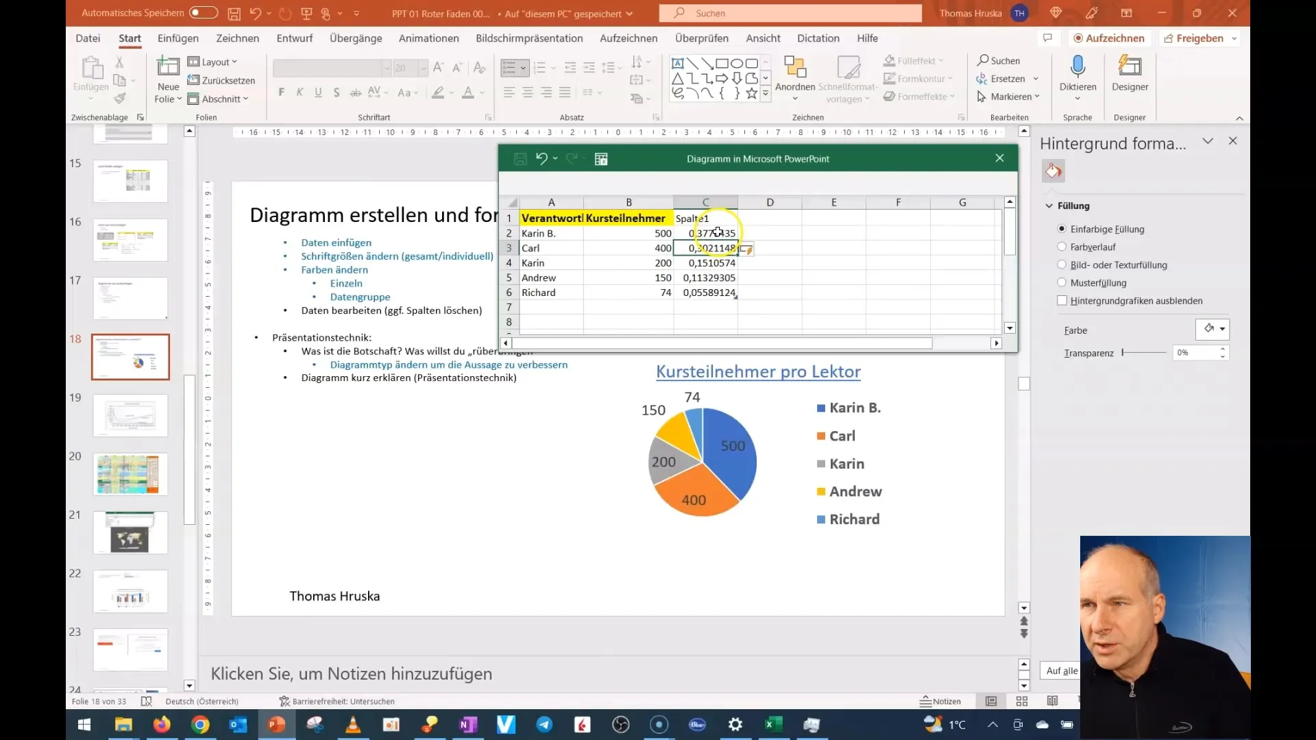
If necessary, you can also adjust the order of the data. If you want to represent the data in descending order, you will need to sort it accordingly. Go to Excel's sorting options and choose the desired order.
Now that your chart has taken a better shape, you can visually represent the data. Enlarge the data labels if necessary to make them stand out and differentiate from other elements.
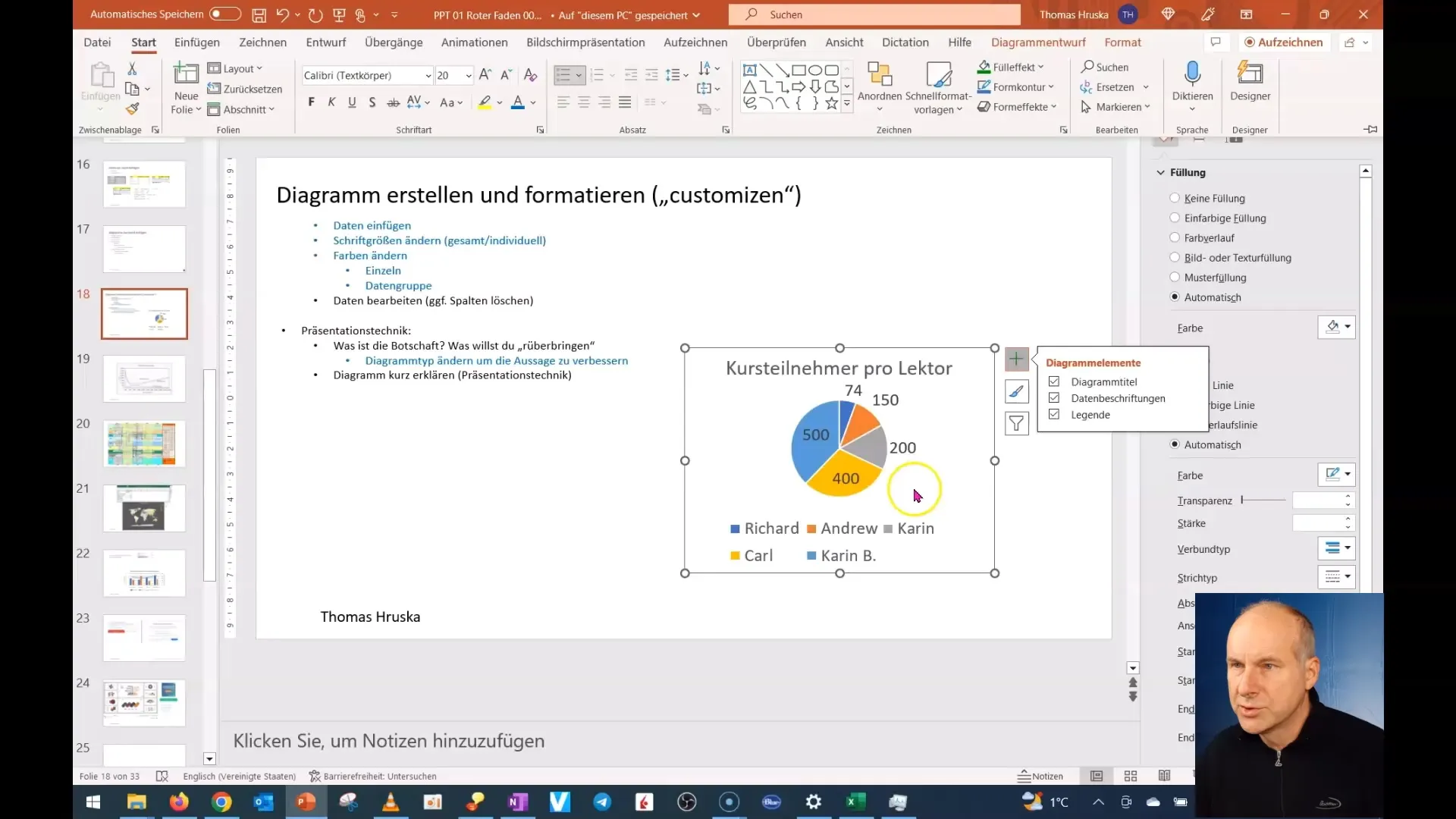
You can further optimize the overall layout by adjusting the arrangement. Position the chart in a way that best suits the presentation of your information. You can also revisit the legend and customize it as needed.
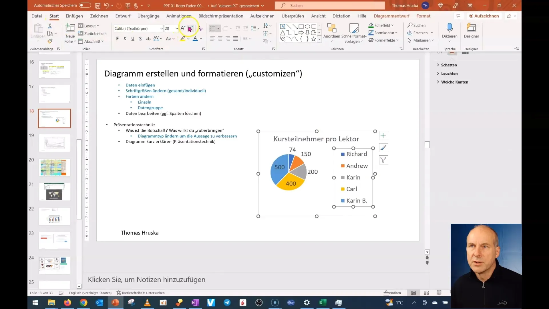
It's also a good idea to rethink the entire data and possibly represent the utilization in percentage. To achieve this, use Excel to calculate the shares per person and format the cells to display the numbers as percentages.
Now that your diagram is fully filled out, you can check it finally. Make sure that everything is correctly placed and that the font is pleasant to read for the readers.
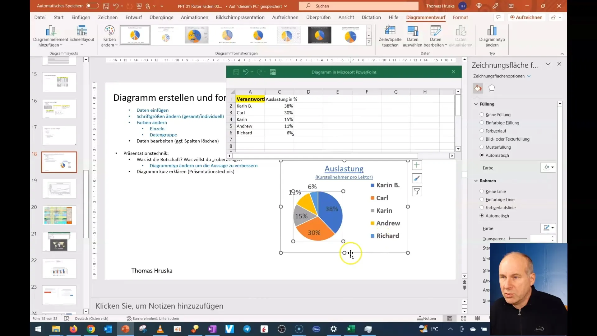
To make your statements clearer, you can adjust the title of the diagram and the data to summarize the most important information.
After making the final adjustments, look at the bigger picture. Is the data representation now more understandable? Have you improved the impact of your presentation?

With this, you have not only changed the content of your diagrams but also significantly improved the overall impact and visual impression. The example shows how simple adjustments can make a big difference.
Summary
By making targeted changes and adjustments to diagrams in PowerPoint, you can significantly enhance the impact of your presentation. Choosing the right type of diagram, adjusting the data, and clearly presenting all relevant information are key to successful presentations.
Frequently Asked Questions
How do I change the chart type in PowerPoint?Go to the menu bar, select "Change chart type," and choose the desired type.
Why is color choice important in a chart?Colored differentiations help highlight and clarify different data points.
How do I insert data from Excel into a PowerPoint chart?Copy the desired data in Excel and paste it into your chart using Ctrl + V.
How can I customize the data labels?Click on the labels and change the font and size in the formatting options.
How do I sort the data in Excel?Select the data and use Excel's sorting options to arrange the data as needed.


