Welcome to this detailed guide that shows you how to effectively present charts in PowerPoint. Charts are a valuable aid in conveying information in a clear and concise manner. In this tutorial, I will introduce you to proven techniques and strategies to ensure that your audience quickly grasps and understands both the content and the visual representations.
Key Insights
A successful chart in a presentation can make the difference between effective information transfer and a confusing representation. Ensure that your charts are easy to understand, use the appropriate language for your audience, and make sure that all necessary information, such as units, are clearly presented.
Step-by-Step Guide
1. Prepare the Chart
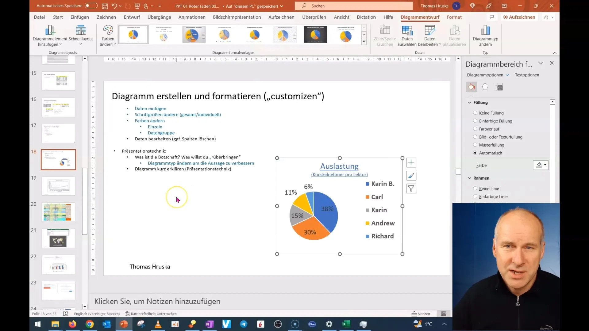
First and foremost, it is important to carefully select the chart you will be using. In the previous unit, we looked at a simple bar chart showing the workload of lecturers. To prepare your presentation, make sure the chart clearly and concisely presents the key information.
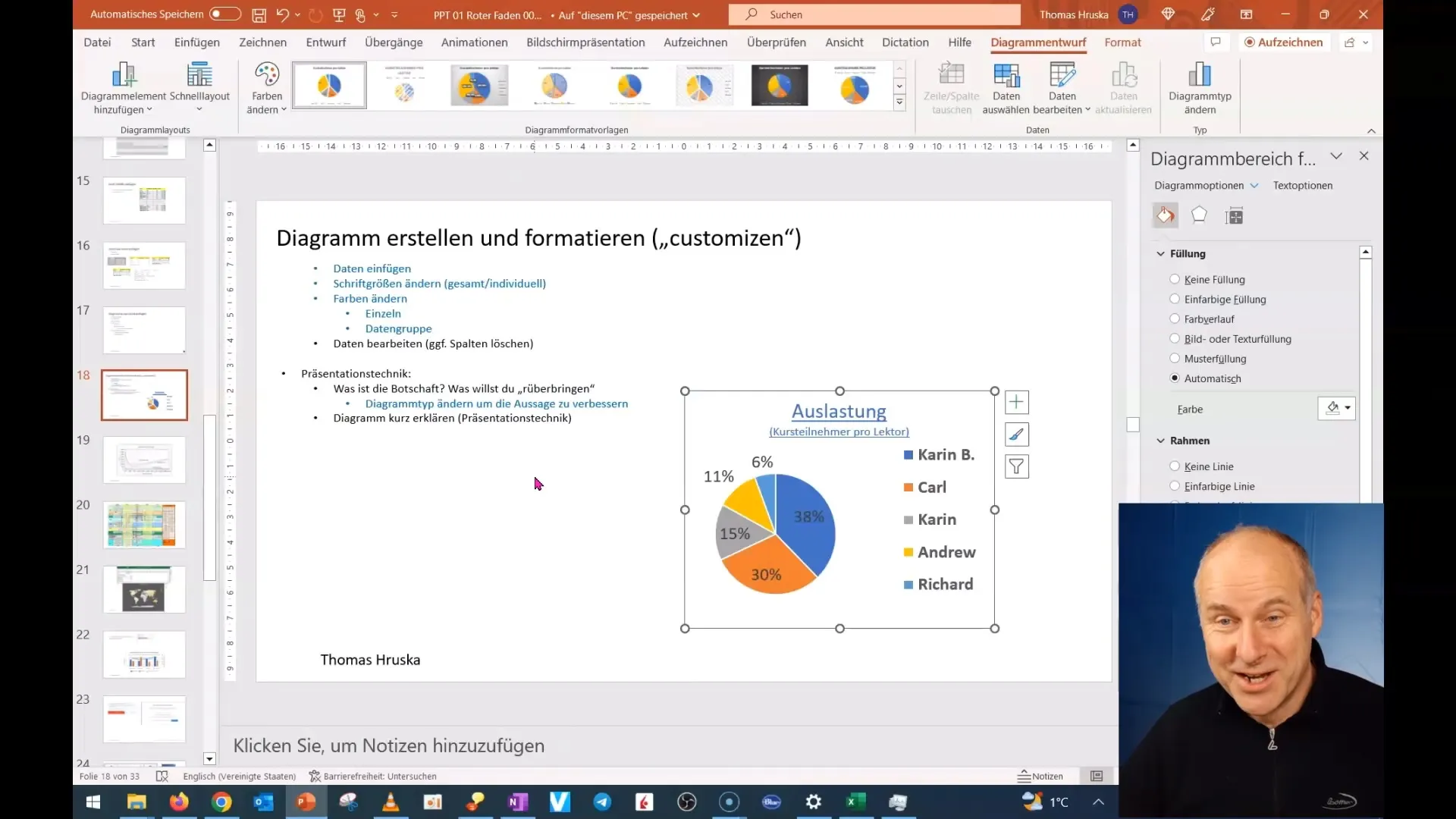
Remember to reduce your graphics to show only the most important information. Minimize the text to a minimum so that your audience is not distracted by unnecessary words.
2. Adjustments for the Audience
If your audience is not familiar with specific technical terms or chart formats, you need to adjust the information. Assume that not everyone in the room has the same background knowledge. Therefore, use clear and simple language, and explain all technical terms.
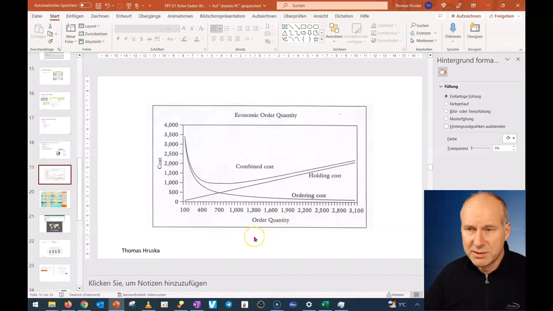
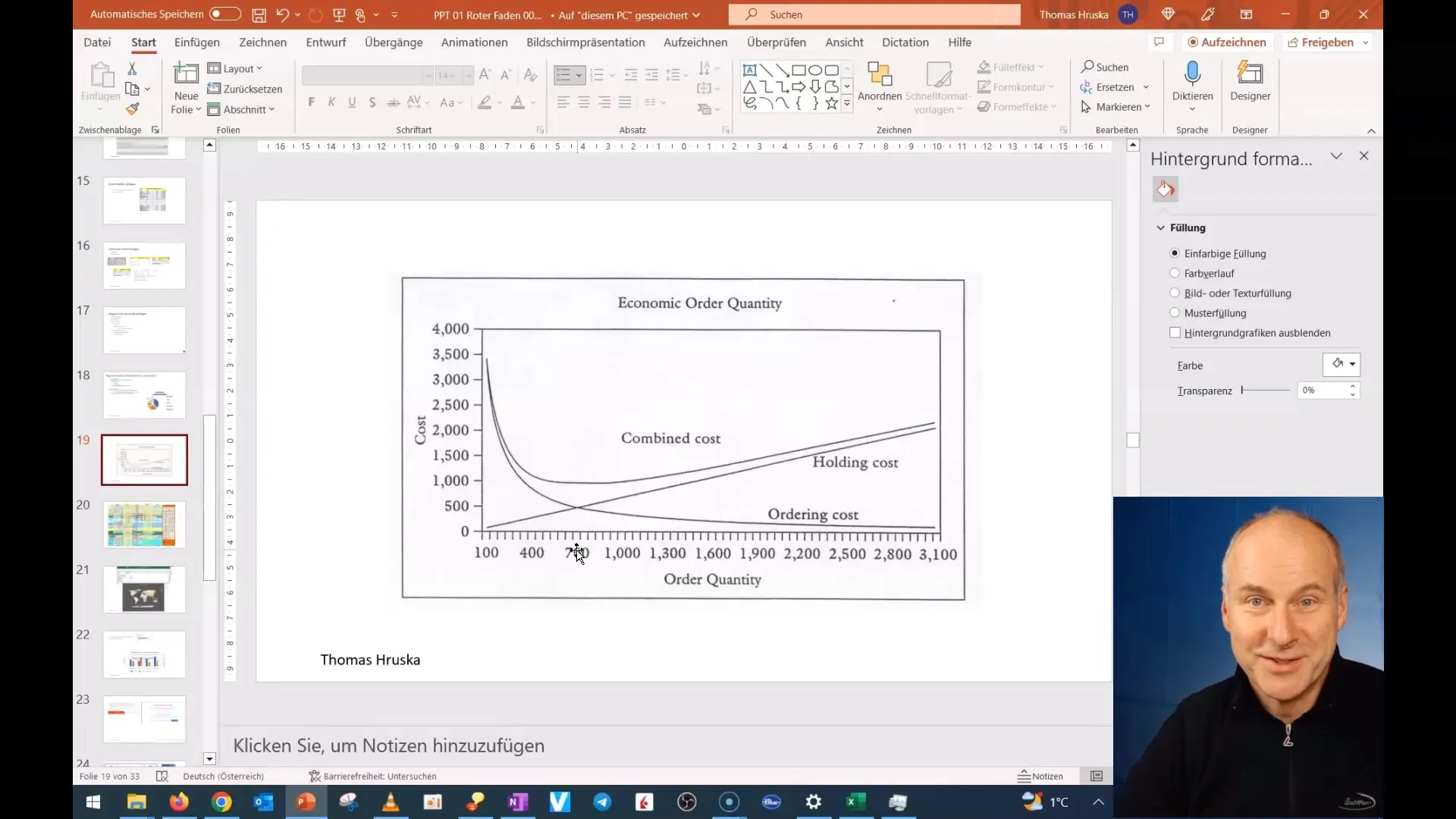
For example, if you are working with American numbers, consider how they are presented. A point as a thousand separator may be confusing for the German audience. Make sure to consider these format differences.
3. Highlight Key Information
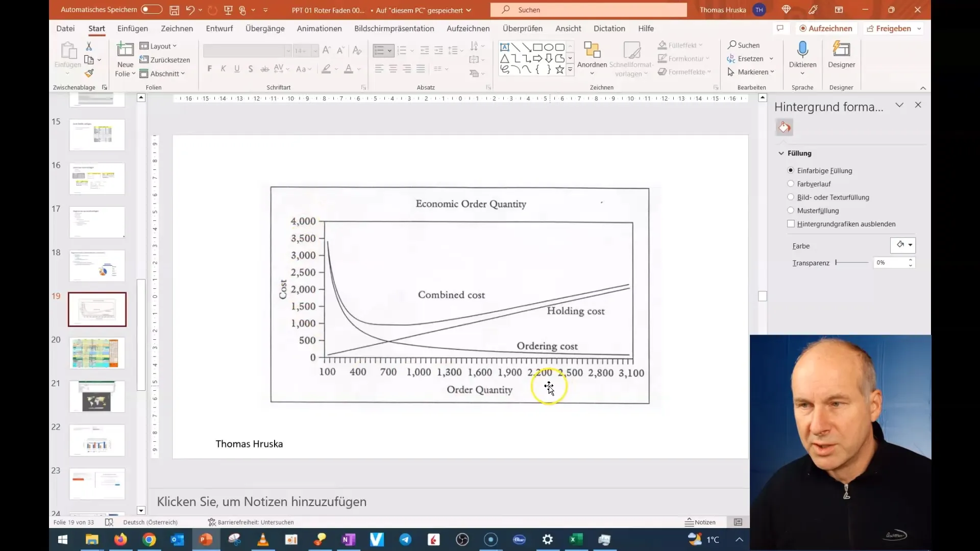
When conveying key information in your presentation, it is important to clearly highlight it. Make sure to clearly present units such as "cost" or "quantity." This helps your audience quickly grasp the core information.
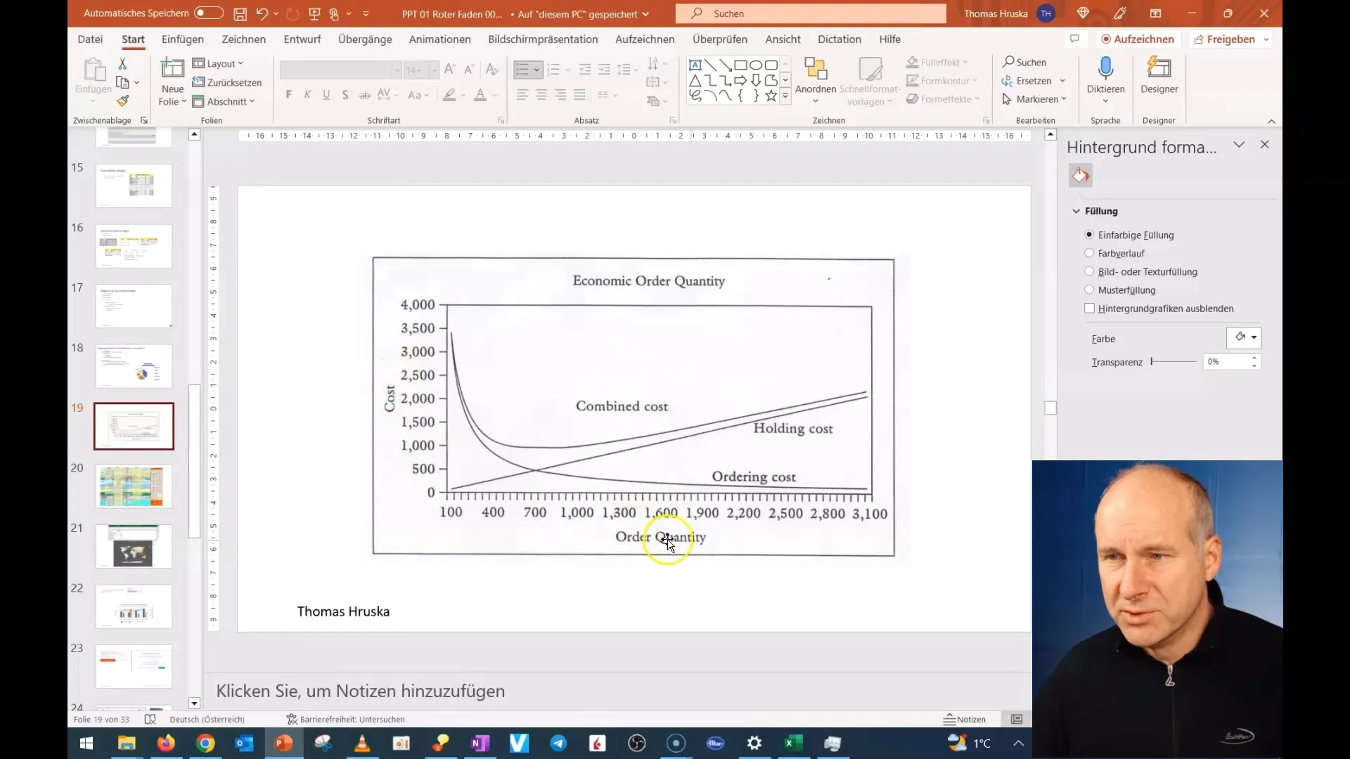
4. Clearly Explain Charts
Explain the chart step by step. Start with the axis labeling and explain the data displayed. For example, if you are depicting the cost per order and the number of orders, first explain the axes and what the data mean to your audience.
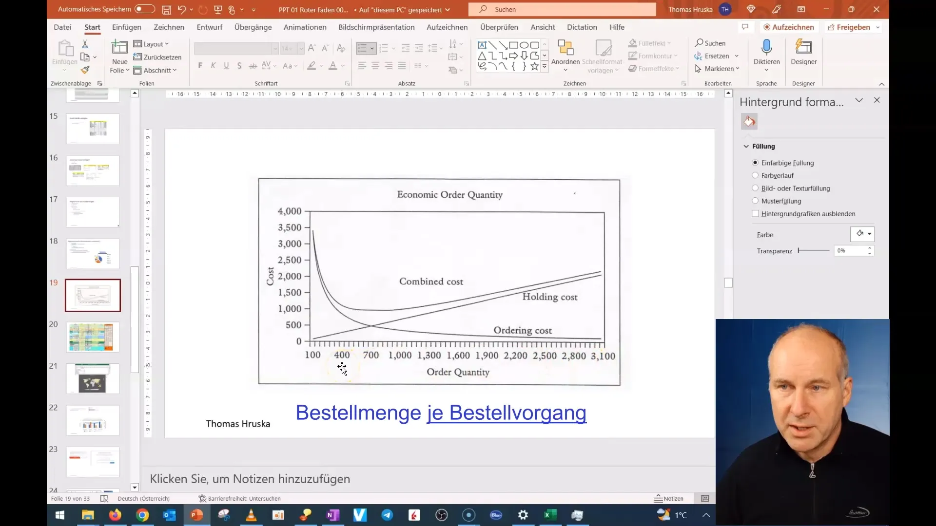
Make sure to clearly highlight the trends and patterns in the data. Avoid presenting too many details at once, as this could overwhelm your audience.
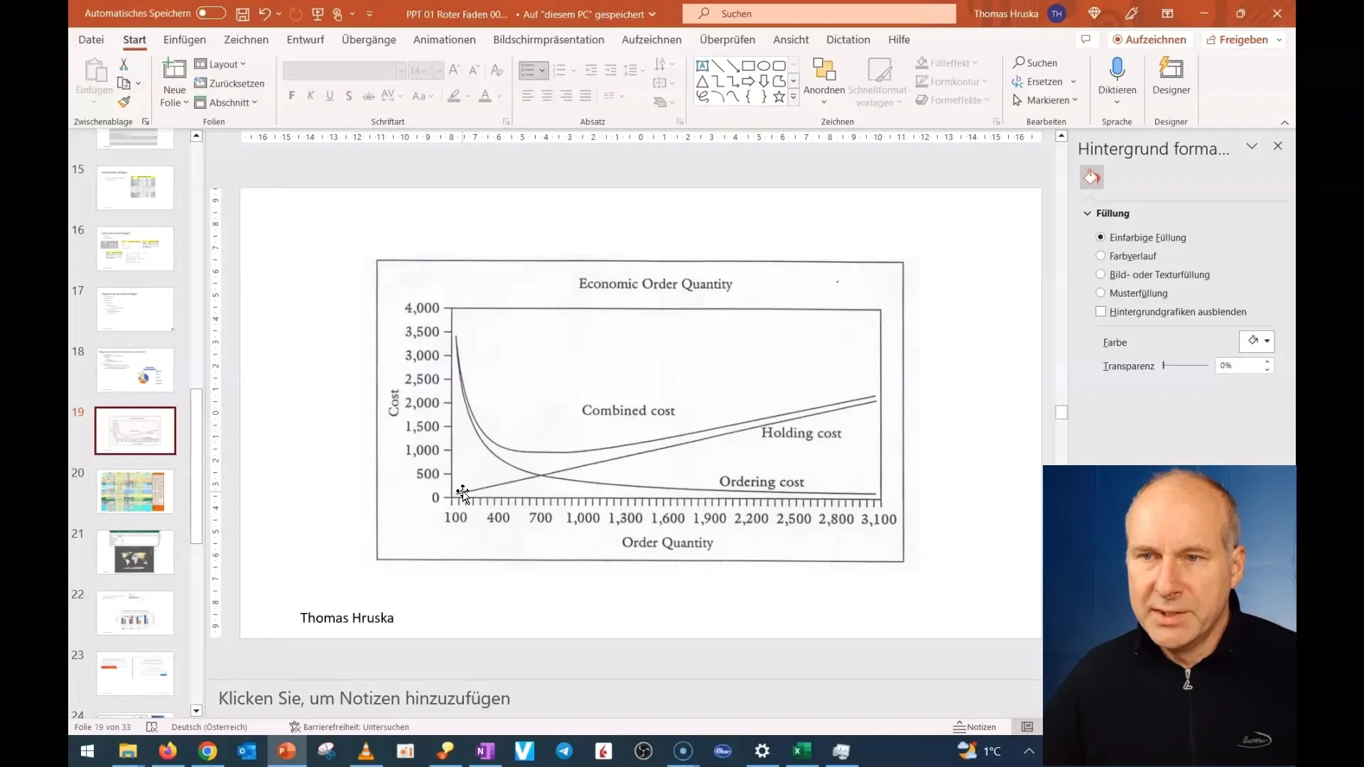
5. Utilize Visualizations
To make your chart even more understandable, you can work with animations. Structure your presentation so that you add information piece by piece. Start with an initial graphical element and then fill it with the relevant information. This way, you guide your audience through the topic and keep their attention.
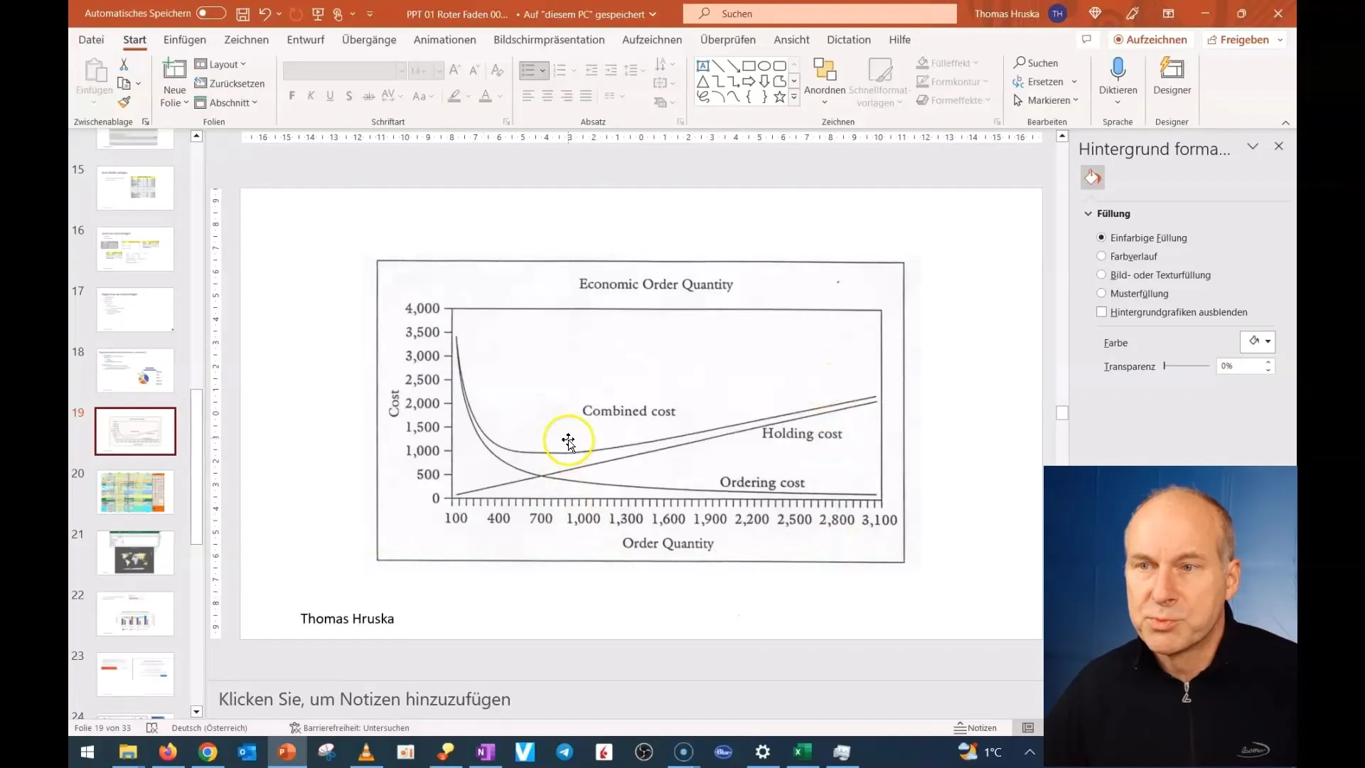
6. Summary and Conclusion
Summarize the key points at the end of your presentation. Show why the information presented is relevant to your audience and encourage them to ask questions. This promotes understanding and engagement.
Summary
In this tutorial, you have learned how to present charts in PowerPoint seamlessly and effectively. By ensuring to present your information clearly and simply, you can significantly increase your effectiveness as a speaker and ensure that the audience processes the information quickly and efficiently.
Frequently Asked Questions
How many elements should I represent in a chart?Keep it simple. Focus on the essential elements.
What is the best way to explain charts?Explain them step by step and avoid showing too many details at once.
How do I deal with different number systems?Explain the differences and ensure that your information is understandable for the audience.
Can I use animations for charts?Yes, animations help to convey the information gradually and maintain interest.
Do I need special software to create charts?PowerPoint already provides many options for creating and customizing charts.


