Welcome to this tutorial where you will learn how to create a chart with a secondary axis in PowerPoint. This technique is particularly useful for technicians who want to combine different data in one chart. Whether you need a force-distance diagram or any other graphic representation – here you will find out how to present two different data sets clearly in a single chart.
The aim of this guide is to make the creation and editing of a chart with a secondary axis as simple as possible. With the various options available in PowerPoint, you can design your charts professionally and highlight the important information clearly.
Key Takeaways
- A chart with a secondary axis allows you to present different data sets simultaneously.
- The steps are simple and enable a quick creation of a professional chart.
- Through targeted formatting, you can improve the readability and comprehensibility of your charts.
Step-by-Step Guide
Step 1: Create and Select a Chart
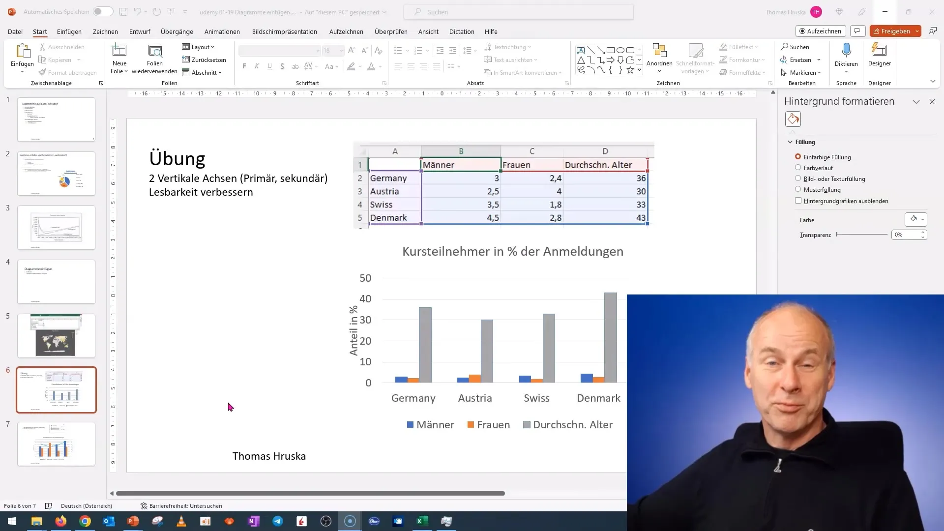
First, you need to create a chart in PowerPoint. You can do this by selecting the chart tool on the slide and choosing the desired chart format. If you already have a chart, simply click on it to select it.
Step 2: Edit Data
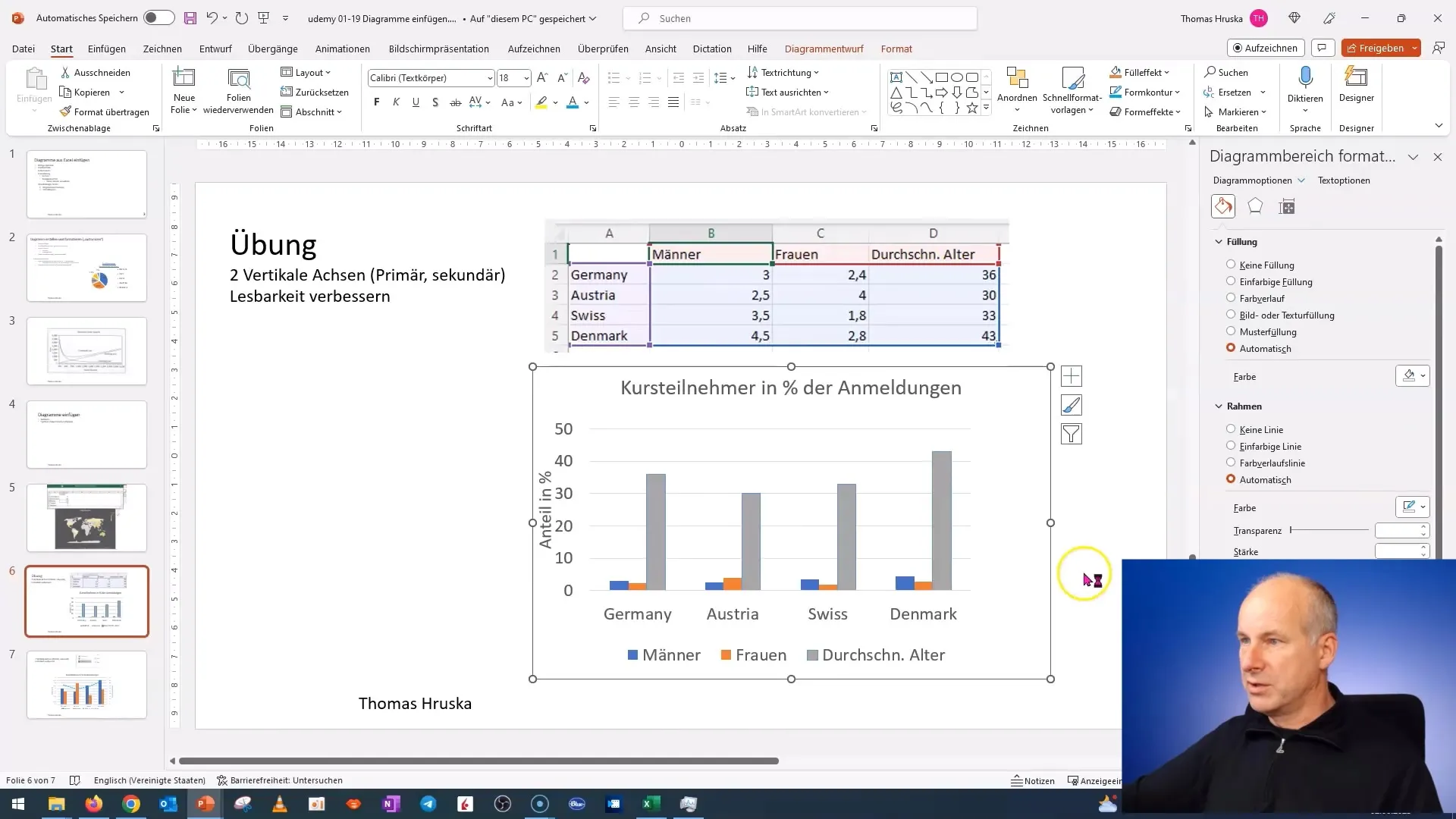
To edit the data of your chart, right-click on the chart and select "Edit Data" from the context menu. Here you can enter the data you want to represent.
Step 3: Change Chart Type
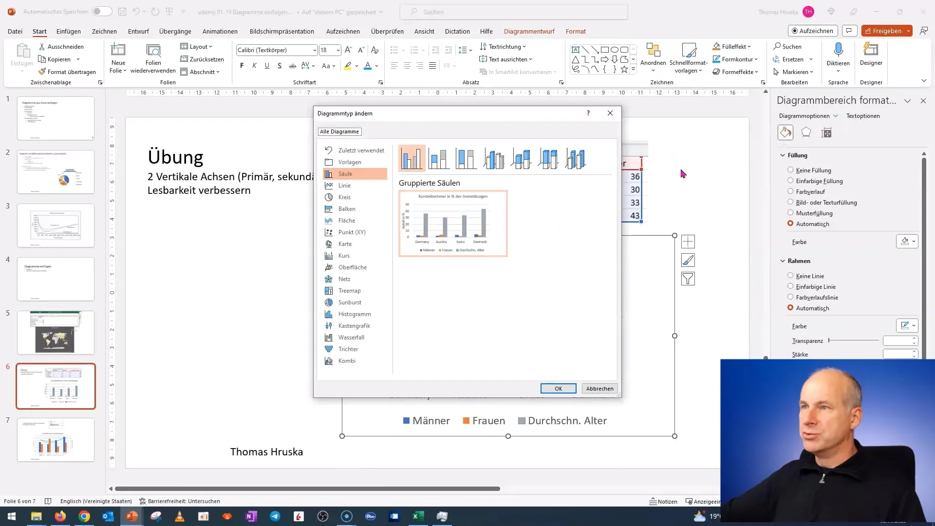
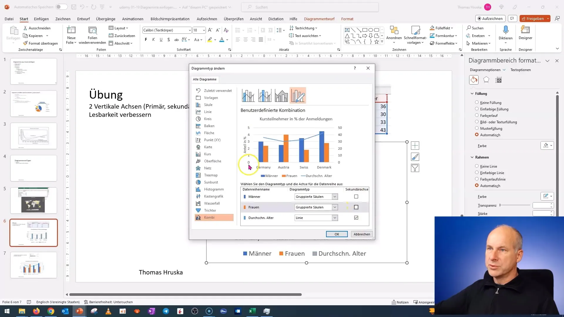
The next step is to change the chart type. Right-click again on the chart and select "Change Chart Type". In the options, you can choose different chart types. Select "Combo Chart" and preview to find the suitable layout based on your data.
Step 4: Add Secondary Axis
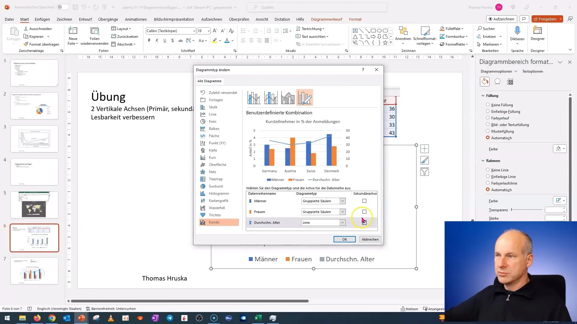
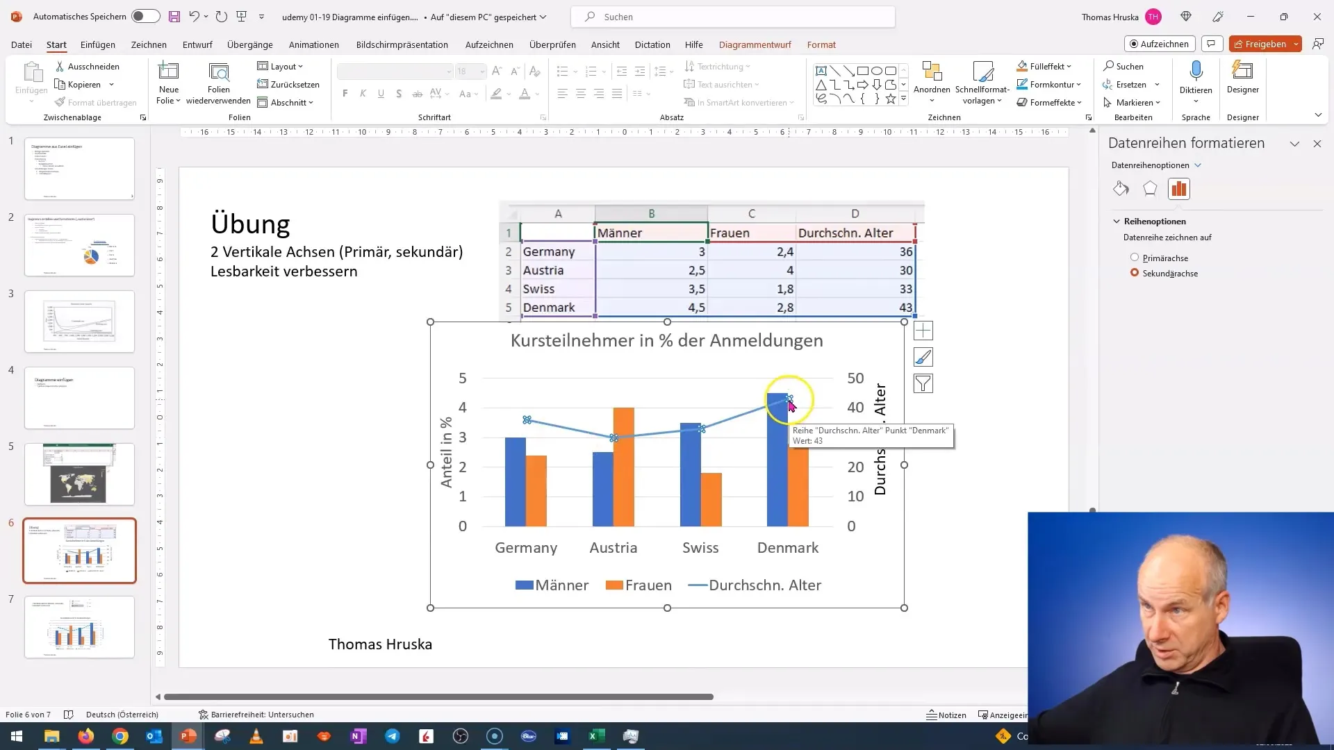
After changing the chart type, you can set which data should be displayed on the secondary axis. You have the option to assign different data sets. Choose the relevant data and click "OK" to confirm the changes.
Step 5: Add Axis Titles
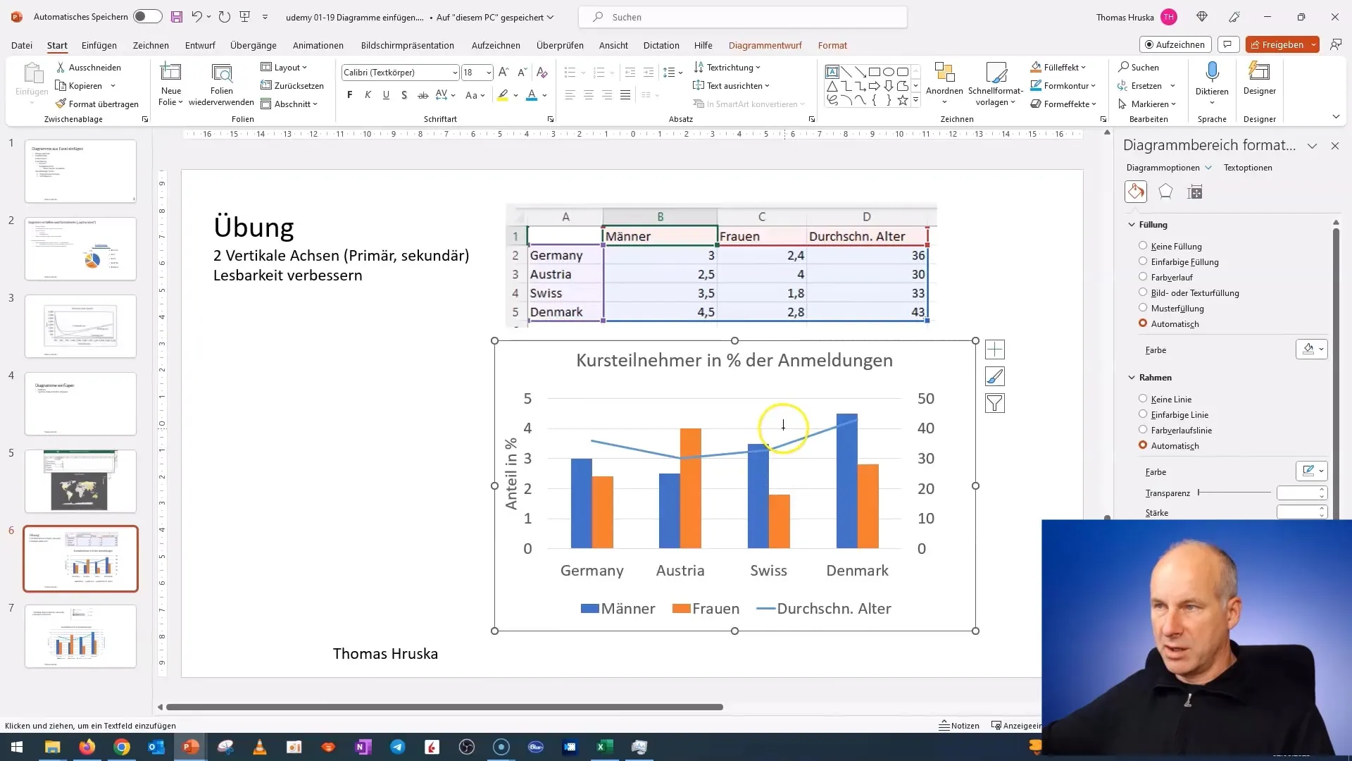
To improve the understanding of the chart, add axis titles. Click on the chart axis and select "Add Axis Title". Make sure the titles correspond to the data displayed – for example, "Percentage Share" for the primary axis and "Average Age" for the secondary axis.
Step 6: Format the Chart
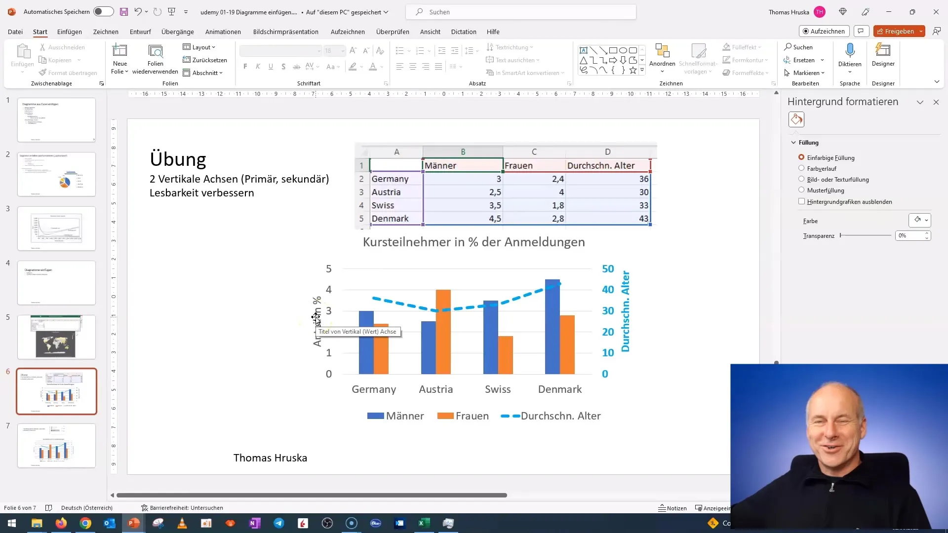
Now that you have your axis titles, it's time to format the entire chart. You can adjust the fonts, colors, and line thickness to make the chart more appealing and clear. Select different elements of the chart and use the formatting options in PowerPoint.
Step 7: Textbox for Additional Information
If you want to add additional information or legends, you can insert a text box. Click and drag a text box on the chart to place explanatory text or summaries directly in the chart. Ensure that this text is easily readable for the audience.
Step 8: Review and Adjust the Chart
Finally, review your chart and make adjustments as needed. Ensure everything looks clear and professional. Experiment with the arrangement of elements to ensure the best readability. Make sure the overall appearance is appealing and clearly conveys the information.
Conclusion
Congratulations! You have successfully created a chart with a secondary axis in PowerPoint. These skills will help you effectively present your technical data. Practice the steps described and experiment with different types of charts to deepen your knowledge further.
Summary
In this tutorial, you have learned how to create a professional chart with a secondary axis in PowerPoint step by step. You can now visualize data effectively and communicate your information clearly.
Frequently Asked Questions
How do I add a secondary axis to my chart?Right-click on the chart, select "Change Chart Type," and choose "Combo Chart."
Can I edit the chart later?Yes, you can customize the chart at any time by right-clicking and selecting "Edit Data."
How do I change the design of my chart?Select the chart and use the formatting options in the menu bar to change colors and fonts.
Can I combine multiple types of charts?Yes, with the "Combo Chart" option, you can combine different types of charts in one chart.
Why should I use a secondary axis?A secondary axis allows you to display data with different scales on a common graph, increasing comprehensibility.


