The so-called Color Lookups are a powerful tool, a powerful adjustment layer. You can find the icon here on the right and it can be used for very nice color grading.
The whole thing comes from the film industry. At some point, people realized: "Wow - we've given the film a certain look, now we'd like to make a poster", and instead of laboriously recreating the look, they simply exported this look from the video editing software or from the video grading software, if you like. The whole thing is now built into Photoshop.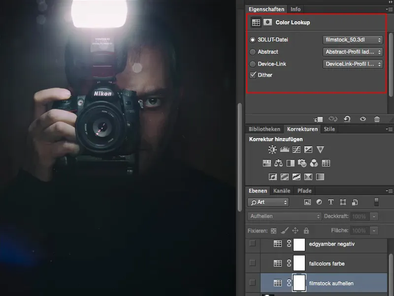
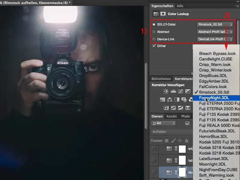
You have saved various presets (1) here. And when I click on it (2), all these tabs open up and you can choose one of these presets. For my taste, I was really looking forward to it at first and when I saw the whole thing in practice, I thought: "Well, it's somehow not that great", until I found out, at least for my workflow, how I personally want to work with it. And that's what I want to show you here.
Color Lookup: Filmstock
I'm going to take a new color lookup layer (1) and select the Filmstock style (2), for example. It makes everything quite dark, it makes the highlights very bright, it increases the saturation. Down here, everything is now completely dark (3). You can use it like this, but you don't have to.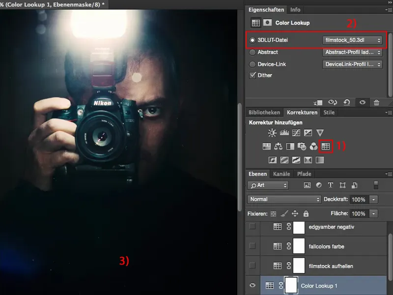
At first I said: "Okay, I'll just reduce the opacity a bit here (1), but ultimately I can also edit the effect using a tonal correction, an adjustment layer, a gradation curve, who knows what ... I can do it differently." If I use these things here, then I also want them to offer me added value. And so far, they haven't been able to do that with opacity.
So I think: what can I actually do here? I take this out, this layer, and drag it here to the trash (2).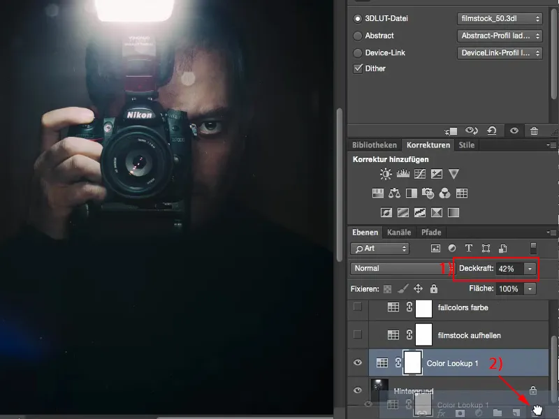
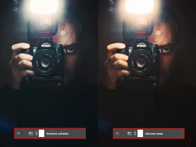
Then I have a look at how the layer modes work. For example, I also came across Lighten (1). Then I thought to myself in the picture: "Heyer, the flash up here, it's really popping now, it has a real aura, the whole thing is getting a bit more grippy, the depths are gone at the bottom, okay, but the sweater was black anyway." And with this mirror image here of me, I thought to myself: "This is definitely an upgrade."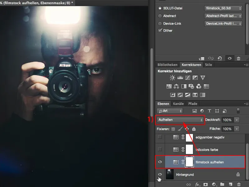
I can still adjust the opacity, so I took another look here. What does it look like? Soft light mode ? Yes, far too dark, let's get rid of it.
Multiply negative mode? Yes, it looks better. It's not bad either, but it's a bit too dull for me.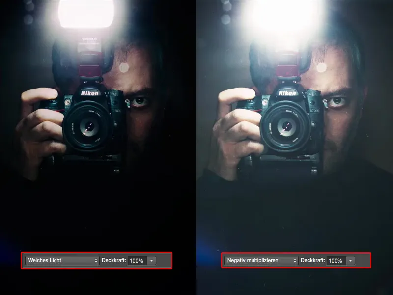
I left it on Lighten, but in the end I'll find out by trying it out here. I can also select the Color mode and find out: No, blue hair, yellow flash, bright orange skin, that's not what this Color Lookup is made for.
But in Lighten mode it works very, very well with this image, because everything else that is not highlights or bright image components is not changed at all. And I have brighter components in the flash and in the areas where the flash light hits my fingers or a little bit on my face. Everywhere where it gets brighter. This is intensified here and it certainly looks cool in my picture.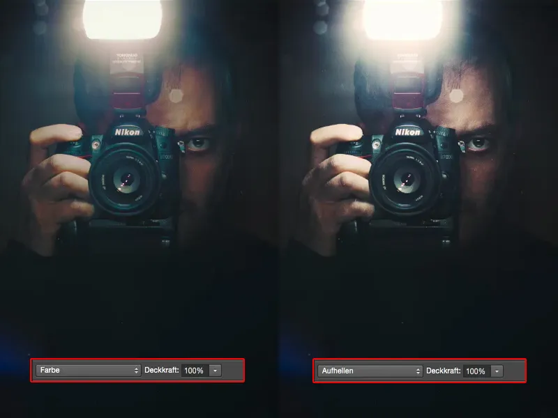
Color Lookup: FallColors
Then I found the FallColors (1) here. It looks like this in Normal mode (2). The whole thing is a bit grayed out, I don't really like the color shift in the face either. It's not really a hit.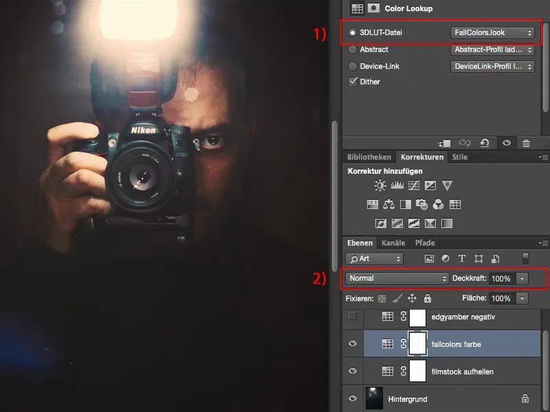
But I thought to myself: "FallColors? Fall color?" Then I took a look at how the whole thing looks in Color mode. And lo and behold: The brightness remains unchanged here, but in Color mode , I can work with it.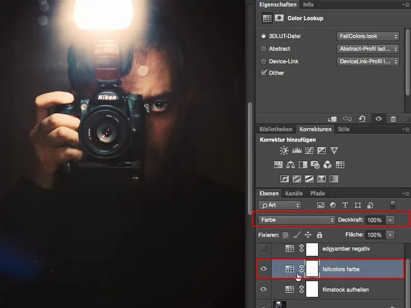
Color Lookup: EdgyAmber
And so I put together various adjustment layers, color lookups here, which are quite cool for my kind of image editing. This EdgyAmber looks a bit evil, like the movie "300". It's not bad at all, but I just don't want the image to look so brutal.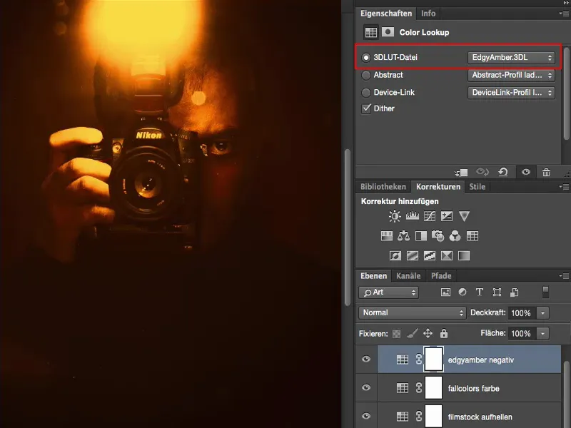
I then reduced the opacity and thought to myself: "Well, I could have just put a color balance over it and warmed it up", ...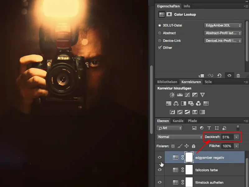
... but in Multiply Negative mode , when I brighten it up, it's grayed out a bit, but it gets a bit of an Instagram look.
I can still play with the opacity: How much do I want to lighten it? Maybe I don't need 50%, but just a hint so that it looks like the sweater isn't completely black.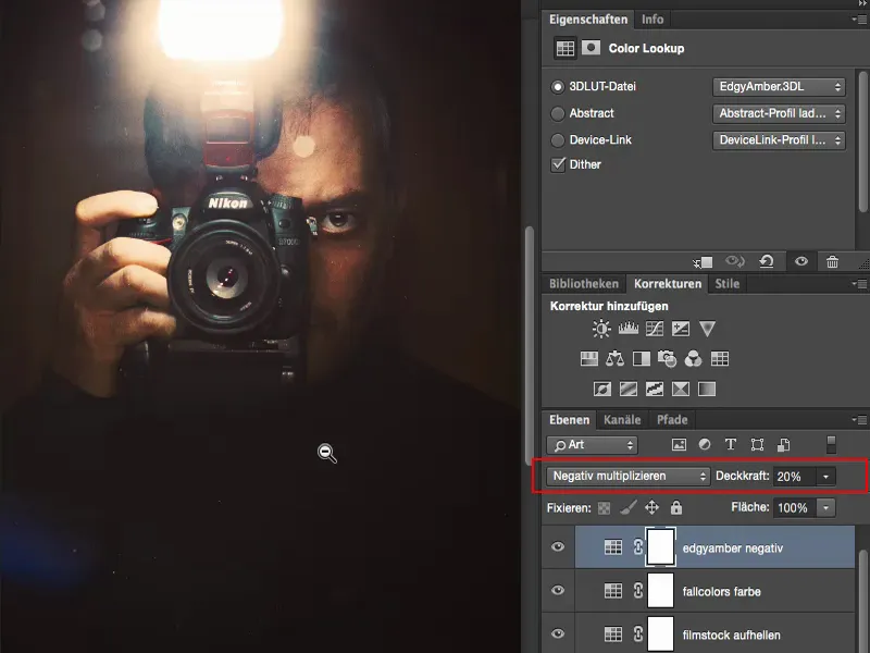
Summary
So I can work with adjustment layers of the Color Lookup type. I have to look at the look in Normal layer mode at 100% opacity and see: What changes in my image? Does the brightness of certain areas of the image change, does the contrast change, does the color change? And if I don't like it, then I have to think about it: What would it look like if I just wanted to have the brightness of this look, for example, as was done here with Filmstock (1). I think that's a relatively cool change to the image. And it actually fits quite well.
Or, if I use the FallColors (2): What does it look like if I set it to Color mode (3), because the brightness that the look creates, that's bullshit, yeah? But in the color mode, which is perhaps what it was originally intended for, the whole thing makes sense again. And so I can learn how these individual adjustment levels, color lookups, work in practice.