In this tutorial, you will learn how to create a creative and entertaining presentation for a 10-minute coffee break in PowerPoint. This is a practical exercise to deepen your skills in animation and presentation techniques. You will see how you can combine and animate different elements to convey a captivating message. Let's start directly with the potential end product to see what we want to create before we start building it.
Key Insights
- The design of a creative presentation can make a difference in how the content is perceived.
- The use of colors and fonts can influence the mood of a presentation.
- Animations can help increase audience attention and control the flow of the presentation.
Step-by-Step Guide
First, I want to show you how the end product will look. We will enter slide show mode and press a key. You will see the countdown in progress. This is an animation that ideally should last 10 minutes, but in this exercise, we will work with 10 seconds instead.
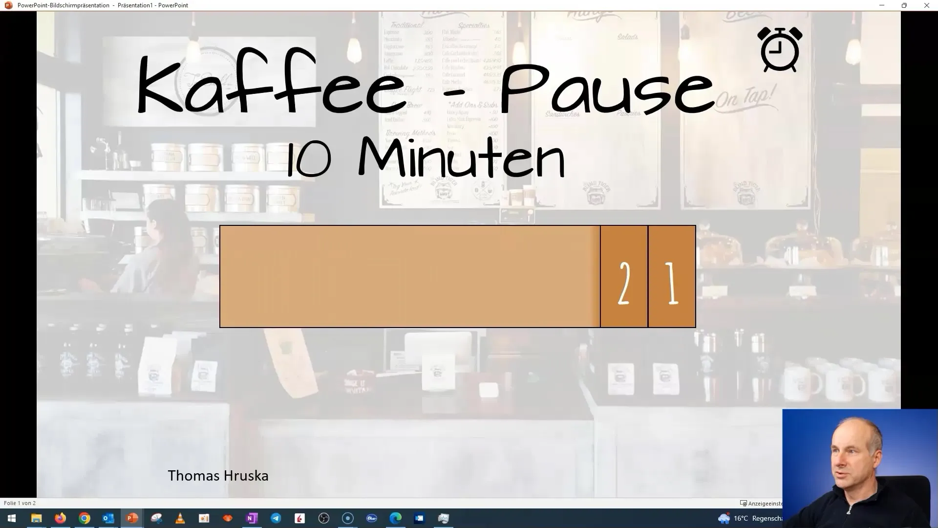
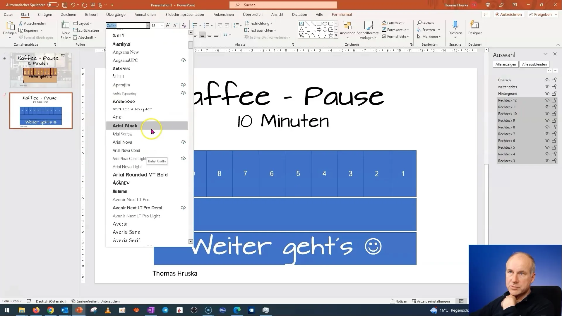
To create a presentation where animations shine, it is important to understand the right presentation psychology. Avoid fancy fonts in serious presentations to minimize distractions. However, for this exercise, I will use a playful approach since it's about a coffee break.
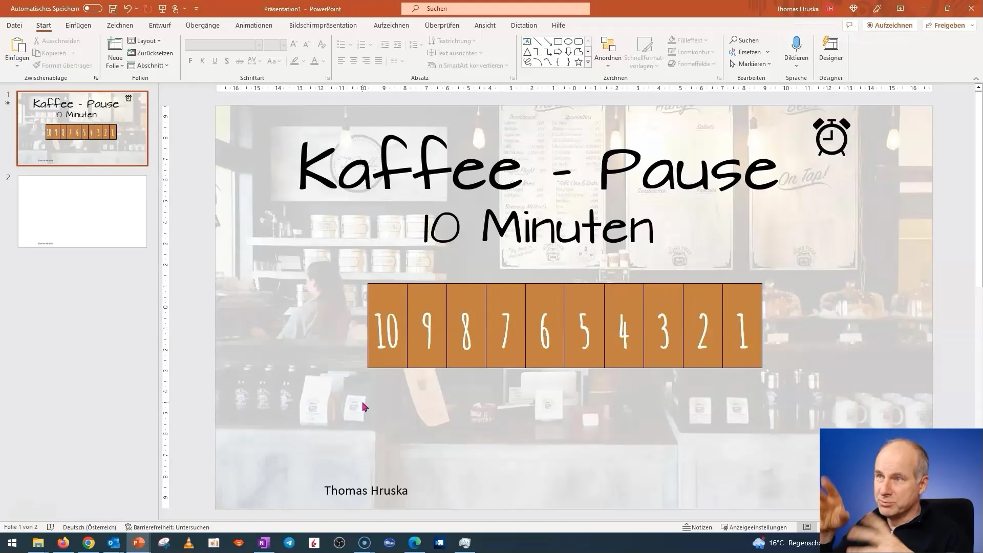
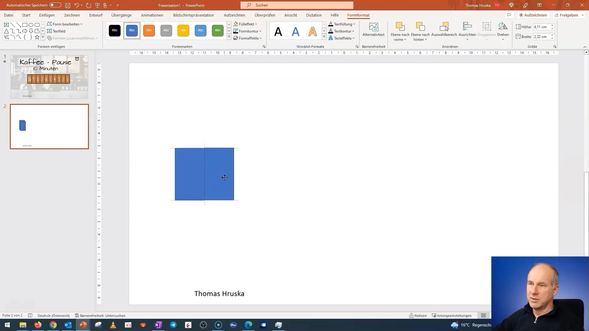
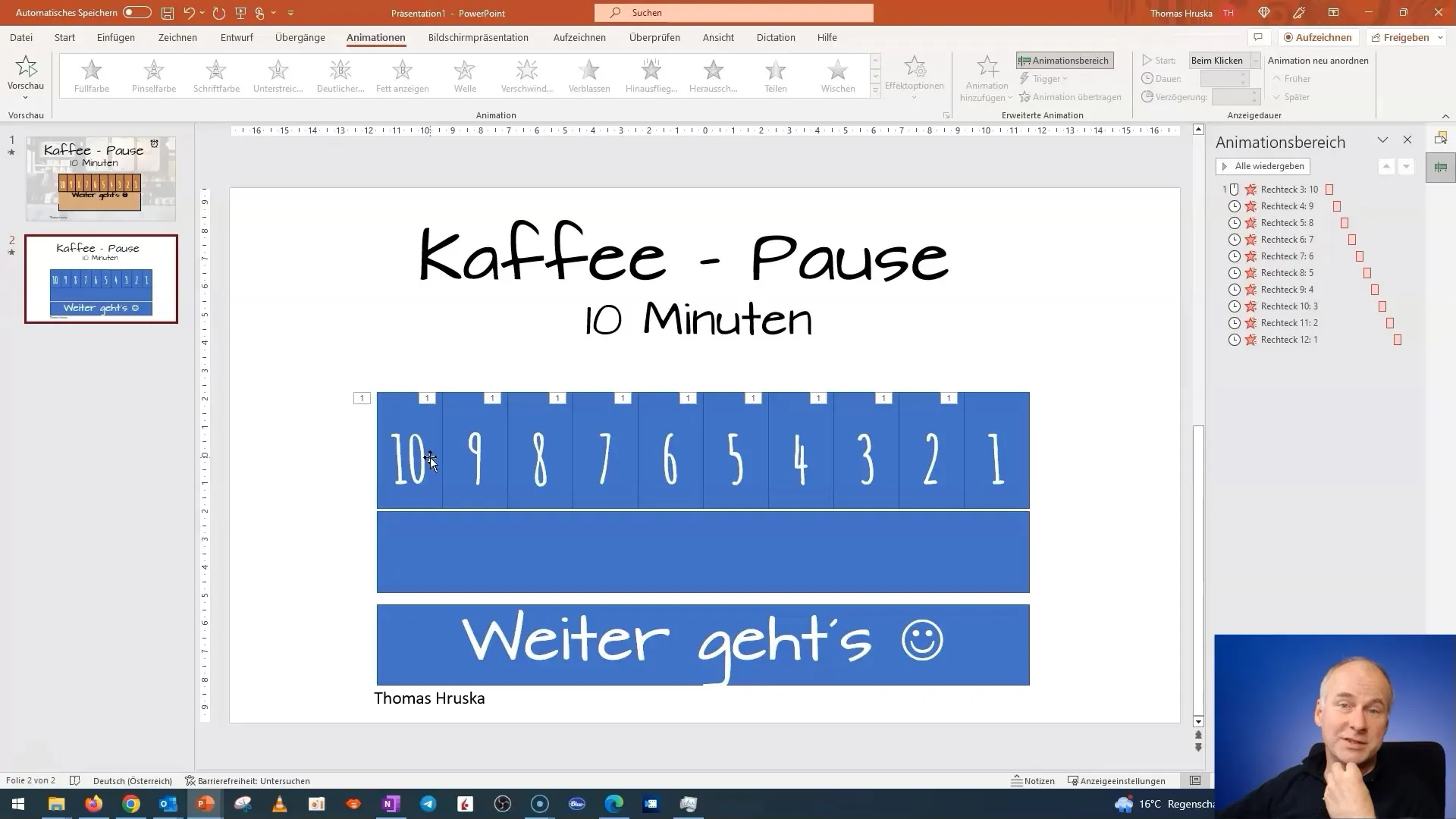
We will now create three levels. Start by creating ten rectangles. You can evenly arrange the rectangles on the slide. This will help you maintain order.
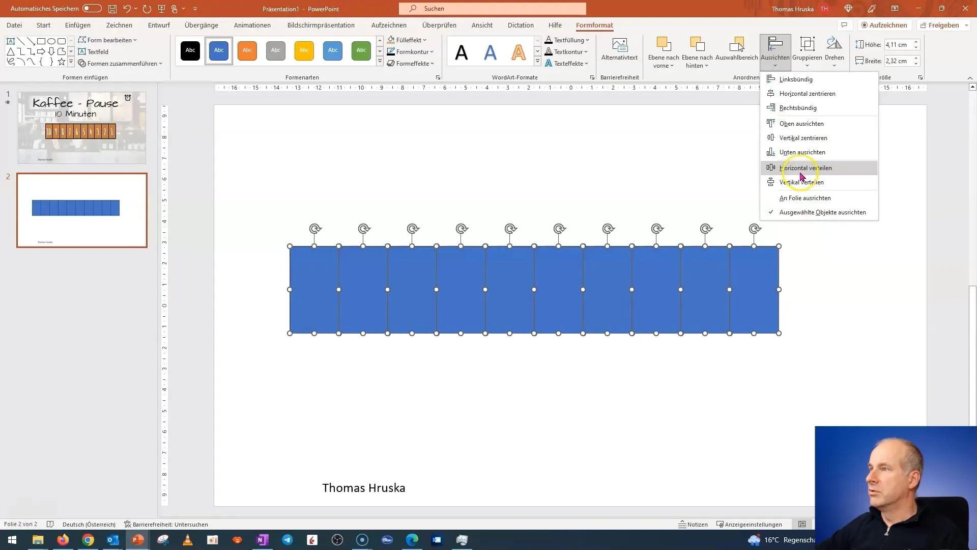
To ensure everything looks clean, align the rectangles vertically and horizontally. Go to the formatting options and choose "Align" followed by "Center Vertically" and "Distribute Horizontally." This will ensure the rectangles are evenly distributed on the slide.
Now we will create a rectangle that serves as a background. Move this rectangle behind your other elements. It's wise to name this background to keep track of it in more complex presentations.
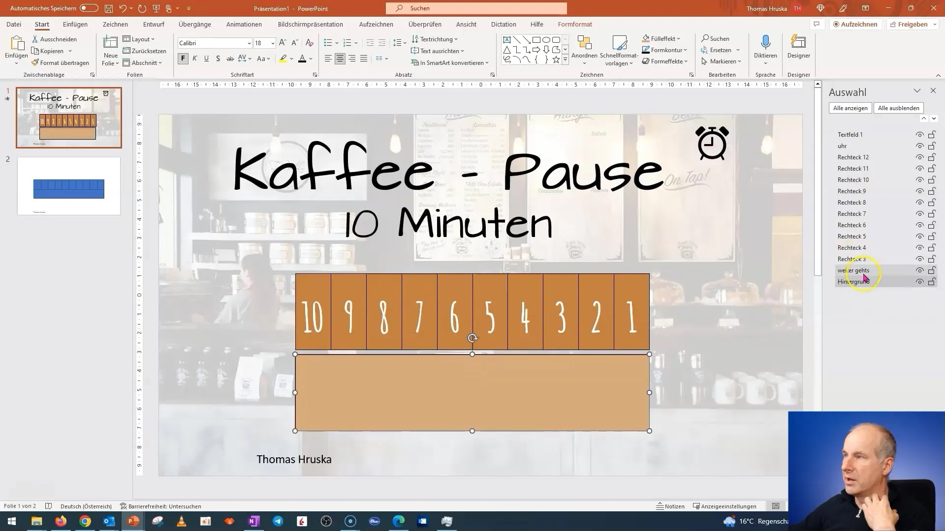
The text for the coffee break should also be within a rectangle. I will now add the third box and create a heading: "Coffee Break 10 Minutes." Make sure the text is large enough and uses a playful font to emphasize the playful nature of the coffee break.
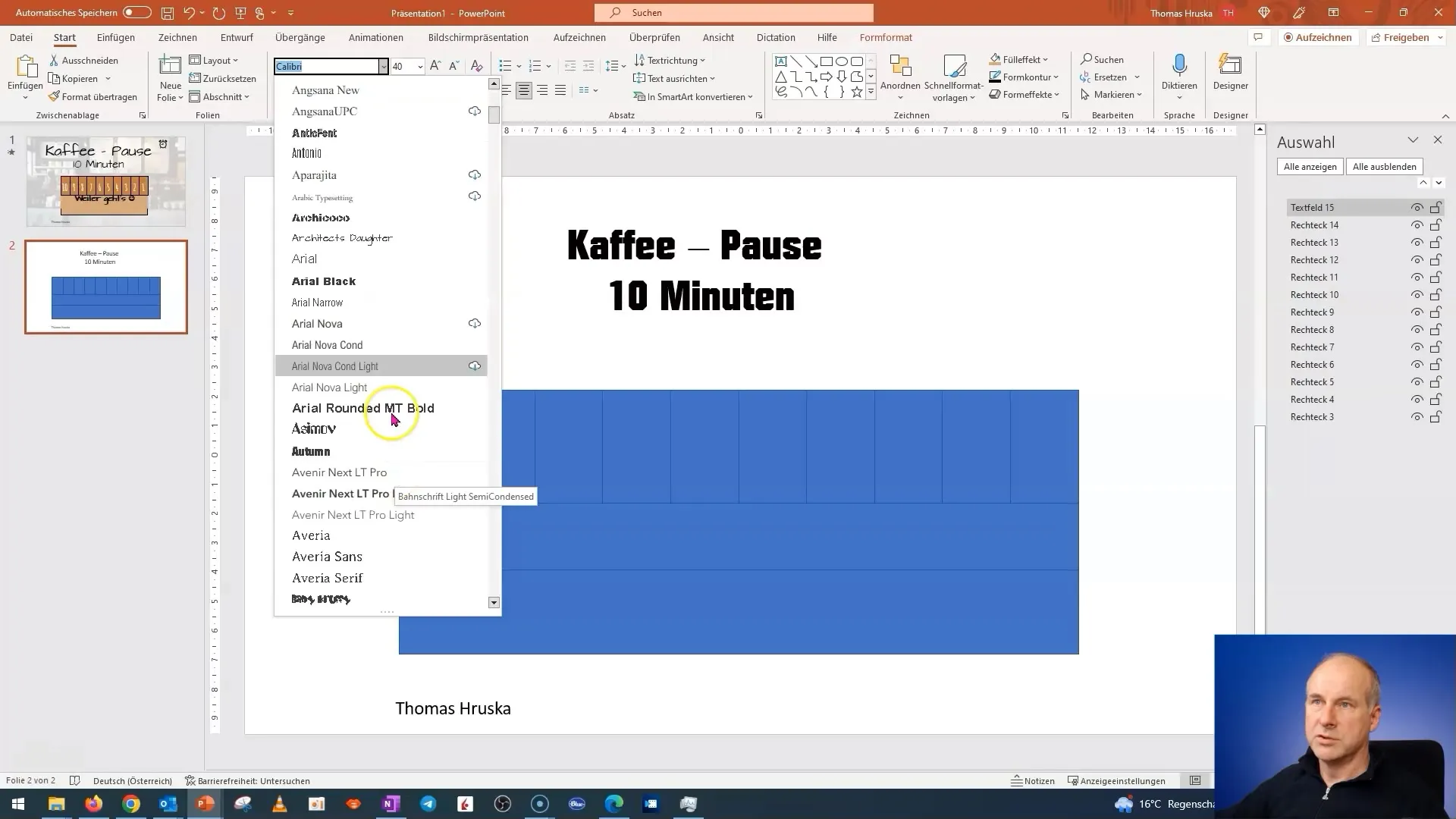
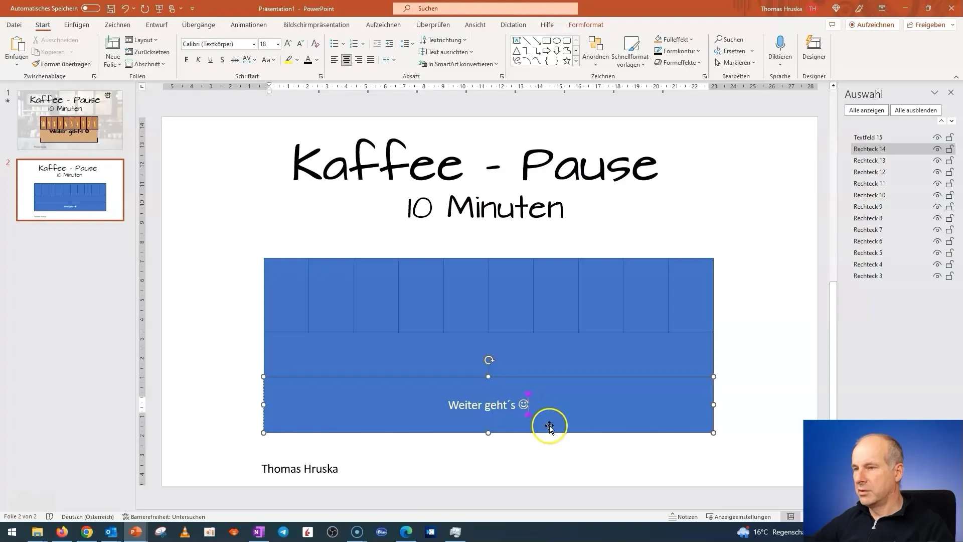
Add a smiley face to emphasize the cheerfulness of the coffee break. It's important to choose a font size and style that fits the theme and is visually appealing.
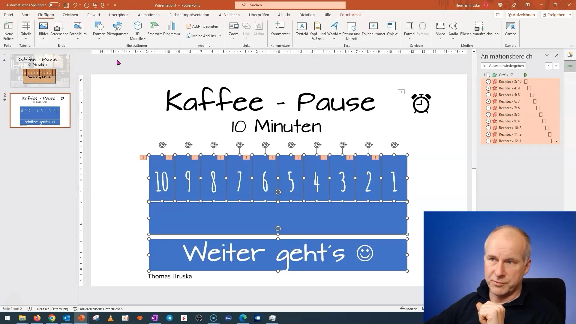
Now we come to the most exciting part: the animation. Start by naming your rectangles to increase clarity. I name my box "Background" and the other boxes accordingly.
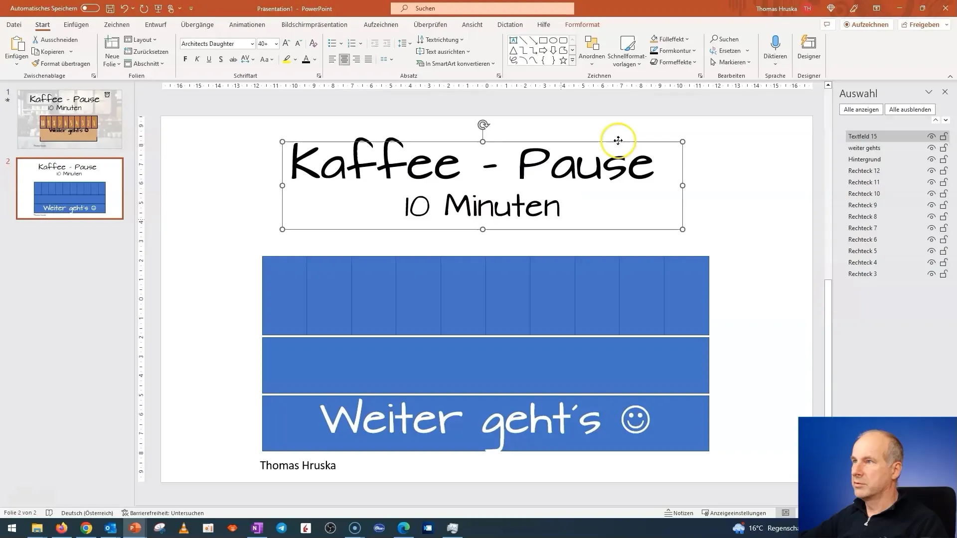
Next, we add the countdown numbers. These should count down from 10 to 1. Choose a sleek font so that the text is easily readable.
Remember to keep the heading visible at the top of the slide so that it does not disappear behind the background when you start the animation.
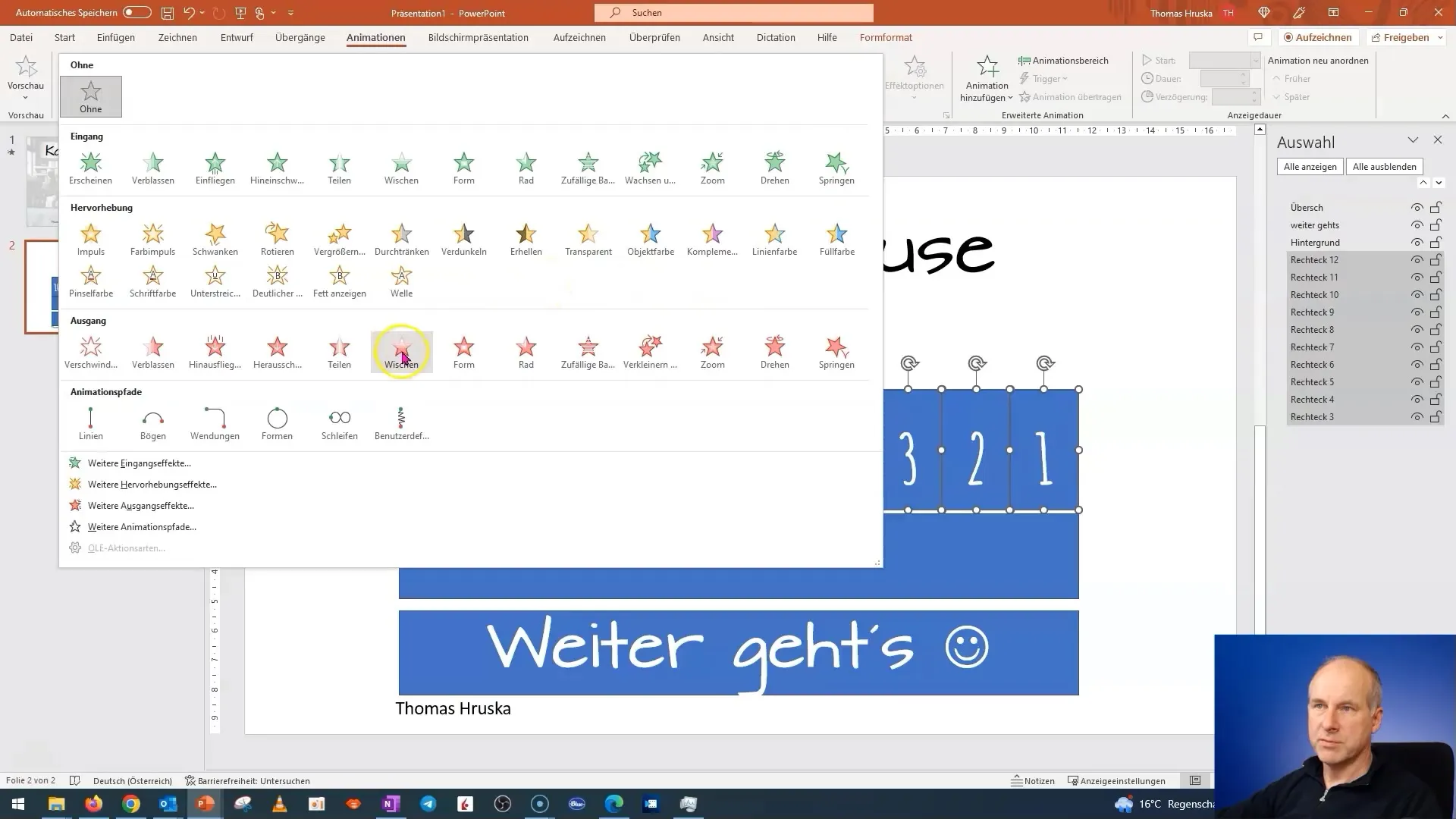
Now we animate the rectangles. The rectangles should disappear in the animation, one after the other. To achieve this, ensure the animations are arranged so that they do not all disappear at once but rather one after the other.
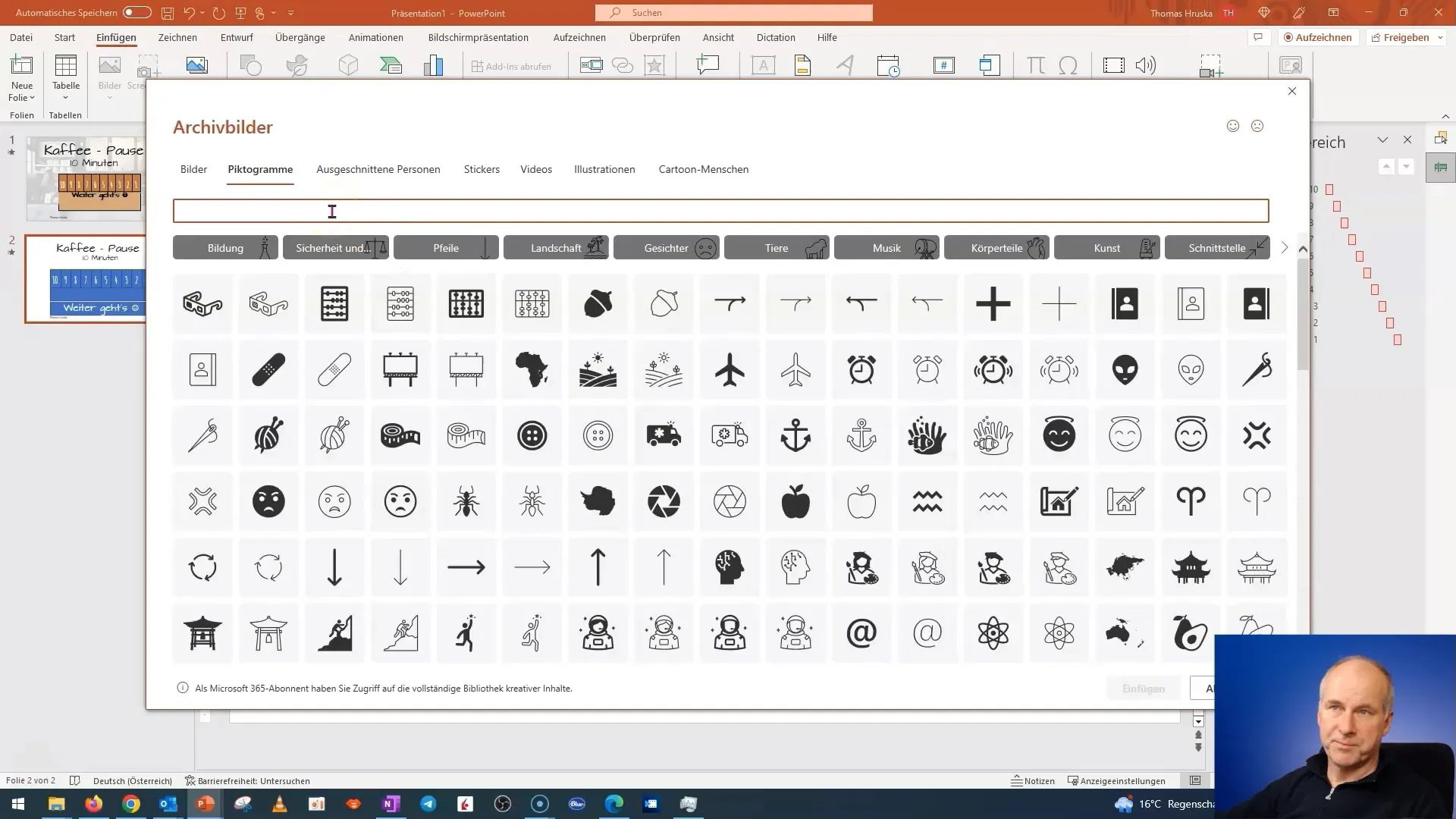
In addition, we will add a small clock or timer to help you monitor the progress. This clock should also be animated. The animation of the clock provides the audience with visual feedback that time is running out.
You will notice that animations from left to right can look unattractive if not properly adjusted. So, navigate through the animation settings to ensure that the boxes appear one after the other.
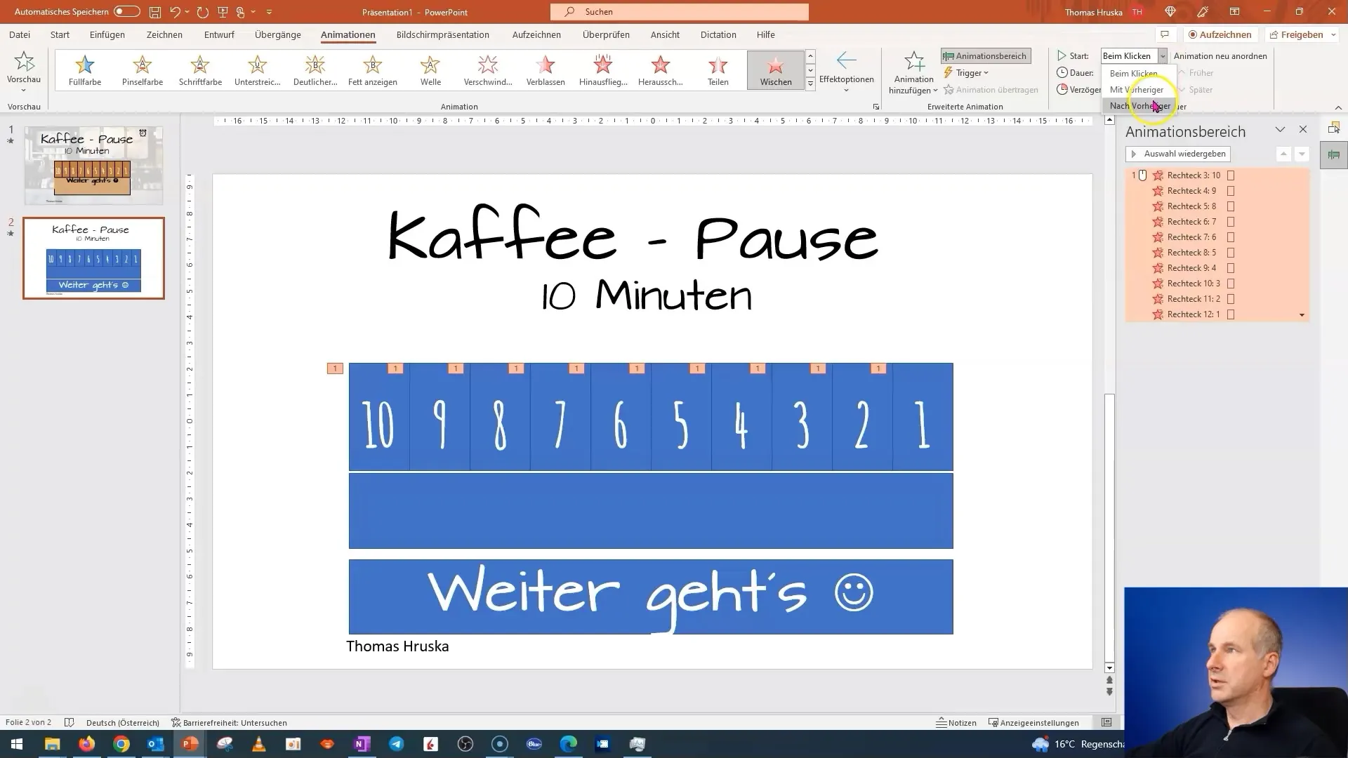
If you have set everything correctly, the animation will look very dynamic and appealing.
To ensure that your presentation does not become too lengthy, plan to make a cut to continue the exciting parts of the animation in the next video.
Summary
In this tutorial, you have learned how to design an engaging PowerPoint presentation for a coffee break with animations. You have learned how important the right font and color are, and how you can effectively use animations to capture the interest of your audience.
Frequently Asked Questions
How do I add animations to my text?You can add animations to your text in PowerPoint using the "Animations" menu. Select the text box and choose the desired animation.
How do I align objects evenly on the slide?You can use the formatting options and choose "Align" to distribute objects evenly.
Why is the font important?The font affects the readability and overall appearance of the presentation. Elaborate fonts can cause distractions.
How can I adjust the duration of the animation?You can adjust the time for each animation individually under the "Animations" menu.
Can I insert images into my animations?Yes, you can add images at any time and animate them as well to make the presentation more engaging.
