Welcome to my PowerPoint tutorial, where I will show you how to create an interactive tile dashboard. Dashboards are a standardized methodology these days to present quarterly reports, monthly status updates, or project progress. They allow you to see relevant key figures at a glance and navigate to more detailed information if needed. In this first part of the tutorial, we will cover the basics of dashboard construction, including creating tiles, customizing designs, and dealing with transparent buttons.
Key Takeaways
- Dashboards are crucial for presenting data in a clear manner.
- You can easily create tiles yourself or customize predefined designs.
- Transparent buttons help enhance the design, even if images are not available.
Step-by-Step Guide
1. Understanding the Dashboard Fundamentals
Before you start creating your dashboard, you should have a clear understanding of the content and structure. You need to have a clear idea of what data you want to present and how users should navigate through the dashboard.
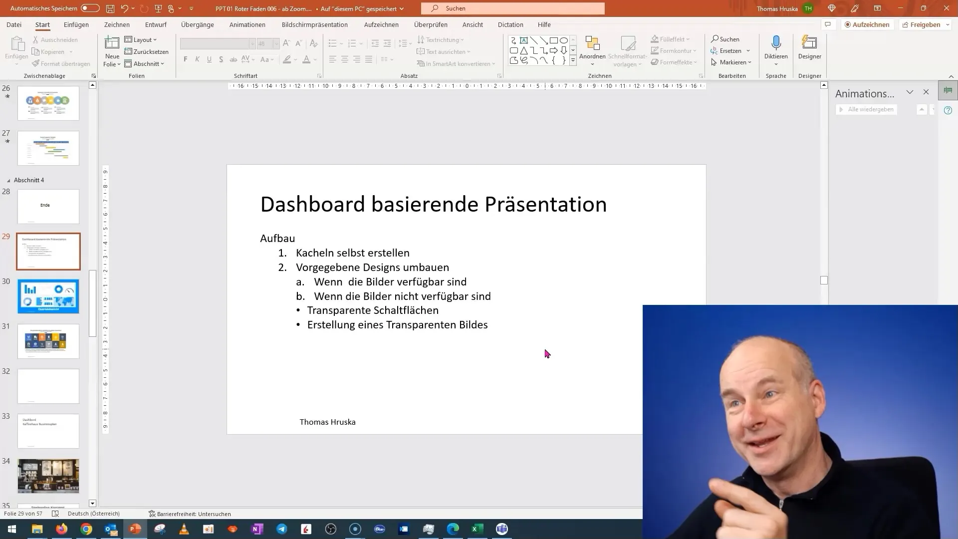
2. Starting a New Project in PowerPoint
Begin with a new slide in your PowerPoint presentation. Make sure you have your existing presentation on hand to access when you want to insert content.
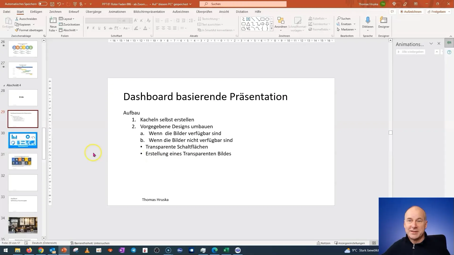
3. Creating Tiles
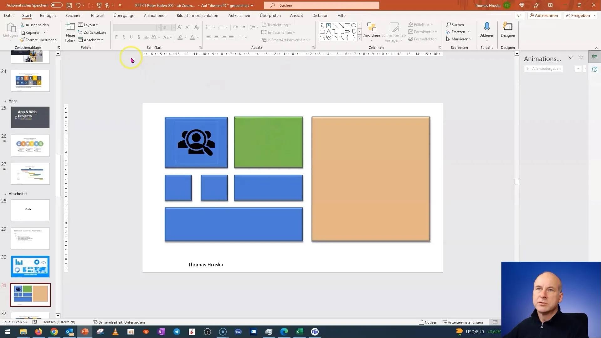
Design your dashboard tiles. Add simple shapes to represent the tiles. You can use rectangles or other shapes and format them. Make sure to add shadow effects to give the tiles depth.
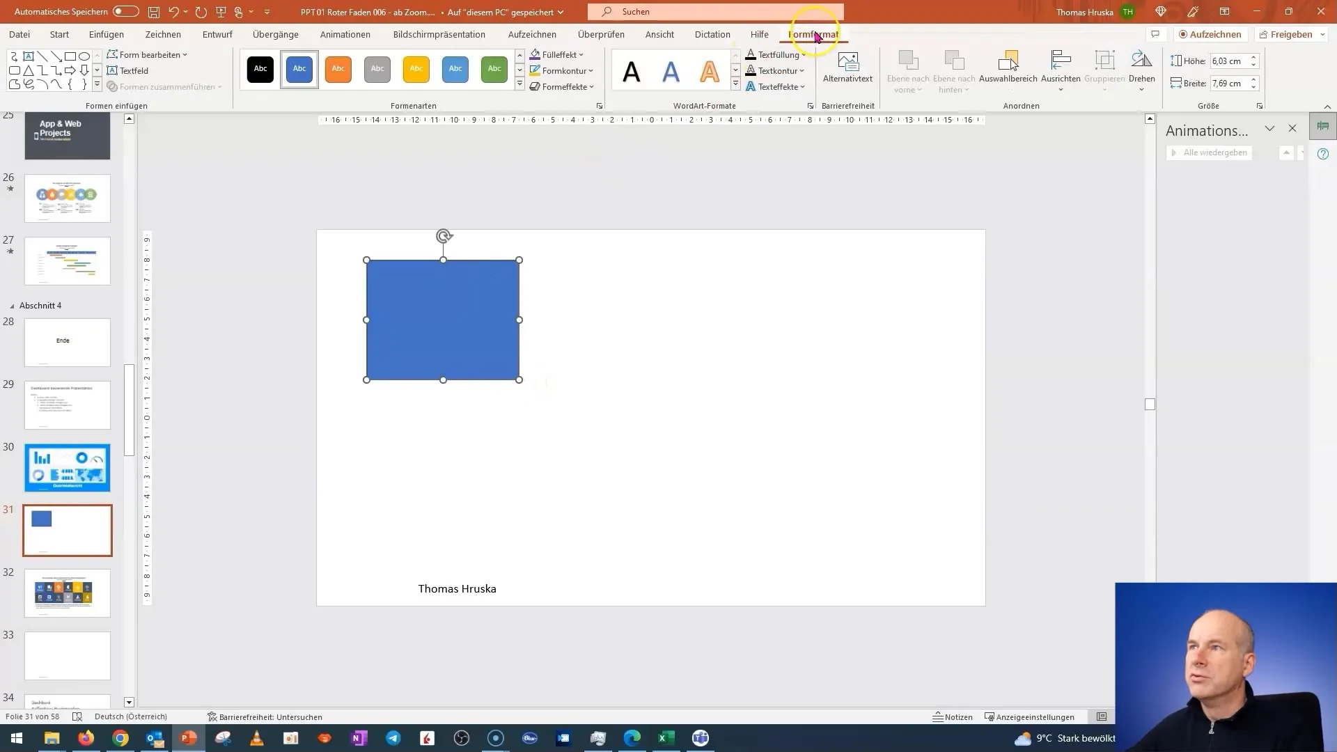
4. Duplicating and Customizing Tiles
To create multiple tiles, you can duplicate a tile. Change the colors and texts to represent different areas or metrics. Experiment with different designs and colors to create an appealing visual layout.
5. Integrating Content into Tiles
Now is the time to add interesting content. Click on the tile you want to edit first and add the necessary information. For example, if it's about quarterly figures, add them directly into the tile.
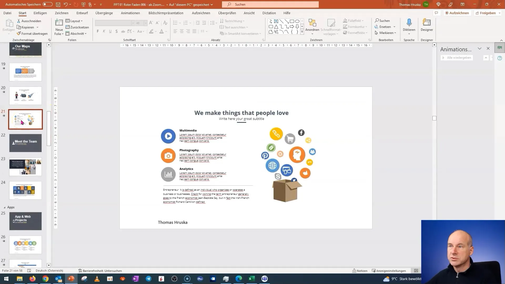
6. Swapping Images
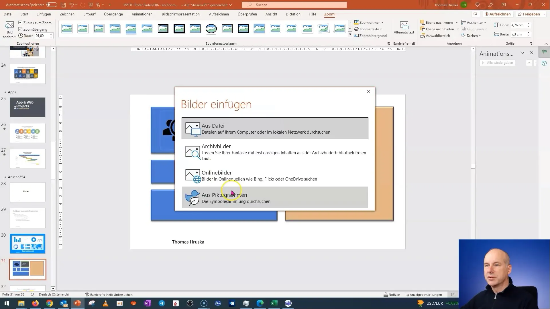
You may need images for your tiles. If you easily find images, you can simply swap them. Go to the image libraries, choose the appropriate images, and insert them. Ensure that the images match the respective message.
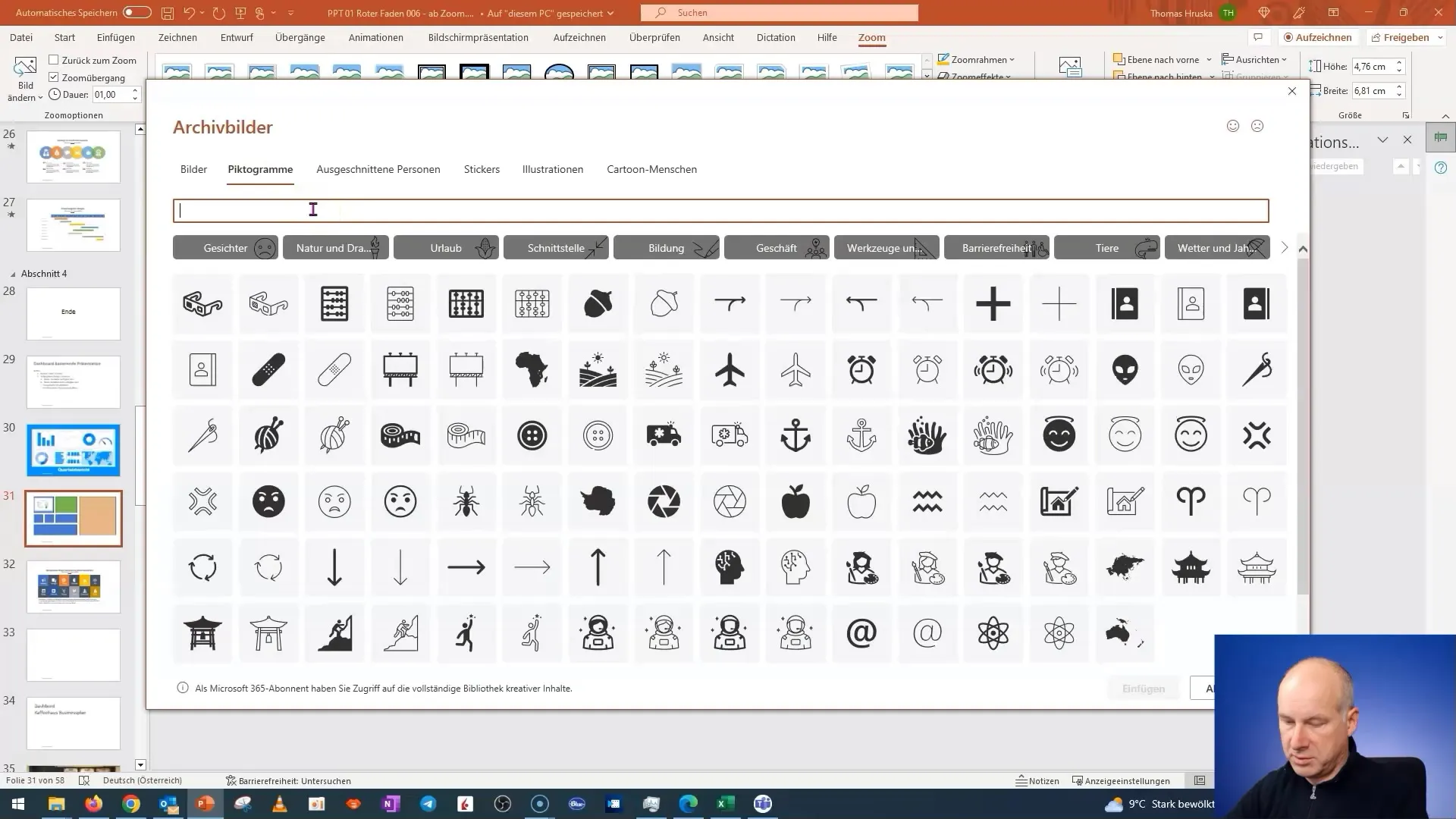
7. Advanced Features: Adding Buttons
Add transparent buttons to your dashboard. These buttons allow interaction and help the user navigate between different tiles and slides. You can easily insert buttons and link them.
8. Designing the Buttons
For a better user experience, design the buttons. Make sure they match the same style as the tiles to ensure a consistent appearance. You can customize colors and fonts to highlight your buttons.
9. Finalizing the Design
Check your dashboard before saving it. Ensure all buttons work and that the content is correct. Use this opportunity to make any final adjustments if needed.
10. Save and Test Presentation
Once you are satisfied with the design and functionality of your dashboard, save your presentation. Test the dashboard in presentation mode to make sure everything works as you envisioned.
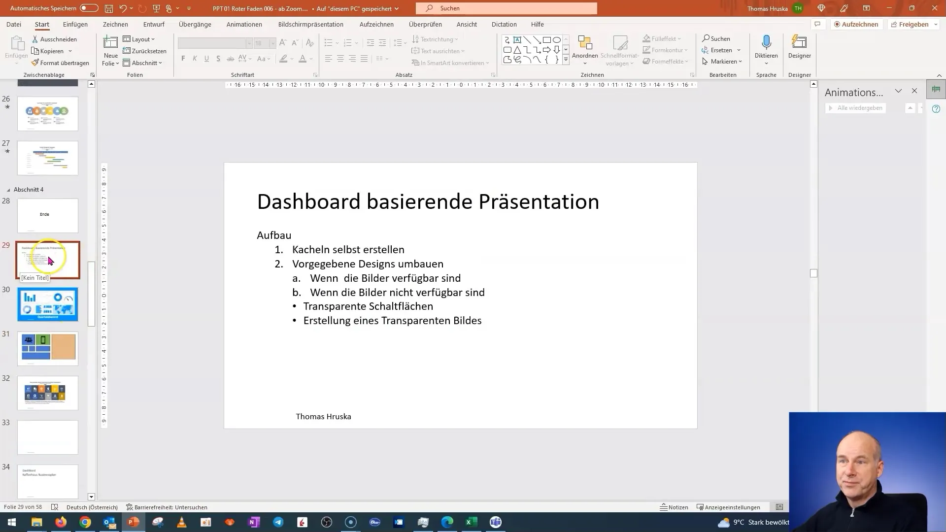
Summary
In this first part of the tutorial, you have learned how to create an interactive tile dashboard in PowerPoint. The process involves creating and customizing tiles, inserting content, and designing navigation buttons. The second part will focus on working with predefined designs.


