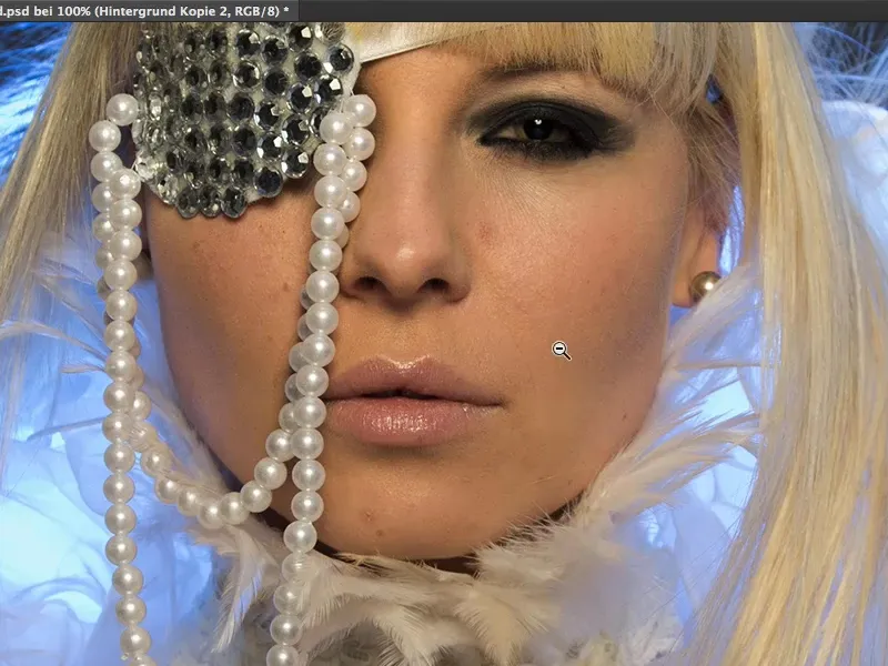
In this tutorial, I'll explain everything you need to know about skin work and skin formation.
Not so long ago, the method of soft-decrunching or skin-powdering, as it was also called in German, was state of the art. Everyone applied it to their picture - reducing the opacity a little to eliminate imperfections and the story was over.
Today, we work with what is known as frequency separation. Sounds very complicated. What is separated here? - Frequencies. That sounds terribly technical and is probably not even suitable for beginners. Who knows what's going on? ... I'll show you that frequency separation is terribly simple.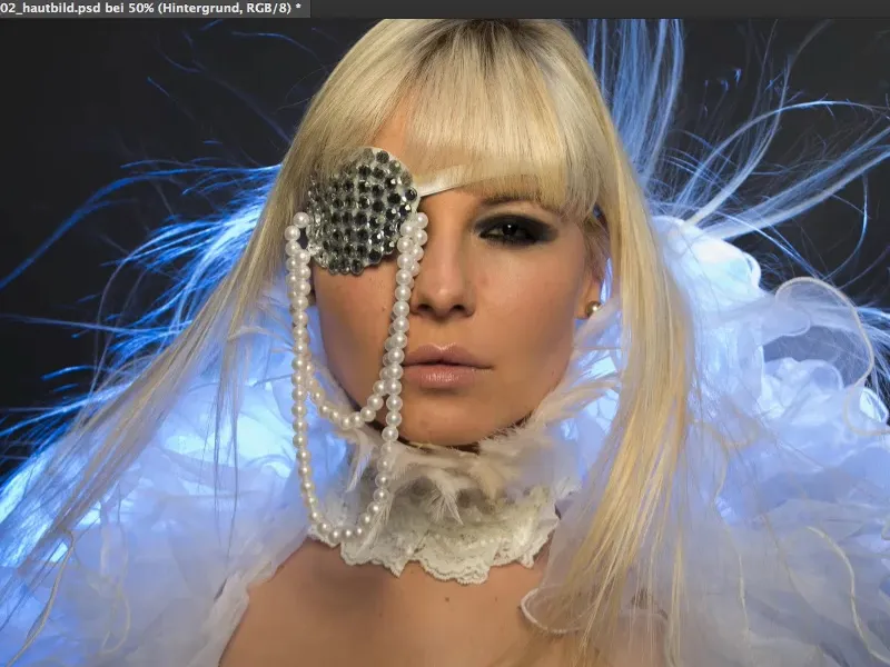
Previous procedure: Powder the skin
You used to do it like this: You might have copied the layer (1), inverted it (2), ...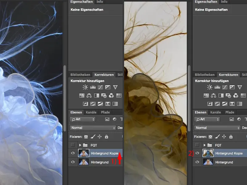
... then you used the high-pass filter with a radius at which you could still see the structures.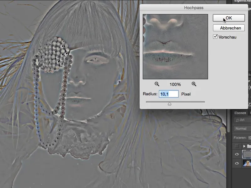
Then go to Soft light here (1). Now you've got this glowing look, this softly drawn skin (2). And using the Gaussian blur (3), you've brought back the pores with a small radius of about one pixel.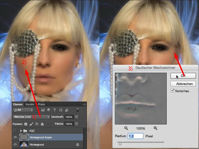
If you look at the before and after, you can see that the entire image has been softened: The entire image has been softened.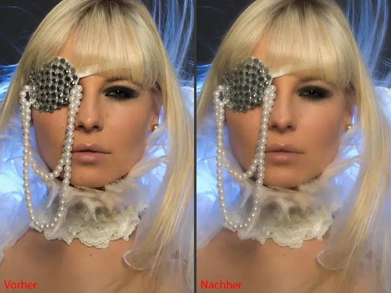
You now had to painstakingly brush this onto the image using a mask. I always do a 200% zoom. Then you can see that the pores are still all there, but they're very slightly blurred. That looks good.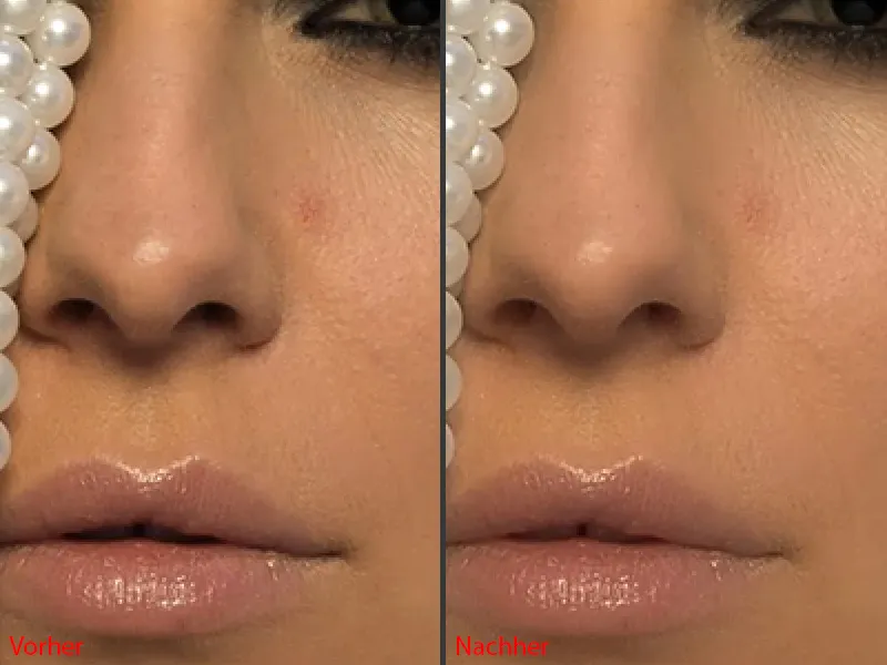
It undoubtedly also looks good if you zoom out here and look at the whole picture. If you imagine that you've only masked out the skin here with the effect ... this soft hair and so on, nobody wants to see that.
But all you can do now is: you can restrict the effect with the mask on this layer (1) and you can brush it on and you can adjust the opacity.
That's all you can do with skin powdering or soft-decrunching. That's why we're getting rid of this layer (1). We no longer need it today.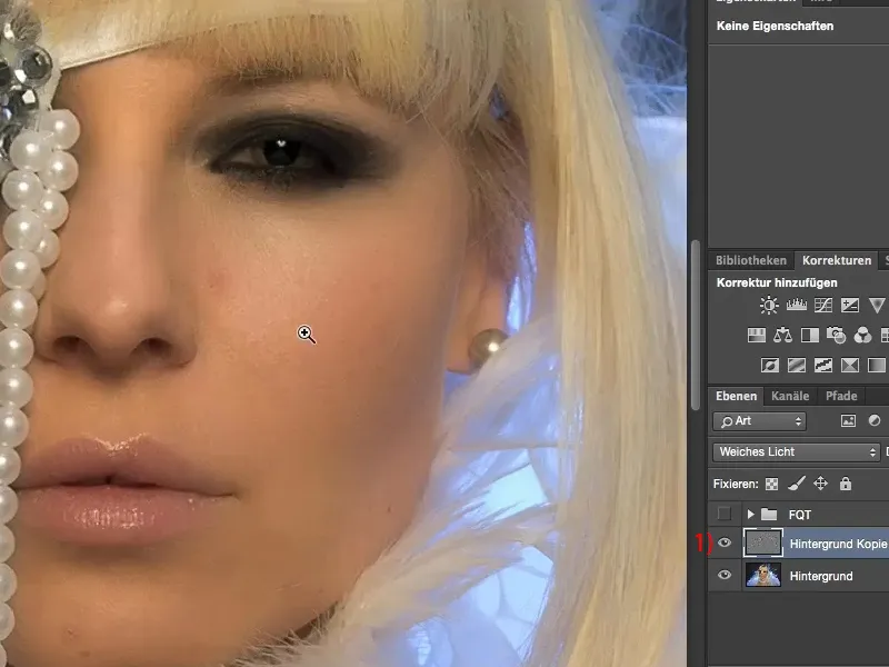
What can frequency separation do?
Frequency separation can do much, much more. I have created my frequency separation here in the PSD file.
And when I click on it (1), the first thing you see is that the girl has blue lips (2), and you think to yourself: "Heyer, we're on the subject of skin editing here!" Yes, frequency separation can do much more than just skin work.
Look up there at the hairline (3): These dark areas, which I would normally have to remove using adjustment layers, I have eliminated with Frequency Separation in just a few clicks. Also here at the bottom (4), the shadow I have in my décolleté, which is really very unattractive: frequency separation - removed.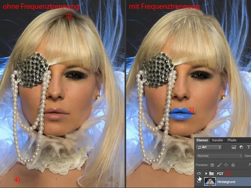
Let's zoom straight into this area, 200 percent view. Take a look at the before and after: You can see that the structure in this shadow is completely preserved. But the brightness is really one-to-one with the neighboring, healthy image areas ... And that's the power of frequency separation, if you will.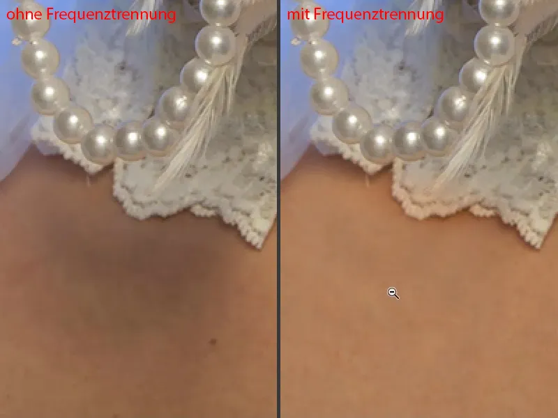
Or the lips: You can color them with frequency separation. The skin structure is one-to-one. I have only removed interference. That's frequency separation.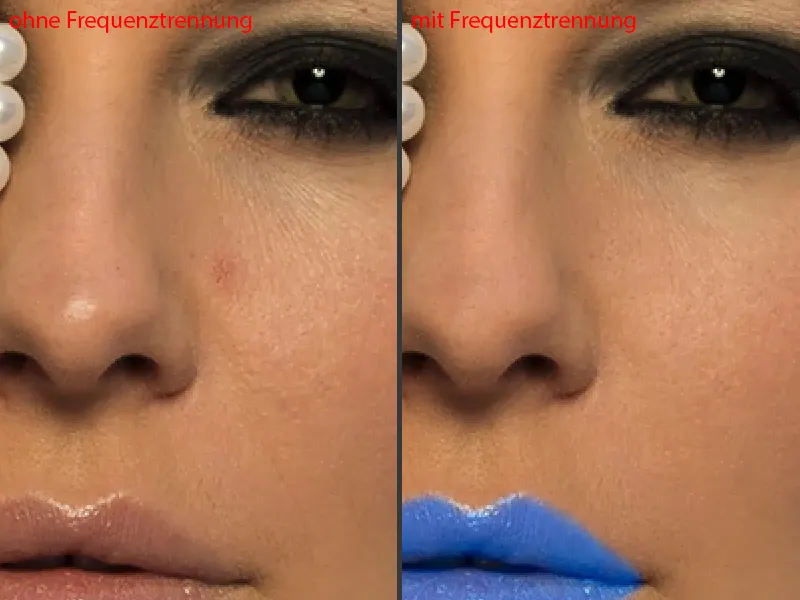
The differences in brightness ... Take a look at this area: Chin and corners of the mouth, that's always the most time-consuming part for me to retouch, because I've removed a lot of dark and light areas - frequency separation - all the spots. You can adjust the brightness using the frequency separation.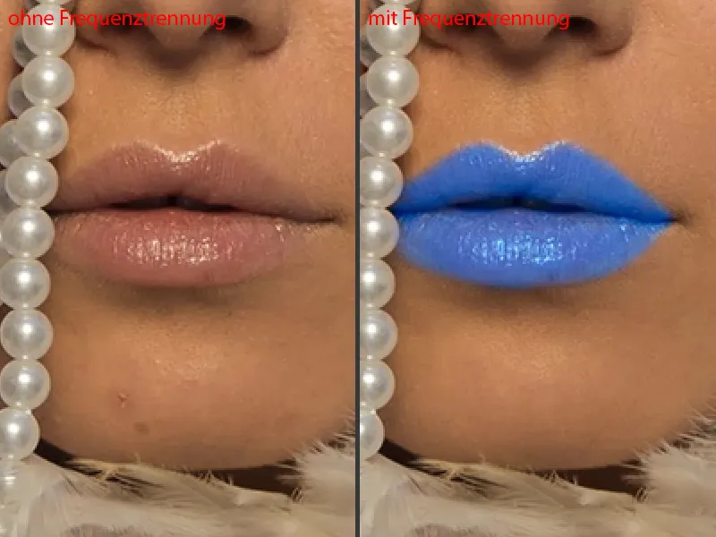
And how does that work? - I'm going to show you two different approaches. I'm sure there are probably many, many more approaches you can take with frequency separation. Photoshop doesn't always think one way. If I have a problem, I usually have five to ten approaches to solving it in Photoshop and I have to look: What is the fastest or best technique for my specific image or what suits me best?
Frequency separation (method 1): Light & color with Gaussian blur
I'll set the foreground and background color back to black and white (1) for a moment and then Blender the whole thing out here (2). And then it starts: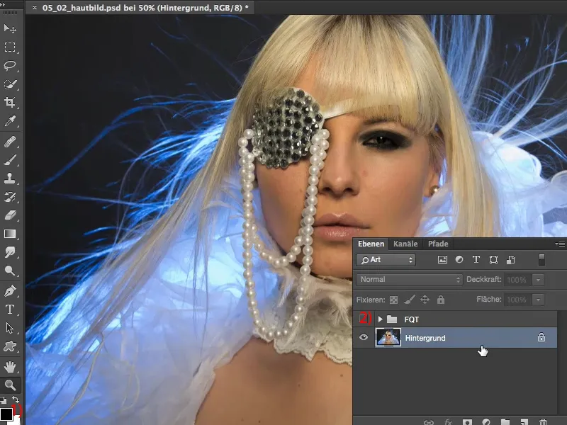
First of all, you need to copy the background layer twice (1). I'll call this one "Light & Color". And I'll call this upper layer "Structure" (2). Frequency separation does nothing other than separate light and color from structure on two layers. And this has the effect, as you will see in a moment, that you can correct interference on one level and light and color on the other. And that saves an enormous amount of time.
If I had wanted to remove this disturbance, this shadow down here (3), earlier, I would probably have made an empty layer, stamped around here in Brightness mode and in Color mode, maybe I would even have made it easy for myself and cut out this part of the image (4), moved it over here (to 3), enlarged it a bit and adjusted it using soft masks. In any case, I have a lot of work to do to lighten this shadow, because if I do it via Dodge & Burn, there's already a lot of gray in here (3), then maybe the whole thing will be blotchy, maybe it will be a little lighter gray, maybe I'll get some redness in there - there's always a lot of orange, red and yellow in skin. These are all things - I always get problems. No matter how I do it, I always have much, much more work than with frequency separation. And now I'll show you how easy it is to do this. First hide the structure layer, then activate "Light & Color" (5) ...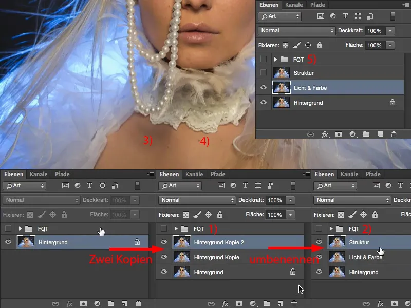
... and now apply the Gaussian blur here (Filter>Blur filter>Gaussianblur...). The value you have to set here depends on the image. There are two methods. In the first method, which I will show you, you set the Gaussian bl ur so that the skin structure just disappears. Under no circumstances do you drag it to this value (1), which you need for the second method, but rather move in the range between four and eight pixels, something like this. I'll go for six pixels (2). You can actually see the skin structure quite well in the preview above. I could maybe even go down to five (3). It looks good like this. That's the first step.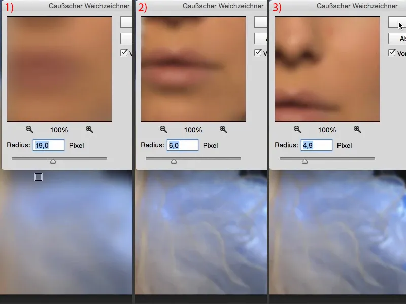
Light and color are now on this layer, I no longer have any skin structures on this layer (1). I can also zoom in to 300% here (2). It's as smooth as a baby's bottom, as they say.
And at this level (3) we now need the structure.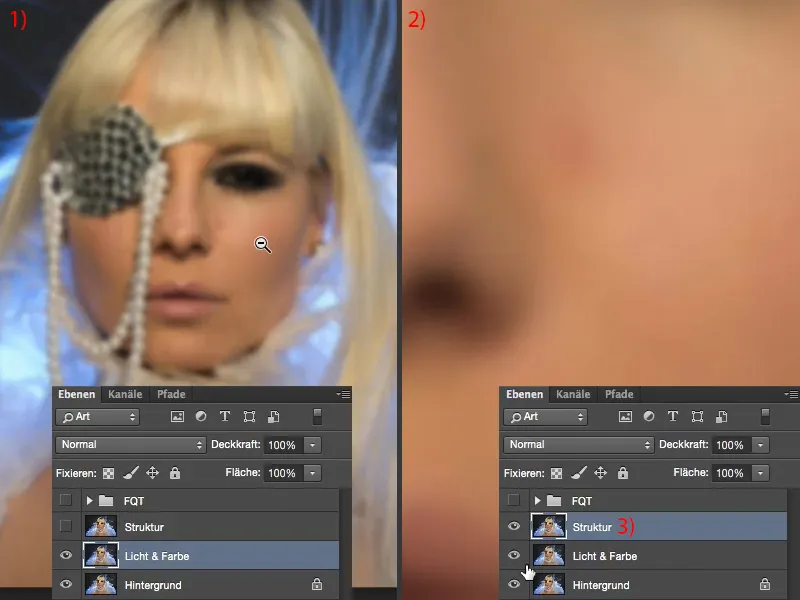
Frequency separation (method 1): Structure through image calculations
To do this, go to Image>Image calculations. In this dialog, you now have the option of selecting a specific layer from a source image, which in this case is our open image (1). And the layer we need here is this "Light & Color" layer (2). So you need to activate this blurred layer here. Leave the RGB channel active (3). And now you can select a blend mode : If you choose Hard Light here (4 and associated image in the background) or Multiply Negative (5) and so on... This will all somehow maybe not look bad, but that's not what you need.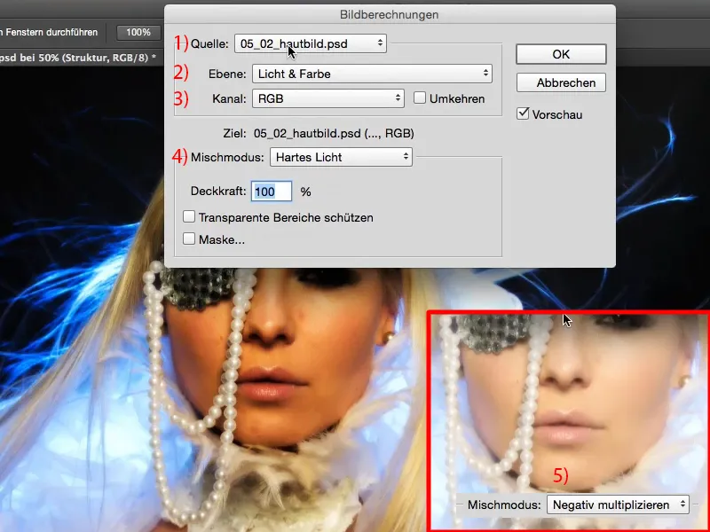
What you need is Subtract (1), with values of Scale 2 and Offset 128 (2). Why do you need to make these settings here? The Subtract layer mode now subtracts the structure (3) from this blurred layer (4), so to speak. So it is looking for the difference. And before the whole thing ran here, this was the normal layer. Now you have the blurred layer and subtract this normal layer from it - all that differs between these two layers is actually the structure, because here you only have light and color on it (4) and here you have the same light and the same color on it (5), but the difference is the structure (3). And that's why it stays, that's the result.
The values Scale 2 and Offset 128 (2): 128 should ring a bell if you have worked a little with layer modes. This sets the brightness or color information on this image to the RGB value 128. And RGB 128 is this Photoshop 50 percent gray, which can be faded out later in the calculation mode. I confirm the whole thing with OK (6) ...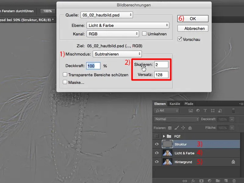
... and change the layer mode to Linear light (1). Many people often say: "Wow, now it looks really cool." They haven't understood the whole thing, because it can't look any different, it has to look exactly the same as before. Because only then have I done the frequency separation correctly.
I'll go to 200% and Blender the after (2) and before (3). As you can see, nothing has changed at all. If I Blender this layer (4), you can see immediately: light and color, all blurred. When I Blender this layer (5), you see: The structures are suddenly doubled in the image. Of course, because I already have the original structure here (6) and I've superimposed it again here (7) in Linear Light mode. So the structure is increased and it is increased in such a way that the original image is present here again, thus compensating for the blurring. And then you are already at the end with the frequency separation. That's it already.
You need two layer copies, one blur and one image calculation. Of course, you can also write the whole thing as an action - then press the start button once and you have your frequency separation.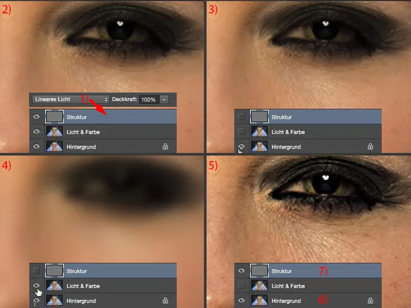
Frequency separation (method 1): Edit the skin with the Gaussian blur
Now you only have to work on it for a few minutes, depending on the skin. What you can do now is: You can now go to the "Light & Color" layer (1), for example, and use the lasso tool (2). You only have to adjust the soft edge (3) a little according to your resolution, according to the image size, how close you are now working here. It should be soft in any case.
If you look at this part of the image here, you now have a reddening (4), you have a large disturbance (5). You have many small wrinkles (6), you have large pores (7), small pores (8). You have a light area (6), you have a dark area here (9), here again a darker area, here again a darker area (arrows). If you want to make it uniform or adjust these differences in brightness, that would otherwise take five to ten minutes for this area - even the whole picture, when I do that, I sometimes sit at it for an hour or two until it all fits - frequency separation, on the other hand, is a matter of minutes.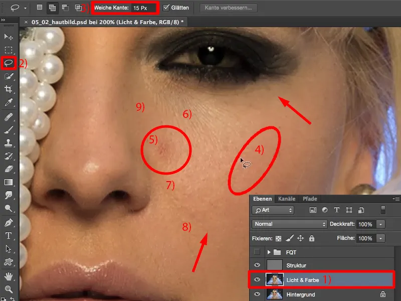
You simply take the lasso and select these areas (as marked in the picture). Because the edge is soft, you get a seamless transition to the outside. So I now have red here (1), I have dark parts (2), I have light parts (3). And because I'm doing this on this "Light & Color" layer (4), where there's no texture, I can now blur this area. So I go to the Gaussian blur filter.
This is still at a value of 4.9. If I go down here, almost nothing happens (5). If I go extremely high, the whole thing turns gray (6). Why does it turn gray? It turns grey because it tries to mix more and more, and the more colors I mix together ... you may remember this from your youth: you started painting with green, then you added red, then you added blue - and at some point you had a grey or brown mash. And the same thing happens here.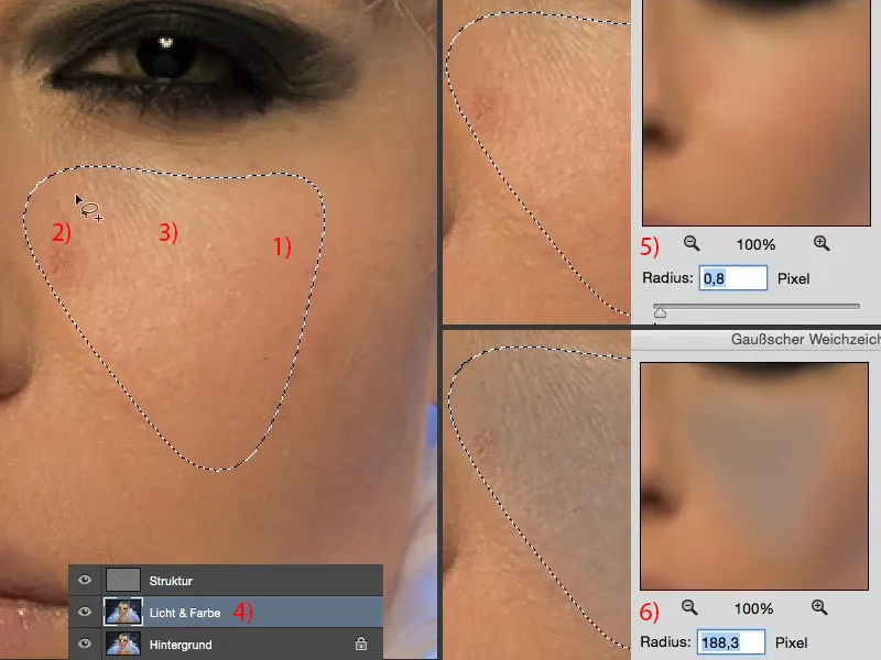
So now you just have to find the value. It's usually between ten and twenty pixels, where the whole thing starts to turn gray. And for me, I think it starts to turn gray at 31 pixels (1). So I go back a bit. 10 pixels are too few (2). You can always have a good look at this in the preview above. You can also see how these areas are now all blurred into one another. I might go for 17, which I think is about a good value (3). And I'll confirm the whole thing with OK (4).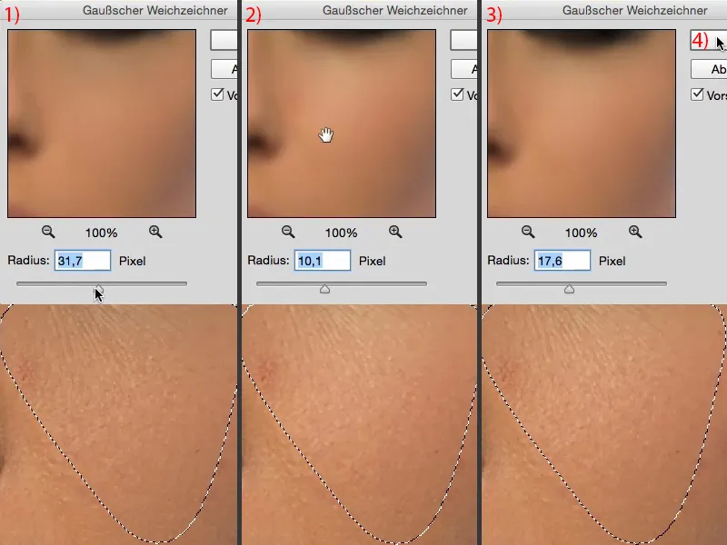
I cancel the selection with Cmd + D (Ctrl + D). And then let's take a look at the before and after. I think you can see quite clearly how these differences in brightness are now adjusted. Also, the disturbance is no longer so striking (1). The color has been drawn out and the redness has almost completely disappeared (2).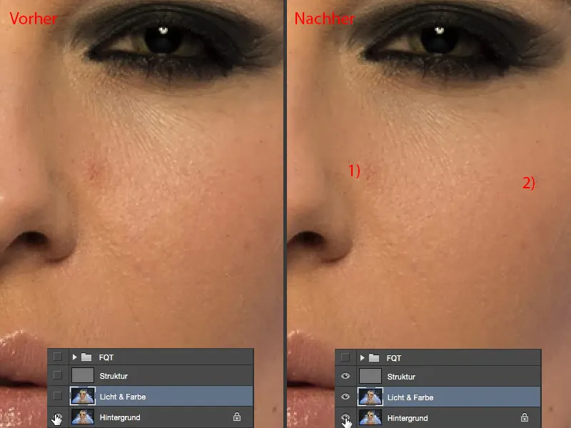
And now you can mark your way through the whole picture. So you look: Where do I have deficits in brightness, in skin redness? Then make a soft selection with the lasso and apply the last filter (Gaussian blur) again and again.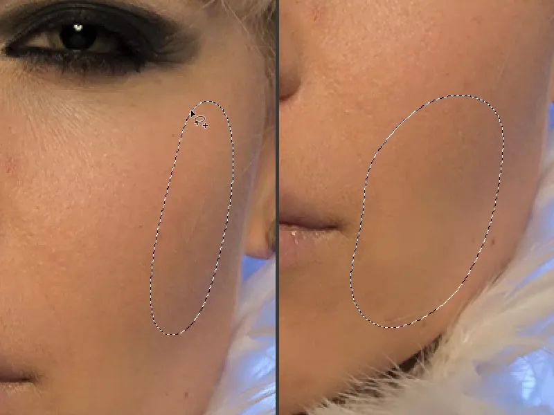
And in this area in particular (top left in the picture), what happens here is really magic, because all that remains are simply these skin blemishes, which I later removed with just a few clicks. Depending on the image, this may take a little time, you can also apply the filter two or three times in succession - as long as you don't produce any gray spots, you're doing everything right. Highlight, then Gaussian blur, maybe Gaussian blur again ... I do the same on the nose. Gaussian blur, Gaussian blur ... I'll have another look to see if I can still get that shiny spot (bottom right in the picture). There's already structure in it, so I'll have to do that on the structure layer.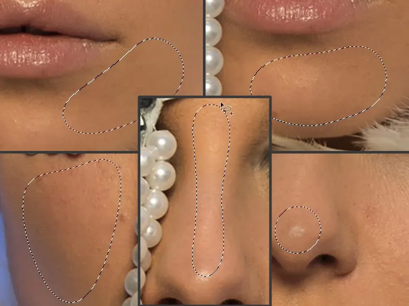
You can also apply the whole thing to hair: If you want to comb it a bit more, then adjust the differences in brightness, because the reason it looks so frayed here is that the light is refracted here (1), and you have dark and light strands here. If you want to adjust the brightness, apply the Gaussian blur. And the brightness in the hair will be adjusted (2).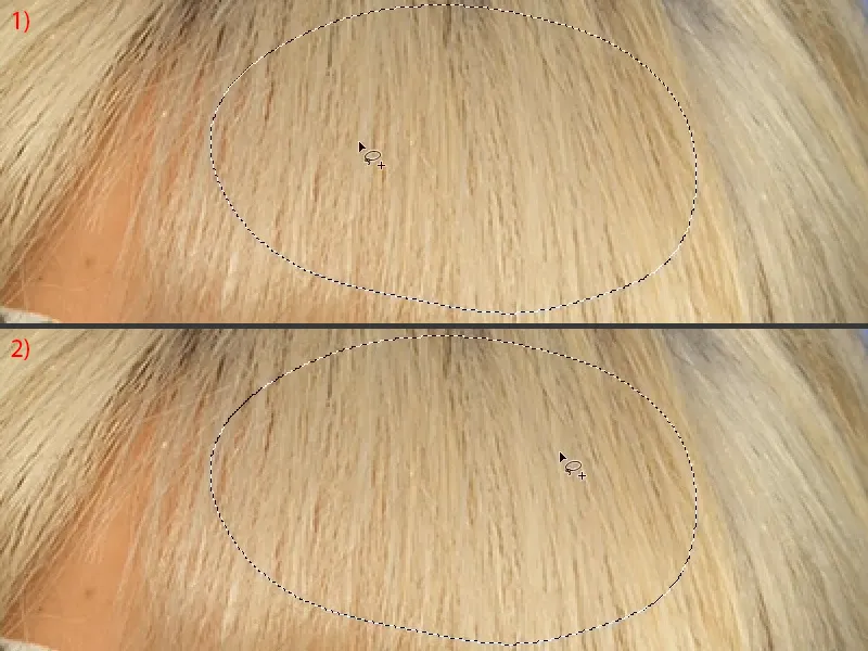
You can do the same here at the roots (1). Here you also have light and dark - Gaussian blur - the brightness has already been adjusted a little (2).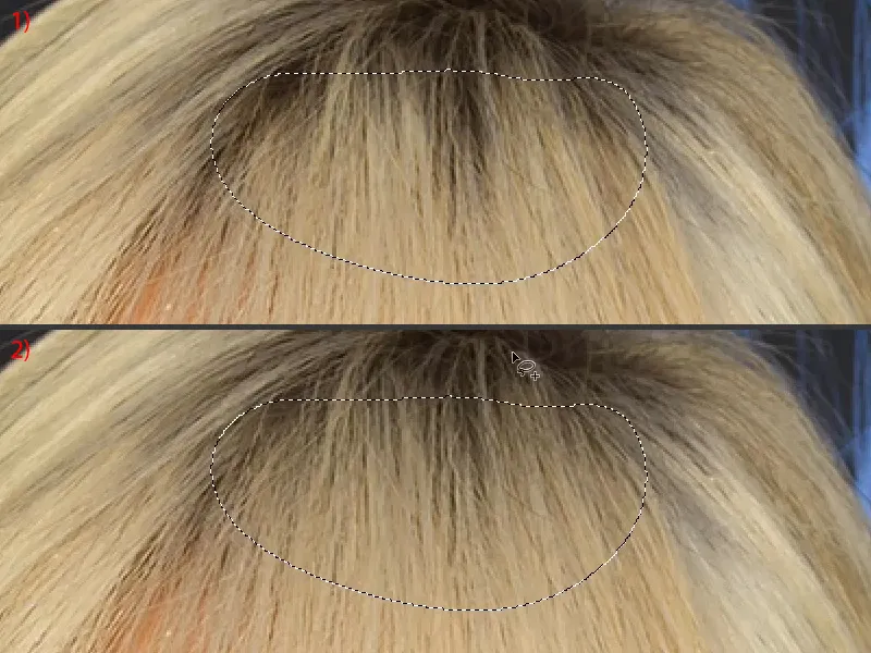
I'll show you again below (select the areas and apply the Gaussian blur). And that's really the beauty of this technique: no matter what I do here, I actually do everything right. There's nothing I can do wrong.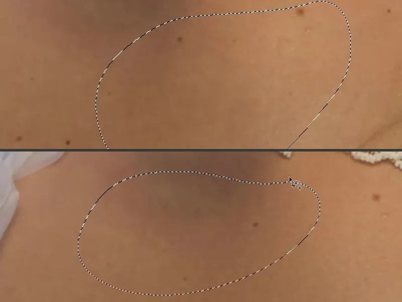
That was perhaps only a minute and a half or two minutes - look what it's done to this picture. It looks a bit flatter, of course, but it's also the ideal preparation for the next step, for Dodge & Burn, for example.
Because now I can completely repaint the highlights and depths, shadows and so on onto the skin. This is how you work on this "light & color" level.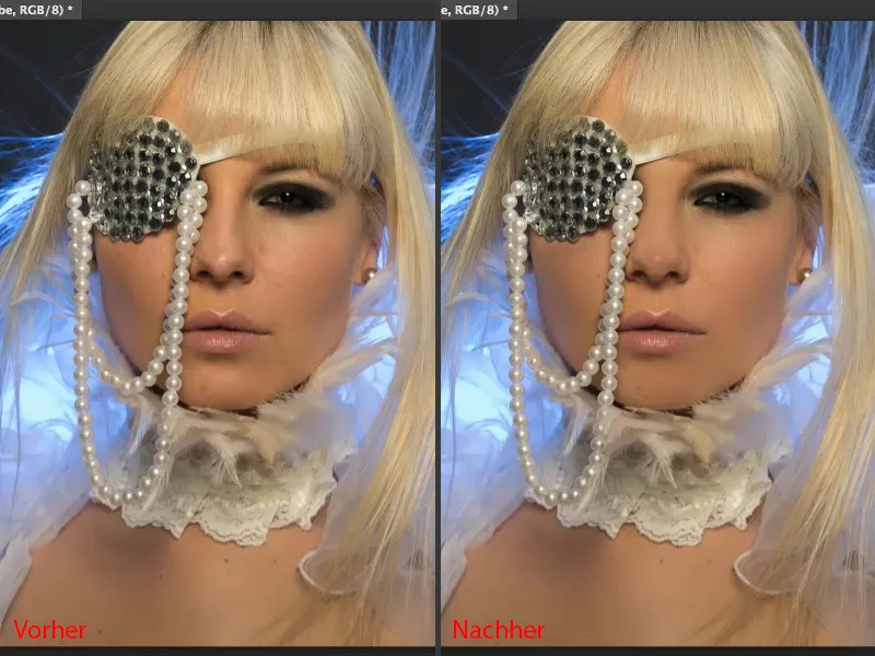
Frequency separation (method 1): Edit structure
You can now use all the retouching tools you want on the "Structure" layer (1). Everyone has their own preferences. I usually stick to the repair brush (2). However, it is very important that you set the tool, no matter which one, to Current Layer (3).
If you are working on an empty layer, then of course you have activated All layers or perhaps Current and below - but if you do this here, then you are also dragging in light and color from "Light & Color" (4). And that looks terrible on this layer or with frequency separation because this layer is in Linear Light mode (5). So I take the step back again and go to Current layer (3).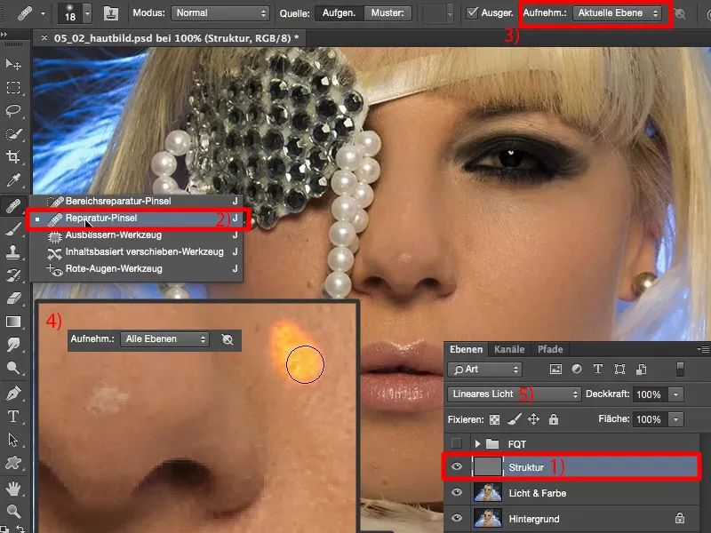
Now you can easily remove your distortions on the "Structure" layer (arrows in the image). You don't have to worry about the brightness and color shift with this method, because everything on this layer is structure. And everything that is structure is eliminated relatively quickly. Now it comes down to this: Do you want to work high-end or low-end here? Do you just want to remove coarse impurities or do you want to create a perfect complexion?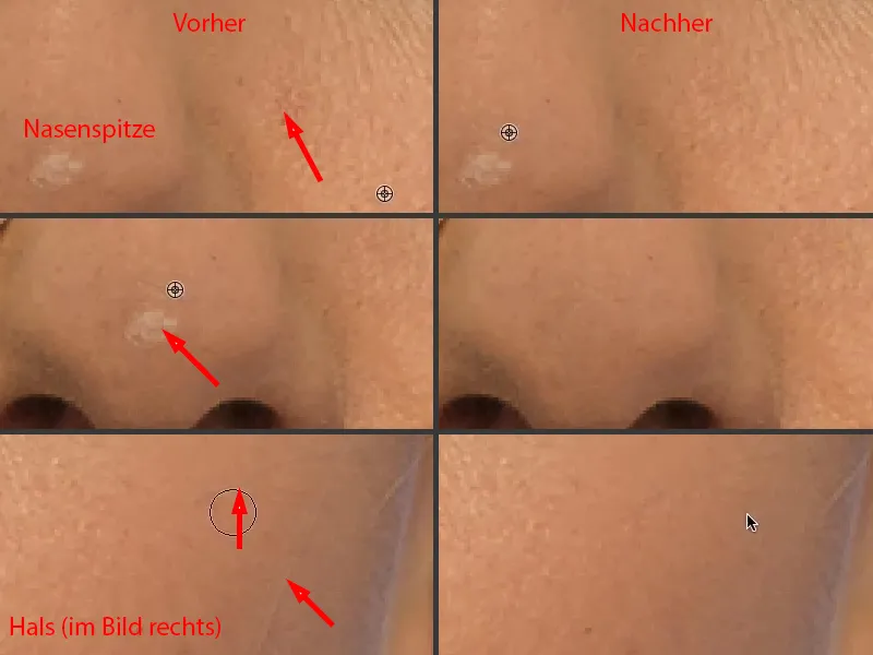
For the perfect complexion, I recommend zooming in really close and working pore by pore by pore ... then your complexion will become finer and finer (areas to be worked on are marked with arrows in the picture). But the nice thing is, it will never look muddy, it will always look good, it will just get cleaner and cleaner.
This is now a question of the time you want to invest here, or also a question of the money that, if you are a professional retoucher, your client wants to pay for the skin image. These are all considerations that you should make beforehand.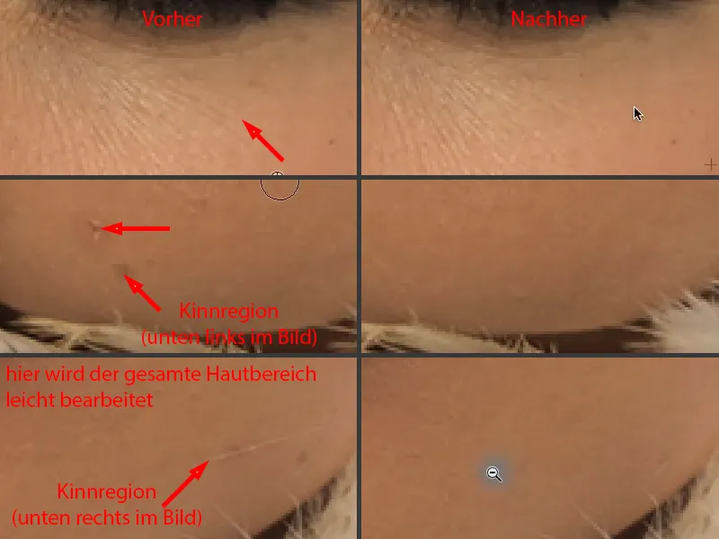
I don't really have much more to do here to make the picture look good. I think the model here actually has quite good skin. Everyone has a few imperfections. "Disorders" - it almost sounds like it's a psychological problem, but it's definitely not.
I just really enjoy it, because in five minutes I've created a complexion that everyone says: "Wow, that's really cool. And how did you do that, because it's not blurred at all?" - No, it's not blurred, only highlights and color are blurred. And that's how I get a real, unadulterated skin image that's just cleaned up of the noise.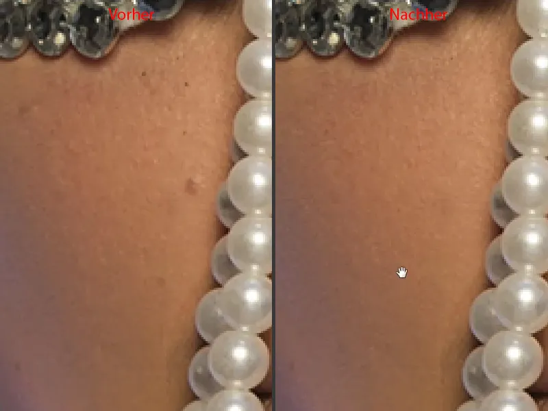
Frequency separation (method 1): Adjusting light and color with a brush
I can't really illuminate it that smoothly, even though this was a large octobox from the front. Now I really have a great base for Dodge & Burn - I can already see myself brushing the gloss on the nose evenly (1) and painting a triangle here (2) and the lip gloss (3) and, and, and ...
Perhaps the only thing I need to do now is to close this gap (4). I can't do that with frequency separation, unfortunately, but I can do many other things with frequency separation, ...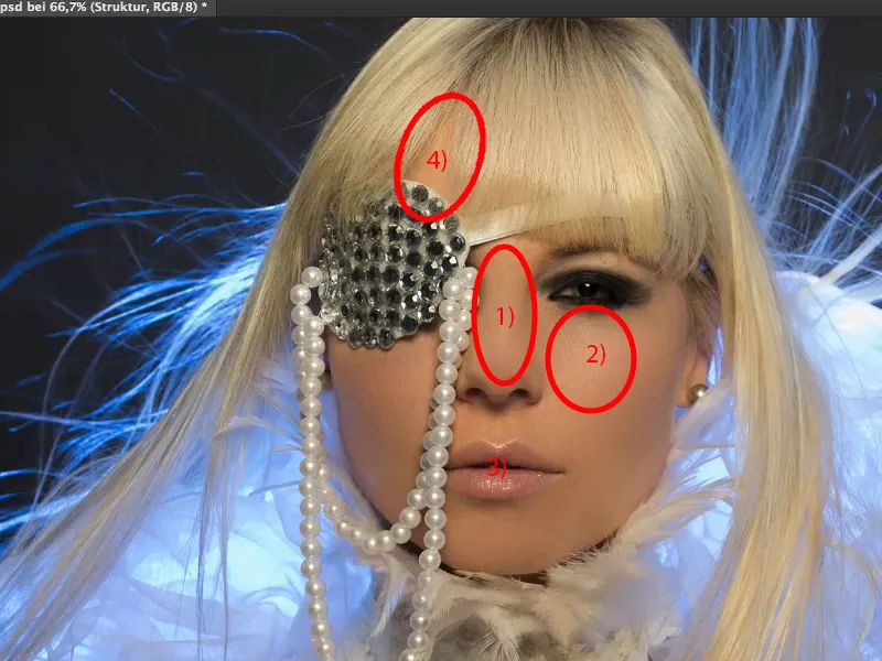
... because I can now insert empty layers in between, for example. I'll just rename them to "paint" (1). And you can now, for example, take this light skin color (2), take the brush (3), go back a little with the opacity, something between 10 and 20 % (4) - the more experienced you are, the more you can increase the opacity here.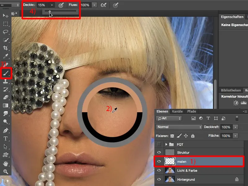
Make the brush very soft (1) and you can now lighten here (2). You can lighten here because you won't paint over the structure, the structure is on the layer above.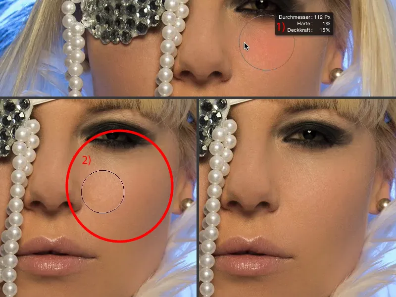
Let me show you how this works at 60, 70 % opacity (1). I can also paint over the eye. The structure of the eye will always remain clear because the structure is on top here (2), only the brightness is shifted. Let's go back a few steps here.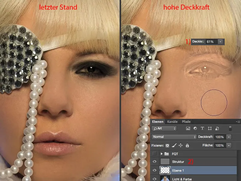
And now I'm also using this to paint over this shadow (1). I pick up the right color next to it (2), of course I go down with the opacity again, 20, 23 % (3), and now I just brush over it until the brightness and color are adjusted (4).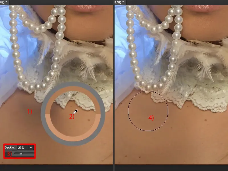
Maybe pick up a little lighter color (1) and apply. And that's it, folks. Frequency separation is that simple. Look at what it's done (before and after comparison).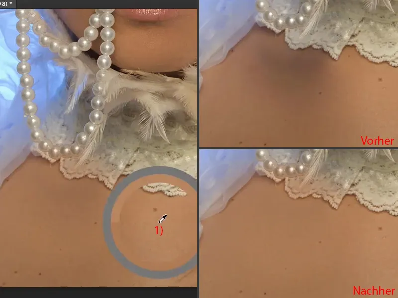
If you've painted over it here, for example at the tip (1), you can now fix it with a mask or you can really destructively erase it in this case. This is one of the few cases where I actually use the eraser (2 and opacity at 3 to 100%). I'm now just going to get it back (4) so that I have the original color again. A little here at the edge too (5). That was it. It's that easy to correct, because all that's on here are just these few splashes of color (6). That's how frequency separation works, that's how flexible the whole thing is.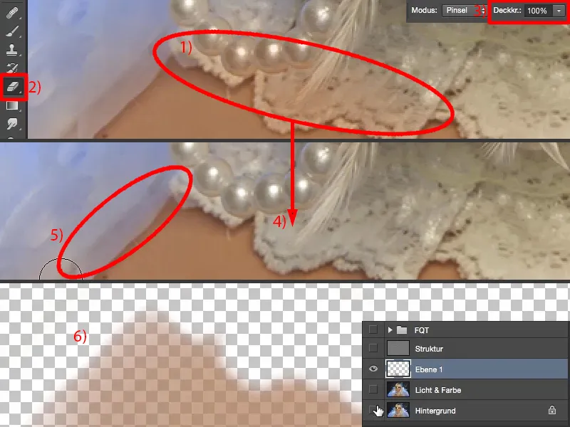
I can now create several layers here. This is what I call "skin color" (1). Up here at the hairline, I'll simply create a new layer and rename it "Hairline" (2).
Then I'll take my brush here again , of course I 'll take this brightness in the front (3) and just go over it with 20, 30 % opacity (4). And you can see that the texture is retained. Now I've removed this hairline (5). I've now gone over the hair exactly three times at 23% opacity.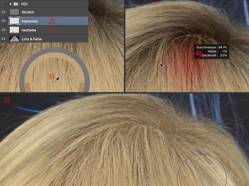
If you look at the result and the four or five seconds it took me to correct these hairs, then I think you'll begin to understand why I love this technique so much: because it's so flexible and so incredibly quick. No matter what other method I would have used to lighten these hairs before - I'm nowhere near as fast and, above all, I don't get such an even and truly perfect result.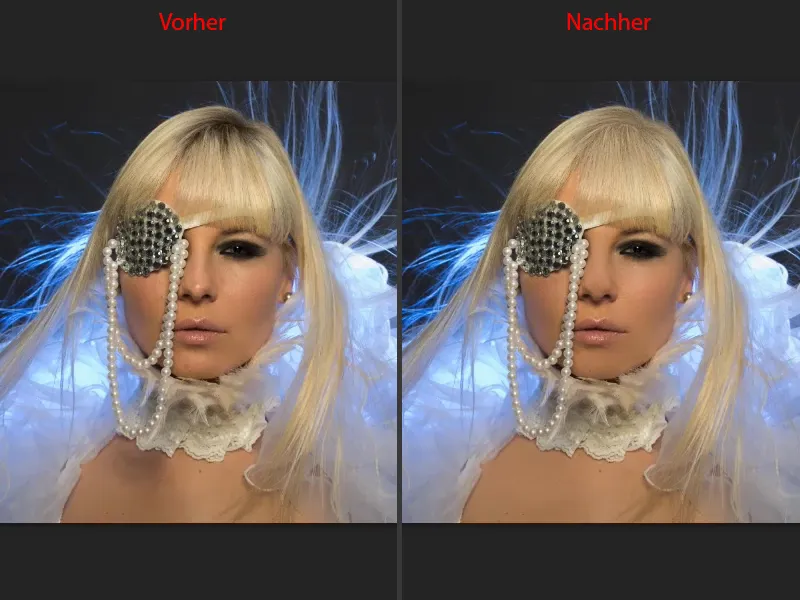
Of course, you can also do the whole thing on a micro level: If you want to add a little sparkle here in the eye, then just take white, make an empty layer and say "iris structure" or something like that - you can use frequency separation to paint on even the smallest structures, you can emphasize eyelashes, you can reduce wrinkles ... You can really do anything with frequency separation.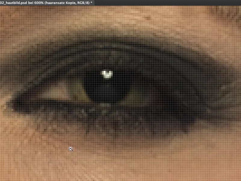
Frequency separation (method 1): Change lip color
I'll briefly show you how you can also change your lip color. You also create a new empty layer, I'll call it "lip color" (1), and set it to Color mode (2). You simply choose a blue (3). So far, we've only ever worked with skin tones. It doesn't have to be blue, but I think it looks really cool with the blue light behind it. Take the brush (4), then set the opacity to 100% (5) ...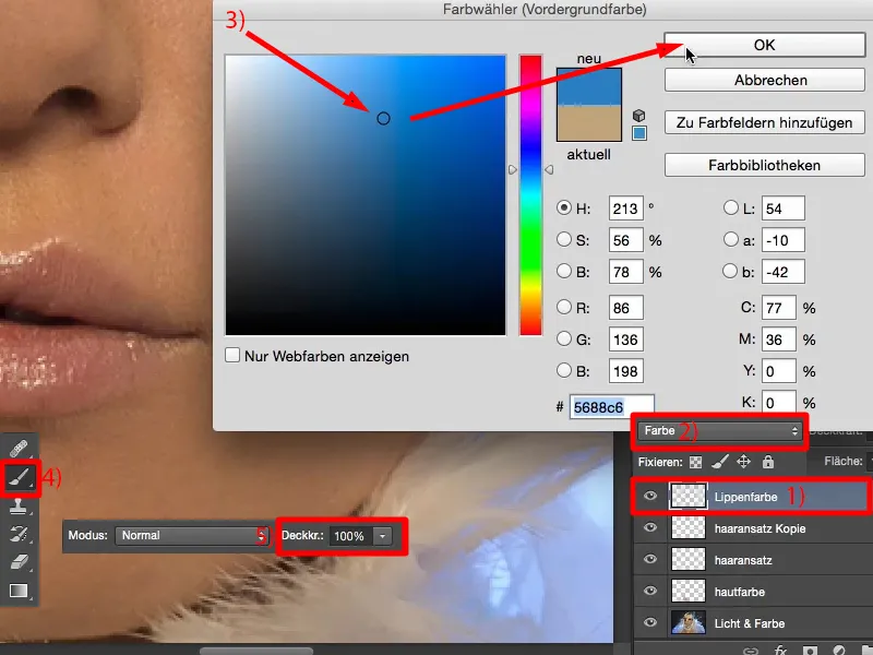
... and simply paint over the lips. I'm doing this really quickly and not exactly, so you can see the effect ... And then the girl here has blue lips. With another method, if I want to recolor something in the picture here, I create a Hue/Saturation adjustment layer , add a correction and, and, and ... You then have to paint it over a mask ... Here, on the other hand, I simply make an empty layer, Color mode and paint over the lips.
Of course, I can do the same with eye make-up. If I knew what I was doing, I could give you such a great make-up job, but unfortunately I don't, I'm not a make-up artist. I can do it technically, but I have no idea what looks really good here. And my wife always falls off the wagon when I say: "Look, that eye make-up is cool" - well, there are certain rules you have to follow. Just as an aside. So you can not only change skin colors here, you can change all colors here. Blank layer, color mode , frequency separation - it's simply a hit.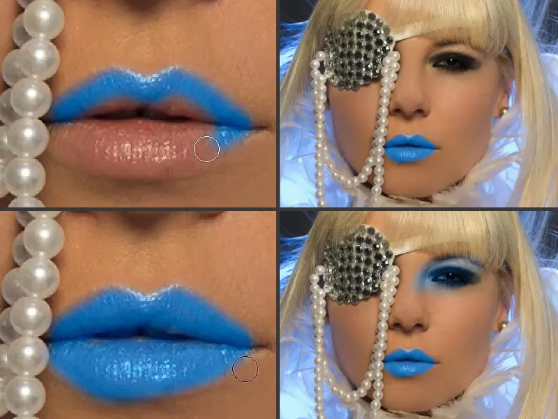
Frequency separation (method 2)
I'll take out the layers (1) and show you the second method. To do this, make a copy twice again (2), similar to the first method, but this time go a little higher with the Gaussian blur, to 21 pixels (3), so that the whole image is really completely blurred and not just the structure, as in the first method. So you make the whole picture really muddy.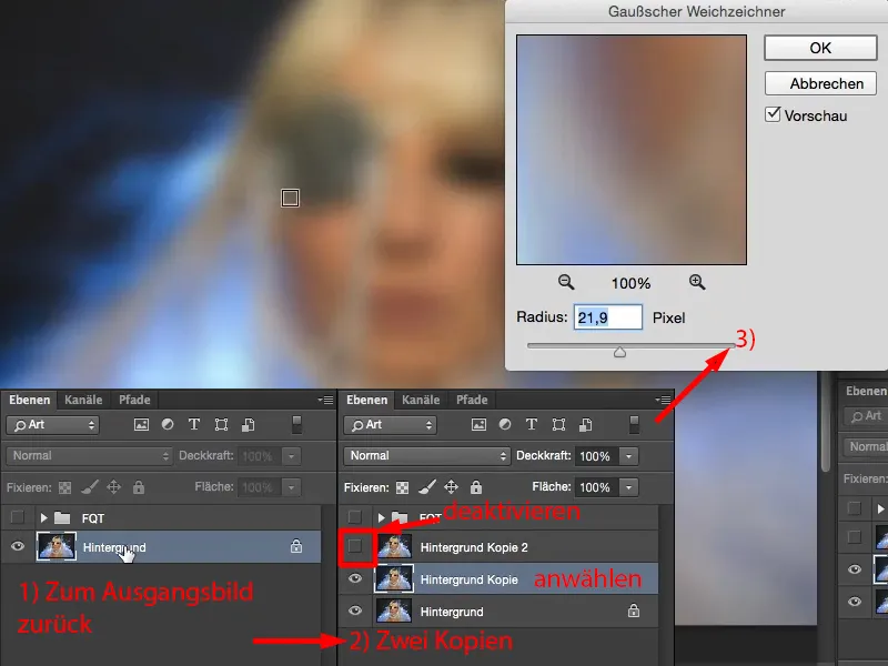
Then activate the top layer here (1), then go straight to Image>Corrections>Brightness/Contrast (2). Check the box Use previous value (3). Adobe changed this at some point and then they thought that if they reintroduced it here, some people might find it chic. Personally, I find it very Schick, because I can now set the contrast here to minus 50 (4), which gives me a flattened image (5).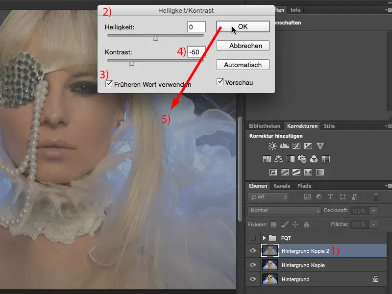
Now I just have to see what value I had for the Gaussian blur. That was 21.9, which is exactly the value you need for the high-pass filter, because - you remember - as with the first method, the two layers must be identical. And now you have the grayscale image again, ...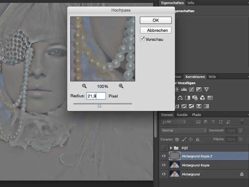
... you can set the mode to Linear light (1). You have done this correctly if you see no difference (between the original, in the image on the right, and together with the two layers, in the image on the left). Bingo. Fits.
Now, as with the first method, you can place your layers in between, you have the structure (2). And you've just blurred the background layer (3), which is your layer for light and color. What you no longer need to do with this method is to blur the brightness. You've already done that on this background layer (3). And if you now remove the structures (2), you will get a similarly good skin image.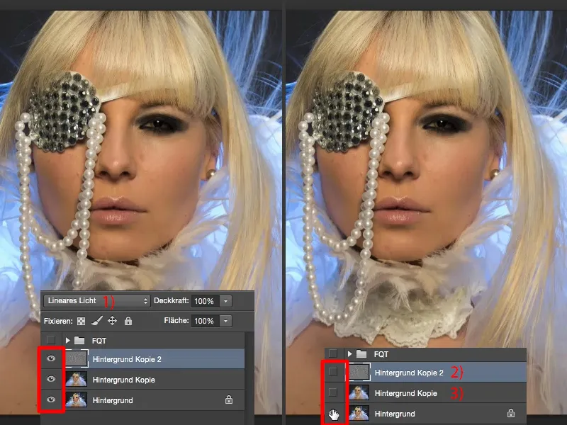
Conclusion
Have fun with the frequency separation. Try out crazy things: Make empty layers, set them to luminance, to color, to hue - you'll see, frequency separation is not only good to use in portraits or in people shots, you can also use it in landscape shots, you can use it in architectural shots. If you have a concrete structure and you want to adjust the brightness in the concrete structure, then separate the concrete structure from the brightness and simply soften the brightness and the color. You can do all this easily with frequency separation. And I'm sure that in future your skin retouching will be at least twice as fast as if you work with a different method. Have fun with it!