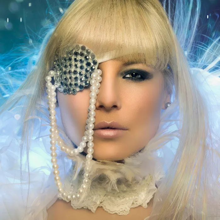
For me, a high-end skin retouch definitely also includes the lips, hair and eyes, because only the overall picture really creates this high-quality image. When I look at these lips here, I think to myself: it's almost impossible for a make-up artist to apply make-up with such perfect precision and that the line here looks like it's been drawn with a ruler (see after). Let me show you the before picture ...
You can see that the lip is actually quite well made up, but as is always the case: you always have dark spots at the corners of your mouth, you have little hairs sticking in or out a little (1), you have shiny spots at the edges that shouldn't be there (2). Here (3) it somehow didn't work out that the light reflected on this area, perhaps the lip gloss wasn't applied so well here. Here you still have little hairs (4) and here the lip breaks out completely (5). And so that I can create this high-end image (after), I have to do something to the lip.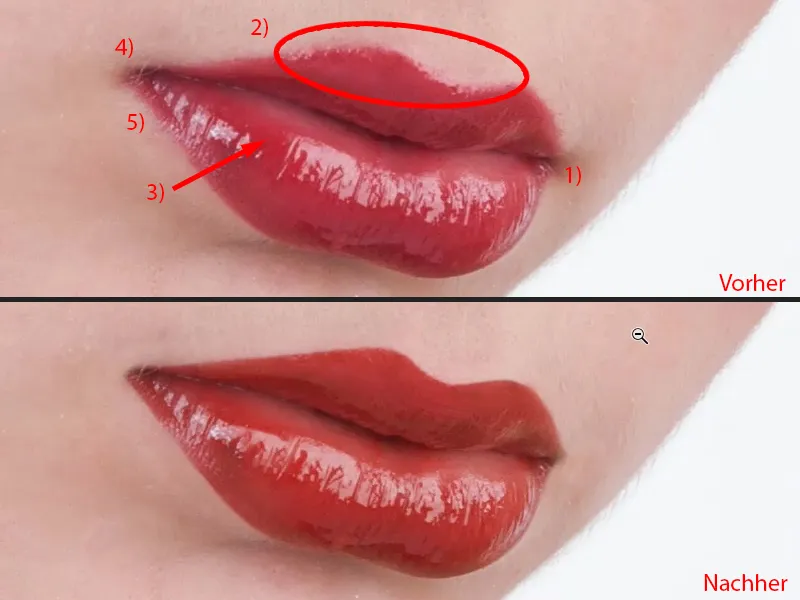
To-do level for preparation
First of all, I always create a kind of to-do layer (1), simply an empty layer. This means that I've already looked at the whole thing a bit and don't just say: "Okay, now I'll make the edge nice here", and then I realize that it would have been better to even out the brightness first or something like that. I always make a little plan first (blue markings in the picture). You don't do that later, you do it maybe two or three times, then you immediately see the deficits. I don't look at the deficits first - I first look at what's good. And this gloss (2) is definitely good, I give it a plus, this whole edge (dashed line at 3) is good. And it starts here (blue border at 6), that's where I give myself my plus signs, and it ends roughly here (blue border at 4), that's where it starts to look strange, to break out, so I have to do something about that (4). I have the corners of my mouth on the left (5) and right (6), so I need to do something about that. I definitely need to add the line here (dashed line at 7). I have a shiny spot up there (7). And it's the same with the rest around the top. Now I know I have to be careful in the corners of the mouth (5, 6), I have shadows there. I have an edge down here, I'm not going to do anything there (3). I've got a cool shiny spot here (2), I've got a gap here (8), I need to close that, and I need to add the edges around the top and here on the left (7). And then I'll get started.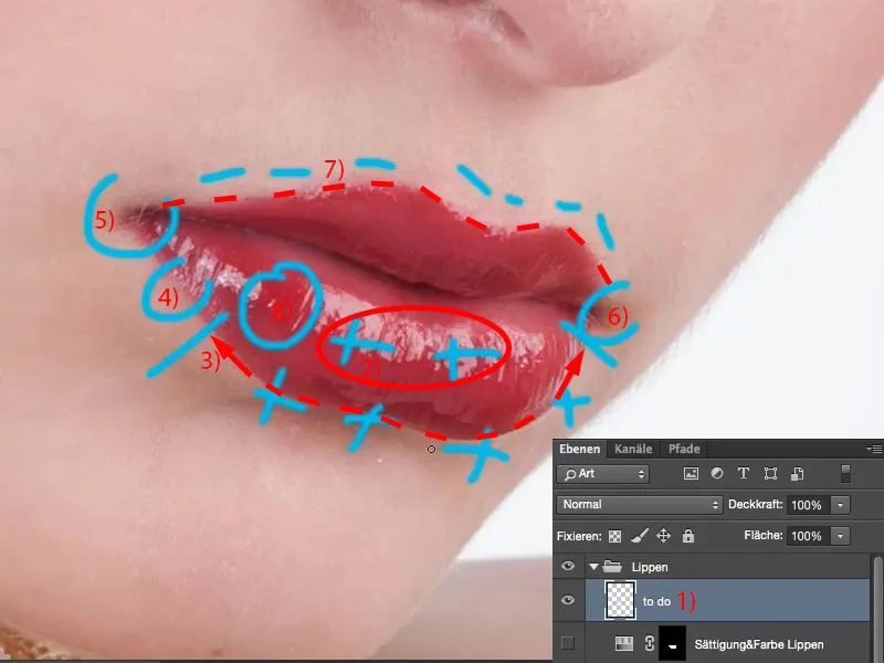
Enhancing the lips by stamping with light and dark
I can hide the to-do layer or throw it away, it doesn't matter. And then I start with an empty layer, which I call "lighten" (1). I create a layer directly above it, which I call "darken" (2). I set the layer mode of both layers to exactly what they are called, Lighten (3) and Darken (4). I hide the upper one and select the lower one (5). Then I grab the stamp tool (6). I also set this to the Darken and Lighten layer modes, because if I'm looking at something like the corners of the mouth, if I want a sharp edge, then I can of course stamp over it in Normal mode, but this means that I'm also stamping the skin structure and the brightness and color. But now I only want to create a contour. Ultimately, a contour is nothing more than the difference between light and dark, which is a difference in contrast. And if I want to adjust the contrast or create an outline, I usually stamp on two layers with lightening and darkening, because then I can lighten from one side and darken from the other. This results in a straight line remaining. As always, there are of course different methods in Photoshop, but I'll show you my method here. I can work very well with it, because later I have the lightened edges on one layer and the darkened edges on the other. I can adjust the opacity, I can adjust it with a mask, I can even destructively erase something if I've messed up here. So for me this is a very, very nice, non-destructive way.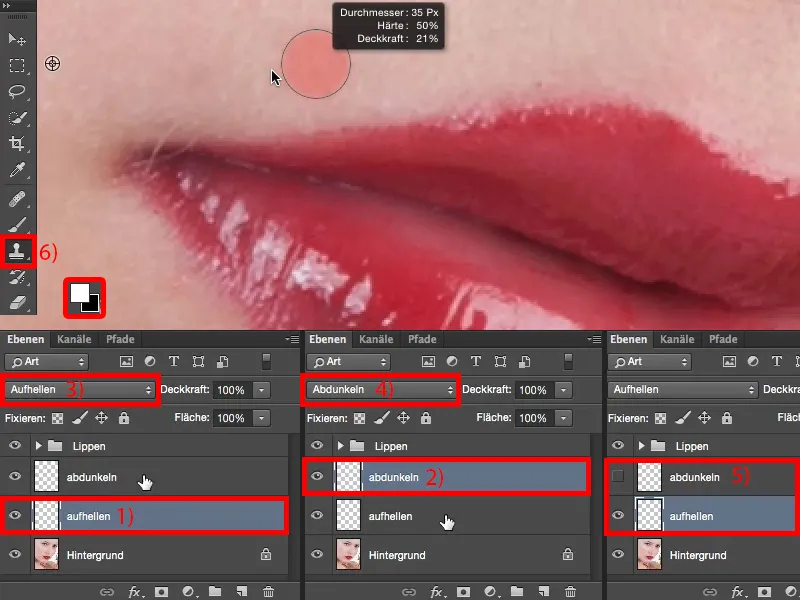
I'll set the foreground and background color back to black and white (1) for later. And then I go with the opacity, let's say 20% (2).
The less you do, the fewer mistakes you will make at the beginning, otherwise it will become blotchy very quickly, because it is still the stamp tool, and if I go over it with 50%, then of course I will immediately see a difference compared to the rest of the skin. So I recommend you do this with a little less opacity. You always have to adjust the brush hardness depending on the image. I can't just say: soft brush, low opacity , because then you'll also get a soft edge. But I also can't say that you need a 77 percent hard brush for the lips. Your lips may look completely different in your photo, they may be painted completely differently, they may be painted better, they may be painted worse - I don't know. You have to find out for yourself what opacity and hardness works. If you're unsure, then just go for a value between 30 % and 50 % in terms of hardness, that's not hard, that's not soft, but you can definitely work with that. I'll just go to 50% here (3), take this brightness (4) and draw a line along here (5) ...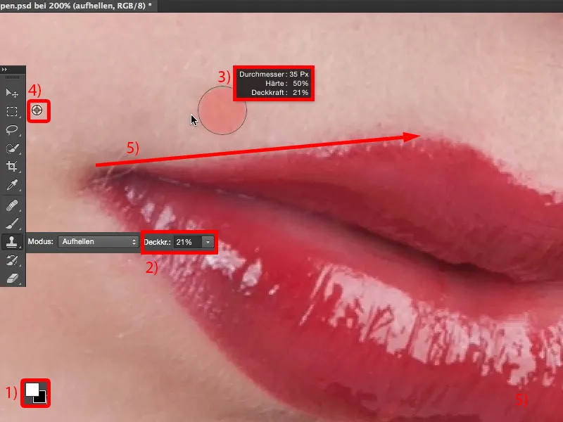
So I can adjust the brightness very nicely and realize (1): The edge is not bad, but it's still too soft (1). So even with 50% I'm still below that. I go to 66% (2), perhaps make the tip of the brush a little smaller, and of course I have to brush over it more often now (3). Then I realize: I can actually do this quite well, it doesn't get blotchy. Then I increase the opacity a little (4) so that I can work faster.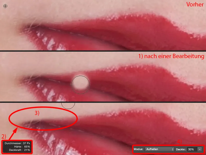
And the more often I do this now (just above the lip, see After), the straighter and cleaner this line becomes.
If you look at the before and after comparison, you can see: The structure is retained because all you are doing is lightening dark areas of the image. The fact that there is a structure underneath doesn't bother Photoshop in this case.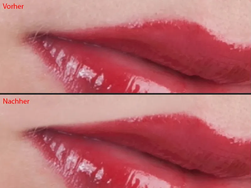
And that's how we continue now. I pick up this brightness (1), just go down and create a beautiful heart here (2). I can't use this method to correct the areas that are now naturally brighter than the ones I've captured here. We then do this on the second layer, on the darkening layer, and then work on the edge from the inside. We do this from the inside out and from the outside in - lightening from the outside in and darkening from the inside out.
I'm a bit more careful in this area (3) now, I take my hardness back down to 40, 50 % (4), because if I have such a hard, jagged line now, it looks terribly unnatural. And if I make the transition a little softer, then it fits again (5). Of course, I always have to stamp the surroundings a little too, i.e. clean them up as well (6). Now I have a soft edge here (5) and then I can work it out again with a slightly harder edge and a small brush tip (7) so that it looks good again (8). So, that's it on this side.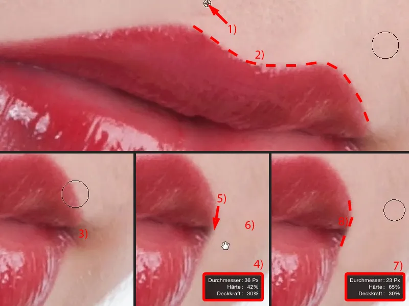
Here at the front I still have the corner of the mouth (1). Here, too, I make a soft brush tip (2), go over it once or twice (to the left of the dotted line in 2) and realize: Okay, now the whole thing is running. Then I go back to 50, 60 % with the hardness, make the brush tip a little smaller (3) and then draw this line here as if I had drawn it with a ruler (dashed line in 3). I round off the corners a little (arrow in 3), because no one has a lip that tapers out like that. And now here come these little hairs (see picture 3). And I have to make a decision: Do I take them away? I decide to take them away because touching them up (4) is a lot of extra work and no one will know later what the lips looked like, so I can do it very easily - and I've now shaped the corners of my mouth in the same way.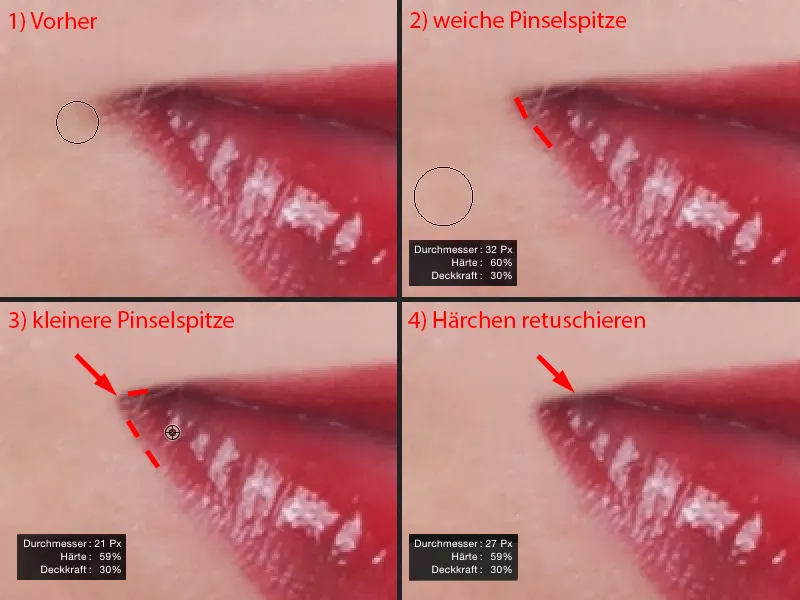
Then I go to the darken layer (1), activate it, go to my stamp tool (2) and set the stamp to darken mode (3). Then the same game again: I need to find out roughly where the hardness I need is. So I go to 50 %, grab a small brush (4) and just draw along here (below the dotted line at 5) - and realize: Yes, I can do quite well with 50 %.
Of course, I have to keep adjusting the size of the brush (6). Now I can simply stamp away these shiny spots (at 7) (below the dotted line at 8), because it's definitely darker in the middle here (9) than at the edge at these shiny spots (8).
And here at the top of the heart, I realize that the hardness is too low. So I go up again, to 60, 65 % (10), and simply go over it again here. Because the structure is not affected by this, I can shape the whole thing very, very nicely here (below the dotted line at 11). And I also stamp over these shiny areas.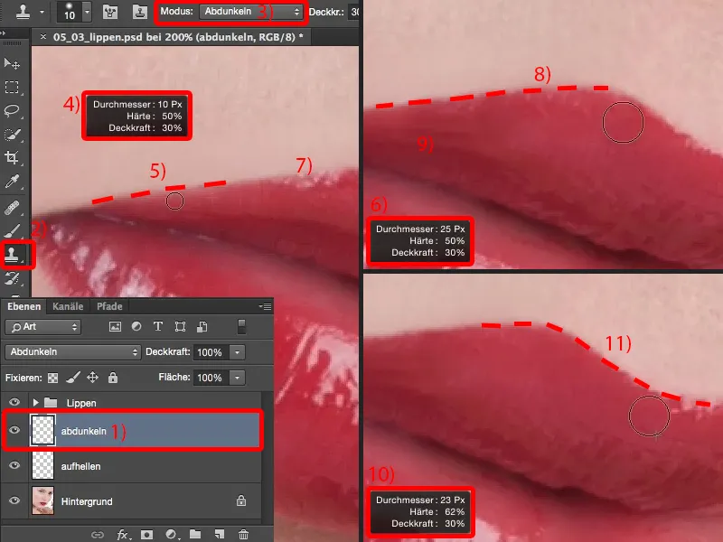
And you can already see that if I want to set the heart a little higher (1), I can now stamp out with this darkening brush here (above the dotted line at 2), and I still get an enormously beautiful structure in the lip. That's the advantage of stamping with darkening and lightening.
Here too (3), I have to reduce the size of my brush again because I don't have enough space. Of course, I don't want to touch the light areas of the picture. I draw my line there too (to the right of the dashed line in 3).
It is now too dark in this area (4). But I only have brightness to record here, so I just record the one in front (5), ...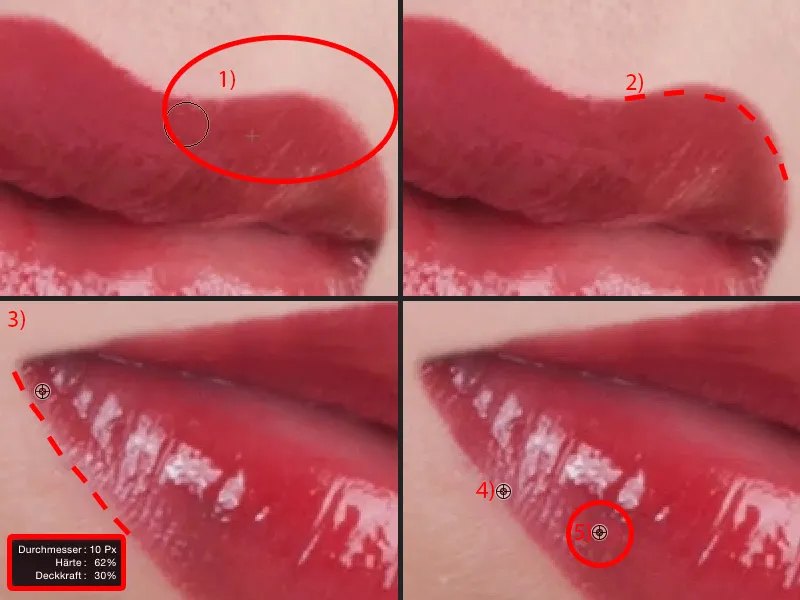
... I already have enough reserves to brush the whole thing up again (to the right of the dashed line in 1). I'll also remove this shiny area (arrow in 1) a little at the bottom - it looks quite cool like this (2).
If you can see this shiny area here (arrow in 2) - it's a bit broken off at the bottom - then just use the stamp, Lighten mode (see Settings and layer in 3), and lighten it here (4). So you can fill in these shiny spots, these gaps. And even if I stamp here (5): I can simply create highlights.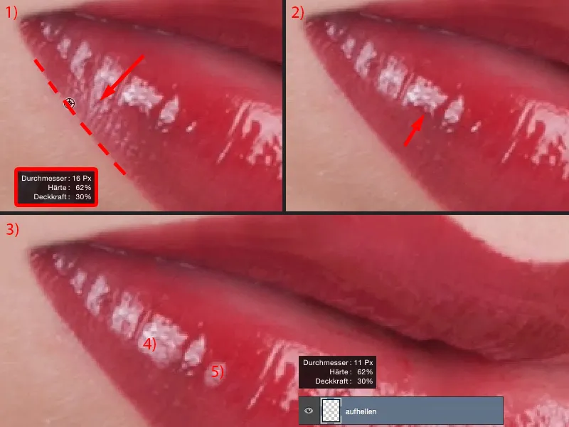
I'll go back to the 100 percent view and we'll take a look at the result. The whole thing took maybe three or four minutes, but the lip contour is definitely perfect.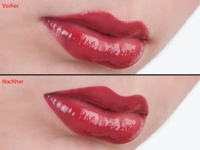
If you want to let it show through a little, you can reduce the opacity to 83% and the whole thing will look a little more natural again. Of course, I want it to be just as hard as I have made it here, so I keep it at 100%.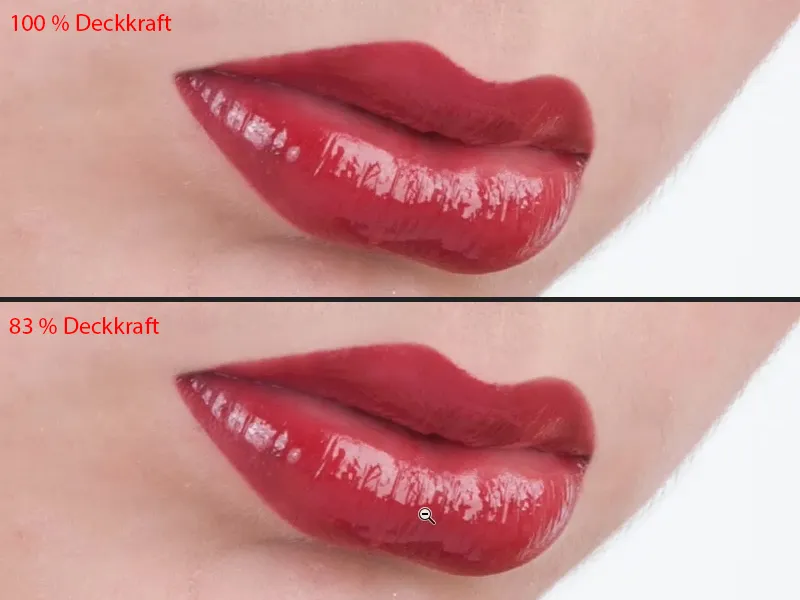
This shiny area (1) is difficult to brush or stamp. That's why I make it really easy for myself and simply cut out this shiny area (2), which looks great, and copy it onto an empty layer (3). I can move the whole thing using Free Transform or the Move tool (4).
Up here you have this distort option (5). And I can now drag the whole thing into place as I want it (6).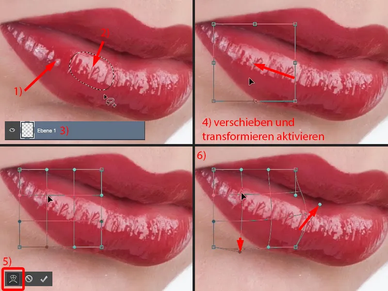
Now, of course, even the layman will immediately recognize that these two structures are identical. I simply remove this by attaching a mask here (1). I go back a little with the opacity, maybe a little more, 30, 40 %, soft edge (2), and now soften it here (3). And then I get this nice, ascending flow here too.
Now I still have the thing (4), absolutely identical. I take that out a little and I've got a structure that you definitely won't recognize - and I've closed the gap.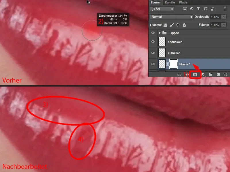
I think the whole thing now looks better and of a higher quality than the original lip.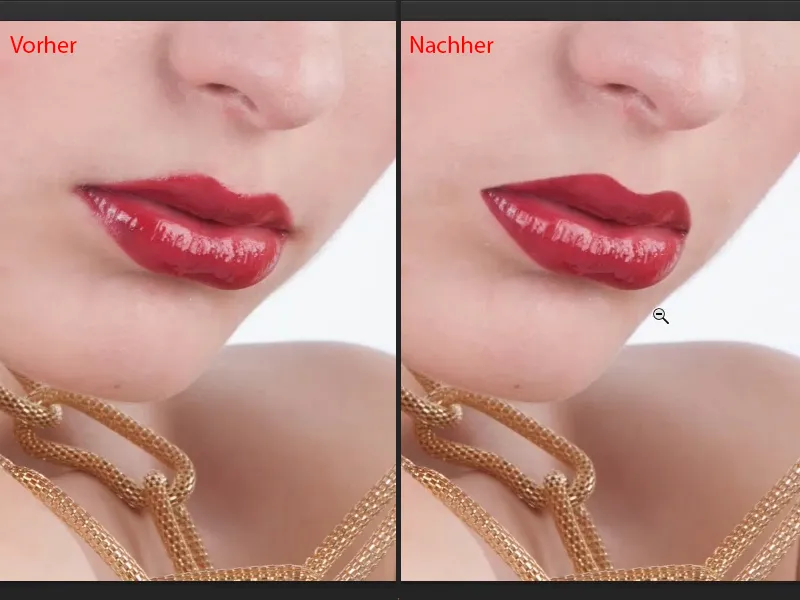
Recoloring lips
With many pictures or model requests, it's also the case that people say: "The lipstick doesn't quite match the dress, can't you change it? It's really easy to do in Photoshop." - Sure, it's very easy in Photoshop. The simplest method for lips is this:
You take an adjustment layer Hue/Saturation (1). This should of course be at the top of your lip group in this layer stack so that it doesn't accidentally affect the lighten and darken layers (2).
The very first thing I do then is: I just drag some color on here to mask it off (3). I then invert this mask with Cmd + I (Ctrl + I) (4).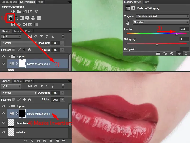
I use the brush, with 100% opacity of course. The edge: I've learned that I need about 50%, I go a bit softer, I might go to 30, 40% (1). And then I can brush on this lip color here with white in the mask. The more precisely I work, the more beautiful it becomes, of course. I'll go over it roughly, I'll take care of the edges in a moment (2).
I still need to reduce the size of my brush tip here (3). I'll zoom in a little closer. And when I've painted out here (4), ...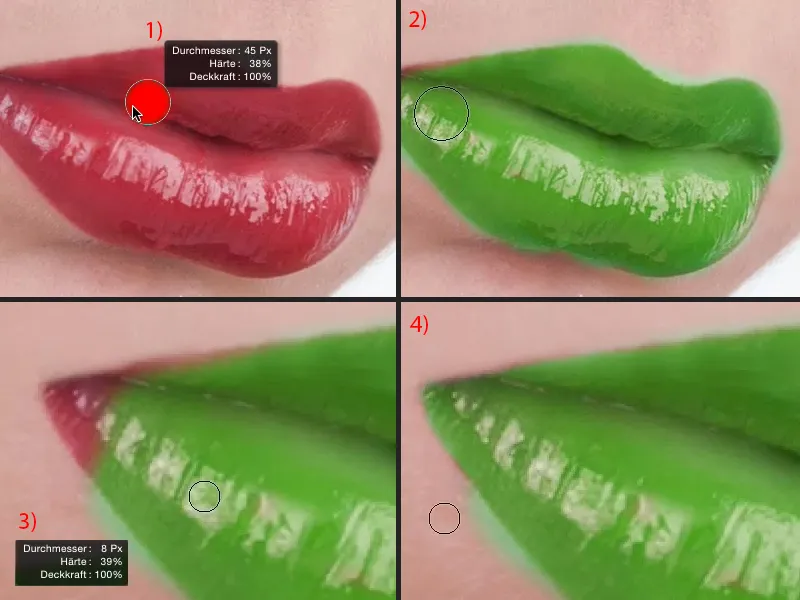
... then I simply switch to black (1) and can correct these overpainted edges very, very nicely (below the red line in 1). It's always such a game of patience, but I like this way of working, that I really paint this mask perfectly first, and then I take care of the color ...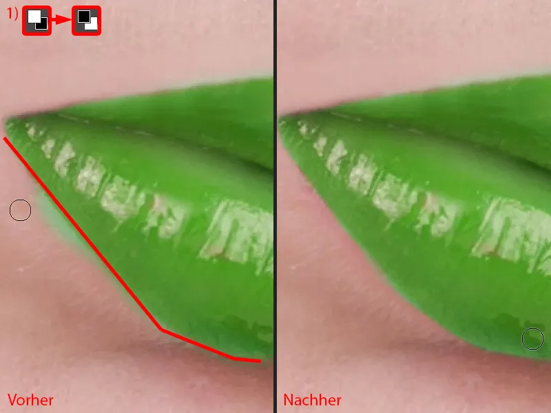
Correct the heart a little at the top here, because nobody wants green skin unless it's the green Hulk. You could easily do that too ...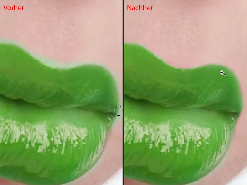
Now the lady here has green lips. And because it's an adjustment layer, I can now simply change the color. No matter where I drag the sliders, it always looks cool, in Normal mode - with the color tone I have the full drawing in the lips, I have the shine in the lips and I can choose a color.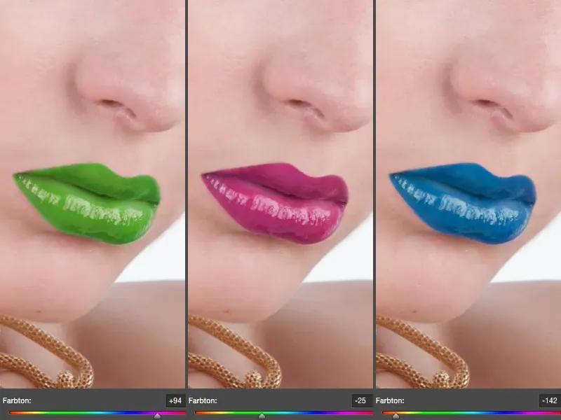
My original lip was like this (1). I would have liked to have shifted it a little lighter (2), you always have to think in complementary terms. The hue slideris moved to blue and the lip is colored red to complement it.
I can also increase the saturation (3), I can make it really bright red. If I increase the saturation here by 10 or 20 %, it looks really cool.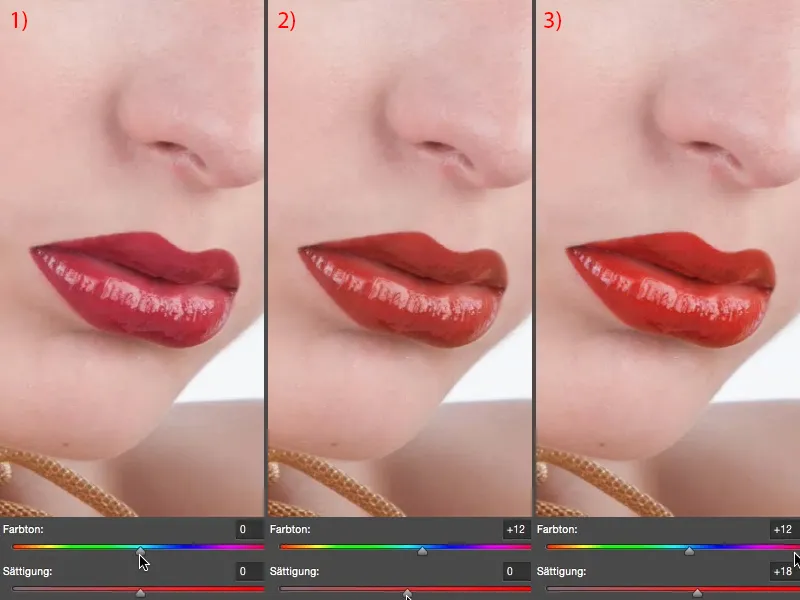
I can also influence the brightness. I can lighten the lip (1), which doesn't look good in this case, and I can darken it (2). But I don't have to make the whole thing extreme, I can lighten it a touch (3) or I can darken it a touch (4). And I can darken them a touch.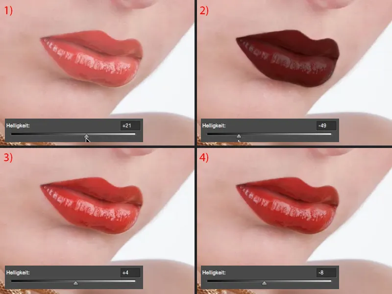
I think this more natural color, this warmer color, has given our image a bit more radiance.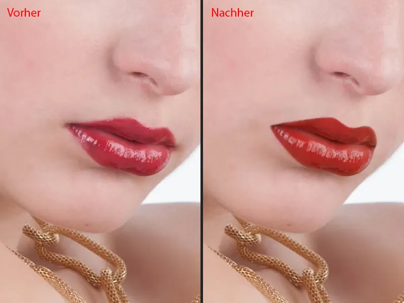
Shape your lips
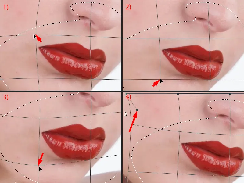
What else you can do: For example, you can combine these layers here in a new pixel layer (1), simply take the lasso (use it to select the outline at 2), then go to Free Transform (Ctrl + T) and activate this checkbox function (3).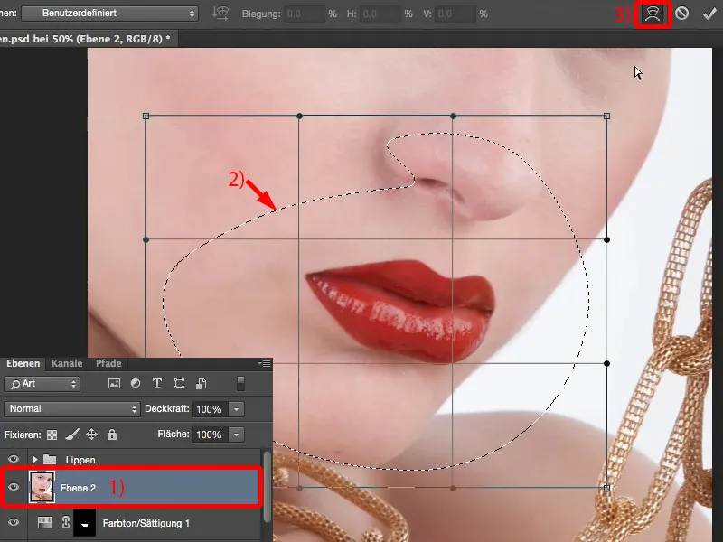
Then you can deform the lip a little in length and width (1), you can make it a little narrower (2), you can let it hang down a little (3). But you can also just take the corners of the mouth and change them a little (4). However, I would only do this afterwards. So if I want to change the position a bit or just think: "The corner of my mouth is hanging a bit, I need to pull the whole thing up a bit", then I do that using this distort function.