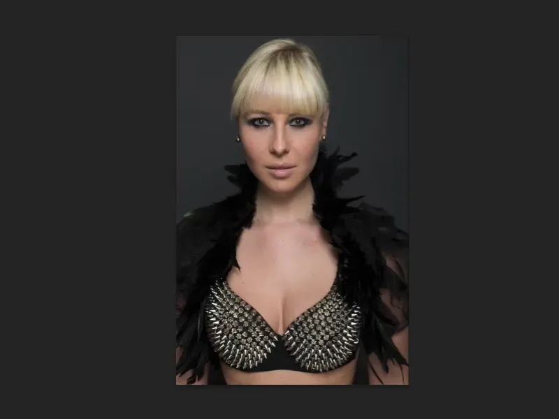
In this tutorial, we will be looking at deformation techniques. We're doing liquefaction here, we're doing bending, distorting, all kinds of things that can be used to change a person. I don't necessarily say "can optimize", because I think the ideal of beauty, especially in the fashion and advertising industry, is ... yes, it's no longer an ideal of beauty. It's just an ideal image of our society, if I may put it so carefully, which doesn't exist in reality, but that's how it works at the moment, unfortunately, with a little wink.
Nevertheless, I would like to show you the techniques, because from a Photoshop point of view they are really great, really simple. Here's the picture: Do you notice anything about it? Do you see any mistakes? Does the face look liquefied, the nose, the lips? I don't think you would recognize it at first glance.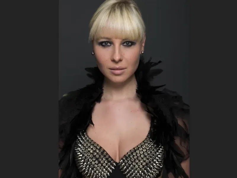
I'll Blender in the original raw (before image) as it came out of the camera. If you compare the two images, you'll see that the person has been pushed inwards and stretched outwards. This gives her a touch more dignity because her eyes are a bit more from above. She's a little narrower and the décolleté is pushed inwards a little, it all looks much, much more compact. And that's a bit like this ideal of beauty: slimmer and slimmer, taller and taller, narrower and narrower, more and more concise. And that's what we're doing here now.
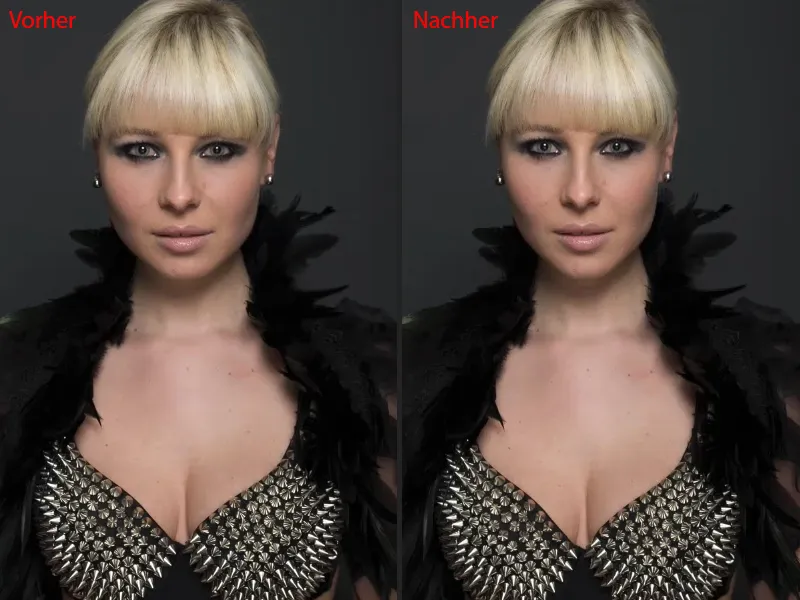
Presentation of the three filters: bending, liquefying, curving
I have prepared various things in this PSD file. I'll show you these briefly and then we'll copy them all. These are all just the basics, I say, that you need, but you can do a lot with these basics.
This is the bending filter, for example (after picture). If you look closely at the neckline and these spikes, you'll see that they blend in softly here. But I'm sure that if you had shown it like in the after picture, nobody would have noticed. So we actually moved the entire upper part of the body to the right without cropping using the bend filter, because I thought to myself: What does it look like if the head moves a bit more to the right? Including all the feathers ... It's not rocket science, as you'll see in a moment.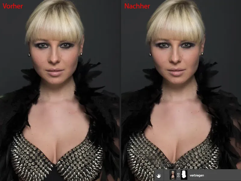
Next up, of course, is the classic when it comes to shaping: the liquefy filter(after image). I'll show you the best way to use it non-destructively.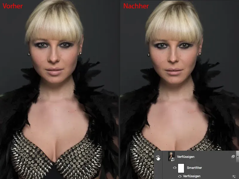
And last but not least, something that I think few people use: the bulge filter(after image). With bending I can not only create any kind of bumps in images that always look uglier, or any kind of dents when I go into the negative, I can also work very nicely non-destructively here, via a smart object, via a smart filter and can give the person a different shape.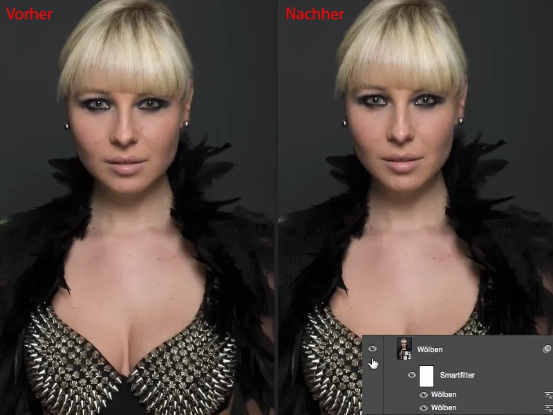
Using the bend filter
Let's get started: We'll start with the bend filter. Make a copy of the layer using Cmd + J (Ctrl + J) (1) and then go to Layer>Smart object>Convert to smart object (2). Of course, we want to be able to access these filter settings again at any time. Next, go to the Distortion filter groupand select the Bend filter (3).
The preview is a bit small, unfortunately. Adobe should improve this - please make larger preview images in all filters, preferably in the live image as well. And here you can now turn the head a little to one side (4) and to the other (5), let the head wobble. That's always quite funny. Of course, it also works with other parts of the body (6), ...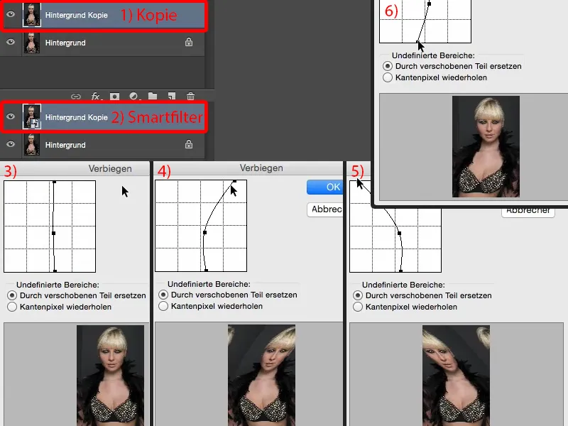
... but what I want to do here now: I set the points (1) just so, two millimeters further to the right (2). I really just want a larger control panel for this ...
Moving the points causes all the pixel layers to shift to the right. I can now also do this using a mask and cut out the area, but if the Bend filter already exists in such a beautiful form, then I can also use it. Confirm with OK.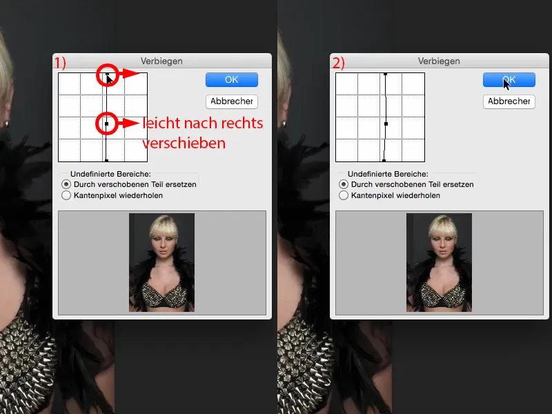
Then I'll create a layer mask here (1). And I'll invert this first (2). Now I'm back to the original image (3), ...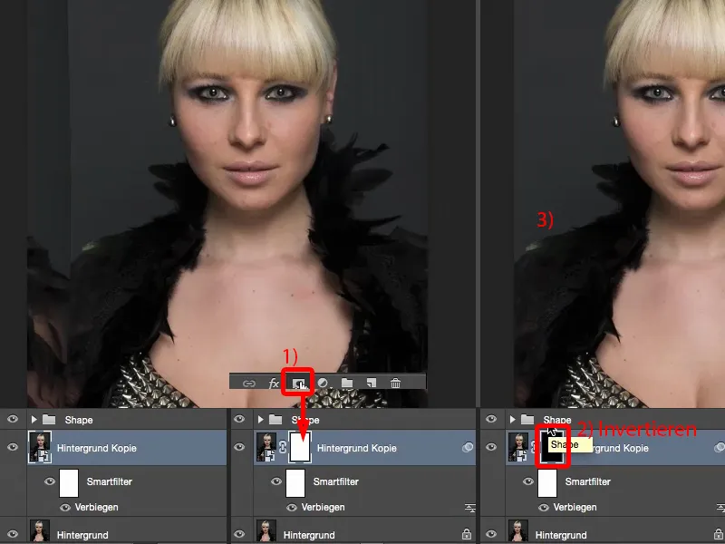
... take my brush, set the opacity to 100% and brush on the new face (2) with a soft edge (1). I don't have to cut anything out, it's all blended in using a soft mask. Down there (arrow in image 3), I'll wait a little longer, I'll get to that later.
And I'll also stop in the area (4) the moment I see these feathers. Then I might have to go over it again in the middle (5) and maybe remove the little hairs there (6).
So you see, you don't have to crop anything here. Because it's basically just painted over a mask (7), ...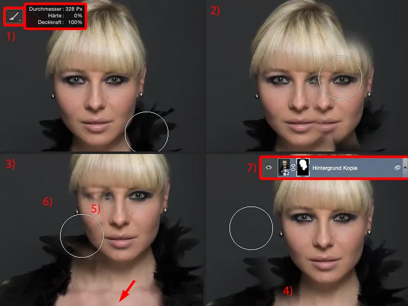
... I now only have to make certain transitions a little softer. And this can all be done using the brush with reduced opacity (1). Then you just paint together what looks good in your picture. If you want to remove the feathers, simply paint over them here (2). It should look pretty cool like this. Of course, you'll have to take a little more time than I did for this training, but then it will look cool.
The area here (3) definitely needs to be concealed very, very well, you can also let a feather grow in here (4).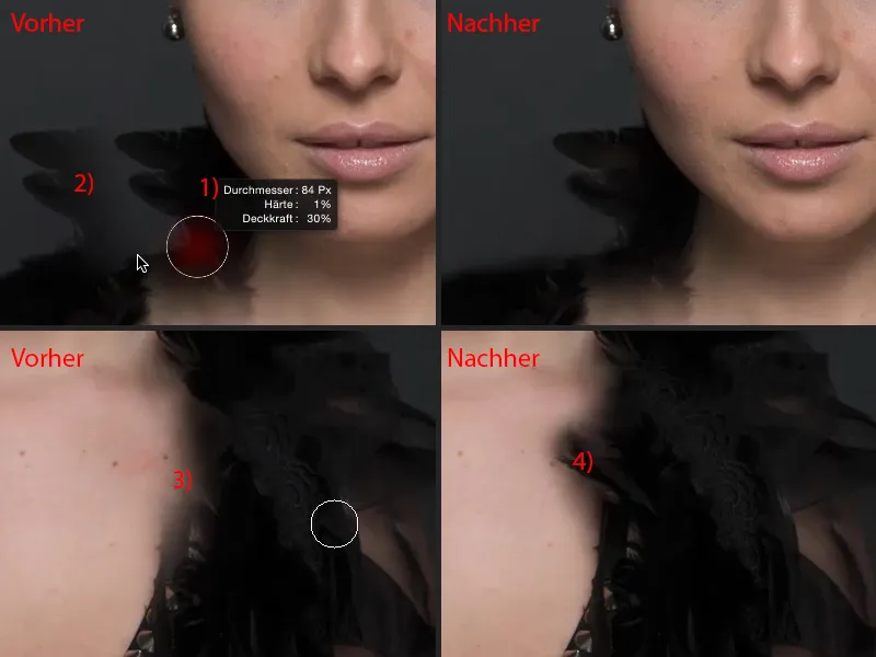
Then I'll reduce the opacity a little again (1). So the processing takes a bit of time - feathers are of course a great example here - so don't do anything with feathers if you want to bend something. That causes more work than it's actually worth.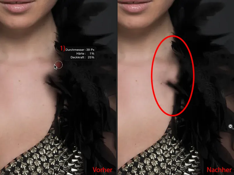
Then you're done in the end. We may still have an area here (1) that we need to work out a bit more. I think you can leave it like this (After). You'll just have to work a little more precisely than I did, but then it will look really cool. There's another edge up here, which of course also needs to be brushed away (2).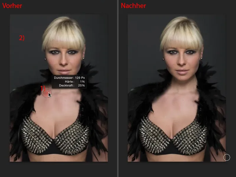
And now you can let the lady wiggle her head (red line for comparison).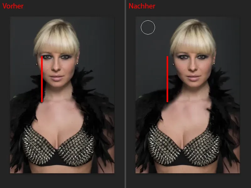
And of course you can do this at any time: You can go back to the bend filter(1) and can now also bend the head back a bit if it was all too much for you and you say, "No, that's not supposed to sit there at all." Then simply push it back over (2), but you've still moved it a little. The mask (3) remains in place, so you brush it on correctly once, then you can move the head back and forth at any time. Of course, this also works very well with other areas of the picture. I really like to do this in the shoulder area, if the shoulders are too narrow or too wide, then I just move them a little bit outwards, make a soft transition, and then I have wider or narrower shoulders, hips, whatever - so you can really do a lot with this. So that's it for the bend filter- a powerful tool that works very, very quickly.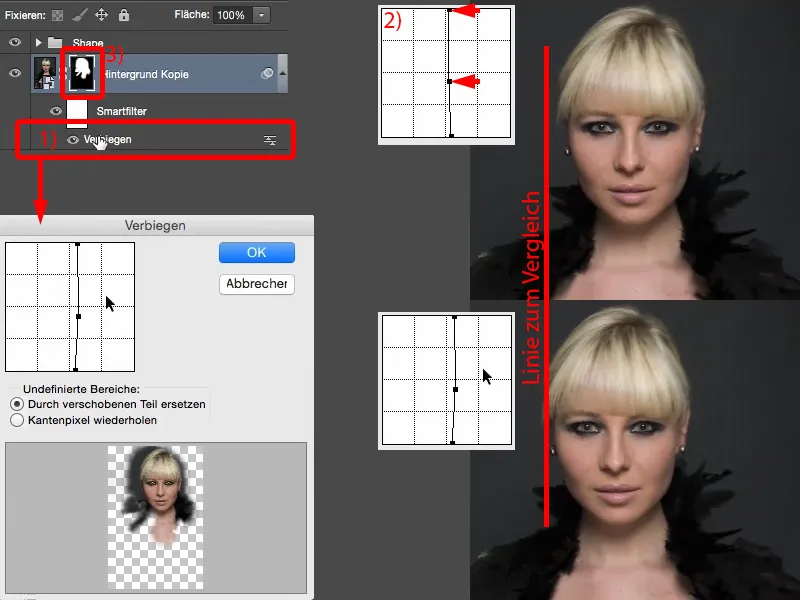
Using the liquefy filter
My next example is the liquefy filter. Again, I'm going to get a copy of a layer using Ctrl + J and of course immediately convert it into a smart object (1), because I want to be able to change these filter settings again at any time. You can find the Liquefy filter under Filter>Liquefy... There are exactly two tools that I use here: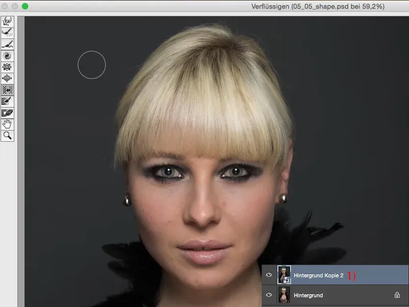
One is the normal Move tool (Drag tool), which I can use to move the pixels in any direction.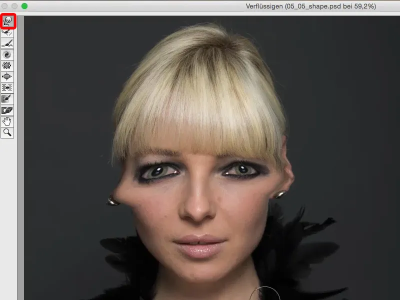
And secondly, there is the move-left tool (1). I would love to meet the person who came up with all these tool names. The move-left tool takes a bit of getting used to at first. I'm just going to pull my hair down here (2). I have to increase the pressure a little and also the density (3) so that you can see something here. And then all the pixels are shifted from left to right (4). It's a bit strange when it's called pushing to the left, because you actually expect it to be pushed out to the left. But if I drag from bottom to top (arrow at 4), you will see that it is pushed to the left (5): It is pushed to the left (5). And so I can pull pixels out here or I can push pixels in.
Let's go to Restore all (6) so that we have a reasonable view again.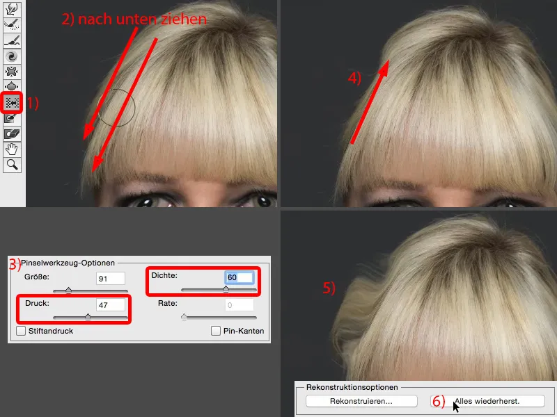
Of course, you can also blow up areas here, such as the eyes and lips (1). It's getting more and more beautiful ... You can already see the problem with the whole thing: It's so powerful that you can really make such a big change with just one click with low opacity that it's almost too much. Or you can also pull things together, such as the tip of the nose, the wings of the nose (2). Yes, it all works very, very well here, it gets narrower and narrower, more and more comic-like, but I don't really use it in practice. And I don't use it because it's all too fast and too simple for me. And if I really just want to draw in a nuance, for example the tip of the nose, then I do it with this normal dragging tool (3).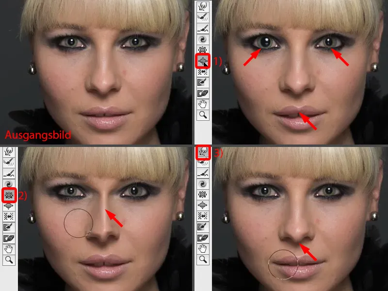
If I want to reduce the size of the nose, for example, I use the push-to-the-left tool (1). Why this brute force tool of all things? This tool because I can move once around the nose (dashed line at 2). I'll just show you how - and all with the same pressure (settings at 3). Especially if you're working with a tablet, this is great to adjust when the pen pressure is activated. And I get an even shift.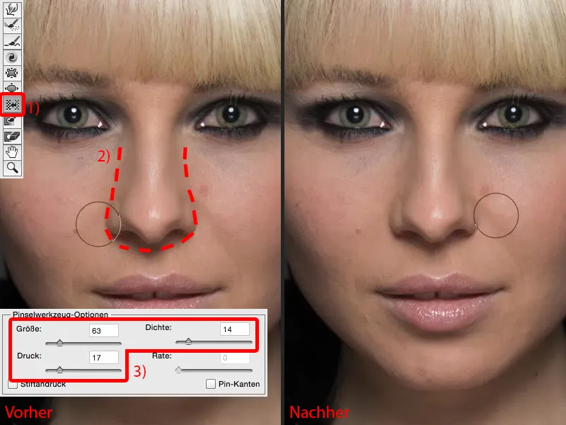
If I were to do this here with the contract tool (1), I would have to make the radius relatively large (as with 1). And that's where it starts: does it pull in the lip or something from the eyes? And he always draws it to the center. So I have to think about it: This is the center of the nose (2) and here I'll just type (3).
But up here (arrow at 3), not much will happen, because the further I get away from this center, the weaker this tool works. And it's the same with the inflate tool. On the other hand: If I take the Move to the left tool and move around it once, I really get the same movement backwards around the entire nose and not just once here on the tip of the nose.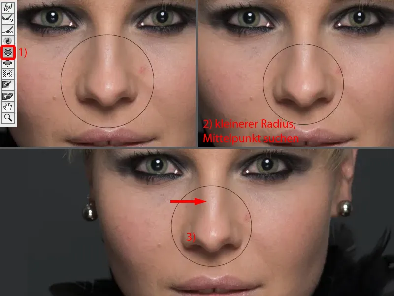
I can do the same with lips. If I want to make lips smaller in the Liquify dialog, if I don't do it any other way, then I move once around the lip (1). Or if I want to make the lower lip narrower, I move once from left to right, perhaps once more and once more (2).
If I want to change the corners of my mouth, I take this tool (3) and simply pull it down a little here (4).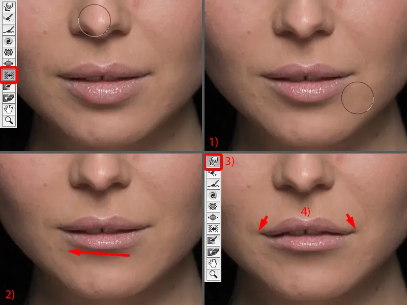
As you can see, the whole thing is very, very powerful. You have to know what you're doing. And to start with, I recommend that if you only want to make a small change, such as pushing the ball in a little here at the bottom of the ear stud or these little hairs here (arrows in the picture), then just move them over manually using this dragging tool.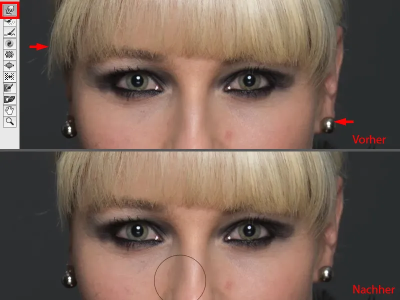
If you want to change larger areas such as eyes, lips, noses and so on, then use move to the left, because even if, for example, I would like this edge to be even narrower (1), then I simply move around it once and on the other side I move up once (2). So it's all very, very soft if I keep the pressure and density relatively low.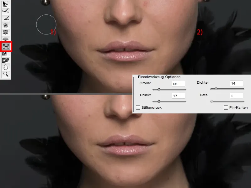
And that doesn't lead to this denting, because when I do it with this tool, I push a little bit here, a little bit there and a little bit there (arrows in the picture) ... and I never get a really nice, smooth line, it always looks strange. It always looks like liquefying and it certainly shouldn't look like liquefying. So you can do all that with the liquefy dialoghere.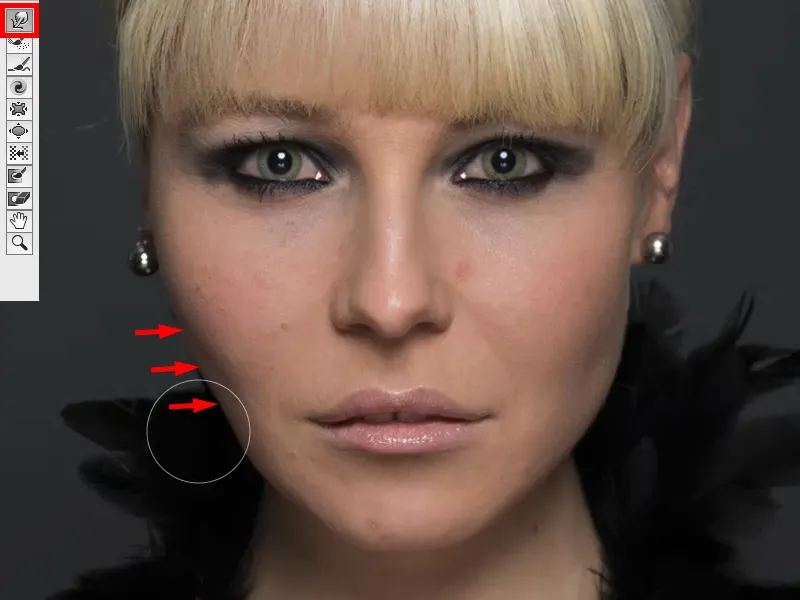
Using the bulge filter
Next, I'll show you another method and that's the Warping filter. I haven't included the Liquefydialog in the image here, because you've now seen it extensively. I still have my smart object (1), go back to the distortion filter groupand select the Warp filter. It does very funny things by default. This is the mega fisheye monster par excellence (2) or it pulls everything inwards (3). You can also use this as a creative effect, by default the whole thing is always at 100%, which I find very funny.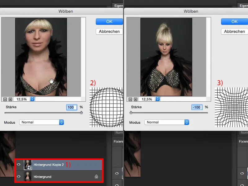
You could also set it to the zero position (1). And now I have the option of using Normal, Horizontal or Vertical mode (2). Normal mode, okay, I can pull the person inwards a bit (3), but that doesn't look good.
And who wants to be made fatter in our society (4)? As a rule, very few. So you leave it like this (1), ...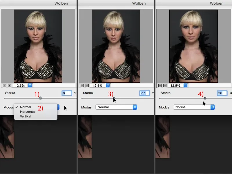
... but I can do something here horizontally and vertically. I can narrow vertically and horizontally here. I'll now go to minus 12 % for Horizontal (1) and say: OK (2).
And then I'll get the filter again and go to Vertical. And here, too, I can now narrow (3) or stretch (4) the person.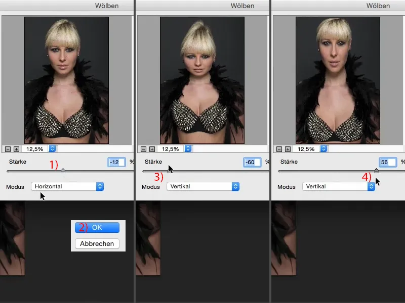
I can't do too much, I have to do just enough so that the normal viewer wouldn't notice it. And I also go to about 11% here and confirm with OK.
Now I've stretched the image using two smart filters here, two curves, one horizontal, one vertical (after image). Of course, you can also do this very destructively by simply going and saying: "I'm going to transform the whole image and pull it up and down." But that's a different effect, because the moment you pull out or pull in to the right and left, you already have to crop your image. And you don't have to do that with the curvature filter. That's why I would always prefer this method.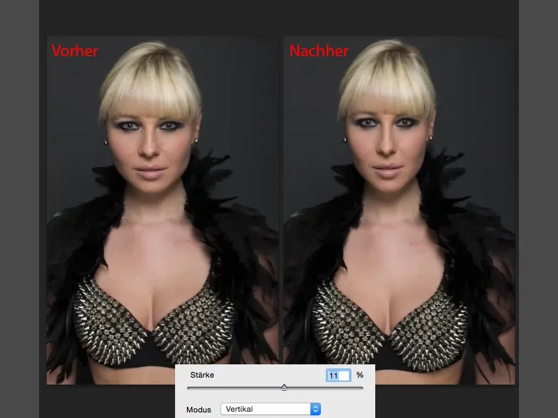
Summary
So these are really three very powerful techniques if you want to influence the shape of a person, a portrait or a full-body shot. In my opinion, the most powerful is still the Liquefy dialog, because here I can really build up completely new people in the end. Then I have the arching function, which is very subtle. And I think that curving is the function if I have a portrait like this and I want the person to look a bit slimmer and a bit taller, then I would do that, because even the viewer won't usually notice it. And with the bend function, I can now change really large areas of the surface, change their position and easily bring them back into the picture using a soft mask.
So I recommend these three options to you. Of course, you can also combine them as you have just done in this example. You never have to limit yourself to just one and you can also use masks to apply the whole thing specifically where you need it in your image.