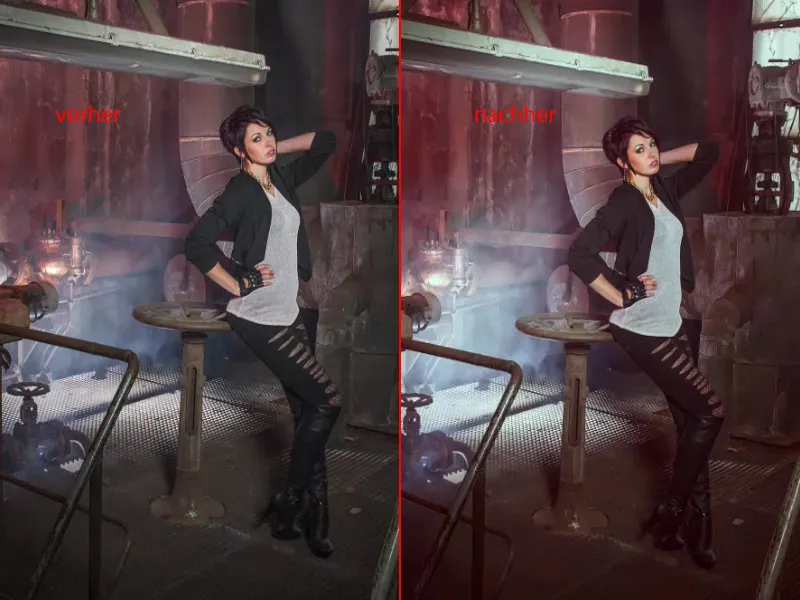
If you're not really the type for non-destructive image editing, then I'll show you in this tutorial how you can also make very good progress destructively with layer modes.
I'll click on this here: This is what it looks like after editing. I think it's a very cool result.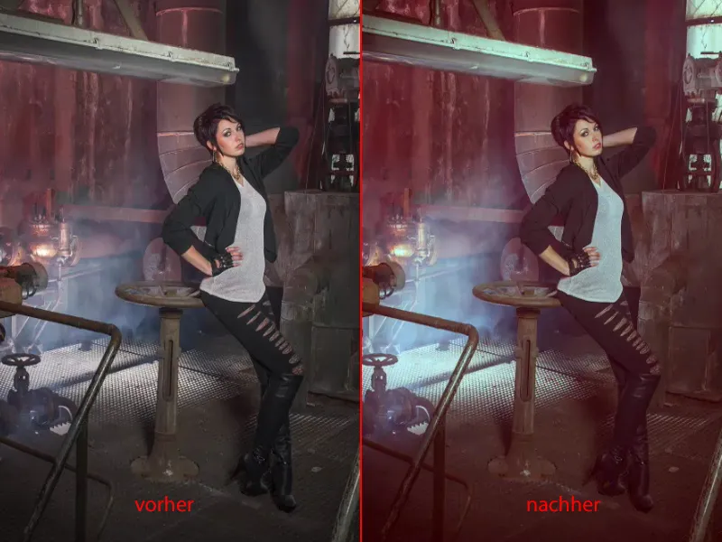
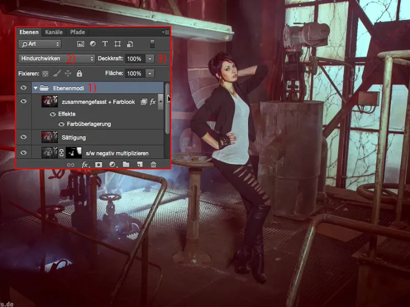
And if I open the group (1), you can see the disadvantage of this way of working: you can't change anything here. These are all pixel layers, they are all layer copies that allow very, very cool effects through certain layer modes (2).
However, the moment you start playing with the opacity (3) on all layers, you will unfortunately very quickly return to the original image. And of course that's not the point.
Or if you say: I've put a color look over the top and now I want to change this layer (1) down here - if you change the opacity (2) here, something will happen, but in the end you can't really tell what exactly is being pulled out.
Here is a black and white layer (1), soft light mode (3), which probably increases the contrast - but is it really just the contrast? - because the colors and the brightness, everything changes. You get funny bluish windows at the back (4), it all looks very strange. And that's the disadvantage of destructive editing.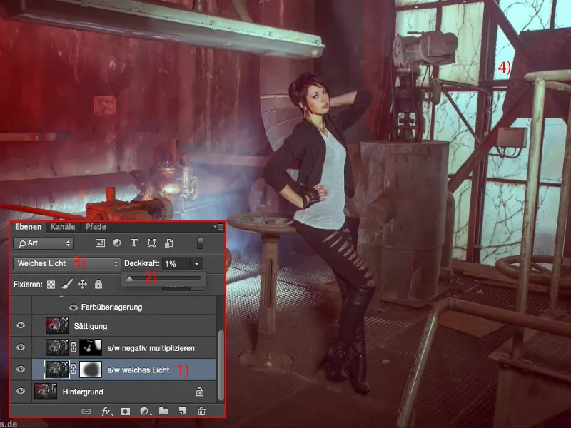
Editing contrast
Nevertheless, fresh and completely free, let's continue destructively here. In principle, you can combine the whole thing however you like. You just need to know which layer modes have which effects. First of all, I always make a copy of a layer (1), then desaturate it using Shift + Cmd + U or via Image>Corrections>Reduce Saturation (2). I do this because the first thing I want to do here is optimize the contrast.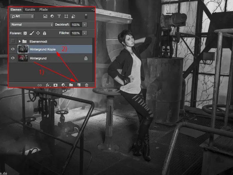
And that's why I set the whole thing to Soft light (1). So the highlights are tightened, the shadows are softened and the mid-tones also become more contrasty. This is the before (2) and this is the after (3).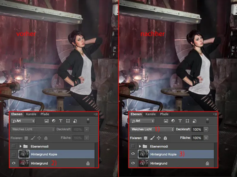
The shoes almost disappear into nirvana, so I go back with the opacity (1) until I say: Okay, I've optimized the contrast a bit. Everything still has definition, everything is still nicely visible.
That would be the first destructive step.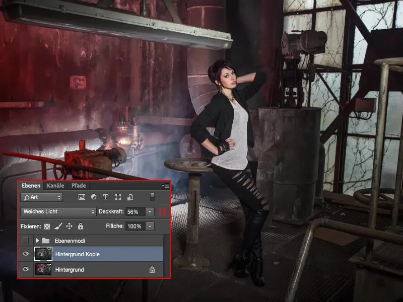
Emphasize highlights
Next, I merge with this layer (1) using Shift + Alt + Cmd + E. Now I have a merged composite layer (2), as they say, and I'll desaturate it (Shift + Cmd + U) first (3).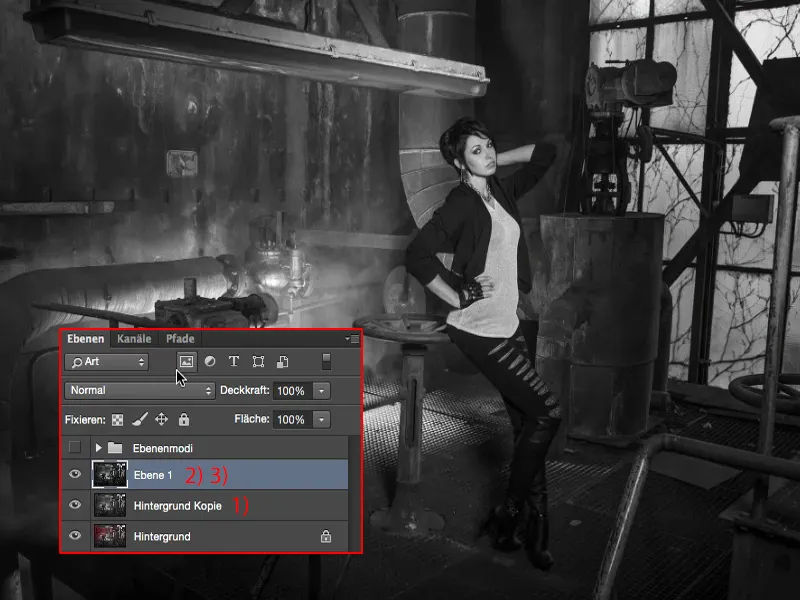
I'm now using the Multiply Negative mode (1) on the layer, because I want to emphasize these beautiful highlights where the fog rises through the grid (2), and on the window (3). So I create a mask (4) here and immediately invert the mask (5) again.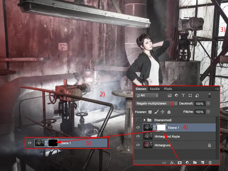
Now I have 46% opacity (1) of the brush (2). Let's see - yes, that actually works quite well. And I can paint these highlights into the picture. And I'll also go over them nicely in the back, because I couldn't really control it so correctly in the shot with all the flashes that the window also becomes bright (3). I missed something in the front, there's also a nice light well (4), and you can now bring the fog into the picture a bit better (5). So that's also a cool way of simply multiplying the negative (6) to create a bit of light, even on the model, if you have to.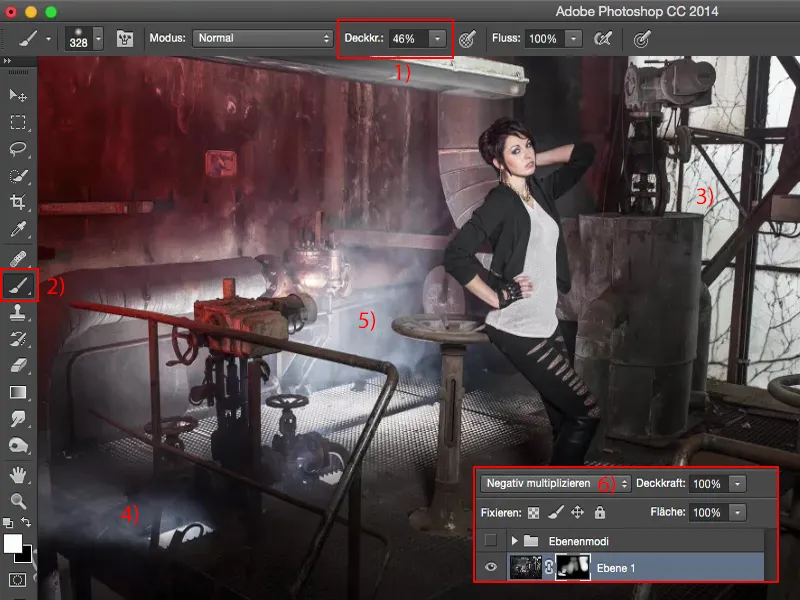
Yes, it looks cool, definitely much, much more exciting, much, much more beautiful, much more dramatic compared to the original image, because now the light looks a bit like it did in the real location.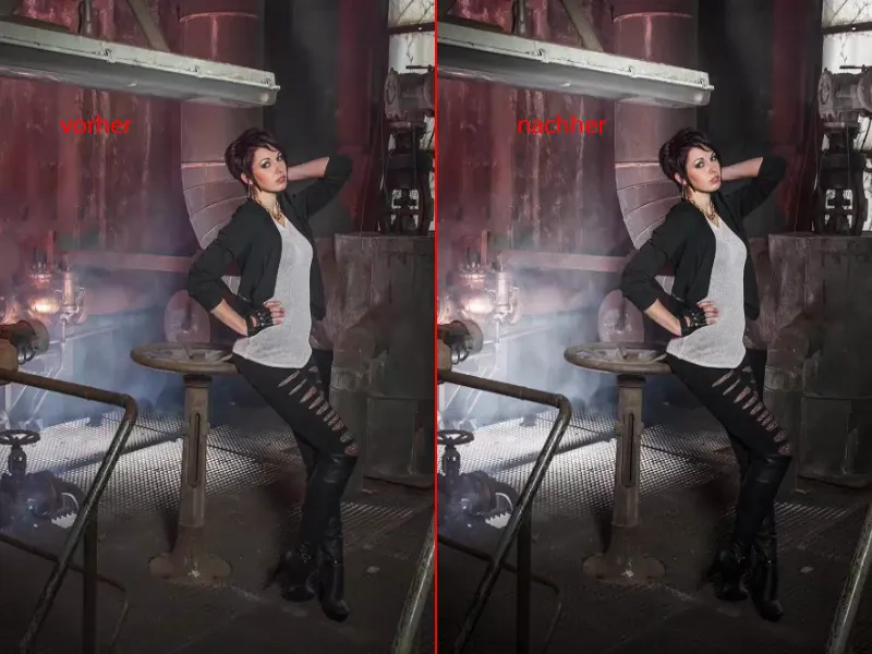
Changing the saturation
The next thing is, you can guess: I merge the layers again (1). I'm working destructively, all on pixel layers, on which I'm making certain changes here. And here I want to increase the saturation, for example. So - I'm working destructively - I go to the corrections here , go to Hue/Saturation (Image>Corrections>Hue/Saturation) (2) and ...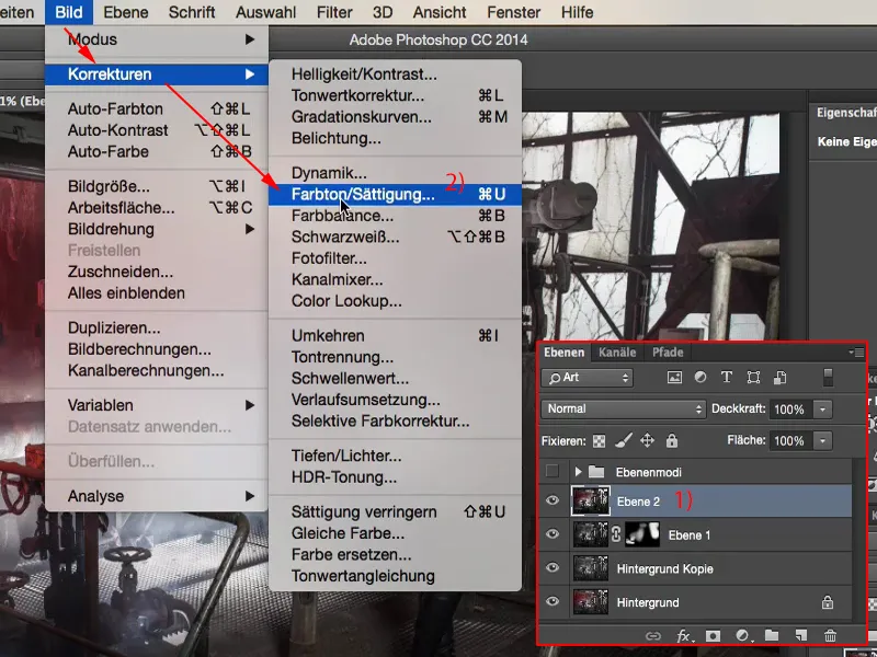
... I just really drag it around until I say: It's actually almost too much.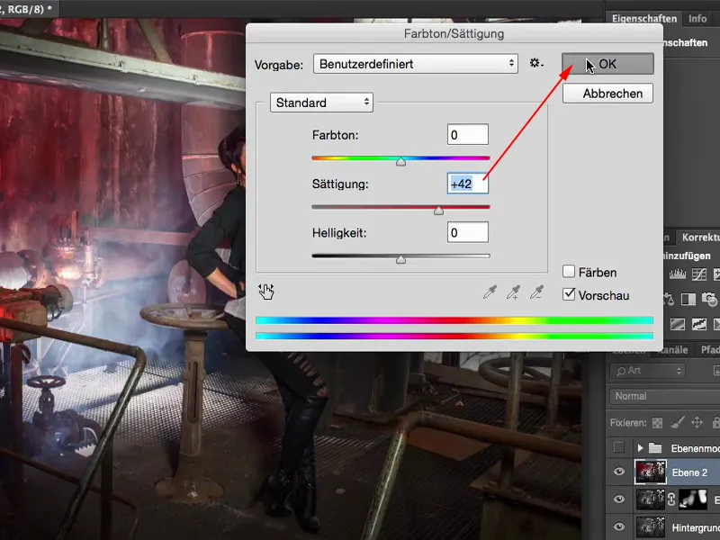
I can change the layer mode to saturation. And if you look at the red: With Normal (1) it's a bit darker, with Saturation (2) it's a bit brighter. As a result, because I have set the slider or the layer mode in Saturation mode, the colors are no longer shifted quite as much. So we already have an increase in saturation here, but not as dramatic and not as dark as when this happens in Normal mode.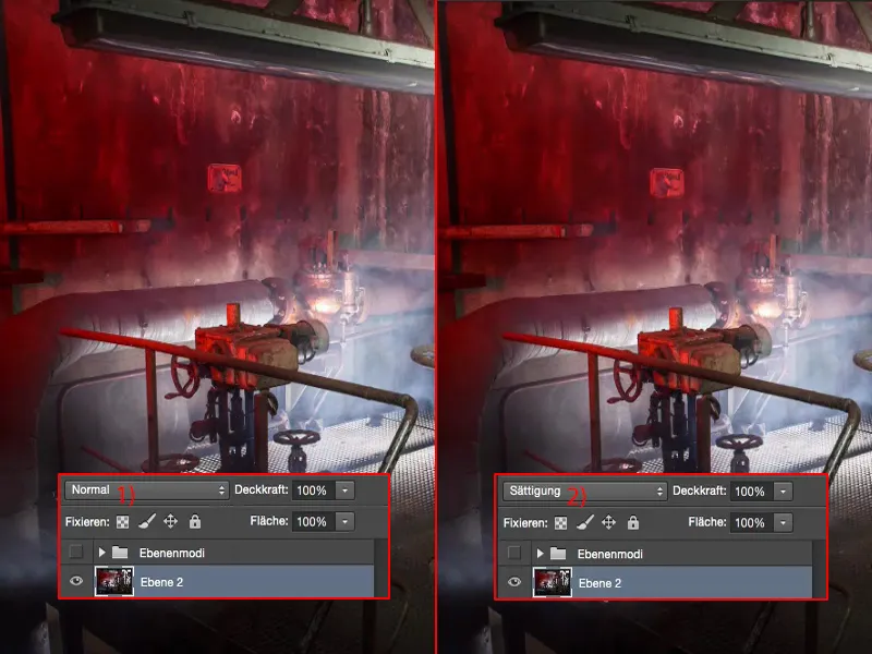
I also adjust the opacity here - that's why I deliberately raised the effect so high - and I probably end up with 40% to 60% (1) somehow. I'm also looking at the reflection on this metal part (2) in front, I think it looks quite cool. And the girl also gets a good face color again, a healthy, beautiful face color, as they say.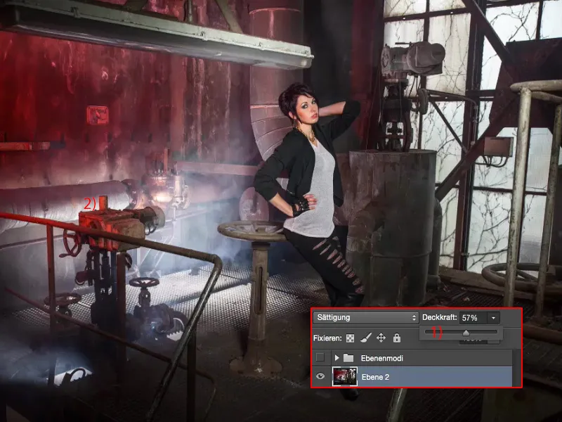
Creating a color look
Let's continue here and make a new copy, summarize this again (1).
I would now like to apply a color look to this copy. And I can actually only change one mode, which now increases the contrast, brightens, darkens. The whole thing can't do much more in terms of color look. Do you think so?
All you have to do is double-click on the layer at the back here, in the empty area, and you'll get to the layer styles. And with these you can now really create a color look. The best way to do this is to simply activate this color overlay and set the mode to Soft light (2).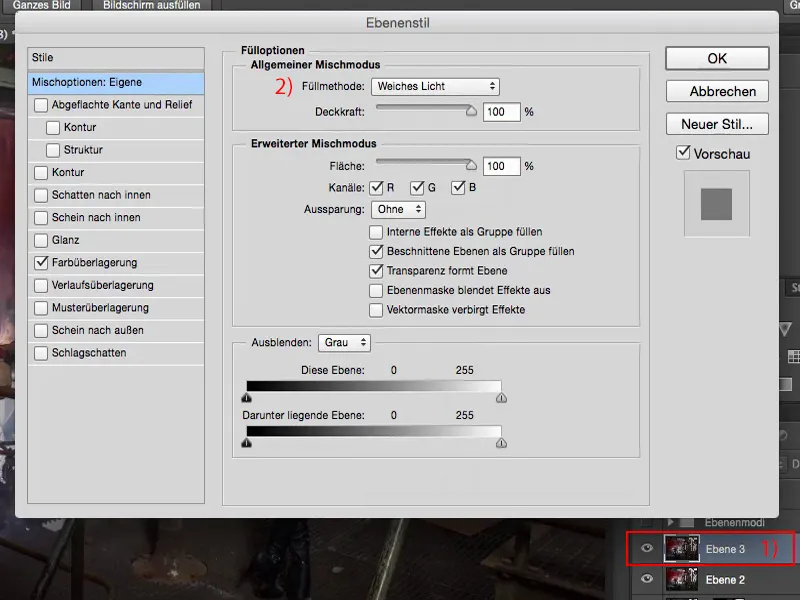
Now that you've checked R, G, B, I'll just take all that out and go to the red channel (1). And you can see how everything is now colored very, very strangely.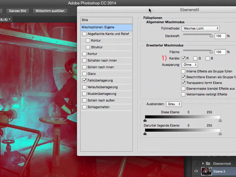
The layer mode is set to soft light and the opacity is 100%. Well, 100 % is a bit too much of a good thing, but if I only enter 20 % to 30 % (1) here, it looks cool to me.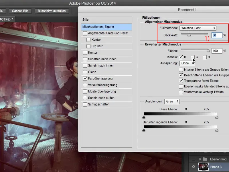
And now I can experiment: If I add the green channel (1), for example ... You can see where the journey is taking me: I can now mix really, really cool color looks together.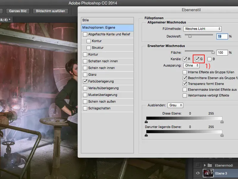
I really like the red channel now, because I have this red spotlight in the picture.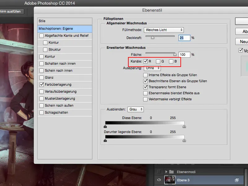
And then I have my color look here on this layer (1). I can still adjust the opacity (2), but I'm going to reduce it a little.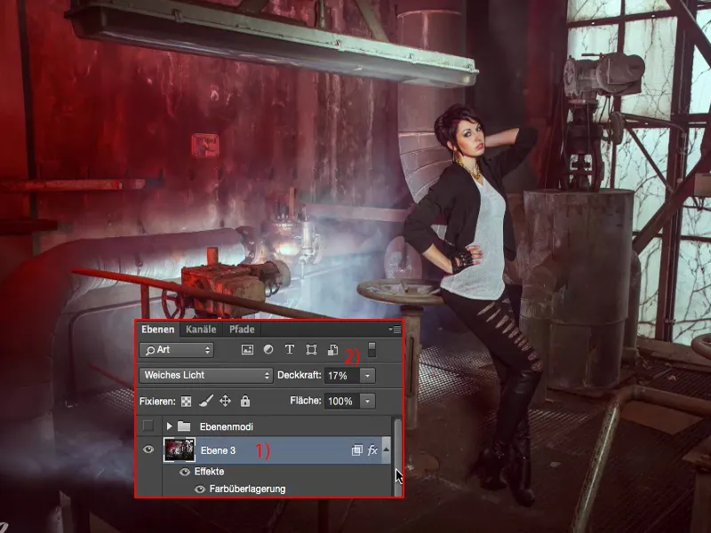
And then let's take a look at the before and after: I think - even if it is destructively edited - the result is still really, really good.