Note: This tutorial is a text version of the accompanying video training by Marco Kolditz. The texts may therefore have a colloquial style.
In this tutorial, we would like to present Marco Kolditz's painting "The Oracle of the Sea" and show you how to assemble this painting, right from the start.
Steps 1-10
Step 1
In this picture you see a mysterious human mask that seems to have just emerged from the sea and is looking down at a little man in his boat with a cute lantern next to him. So how can you manage to create this image?
First of all, take a look at the overall composition of the picture. Basically, it represents the goal. This was also the image that Marco had in mind before he even built the picture. In that sense, this is the optimal goal you want to achieve.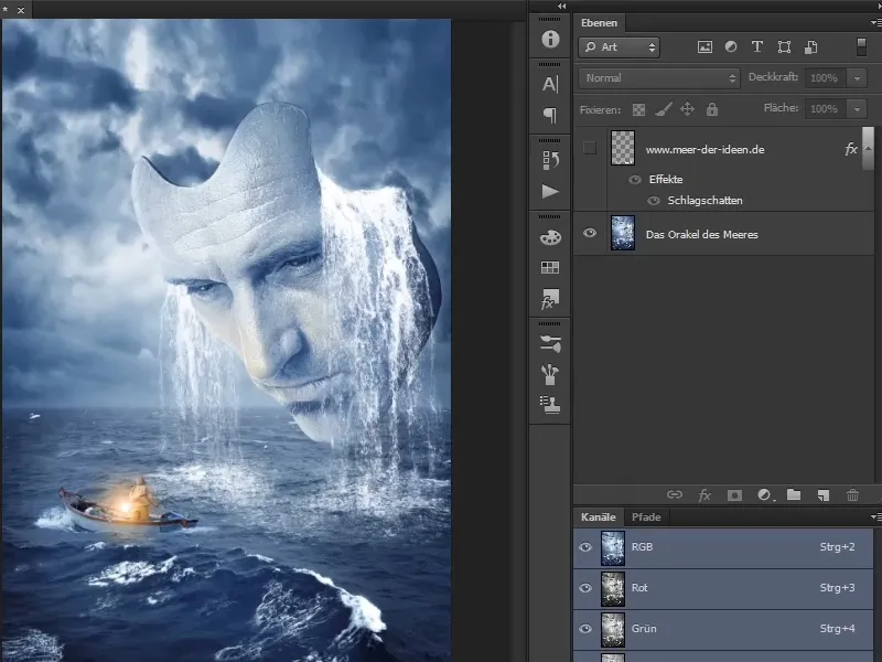
Step 2
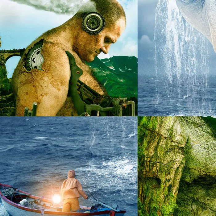
What do you need? In the background you can see a cloudy sky and a stormy sea. At least it is anything but calm, as you can see from the waves and the spray.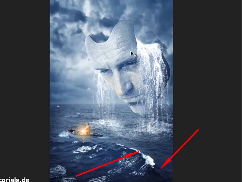
Step 3
Also the human face, which looks like a mask with seawater running out of it. You could guess what has happened; perhaps the mask has just risen from the sea and filled up like a bowl with seawater, which is now flowing out.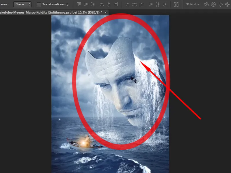
Step 4
Then add the man in the boat and his lantern, which is not normally there.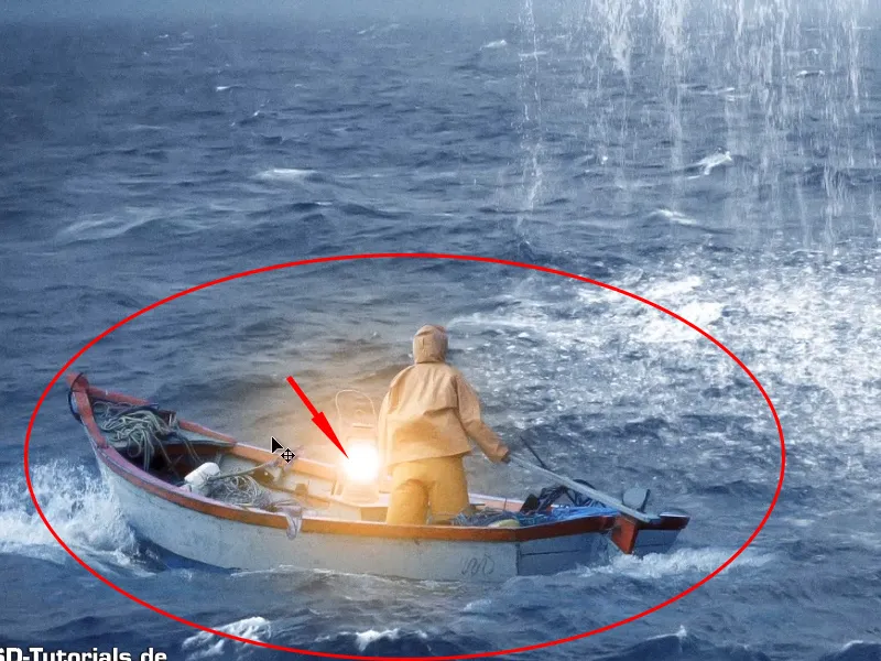
Step 5
... corresponding light and water effects.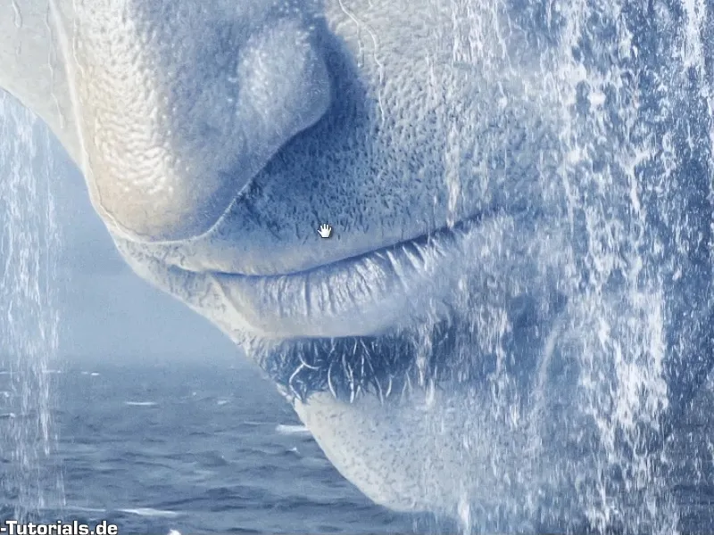
Step 6
If you now zoom in even closer, you can see that the lantern is reflected in the eyes ...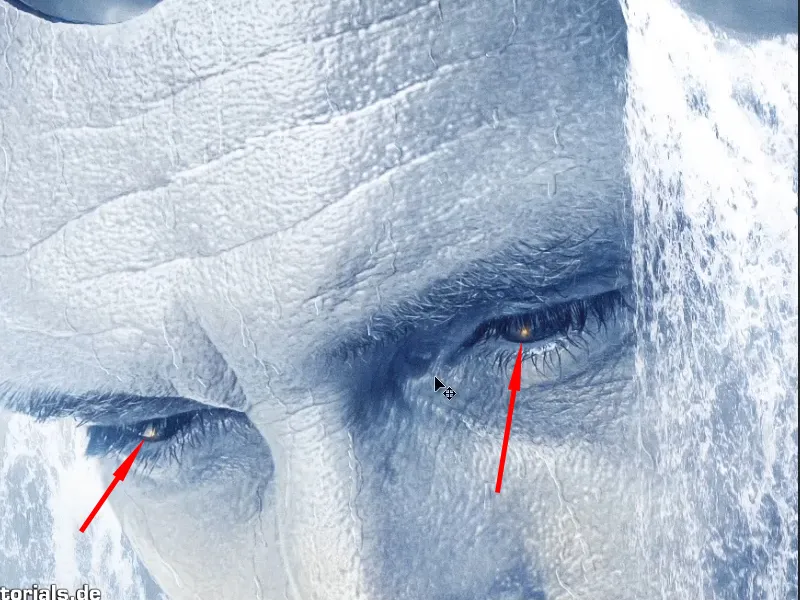
Step 7
... and that water is also running down the mask. Even if you zoom in very close to this mask, everything is still sharp and crisp.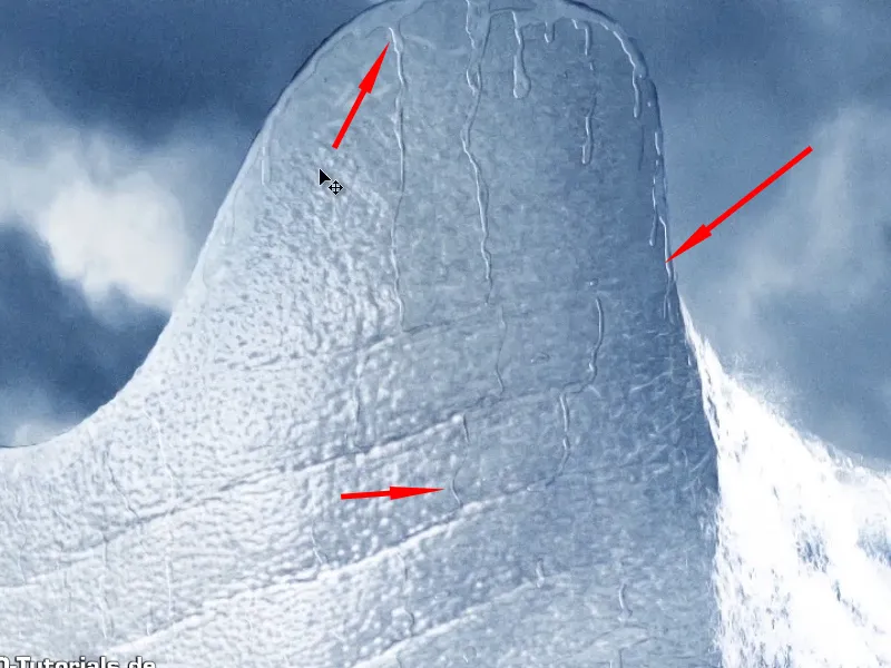
Step 8
Before you start with the actual work, you should ask yourself what format the finished image should have. Marco always prefers a poster format because he likes to print the image (regardless of whether it's in portrait or landscape format). And in most cases he chooses the 3-to-2 format. This is also the case with this picture.
This is a picture 75 cm high and 50 cm wide with a resolution of 200 dpi. You will now create this canvas on which you can then let off steam creatively.
To do this, click on File>New. You will then see the following dialog box, which many of you will already be familiar with.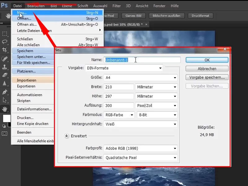
Step 9
Change the name to "Oracle of the Sea". Instead of millimeters, select centimeters and choose a width of 50 cm and a height of 75 cm because you have a portrait format.
You will now see an estimated image size at the bottom right: 149.7 MB is not small.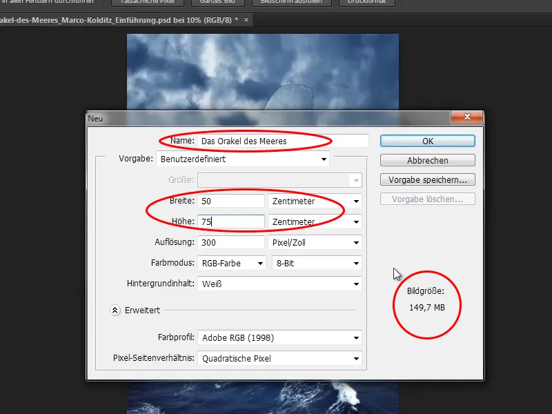
Step 10
This is mainly due to the resolution of 300 dpi. 300 dpi is good, but experience has shown that 200 dpi is also sufficient. Therefore, change the resolution to 200 dpi. The image is now only 66.5 MB in size.
Color profile: Adobe RGB (1998) (depending on whether you value color management). Marco always selects Adobe RGB. So you click OK.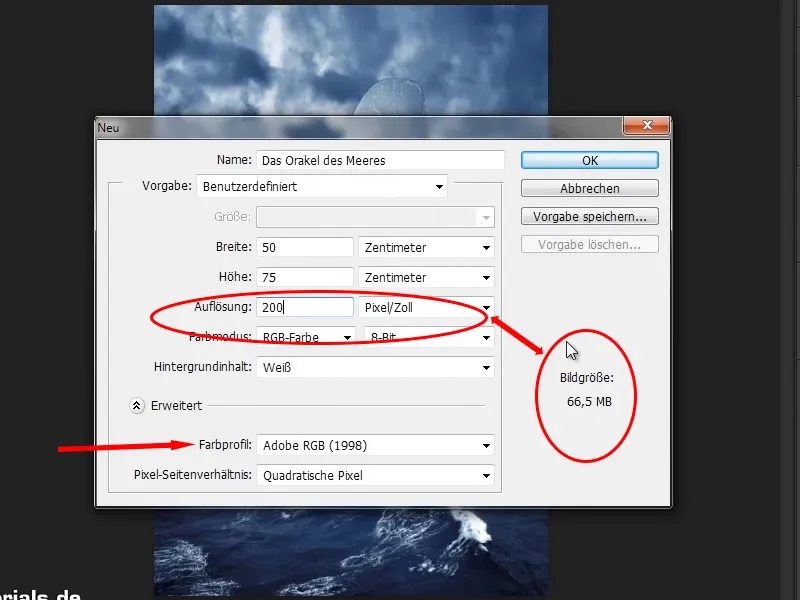
Let's continue! Steps 11-20
Step 11
And now you have a beautiful white canvas that promises a lot of creativity. You'll use this white surface to create the picture on the right.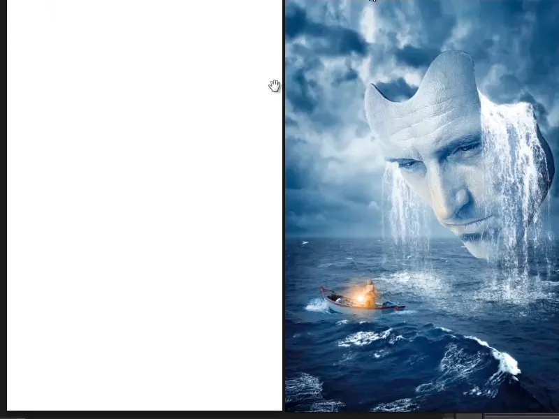
Step 12
You will now roughly place the individual objects on the canvas. Before you do this, press Ctrl+R to display the rulers. You can create guides on these rulers by holding down the mouse button. If you drag such a guideline back up, it will disappear again.
You need these guides to generate distances. Why do you need them? There are two reasons.
- There are people who would like to print out a picture - in poster format. And print shops cut pictures to size, of course, otherwise you would have rolls of paper lying around at home instead of posters on the wall. This cropping process naturally results in the loss of one or two millimetres, and this area should not contain any important image information. This is particularly important for layouts where text plays a role, for example. So you should get used to keeping a certain distance, which can then be cropped away.
- Spacing also helps with image composition in general. You don't always have to stick to the distances, but they serve as a guide. You can also deliberately break the spacing, which can also lead to exciting results if you place something outside the frame.
For this reason, Marco has gotten into the habit of creating guide lines and keeping distances.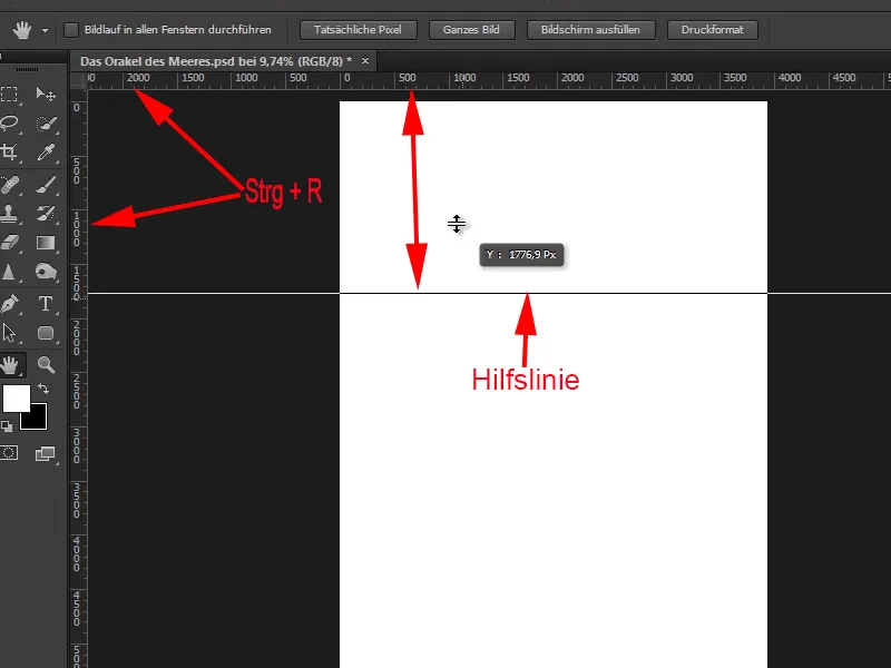
Step 13
As this is a cinematic poster, he realized that there are no standards for such spacing in posters. So he created his own.
Movies run at 24, sometimes even 48 frames per second. So it would be quite nice to divide a picture into 24 parts.
Now take a look at the height - 5906 pixels. You open the calculator, enter 5906 / 24 and you get a height of about 246 pixels. The same for the width: 3937 / 24 = approx. 164 pixels.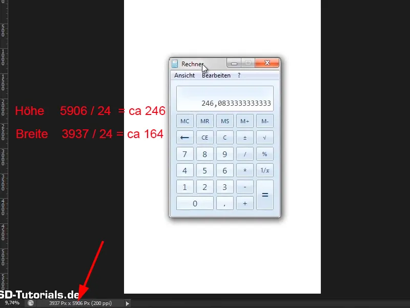
Step 14
You select the selection tool, go to Fixed size and enter the correct values:
- Height 246 pixels
- Width 164 pixels
You have defined a fixed size of 246 x 164 pixels, click once in the image and have created a selection rectangle with the defined dimensions.
This can also be quite helpful for other tasks, especially if you do web design with Photoshop. But that's another topic.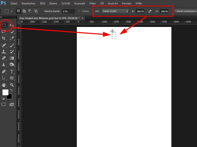
Step 15
Now drag this selection rectangle upwards to the edge, and if you have activated the Align item in the View menu, this rectangle will snap to the edge at the top.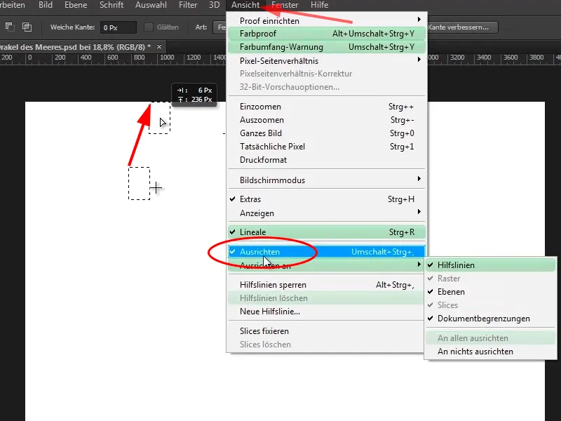
Step 16
Now draw an auxiliary line from the upper ruler and snap it to the rectangle. To do this, Align and Align to>Guidelines must be activated again in the View menu.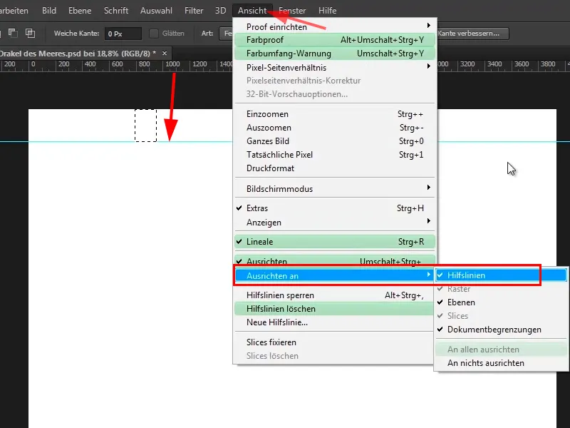
Step 17
Now drag the rectangle to the left and then also draw an auxiliary line from the ruler. Do this on all four sides. You have now created a border with the guides.
Press Ctrl+D to deactivate the selection rectangle and you have now created a nice spacing.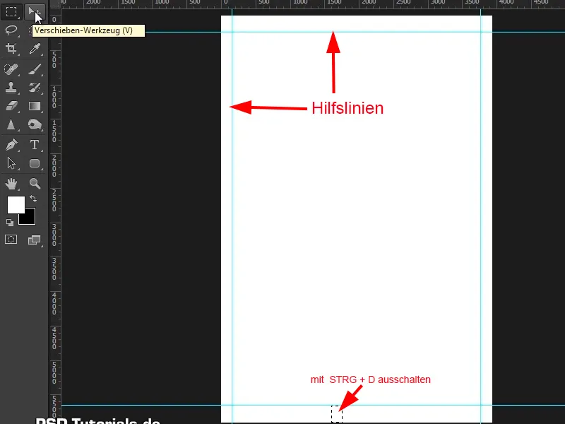
Step 18
Now pictures finally come into play again. First, however, generate another guideline to represent the horizon. This means that everything below the guideline is sea and everything above is sky.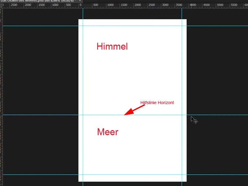
Step 19
You now want to drag these two image components into the Photoshop program. To do this, open this folder with the images in Windows. Hold down the Ctrl key and click on these two images, select them both and drag them into Photoshop.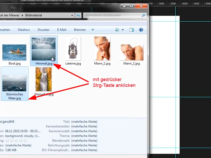
Step 20
Why take this detour? Normally you call up images via File>Place. You can then click on images and place them in Photoshop. However, the trick with the Ctrl key does not work here, so that you activate several images at the same time. If you press the Ctrl key, you can only select one image at a time.
If you want to insert several images into Photoshop, you have to select and place each image individually. It is therefore better to take the detour via Windows.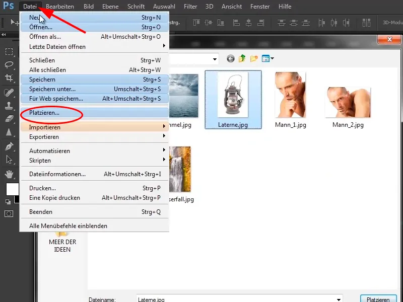
Simply continue working: Steps 21-28
Step 21
Now drag the two images into Photoshop. You have the first image (here the sky) and let the image snap to the top. Hold down the Shift key and drag it upwards to enlarge it proportionally. Then stretch it a little at the bottom (without the Shift key) until it is positioned correctly. In this case, it is not a problem that it is slightly deformed. Press Enter to accept the settings..webp?tutkfid=48654)
Step 22
The second image will appear immediately. Place it at the bottom (it is the sea) and, holding down the Shift key, drag it upwards and then lengthen it slightly until it looks good. Please note the horizon line!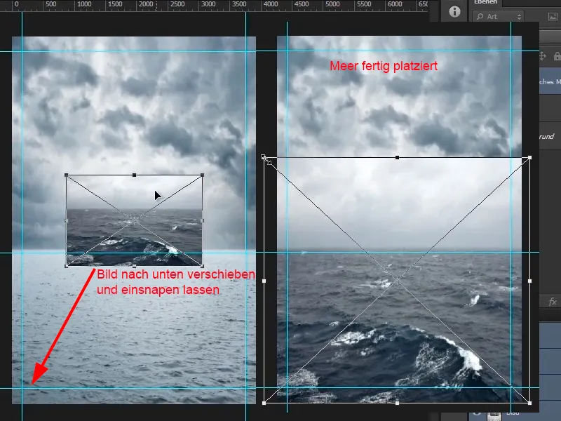
Step 23
What's still annoying is the sky of the sea - it just looks too plain. The sky of the other plane looks much more dramatic. That's why you want to remove the sky from the sea. To do this, select the "Stormy Sea" layer, click on the mask icon and select the mask. Click on the brush (or press the letter B).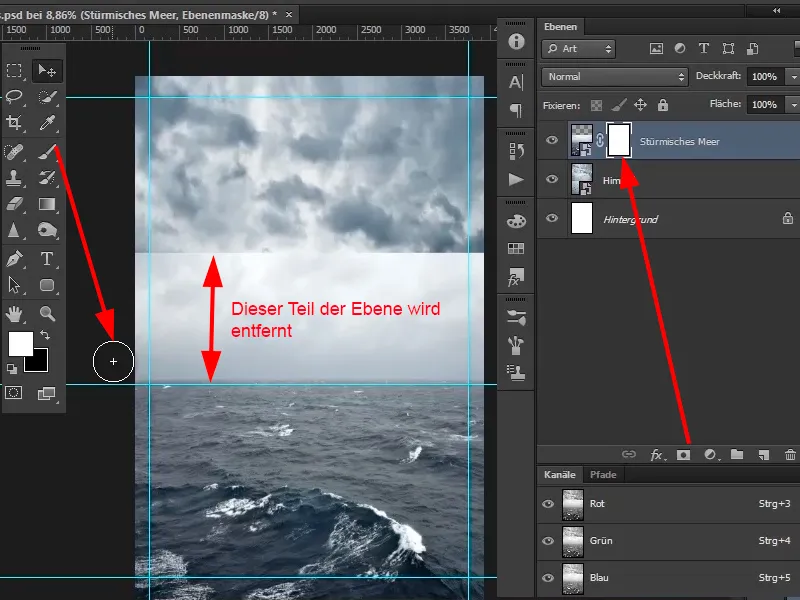
Step 24
Now right-click in the image - the dialog box for the brush selection opens. Select a soft (relatively large) brush tip.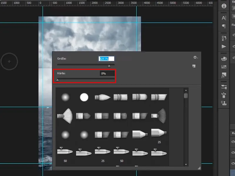
Step 25
You can also change the size of the brush tip by holding down the Alt key and moving the mouse to the left and right while holding down the right mouse button. By moving the mouse up or down, you can adjust the hardness of the brush tip.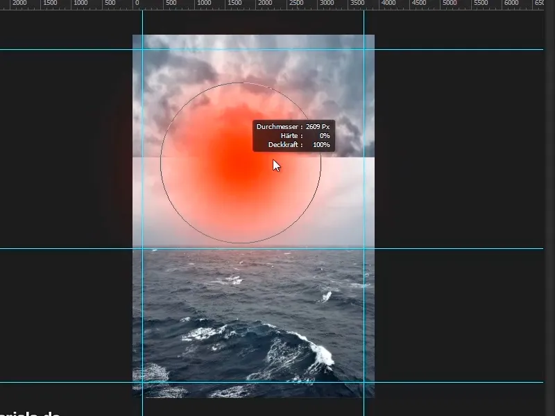
Step 26
In this case, use a soft brush, about the size of 1909 Px. Then go over the mask with black foreground color. You can also change the opacity a little.
Zoom into the image a little, click in with the brush and blend the different skies together. It can be a little foggy at the back of the horizon, as is often the case in reality when something is further away.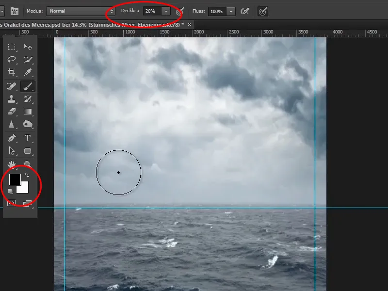
Step 27
Now zoom out of the image until it is completely visible, or double-click on the hand in the left-hand function bar. This scales the image so that it is fully visible. Double-click on the magnifying glass to get a 1-to-1 resolution.
With Ctrl+, (comma) you can hide and show the guide lines.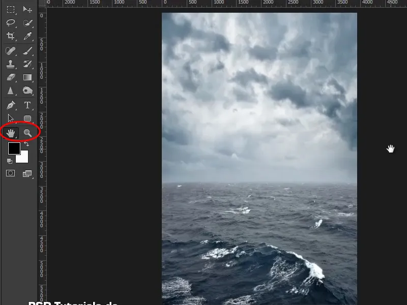
Step 28
This is already a pretty good result - beautiful horizon, beautiful sky, beautiful sea. And now you can move on to the next tutorial.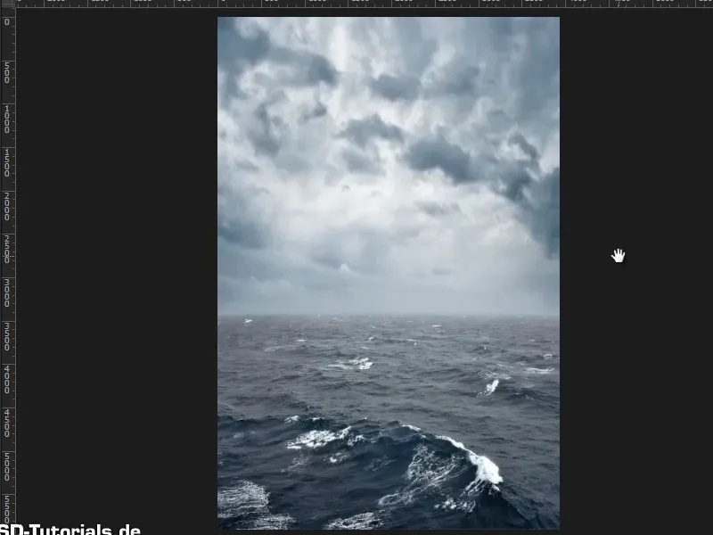
End of the first part
Oracle of the sea
