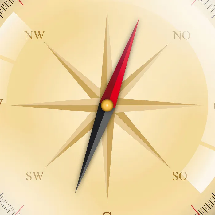
You have already created a large part of the Kompass and are now ready to take the final steps to complete your design. In this section, we will focus on refining the compass with reflections and giving it a realistic shadow. Through these last work steps, your compass will not only be aesthetically pleasing but also appear authentic. Let's implement these final touches together.
Key insights
- Reflections and shadows significantly contribute to the visual depth of your design.
- By applying gradients, you can create color transitions that enhance the appearance of your compass.
- The Pathfinder is a powerful tool for creating and editing complex shapes.
Step-by-step guide
To complete your compass in Adobe Illustrator, follow the steps below.
1. Setting a note on the reflections
First, it’s about setting up the reflection layer. To ensure that the reflections are placed accurately, you should select the corresponding layer.
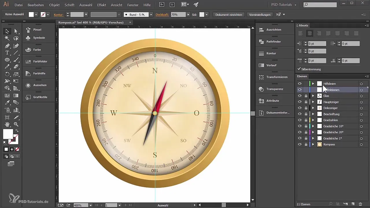
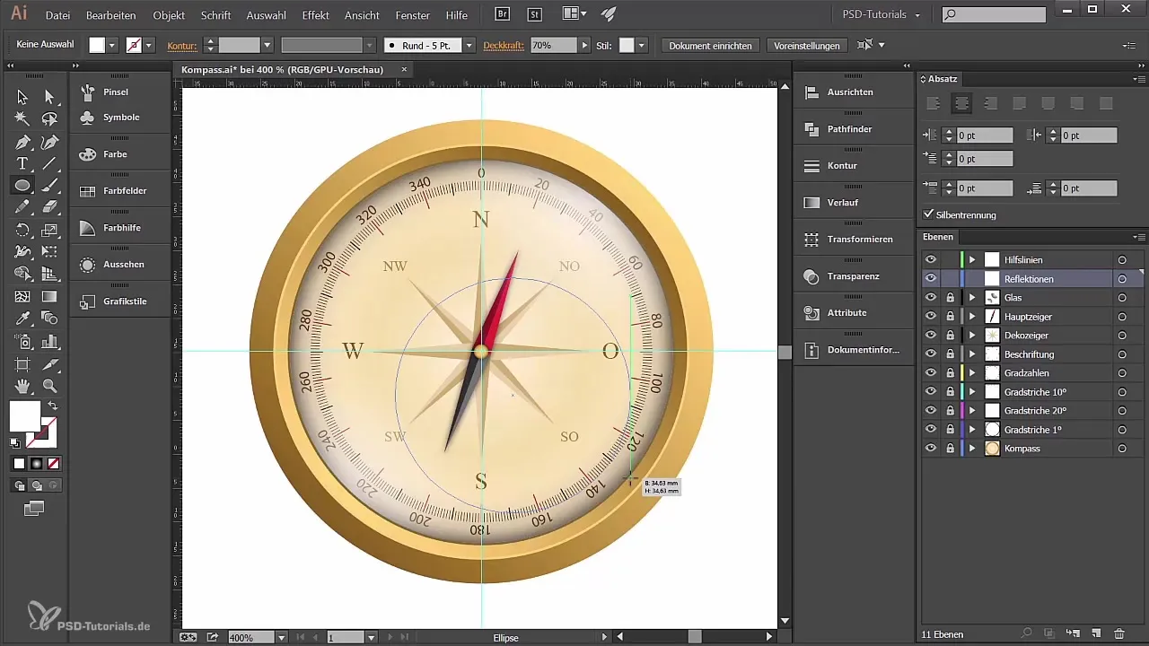
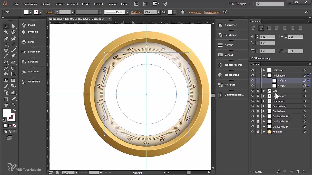
The reflection is then created using the Ellipse tool. Draw a circle approximately the size you need for the reflection and make sure it is centered below the degree markings of your compass.
You can now take care to scale the circle so that it meets your expectations and sits in the right place.
2. Copying and positioning elements
To create a copy of the circle above your original, press the Control and F keys simultaneously. The copy will be generated directly above the original. Then reduce the size of the copy.
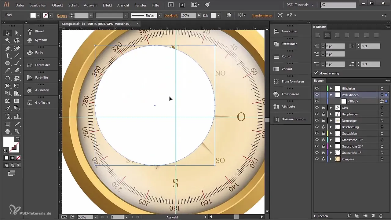
Now both circles are active, and you can use the Pathfinder to subtract the smaller shape from the larger one. This is done through the Pathfinder and the function “Subtract Front Object.” This gives you a ring, which forms the basis for your reflection.

3. Splitting shapes
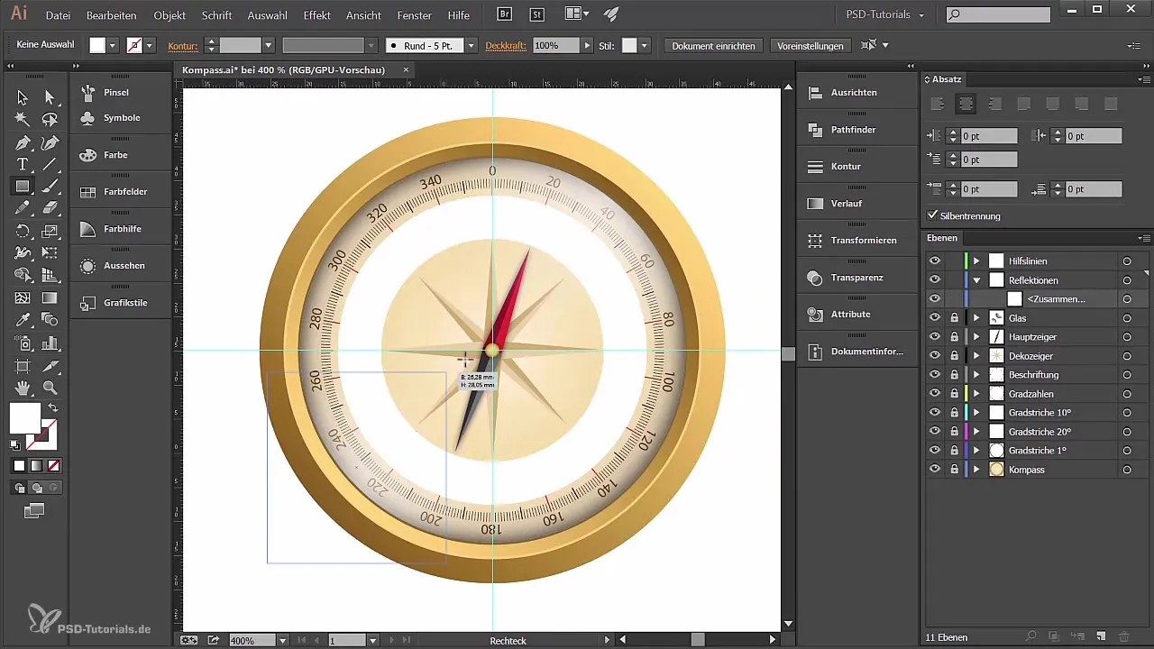
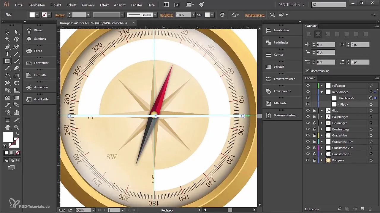
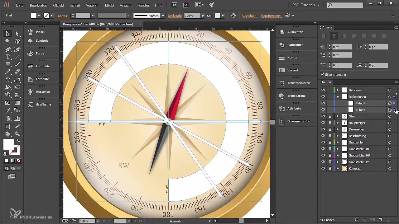
Now the ring is further processed using the Rectangle tool. Place some rectangles on the ring shape. Then select both shapes and again use the Pathfinder to subtract the front object, so that the ring shape is split.
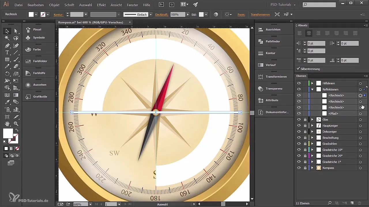
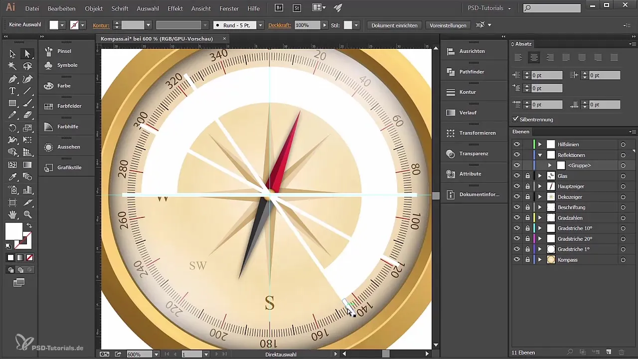
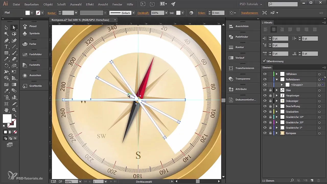
Draw smaller rectangles, place them in the center, and make copies of these rectangles. Rotate them as desired to give the shape variety before selecting them all and merging them into a single shape again using the Pathfinder.
4. Creating a gradient
Now, before adding color, it's wise to ensure that the areas are united into a coherent object. This is easily done via “Object” and “Create Compound Path.”
For the gradient, go to the gradient options and select a radial gradient. You want the colors to transition from black to white, so adjust this gradient to fit your compass shape.
Additionally, you can change the transparency of the areas to achieve an even softer look.
5. Shadow beneath the compass
To give your compass a realistic shadow, create a new layer specifically for it and name it “Schatten”. Draw an ellipse beneath the compass that will represent the shadow shape.
For the shadow enlargement, create copies using Control C and Control F, which you can then lower further. Give them a gray tone so they do not stand out too much.
All the paths you have created can now also be aligned together to create a clear shadow gradient.
6. Final touches and last adjustments
With the shadow in the right position, you can further adjust their transparency to achieve a realistic effect. Consider whether you want to adjust the shadow color a bit to get the best look for your compass.
If you have followed all the steps, your compass will be visually appealing and ready for presentation.
Summary
You have now learned how to bring visual depth to your compass design through targeted reflections and the addition of a shadow. The use of the Pathfinder and gradients was crucial in achieving a harmonious overall image.
Frequently Asked Questions
What is the Pathfinder in Adobe Illustrator?The Pathfinder is a tool that allows you to combine, split, and adjust shapes.
How do I create a gradient in Illustrator?You select the object and go to the color picker tool to create the gradient.
Can I edit my work later?Yes, as long as you haven’t rasterized the objects, you can edit them at any time.
Why is transparency important for my shadow?Transparency creates a more realistic shadow effect that is less intrusive.
What should I consider regarding the colors?Ensure that the colors harmonize well and do not impair the visibility of the compass.
