The second tutorial in this series focuses on the effective design of a lens in Adobe Illustrator. You will learn how to add shadows to create depth, place text along a ring, and adjust the lens color to achieve a realistic appearance.
Main insights
- Quick and effective creation of shadows for plastic effects
- Placement of text along a curve
- Basic color design for an appealing design
Step-by-step guide
Adding Shadows
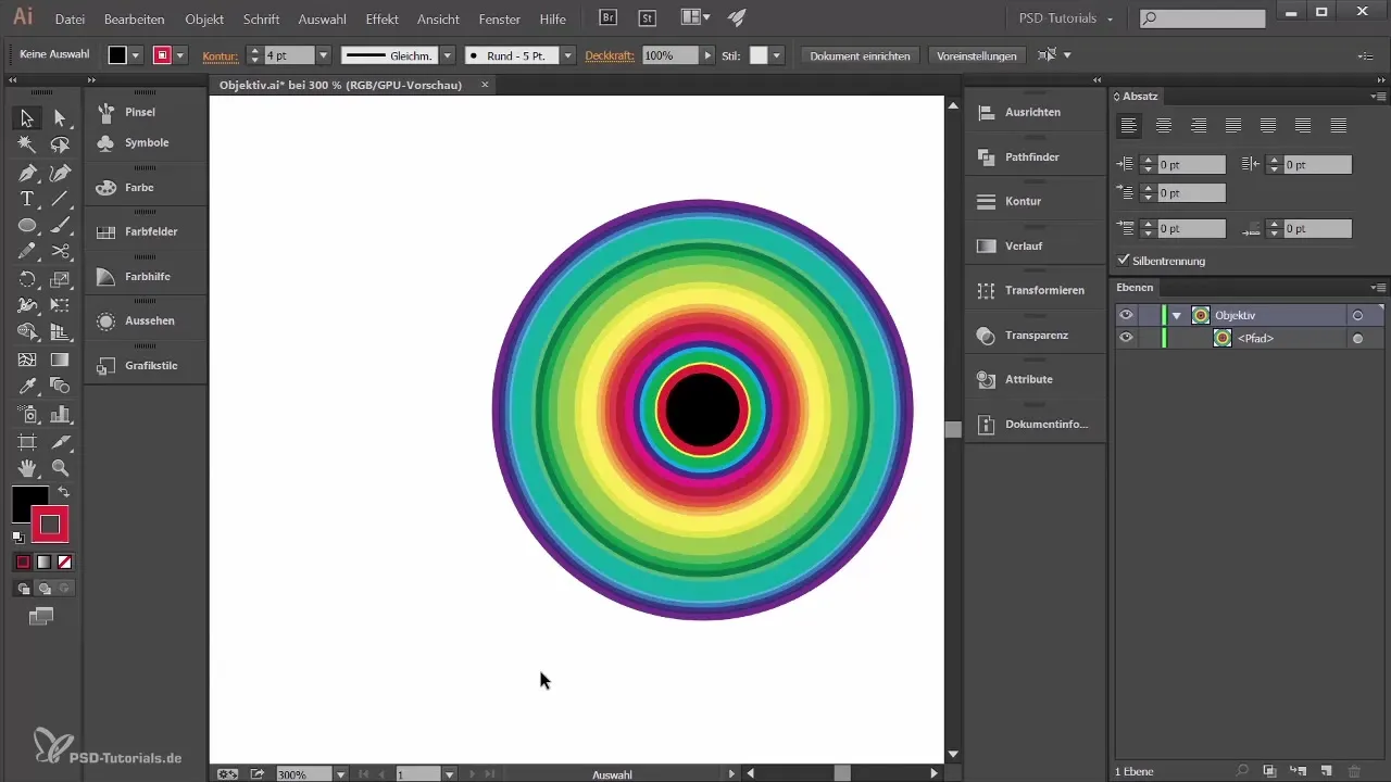
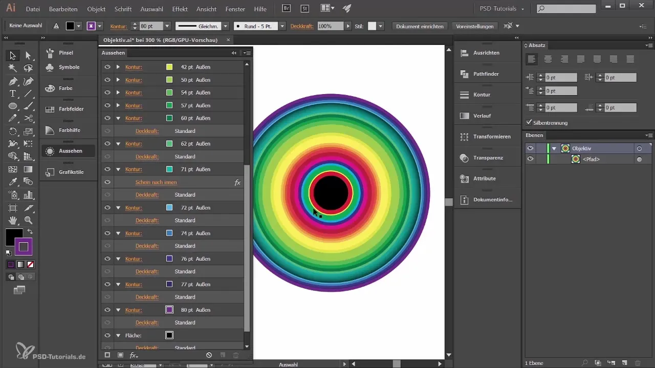
To give your representation more depth, you start throwing shadows on the outer rings of the lens. Select your circle and open the Appearance palette. There you can see the current strokes. After hiding them, you’ll find the desired stroke to efficiently design the shadow.
Select the stroke and go to the FX menu to apply the stylization filter. Click on Inner Glow. By default, the option might be set to multiply, which creates a light glow. To effectively design the shadow this way, select the mode to Multiply and set the opacity to 75% as well as the blur to 3 mm. Confirm your selection to generate the shadow.
Placing Text along a Ring
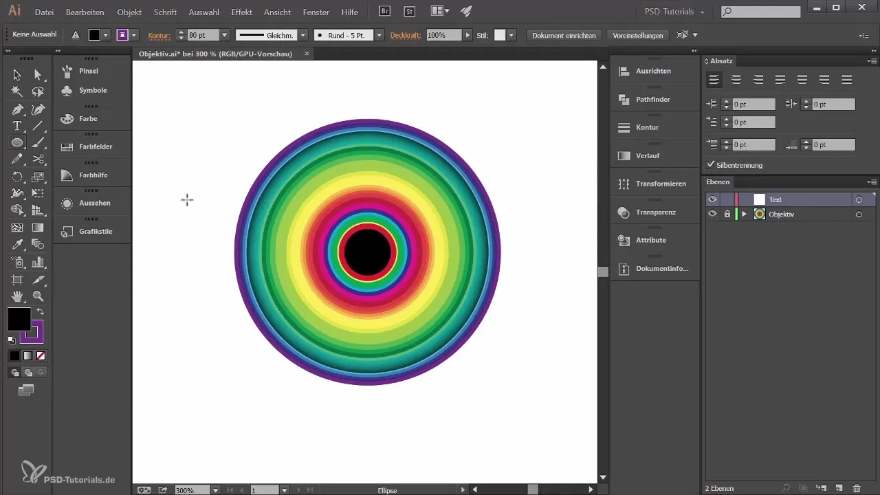
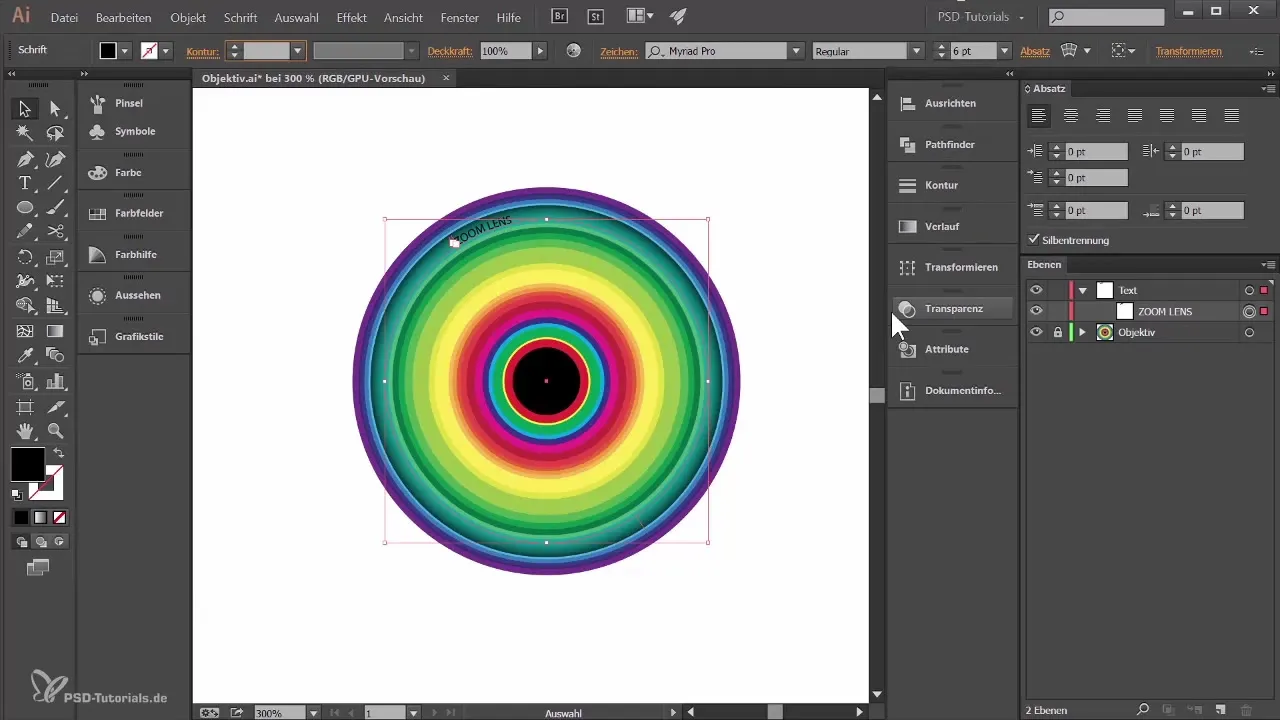
Before you start with the text, create a new layer and rename it to "Text". Click on a free space to lock this layer so that you do not accidentally change the lens. Now use the Ellipse tool to create a new circle that the text will follow. Set both the fill and stroke of the circle to transparent and draw the circle out.
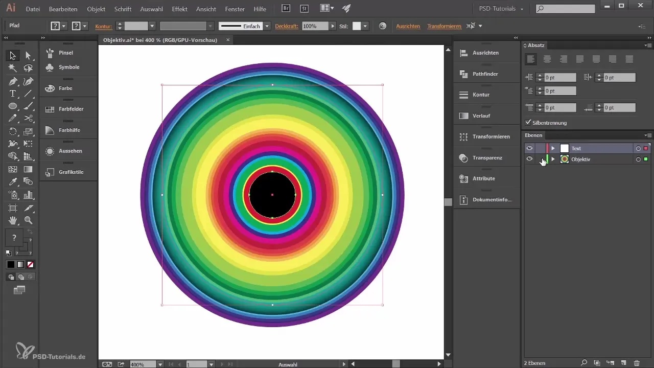
To ensure the text is placed correctly, select both circles – the one on the text layer and the actual lens. Use the Align function to perfectly align the centers. Click on “Align Horizontal Centers” and “Align Vertical Centers” to ensure that both circles are exactly superimposed.
Lock the lens again and select the Text tool. When the cursor approaches the circle, it will change. Click to place the text and type, for example, “Zoom Lens”. Adjust the text size and use the Transparency palette to set the mode to Overlay, so the text is harmoniously embedded in the design.
Color Design of the Lens
Now it’s time to further develop the color of the lens. First, lock the text layer and introduce the colors of the outer rings. Select one of the rings and open the Appearance palette. Here you can see the current stroke and fill. To work with a gradient, go to the Gradient palette and choose a suitable gradient. Make sure you are on the fill, not the stroke.
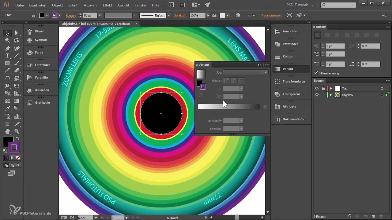
Design the gradient with a darker gray on one side and a lighter gray on the other side. Rotate the gradient slightly to make the design more dynamic. When you edit the next ring, you can come back to this approach and adjust the shades accordingly.
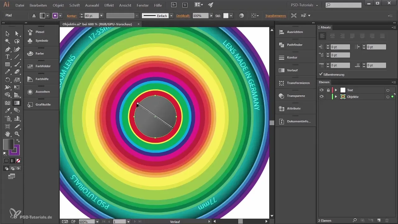
Apply the same principles to the other rings so that some appear darker and others lighter. Experiment with the angles of the gradients to create interesting interactions between the rings. A variation in the color design gives the lens a more appealing, three-dimensional appearance.
Final Touches
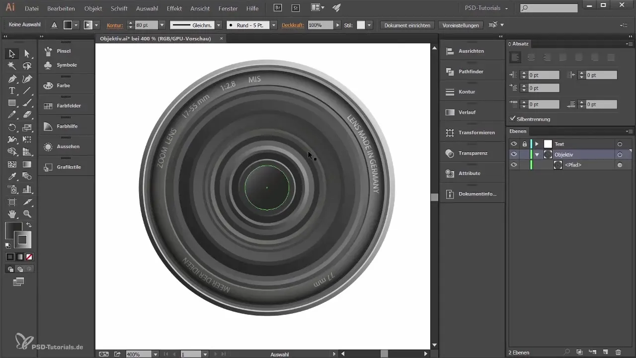
After adjusting the colors and adding gradients, you will see the result of your work. Make sure that all rings are well coordinated to achieve a clean and appealing overall look. Create orderly gradients and ensure that the reflections and shadows are in a harmonious relationship to make the lens look realistic.
Summary
In this guide, you learned how to effectively add shadows, place text along a ring, and make color designs to create a realistic lens.
Frequently Asked Questions
How do I add a blur effect?Select the stroke, go to FX, and then to Stylization filter to choose the effect.
Can I change the text later?Yes, that is possible at any time by selecting the Text tool and editing the desired text.
How do I adjust the gradients?Go to the Gradient palette and change the colors accordingly to achieve the desired effect.
Can I add more effects?Yes, Adobe Illustrator offers many other effects that you can access via the FX menu.
Do I need to lock the layers?Locking the layers helps you avoid unwanted changes to your design.


