Welcome to this detailed guide to split toning in Lightroom Classic CC! In this tutorial, you will learn how to give your images a unique color style with split toning. Split toning allows you to selectively tint different brightness ranges of your photos. The result is stunning images that convey more life and expression. Let's dive right in!
Main Insights
- Split toning allows for targeted coloring of highlights and shadows in an image.
- Complementary colors can be used to create balanced color compositions.
- By using the balance slider, you can control how strongly the bright or dark areas of the image are colored.
Step-by-Step Guide
Step 1: Image Preparation
Before you can start split toning, you need to choose an image that has different brightness ranges. Make sure your image has highlights and shadows that allow for selective coloring. Once you have a suitable image, import it into Lightroom and open it in the Develop module.

Step 2: Access to Split Toning
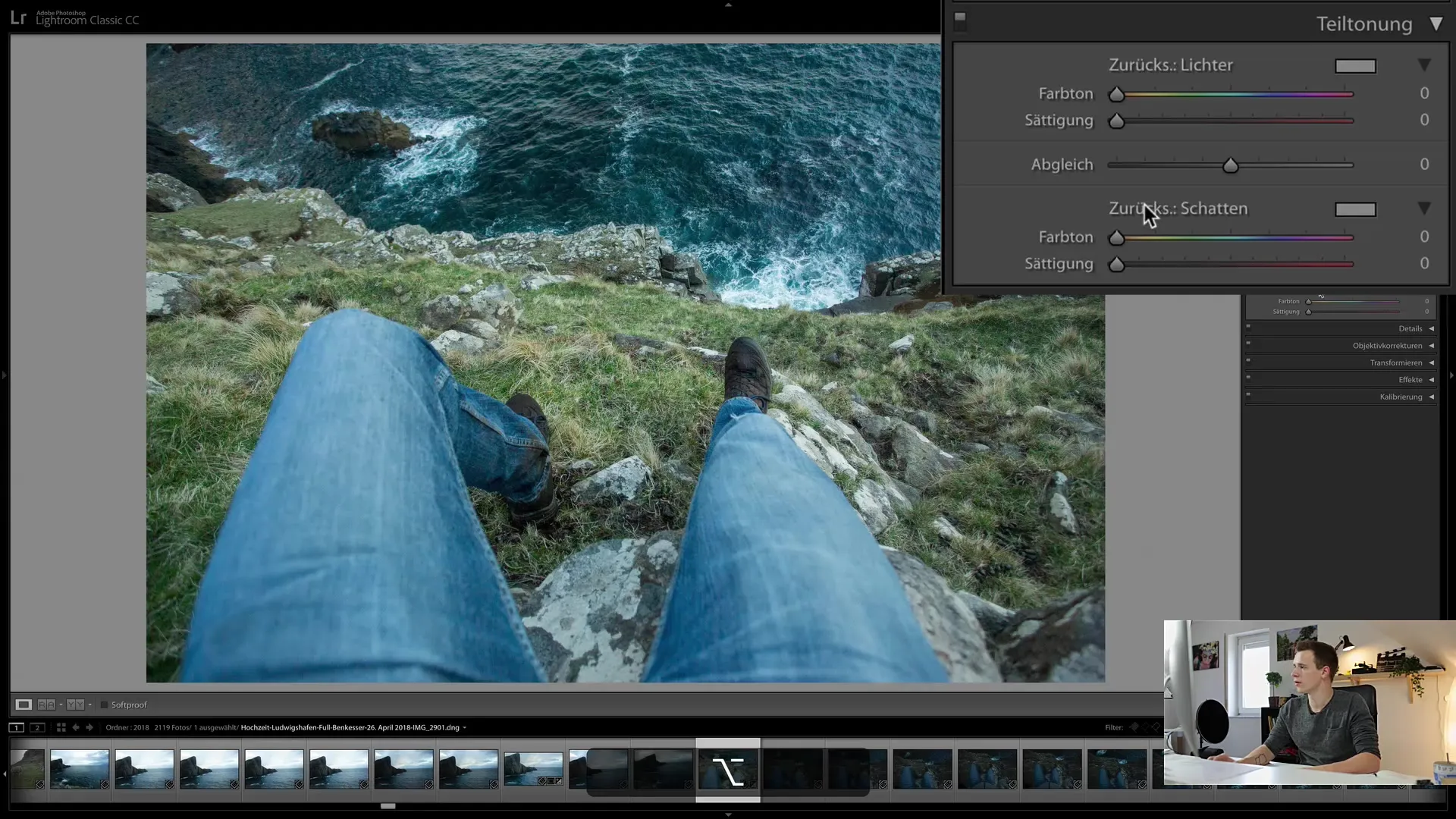
In the Develop module, you will find the "Split Toning" function, divided into "Highlights" and "Shadows" sections. Here you can independently adjust the coloring for both areas. Click on the respective sliders to start adjusting.

Step 3: Coloring Highlights
To color the highlights, hold down the Alt key and move the hue slider. This will immediately show you how the image is colored by moving the slider. Choose a hue you like—for example, a warm orange for an inviting mood.
Step 4: Adjusting Saturation
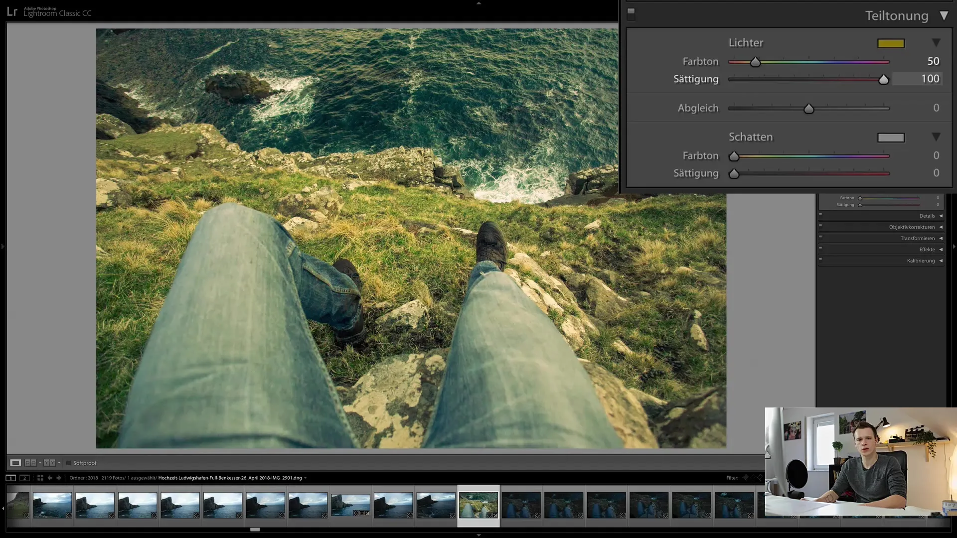
After selecting the desired color for the highlights, you need to adjust the saturation. Move the saturation slider up to increase the intensity of the color. Set it to a value of about 50% to achieve the desired look.
Step 5: Coloring Shadows
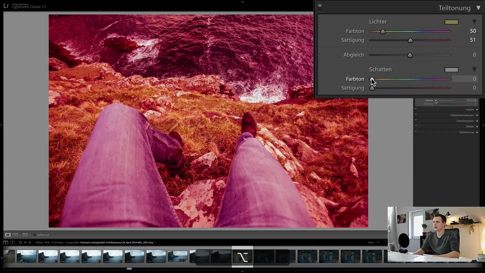
Now it's time to work on the shadows. Proceed similarly by adjusting the shadow slider. Make sure to choose a complementary color to create a harmonious contrast with the highlights. This creates balance in your image.
Step 6: Using Complementary Colors
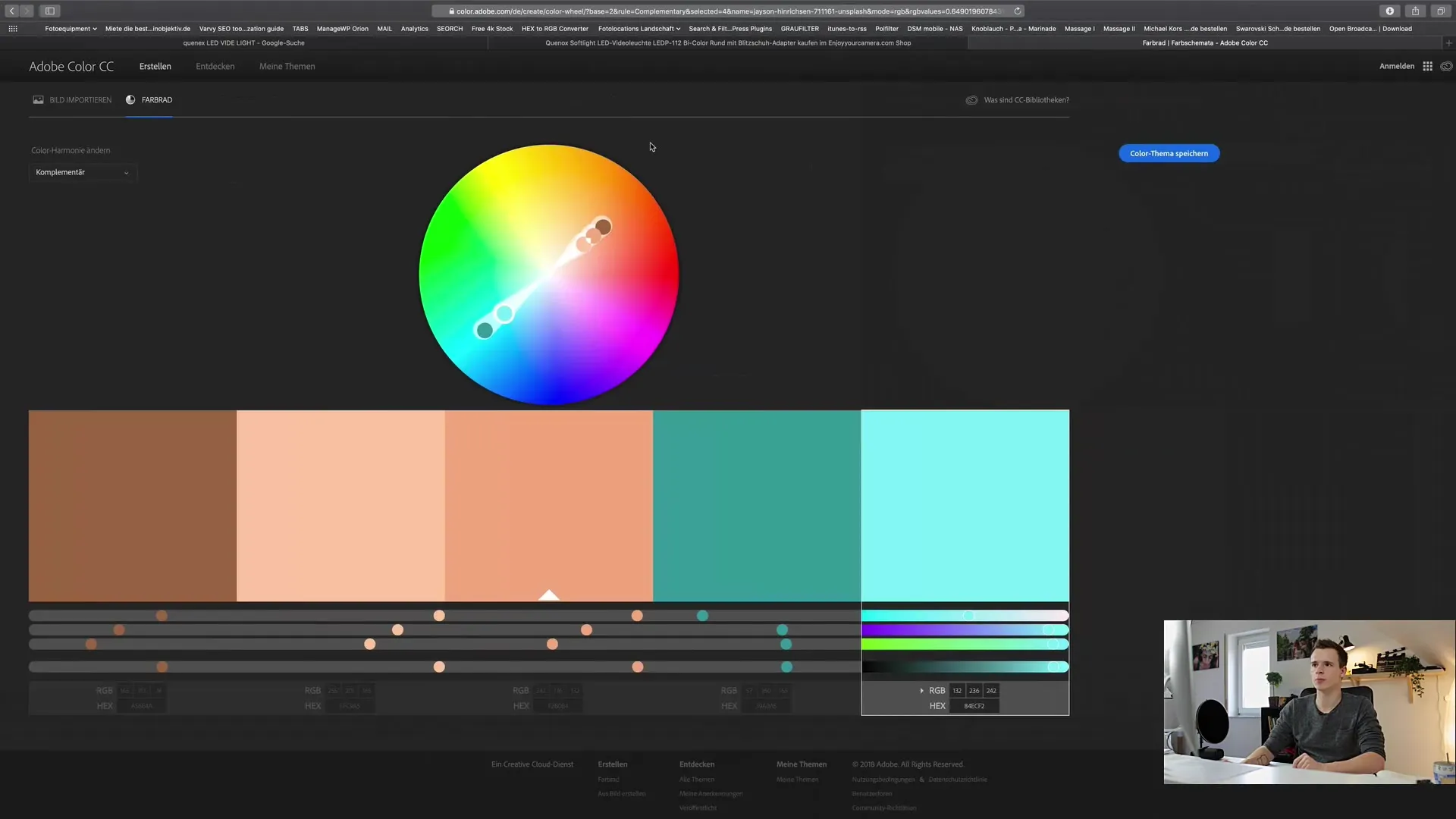
To ensure you are using complementary colors, you can use tools like color.adobe.com. There you will find color palettes to help you find the best color combinations. For example, choose a slightly bluish hue for the shadows to achieve a harmonious overall effect.
Step 7: Using the Balance Slider
The balance slider is an important tool to influence the relationship between the bright and dark areas of the image. Drag the slider to the right to color more of the bright areas or to the left to focus on the dark areas. Experiment with different settings to achieve the best result for your image.
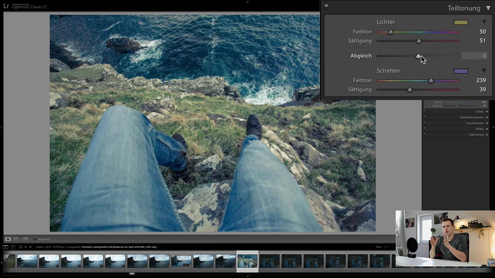
Step 8: Final Touches
After adjusting the colors, you should fine-tune the saturation of both areas a bit. It is important that the colors are well balanced. Make sure they are not too dominant but rather enhance the mood of the image.
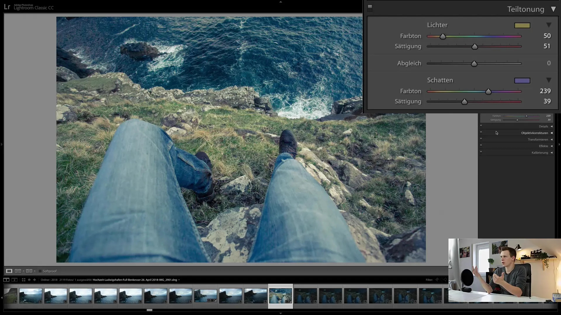
Step 9: Save Style
If you are satisfied with the result, you can save the new image style as a preset. Click on "Create Preset" to save your settings for future projects. This saves time and allows for consistent coloring in your work.
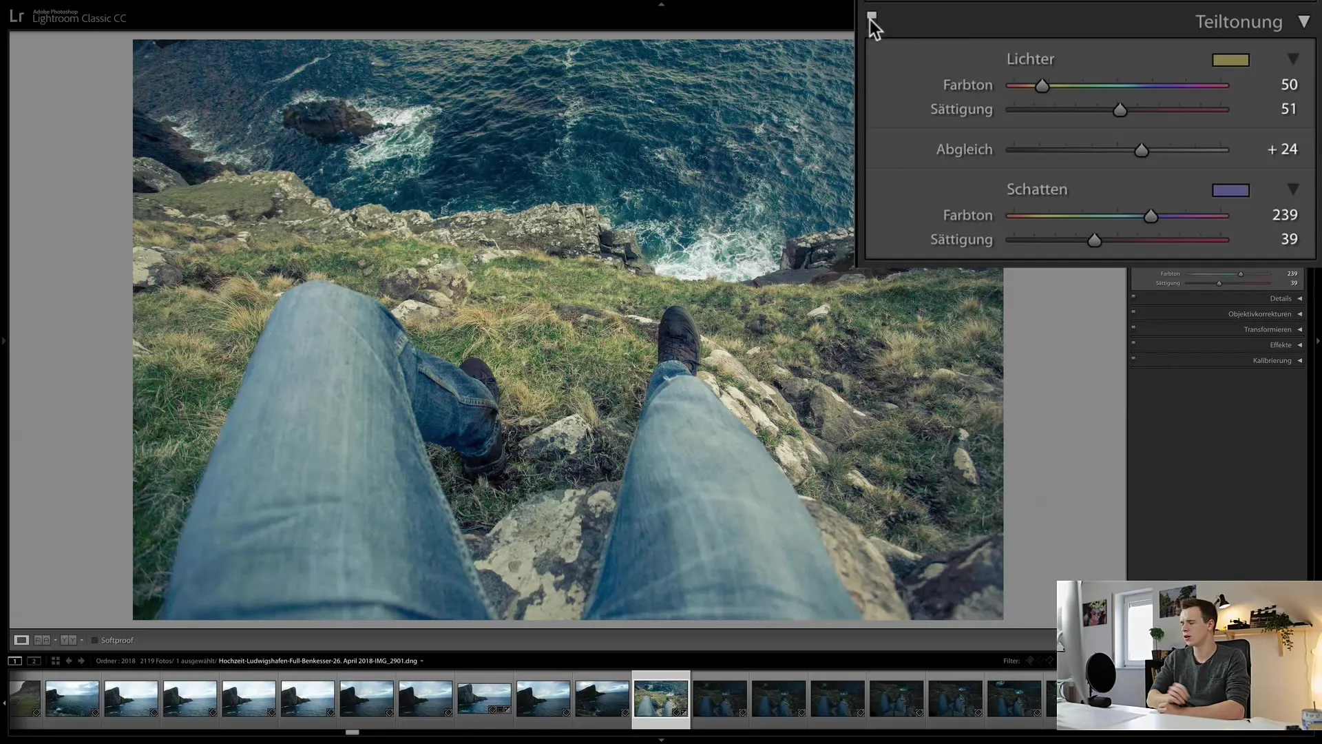
Step 10: Review Success
Now, take a look at your edited image as a whole. You will notice that the split toning gives your image a unique character and sets it apart from other photos. With a little practice, you will quickly discover how to make the most out of split toning.
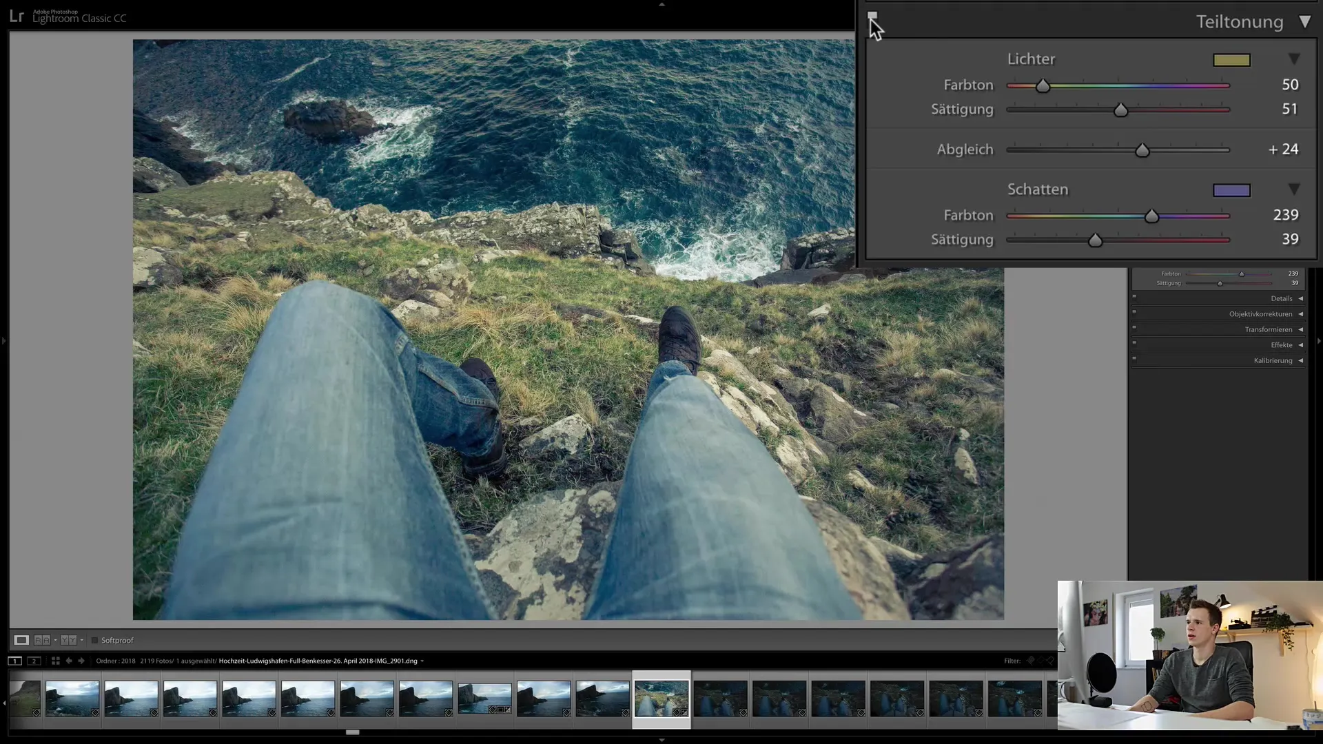
Summary
In this guide, you have learned how to effectively use split toning in Lightroom Classic CC to bring life to your images. You can colorize highlights and shadows individually, creating a unique image style. Using complementary colors and the balance slider, you can fine-tune the color composition and give your images a special expression. Save your settings as presets to work more efficiently in the future.
Frequently Asked Questions
How does split toning work in Lightroom Classic CC?Split toning allows you to selectively color different brightness ranges in an image by defining hues for highlights and shadows.
Can split toning be applied to black and white images?Yes, split toning can also be applied to black and white images to add a color tint that changes the mood of the image.
How can I find complementary colors?Complementary colors can be found using tools like color.adobe.com, which provide color palettes.


