Creating animal surfaces in digital artworks requires precise technique and a good eye for detail. In this guide, you will learn how to transfer the scales of a fish onto a hand to create a realistic texture. Special attention is given to the symmetrical and ordered structures of the scales. First, we will look at the differences compared to more chaotic textures before focusing on the specific implementation of fish scales.
Main insights
- Familiarize yourself with the basic structures of scales.
- Use different hues to create depth and variation.
- Make sure to adapt the scales to the shapes you paint in order to achieve a realistic result.
Step-by-step guide
Start with the basic shape
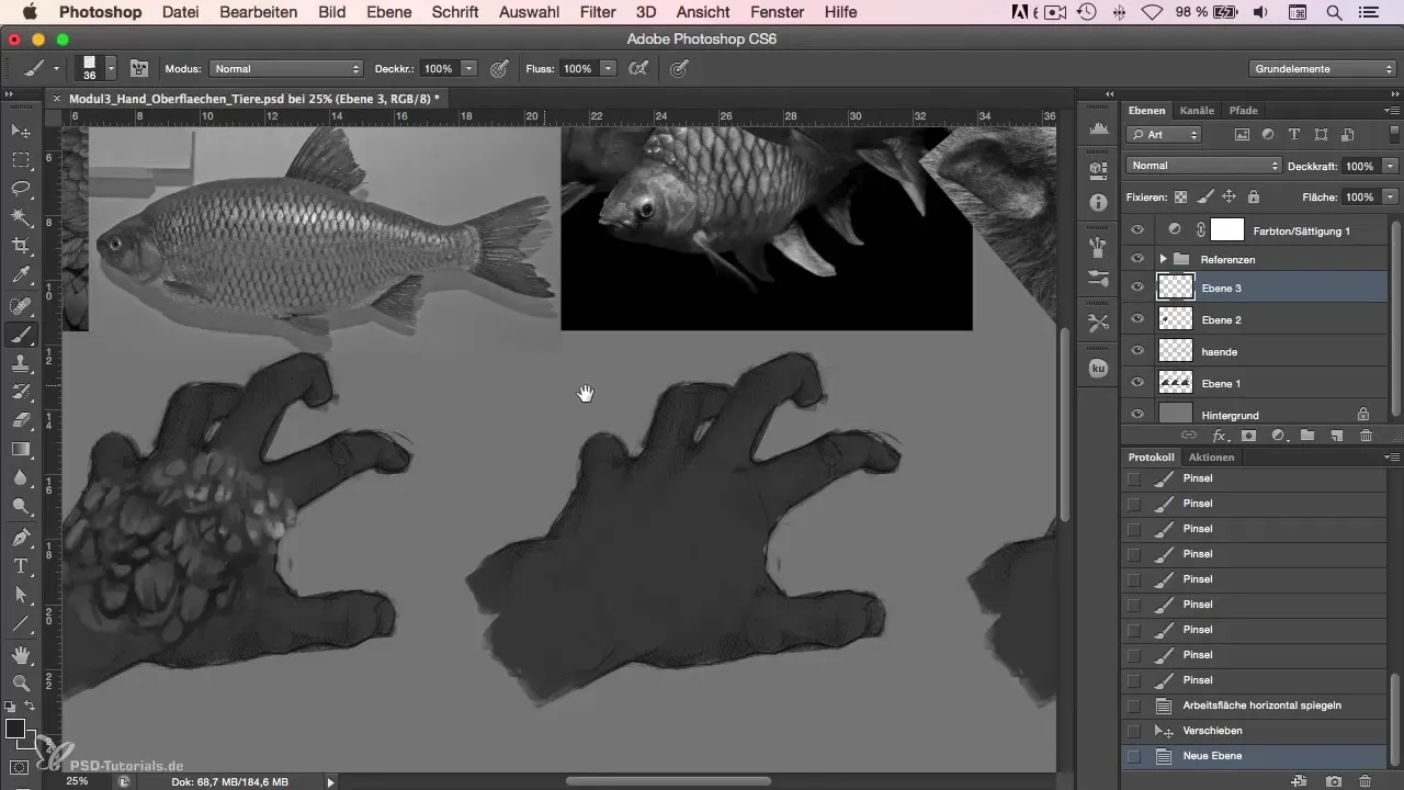
To design the fish, start by creating a basic shape. This means drawing a rectangle that will serve as the base for the texture of your scales. It’s important to choose a simple sketch that will be refined later on.
Construct the scale structure
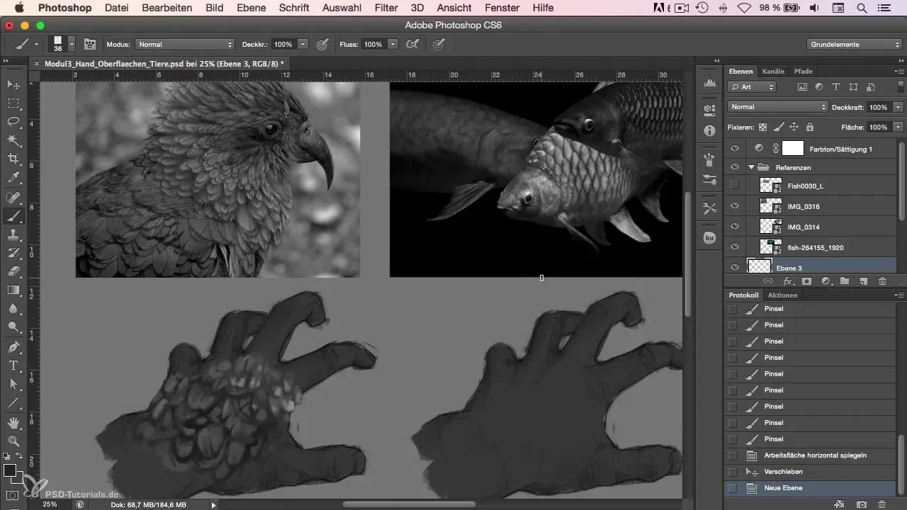
Now it’s time to construct the scales. The scales of a fish are symmetrical and ordered, which makes the task a bit more complex. You can arrange the scales along the shape so they transition naturally into each other. Be careful not to place the scales too close together, as this may create a chaotic appearance.
Incorporate variation
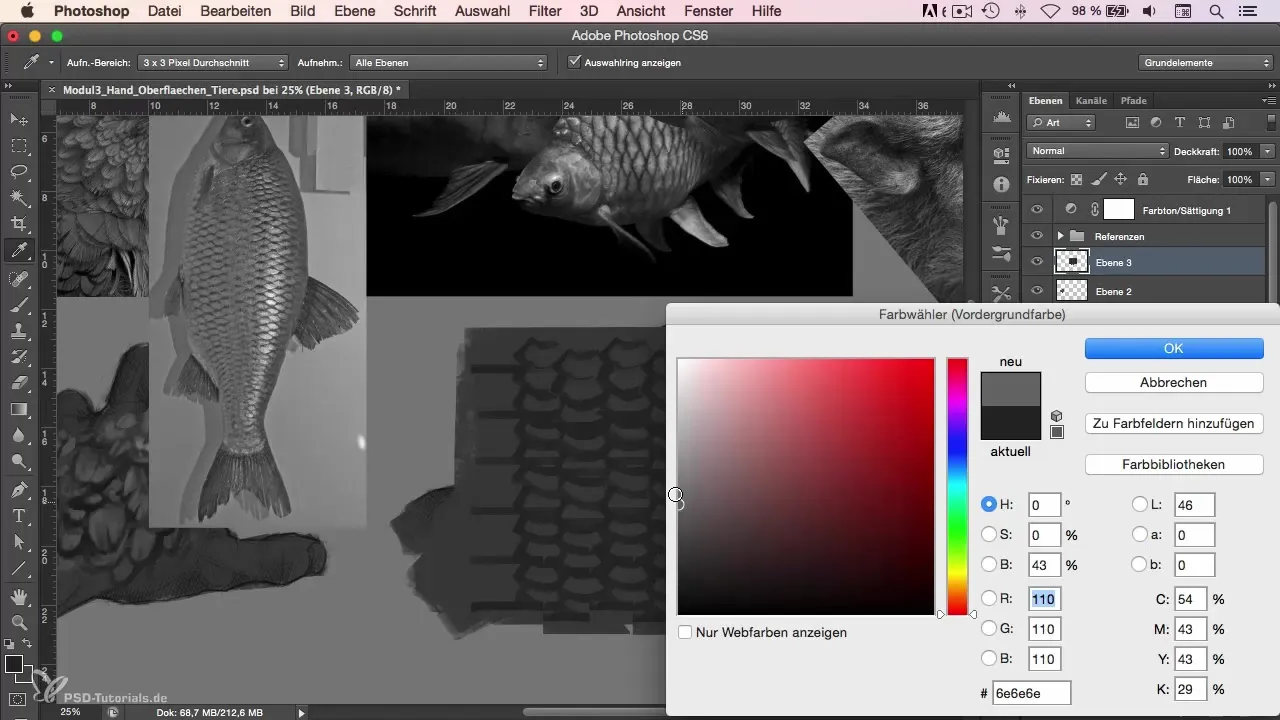
To make the scales appear more vibrant, I recommend working with different hues. At the beginning, you can choose a base color and then vary it. By not always using the same hue and incorporating variation, you will achieve a more natural look.
Consider brightness and shadows
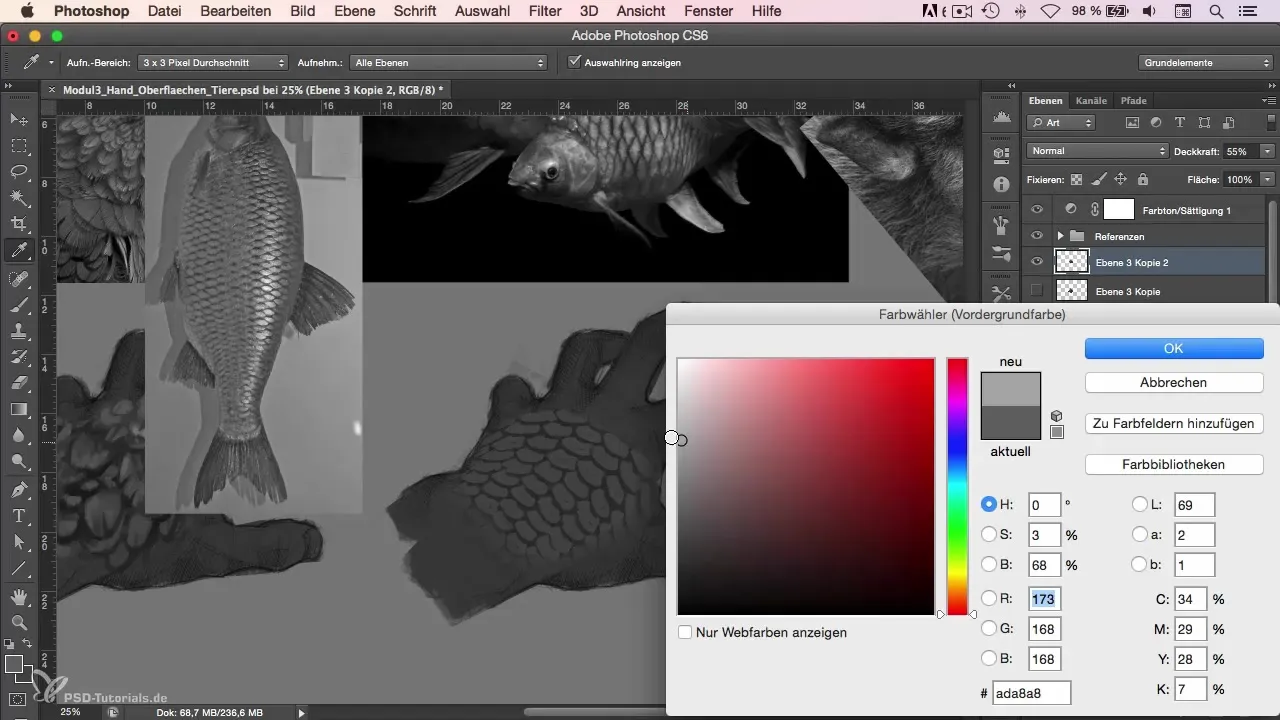
Now it’s time to go over the scales with a lighter color to add highlights. Place reflective points to simulate the light hitting the scales. These highlights give the scales more depth and dimension, making them appear more lively.
Apply distortions
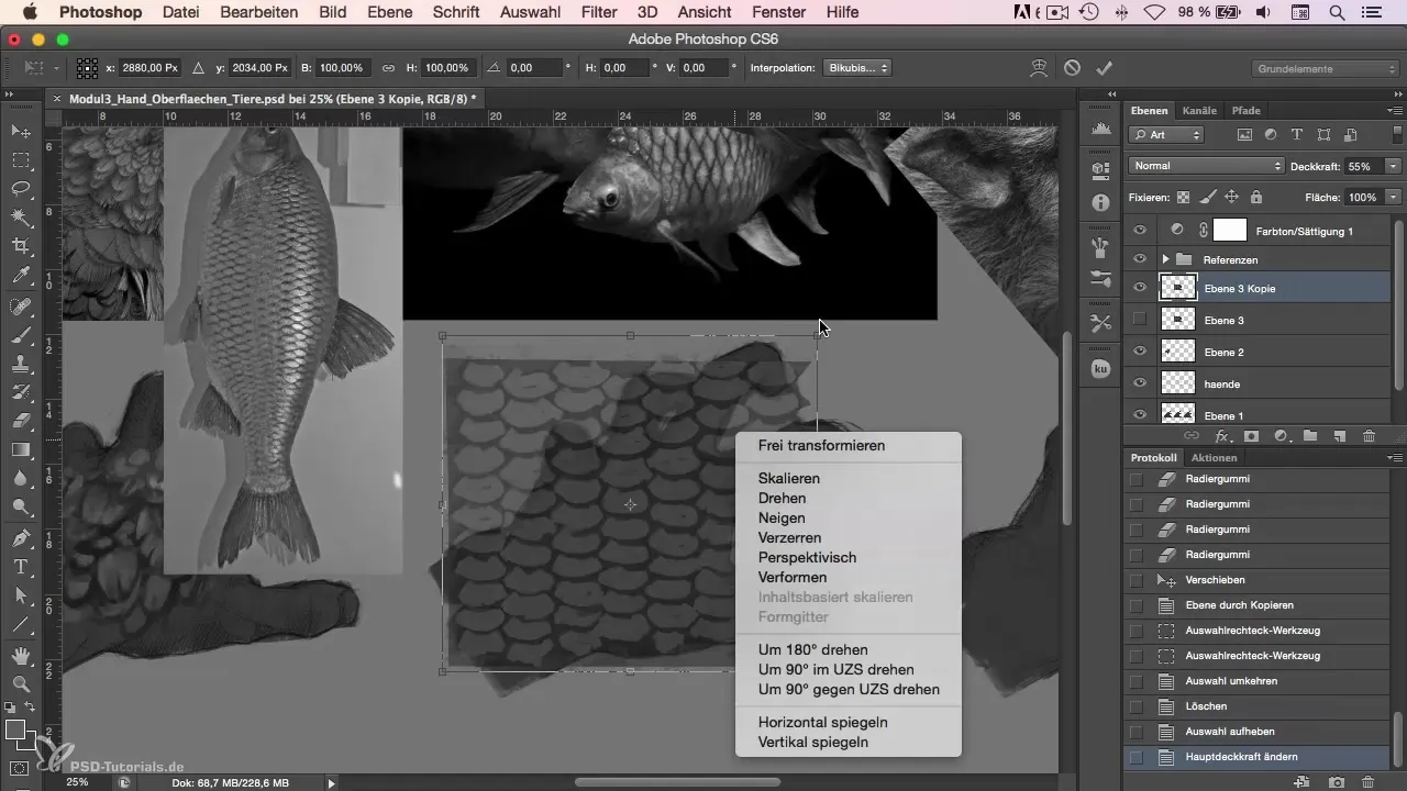
You should also consider the aspect of distortion. Regarding the shape you are painting, it is important that the scales are adjusted accordingly. You can use the warp function to fit the scales to the contours of the hand. It is important to edit the edges so that the scales do not look too sharp and are more integrated into the given shape.
Highlight the highlights
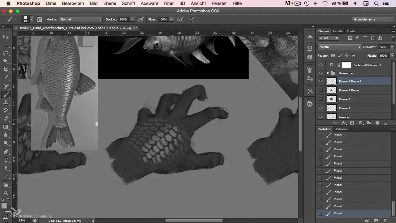
To further refine the representation, you can additionally draw small stripes into the design that emphasize the various light reflections of the scales. These stripes should be subtle to not disturb the natural flow and texture.
Final touches and revision
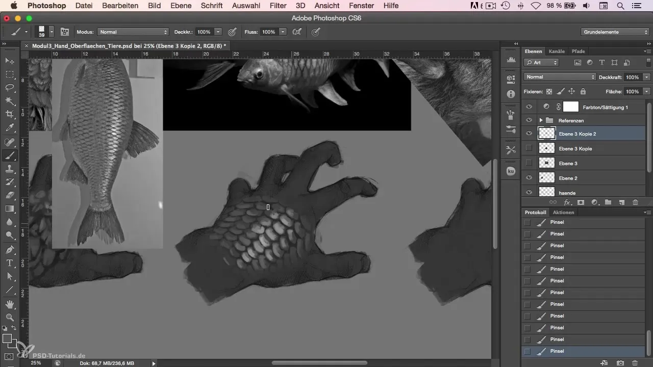
After establishing the basic structure of the scales, it is advisable to review all parts once more and refresh them if necessary. Some color nuances could be revised to make the previous distortion and the 2D beginnings less obvious.
Completion of the scale
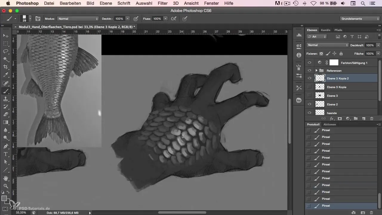
In the end, you should take a complete look at your artwork and ensure that the scales appear as you envisioned them. Make sure that the scales are placed correctly and support the shape of the hand. Small details like dark-colored points can be added to emphasize details and make the scales appear more lively.
Summary
In this step-by-step guide, you learned how to create scales on a digital hand in Photoshop. You analyzed the structure of the scales, worked with various hues, and considered the application of light and shadow.
Frequently Asked Questions
How do I start drawing scales?Start by creating a basic shape and arranging the scales symmetrically.
Which color variations are best for realistic scales?Use different shades of the base color to create depth and variation.
How do I achieve impressive highlights on the scales?Place bright points to simulate light reflections and give the texture more depth.
What are the best tools in Photoshop for designing scales?Use the shape tools along with warp functions and brush strokes for details.
How can I adapt the scales to different shapes?Use the warp tools to adjust the scales to the contours of the substrate.


