In this tutorial, I would like to show you how to create your own poster in Adobe InDesign. You should end up with a similar result - depending on which graphic elements and font you use.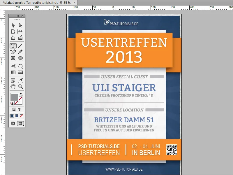
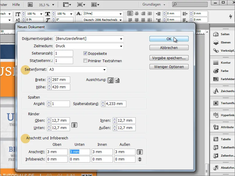
You can start by creating a new document. Select A3 size from the drop-down field for the page format and, if the document is to be professionally printed later, set a suitable value under bleed. This is usually around 3 mm; you can find this out from the printing company.
Next, you can insert the logo and the name of the page, for example. You can place a file (image) with Ctrl+D . Select a suitable graphic file for the import and then drag it to the size required.
The logo should not appear as dominant as you might expect. That's why you can barely make it out on the light background so far. The logo is also supplemented by a text area for the name. Conveniently, this can be drawn right next to it using the text tool. If you start directly next to the logo graphic, InDesign aligns itself with its dimensions and snaps the corner points to the object boundary of the graphic.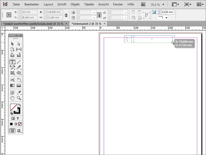
You can quickly zoom into the document with Ctrl++. Select a suitable font for the poster. Arial Narrow was used in the example. However, the font should not be at the top left, but further down or in the middle of the text box. Therefore, switch to the selection tool.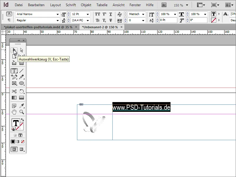
The text box is now actively selected and the formatting options for this text area appear in the options bar. There you can also influence the position of the text and position it vertically centered or at the bottom of the frame, for example.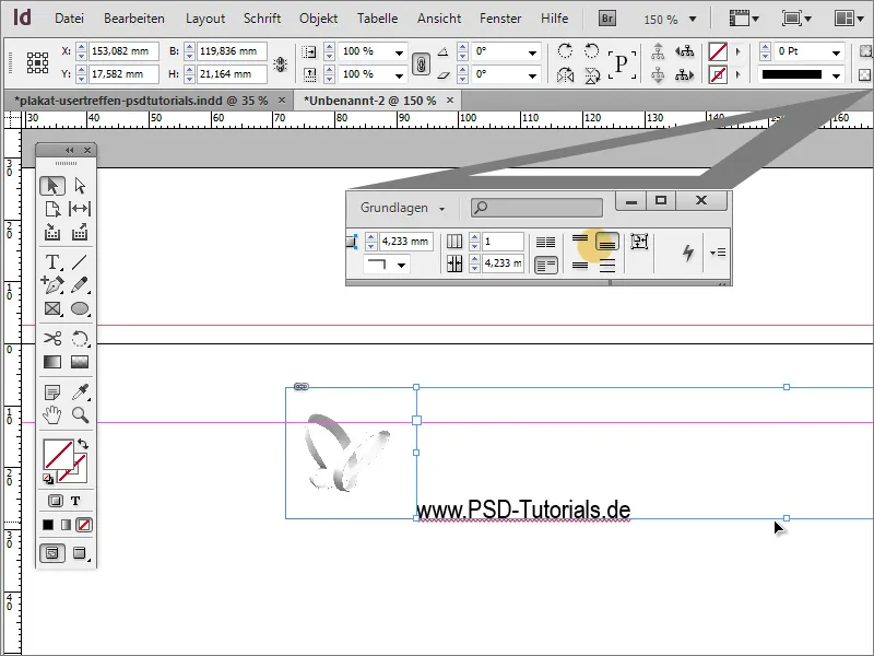
To make it easier to assess the effect of the text and logo, you can now place a fictitious background image in the document. For the time being, it is only used for visual support. To do this, simply use the rectangle tool to draw an area up to or beyond the bleed edges, color it with any color and position it in the background with Ctrl+O.
Now the text can first be recolored and enlarged to 26 points and changed to the Bold font style.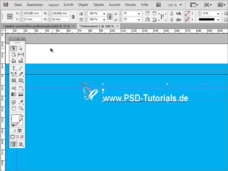
Next, you could center the content on the page at this point. To do this, you should align the background graphic exactly to the bleed edges. Once this has been done, both the logo and the name are selected by holding down the Shift key. If both are selected, you can select the option to group these elements via the context menu.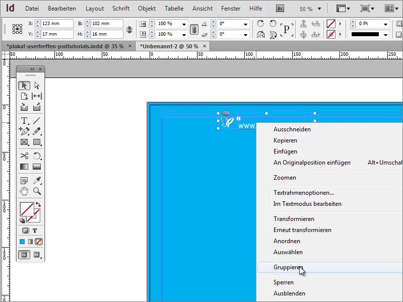
You can then move the object on the page. As soon as you cross the center axis, InDesign will show you this in the form of an alignment guide, which only appears when a strategic alignment point is reached near the object or based on the document dimensions.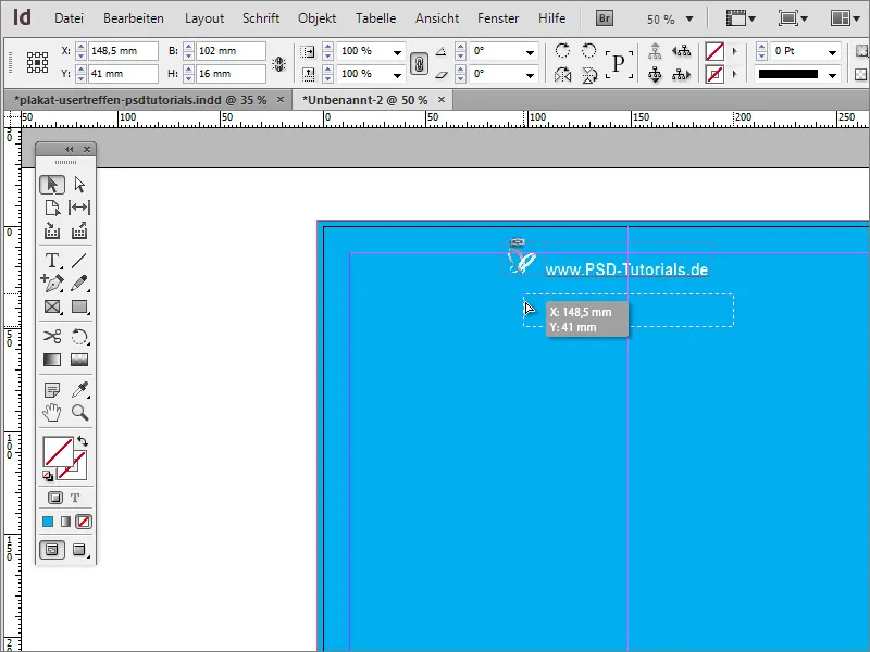
If you do not see any of these lines when moving the elements, it may be because they have not been activated for the document. You can set the display option via the View>Grid and guides>Intelligent guides menu.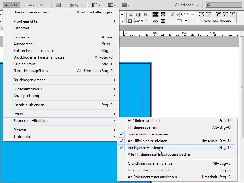
This option may not be available in earlier versions of the program. In this case, you can also align objects with another tool. To do this, call up the Align function under Window>Object and Layout.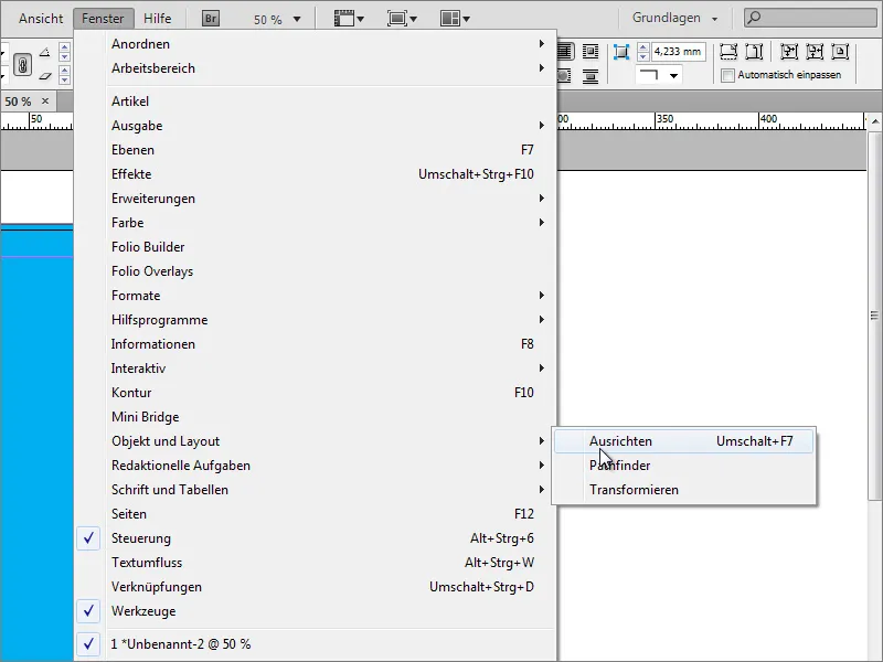
Now you need to select the objects that you want to align. In this specific case, that would be the background image and the group of logo and text. These two objects can now be aligned with each other. It is important that the background image has been fitted exactly on this page, as otherwise the group of logo and text can be centered based on the physical dimensions of the background image, but may not be in the middle of the page.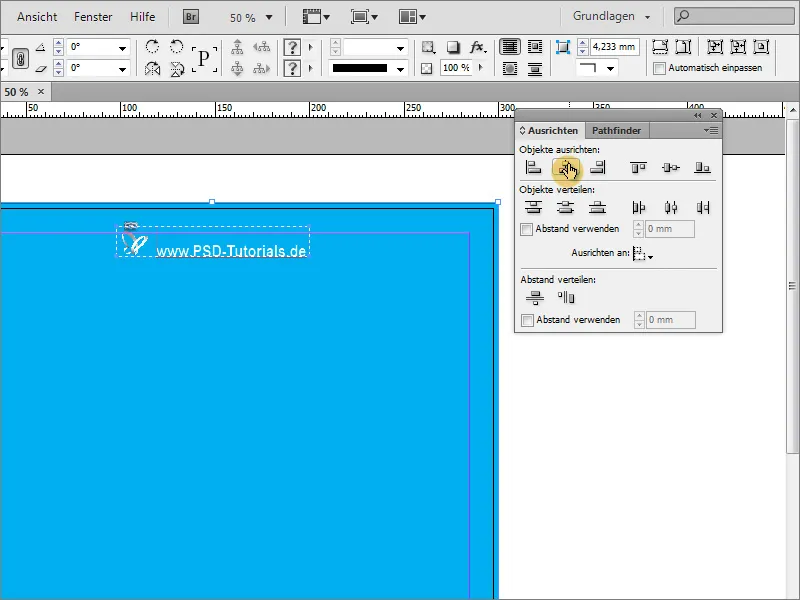
The background should now be expanded a little. A simple, colored background is not really appealing. You will need the polygon tool for this. To determine how many sides the polygon should have, first double-click on the tool. 3 sides are sufficient for now. No star shape is required, which is why this value should be set to 0 %.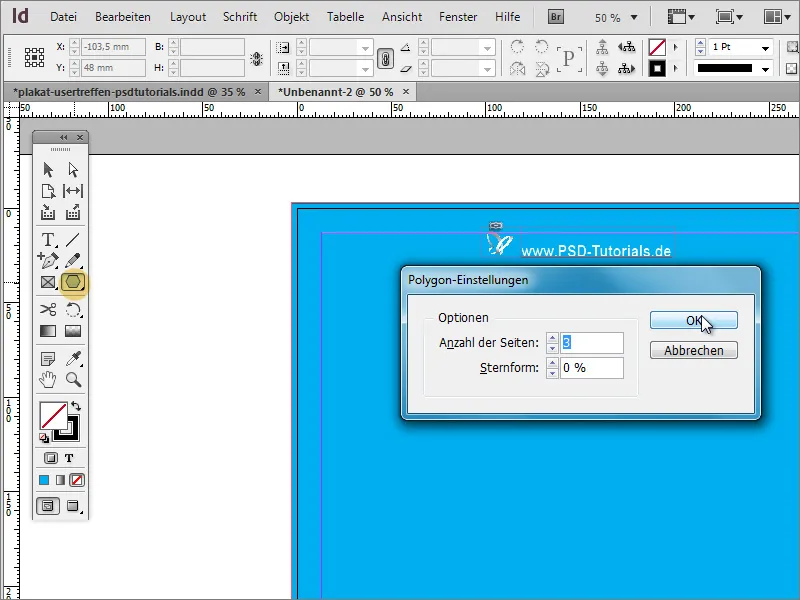
Then simply draw a triangle. This does not have to be particularly pretty as it is only an initial shape. It is best to color it in a clearly visible color - for example, white and without an outline.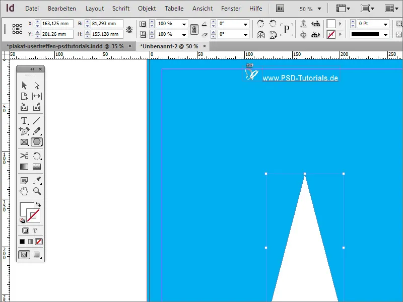
The triangle is still a little bulky at the moment. You can use the selection tool to make it narrower and longer.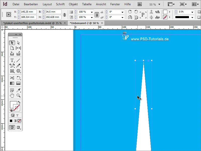
Now the object should be rotated. It is best to do this several times. Of course, you could create each individual copy manually. But that would be too much work. Select the object and move the center of rotation to the middle of the triangle tip. Then call up the Rotate entry under Object>Transform.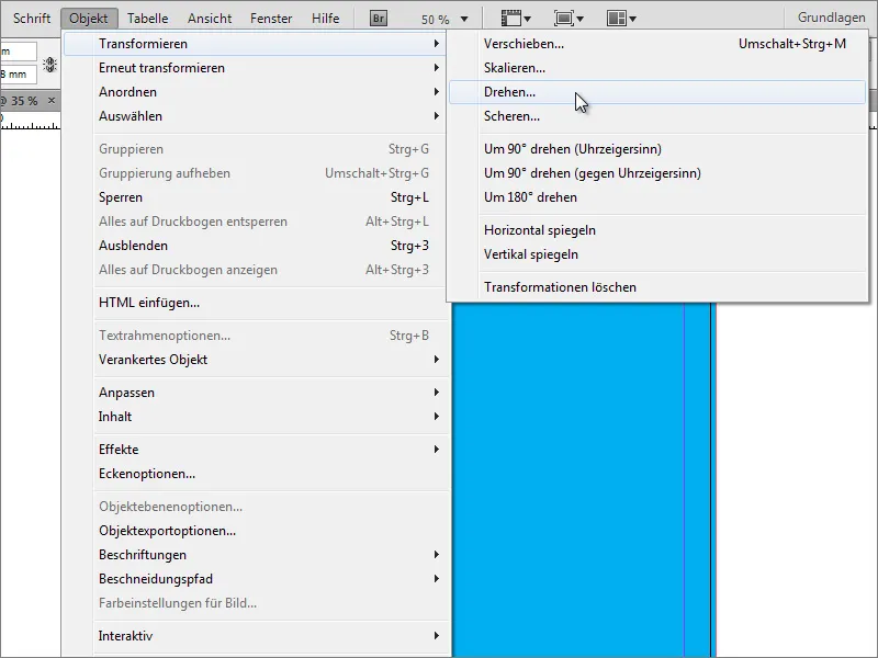
In the dialog box, you can enter the angle by which the object is to be rotated. However, do not simply confirm the dialog box with OK, but by clicking on Copy.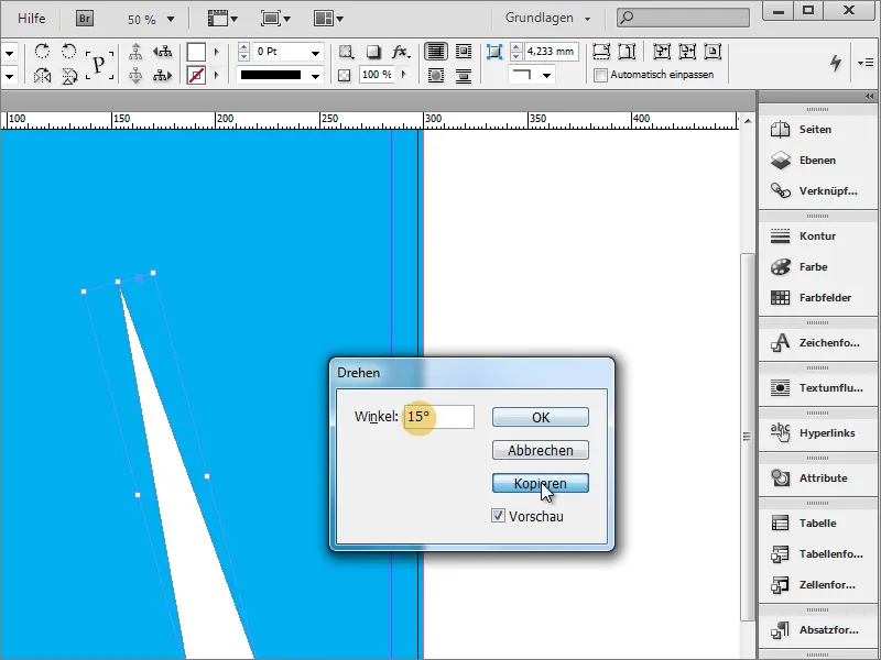
A copy of the object is then created.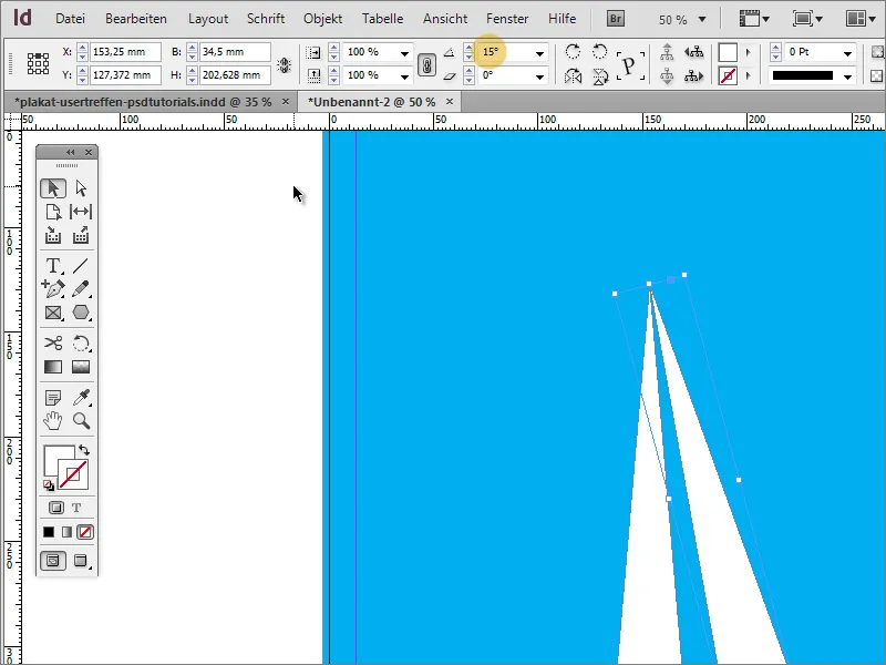
You can now repeat this transformation. All you need is the menu item Object>Transform again>Transform again - Sequence.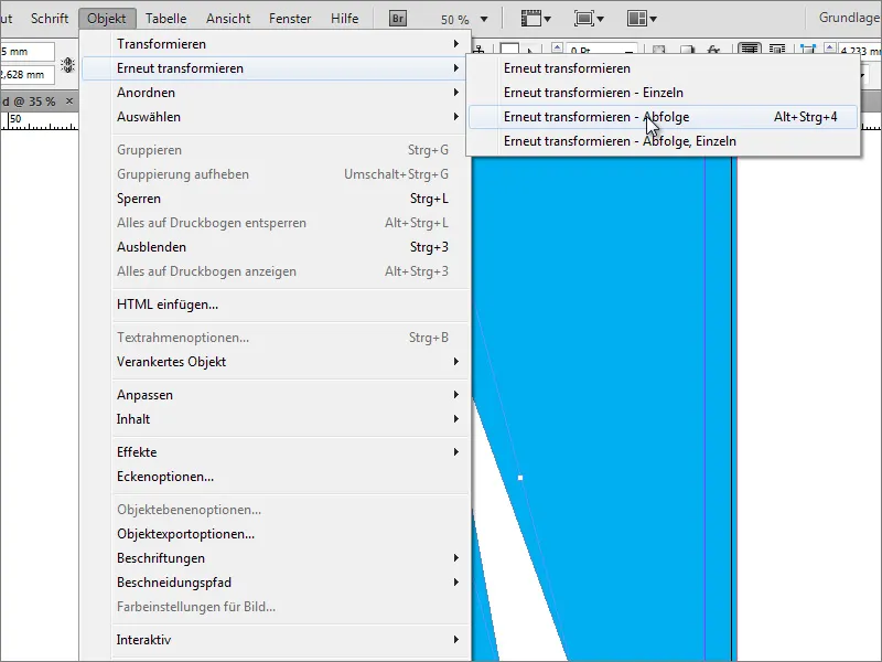
As soon as you click on this entry, the object is transformed again using the previously set values. You can repeat this process with Alt+Ctrl+F4 until the copy sequence is complete. It is also important that you enter a value for the initial angle settings that allows an even division of 360 so that the final copy does not overlap with the initial object; for example: 360 degrees/15 degrees = 24 (whole) parts!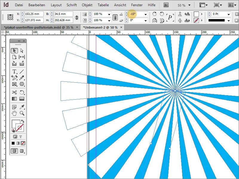
Now this construct is first standardized so that it can be moved and edited as a whole. To do this, you must select all objects. This is easy to do using the Shift key in the layer palette.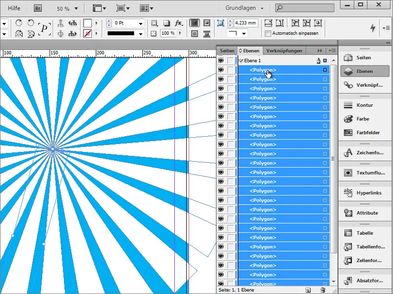
You can either group all the individual elements together, which would have the disadvantage that you would have to delete the group before making individual changes, or you can create a new layer in the layer palette and move the selected elements into it. Move layer 2 with the individual objects to the bottom of the layer stack.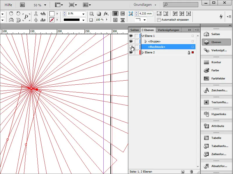
As the rectangle of the background layer is now above this new layer, you need to edit it further. Use the layer palette to move this background layer from layer 1 to layer 2 at the bottom.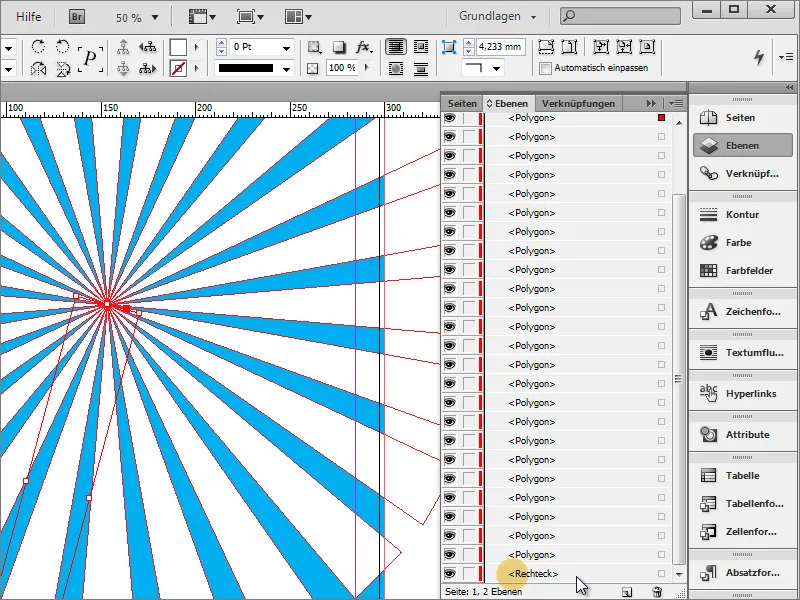
If you click on the marker next to the layer folder, you will automatically select all the elements in this folder.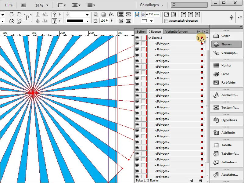
The triangles should be moved. To do this, it is necessary to protect the background layer from being changed. To do this, click on the selection of the rectangle in the layer palette while holding down the Shift key so that it is excluded from the group selection.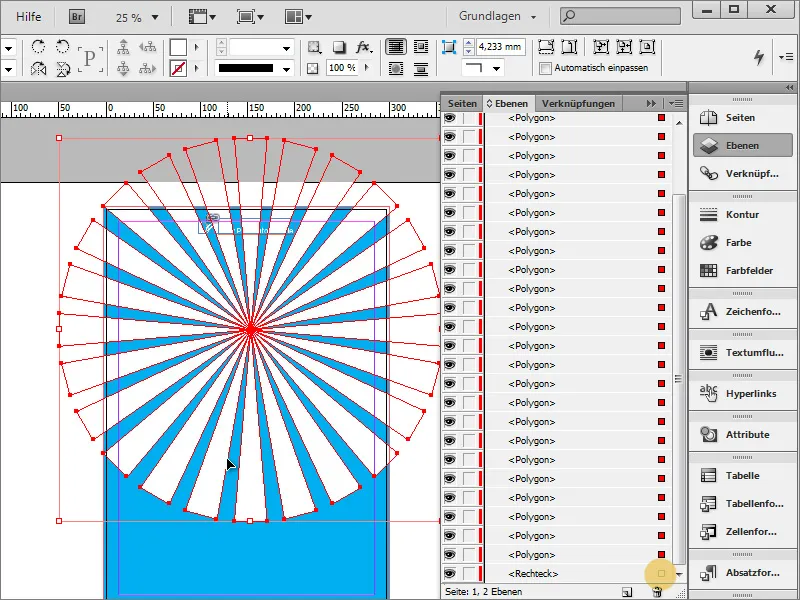
You can then reposition the polygons without moving the background.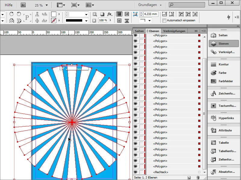
By holding down the Shift+Alt key, you can now scale the object proportionally and, for example, enlarge it.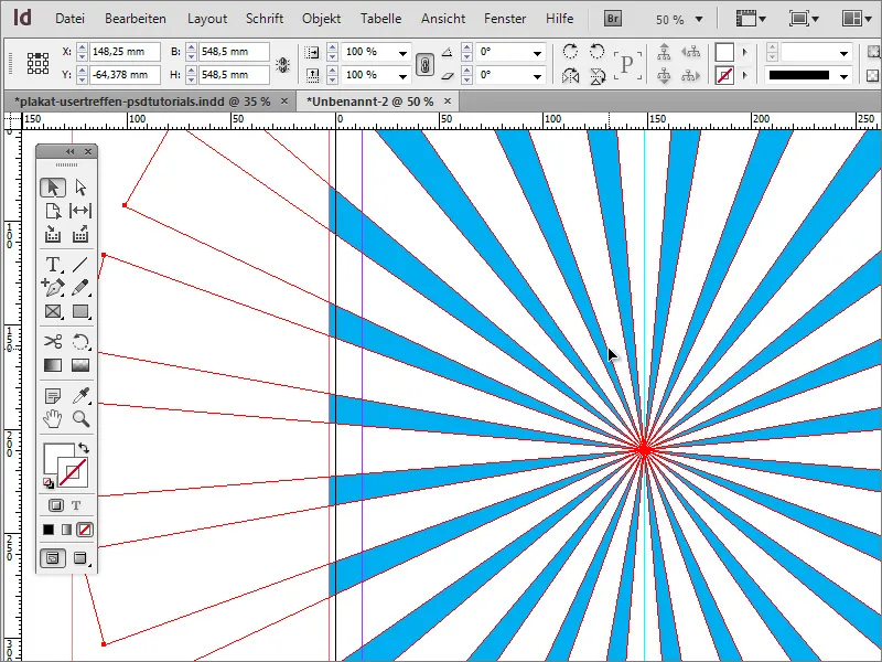
To be on the safe side, you should also group these polygons. You can do this by right-clicking on the Group entry. Please make sure that only the polygons are selected.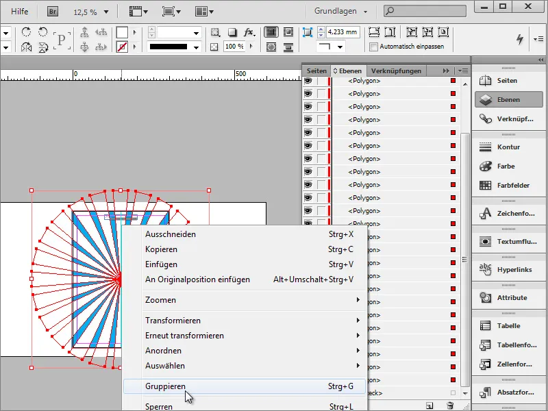
Now you can change the opacity of this group. A value of around 25 percent will produce the desired result. This way, the "rays" do not dominate the background so much, but decorate it elegantly.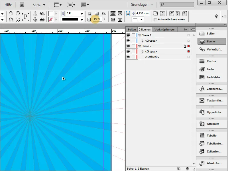
In the template, you can see that an additional effect has also been used, a minimal color gradient.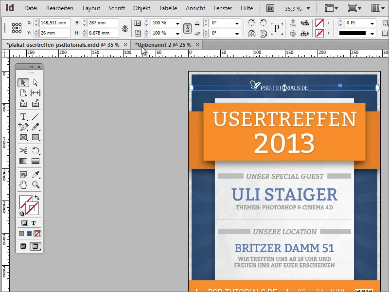
This color gradient is applied to the background graphic. You must therefore first select it from layer 2. In the swatches panel, you can create a new gradient swatch using the palette options.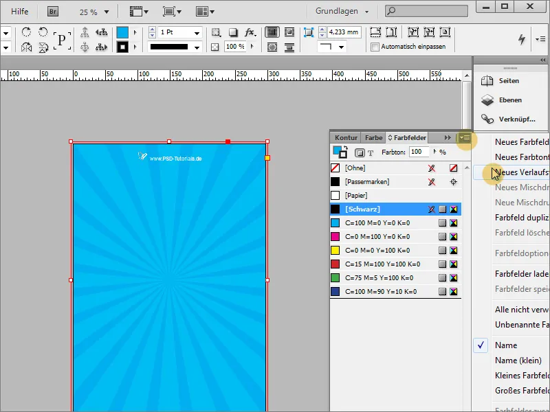
You can create a suitable gradient in this gradient dialog.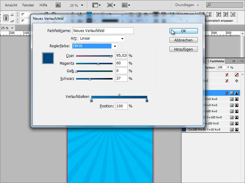
Then fill the area of the rectangle with this gradient. You can also specify the gradient type in the gradient control panel. In addition to the linear grad ient, you can also choose the radial gradient type. The radial gradient is the desired gradient type.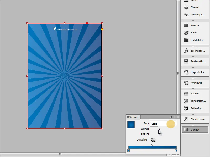
You can also use the gradient tool to redraw the gradient if it does not yet meet your expectations. You can use the layer palette to hide all distracting layers so that you can make this setting without being disturbed.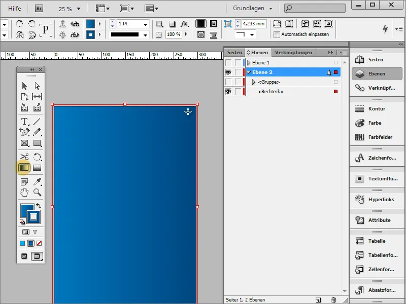
Now you can redraw the gradient and, if necessary, reverse the direction of the gradient using the small button.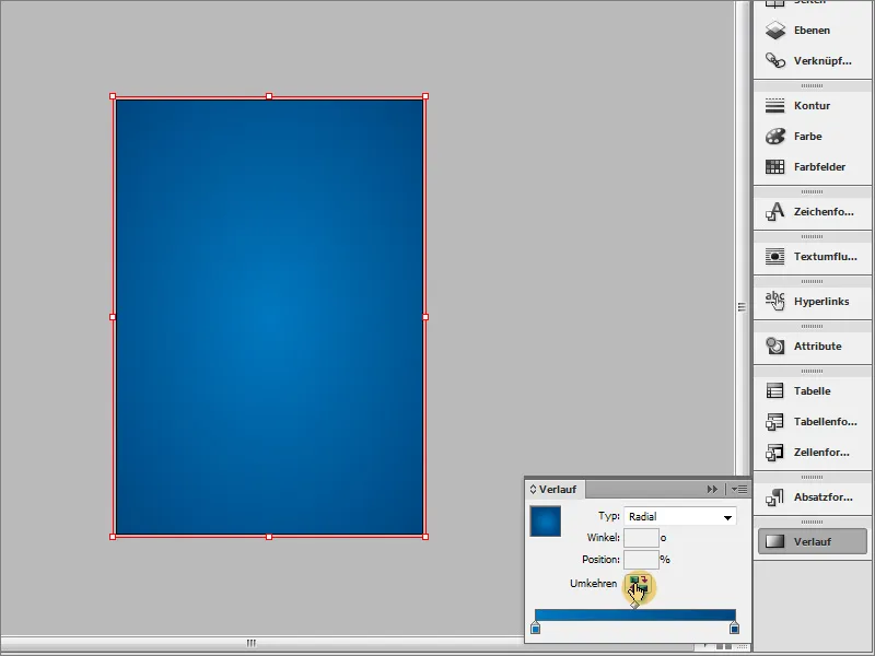
In the end, once you have shown the remaining layers again, the result should look something like this: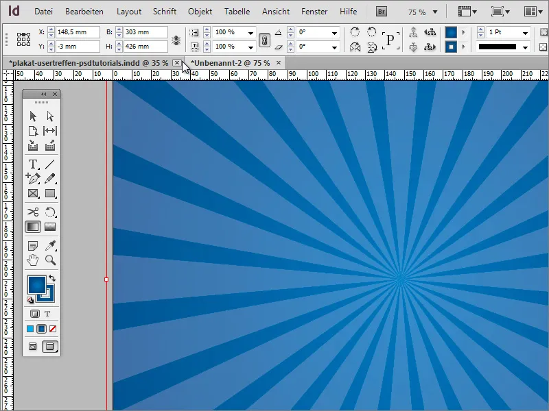
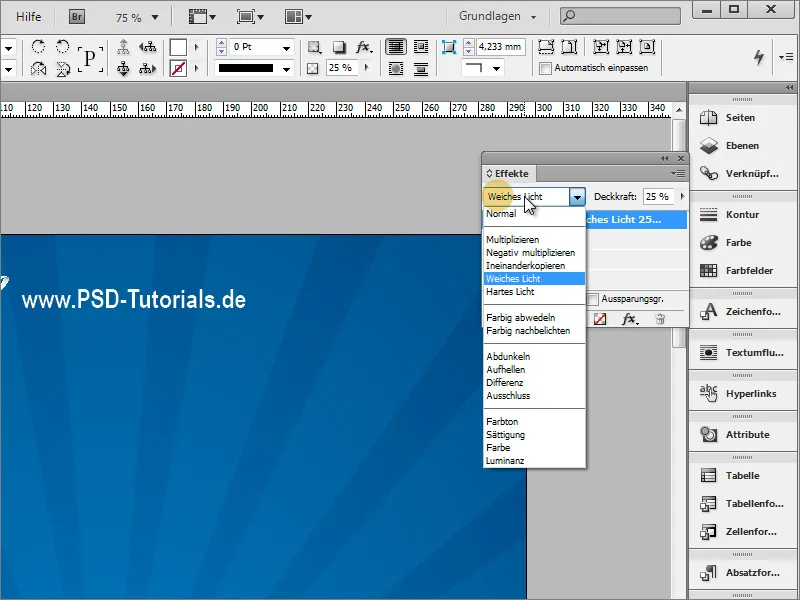
You can also apply an effect to the group of rays. To do this, select the rays and set a different blending mode, for example Soft Light, in the Effects panel.