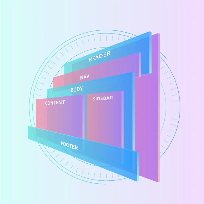
Welcome to this tutorial on Flexbox in CSS and HTML! Do you want to know what Flexbox is and how to effectively use it for the layout of websites? In this tutorial, you will learn everything you need to know about Flexbox to make your websites responsive and visually appealing. Flexbox is a powerful layout model that helps you arrange elements flexibly without dealing with the complex challenges of traditional layout techniques like floats and margins.
Key Takeaways
- Flexbox makes creating responsive layouts easier and simplifies handling elements in CSS.
- It solves problems that can arise when using floats and margin adjustments.
- Flexbox supports flexible arrangement of elements, both horizontally and vertically.
- All modern browsers support Flexbox, so you don't have to worry about browser compatibility.
Understanding Flexbox
To effectively use Flexbox, you should first understand the basic concepts behind this layout model. Flexbox is activated by the CSS property display: flex, which creates a flex container. All direct children of this container become flex items.

A key feature of Flexbox is the main axis, which determines the direction in which flex items are arranged - either horizontally (row) or vertically (column). The main direction is crucial in deciding how your elements' layout will be designed.
For example, considering a main axis that runs from left to right (row). In this case, the child elements of the Flexbox are arranged in this direction. However, you can also reverse the alignment, so that the arrangement is from right to left (row-reverse).
In the case of a vertical main axis (column), the elements are arranged from top to bottom, and here too, there is the option to reverse the alignment (column-reverse).

Flexbox also has a cross axis that runs perpendicular to the main axis. This is used to align Flex items vertically or horizontally within the container. For instance, you can center, stretch, or align them at the edges.
Additional Flexbox Functionalities
Another powerful feature of Flexbox is the ability to arrange elements in multiple rows or columns when space is limited. This is done using properties like flex-wrap. If you have limited width, you can ensure that the elements wrap as needed.
Flexbox also offers a variety of alignments for Flex items. These include vertical and horizontal alignments at the edges, in the center, or evenly distributed within the container.
When using Flexbox, it is important to choose the right combination of properties to achieve the desired layout. These properties include justify-content, align-items, and flex-direction, which help you define the exact positioning and alignment of the elements.
Summary
Flexbox is an extremely versatile tool for web designers that revolutionizes the way layouts are developed. It is no secret that using traditional layout methods, like floats and margins, often leads to complex solutions. Flexbox, on the other hand, significantly simplifies these processes. With the support of all modern browsers, you are well-equipped to use Flexbox in your projects. In the next step, you will learn how to build your first Flexbox layout and apply the basic properties to efficiently structure your files.
Frequently Asked Questions
How do I enable Flexbox in CSS?You can activate Flexbox by using the property display: flex for a container in your CSS.
Can I use Flexbox in older browser versions?Flexbox is well supported in most modern browsers. However, there may be challenges in rendering with older browsers.
What is the difference between row and column?The main axis row arranges elements horizontally, while column arranges them vertically.
How can I center the elements in a Flexbox?You can center the elements by adjusting the justify-content and align-items properties accordingly.

