Flexbox is a powerful layout module in CSS that helps you efficiently utilize the available space within a container. In this tutorial, you will learn how to evenly distribute child elements in a flex container. This is especially useful for responsive designs where the window width can change. Let's dive in!
Main Takeaways
- With Flexbox, child elements in the layout can be evenly distributed by adjusting the flex values of the elements accordingly.
- You can make the width and height of child elements flexible, allowing them to automatically adapt to the available space without needing fixed dimensions.
Step-by-Step Guide
To understand how to evenly distribute child elements in a flex container, follow these steps:
First, create a flex container by applying the CSS property display: flex;. Here is a simple example of how you can do that. Make sure the container is aligned in row format:
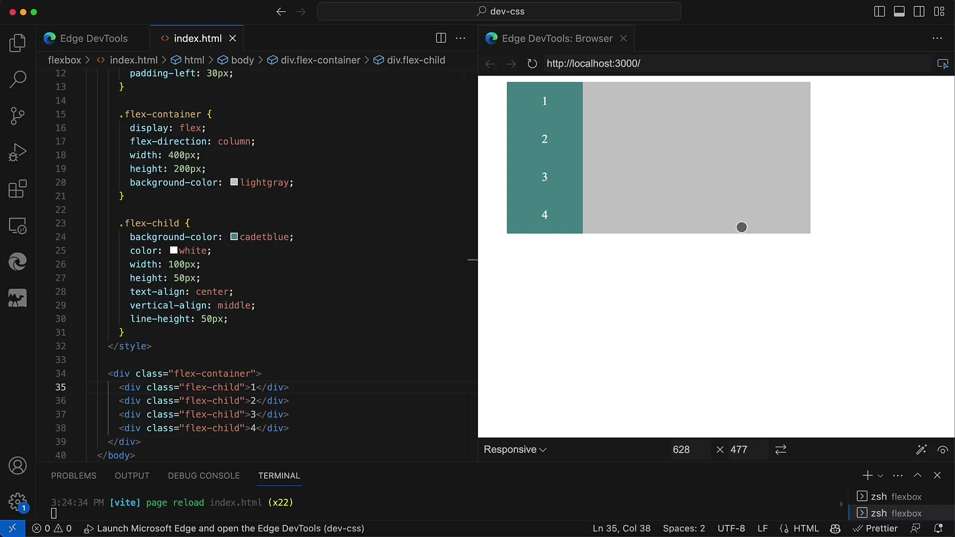
In this state, the space is evenly distributed among all child elements as long as these child elements do not have fixed widths. If you set the width of the child elements and then set them to 100 pixels, they will be evenly distributed in the container, but this is not optimal for a responsive design:
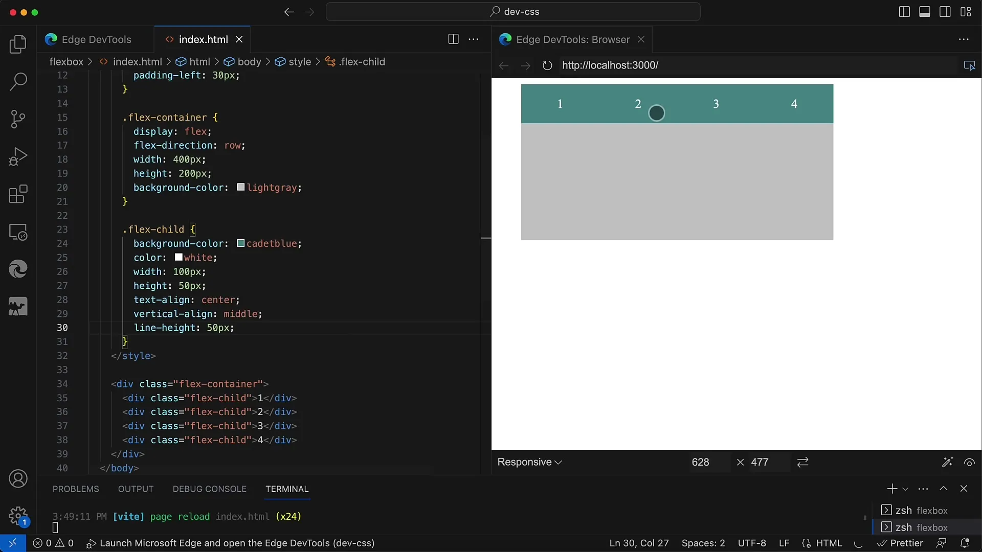
When you remove the fixed widths, you will quickly see that the space is dramatically reduced, especially when there is no text in the child elements. In this case, everything collapses to the minimum width defined by the text:
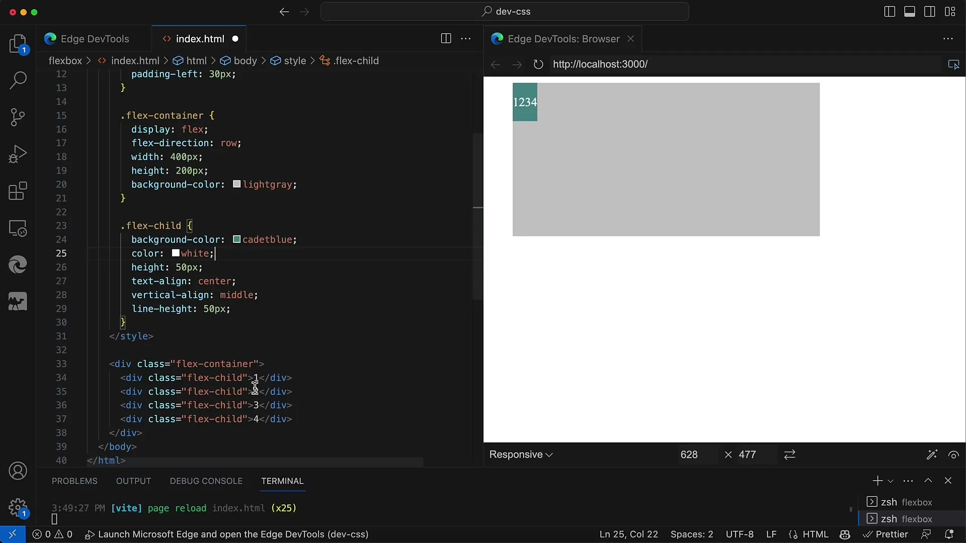
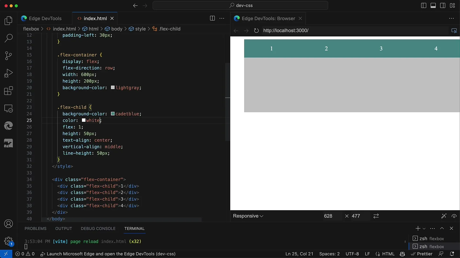
To evenly distribute the available space, you need to set the flex value for the child elements. This can be conveniently done by using the flex property, which allows you to define a proportional share of the available space. Set the flex value of each child element to 1:
Once you have done that, you will see that all child elements have evenly distributed the space. This is a very flexible solution as it dynamically adjusts to the width of the container:
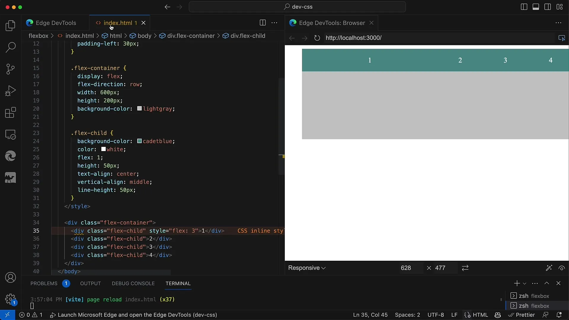
You can also vary the flex values to create different proportions. For example, if the first element should receive half of the space, you could set it to flex: 2; while keeping the other elements at flex: 1;:
Once you adjust the values, the child elements will be distributed according to the set values. Through the flexible proportions you have assigned, the first element will receive more space than the others:
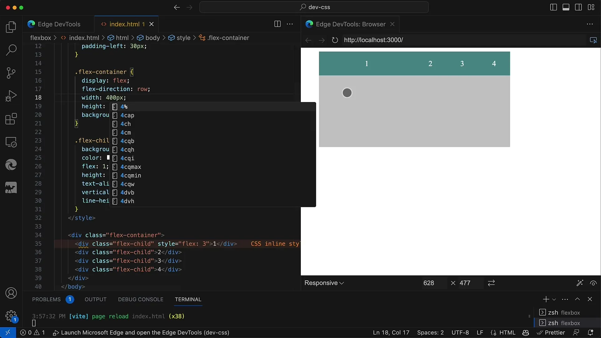
When you change the width of the container, the proportions remain stable. Whether you change the width to 800 pixels or 400 pixels, the child elements automatically adjust and distribute the space evenly based on the previously defined flex values:
You can easily adjust the Flexbox properties by changing the flex-direction property. For example, if you change the Flex container from row to column, the distribution logic remains the same. The child elements will then be arranged vertically:
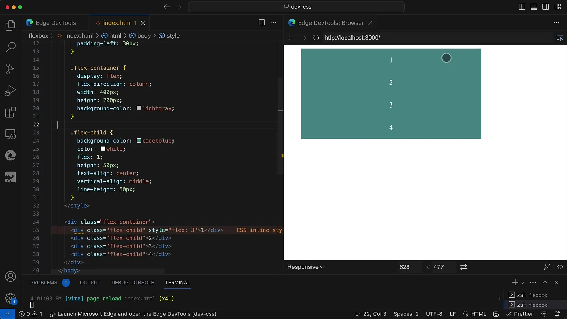
Ensure that the height of the child elements is not fixed to maintain flexibility. This works particularly well for responsive designs, as the child elements adapt based on screen size and orientation:
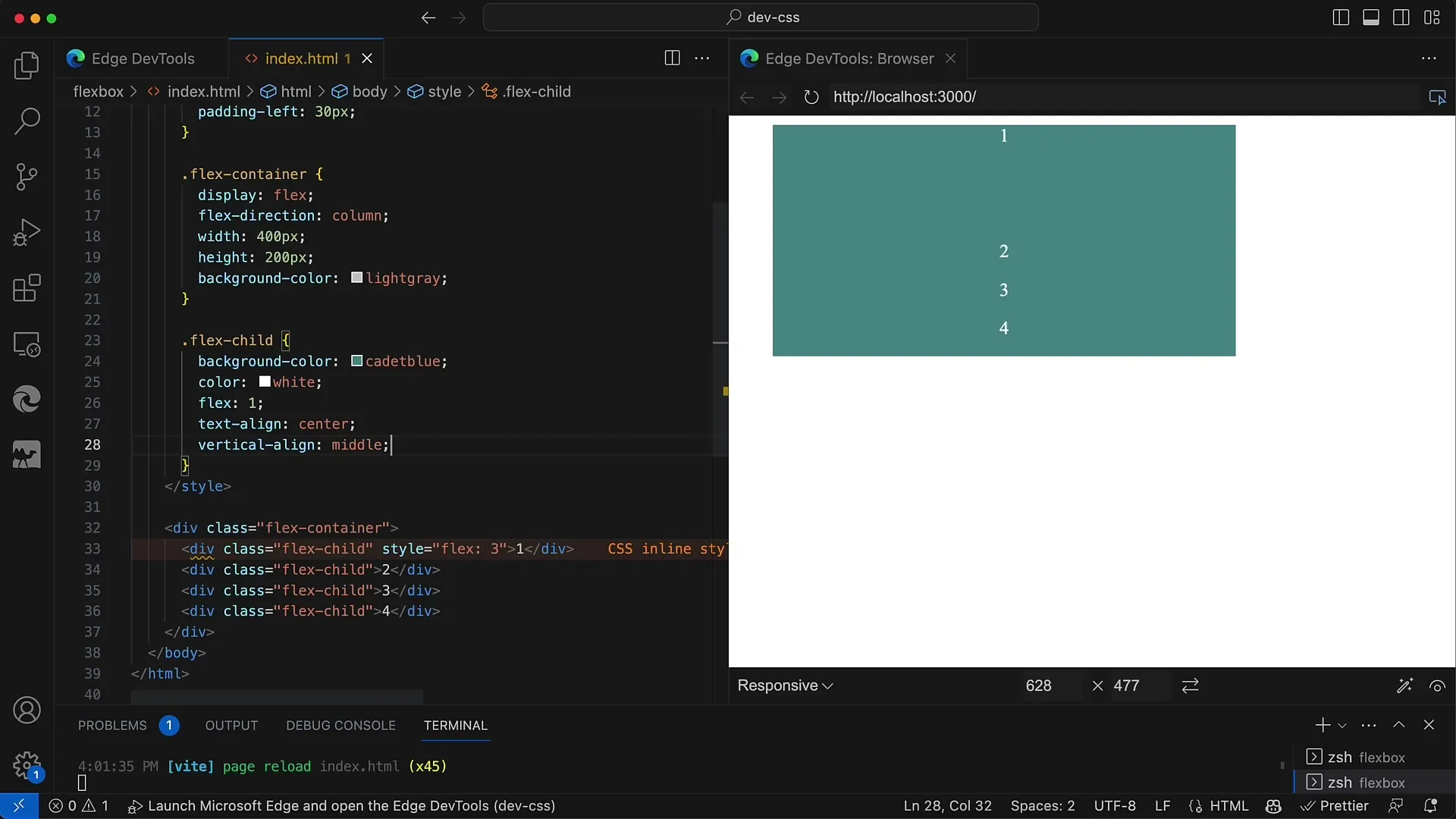
This way, you can create a highly responsive layout, ensuring that your design looks great on both desktop and mobile views.
Summary
In this tutorial you have learned how to use Flexbox in CSS and HTML to evenly distribute child elements. Thanks to the flex properties, you can create responsive layouts that seamlessly adapt to different screen sizes and formats.
Frequently Asked Questions
What is Flexbox?Flexbox is a CSS layout module that simplifies the arrangement of elements within a container.
How do I use Flexbox?Apply the CSS property display: flex; to the container and use flex on the child elements to define their shares of the available space.
Can I use Flexbox for responsive designs?Yes, Flexbox is ideal for responsive designs as the child elements dynamically adjust to the size of the container.
