In this tutorial, you will learn how to align the child elements of a flex container along the cross axis. The Flexbox technique in CSS allows for a flexible and dynamic arrangement of elements, which is essential for responsive designs. You will discover step by step the different alignment options to optimize and enhance your layouts.
Key Insights
- Flexbox offers various methods for aligning child elements.
- The properties align-items and justify-content play an important role in the arrangement of Flex elements.
- You can align child elements centered, as well as on the right or left edge.
Step-by-Step Guide
Step 1: Create Flex Layout
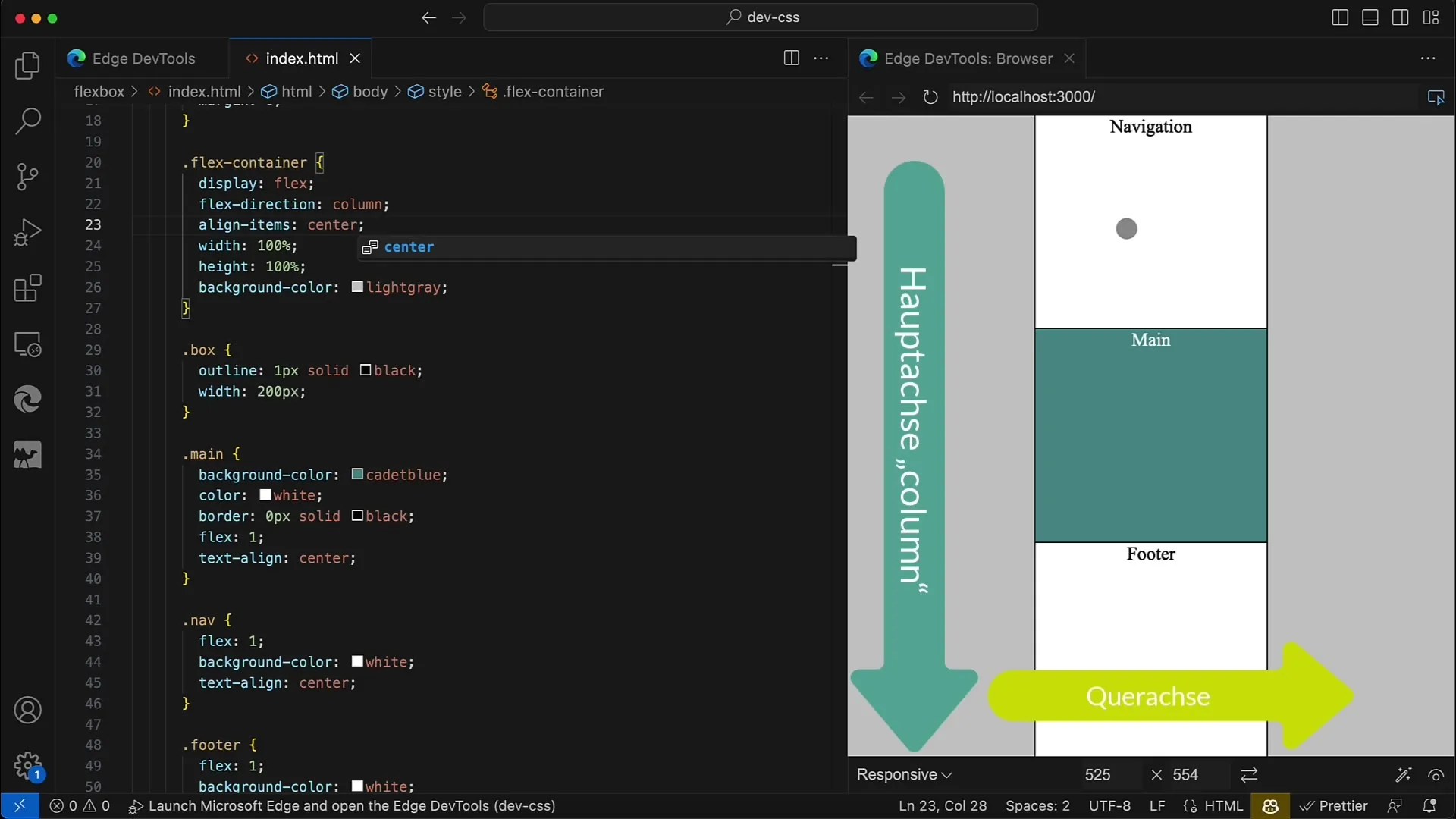
Start by creating a flex layout. Set the display of the container to flex and define the direction of the elements with flex-direction: column. The container should have a width of 100% and a height of 600 pixels to occupy the entire area of your browser.
Step 2: Reset Margin
To ensure that no unwanted margins from browser settings interfere, reset the margin of the body to 0. This helps ensure a consistent layout.
Step 3: Apply Box Styles
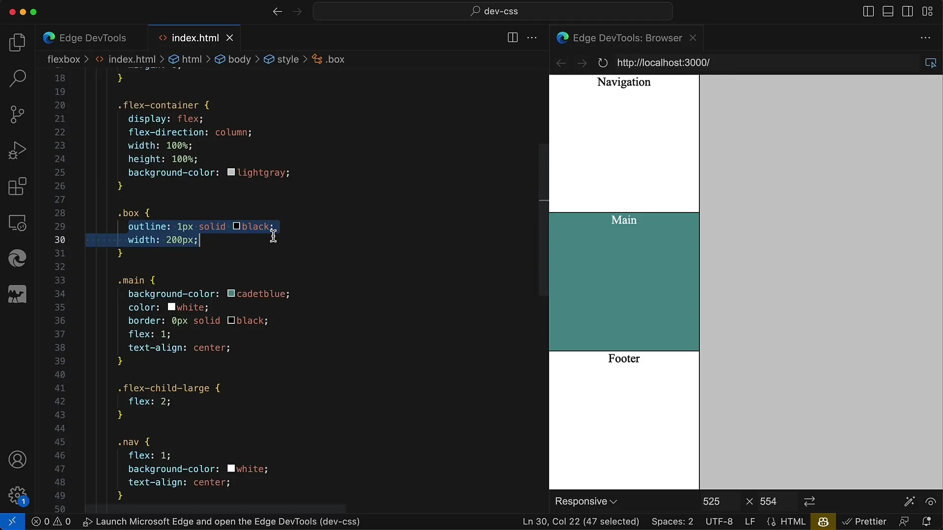
Add another box to the container to differentiate the child elements from each other and clarify the layout structure. Each box should have a width of 200 pixels.
Step 4: Initial Alignment of Child Elements
By default, the child elements are aligned to the left since the width is set to 200 pixels. You can observe that all child elements are displayed on the left side of the container.
Step 5: Centering Child Elements
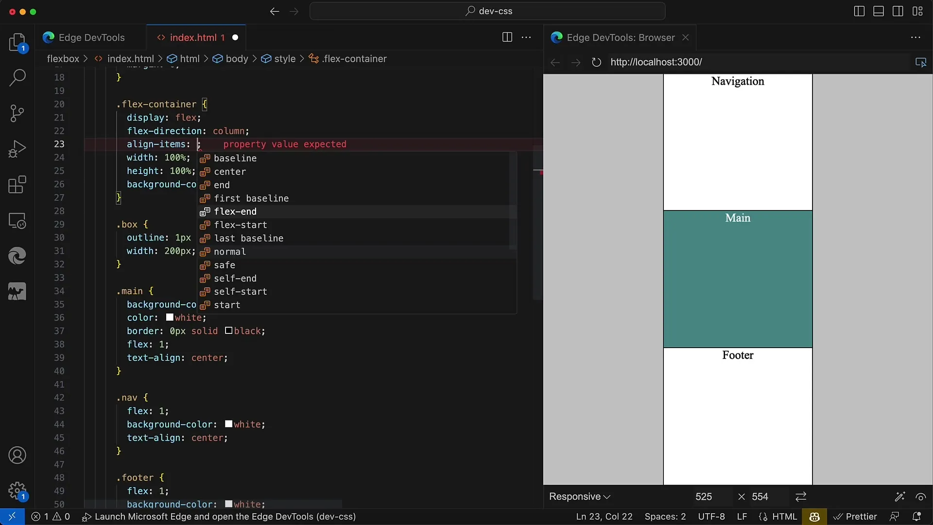
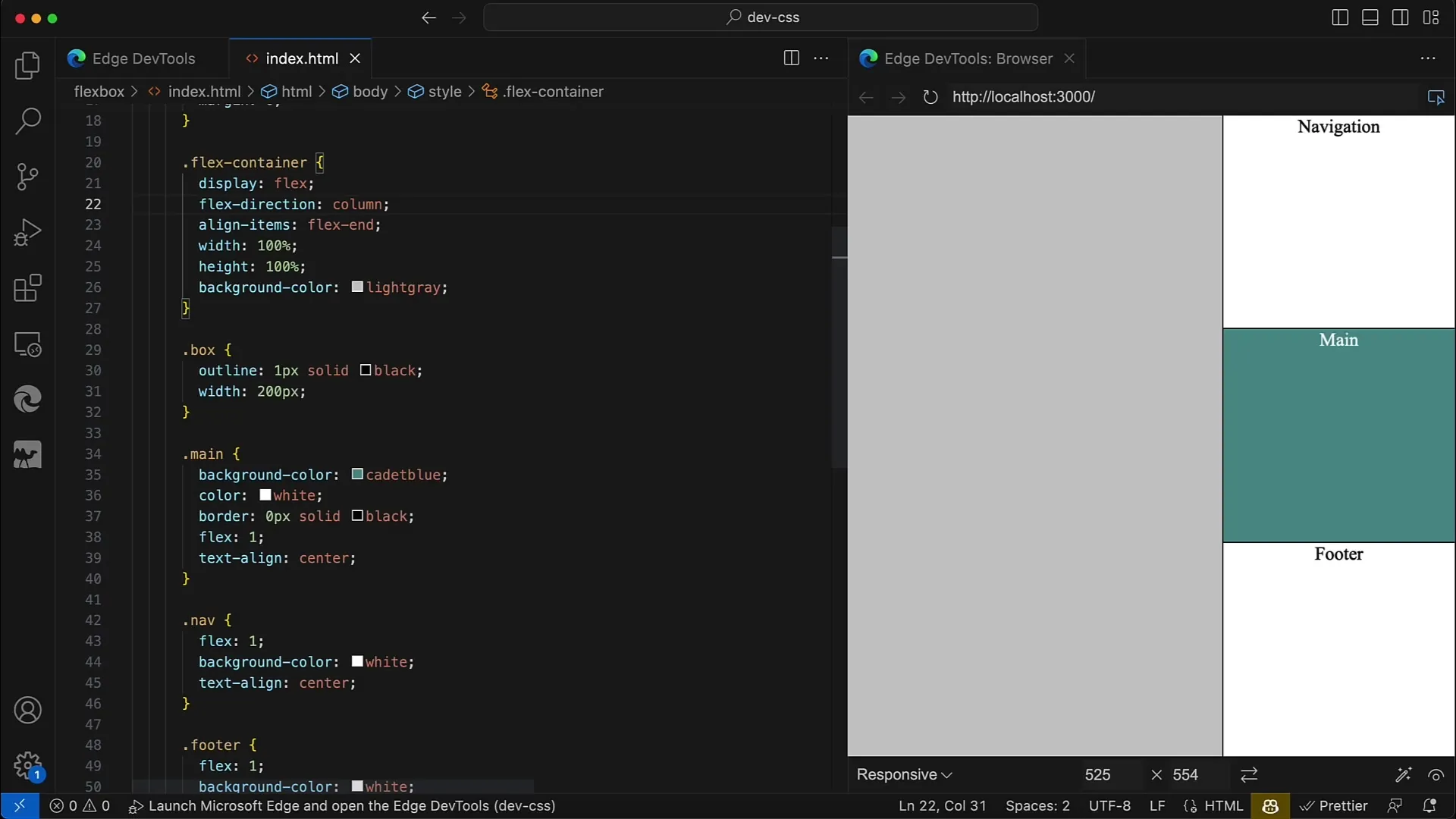
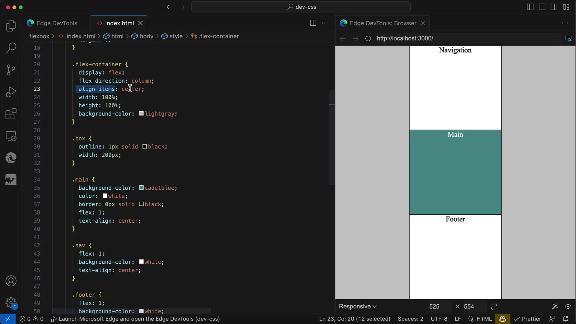
To align the child elements in the center of the container, use the property align-items: center. This ensures that the Flex elements are centered, often creating a more appealing aesthetic in web page designs.
Step 6: Right Aligning Elements
If you want to align the elements on the right side instead, use align-items: flex-end. Make sure to use flex-end here and not right, as Flexbox operates under a different logic.
Step 7: Changing the Flex Direction
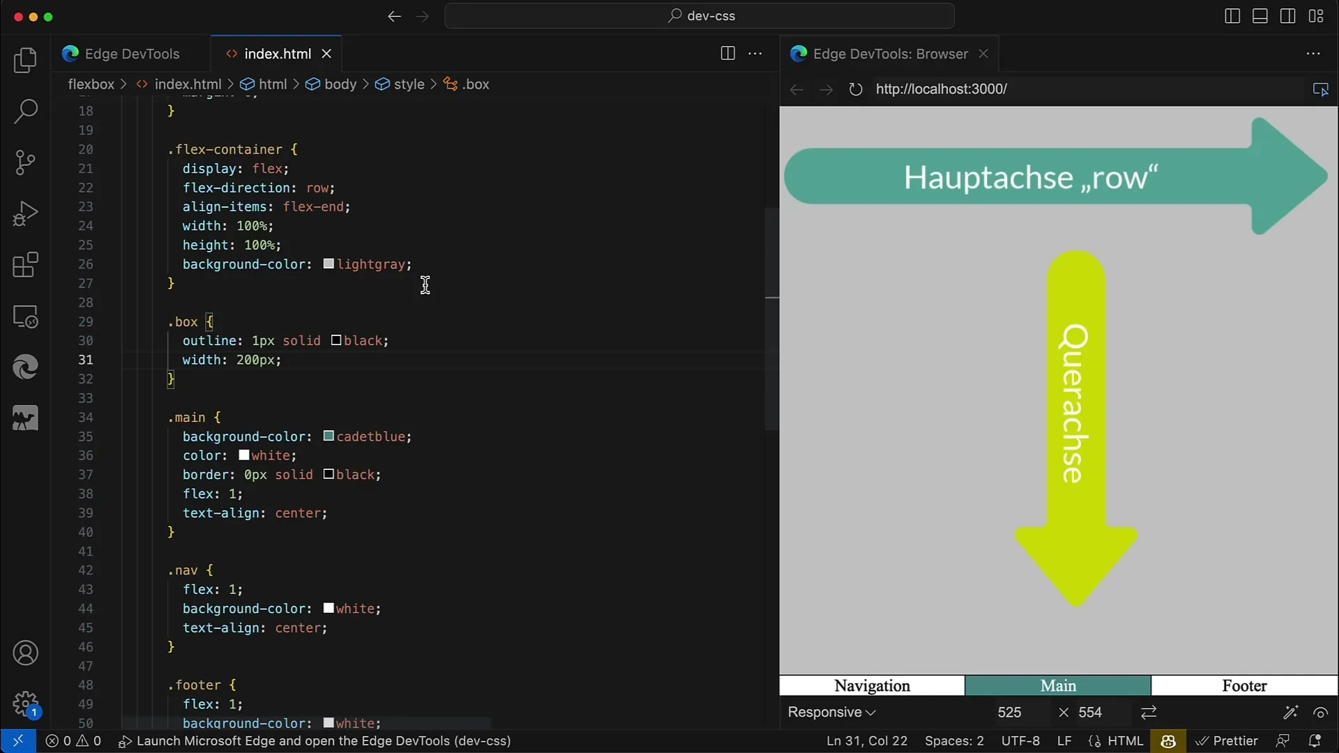
By changing the Flex direction to row, you will see that the child elements are now aligned horizontally. If you now apply align-items: flex-end, the elements will be aligned at the bottom of the container.
Step 8: Returning to the Original Alignment
After experimenting with different alignments, you can return to flex-direction: column and readjust the alignments to achieve the desired layout.
Step 9: Setting Maximum Width
If needed, you can also define a maximum width for the container so that it expands up to that width in the center. This makes the arrangement more flexible and visually appealing across different window sizes.
Step 10: Practical Application
Finally, you can test yourself how all child elements can be aligned using the properties align-items and justify-content. Experiment with different layouts and explore the versatile possibilities that Flexbox offers.
Summary
In this tutorial, you have learned how to align the child elements of a Flex container along the cross axis. The various possibilities, such as centered or right-aligned, provide you with flexible design options for your web design.
Frequently Asked Questions
What is Flexbox and what is it used for?Flexbox is a CSS layout module that allows for a flexible arrangement of elements within a container. It is commonly used to create responsive designs.
How can I center the child elements?You can center the child elements by using the CSS property align-items: center in the flex container.
What properties are there for aligning elements?The main properties for alignment are align-items (vertical alignment) and justify-content (horizontal alignment).
How do I change the flex direction?The flex direction can be set using the property flex-direction, either to row or column.
Can I give child elements different alignments?Yes, you can set the alignment for all child elements at the same time using align-items. However, you cannot directly adjust individual child elements unless you use align-self to control the specific element.
