In this tutorial you will learn how to use Flexbox in CSS and HTML to style the individual alignment of elements. Through a small exercise where we create a dice face with the number 3, we will apply the various properties of Flexbox. The focus is on stretching and aligning elements individually within a container. This exercise will help you deepen your knowledge in using Flexbox and understand how to efficiently design the layout of your web projects.
Key Takeaways
- Flexbox allows for easy arrangement of elements within a container.
- The properties align-items and align-self help control the alignment of Flex elements.
- Flexbox can be applied in two directions: as a column or as a row.
- When working with Flexbox, it is important to properly set the dimensions of the container and Flex elements to achieve a clean layout.
Step-by-Step Guide
To design the dice face showing the number 3, please follow these steps:
Step 1: Create HTML Structure
First, establish the basic HTML structure for the dice face. Create a container that holds the three circles (dots). Make sure to link the container with the CSS stylesheet to later apply the Flexbox properties.

Step 2: Activate Flexbox
Apply the display: flex; property to the container. This turns the container into a Flex Container. You can also use flex-direction: column; to arrange the dots vertically.

Step 3: Aligning the Dots
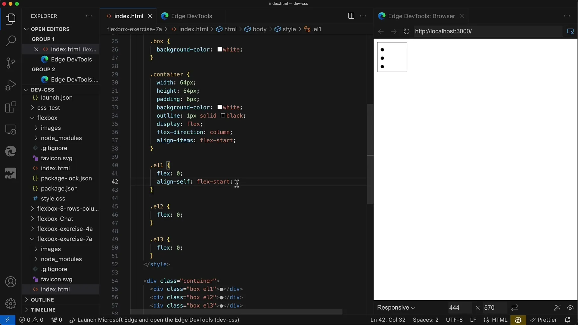
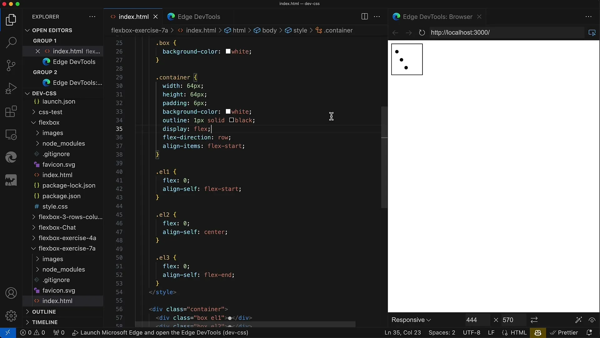
Now it's important to align the individual dots. For the first dot, you can use the align-self: flex-start; property. This positions the first dot at the top of the container. Since this is already the default, it won't cause any visual change.
Step 4: Centering the Second Dot
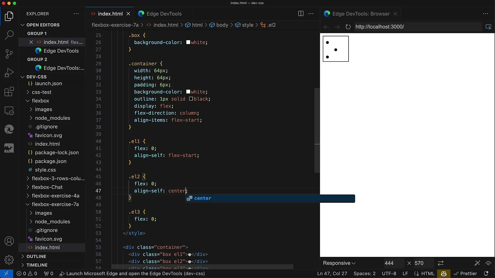
For the second dot, apply align-self: center; This will move the dot exactly to the center of the container. You may need to experiment with padding and size to optimize the position.
Step 5: Positioning the Third Dot
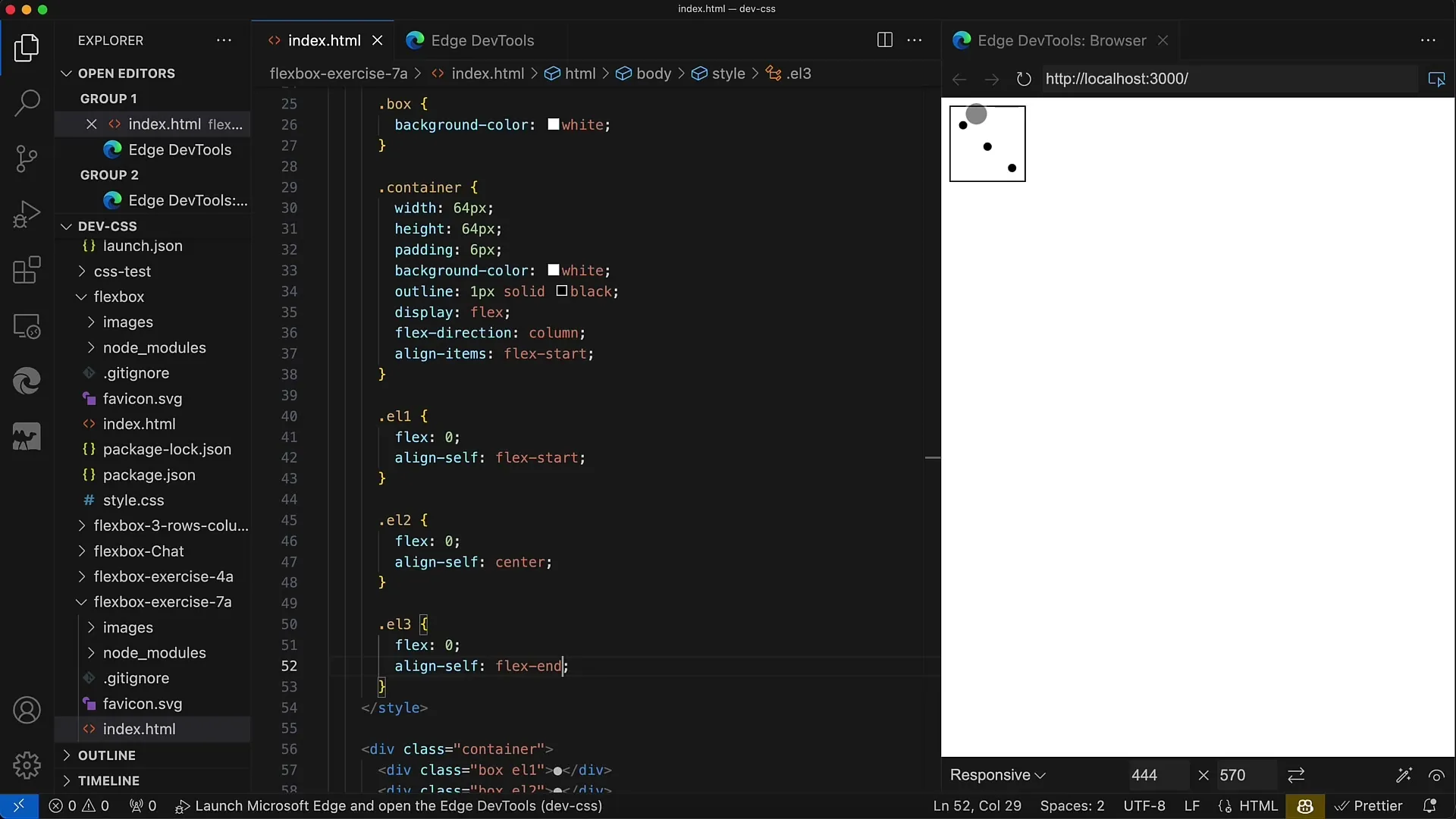
Use align-self: flex-end; for the third dot to move it to the bottom end of the container. This should visually represent the dots forming the number 3.
Step 6: Adjust Flex Direction
You also have the option to change the Flex direction to row; This will display the dots side by side. If you do this, make sure the dots still have the correct order to represent the number 3.
Step 7: Adjust Box Sizes
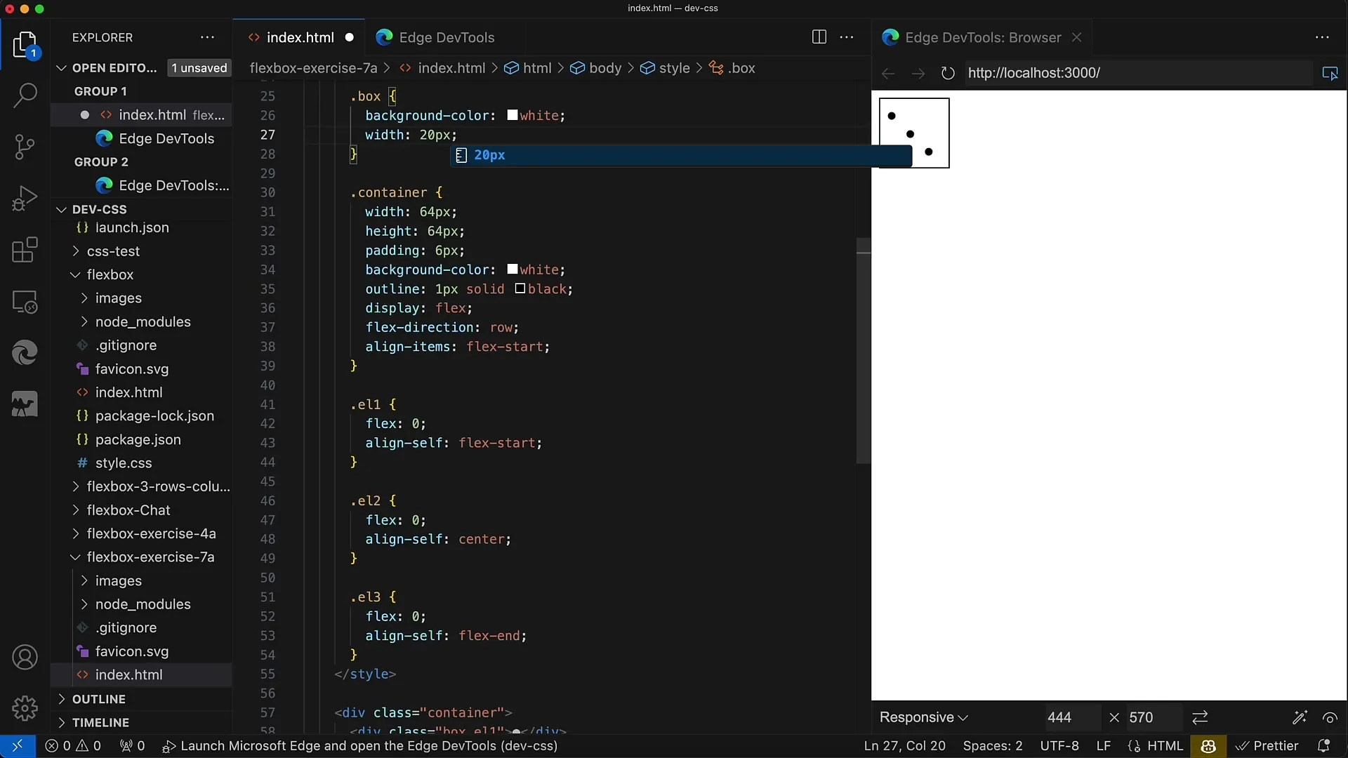
To ensure the dots are clearly visible, adjust the sizes of the boxes. For example, set their width to 20 pixels to see how they look side by side.
Step 8: Define Text Alignment
To enhance the presentation of the circles, apply the text-align: center; property. This will center the text inside the circles, making the overall layout more visually appealing.

Step 9: Fine-Tune Adjustments
To perfect the layout, you can experiment with padding and margin values. You may need to adjust the padding of the container to ensure everything looks uniform.
Step 10: Final Check
Check the entire layout. Pay attention to the placement of the dots and their spacing. Make sure that everything is displayed as you envisioned.
Summary
In this guide, you have learned how to use the Flexbox technology to design different element alignments within a container. With the help of Flexbox, we have arranged the dots of a cube in a way that visually represents the number 3. You have learned the meaning of align-items and align-self, as well as the Flex directions. This knowledge will help you to design your web layouts more effectively and meet various requirements.
Frequently Asked Questions
What is Flexbox?Flexbox is a layout module in CSS that allows efficient arrangement and alignment of elements within a container.
How can I activate Flexbox?You can activate Flexbox by adding display: flex; to the container in which the elements are to be arranged.
What is the difference between align-items and align-self?align-items defines the alignment of all Flex elements in the container, while align-self overrides the alignment of a single Flex element.
What is the default value for align-items?The default value for align-items is stretch, which means that the Flex elements occupy the entire height of the container.
How can I change the direction of the Flexbox?You can change the direction of the Flexbox by setting the flex-direction property to row or column, depending on the desired arrangement.
