In this guide, you will learn how to align the elements in a flex container along the main axis using Flexbox. We have already covered alignment along the cross axis, but the main axis is equally important. Flexbox technology offers you various ways to make the alignment of your elements flexible and adjustable. Let's take a closer look!
Main Takeaways
- Alignment along the main axis is done with the justify-content property.
- You can use different values, such as center, flex-start, flex-end, space-between, and space-around, to adjust your layout.
- The Flexbox settings directly affect the arrangement of the elements in the desired direction.
Step-by-Step Guide
1. Initialize Flex Container
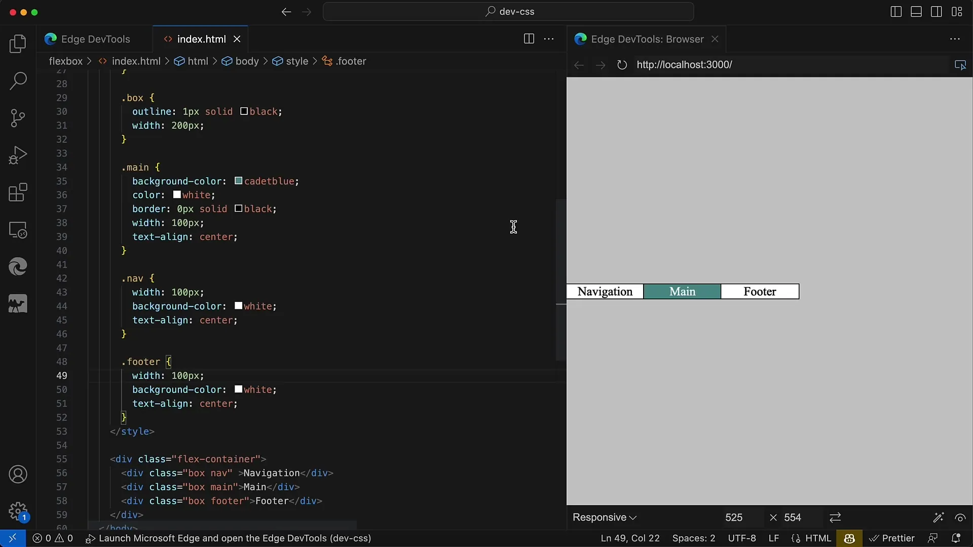
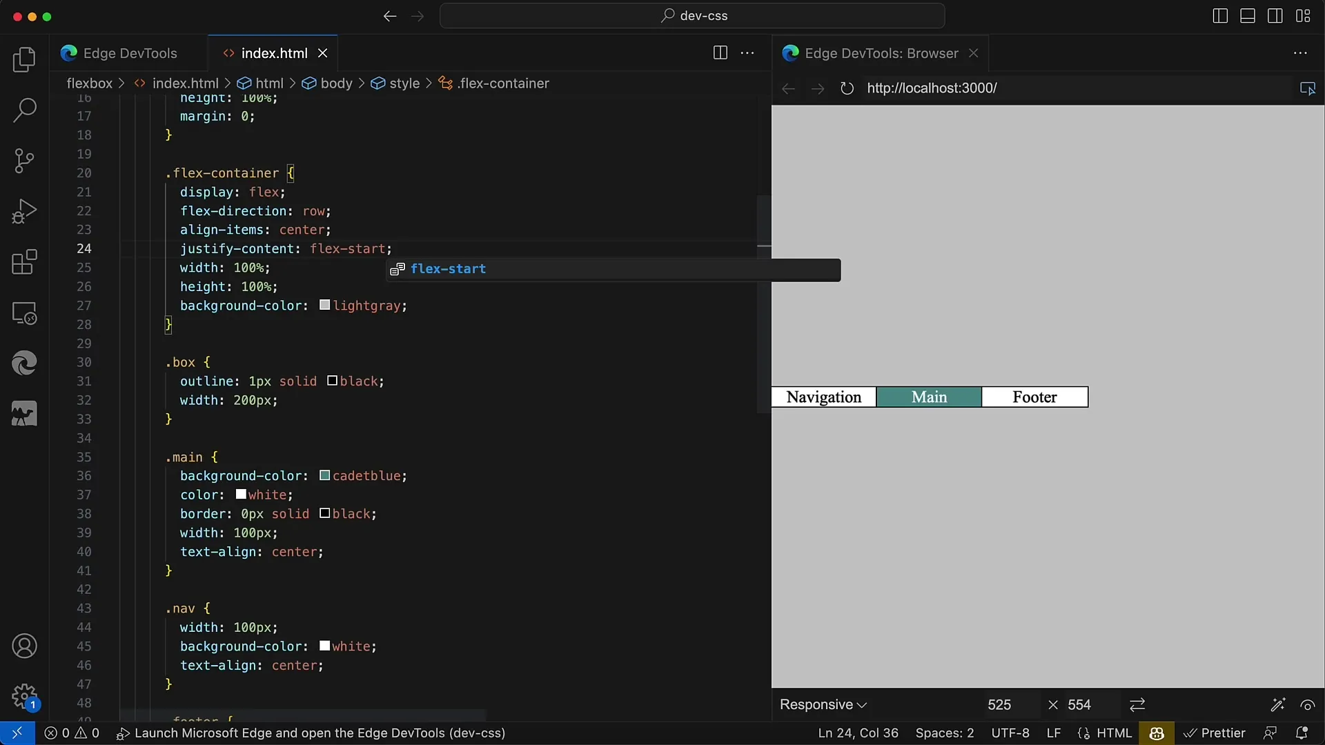
Start by creating a Flex Container and setting its flex direction. In this example, we set the flex direction to row. This means that the elements will be arranged in a row from left to right.
2. Default Alignment of Elements
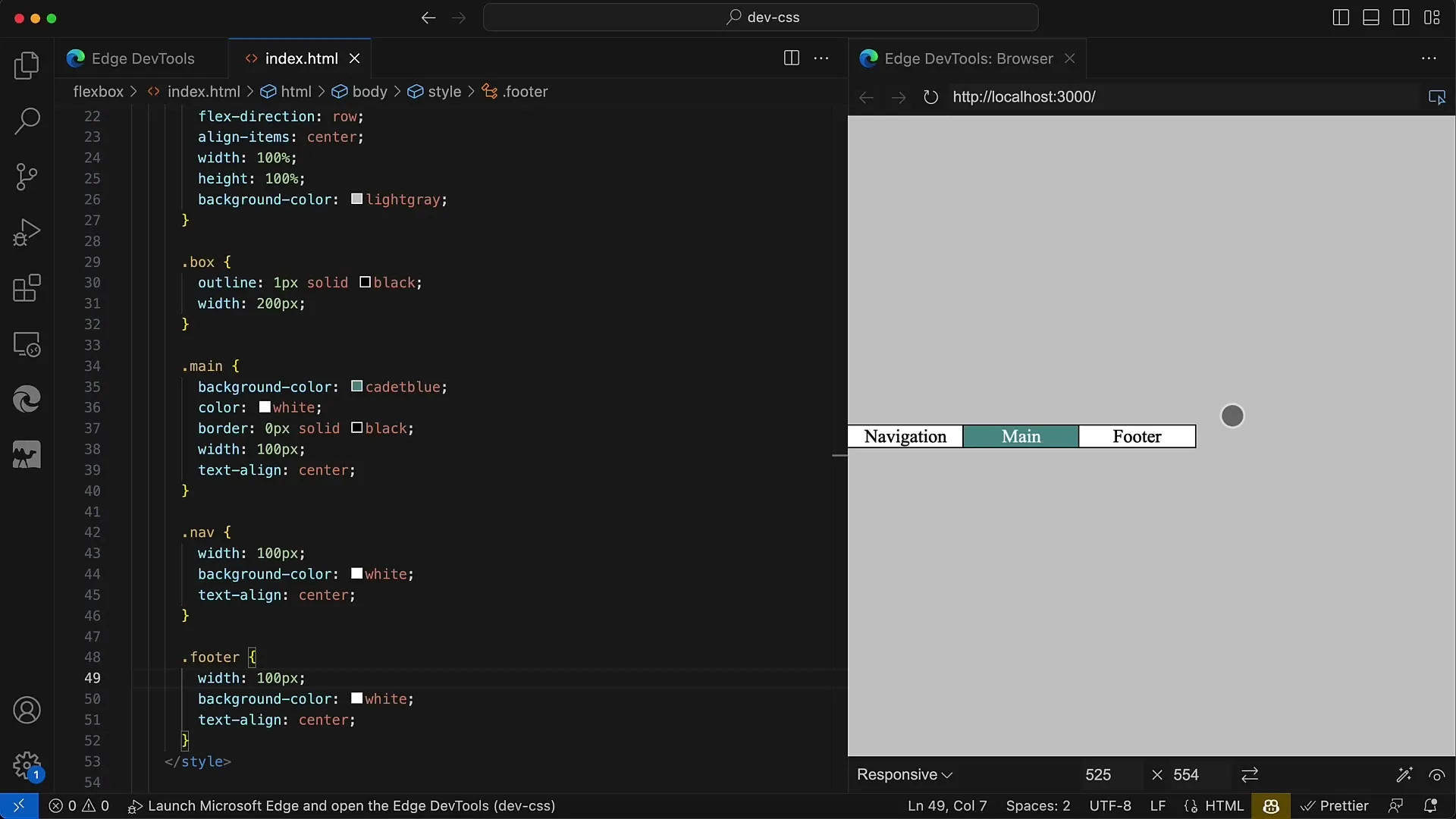
When you place your elements in the container without any special styling adjustments, you will see that they are aligned by default at the beginning of the container. You can give them a width of 100 pixels to illustrate them.
3. Centered Alignment
To center the elements, you use the CSS property justify-content with the value center. This will align your elements in the middle of the container, creating a very appealing arrangement.
4. Aligning Elements at the End
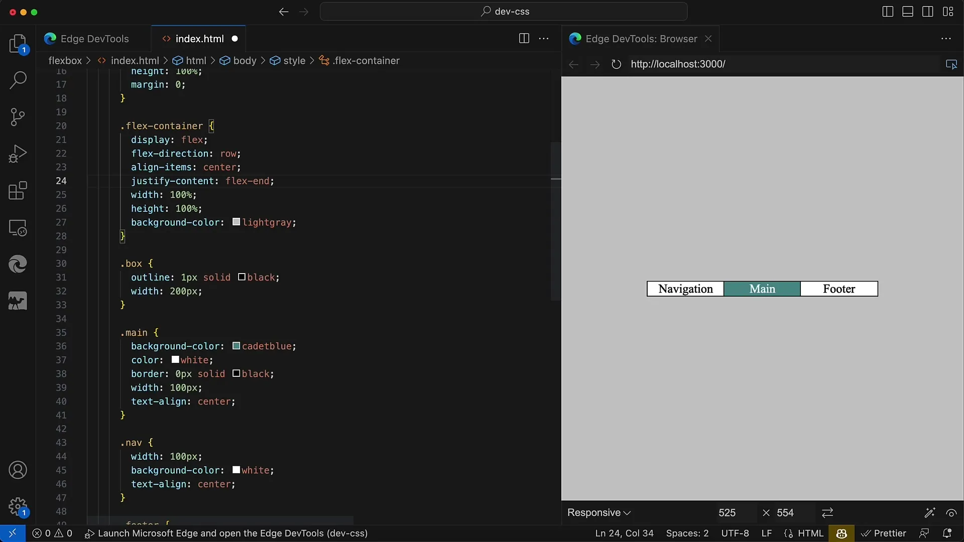
If you want to align your elements at the end of the container, you can use the value flex-end for justify-content. This will move the elements to the right end of your container.
5. Aligning Elements at the Start
The default behavior without adjustment is flex-start, which means the elements remain at the beginning of the container. This setting is useful when you want a clear, tidy arrangement of elements at the top of the container.
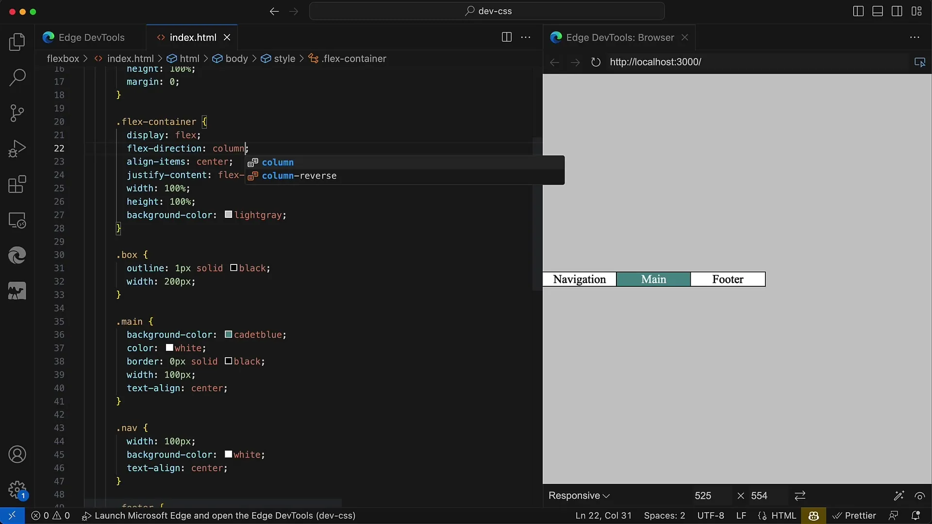
6. Changing Flex Direction
By changing the flex direction to column, the main axis changes from horizontal to vertical. This will now arrange the elements from top to bottom.
7. Centering Elements in Vertical Alignment
You can also center the elements in this new alignment by using justify-content: center. This setting ensures that all elements are displayed in the center of the container.

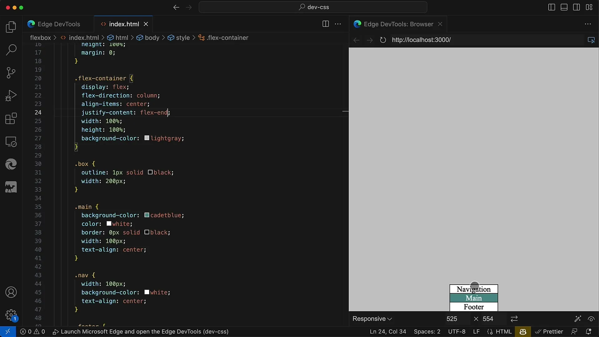
8. Alignment at the Lower End
If you want the elements at the bottom of the container, you can set flex-end again. This will position the elements at the bottom edge of the container.
9. Using Space Properties
Flexbox also allows you to control the space between your elements using space-between, space-around, and space-evenly. These properties distribute the available space in different ways.
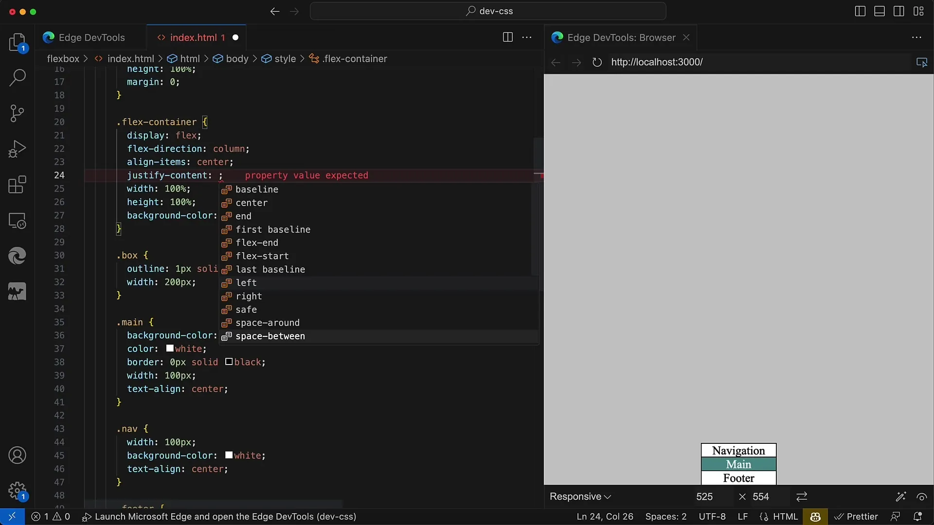
10. Using Space-Between
With justify-content: space-between, the first element remains at the top edge and the last element at the bottom edge of the container, with the space between elements evenly distributed.

11. Try Space-Around
When you use space-around, equal space is created around each element. This spacing is visible in the center of the container, while the elements remain evenly distributed.
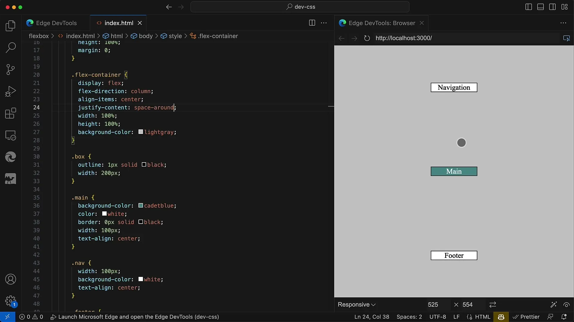
12. Using Space-Evenly
By using space-evenly, it is ensured that there is more even space between the elements and the edge of the container.

Summary
In this tutorial, you have learned how to adjust alignment in the main axis using Flexbox. Through the use of justify-content, you can make the positioning of your elements very flexible. You have also learned various properties that help you achieve a desired layout. Use this knowledge to create appealing and user-friendly designs!
Frequently Asked Questions
What is Flexbox?Flexbox is a CSS layout module that allows elements to be arranged flexibly within a container.
How does justify-content work?The justify-content property determines how the available space is distributed between and around the elements in the flex container.
Which flex directions can I use?You can use row, row-reverse, column, and column-reverse to control the arrangement of elements in the container.
What is the difference between space-between and space-around?Space-between places the first and last elements at the edges of the container, while space-around creates even space around each element.
