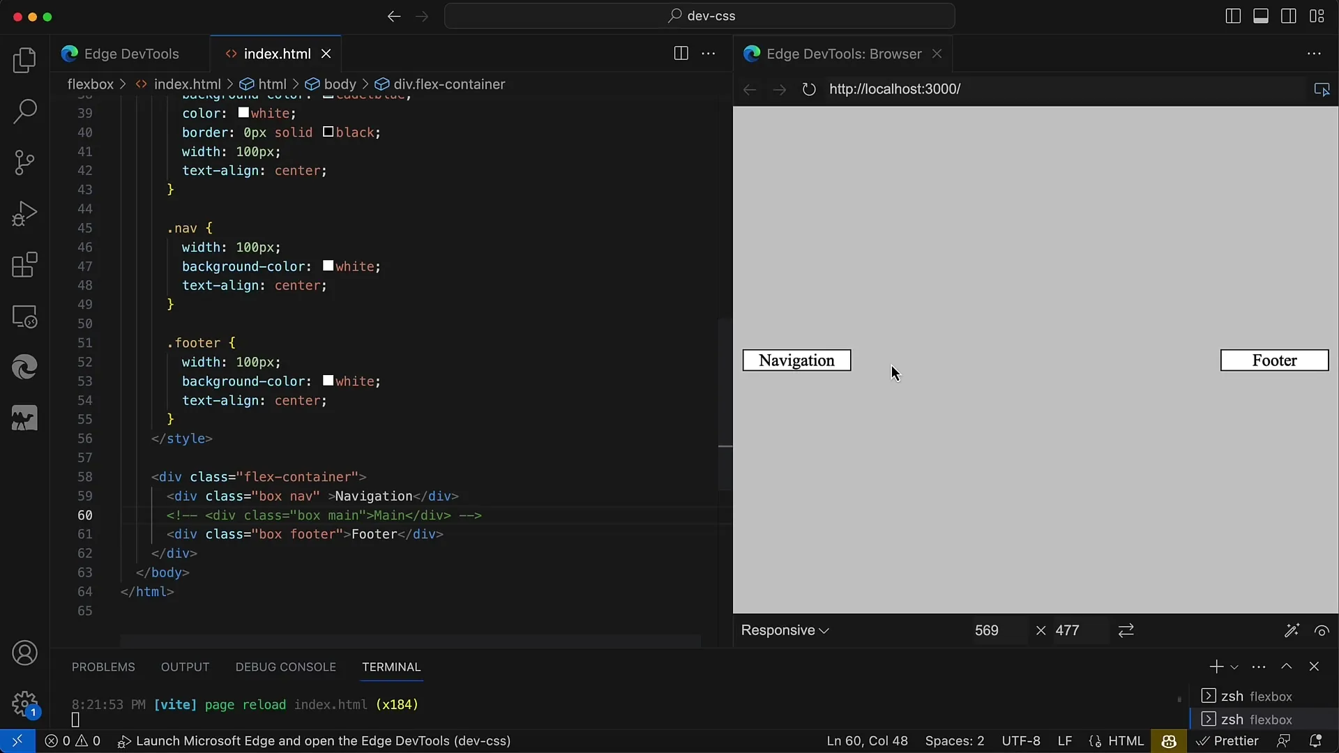
Flexbox, also known as the Flexible Box Layout, is a powerful CSS technology that helps you create layouts efficiently and flexibly. In this tutorial, I will show you how you can use Flexbox properties to align content along the main axis. In particular, we will focus on the use of justify-content, which offers you various options for arranging your elements. This example demonstrates how you can create a navigation on the left and a button on the right, while leaving enough space in between.
Key Takeaways
- You can use justify-content to efficiently align elements.
- space-between evenly distributes the available space between elements.
- Flexbox allows you to create layouts without additional containers.
Step-by-Step Guide
1. Creating the Main Container
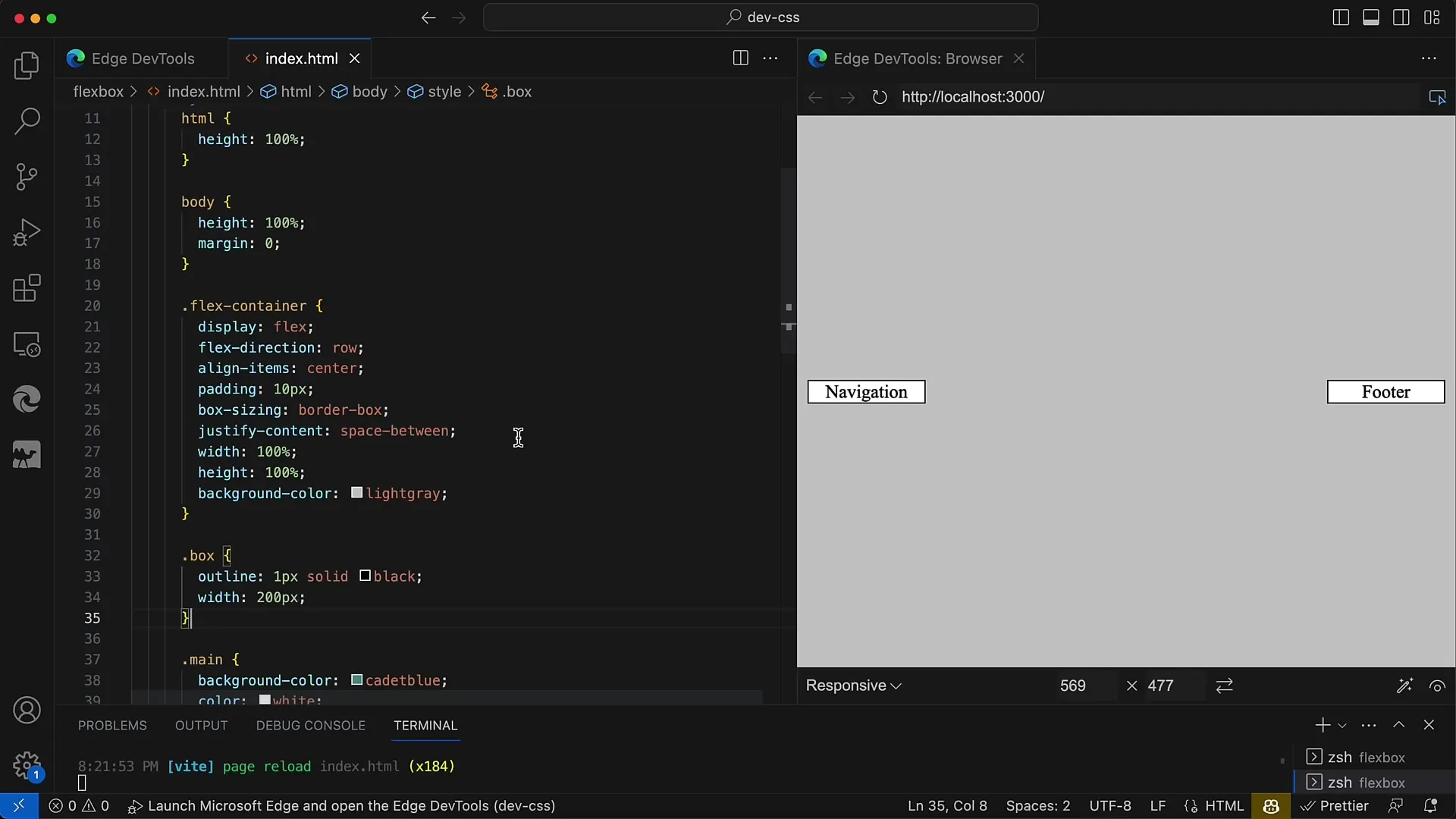
At the beginning, you need to create your main container (e.g. a div element) that should act as a flexible element. Make sure to add the property display: flex; to it. This turns your container into a Flex Container and allows it to apply Flex properties to the elements inside it.

2. Adjusting the Flexbox Properties
Next, we will change the justify-content property of the container to optimally distribute the space between the elements. In this tutorial, we will use space-between as the value. This ensures that the available space is evenly distributed between the elements.
3. Adding Padding and Box-Sizing
To ensure that our layout looks good and that no content is too close to the edge, set the box-sizing property to border-box. This prevents elements from unexpectedly overflowing the container boundaries. Additionally, we add a padding of 10 pixels to provide a pleasant distance from the edge.
4. Creating the Navigation and Buttons
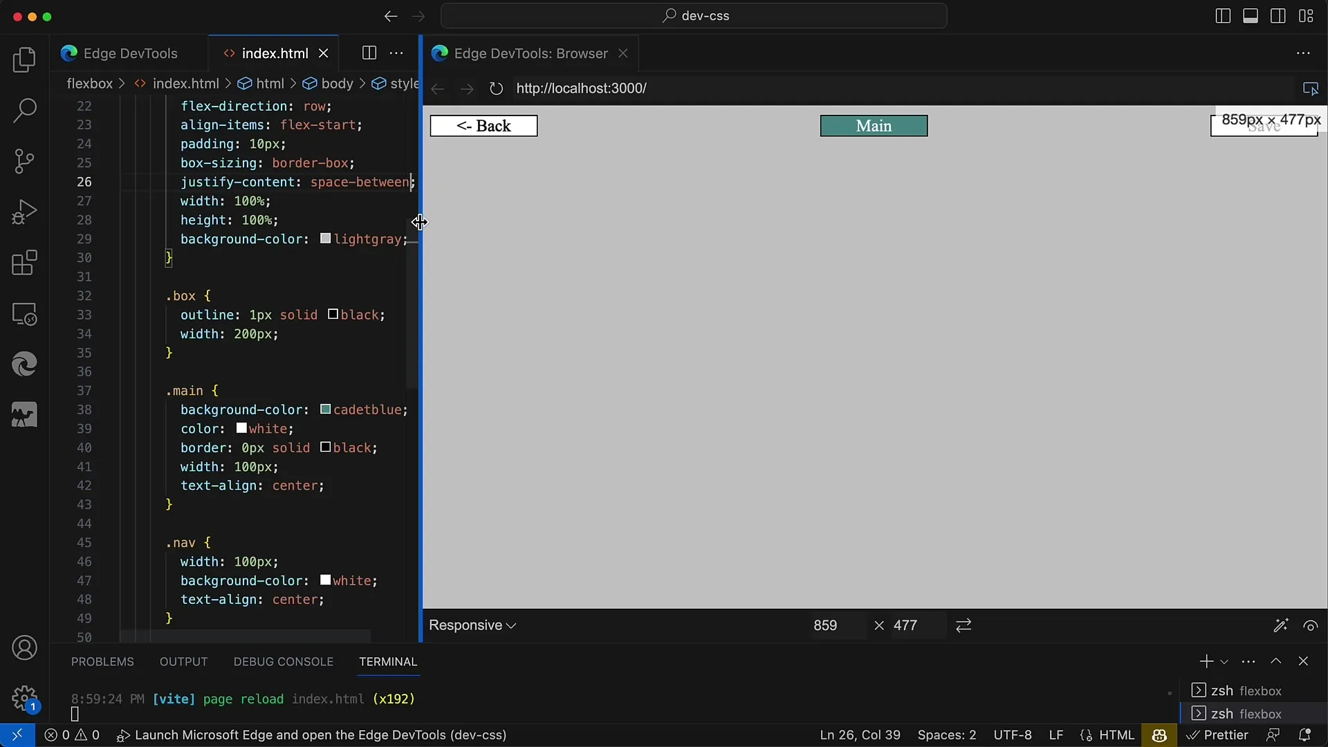
Now you can add your navigation elements. These elements should be arranged within the main container. For example, you can use links for "Back", "Export", and "Preview". These will be listed in the Flex Container and evenly distributed thanks to space-between.
5. Applying Flexible Properties to Individual Elements
If you want to place additional elements in the middle, such as a toolbox with multiple buttons, you can do so by also placing these controls in the Flex Container. Flexbox takes care of the alignment and positions them in the middle between the left and right navigation elements.

6. Using space-evenly as an Alternative
Although space-between is an excellent option, you can also use space-evenly to evenly distribute the space between all elements, including at the edges. However, this results in the distance between all elements being equal. In many cases, you may want the outer elements to remain close to the edges.
7. Repetition and Adjustment
You can further test the layout by changing the width of the container. The layout responds dynamically based on the container's size. This is a key advantage of Flexbox, as it automatically adjusts to ensure a flexible user interface.

Summary
In this tutorial, we explored the Flexbox technology in CSS. You learned how to create a flexible and appealing layout using justify-content and particularly space-between, which professionally arranges navigation elements and buttons. Flexbox offers you the ability to easily realize complex layouts without needing to insert additional containers.
Frequently Asked Questions
How do I use justify-content in Flexbox?You can use justify-content to set the alignment of your elements along the main axis. For example: justify-content: space-between; creates spaces between the elements.
What is the difference between space-between and space-evenly?space-between distributes the available space solely between the elements, while space-evenly distributes the space evenly between all elements, including the edges.
How can I adjust the size of the Flex Container?You can easily adjust the size of your Flex Container using CSS properties like width and height. Flexbox dynamically responds to these changes.


