Flexbox is a powerful layout module in CSS that allows you to create flexible and responsive layouts. In this tutorial, we focus on the flex-basis property, which is responsible for defining the base size of an element in the flex direction. It is essential to specify the size of child elements independently of the specific dimensions of the Flex container. By using flex-basis correctly, you can significantly simplify and optimize layout design.
Main Insights
- flex-basis sets the initial size of an element in the direction of the Flex container.
- By default, the value of flex-basis is 0%, which means the element only occupies the space needed by the content.
- With flex-grow and flex-shrink, the element can adjust its size according to the available space.
- The Flex direction influences the interpretation of the base size.
Step-by-Step Guide
First, let's examine how flex-basis works in a Flex layout. Start with a simple example. Make sure you have set up a Flex container with elements.
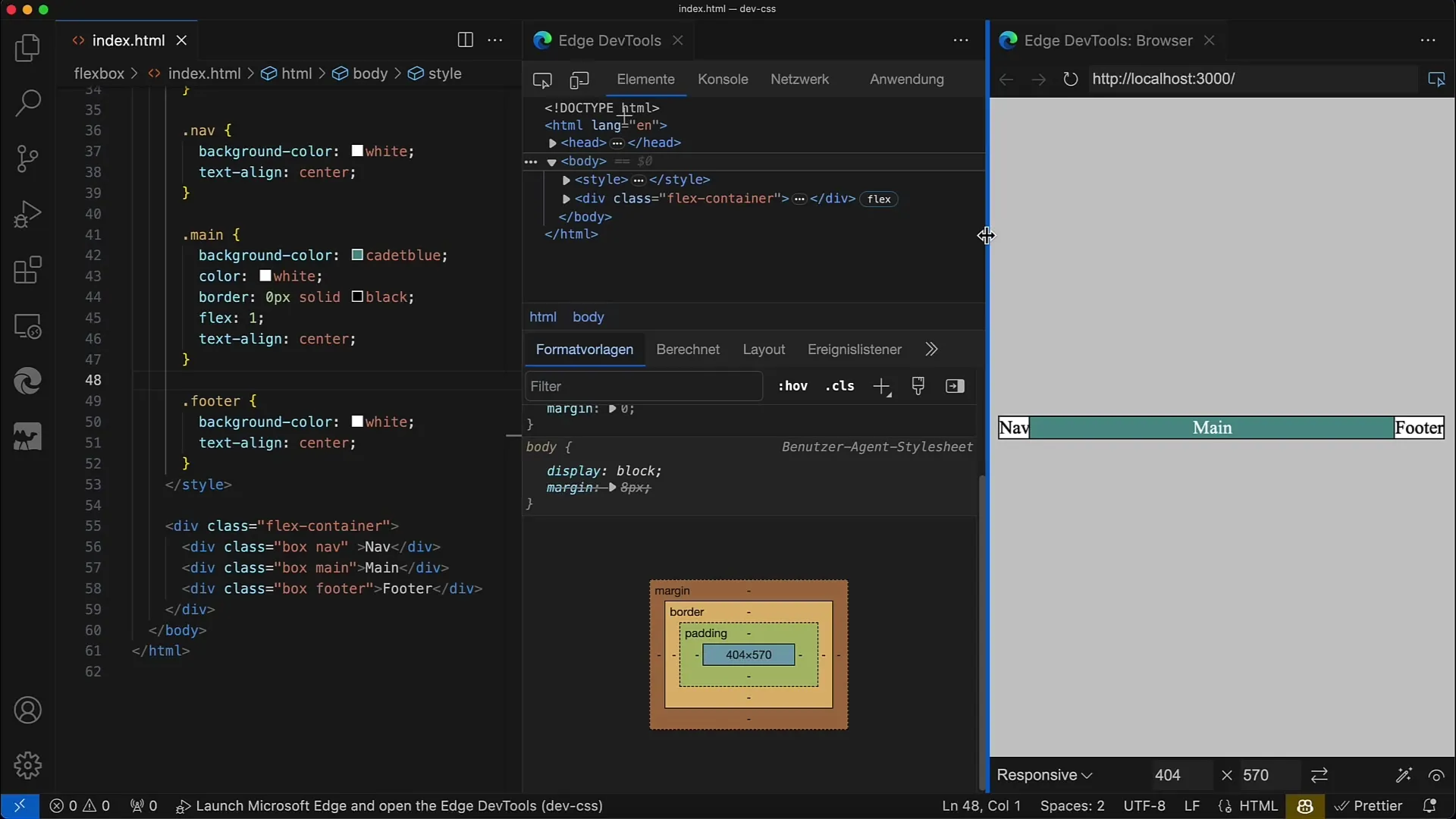
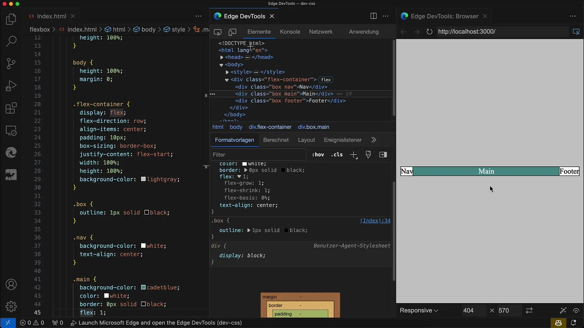
First, you define your Flex container. In our example, we have set display: flex and flex-direction: row on our container. This allows the child elements to be arranged horizontally side by side.
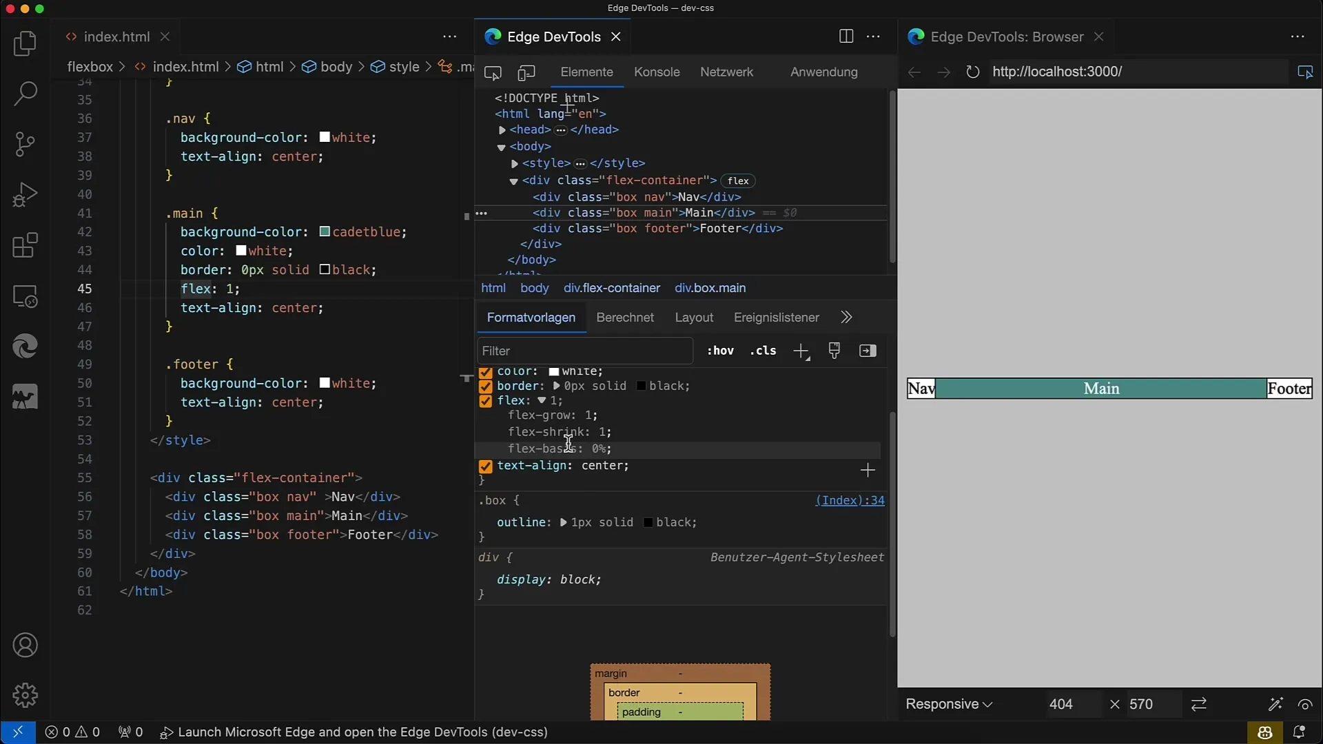
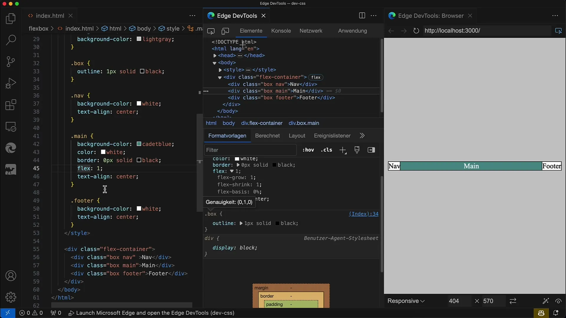
The next thing you want to do is select an element within the container and apply the flex property. Here, we use flex: 1, which is a combination of flex-grow, flex-shrink, and flex-basis. Let's delve into each component.
With flex: 1, the element will take on a flexible size, with the base default size set to 0%. This means it will only occupy the space needed by the content.
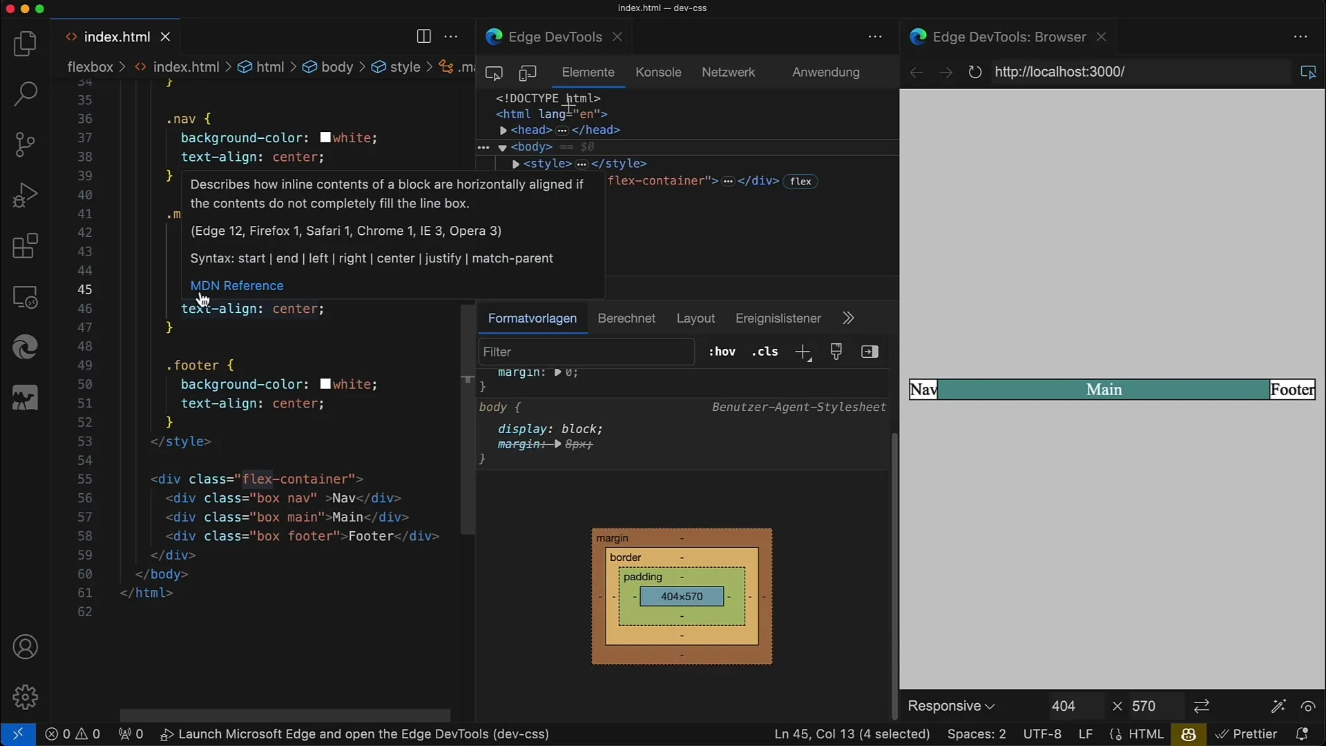
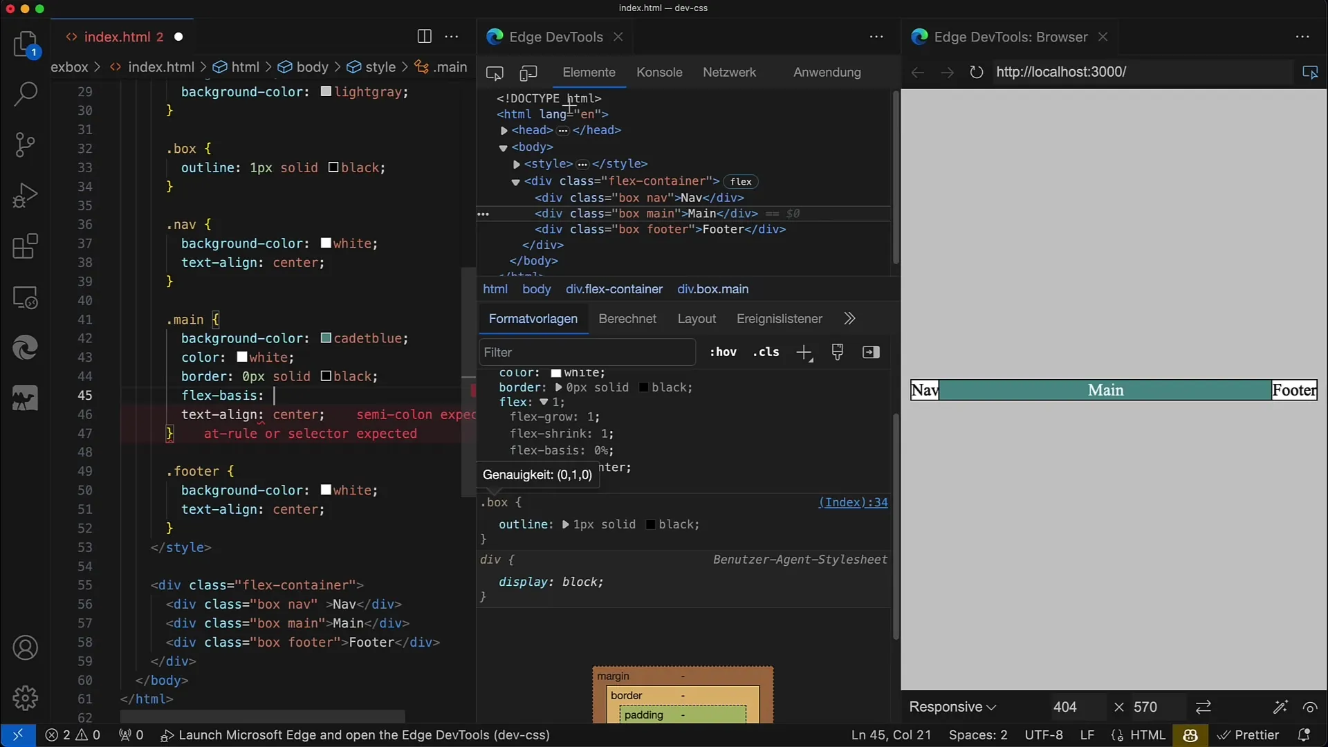
Now, let's take a closer look at the flex-basis property. You can specify it directly by, for example, starting to change it from flex to flex-basis: 100px. This sets the initial width of the element to 100 pixels.
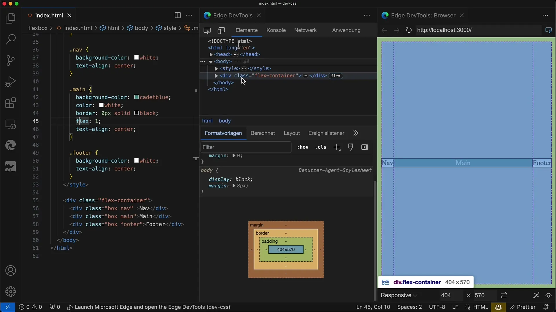
Save your changes, and you will see that the main element is now 100 pixels wide. These 100 pixels are the base width from which the browser layout starts.
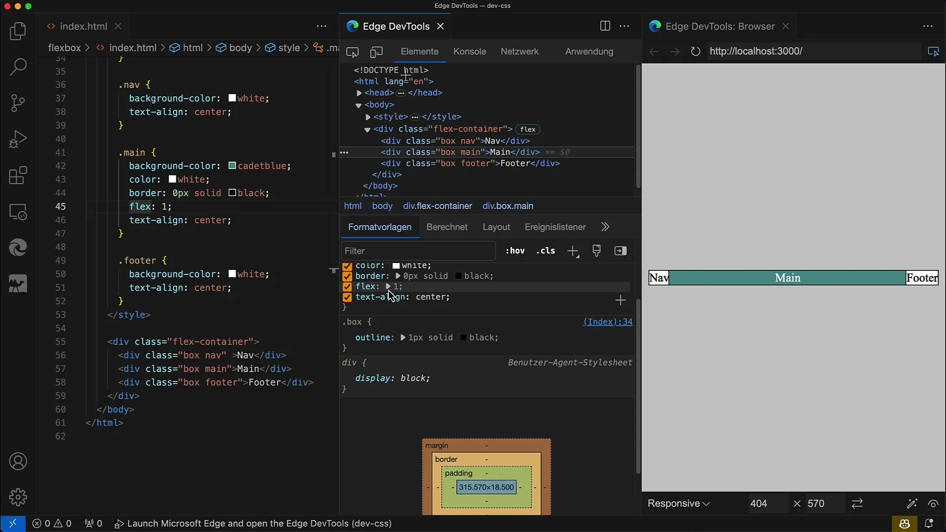
This means that the element can take up more space if it has more space available through flex-grow or less space if flex-shrink becomes active.
Alternatively, you can also specify percentages. Change the value to flex-basis: 100%, meaning the element should occupy all the available space in the container.
If you set flex-basis to 0 now, you will see that the element collapses to the width dictated by the content. It is important to note that 0 does not mean the element has no width, but it is based only on the minimal content.
A commonly used value for flex-basis is auto. When you set this value, the layout becomes very flexible, as the width varies depending on the content. Check this by setting the width explicitly, for example to 200px, and see how the element takes up 200 pixels.
You can also change the Flex direction. Set the flex-direction to column. This changes how the base size is interpreted - now the base size applies in the vertical direction.
So, when you change flex-basis now, you need to adjust the height of the element. If you set flex-basis to 100 pixels, the element will be 100 pixels high, and you have the flexibility to scale based on the content.
It is important to understand this because, while width and height are static, flex-basis changes in accordance with the flex-direction. This makes Flexbox much more flexible compared to traditional layout methods.
Next, the meaning of flex-grow and flex-shrink in connection with flex-basis will be explained as the next step. These values define how much space the element takes up in the container, depending on its size and the available resources.
Summary
In this tutorial, you have learned the basics of the flex-basis property. You now know how to define the base size of an element using this property and how the flex-direction affects the layout display. With this knowledge, you are ready to create advanced Flexbox layouts that adapt flexibly to different screen sizes and content.
Frequently Asked Questions
What is flex-basis?Flex-basis sets the initial size of a flex item in the main axis.
How does flex-grow work?Flex-grow determines how much space an element takes compared to other flex items when space is available.
What happens when I set flex-basis to zero?If you set flex-basis to zero, the width of the element will be reduced to the minimum content width.
Can I use a percentage for flex-basis?Yes, you can specify flex-basis in percentage to define the space the element should occupy relative to the container.
How does the flex-direction influence flex-basis?The flex-direction determines how the flex-basis is interpreted, either in terms of the width or height of the element.
