In this tutorial, you will learn how to use the CSS Property flex-grow to control the growth of Flex items in a Flex container. Flexbox is a powerful layout technology that allows you to dynamically and responsively arrange elements. With flex-grow, you can define how much space an element should occupy in a container when additional space is available.
Main Insights
- flex-grow determines the ratio in which an element should grow compared to other elements.
- A value of 0 for flex-grow means that the element does not grow and only occupies the defined base size.
- All elements with the same flex-grow value grow evenly.
- The total space is distributed based on the sum of the flex-grow values.
Step-by-Step Guide
To illustrate the concept, let's look at some steps in which you can effectively use the flex-grow property.
Step 1: Prepare the Layout
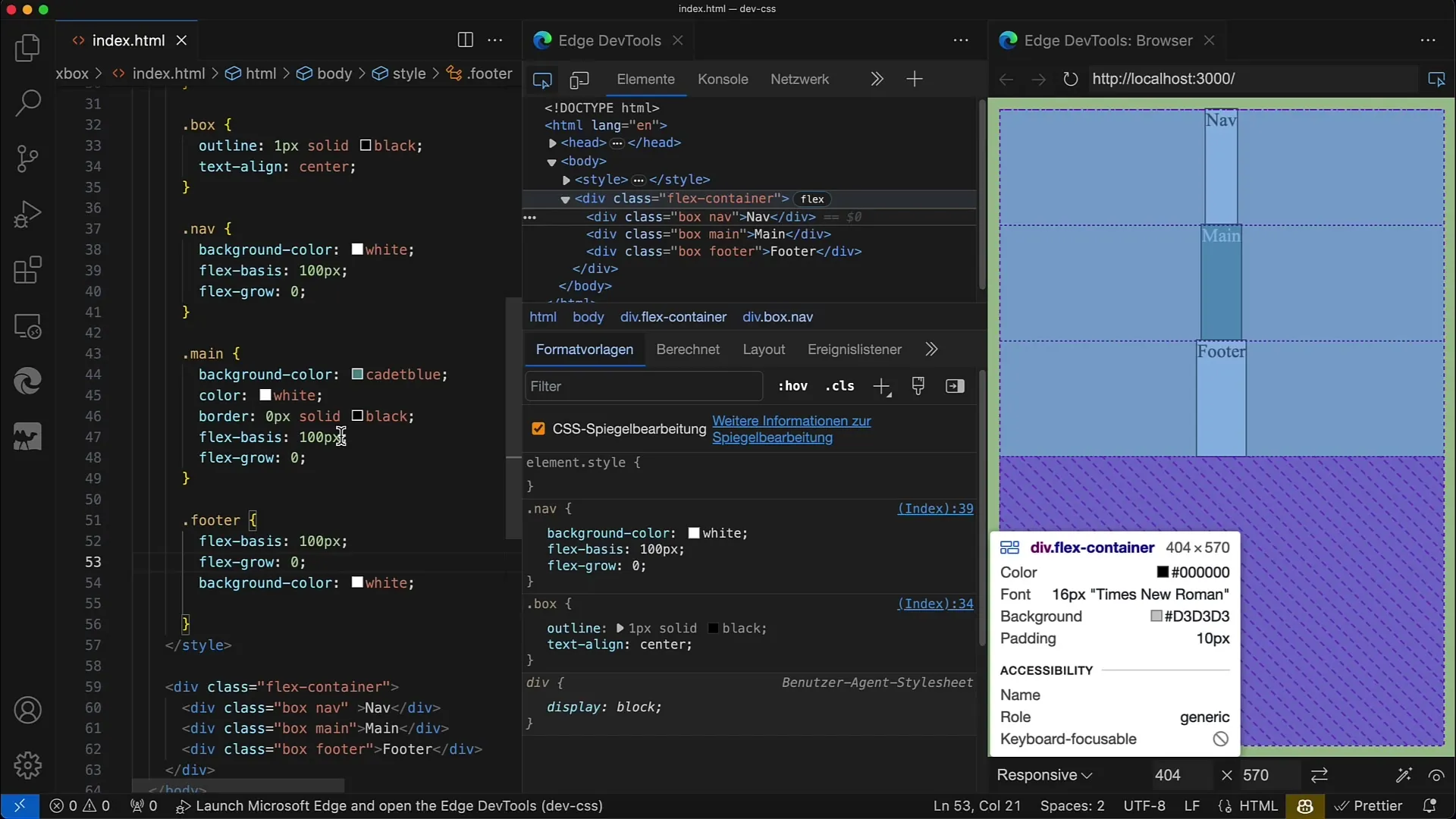
Firstly, create your Flex container and define some Flex items. Set a fixed flex-basis for all elements. In the following example, the flex-basis is set to 100 pixels for each element, and we choose a vertical arrangement (Column).
Step 2: Set Flex-grow to Zero
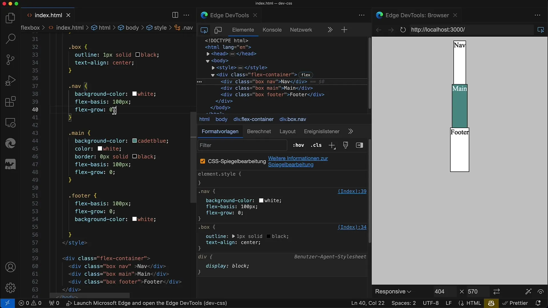
Next, set the flex-grow property to 0 for all elements. This means there is no growth in the height of the elements, and each element remains at a height of 100 pixels.
Step 3: Adjust Flex-grow for the Main Element
Now it gets interesting: Change the flex-grow value for the main element. Set flex-grow to 1 for the main element, while keeping the other two elements with flex-grow: 0. This will make the main element occupy the available space within the container.
Step 4: Apply Flex-grow to Additional Elements
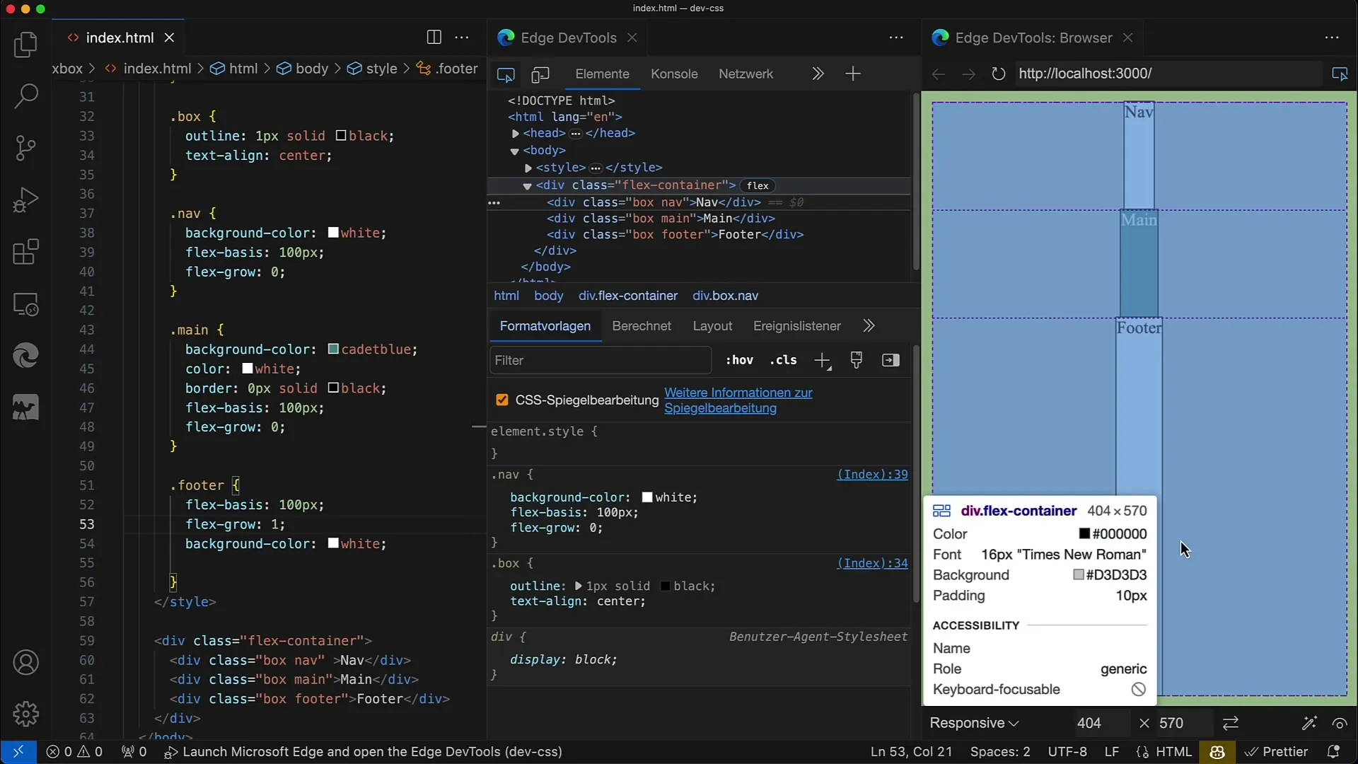
You can also apply the flex-grow property to other elements. For example, set flex-grow to 1 for the footer element as well. Suddenly, the entire layout dynamically adjusts with the same increase in space.
Step 5: Even Growth of All Elements
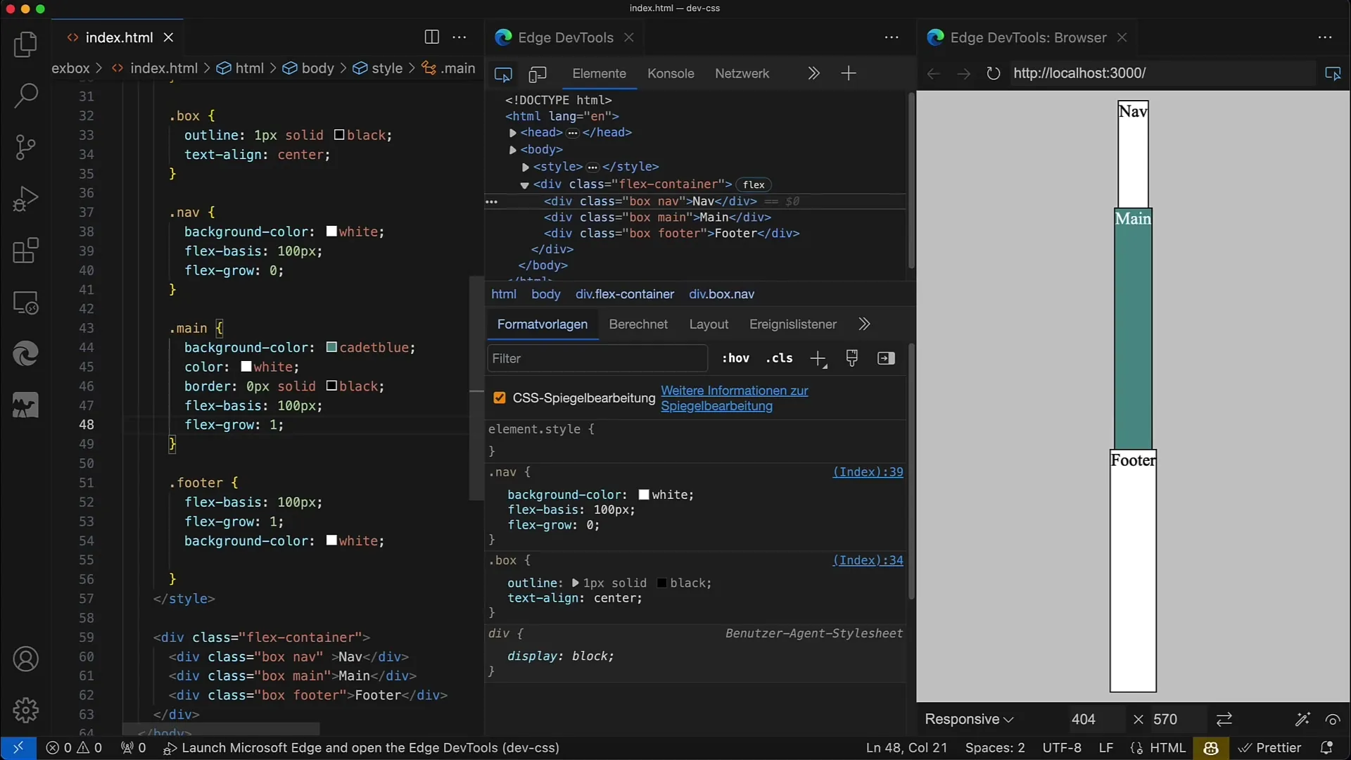
If you want all items to grow evenly, set flex-grow to 1 for all. This way, all elements grow uniformly and fill the available space. This is especially useful when you need a consistent layout.
Step 6: Adjust Flex-basis
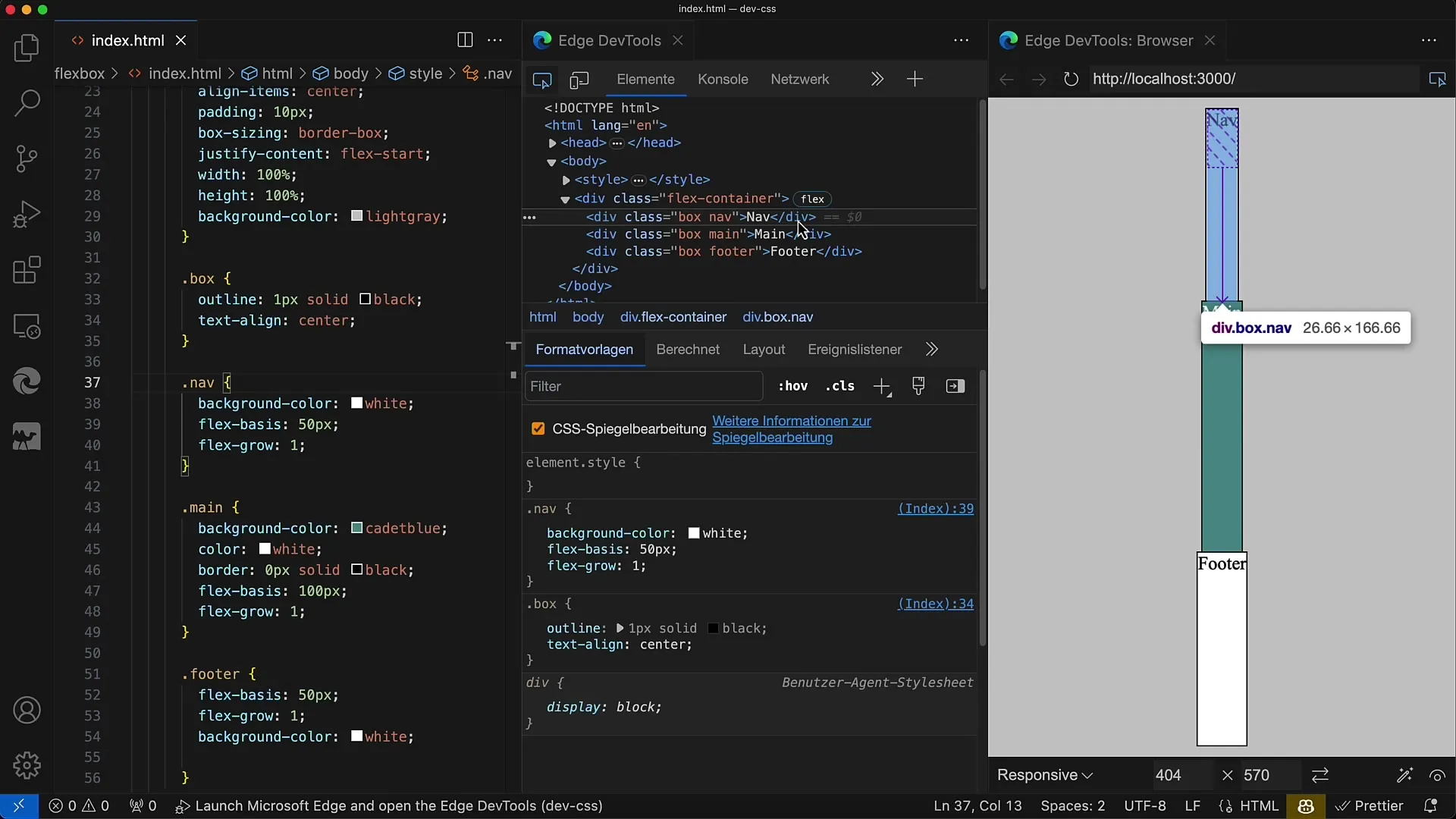
You can also use different flex-basis values. For example, set a flex-basis of 50 pixels for the navigation element. In this case, the navigation element will be smaller but still grow alongside the rest of the elements.
Step 7: Manage Additional Space
By changing the base values of multiple elements, you can see how the growth ratio changes. When the base sizes vary, the element with the smaller base takes a different share of the free space.
Step 8: Set Flex-grow Variable
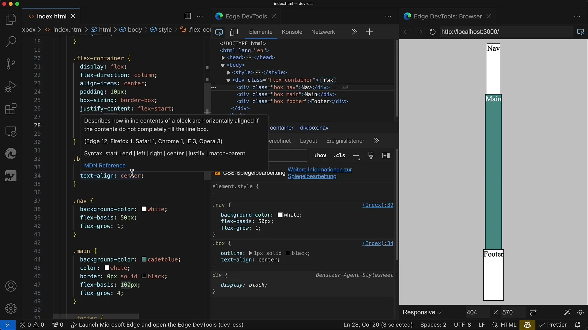
To further control the growth of an element, you can set flex-grow to 2 for some elements while others have a value of 1. This way, the element with the higher value will get more space compared to the others.
Step 9: Adjust Container Size
Test the behavior by changing the height of the container. For example, if you reduce the height to 400 pixels, the distribution of the elements will have less space accordingly. You will see how the layout dynamically responds.
Step 10: Combine Flex-grow and Flex-shrink
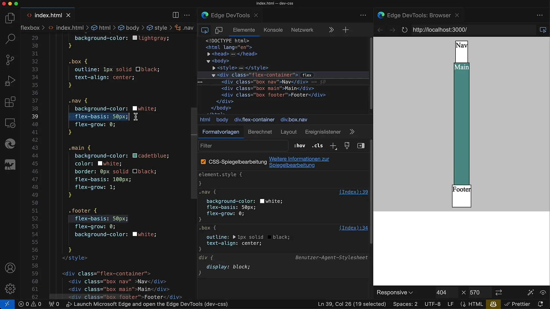
Keep in mind that flex-grow and flex-shrink interact with each other. While flex-grow determines how much space is gained, flex-shrink controls what happens when less space is available. This concept is important for creating responsive designs.
Summary
In this guide, you have learned how to use the flex-grow property in CSS to control the growth of flex items. You now know that flex-grow affects the distribution of available space in the flex container and how you can use these settings to create dynamic and responsive layouts.
Frequently Asked Questions
What is flex-grow?flex-grow determines how much an element should grow when additional space is available in the flex container.
What happens if I set flex-grow to 0?A value of 0 for flex-grow means that the element does not grow and only occupies the standing size.
How can I ensure that all elements grow equally?Set flex-grow to the same value for all elements in the container, e.g. 1.
What happens if the container has less space?If the container has less height, the elements can shrink according to their flex-shrink value.
Can I combine flex-grow with flex-basis?Yes, flex-grow is used in relation to flex-basis to control growth when space is available.


