In this tutorial, we will focus on the CSS property modifier flex-shrink. This option is part of the Flexbox model, which allows you to create flexible layouts that adapt to different screen sizes. While in the last video we covered flex-grow, which determines how elements in the Flex container can grow, this time it's about shrinking elements when the space in the container is less than the specified flex-basis. In this post, you will learn how to selectively constrain or adjust the shrinking of Flexbox elements with flex-shrink.
Key takeaways
- flex-shrink determines how much an element can shrink when there is not enough space available.
- The default value for flex-shrink is 1, which means that an element can take up space depending on the available space and how other elements in the container are defined.
- You can use flex-shrink to establish a specific ratio for the shrinkage among multiple elements.
Step-by-step guide
Here, I will explain the steps to optimally utilize flex-shrink. I will provide each step with screenshot variables that you can later replace with the respective screenshots from the video.
First, you will see a basic Flexbox application in CSS. You have three elements with a flex-basis of 100 pixels. If there is enough space in the Flex container, everything remains as planned.
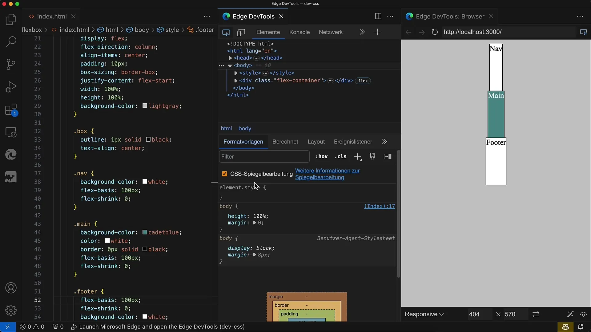
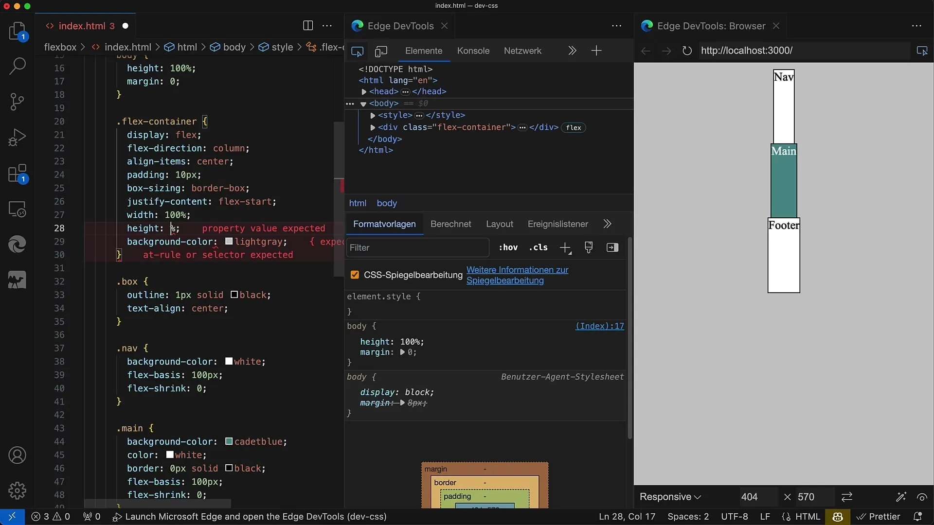
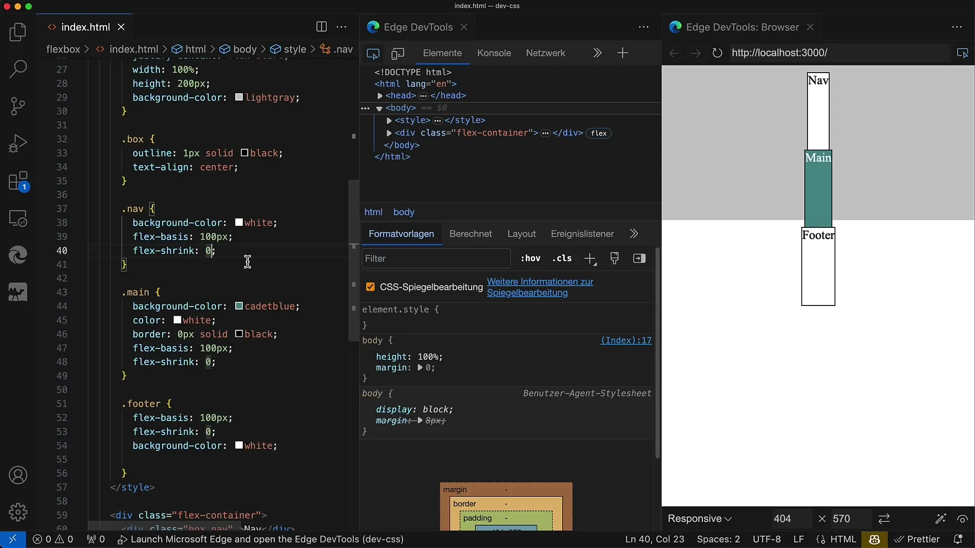
Now, let's reduce the height of the container to 200 pixels. In this case, the space needed is larger than the container's height. The elements still have a flex-basis of 100 pixels and therefore cannot shrink because we have set flex-shrink to 0.
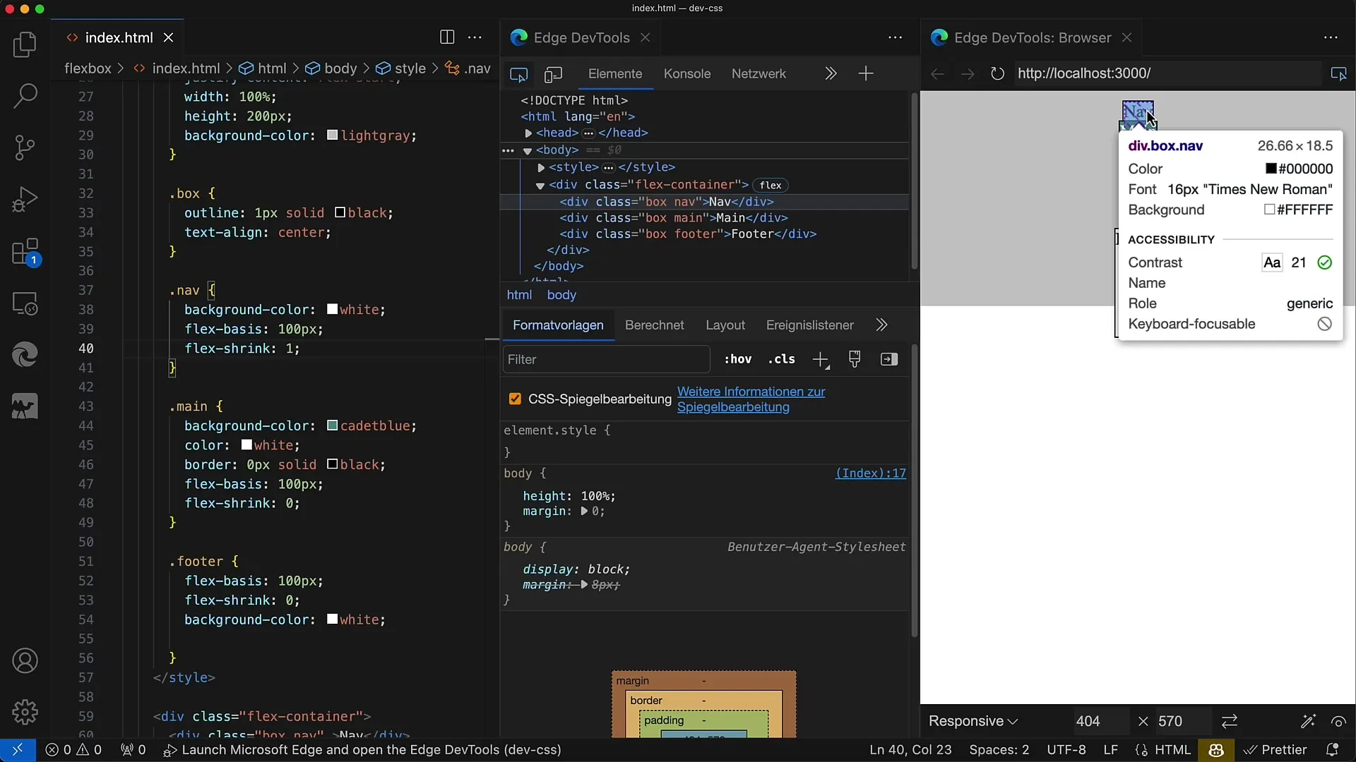
To activate the shrinking mechanism, change the value of flex-shrink. Set it to 1 for the nav element. This informs CSS that the nav element should shrink to the maximum.
Now, save your changes, and you will see that the nav element shrinks proportionally, down to the minimum height dictated by the content.
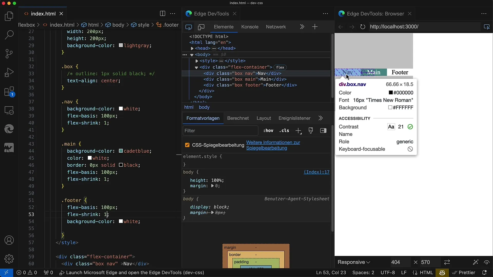
If you want all elements to shrink evenly, set flex-shrink to 1 for all elements. If the container becomes smaller than the required space, all elements will shrink accordingly.
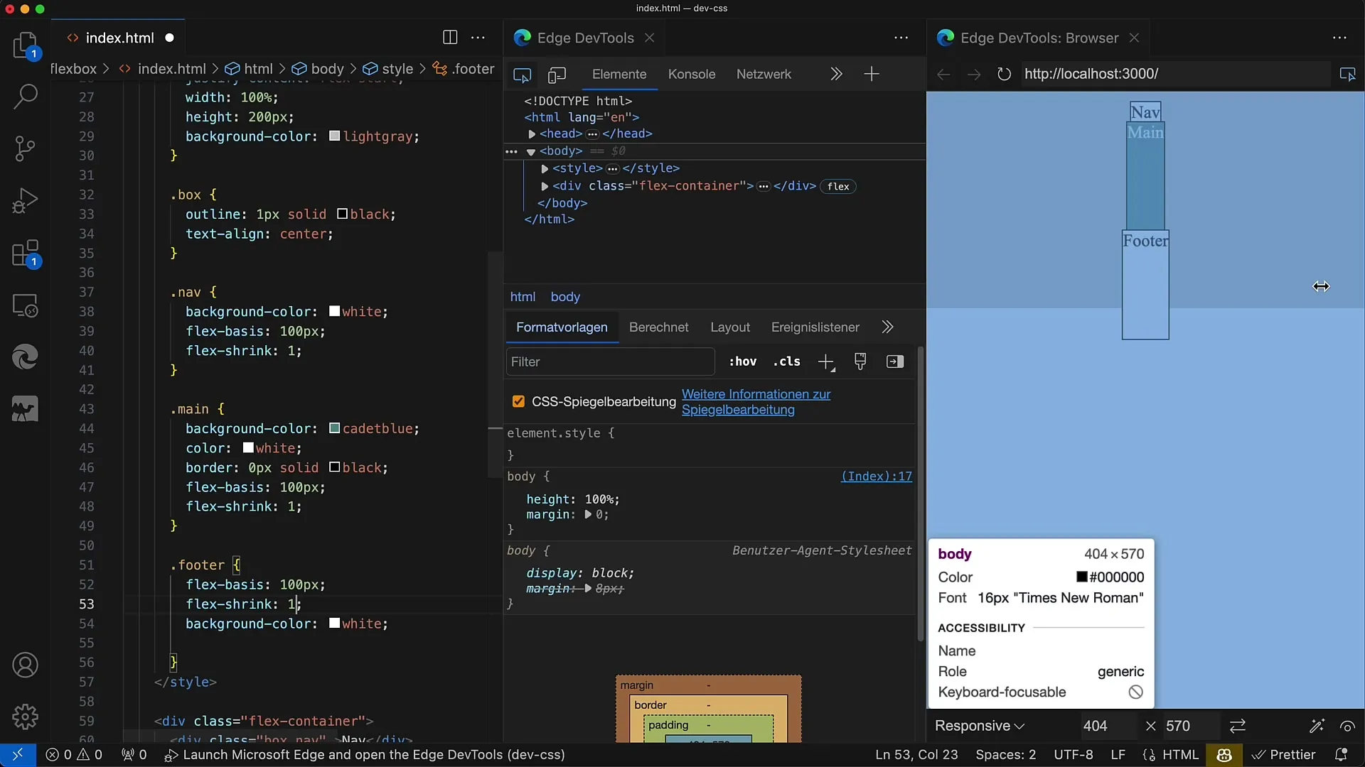
To demonstrate how different flex-shrink values affect the layout, choose a ratio like 1:1:2. In this case, the main area receives the largest share of the shrinkage, while the other elements receive smaller shares each.
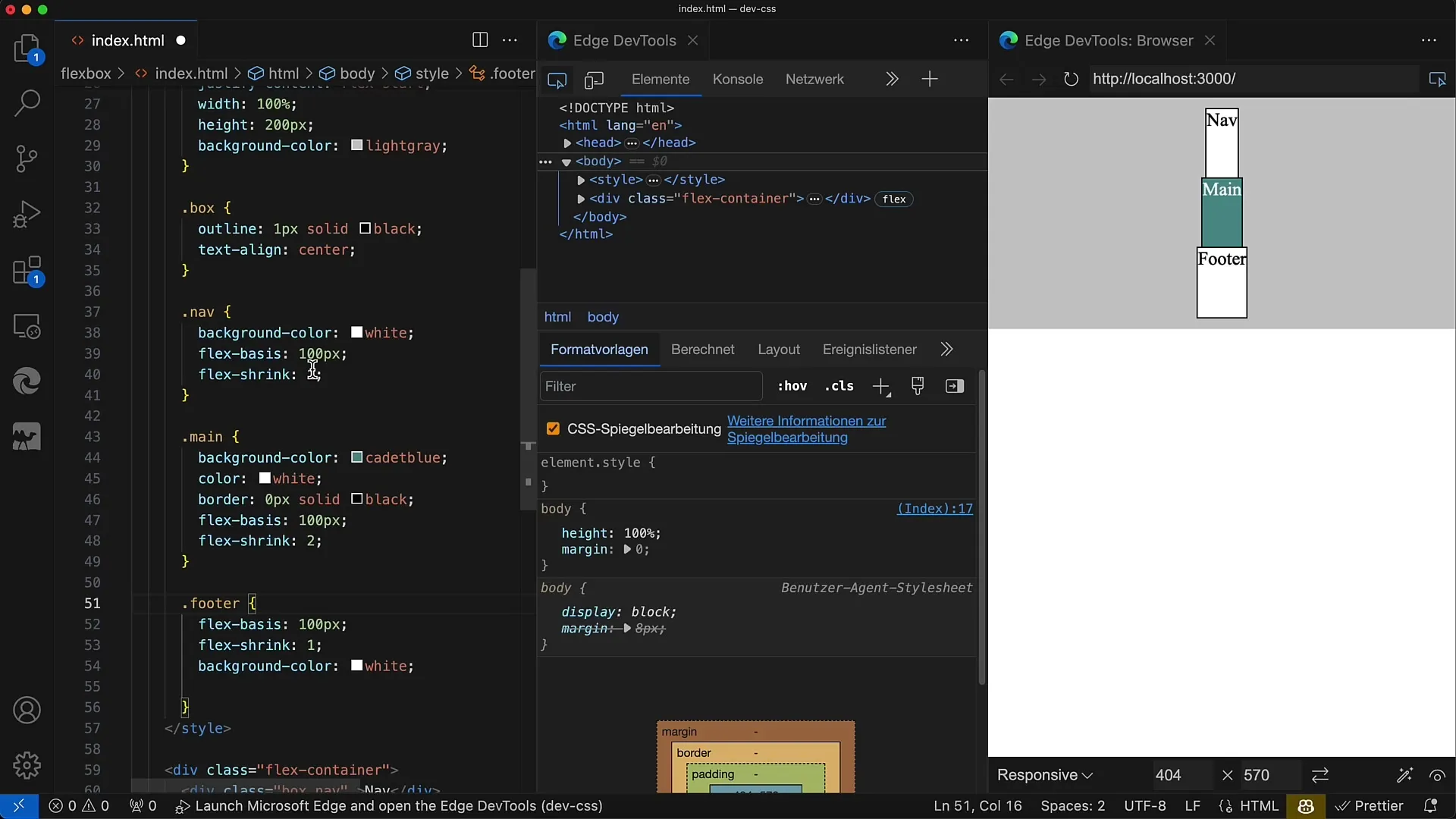
This means that the main element will take up more space or require less space when there is limited space, compared to the other two elements. However, if you want a uniform layout adjustment, you can also set flex-shrink to the same value for all elements.
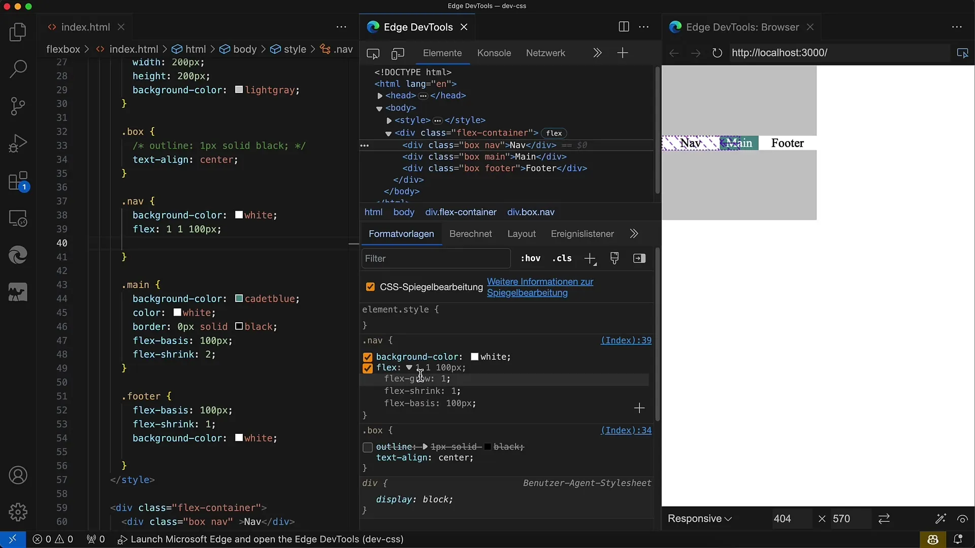
Finally, you can combine the values for flex-grow, flex-shrink, and flex-basis to achieve more flexibility in layout design in CSS. Make sure to always tailor them to the requirements of your design.
Summary
In this tutorial, you learned how to use flex-shrink in CSS to control the size changes of Flexbox elements. You have explored different ways to define the shrinkage and how it affects the layout.
Frequently Asked Questions
How does flex-shrink work?flex-shrink determines how much an element can shrink when the available space is less than the flex-basis.
What is the default value of flex-shrink?The default value of flex-shrink is 1, which means all elements shrink evenly.
How do I set flex-shrink for multiple elements?By specifying the same flex-shrink value for all elements, the shrinkage is evenly distributed.
Can I use flex-shrink in combination with flex-grow?Yes, flex-shrink, flex-grow, and flex-basis can be used together to achieve a flexible layout.
What happens when flex-shrink is set to 0?When flex-shrink is set to 0, the respective elements do not shrink, even if the container is smaller than the sum of the flex-basis.


