In CSS Flexbox, there is a variety of properties that help you design the layout of your website. One of these properties is flex-flow, which combines flex-direction and flex-wrap. This compact notation allows you to express your intention more clearly and concisely. In this guide, I will explain to you step by step how you can effectively use flex-flow.
Key Insights
- The flex-flow property combines the values of flex-direction and flex-wrap, allowing for more flexible and concise styling.
What you should know about the flex-flow property
To fully exploit the potential of flex-flow, it is important to first familiarize yourself with the two individual properties: flex-direction and flex-wrap.
Layout Basics
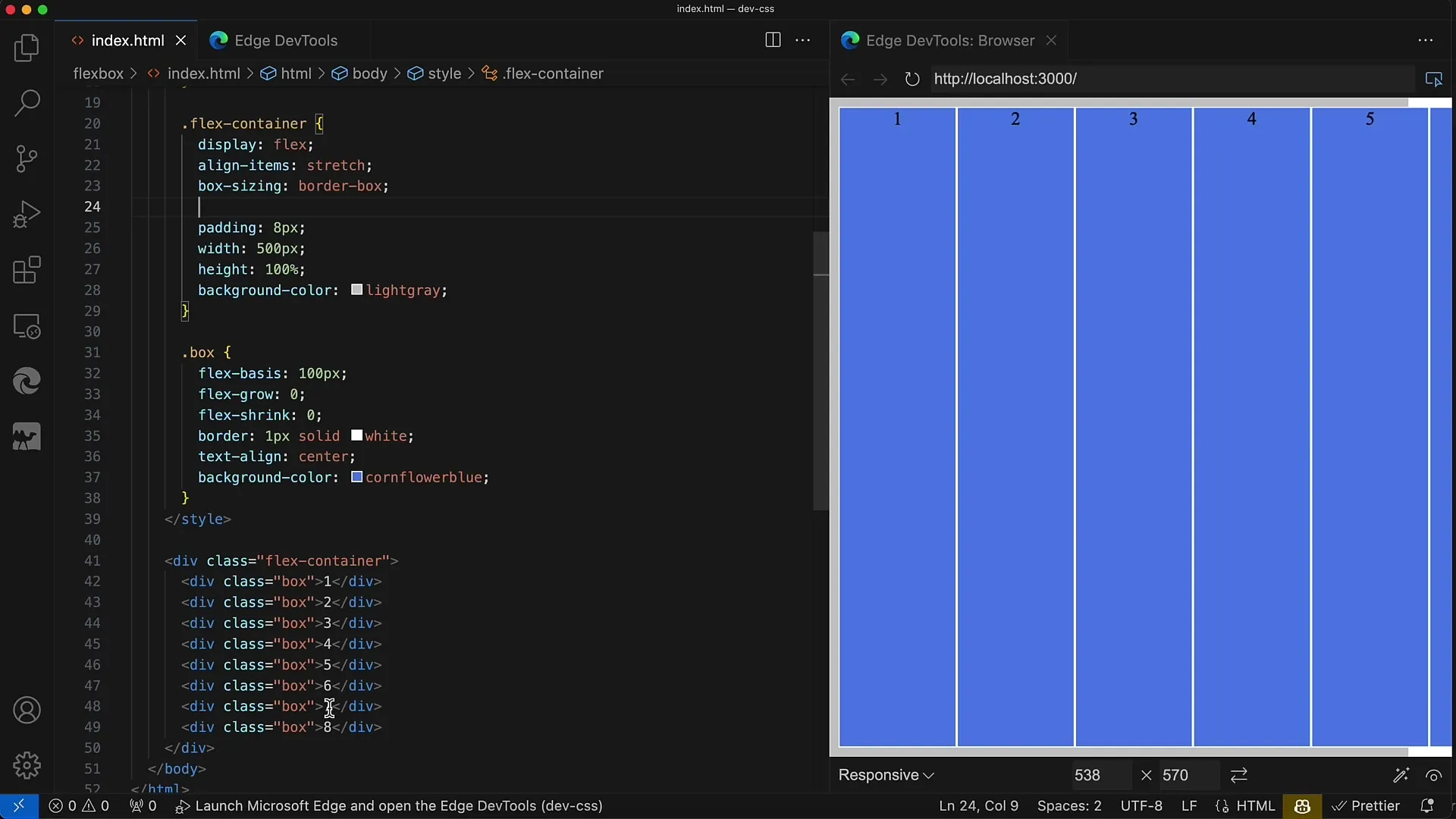
First, let's look at the starting point. You have a container with eight div elements displayed as a Flexbox side by side. The container has a fixed width of 500 pixels, and each div has a width of 100 pixels. This means that only four divs fit in a row. Without further settings, nothing happens if more space is needed.
For the correct display of the divs, we have defined display: flex as well as flex-direction: row. However, the divs quickly exceed the width of the container with this configuration, which is not desired.
Using flex-flow
Now we use the flex-flow property to set both the direction and wrapping behavior. With flex-flow, you can specify a combination of these two properties, for example, flex-flow: row wrap;.
This means that the divs will be automatically wrapped if there is not enough space. This creates clear, organized layouts.
Reverse Wrapping
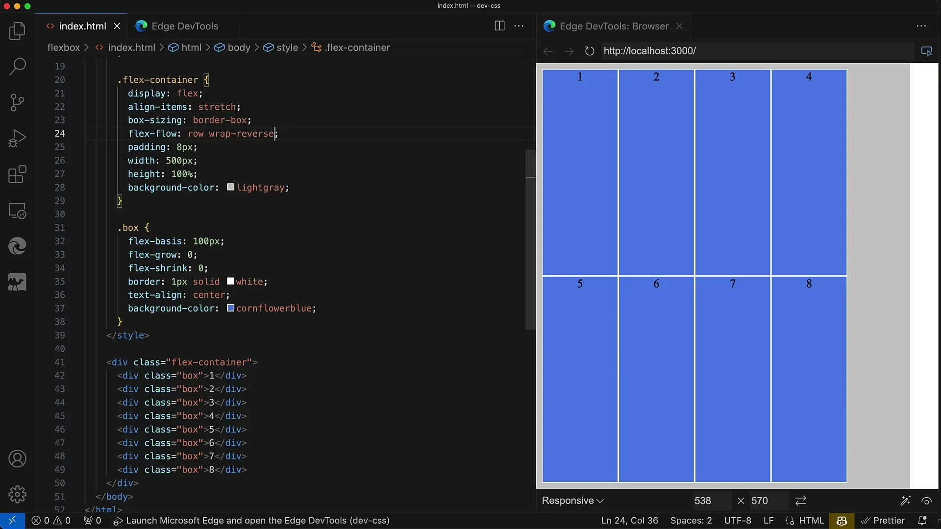
Another useful feature is reversing the direction and wrapping behavior. When you apply flex-flow: row wrap-reverse;, the divs start from the bottom and change direction accordingly.
This may be desired in some designs to create a more dynamic and interesting user interface.
Other Combinations
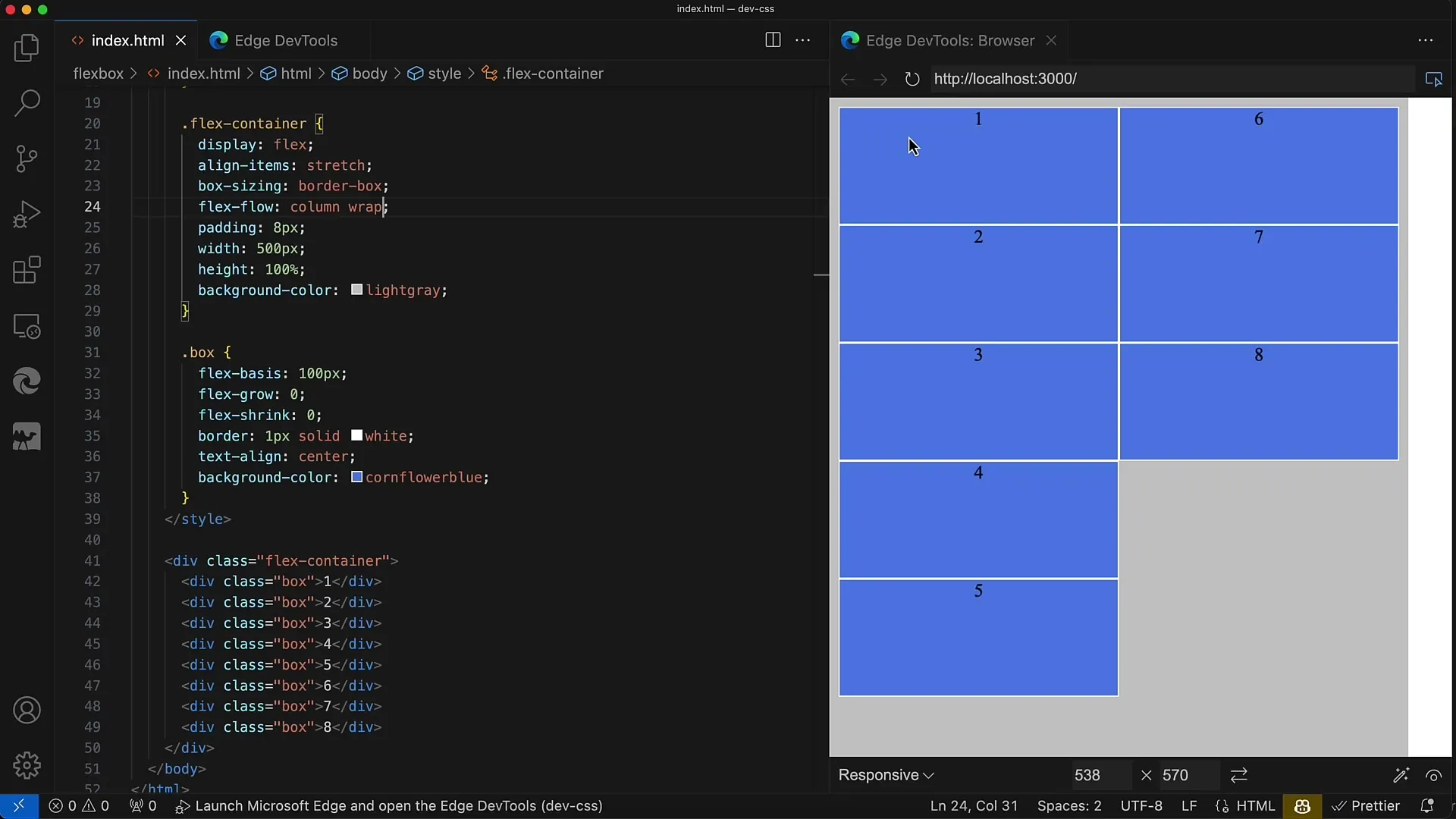
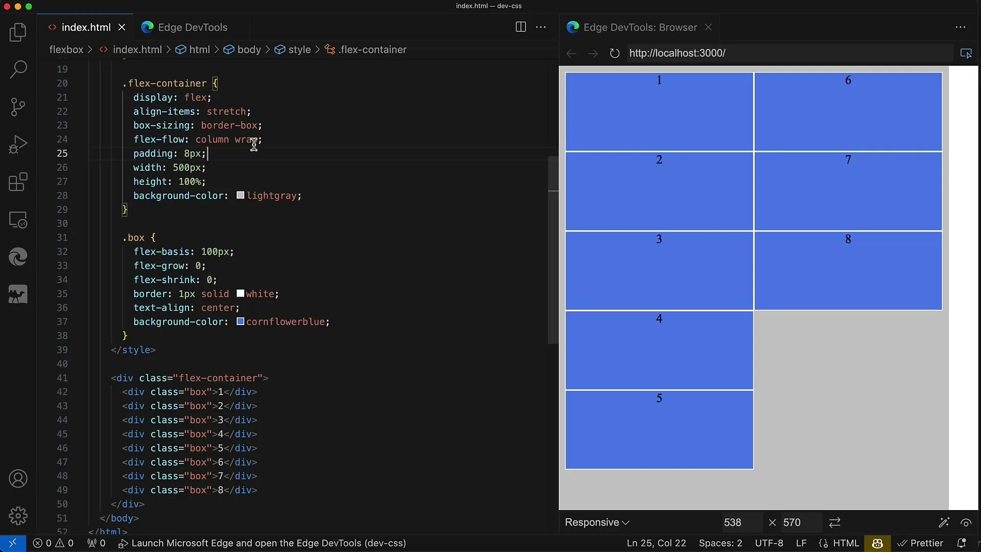
The flex-flow property is very flexible and allows you to create numerous combinations. For example, you can use flex-flow: column wrap; to arrange the items vertically while still maintaining the possibility of wrapping them.
If you want to reverse the direction, then you set flex-flow: column wrap-reverse;, which displays the elements in reverse order from top to bottom.
Advantages of the flex-flow Property
The key advantage of flex-flow is simplifying your CSS rules. Instead of specifying two separate properties, you can define everything in one line. Not only does this save time in programming, but it also makes your code more readable.
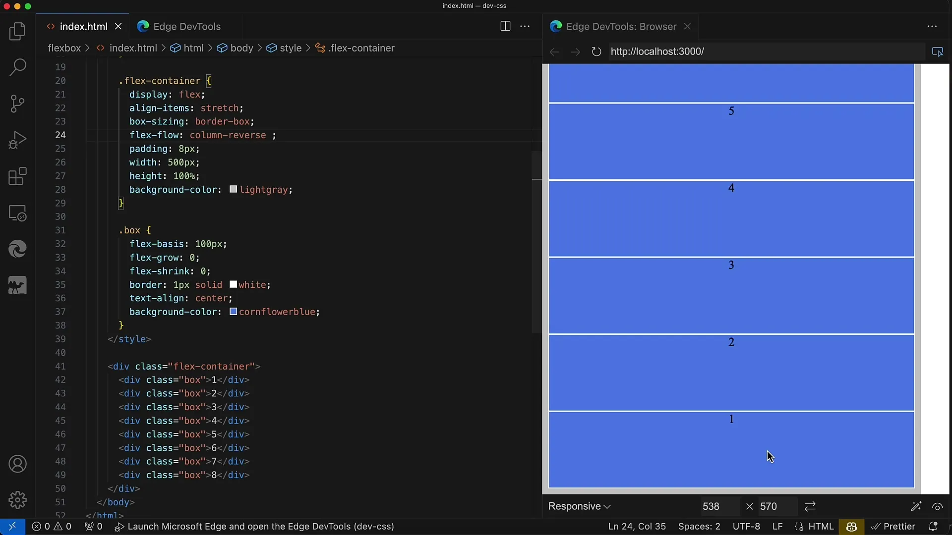
Another example would be flex-flow: column;, which by default keeps the wrap property active. If you then want to change the value for flex-wrap, you can do so in the same line.
Conclusion on Using flex-flow
In conclusion, using flex-flow is an extremely practical method to make Flexbox layouts more concise and shorter. You can set both the direction and wrapping behavior without having to write long and unmanageable CSS rules.
Summary
The flex-flow property is an extremely useful CSS feature that helps you streamline the Flexbox structure of your website efficiently. It allows you to combine both the flex direction and the wrapping in a single statement. Make your work easier and keep your code clean!
Frequently Asked Questions
How does the flex-flow property work?The flex-flow property combines flex-direction and flex-wrap in a single CSS line.
Can I use flex-flow without wrap?Yes, you can use flex-flow: row; to set the Direction without forcing wrapping.
What happens if I specify only one value for flex-flow?If only one value is specified, flex-wrap is set to the default value "no-wrap".
Can I set the values of flex-direction and flex-wrap separately?Yes, the values can also be set individually, but flex-flow is a more compact and clear option.
Can I combine flex-flow with Media Queries?Yes, you can use flex-flow in Media Queries to create responsive layouts.


