In this tutorial, you will focus on the practical application of Flexbox, particularly on the flex-wrap property. This technique is crucial for creating responsive layouts in web projects. The goal is to achieve a specific sequence of elements in a flexible container that can be wrapped if necessary. You will learn how to arrange elements so that they elegantly transition from one row to the next while maintaining consistent spacing.
Key Insights
- Using flex-wrap allows Flexbox elements to move to a new line if needed.
- With flex-direction: row, elements can be arranged horizontally, while flex-wrap: wrap-reverse ensures that wrapping occurs from bottom to top.
- To ensure consistent spacing between elements, justify-content: space evenly is important.
Step-by-Step Guide
First, we familiarize ourselves with the task and look at the desired end result.
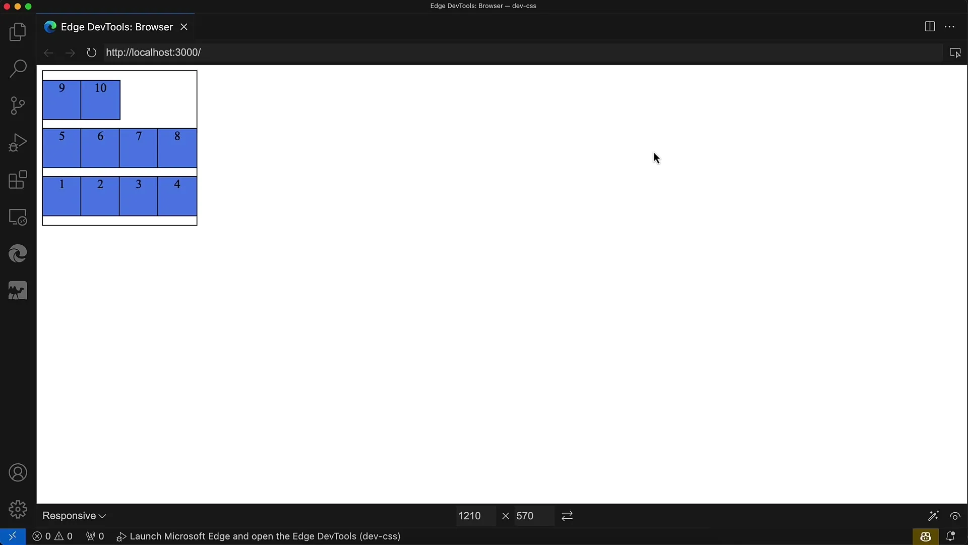
The end result should show the numbering from 1 to 10 being wrapped from bottom to top in a flexible container. It's important to ensure the correct order so that the second row appears after the first row.
Next, we examine the provided HTML. Here, there are ten div elements in a container that needs the necessary Flexbox properties set up initially. These div elements are currently unstyled.
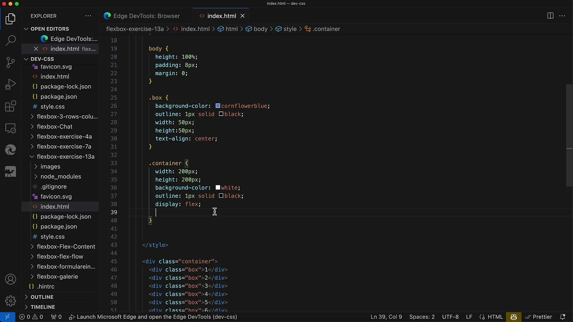
To correctly apply the Flexbox properties, you apply display: flex, which will display the elements in a row. So initially, it will appear that all divs are lined up together.
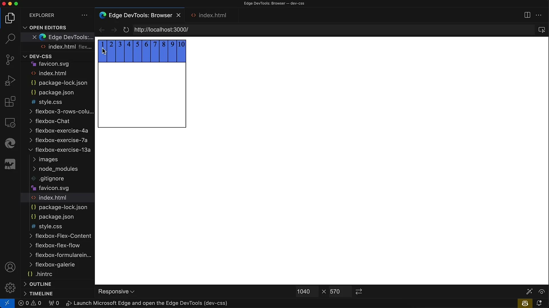
However, the entire layout needs to be adjusted to achieve the desired look. The container needs to be set up as a Flexbox, and the elements need to be wrapped.
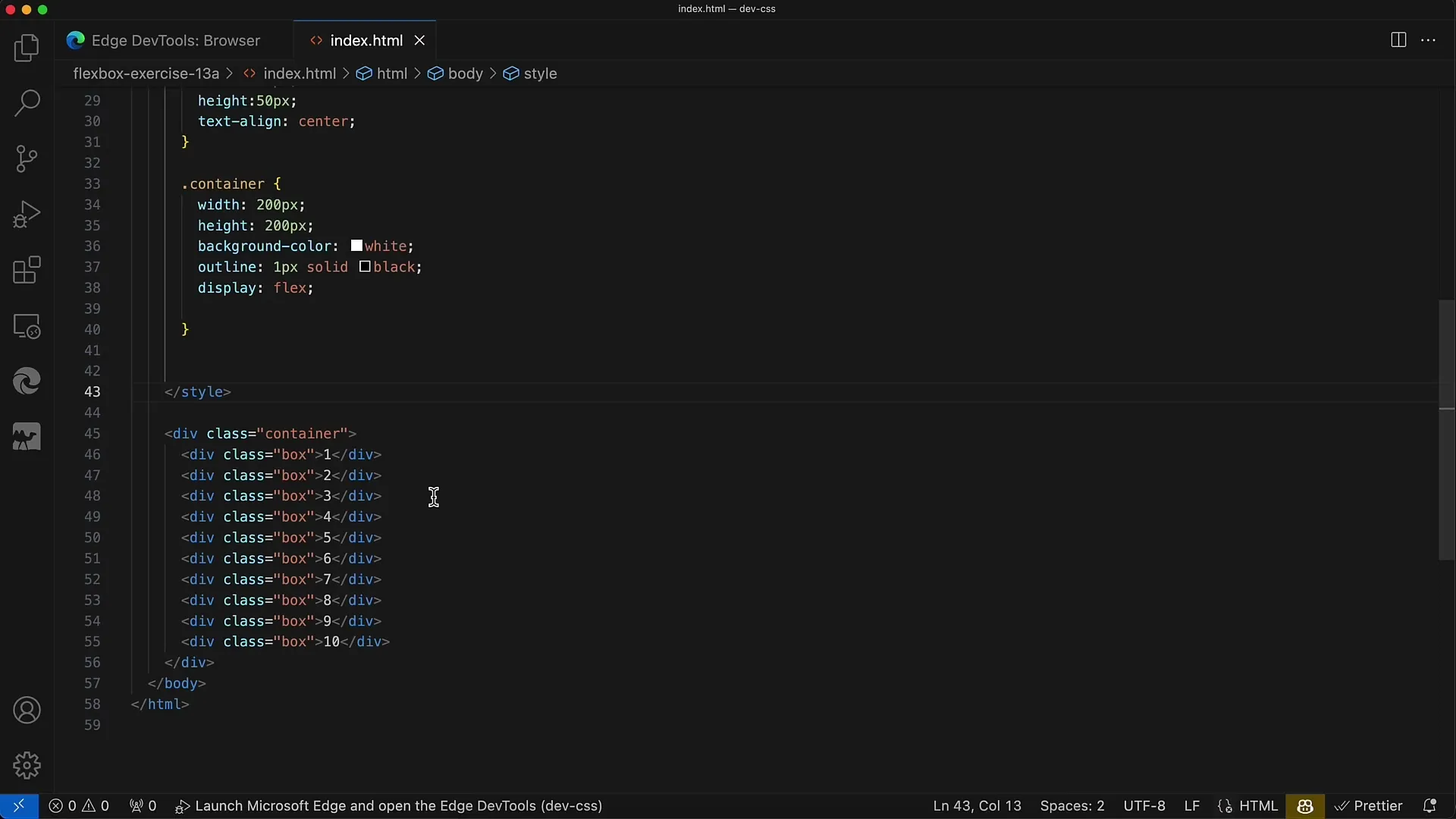
Before you start styling, make sure the spacing between elements is even and appropriate. It's important to have the same spacing between rows as well as above.
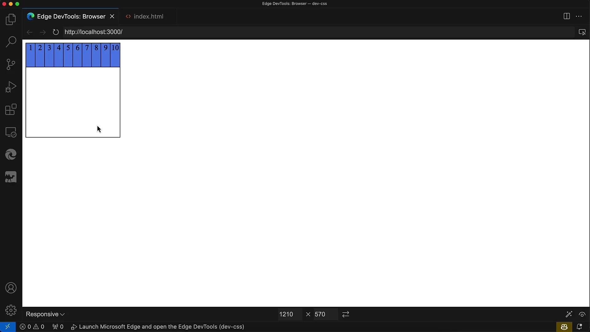
Now that you have laid the groundwork, try your hand at implementing the arrangement. The first row will be arranged in a horizontal line from left to right, and the second row will be wrapped accordingly.
The goal is to finalize the last row with elements 9 and 10 at the top and ensure that the spacing is maintained.
The div elements now need the CSS rules for the Flexbox model. It's important to mention that you can adjust the size of the elements by enabling the wrapping property, so they are not constrained.
Once you have inserted the relevant rules, check your layout in the browser. Make any changes in the CSS visible again if you are not satisfied with the result.
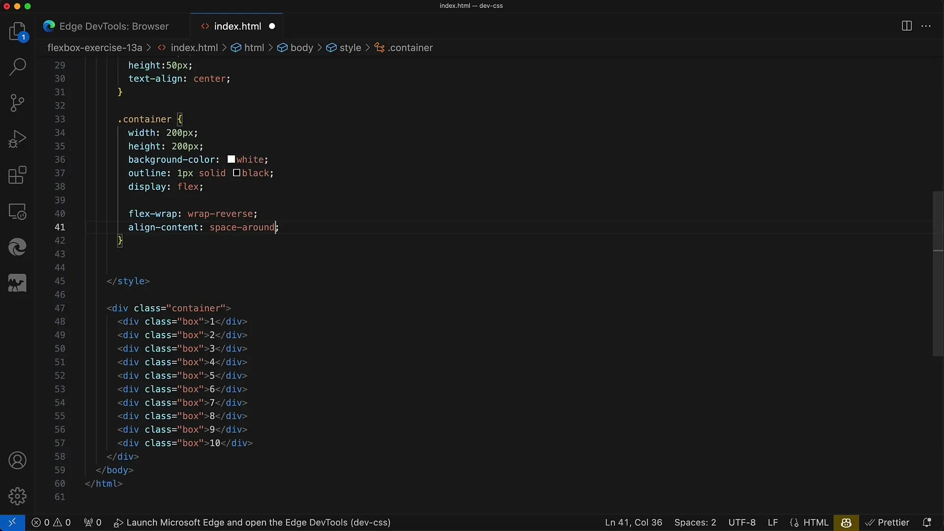
The key to your layout lies in the flex-wrap and justify-content properties. When using flex-wrap: wrap-reverse, the layout will add rows from bottom to top.

The second important property is justify-content: space-evenly. This ensures you have consistent spacing both between rows and from top to bottom.
However, if you use space-between instead, you will notice there is no spacing at the top and bottom. This does not result in an optimal layout; therefore, space-evenly is the preferred option.
Summary
In this exercise, you have learned how important flex-wrap is for creating responsive layouts. You have also seen how the arrangement of elements is enabled by Flexbox and which properties are important for consistent spacing.
Frequently Asked Questions
How can I ensure that items wrap?Use the flex-wrap property in your CSS to achieve the desired behavior.
What is the difference between space-evenly, space-between, and space-around?space-evenly ensures equal spacing, space-between has no spacing at the beginning and end, and space-around has different spacing on all sides.
How do I activate flex-wrap for my layout?Simply add the rule flex-wrap: wrap; to your container.
